|
| Group |
Round |
C/R |
Comment |
Date |
Image |
| 2 |
Apr 24 |
Comment |
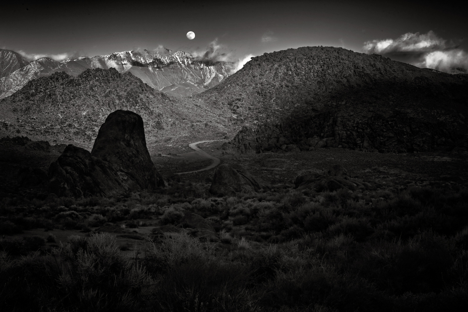
Kudos to Karen for maintaining the early morning vibe she experienced (enjoyed) on this particular sailing journey. The large expanse of space defines a sense of "place".
Re-cropping to a 16x9 ration is appropriate and maintaining the hazy, and somewhat desaturated view presents viewers this early morning landscape in a natural way.
(So refreshing to see work that is not over-processed).
One comment: try a re-crop (same 16:9) but bring the frame to the bottom, thus more water, less sky. Use the Spot Healing Tool (Normal mode) to ride only those bright/larger spots in the foreground. This still keeps the foggy sky and main subject at the (top third), thus highlighting the water and its reflection and shadows to compliment the whole scene. Try it, see what you think. Great work, Karen!
Lance A. Lewin
PSA Global B&W Photography Mentor
PSA South Atlantic Area Membership Director
lance.visualizingart@gmail.com |
Apr 9th |
1 comment - 0 replies for Group 2
|
| 5 |
Apr 24 |
Comment |
Happy Sunday, Sophia!
I like the natural feel of the scene that lay before us ... this is Lovely work!
However, alternatively, I also like the Original perspective: though cropping brings viewer attention to a specific (part) or a sculptured-view, the original registered image offer viewers' a perspective of the glorious vast landscape you have framed and captured: in my edited version of the (un-cropped) original I was careful not to bring too much illumination into the underexposed portion ... trying to present what may have been an accurate visualization when viewing this vista in real-time. (Best viewed by DL'ing first on larger monitors)
Both renderings are valid ... one that highlights a specific portion (sculpted-view), the other (edited version) trying to present spectators a sense of "Place" this beautiful location in California offers. |
Apr 7th |
 |
1 comment - 0 replies for Group 5
|
| 14 |
Apr 24 |
Reply |
.... yes, indeed, keeping a higher speed will help stabilize the exposure, for sure. Then try exploring Hyper-focal Distance manual focusing: in this case, for one possible example, you would press the shutter button to see what F/stop the camera is choosing, then begin a series of exposures at slightly different focusing points.
Then, when reviewing images only on a computer screen, choose the best one. This process is known as "Bracketing". (So we are clear, this NOT merging images in Photoshop ... it is just recording the same composition from behind the viewfinder several times, each at a slightly different focusing point to manage Dof).
However, F/4 is large, if you use a Higher ISO,then you can use something like F/10 or higher, thus increasing the Dof range: then HFD focusing may actual work very well. I hope you experiment with this idea. |
Apr 12th |
| 14 |
Apr 24 |
Comment |
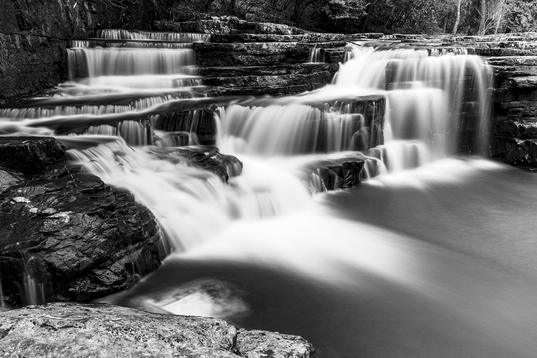
Kudos for having the eye/visualization to see this lovely play between lines, shapes and texture! I like this!
But let us speak about one particular technical point: focus and Depth of Field (Dof).
You selected Shutter Priority and for this type of composition/subject, this was not the correct camera dynamic that would help create (or expose) this scene. (F/4 will not often do the trick, especially when the subject occupies several feet from front to back). Instead, Control over the Dof (Aperture Priority) was key in maintaining a very clear/in-focus back wall, as well as manual focus.
As such, you allowed the camera to choose the f/stop, and thus, define the Dof. As a result, the back wall becomes increasingly blurred, and including the top steps. I look forward to continuing this conversation, Ingrid. Thank you.
Lance A. Lewin
PSA Global B&W Photography Mentor
PSA South Atlantic Area Membership Director
lance.visualizingart@gmail.com |
Apr 11th |
1 comment - 1 reply for Group 14
|
| 18 |
Apr 24 |
Comment |
Chan, this is outstanding work! Not just from a technical perspective, but also, strong narrative possibilities!
"Points to Ponder":
In an age where we can easily record images of the places and things we do on a daily basis, makes one think hard/critical about our relationship to the World around us: around every corner we often see another person standing squarely behind a viewfinder �� thus the transparent wall between ourselves and the reality that lay before us, and at that, a "cropped" world, indeed!
Chan's image this month can be interpreted as exploiting this notion �� another of course, is those who explore the world between the padded armrests of their favorite chair �� again, seemingly experiencing the site and sounds of faraway places, or the charm of local vernacular, filtered through the lens of photographic devices.
Lovely work, Chan!!
|
Apr 7th |
1 comment - 0 replies for Group 18
|
| 45 |
Apr 24 |
Reply |
... on the other hand, perhaps the Low-Resolution is plaguing the image. |
Apr 2nd |
| 45 |
Apr 24 |
Comment |
Good day, Phyllis. Very Artistic Interpretation!
Though I love, what I refer to as, the "compositional structure", the work is very "creative" or imbues an aesthetic we often enjoy in "Conceptual" or what we may see in "Photo-realistic" (or cartoon-like) imagery.
As such, I do feel the color (and thus, the featured work) is over processed from the standpoint of most photography in the classic sense. |
Apr 1st |
1 comment - 1 reply for Group 45
|
| 60 |
Apr 24 |
Reply |
My pleasure, Michelle ... hey, be careful where you walk! : ) |
Apr 17th |
| 60 |
Apr 24 |
Reply |
My pleasure, Dean. "Points to Ponder", as it were. |
Apr 1st |
| 60 |
Apr 24 |
Comment |
Good day, Michelle! Well composed and exposed!!
Well, I would not so quickly count out the peripheral 'junk' Dean highlights: why?
1. almost everyone composes "vehicle portraits" ... most without reference as they are, well, portraits. So, in being different, Michelle's composition bucks this trend ... as she was photographing a "scene", and not just a portrait.
2. Outside of composing a Portrait, we then want to define a sense of "place", and in this case, Michelle's Farm (and its collection of odd pieces and junk, very much compliment the aging, rusting, and frankly, "junky" truck).
As such, as a record of local vernacular, this photographic composition should be well regarded. Perhaps within a series of like work will present a narrative. Does this work scream to be in a photo competition, likely not, but instead the work is still an example of, can we suggest, journalistic art? |
Apr 1st |
1 comment - 2 replies for Group 60
|
| 83 |
Apr 24 |
Reply |
Adi, indeed, some may see the 'wheel' as interfering, and if this caveat had been noted without the other image-dissection , perhaps it would have been more well received. (For me, the nighttime scene is rich with flavor ... as such, the 'wheel' escapes my focus).
However, in the real sense of the "street" photography genre, this scene it is not: it represents an outstanding travel photographic image imbuing the mood/atmosphere of local vernacular. It is instead, what PSA defines as "Street Scenes": in this group of work, it is hit or miss if the photographer actually composes and registers in the classic sense.
As Michael, insists, please, continue to critique as you have done here ... all comments, in one way or another, illuminate the complexity in the review process of photography.
|
Apr 30th |
| 83 |
Apr 24 |
Reply |
Adi, your approach to defining this works "compositional Structure" is illuminating, and maybe, for young students of photography, may be beneficial when forming an initial foundation in the art of photography ... however, I argue, such critique is not beneficial in inspiring and / or instructing mid-level and above artist photographers.
Of course, this is (my) (strongest) opinion, as I instruct/lecture many on cutting the tethers between "rules" and artists'. |
Apr 29th |
| 83 |
Apr 24 |
Reply |
Adi, these are two different images .. as described in the description. |
Apr 29th |
| 83 |
Apr 24 |
Reply |
First, thank you both for positive comments ... I know some will not appreciate this type of abstract photographic art .... but this is a direction I began working about four years ago.
My thinking, to some degree, relates to how we (may) see in everyday life: that is, not as clearly and immediate as, for example, 4K TV says we suppose to see.
This way of thinking is a bit like the ideas Monet offered viewers of his art ... and from his ideas on visual composition we got Impressionism. I suggest, we often do not realize the turbulence in "seeing" .... thus, the juggling of multiple views (or interpretations) actually take place at the same time. It is an interesting discussion, indeed.
At the heart of these types of visual complexities is the Art found within Chinese and Japanese aesthetics ... which I study with vigor on a weekly basis. Thank you, guys! |
Apr 27th |
| 83 |
Apr 24 |
Reply |
BINGO!!!!
I Love it!! Again, beautiful work!
Clark, though in many instances cropping into (The) subject is necessary, in my opinion, this scene works because (everything) is contributing to make a Picture ... a narrative. The narrative, (is) the whole location and the items you so carefully placed within the field of view behind the lens. Here, we enjoy the compositions, Gestalt.
(Read my article in the 2023 PSA Journal March Issue, that speaks about this.. free on PSA website).
|
Apr 22nd |
| 83 |
Apr 24 |
Reply |
... and I am sure your medical team and patients appreciated the clarity/focus in the important images you provided!
But here ... not so much!! LOL!! Just kidding!
Yes!! This image really impacts the subject/space more organically! Lay off the Sharpening! : ) |
Apr 22nd |
| 83 |
Apr 24 |
Comment |
Once again, welcome to the group, Clark!
Indeed, your first image is wonderfully engaging! A very pretty (symmetrical) view of this really cool location! The B&W rendering via Digital IR is stunning! (Hope you are careful when composing such pictures through your viewfinder).
"Points to Ponder"
If I have to critique anything, I wish the far left-side Switching Light Post was in full view: why? Its placement is actually perfect in balancing the (visually smaller/further) Power-line Pole to the right: but not seeing the full height of the Switching Light Post distracts me ... it interferes with an otherwise perfectly balanced (subject-centered) composition, in my opinion. The longer I want to gaze at this picture, the more I am bothered not being able to satisfy my need to see all of the switching Light post.
What I am hoping, this location is easily accessible for you and you rework the subject to see if using a different lens or position (while maintaining the same, symmetrical structure) will test my objection as worthy or not.
Bulletin Board Post:
When you have time, I hope you post some information about the Digital IR process, including what is actually done to the camera and the different types of filters that can be used to create different levels of the IR aesthetic, if such things are possible, or is most changes done in post-production? Looking forward to your contributions! Thank you, Clark!
|
Apr 21st |
| 83 |
Apr 24 |
Reply |
... yeah, both work. : ) |
Apr 19th |
| 83 |
Apr 24 |
Comment |
Hi Adi!!
Very well visualized and executed!
Seems I am in a Cropping mode today: allow me to suggest a small crop to take out a bit more of the foreground Rock: in my opinion, it is a bit too prominent ... and likely due to its lighter tone than anything else. Your thoughts? |
Apr 16th |
 |
| 83 |
Apr 24 |
Comment |
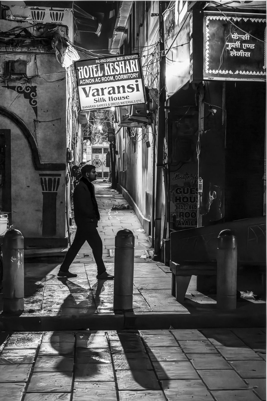
Well done, Michael!
A proper Street scene, as it were ... natural, candid, and presenting spectators a taste, as it were, of the local vernacular. Some thoughts: Michel brings up a valid suggestion relating to noise-grain: indeed, at ISO8000, too bad not more Noise be present to offer a more, can I suggest, natural aesthetic in the way we often see the world around us ... that is, in less than perfect 4K-like appearance. In any case, the visualization is still quite attractive.
I did however Re-Crop the scene ... ever so little to 1. place the man more left, and 2. crop out the extra street-space, I suggest is not needed. Thoughts? Good, bad? |
Apr 16th |
 |
| 83 |
Apr 24 |
Comment |
Thank you for your positive comments, Michel.
Indeed, a lot of my recent work like this one are "teasers" in a sense: making the viewer ponder more deeply then usual. I feel we often "see" the world, and perhaps, especially in nature, not as clearly, in a cognitive way, rather than purely just with our eyes: I argue, at times, overlap what lay before us as we try to take in the whole, thus enjoying the Gestalt of lay before us.
These types of abstract-like compositions are my attempt to illustrate this notion of multi-layer observations, and the complexity in narrative options that ensue. |
Apr 16th |
| 83 |
Apr 24 |
Comment |
Good day, Michel!
My initial reaction to the scene is with much interest ... the B&W rendering/conversion is starling, along with the unusual perspective, together make a rather unique photographic picture. I really like this!
The one caveat is because of the crop ratio ... my attention/engagement is somewhat cut short. In my opinion, the work suffers from a kind of structural imbalance. Instead, perhaps, the original 4:2 ratio, or maybe even, if possible, a Square format would have brought more symmetry. Perhaps you can reedit from the original image file to experiment with these suggestions ....
Technically: can you elaborate on why you chose the native ISO, (since the space being recorded seems to be illuminated only with artificial light), and also, how is there NO camera/hand shake at 2.5 sec shutter speed? How was this picture created? Thank you, Michel. |
Apr 16th |
5 comments - 7 replies for Group 83
|
| 87 |
Apr 24 |
Reply |
Thank you for your critique, Dale.
Yes, many may not like the exaggerated lines reaching for the ceiling, and I get that ... however, I too, feel it brings another quality that perpetuates viewers (longer term) interest. |
Apr 8th |
| 87 |
Apr 24 |
Reply |
....so I am clear, Chan, this type of photographic art is creative ... and in a gallery setting patrons of arts would likely understand this ... as I noted above ... long as the work was properly identified ... and the artist intent was fully revealed. Looking forward to more of this type, including the work in DD-18. |
Apr 7th |
| 87 |
Apr 24 |
Comment |
Lovely transformation from a rather a bland scene to one that speaks with a bit more enthusiasm.
However, the point for realism must be made: and of course, the scene imbues a sense of post-production intervention via the over-saturation colors and, like Will points to, the purple sky ... however .... "Points to Ponder"
But if you printed several different landscape compositions finished in a similar manner (a series), it would be important spectators read about your creative vision behind the work ... thus, defining the artist intentions, and properly identifying or categorizing the work goes a long way in appreciating the work for what it is ... this Conceptual Photographic Image is easily identifiable by its loud (color) voice, as it were. Properly identified, the viewer then contemplates and appreciates the work in a certain manner instead of looking at the work with skepticism.
The final image reminds me of old slide film images. |
Apr 7th |
| 87 |
Apr 24 |
Comment |
Though 'crunchy', I like the effect! (Not sure it would hold up to being printed, however).
Otherwise, I really like the composition: nice balance between the two trees, rocks, lovely, Jennifer.
|
Apr 7th |
| 87 |
Apr 24 |
Comment |
Very cool effect, indeed!
However, the overall "compositional structure" does not inspire me to keep looking at it: perhaps if the Sun had been above, and not behind the structures it may have, for me, brought more interest. The Wind Turbines bother me too; instead of being part of the image, they seem to be a distraction.
I do suggest, re-cropping via custom size to eliminate much of the water and sky, which may bring more focus/attention to this amazing effect.
|
Apr 7th |
| 87 |
Apr 24 |
Comment |
A very lovely spring scene!
|
Apr 7th |
| 87 |
Apr 24 |
Comment |
Interesting character!
But the overall scene does not move me in any particular manner ... other than looking at a snapshot of a local parade. The image would likely do well in an article that talked about both the subject and the parade he is participating in, for one example. |
Apr 7th |
| 87 |
Apr 24 |
Reply |
Appreciate your comments, Chan.
Indeed, the dash of color and single-point light behind the chair are key visualizations, together, hopefully extract an emotional reaction from viewers, emotions/feelings I enjoyed while visiting this quiet space within the walls of this otherwise large church. |
Apr 7th |
| 87 |
Apr 24 |
Reply |
Will, I agree ... was just being open-minded.
Steve, please, do not straighten this work ... love it as is .. as I already commented. |
Apr 3rd |
| 87 |
Apr 24 |
Reply |
No.
1. The added light is not logical considering where the light is coming from.
2. The main component in this scene is in fact, the single light behind the chair ... and what prompted me to register this scene. Adding the other splash of light negates this visual intrigue.
3. Lastly, the added splash of light is a manifested artifact via post-production which I am solidly against unless the work is one within Conceptual Art or Graphic Arts, for two examples. |
Apr 3rd |
| 87 |
Apr 24 |
Reply |
Though this version is acceptable, I often use wide angle distortion ... as such, your version is OK for documentary purposes ... but not for an artistic version. |
Apr 3rd |
| 87 |
Apr 24 |
Reply |
The scene is crooked, or appears that way from the wide angle aberration. The sloping to the right is engaging and works for this picture. Also, in a lot of traditional "street photography" similar off-kilter compositions are the norm ... usually a result of spontaneous (and likely candid) exposures. |
Apr 3rd |
| 87 |
Apr 24 |
Comment |
First, I like ... this type of image ... being off-kilter, it is the first component that engages the viewer. Next, the "net" adds another delightful aesthetic, in my opinion, together, this composition of an otherwise common sight/view, instead, promotes much interest and joy, if I may. Well framed, Steve! |
Apr 2nd |
6 comments - 7 replies for Group 87
|
17 comments - 18 replies Total
|


