|
| Group |
Round |
C/R |
Comment |
Date |
Image |
| 6 |
Mar 24 |
Reply |
Ruth, so we are clear, I did not soften the background ... I used your original image and re-cropped with a square ratio. But, I did add a carefully applied vignetting to darken the background ... and this must be the extra softening (effect) you are experiencing.
Relating to Image Data, I only use PSCC for all my post-production work, (plus NIK Color Efex Pro4 and Silver Efex Pro3) ... interesting that Lr stated much higher ISO; I never heard these two platforms disagreeing with one another. |
Mar 17th |
| 6 |
Mar 24 |
Comment |
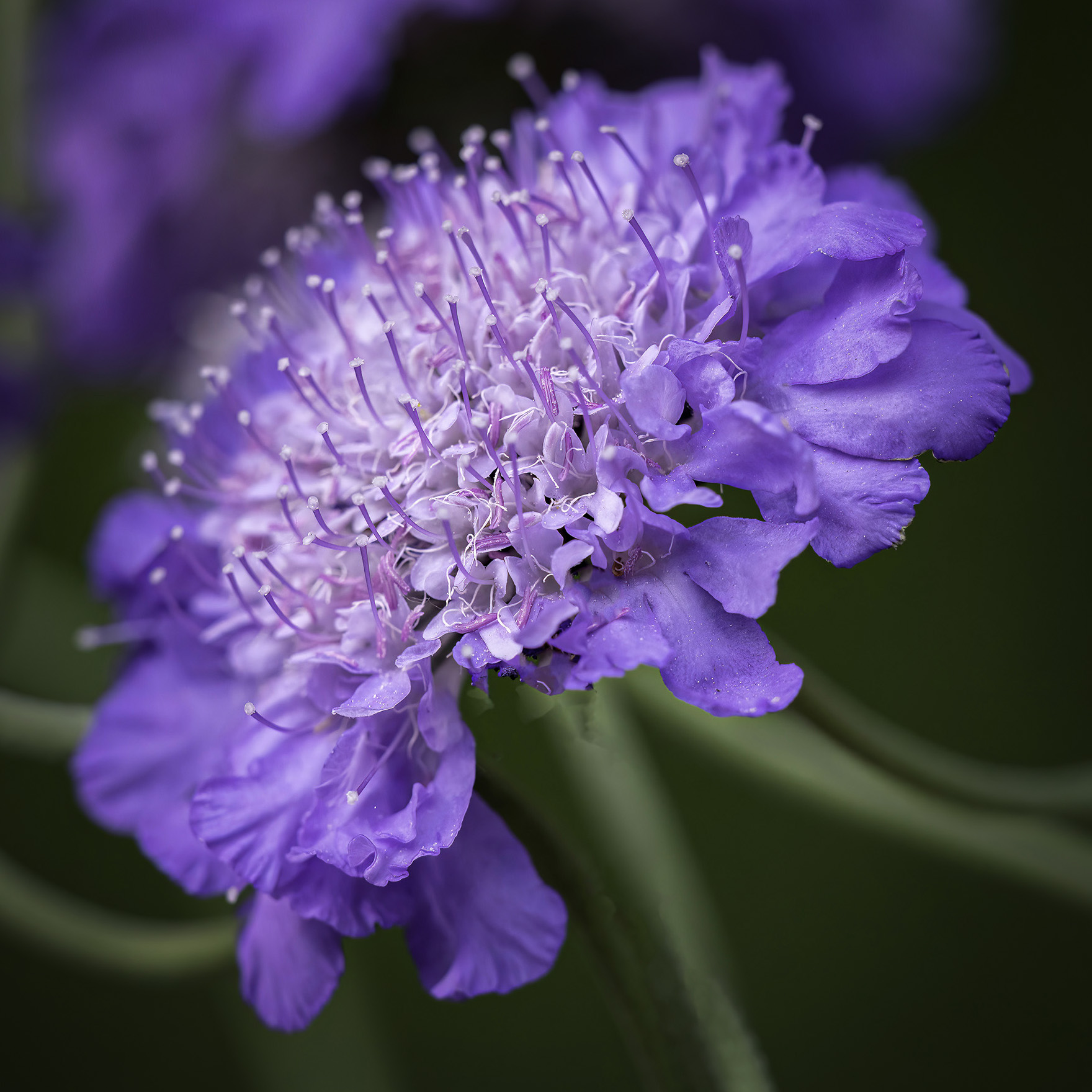
What a lovely Flower, Ruth!
I especially like the focused details in the center-bottom of the flower, the surrounding lens Bokeh giving the image depth. However, I suggest, (also) the original image reveals, perhaps, an authentic representation some viewers may connect to, this in virtue of the stems "orientation" to the main subject. (I only suggest this as another way of presenting your work, and by no means the featured image is anything less).
This example of course, took 60 seconds to accomplish, as less post-production manipulation was needed to convey the final version. I am looking forward to continuing the conversation.
(Note the actual ISO was 640, not 2500, so noise-grain would be a less, indeed).
Lance A. Lewin
PSA Global B&W Photography Mentor
PSA South Atlantic Area Membership Director
lance.visualizigart@gmail.com
|
Mar 17th |
 |
| 6 |
Mar 24 |
Comment |
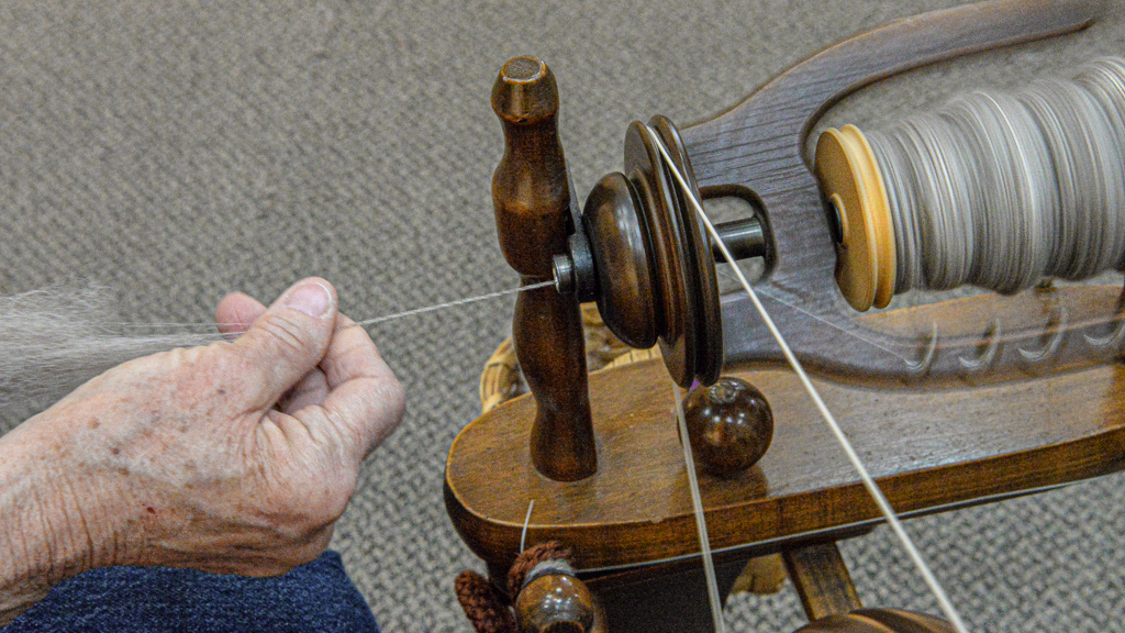
First, exploring Trade Shows of this type are often wonderful resources for creative photography, and Jim's featured work brings this to mine. Next, the image and how it was composed is a fine "TalkingPoint" for us to explore ...
Indeed, Jim's vision to examine both the artists hand and her machine is well visualized ... and the viewer is invited to take this closer look than we may actually do in real time ... hence the power of photography ... often revealing what we miss in our hurried pace as we move from on location to the next.
But I must also point out caveats I feel are important ... all in an attempt to suggest alternative "compositional" and "technical" components that can elevate spectator interest.
1. What I call, "compositional structure" basically refers to how any visual art is balanced (painting and photography for two examples) and I suggest perhaps a different lens or crop is needed for better balance. In this case, A. a different position to reveal more of the spinning Flyer and Bobbin or B. the use of a wider lens to offer an alternative perspective to do the same. (See my Edit that re-crops the featured work to a 16x9 ratio, and selective Dodge & Burning, all to help focus our attention on the mostly horizontal plane ours eyes focus along Jim has created).
2. Technically, two items come to mind, A. very High ISO setting, and B. the combination between 1/60sec and F/16: I question all three of these values as they seem excessive: simply, why did you choose ISO12,800, or did the camera choose this for you? I look forward to continuing this conversation!
In the end, Jim's image is a fine example of composing and registering a difficult subject, and the varied means in which the artist photographer choose to accomplish his or her artistic goals.
Lance A. Lewin
PSA Global B&W Photography Mentor
PSA South Atlantic Area Membership Director
lance.visualizingart@gmail.com
|
Mar 17th |
 |
2 comments - 1 reply for Group 6
|
| 11 |
Mar 24 |
Reply |
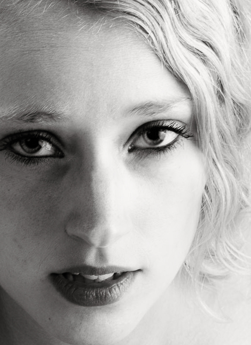
One alternative B&W version that maintains the unique contrast between light and shadow (as enjoyed in the color original) we normally do not see in the standard portrait. |
Mar 14th |
 |
| 11 |
Mar 24 |
Comment |
Hello, Mr. Serre!
Now that I see this color version, what is intriguing is the shadow vs the lighted portion on the models face: alone, without seeing the color version, the close up composition is dramatic, outside the box creativity; however, in my opinion, this light/shadow conflict may actually be the impetus to a more lasting image.
I am surprised you did not maintain the shadow/lighted abstraction in the original over to the B&W conversion. As such, I would like very much if you reprocess the color version in such a way to follow this suggestion. : ) |
Mar 4th |
1 comment - 1 reply for Group 11
|
| 18 |
Mar 24 |
Reply |
Of course, this discussion point/s that come up regularly: how/when does negative or digital image file manipulation cross a line from "classic tradition" to Conceptual or Graphic Arts, for two examples?
Chan, you are correct: as soon as you 1. removed the people, and 2. replaced the sky this image became a Hybrid or perhaps we can say, Multimedia Photographic, or perhaps, Composite Photography. However, as Joan points out, it needs your regular, and rather talented "hand" to create what we would expect in the form of Conceptual Art, like you do so well. (Love the "Artist Touch" below!!) |
Mar 21st |
| 18 |
Mar 24 |
Reply |
Very clever, Chan!!! |
Mar 21st |
0 comments - 2 replies for Group 18
|
| 25 |
Mar 24 |
Comment |
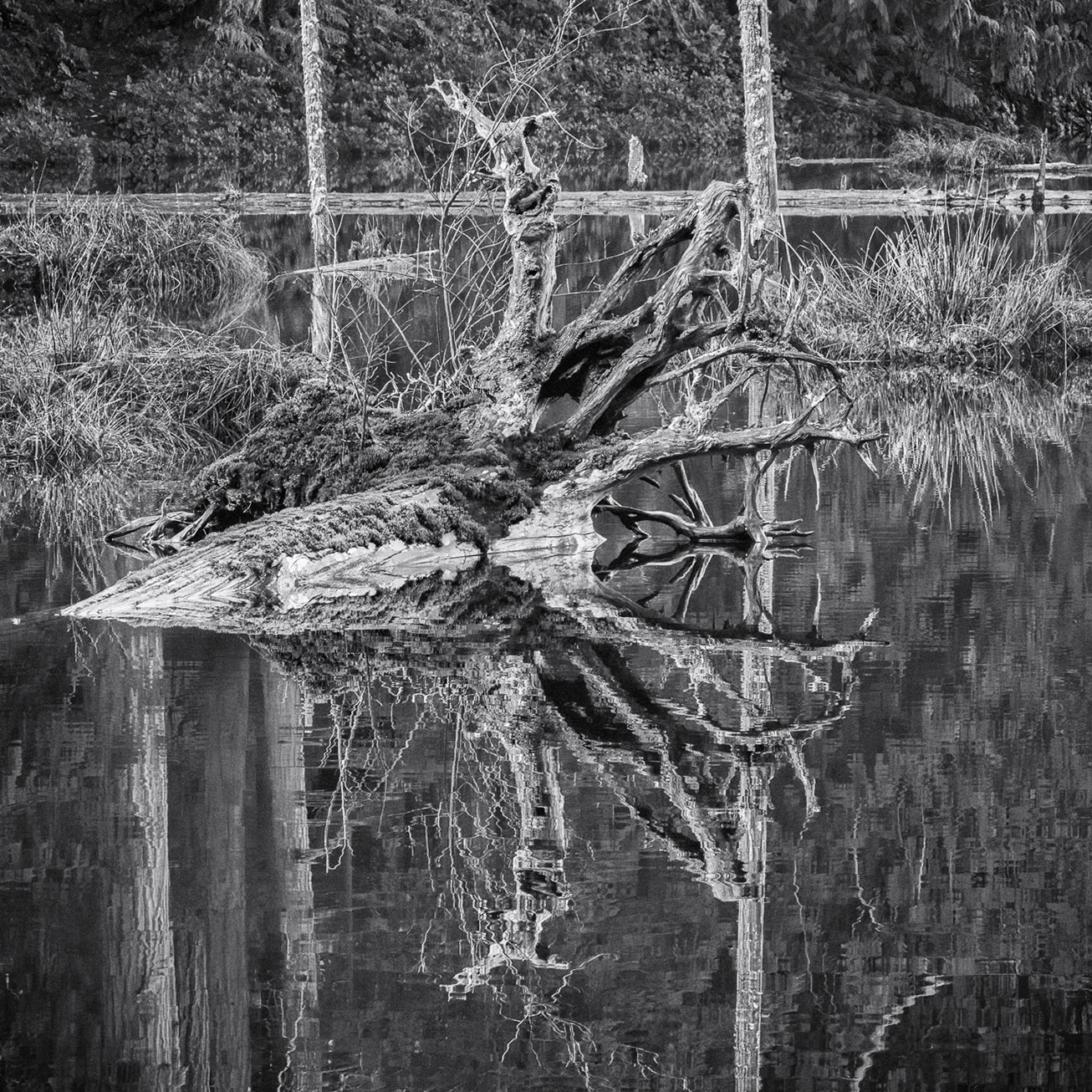
Really like this Bollin! Well visualized!
I am giving a lecture at the Foothills Photography Group in North Georgia next week ... titled, "Drawing with Shadows". Your featured work emphasizes the beauty we normally do not see in our hurried pace. "Were it not for shadows, there would be no beauty" (In Praise of Shadows by Jun'ichir�…� Tanizaki 1933).
Though the work imbues the essence of minimalism as is, the image does have potential for other compositional designs via cropping, for example a Square Crop to focus on the walls ... but of course this would alter the scene dramatically and perhaps lessen its impact in virtue of diminishing the "space".
Lance A. Lewin
PSA Global Photography Mentor
PSA South Atlantic Area Membership Director
lance.visualizingart@gmail.com |
Mar 6th |
1 comment - 0 replies for Group 25
|
| 38 |
Mar 24 |
Comment |
Simply brilliant visualization, Gabriele!
I do like Jacoby's interpretation better in virtue of keeping more separation between the multitude of shapes and colors. As a result, his rendition provides more depth. In any case, the creative sense is composing this Conceptual Art is striking, indeed.
Lance A. Lewin
PSA Global Photographer Mentor
PSA South Atlantic Area Membership Director
lance.visualization@gmail.com |
Mar 6th |
1 comment - 0 replies for Group 38
|
| 39 |
Mar 24 |
Reply |
... my pleasure! |
Mar 17th |
| 39 |
Mar 24 |
Comment |
Hi Fran ... hope you are well.
Very powerful image considering the title ... but still feel without it the image imbues strength. This especially created in virtue of the wide open aperture creating a shallow Dof ... well done! |
Mar 6th |
1 comment - 1 reply for Group 39
|
| 42 |
Mar 24 |
Reply |
Beautiful work, Susan! |
Mar 17th |
| 42 |
Mar 24 |
Comment |
Hi Susan!
An image that imbues the cold and longness we often feel exploring vast spaces in winter ... the use of open space ... helps define a sense of "place" ... you have done that well. It is also nice you did not over-process the sky to reveal more cloud structure ... and this is a breath of fresh air.
"points to Ponder"
Without the title, how does the image convey a narrative, outside the emotional one defining longness, it, initially, and easily portrays ... I only bring this into the conversation to make one alert of such factors in how we "appreciate" imagery, photography, as one example.
Lance A. Lewin
PSA Global B&W Photography Mentor
PSA South Atlantic Area Membership Director
lance.visualizingart@gmail.com
|
Mar 17th |
1 comment - 1 reply for Group 42
|
| 47 |
Mar 24 |
Comment |
Good day, Jeff.
Though I enjoy your (technical abilities) to transform this likely "street" scene into a something that is more "Creative", it is a fine example of how artist photographers need to begin presenting their work accordingly ... this goes a long way in helping spectators realize a reliable and accurate "appreciation" for the work ... work that may be similar to others like it, especially those composed in the "classic tradition" of photography, especially 1940's to 1960's jazz club photographs, for one important comparison/example.
In this case, for example, the work could be presented as:
"Keeping Warm" Creative Photography by Jeff Manser, or
"Keeping Warm" Artistic Photography by Jeff Manser |
Mar 17th |
1 comment - 0 replies for Group 47
|
| 60 |
Mar 24 |
Reply |
Indeed, time and Patience go a long way in helping to perfect our creative goals/vision. : ) |
Mar 21st |
| 60 |
Mar 24 |
Comment |
Hi Michelle!
The subject is one we all love to photograph and though your intentions are sound ones, I need to speak about one particular caveat.
Focusing and Depth of Field (Dof): with a 35mm lens (and F/22) the Dof should have been enough to capture all that lay before the camera, for example, a museum like photograph. Instead, barley any part of this image is clearly in focus: a. due to auto focusing or b. you did not correctly focus on the middle of the flower, but again, I am a bit puzzled why w/35mm the area of blur is so severe at F/22.
Now alternatively, and as Dean brings to our attention, the soft-focus presentation also allows for a sense of Depth ... and this is always one particular benefit to experimenting with different aperture and lens Bokeh. This we get a glimpse at in the featured work. These types of Soft Focus aesthetics are normally achieved through the use of Larger Apertures (e.g., F/1.2 to maybe F/3.5). (see/study 19th century photographer Julia Margret Cameron for her celebrated soft-focus techniques).
Moving forward, spend more time trying different focusing points and F/stop combinations ... via "bracketing" and reviewing images in post-production for accurate analysis. I look forward to seeing more of your work in the future. |
Mar 17th |
1 comment - 1 reply for Group 60
|
| 74 |
Mar 24 |
Reply |
In fact, I suggest, (it) is key in presenting a perspective we do not often enjoy in both reality and the visual arts. In addition, because of the surrounding (very busy) foliage, I feel the centered trunk stabilizes the composition. (I have done similar work within my Intimate with Nature series of images).
One other note, try another B&W version where the Trunk (and main branches) are "Burned" just a bit more ... maybe not. Experiment. Lovely work.
|
Mar 18th |
| 74 |
Mar 24 |
Comment |
Absolutely love this perspective!!
Terrific Visualization, Haru!! |
Mar 14th |
1 comment - 1 reply for Group 74
|
| 83 |
Mar 24 |
Reply |
Hi Michael! Thank you for your thoughts on this ...
Yes, to many, this series of work would seem outside my usual theme, but in fact, this series was started in 2014 (in NYC) and later additional work completed (in NYC) in 2016 and later. Covid halted my progression ... and that is too bad, as the empty (Covid-19) streets in NYC would have made a vivid juxtaposition to these.
Indeed, it is very important this work presents identifiable subjects (to a large degree), as compared to one that was purely abstract. Your reflections are valid and what I hope sparks others' interests. |
Mar 29th |
| 83 |
Mar 24 |
Reply |
A Typo in my remarks:properly written, .. the Cross is Not an obvious interference. Sorry for not proof-reading my comments. |
Mar 29th |
| 83 |
Mar 24 |
Reply |
Good questions:
1. Yes, as seen through the viewfinder, if I am not mistaken.
2. ISO-2000 allowed me a bit more freedom for camera settings.
3. No. I strongly suggest doing so would "cramp" the scene and lesson a sense of "place". Thank you, Adi! |
Mar 29th |
| 83 |
Mar 24 |
Reply |
Well documented and appreciated, Michael. Thank you! |
Mar 14th |
| 83 |
Mar 24 |
Reply |
Interesting comment, as this exact effect, and subsequent abstract bears an important factor in the narrative aspect of the frame. Without it, the image will lose its staying power.
As such, the more time we spend looking at this image, the more we begin to see (or perhaps imagine what lay before us), while the constant presence of the "still Man" is the key catalyst for decisive narrative. |
Mar 13th |
| 83 |
Mar 24 |
Comment |
Well visualized, Don!
I like your Featured version the best, with Michel's left-side crop. Done. Perfect!
"Points to Ponder"
I often tell students of photography ... don't be so fast to correct "perspective" issues ... or what we may initially perceive as "issues". Alternatively, wide angle lens perspective anomalies are often effects we can use for creative photography.
|
Mar 13th |
| 83 |
Mar 24 |
Comment |
First, let me address Michels comments about seeing and wondering what this person is doing .... simply, I see no person and I am confident no one ever will: as such, it has no bearing on how the viewer interprets the scene. Next, I did not see the cross until Michel pointed it out, it too, in my opinion, is NOT an interference ... this in virtue of its minuscule "stance" in this otherwise wide landscape perspective.
As it relates to the overall scene, the image may conjure a cultural reference to humanities continued technological progress and its affect on nature and the Earth as a whole. The more I look at it, the more now, the Cross bothers me.
|
Mar 13th |
| 83 |
Mar 24 |
Comment |
Michael, like Michel, the only aspect in the scene that causes me to cringe is the interfering diagonal line: even if the that line is actually recorded correctly relative to your cameras position and the Earth, perhaps trying to correct this will serve the subject/s better. Because I absolutely love the main subject and its reflections!!
See my edited version which offers a less "stressful" interpretation.
"Points to Ponder": it is so important we take a little extra time to carefully view in front and behind our main subjects a we peer through the viewfinder: in this example, you could have made adjustments to your stance/camera position all the while practicing "Bracketing", later to review best results. |
Mar 13th |
 |
| 83 |
Mar 24 |
Comment |
Very well visualized and executed, Michel!
Indeed, a very strong vertical-presence, as it were, that makes use of the open space of the sky that gives the composition a special level of interest or engagement. There are many like-images, but your (wet) version offers viewers a new interpretation. |
Mar 13th |
4 comments - 5 replies for Group 83
|
| 87 |
Mar 24 |
Reply |
Excellent! Well visualized and executed! |
Mar 12th |
| 87 |
Mar 24 |
Reply |
Perfect!! |
Mar 12th |
| 87 |
Mar 24 |
Comment |
My thinking echos the other participants.
Go back out and re-work a similar scene taking care to compose more thoughtfully through the viewfinder ... working the scene for a couple of hours if necessary.
|
Mar 12th |
| 87 |
Mar 24 |
Comment |
Very creative scene, Will! I really am enjoying it.
The lighting is great ... how did you light this? |
Mar 12th |
| 87 |
Mar 24 |
Reply |
|
Mar 12th |
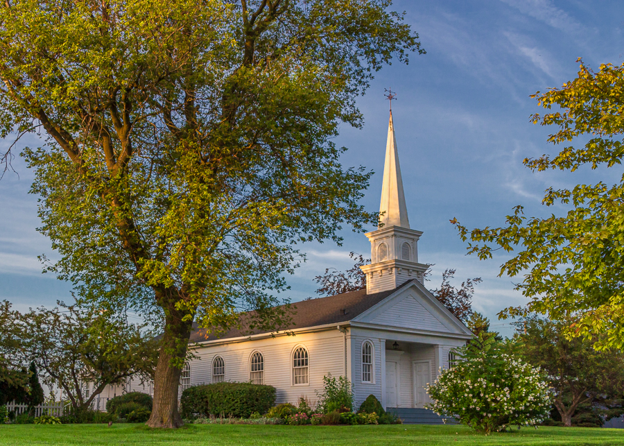 |
| 87 |
Mar 24 |
Comment |
Light and Shadow:
Very lovely spring scene focusing our attention on the subtle sun-drenched portions against an otherwise low-illuminated space. We often tend to want to increase shadows in a lot of the images we compose, even though in reality we see and enjoy such strong contrasts: but I argue, and a theme in one of my Lectures I give across the southeast, shadows are often catalysts for beauty and we should give pause before lessening their prominence in our work.
I especially like the orange hue and the overall color palette.
As opposed to Steve's version, I maintained the color and "stark" differences between light and shadow that you have exposed for us to enjoy, while increasing the overall illumination.
Tech:
I applied a Polarizing filter, Dodge tool to (selectively) increase the shadows, and burned the steeple ever so lightly. Lastly, I gently applied Midtone Adjustment to help add contrast, but tried to still maintain the soft and gentle interactions between light, shadow and color. |
Mar 12th |
| 87 |
Mar 24 |
Comment |
A good example of recording a local vernacular.
I agree with Dale the person sitting, and the "Open" illuminated sign gives a sense of life, however, their presence is all but consumed within the larger framework of architecture.
Technically, I like the finished piece and how you Brough more (natural) detail to the sky that was otherwise hidden in the Highlights. Well done!! |
Mar 12th |
| 87 |
Mar 24 |
Comment |
Thank you, everyone! |
Mar 12th |
| 87 |
Mar 24 |
Reply |
You are absolutely correct, Chan!
And why the work is titled (and description, too) attempts to rectify the issue you point to. I would agree the featured work is out-of-place, as it were, without support from like images from the series.
As such, we have opened up for others' a Talking Point I often discuss on this and other PSA pages .... where often the participants single image does not offer enough to live on its own. This a prime example. (I was just about to replace this image with another, but now, I think I like the Talking Point you initiated).
As it relates to the series, it is a multiyear effort that will eventually be presented as an exhibition with prints, including one of my favorite, the image posted in DD83. Thank you, Chan. |
Mar 2nd |
5 comments - 4 replies for Group 87
|
19 comments - 17 replies Total
|


