|
| Group |
Round |
C/R |
Comment |
Date |
Image |
| 1 |
Jan 24 |
Comment |
Good day, Dennis!
Well, quite the scene! Seems you are really trying to find a narrative for this solitary Church, but I must confess, outside of viewing this "abstraction", I can not find one.
Alternatively, the work very much sits comfortable within, what I call, "Digital Pictorial" and within this "creative" space spectators may be able to appreciate the artistic value you present here. Perhaps a B&W version will solidify (or maintain attention/focus) of the subject, thus help the viewer to appreciate it more. Maybe not. (I do wish the overall composition was more in focus ... and not blurred by the intentional manipulations).
Lance A. Lewin
PSA Global B&W Photography Mentor
PSA South Atlantic Area Membership Director
lance.visualizingart@gmail.com |
Jan 3rd |
1 comment - 0 replies for Group 1
|
| 2 |
Jan 24 |
Reply |
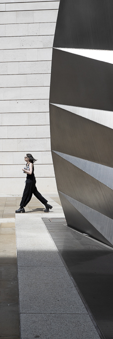
Roger that, Terri .... but in many instances, traditional "street photography" is less about long planning and more about "instinctive" awareness of the photographers surroundings.
You have done this here ... this is a great visualization! Hope to see more like this from you. On google, search images by Arthur Tress (b.1940) for a variety of street-perspectives from this 20th century artist photographer ... it may be inspiring. Enjoy! |
Jan 3rd |
| 2 |
Jan 24 |
Comment |
Happy New Year, Terri!
Though the work reveals a very impelling subject ... one we often do not see in our hurried pace, such work could be thought as "artificial" or fake if spectators, and other serious "street photographers" knew the work was manipulated.
Alternatively, the work can be Categorized or "tagged", what I call, "Digital Pictorial", add the tag Street Photography, all suggest the "creative" nature of the work.
Another alternative, would to forgo the manipulation and present something that was captured via a crop ... which lies very comfortably within the "classic tradition" of photography ... see my 42x14 crop (of your original) that is not manipulated, but still, within the "street Photography" genre would likely be deemed taboo... maybe not!
Lance A. Lewin
PSA Global B&W Photography Mentor
PSA South Atlantic Area Membership Director
lance.visualizigart@gmail.com |
Jan 3rd |
 |
1 comment - 1 reply for Group 2
|
| 5 |
Jan 24 |
Reply |
Very entertaining article, Sophia. : )
|
Jan 16th |
| 5 |
Jan 24 |
Reply |
Sophia, I also think my article in the March Issue of the PSA Journal would be of interest to you ... I posted the link on your Bulletin Board back in March. Looking forward to your feedback. Ciao. |
Jan 11th |
| 5 |
Jan 24 |
Comment |
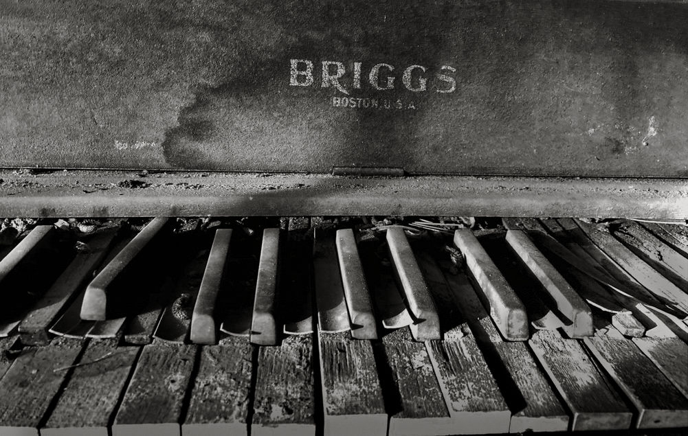
Hello, Sophia! Passing by and saw this seeming long ago abandoned piano caught my attention .... sometimes a picture suppose to imbue a sense of uneasiness, tension and / or intrigue .... to stimulate the viewer. Also, most of my critiques are not focused on rules connected to competition, but rather for the sake of making art; Art for the sake of Art.
"Points to Ponder"
May I suggest the "original" composition with its awkward stance is actually the best ... why? Well, "Things in the Attic" conjure up a space of dust, low light and often, items/artifacts placed haphazardly ... in this sense, the awkwardness seen in the "original" is quite appropriate, indeed.
I especially enjoy the crooked logo, which, in my opinion, is a key attribute in this sense of seeing something that is old, weathered, forgotten, perhaps even, lost .... see my example which includes specific areas of Dodge and Burn and other subtle modifications. The work is less focused than I would have liked, but it still works very well, especially presented as a "small print" with a 3 or 4 inch matte.
Lance A. Lewin
PSA Global B&W Photography Mentor
PSA South Atlantic Area Membership Director
lance.visualizingart@gmail.com
|
Jan 11th |
 |
1 comment - 2 replies for Group 5
|
| 11 |
Jan 24 |
Reply |
Indeed, these examples "open up" the exposure in helping to maintain the softness I spoke about. The subject and surroundings work together to reveal a gentle narrative and keeping contrast to a bare minimum really does maintain this atmosphere in the Black and White rendering. Well done! |
Jan 24th |
| 11 |
Jan 24 |
Reply |
Looking forward to it! |
Jan 16th |
| 11 |
Jan 24 |
Comment |
Good day, Jim!
Was attracted to the thumbnail, but my appreciation for the work changed upon viewing the original and realizing the work is not one from reality: in itself this is OK, and obviously within the sub-genre of "creative" or composite photography. I am attracted to the overall balance and B&W treatment the scene offers.
But let us speak about "appreciation" ... not necessary good or bad, but more about what constitutes our notions of appreciation.
As such, I always suggest to the artist photographer following (this) particular style, please, "tag" or otherwise announce the work as such: in this case, the work could be titled:
Lighthouse Window - Hybrid Photography or
Lighthouse Window - Composite Photography or maybe
Lighthouse Window - Digital Pictorial Photography, which i like a lot.
I bring this to our attention to press upon the fact spectators "appreciate" art by often contemplating everything about it: subject , the authors background and how the work was created ... thus maintaining transparency in this respect goes a long way in minimizing the skepticism, or what I refer to as, "viewer apprehension" when spectators initially approach and contemplate exhibited photographs in the 21st century.
I am aware within the photography art genre we do not (consistently) apply these identifications, but hope in the future it becomes a regular practice.
Thank you. |
Jan 9th |
| 11 |
Jan 24 |
Comment |
Good day, Christian, everyone! First, the entire scene/subject is most beautiful, charming and heartwarming. I especially enjoy the use of space to define a sense of "place" and if I cropped it at all, it would be very little. Well visualized and recorded!
"Points to Ponder"
But the two images (original and the B&W version) are good examples how an artist photographer has the power to change a particular narrative in post-production: think of Ansel Adams, where we mostly see dramatic aesthetics of scenes that were actually less powerful in their presentation at the time the image was registered. (e.g., Moonrise, Hernandez, NM 1941 for a prime example).
Here, too, we see such a change: you have slightly altered the narrative I outlined above by imbuing a dramatic presentation ... less soft and subtle as I suggest the color version entertains us with.
In itself this is fine, but want to highlight changes like this to bring attention how quickly we are able to alter narratives in post-production. I also wanted to point out a less contrast focused B&W rendering may result in imbuing the aesthetics I personally enjoy in the original; not because it is in color, but the incredible softness the color version quietly whispers, and argue can also be enjoyed in the B&W version via a different set manipulations. Thank you.
Lance A. Lewin
PSA Global B&W Photography Mentor
PSA South Atlantic Area Membership Director
lance.visualizingart@gmail.com
|
Jan 9th |
2 comments - 2 replies for Group 11
|
| 39 |
Jan 24 |
Comment |
A very lovely abstract, Jerry!
I especially like the entire composition expands to the edges ... perhaps a well chosen Matt and Frame will highlight the work! |
Jan 22nd |
| 39 |
Jan 24 |
Reply |
Hi Fran! Hope you are well. And that is a very important point ... trying to reveal what you experienced in real-time ... that, such an experience was special ... and obviously artistic, as such, your featured work caught my attention for its uniqueness in tonal gamut.
I especially like the beautiful melting of tones in the crashing waves! Matted and Framed will delight most viewed under a powerful spotlight!
"Points to Ponder"
The resulting re-edit completely changes the original interpretation and in my opinion, makes the work more common placed: however, if we decide some darkening of the sky is needed (to reveal more clouds) then it should be done very lightly to maintain the original scene (as you experienced it). In this case, you will only add a "dash" of salt, instead of the tablespoon that has been added. Great work, Fran! |
Jan 22nd |
| 39 |
Jan 24 |
Comment |
Good day, Ken!
Lovely scene you have constructed here ...though dark, enjoyed a nice tonal gamut, and a prime example of work that would be presented to spectators as ....
"Bannick City Grill" - Digital Pictorial Photography ... for one possible category or tagging. Well done! |
Jan 10th |
2 comments - 1 reply for Group 39
|
| 40 |
Jan 24 |
Reply |
Well, Happy New Year, Don!
And often, it is the spontaneous actions of the artist photographer would catches the worm!
Was the sky in featured work here altered using Topaz? The one in your home looks more detailed and layered ... but is this due to reflections on the glass? |
Jan 3rd |
| 40 |
Jan 24 |
Comment |
Good day, Don!
Passing by and thought I would take a closer look at this intriguing image. Intriguing, as often, silhouettes present ways of seeing we normally do not enjoy in our daily routines. On a whole, the composition was well visualized and captured.
Questions: after scanning did you edit the work? One obvious area I am attracted to is the soft sky: this, likely in virtue of a slow shutter speed, but the building details are very clear .... so can you elaborate how this scene was captured?
"Points to Ponder":
You question the "compositional structure" for having the dead-black space or (empty) space that is salient, or overpowering ... it is what makes the image engaging. It is fantastic from the standpoint of good artistry. Grain or (Noise) is often a welcomed addition to many types of images; it is here, from what I can see ... as the overall blackness/softness could have also been made from a digital exposure, too.
The composition is intriguing, but we also must ask, does it hold firm as a stand alone photographic image? Well, yes, and no. I often suggest to PSA members and others such work gains more "appreciation" when viewed within a series of like images, but if the work is properly matted and framed, and where it is presented, this work can also survive as a single narrative. It would be nice to see if you can find more from your archives. Thank you, Don.
Lance A. Lewin
PSA Global B&W Photography Mentor
PSA South Atlantic Area Director
lance.visualizingart@gmail.com
|
Jan 3rd |
1 comment - 1 reply for Group 40
|
| 43 |
Jan 24 |
Comment |
Gorgeous!!! |
Jan 16th |
1 comment - 0 replies for Group 43
|
| 83 |
Jan 24 |
Reply |
Good point you bring up, Carole ... we often tend to enjoy the Gestalt of black and white imagery before one rendered in color. Thank you for stopping by. |
Jan 24th |
| 83 |
Jan 24 |
Reply |
You bring up a very important talking point: how/when to view visual art, and especially when differentiating between film based work, and digital photography alternatives.
Though we can spend some time on this ... a short version may look like this: when viewing film based photographs, it is important to view from afar relative to the size of the print, this often is not influential when viewing digital based photographic prints.
Indeed, the featured work will reveal all its nuances (good or bad) upon illuminated under a spotlight in print form. Thank you, Don. |
Jan 24th |
| 83 |
Jan 24 |
Reply |
My pleasure. |
Jan 24th |
| 83 |
Jan 24 |
Reply |
Mark, everyone one sees and feels differently about photographic images, paintings and often, we can have a similar discussion referencing music. Indeed.
Composed recently using film ... the scene spoke to me ...yes, mostly the tree trunk and branches seeming to stretch out like some bizarre contortionist. Also, I do feel taking in the whole scene reveals more, and helps set the stage, as it were, to offer the perspective I enjoyed behind the viewfinder.
Though Adi's crop is a viable one ... but I still feel losing that much off the tree-tops bothers me.
Yes, film can often offer less in ... otherwise sterile photographic aesthetics ... and honestly, wished it was a bit less "crunchy" in the details you alluded to, but it does define a certain aesthetic adventure enjoyed in Japanese aesthetics, for example, and one that I enjoy more often than not.
Alternatively, I very much understand your reluctance to assimilate the visual nuances I am trying to present ... as this is sometimes not an easy recipe to follow. Your comments will go a long way in helping me remain keen to how others may be perceiving my visual intentions. And thank you for that. |
Jan 22nd |
| 83 |
Jan 24 |
Reply |
... and I very much appreciate your adding to this conversation. As Micheal mentions below, it really is a wonderful space to share insights, opinions and we all seem to respect the process quite well. As you allude to (below), I hope some of the thinking shared in this conversation allows you (and others) to see alternative paths of interest .. or at least, inquiry. Thank you, Mark! |
Jan 21st |
| 83 |
Jan 24 |
Reply |
Hi Mark, and appreciate your feedback: and I did mean, "I do not like it one bit" only when the work is not properly identified. Please, go to DD3 "Bulletin Board" and read the article I posted that Micheal asked me to write. Thank you, Mark. |
Jan 21st |
| 83 |
Jan 24 |
Comment |
This is a wonderful Landscape composition, Mark!
What especially works is the difference between sun-drenched rock and the shadows that hide the rest. The center Cumulus balances with the sun-drenched light, too. |
Jan 16th |
| 83 |
Jan 24 |
Reply |
I almost was, too ... but upon bringing up the image on my large screen ... |
Jan 8th |
| 83 |
Jan 24 |
Reply |
I just followed the Link: it is a story/concern that is popping up more and more as people like myself, Magazine and News editors and the art world, come to grips with the task how to gauge artist integrity, especially within documentary/news genre of photography, and the affects of AI within the photography genre of art.
I am currently deeply involved in a three year project with the International Visual Sociology Association (IVSA) Think Tank (one of 5 regions across the globe) in pursuit of re-writing/updating the IVSA Code of Ethics: I have helped convince my group (of 5) we should focus on threat of AI generated imagery in research. The 30 participants must come to a final solution by early 2025, unless this changes. |
Jan 5th |
| 83 |
Jan 24 |
Reply |
Good questions: but I thought some of these questions would be nullified after reading the essay ... maybe not, it seems.
Michael, adding an "imitation" aesthetic from the proprietary source where the aesthetic defines itself (within a sub-genre) is misleading the public eye when applied to a non-film based image.
Toning is a regular/normal practice in photography for 180 years, adding it digitally is one of convenience, but its application (to the digital image) does not mislead the viewers eye: the resulting image could be film or digital based and the (toned) image would represent the same in both: that is, a "Toned image".
If I apply a Red filter in B&W conversions, this too, is one of convenience; where the resulting image could be film or digitally based and reveal the same results; although the film based image will have the film-aesthetic most appreciated by those who use it, this is obvious.
Again, as I pointed out in the article, a lot of these pre-sets, layers, imitation (film) grain, sky-replacement, deleting artifacts ... and others, are all very popular for its function, not just as a creative tool, but to make the creative process within photography rather quite simple compared to achieving similar results ... accomplished through patience, perseverance, and good visualization and judgement skills, generally, practiced in "classic tradition" of photography.
Again, as I also state in the Bulletin Board essay, all these tools and their applications are viable, meaningful actions in pursuit of ones creativity, but please, let the work be Tagged or identified to alert the masses of how the work was accomplished: this too, is well documented and includes general examples of how this process has already been initiated in the art world. Thank you, Michael.
|
Jan 5th |
| 83 |
Jan 24 |
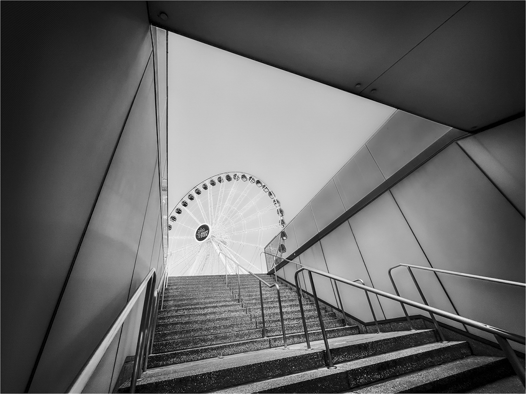
Comment |
I love this composition, Don!
Michael presented quite a list of pluses and minuses, but I do not agree about some of them: for instance, viewing the work from afar on my large monitor reveals the images Gestalt more accurately, in my opinion.
In this case, the sky is not too prominent. Why? I feel the upper black space is initially lost when viewing the work and this promotes the sky as being too prominent. However, careful inspection invites one to "see" the black and sky (white) portion as one.
"Points to Ponder"
As far as narrative ... the narrative here is more abstract, it is a display of visual art in virtue of the artists framing "compositional structure" that lay before him. However, as Michael pointed out, yes, having a person (and only in a certain position and moving along the steps) could add (or make) narrative options, but this is not a necessary element unless the work is part of a series of, for example, Amusement Parks, and the artist needs/wants human element interjection.
Interpretation:
We may interpret the image to suggest the Ferris Wheel is supported by the salient features defined between the steps, wall and ceiling. In this case, though the Ferris Wheel is the main subject, it is not prominent within the frame: an important design feature I often speak/teach in my lectures. A feature we often see in some of Henri Cartier-Bresson work.
Technically Speaking:
My only suggestion is to slightly Dodge the black ceiling to allow it to "enter" the scene to help balance (support) the sky. See my edited version which includes also Dodging the other areas (walls) within the shadows. |
Jan 5th |
 |
| 83 |
Jan 24 |
Reply |
Good morning, Michael!
The B&W negatives were first scanned. A slight crop from the upper-right to take out more sky. The bright areas of sky were Burned, (but before printing will likely re-do this more carefully).
Selected spots/areas were Dodged to help differentiate between dark and light portions within the scene, which, for me, was the essence for which I feel the scene/subject offered in terms of interest.
Out of camera, the sky is much brighter and slightly less contrast overall.(In fact, I still may use the original full-frame version if I can Burn the sky more effectively).
Lastly, a custom silver-copper tone was added ... actually, it is added first. |
Jan 5th |
| 83 |
Jan 24 |
Reply |
An essay inspired by your questions is now posted on the Bulletin Board in both DD-83 and DD-3 per your request. Thank you, Michael. |
Jan 4th |
| 83 |
Jan 24 |
Reply |
Yup, leave it to you to get us all started in deep conversation ... I love it!
However, the questions you pose need a serious and thought-provoking response, as such I will email my response via an email later today. By all means, feel free to share all or part with the group. Thank you, Michael! |
Jan 4th |
| 83 |
Jan 24 |
Comment |
Hi Micheal! Gee, talking about reaching outside one's comfort zone!!
This type of composition/narrative is very uncommon in your work ... and I like the almost abstract nature the image presents. We are presented a very interesting play between light, shadow, shapes and texture.
I do not feel the Film-like layer added anything ... at least I do not see this on my 42 inch monitor ... in my opinion, of course. However, I suggest the lighting in the scene has already added a bit of noise to soften the scene.
Conversation Starter: you asked how we feel about applying film-like aesthetics to digital image files: I do not like it one bit! If an artist photographer wants to enjoy film-like aesthetics, then go load a roll of film and enjoy. It is unfair to artist photographers' using film to have their work displayed next to digital based work that "added" film-like aesthetics ... and usually the title will not alert the spectator of such digital post-production use .. unless a series of like-images are being exhibited in a museum or gallery ... as such, most likely, an extended Bio will be provided where the artist explains in depth his workflow and why.
Alternatively, there are a couple of tricks that can help a digital produced image look/feel like film: using a higher than normal ISO for a given lighting situation, and allowing sun glare to splash into the frame, for two examples. |
Jan 2nd |
| 83 |
Jan 24 |
Comment |
Good day, Adi! Really a very engaging composition! Another fine example in your series on like-images presenting potential multiple narratives.
Well, my comments pretty much echo Michaels ... where the point of interest ... the Power Point, as you state, reveals itself in the lower right corner. Only the right-side asymmetrical column of bricks interferes with a perfect composition, in my opinion, and only because everything else is perfectly lined up/symmetrical.
Was the right-side "skew" a result of trying to perfect Lens Perspective? |
Jan 2nd |
4 comments - 12 replies for Group 83
|
| 87 |
Jan 24 |
Comment |
Cindy just sent this to me .... a version with the window heavily darkened or Burned.
Looks great! Thank you, Cindy! |
Jan 16th |
 |
| 87 |
Jan 24 |
Reply |
Another Good Question, Chan.
Yes, but decided this was the optimum design that incorporates both the vertical hanging moss and the rest of the scene. In this sense, I feel the bold/dark statement of the tree balances the otherwise brighter space below the squirrel ... thus off-setting attention that the squirrel is centered.
In Print, with matte & frame, I think this particular "compositional structure" will evade scrutiny your question addresses ... in my opinion, of course. |
Jan 12th |
| 87 |
Jan 24 |
Reply |
Yup! Agree! |
Jan 5th |
| 87 |
Jan 24 |
Reply |
Thank you, Dale!! : ) |
Jan 5th |
| 87 |
Jan 24 |
Reply |
I agree with you .... that is, if you do not have a special agenda that includes the often special aesthetic film brings to many images, then just occasionally loading up a film camera seems pointless ... and expensive. The featured image above is was registered outside the series of work in which the film is being utilized. Thank you, Steve. |
Jan 4th |
| 87 |
Jan 24 |
Comment |
Cindy, and here is a cropped edit with vignetting to eliminate some of the surroundings ... something I rarely suggest, but here I think it works well. Your thoughts? |
Jan 4th |
 |
| 87 |
Jan 24 |
Reply |
No. The effect is very 3-D'ish .... this composition works especially well because the objects are floating ... its different! It is visually attractive. |
Jan 2nd |
| 87 |
Jan 24 |
Comment |
Hi Will! Very glad you are enjoying this little guy.
I was pleasantly surprised when I saw this vivid silhouette, with the likeness between the vegetation and its fur ....
Custom Crop. |
Jan 2nd |
| 87 |
Jan 24 |
Comment |
Happy New Year!
yup! I think the background blur works very well! |
Jan 2nd |
| 87 |
Jan 24 |
Comment |
Hi Jennifer!
Well, this is a very pristine version of a very iconic and sought after view of the Golden Gate .... well done!
"Points to Ponder"
However, I must comment on your use of Shutter Priority for this particular composition: more correctly, Aperture Priority or even Bulb exposure setting would be the correct choice ... as it relates to low light/Tripod use: in this sense, several different ("bracketing") F-stops should have been used, thus allowing the camera to choose the shutter speed and then, the user reviews the best exposure in post-production. This would also solidify details in the background if so the artists choice. (Of course, other camera dynamics such as manual focus (and perhaps using hyperfocal distance) would yield consistent results.
In other words, these types of compositional situations are usually based around "controlling Depth of Field".
|
Jan 2nd |
| 87 |
Jan 24 |
Comment |
Good day, Will!
Well, when standing back the main subject is pretty clear. Terrific! |
Jan 2nd |
| 87 |
Jan 24 |
Comment |
Yes, Steve ... very soft, smooth, perfectly focused ... was this manual or auto-focus? Really fantastic exposure considering the use of only ISO-640 in this apparent very dark space. Did you try test-exposures using various ISO's?
Well done! |
Jan 2nd |
| 87 |
Jan 24 |
Comment |
Hi Chan!
Well, it is very evident you have really fined tuned your post-production skills ... as this Museum-like illustration is wonderfully expressed, especially when we compare it to the original exposure. Well done! |
Jan 2nd |
| 87 |
Jan 24 |
Comment |
Oh, yes! The famous Rat Motor, GM's 502!
The image brings back fond memories (1972) of my friend Billy Bruno's 57 Chevy and the weekend he and others replaced the original with a 502 Rat motor!
Nice work in showing this beautiful, dare I suggest, piece of Art! But in fact, it is a piece of art its own right. |
Jan 2nd |
9 comments - 5 replies for Group 87
|
22 comments - 24 replies Total
|


