|
| Group |
Round |
C/R |
Comment |
Date |
Image |
| 2 |
May 23 |
Comment |
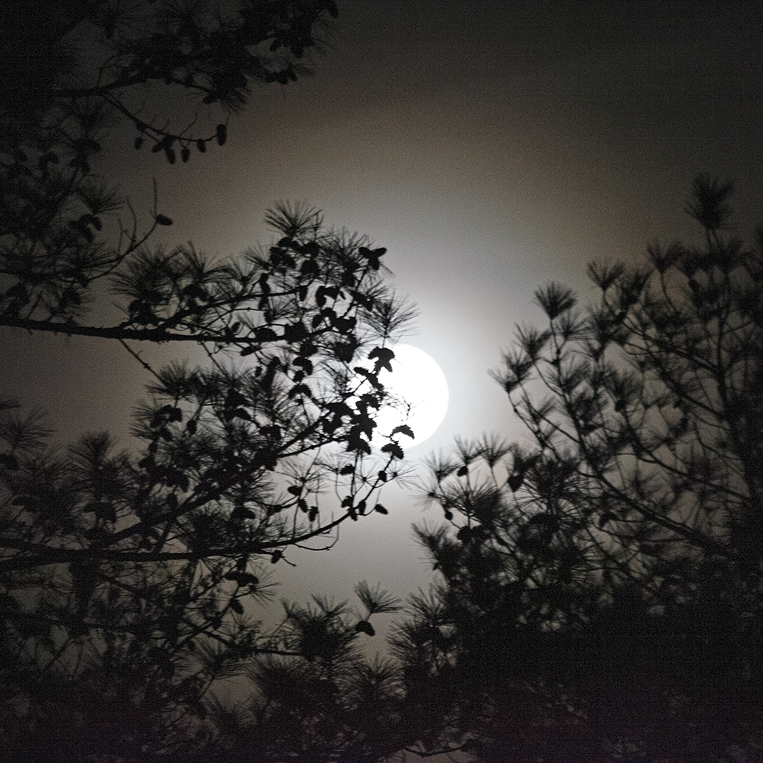
Jim, what a wonderful composition in virtue of both the overall "compositional structure" and the use of a more natural (mid-tone) tonal gamut: that is, less contrast sets the work apart from others that tend to present such work with the deepest of blacks and whitest of whites: though , the former aesthetic is a viable option, the latter (the featured work) presents one that is different, at least different from recent standards.
Please, see the work of 20th century landscape photographer Bob Kolbrener (b.1947), if you have not already. Kolbrener's large format images are known to exhibit less contrast ... as he does little in the way of extreme Dodge and Burning we may see from Ansel Adams, for example.
Beautiful work, Jim.
Lance A. Lewin
PSA B&W Photography Mentor
PSA South Area Membership Director |
May 17th |
1 comment - 0 replies for Group 2
|
| 22 |
May 23 |
Comment |
Hi Marti. What do mean ... you 'added a small stroke' ...?
Thank you.
|
May 7th |
1 comment - 0 replies for Group 22
|
| 24 |
May 23 |
Reply |
Gee!! This is perfect! Just a touch of clarity is nice!
Yeah, I screwed up the composition by cutting off the the top leaf ... I need to go and see the original ... can't remember if this is a Crop issue or compositional issue as seen through the viewfinder. Really appreciate this revision, Tom! |
May 28th |
| 24 |
May 23 |
Reply |
Really appreciate your encouraging comments ... thank you!
The sunlight was perfect and I enjoyed working the area (and this subject). The play between light, shadow and textures is where I focused my attention this particular evening. |
May 12th |
| 24 |
May 23 |
Reply |
I will revisit the original and see if I can maintain the entire leaf. |
May 12th |
| 24 |
May 23 |
Reply |
... on further contemplation of this image ... the work really imbues the aesthetics we enjoy in Mixed Media Paintings. |
May 8th |
| 24 |
May 23 |
Comment |
Gee! What vivid colors!
Wonderfully composed and exposed .... however, as Fred has mentioned, next time composing this or similar flower arrangements, be sure to "bracket" (which includes the idea of "working" the subject) compose using the Macro, and then back off, too. Change F/stop and focus points to experiment with Dof ... if your camera has Dof button, makes the process so much more satisfying.
In post-production then review an assortment of images and choose the one that best exemplifies the creative vision you feel is most engaging for you. |
May 4th |
| 24 |
May 23 |
Comment |
Beautiful detail in the center of the flower!
I have similar comments as Fred .... |
May 4th |
| 24 |
May 23 |
Comment |
Gorgeous!!!
|
May 4th |
| 24 |
May 23 |
Comment |
Indeed, very engaging art within the subgenera of "Conceptual Photography", and some may place it within the realm of graphic arts.
Well done! |
May 4th |
| 24 |
May 23 |
Reply |
Pinaki, if your Polarizing filter is (a rotate) type, experiment with careful minute adjustments .... you can outside on a clear day and test. Regardless, it is not uncommon that post-production to minimize Highlights is needed as well. |
May 4th |
| 24 |
May 23 |
Reply |
Hi Fred ... I thought about this too, but the one (front) petal imbues, in my opinion, a satisfactory about of detail . Taken-in as a whole, along with the effects from light and shadow, I am hopeful the work will look as satisfactory in print.
As always, I appreciate your thought provoking critiques.
|
May 4th |
| 24 |
May 23 |
Comment |
I love this perspective!!!
The balance, the "compositional structure" is really engaging!
Some Criticism: I can easily see where you "Burned" small sections between the
branches ... I am not sure what method was used, regardless, it needs to be redone in a way as not to add "blemishes".
If you think these areas are too "brilliant", have you tried running the image through a Polarizing Filter in Nik Color Efex Pro, or other like-program? This may help in minimizing the bright areas .... just a thought. |
May 3rd |
5 comments - 6 replies for Group 24
|
| 83 |
May 23 |
Reply |
Welcome to the group, Michael!!
Indeed, a lot of viewers will likely agree with your choice, but there is another side of the isle, if I may, that relishes viewing work normally set aside as accidents or otherwise visually disturbing; my quest is 1. to often present scenes we actually experience in nature ... ones that may be deemed "interference" to how we see the subject; where we squint through blinding light, snow, rain or subjects mostly obscured by fog, smoke and the like, thus, 2. invite the viewer to contemplate the image more deeply in an attempt to find narrative.
In the end, it is my attempt to offer photographic images - within the realm of "classic tradition" - that set themselves apart from more common perspectives that populate our space.
Looking forward to having you in the group and enjoying your often thought provoking comments/critiques!
|
May 28th |
| 83 |
May 23 |
Reply |
Thank you, Debasish! |
May 14th |
| 83 |
May 23 |
Reply |
Thank you! |
May 9th |
| 83 |
May 23 |
Reply |
I had a lot of fun ... working this subject. |
May 8th |
 |
| 83 |
May 23 |
Reply |
Really appreciate your comments on this discussion ... "artifacts" being sun-glare and "ghosting" from reflections off the aperture-blades, for one key cause of ghosting.
Glad you enjoy each of the "expressions" I have composed as the sun went in and out of the clouds. Using a wide angle lens (or perspective) can often give these unusual optics (visual effects); composed/used carefully, wide perspectives can sometimes give interesting results, many times within the Abstract, like these last two samples below. Thank you, Margaret. |
May 8th |
 |
| 83 |
May 23 |
Comment |
Great Question, Mark!
1. as it relates to how to remove these types of optical artifacts ... I am no expert ... but surely there are several means (techniques) to remove these artifacts without leaving any trace the user did so.
2. more importantly, to the Art of Photography, does the user really want to remove such artifacts: this obviously depends on the "intentionality" of the artist photographer: in the case of designing the composition to "include" such artifacts, then of course the result is to keep them, and this also may be the case when such artifacts "accidentally" appear in a composition: in both examples the added visual artifacts in fact, add to the works, what I often call, "Contemplative Structure" ... or effects to engage the viewer and spawn narrative. My examples are clearly designed to include them ... in fact, I moved (composed the image through the viewfinder) to induce them!
For the time being, I hope this response is satisfactory. Thank you, Mark! |
May 8th |
| 83 |
May 23 |
Reply |
No. I did not say darker tones will add to interest ... I said, he needs to redo the Burning of highlights to remove the blotching that appears in the sky. In fact, my comments reinforce just the opposite, and encourage the mid-tones as 'refreshing'. |
May 8th |
| 83 |
May 23 |
Reply |
... another viable option, indeed. |
May 8th |
| 83 |
May 23 |
Reply |
My pleasure, Mark! |
May 8th |
| 83 |
May 23 |
Reply |
This one without sun-glare ... in total I have several different exposures, some when the sun was out, other with almost full sun (e.g., sun-glare images) as the passing clouds offered a variety of exposure challenges, indeed. |
May 8th |
 |
| 83 |
May 23 |
Reply |
Yes, and that is precisely why the "bracketing" practice becomes so valuable in every photographer's bag of tools. Indeed, the variety of exposures, and thus characteristic traits within the registered image are so varied: see two more examples...
|
May 8th |
 |
| 83 |
May 23 |
Reply |
Very creative, indeed!
I think an entire series of like-images would be an engaging study: one that focuses on, for example, social issues that juxtaposition old and new cultural trends and / or technologies, or even perhaps architectural changes within urban landscapes ..... I hope you decide to contemplate like ideas and then embark on such a project.
It is photographic journeys like this, one idea, I often speak about to artist photographers in my mentoring programs. Hope you experiment first, and then bring examples to this group for review. |
May 8th |
| 83 |
May 23 |
Reply |
5D Mark II with the 16-35mm L lens. (Other notes in description). |
May 7th |
| 83 |
May 23 |
Reply |
Excellent response ... and what I was looking for you to share with the group.
Your entire workflow process to register this scene through the lens sounds logical and obviously, produced results! Yes, I really like the mood this scene offers viewers'. |
May 6th |
| 83 |
May 23 |
Reply |
Yeah, not sure. : ) |
May 5th |
| 83 |
May 23 |
Comment |
Simply beautiful, Mark!!
Tonal gamut, compositional structure or image balance is fine, a lovely nature scene!
1. Can you explain where you were standing and how you negotiated the shot in the snow?
2. How did you decide to choose the camera dynamics for this shot?
Thank you. |
May 4th |
| 83 |
May 23 |
Comment |
Love it!!!!
Like Debasish, the mid-range within the tonal gamut is refreshing, calming and imbues the structures age and capture by nature.
However, like Pinaki's image in DD-24, you have not satisfactory "Burned" areas in the sky in attempt to bring out detail or lessen Highlights. In this case, viewers see blotching or smearing in the sky.
This type of editing needs to be redone from the original image with a gentler hand, as it were. |
May 4th |
| 83 |
May 23 |
Comment |
Adi, my comments are similar to Mark's, but speak about something else.
1. The overall composition is wonderful ... exposure, grey-scale or tonal gamut is so, so pleasing.... beautiful work.
2. My issue is the "ghosting" or smearing that permeates around part of the light house; what perpetrated these artifacst? I saw these artifacts because the lighthouse seem to be "sticking out" from the image. Thank you. |
May 4th |
| 83 |
May 23 |
Comment |
The first thing I love about this composition is the less than super-heavy contrast we often see in images like this .... see some of Bob Kolbrener's (b.1942) landscapes for a similar, more natural visual experience ... like your presentation this month.
The work captures that sometimes special moment we encounter in nature, regardless if along the sea or hiking through early morning fog in the mountains.
Well done!! |
May 4th |
| 83 |
May 23 |
Comment |
An intriguing image indeed!
The students expression is so relaxing, pretty and tends to draw the viewer into her psyche.
On the other hand, as a stand alone image, and even with the title, it (may) be hard to find narrative .... of course, the title offers this example: the student is reminiscing about being back home, perhaps in her native land.
Questions:
Can you explain the process you used from start to finish? Thank you. |
May 4th |
| 83 |
May 23 |
Reply |
Good day, Mark ... these are good questions .... my intent is to present "an experience" or an "emotion" felt during my visualizations through the tropical space this late afternoon.... sometimes our gaze is compromised looking through rain, snow, fog, and here the piercing light of the sun: these obstacles that interfere with our sight can also be gateways in "seeing" in new ways: where both austere objects (and even those of prominence) are reformed with a certain type of beauty often overlook in both nature and urban landscapes.
Within Japanese and Chinese aesthetics we find many avenues to explain such beauty and / or emotion response ... "Y�…�gen" and "Mono No Aware" are two concepts that help:
"When looking at autumn mountains through mist, the view may be indistinct yet have great depth ... the limitless vista created in imagination far surpasses anything one can see more clearly..." Kamo no Ch�…�mei (1155 to 1216)
Take in the whole scene .... see the images Gestalt, and not so much investigate individual details.
(Also read my article in PSA's March Journal where I speak a little about this: the Link is on the Bulletin Board). |
May 3rd |
6 comments - 15 replies for Group 83
|
| 86 |
May 23 |
Comment |
Very Psychedelic !! Love It!!
I like the composition that highlights the light-show and adds a few people for perspective. Anymore, and we have distraction, in my opinion. |
May 11th |
1 comment - 0 replies for Group 86
|
| 87 |
May 23 |
Reply |
Thank you, Dale. |
May 22nd |
| 87 |
May 23 |
Reply |
Thank you, Chan. |
May 22nd |
| 87 |
May 23 |
Reply |
... and for the record ... any artist photographer will tell you, mostly those who work outside the borders of camera clubs and like institutions, that is the worse advice ever. |
May 6th |
| 87 |
May 23 |
Reply |
Perhaps you would find my post on DD-24 Bulletin Board helpful. Enjoy. |
May 6th |
| 87 |
May 23 |
Reply |
... yes, I believe you are correct ... I think ... Cindy's glass is actually a 24-70mm, so without knowing anything else about either lens ... I guess Cindy's F/2.8 is correct for (this) lens. ?? |
May 6th |
| 87 |
May 23 |
Reply |
Cindy, email me to discuss ... lance.visualizingart@gmail.com
I look forward to speaking with you. : ) |
May 6th |
| 87 |
May 23 |
Reply |
.... I believe I often see these types of gloves used when cutting up fish .... |
May 6th |
| 87 |
May 23 |
Reply |
Good memory! (Yes, happen to have that lens handy just inside the house from our recent unpacking from latest trip...walked back in and grabbed it!)
Indeed, this aesthetic does follow the "coffee cup" series of work.
And yes, the vignetting is a natural dynamic in virtue of the exposure situation as seen through the 300mm lens. |
May 6th |
| 87 |
May 23 |
Reply |
Cindy, choosing (Aperture Priority) on your camera allows you to dictate this important dynamic, while the camera decides the shutter speed for you. For almost all types of portrait, landscape and nature images (like the featured Azalea) this works fine. All other exposure metering (as usual) is done for you as well, but at least controlling the lens opening (e.g., F/2.8 to F/16 for example) allows the artist photographer to enjoy a host of creative opportunities.
As Jennifer mentioned, if your camera has the feature, (for the most part) you can fine-tune the clarity from behind the viewfinder to accommodate your eyesight. I am always adjusting mine to be sure the view is crystal clear. (Try it with and without glasses). |
May 6th |
| 87 |
May 23 |
Comment |
Steve, indeed this lens and other "Fast" zoom lenses open to F/2.8.
My Sigma 70-200 shoots wide open (F/2.8) at any focal length. |
May 6th |
| 87 |
May 23 |
Reply |
Very much so! |
May 5th |
| 87 |
May 23 |
Reply |
Very interesting interpretation, Cindy! Glad you like it! |
May 5th |
| 87 |
May 23 |
Reply |
Excellent! Hope we get to see those in the near future!! |
May 5th |
| 87 |
May 23 |
Comment |
Hi Cindy! Yes, a very uncommon color for Azalea's .... very pretty, indeed.
I like the overall compositional structure, color, and exposure.
Can you share why you choose F/2.8 for this shot?
How much of this image was cropped?
Some Criticism: The central portion (the first part of the subject we view) is out of focus ... where the bottom-right flower edges are more sharp. Possible reasons are 1. using Auto-focus, 2. camera movement (which is not the cause for the issue here) are key reasons for missing out on having key areas in focus, especially when photographing groups of flower buds, and the like. Both these causes can also be exacerbated by a shallow Depth of Field (Dof).
(You may enjoy my article on Manual Focus for photographing Flowers on DD-24's Bulletin Board)
Thank you, Cindy.
|
May 4th |
| 87 |
May 23 |
Comment |
Another lovely adventure that is seems to be paying dividends in finding and composing interesting subjects!
Beautiful exposure! Beautiful Horse!
Of course, the value in a (single) image as being engaging is marred by the Mare as it really causes unbalance in the overall composition which is otherwise adorned with a marvelous landscape with a very prominent subject steadied for the portrait session.
As I mentioned with Will's image ... in a series of like-images and accompanying text discussing the encounter described above, this particular image would fit into an overall narrative. |
May 3rd |
| 87 |
May 23 |
Comment |
Good day, Will.
Let us speak a moment about how we "appreciate" art ... something I may have talked about in the past, but these topics often come up and there is no harm in speaking about them again:
1. even with the title, the (single) image lacks a connection to a potential story ... outside of knowing its a famous market, in my opinion, the narrow (small) field-of-view limits deeper contemplation.
2. Alternatively, if part of a Photo Essay, for example, and presented in a series of images (or photographs) at a gallery exhibition, we can surmise this image would likely fill a necessary piece in the essay's overall narrative.
As such, as a single visual entity, spectator "appreciation" is different, perhaps not as engaging if enjoyed within a series I speak about ....
I like the image for its Commercial appeal .. aesthetically, but without some kind of artist commentary I suggest we may ponder the art in the abstract. Of course, you have baited the group with the question of narrative, so indeed, we can imagine deeper into the image then initially meets the eye.
For one example in narrative direction, and similar to Jennifer's image last month, we see the juxtaposition of the old (the traditional market) but touched by modern technology where swiping a card replaces the exchange of paper money or perhaps some other reciprocal exchange between buyer and seller. |
May 3rd |
| 87 |
May 23 |
Reply |
Yes, here we have clarity. |
May 3rd |
| 87 |
May 23 |
Reply |
(B&W Version)
This version ended up with a lot of depth compared to the color original. |
May 3rd |
 |
| 87 |
May 23 |
Comment |
Hello, Dale!
When composing and registering this type of subject, it is very critical certain aspects are maintained to reveal an engaging image: I will suggest, 1. too much out-of-focus sections, 2. and extreme Highlights can foster the spectator to nod and move on to the next image. These two factors are also amplified due to the subjects (almost complete) lack of detailed focus.
Now I am not a fan of using the "structure" slider, but in fact, most of the "revealed" structure (or leaf detail) was accomplished with adjusting the over-all exposure, including desaturation of color, though it looks like I did. However .....
... the B&W version does have a (selected) exposure Mod dead-center of the Rose where I increased "Fine Structure" to help bring focus to the center, though complete focus/clarity is not necessary. Also, converting to B&W helped achieve more detail and seemingly lower the brightness (Highlights) that, in my opinion, was interfering with the overall composition in the original color version. (Note I made a Square Crop)
|
May 3rd |
 |
| 87 |
May 23 |
Comment |
Anne enjoys this game a few times a month when not involved with her tennis teams, though she does complain Pickleball can interfere with her tennis game.
Terrific action shot! |
May 3rd |
| 87 |
May 23 |
Comment |
Chan, I like the subject and the color illustration this image tries to reveal, but it does not work because the main subject is not in focus: this would be most of the fruit and vegetables.
The other matter that needs pointing out - the table just behind the subject is distracting and does not add to the overall composition.
"Points to Ponder"
Alternatives: w/ crystal clear focus
1. make this a studio shot and place a background behind the subject
2. Change the perspective (with position and / or lens) and bring the subjects closer while initiating Bokeh via large aperture to naturally blur-out the area behind the subject.
|
May 3rd |
| 87 |
May 23 |
Reply |
Stephen, here is the square crop, it too, works well, perhaps better, indeed. Thank you for your comments. |
May 3rd |
 |
7 comments - 15 replies for Group 87
|
21 comments - 36 replies Total
|


