|
| Group |
Round |
C/R |
Comment |
Date |
Image |
| 5 |
Apr 23 |
Comment |
Hi David!
I must say, I am perplexed by your statement that you originally thought of deleting the image �� that ��'how often do we take a picture without thinking' ��
As a matter of fact, the original image is spectacular in recording local vernacular: here, we are presented the local worker (and by virtue of the surrounding artifacts that surround his space) identifies him as a possible shoe-man of sorts. This image is well balanced and extracts the hard work (perhaps hardship) this particular individual navigates daily. It reminds me of the 1960's NYC "Shoeman" working in a similar posture �� a fond childhood memory, indeed.
So, I must ask, you really did not know or compose this image knowing the strong narrative/s the composition can bring? I feel you did not ��'take a picture without thinking' �� but perhaps, subconsciously realized the significance of capturing this scene. (In any case, I am illuminating the fact the original image should not be categorized as one with no possible narrative, which your description suggests).
As it relates to the featured work, it is an alternative composition found hidden within the larger frame �� something we all should look closer at when viewing all our images, regardless if we like them or not.
I would love to see the original converted to B&W!
If you have more like the original, a grouping of local workers would make a fine photo-essay!
Lance A. Lewin
PSA B&W Photography Mentor
PSA South Atlantic Area Membership Director
lance.visualizingart@gmail.com
|
Apr 1st |
1 comment - 0 replies for Group 5
|
| 24 |
Apr 23 |
Reply |
Hi Carol!
As I see from some of the comments, the background seems to be less appreciated: this makes Stuart's crop a better choice.
|
Apr 24th |
| 24 |
Apr 23 |
Reply |
Hi Fred ... thank you! |
Apr 23rd |
| 24 |
Apr 23 |
Reply |
Nice to see you, Stuart ... I like this framing. It is a very viable and clean frame.
My original idea was to have more (or a longer) stem to balance the upper part, but I did not. As an alternative, your offering is well balanced, but of course changes the design using "empty" space as a source for contemplative structure. In this sense, your framing (while maintaining the essential film-aesthetics) works very well.
Hopefully I can go back later in the year and find a similar subject to re-work. Thank you for your comments. : )
|
Apr 17th |
| 24 |
Apr 23 |
Reply |
Hi Bev .... Though I always appreciate your input and various means of reproducing backgrounds, your attempt, unfortunately diminishes the "natural" background created by lens bokeh, which is especially essential in many types of compositions within Japanese aesthetics.
In this case, my featured work (in virtue of pronounced film grain) presents the subject, not in contrast, to the background, but seemingly blends textures: this blending is very reminiscent to some ideas found in both Impressionistic paintings and photography, as well as Japanese esthetics.
Alternatively, your edited version takes the impressionistic flavor and replaces it with a more graphic art/design approach, where we are offered a well defined contrast between subject and background (each has no relation to the other) and our subject is also suddenly floating out in space, thus further detaching the subject from reality.
Both are viable options, but each serve completely different narrative objectives. Thank you for prompting this thought-provoking discussion.
|
Apr 7th |
| 24 |
Apr 23 |
Reply |
And the first rule .... do not contemplate that digital and film-based B&W photography as two separate entities: to start, simply, all subjects are potentially good to be presented in Black and White, regardless if registering the subject onto film or digital sensor. |
Apr 6th |
| 24 |
Apr 23 |
Comment |
Lovely composition, Pinaki!
I can see this as a Post Card for Easter! |
Apr 6th |
| 24 |
Apr 23 |
Comment |
Welcome to the group,Yvonne!
I find this composition very appealing/attractive in virtue of the the colors and textures revealed by two contrasting objects; Wood and delicate and lovely yellow flower.
First, good eye in visualizing this scene and Kudos for having your phone handy! LOL!
Compositional Structure: ideas .... crop off some of the top which brings the viewer closer to the larger yellow Poppy. Also, decrease the Highlights .. just a bit ... just a little, to help reveal more details.
In the future, I hope you take your camera and work this, or other similar subject longer, trying different F/stops (apertures) and positions in framing the scene. My 50mm lens is my go-to-lens for similar work.
Nice work, Yvonne!!
Lance A. Lewin
PSA B&W Photography Mentor
PSA South Atlantic Area Membership Director
lance.visualizingart@gmail.com
|
Apr 6th |
| 24 |
Apr 23 |
Reply |
It is not a dramatic change: instead, the Highlights (the over-glow) is calmed down revealing more definitive details. |
Apr 6th |
| 24 |
Apr 23 |
Reply |
: ) |
Apr 5th |
| 24 |
Apr 23 |
Comment |
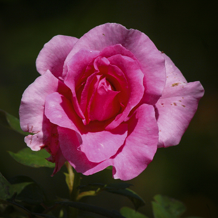
Hi Tom, very deep and rich Red color! I can almost smell its intoxicating scent!
Details are well preserved. Nice!
A possible presentation is to print ( or digitally merge) (4) images and present them together: The Four Roses.
Just a thought. |
Apr 5th |
| 24 |
Apr 23 |
Comment |
Gee! This is a very well composed image, Fred!
Again, I enjoy good details in many (not all) Flower compositions, and here it works well. It should be noted, the slightly out-of-focus pedals create Depth and I would not have been upset to see another, similar composition, with more Bokeh.
Well done! |
Apr 5th |
| 24 |
Apr 23 |
Comment |
Love it!!
The details in the water droplets are very cool! |
Apr 5th |
| 24 |
Apr 23 |
Comment |
A lovely Rose, indeed, Bev!
"Points to Ponder" ... regardless of how you treat the background, the Rose seems over-modulated, if I may: the term referencing sound emanating from a speaker, but here the Pink color seems to be doing the same: in this sense it is a bit harsh. I took the original image and edited the exposure some to get the pink "brightness" under control a bit more. (Now add this image to your background).
What do you think? |
Apr 5th |
 |
6 comments - 7 replies for Group 24
|
| 28 |
Apr 23 |
Reply |
My pleasure. |
Apr 3rd |
| 28 |
Apr 23 |
Reply |
Your creative sense is well documented here ... and I hope you continue to explore the vast array of possibilities within the photography art genre and its many sub-genres, (e.g. Composite Photography, Conceptual Photography, Hybrid Photography and even more engaging, though surely more arduous, Alternative Printing, to name a few). |
Apr 3rd |
| 28 |
Apr 23 |
Comment |
Good day, Deborah.
As I passed by, saw this engaging, quite dramatic Blizzard, but only to find out such conditions did not exist at the time of capture; as such, my "new appreciation" is a bit different than before knowing this.
To be clear, my appreciation is still a positive one, just different. In this case, I am amazed at your digital, post-production skills and artistic eye needed to create the featured image, as opposed to alternative means to approaching, setting up, composing, and finally registering the scene through the lens of your camera during an (actual) Blizzard or right after a heavy fallen snow presenting whiteout visualizations.
Regardless, the work is very striking, but must be appreciated within the context of how it was created. Context: proper categorization goes a long way in improving spectator appreciation for a particular work, indeed. It is most important because of photography's inherent epistemological value (or validity) compared to other art genres.
"Points to Ponder"
The difference between Ansel Adams manipulation of, for example, "The Tetons and the Snake River" (1942), and your featured composition is, Adams famous image is an "enhancement" while the featured "Homestead on a Snowy Day" is outside of the reality you were presented with at the time of capture: here, the blustery (and freshly fallen snow), "created" a Blizzard-like condition, that actually never existed (with the fury of its presentation) at the moment the shutter was released. So, the featured work is beyond just what some refer to as High Key and instead we have a Photographic Mixed Media or perhaps categorized within the subgenre of Conceptual Photography.
So, how will (or should) a printed image be categorized in a gallery or competition?
Illustrative Photography or Photography Hybrid or Conceptual Photography
"Homestead on a Snowy Day "
by Deborah M.
Lance A. Lewin
PSA B&W Photography Mentor
PSA South Atlantic Area Membership Director
lance.visualizingart@gmail.com
|
Apr 2nd |
1 comment - 2 replies for Group 28
|
| 62 |
Apr 23 |
Reply |
Gee, really appreciate your encouraging comments .... thank you, LuAnn.
Indeed, as you have described your personal preferences related to both visualization and the technical aspects of photography, the Velvet 56mm seems to be the right tool in the right hands: I do appreciate your use of this innovative lens compared to others (and including some Director of Photography on several mini-series and movies I have seen the past several years) which make the scene more dream-like or fantastical as apposed to what we expect in traditional Soft Focus and even Impressionistic visual aesthetics.
I have enjoyed this conversation!
|
Apr 8th |
| 62 |
Apr 23 |
Comment |
Yes, Sumiko, a fine stylus, indeed. I too, am an Audiophile and appreciate this image greatly. The finished presentation shows good balance in both its compositional structure and final illumination. (What soundtrack was spinning at the time of capture?)
"Points to Ponder":
Of course, I must also add this shot could have also been achieved with a good (traditional) fixed 50mm lens and wide apertures: in this sense, the crystal clear focus of the stylus is imperative while you Bracket 3 shots at different F/settings to review later in post production for the best Bokeh. Of course, on most film and some DSLR's the use of the (Dof) button would immediately show the degree of Bokeh as you set different apertures.
Lance A. Lewin
PSA B&W Photography Mentor
PSA South Atlantic Area Membership Director
lance.visualizingart@gmail.com |
Apr 3rd |
1 comment - 1 reply for Group 62
|
| 82 |
Apr 23 |
Reply |
Oh, indeed, a deeper narrative hides among the obvious minimalism you have presented us: one such contemplation brings light to the fact our Earth is so very small in a vast Cosmos, and our very existence is, too, similarly minuscule compared with the planet we live on, including the vastness and great power we sense when strolling Ocean shorelines.
(Perhaps a series of images where the narrative lingers between our "sense of place" and contemplation of existence). |
Apr 10th |
| 82 |
Apr 23 |
Comment |
Hello, Keith!
Yes, the "compositional structure" makes for a very engaging image: you have offset the tent from the larger and salient ocean and this is huge in helping to form narrative or at least, as you say ... 'startle the viewer' ... or we can say, make the viewer stay for a longer look and deeper contemplation.
You have taken an otherwise nice beach image and presented the viewer with something more. Well done!
(Please, read my article in the March issue of the PSA Journal, I talk a lot about this: the link is posted in the Bulletin Board).
Lance A. Lewin
PSA B&W Photography Mentor
PSA South Atlantic Area Membership Director
lance.visualizingart@gmail.com |
Apr 2nd |
1 comment - 1 reply for Group 82
|
| 83 |
Apr 23 |
Comment |
Good day, Mark.
So, I like the natural bokeh that blurs the background .... I like the background exposure, too .... I think the heavy contrast fits our subject ....though alternatively, more subtle tones could have worked also.
However, the Women in the background .... (and especially looking back toward the subjects direction) is interfering with the whole composition. I am not a fan of the darkening Debasish has offered us .... so where does that leave you?
Being more cognizant of your surroundings before pressing the shutter release button, is the proper answer, when deciding to register a portrait such as this ... at least most of the time. |
Apr 30th |
| 83 |
Apr 23 |
Reply |
Margaret, again, thank you for sharing the link: yes, these are lovely illustrations on the type of subject and interpretations we might see within Japanese aesthetics. But also remember, this is just one of several types of Style Motifs ...
Took a break from biking and went out for a hike to a lovely tropical section in Lithia, Florida ... where Anne and I found a most lovely collection of Cypress along a small river bed. I captured some images today and will share later today or Tuesday with the group. I have not tried getting back to where the featured image was composed, but will try later in the week. |
Apr 17th |
| 83 |
Apr 23 |
Reply |
Yes, Vignette was applied sparingly. |
Apr 17th |
| 83 |
Apr 23 |
Reply |
(See my response above) |
Apr 17th |
| 83 |
Apr 23 |
Reply |
Really appreciate the Link ... I will review after this post. : )
Yes, this image is too hard, and comesoff as too complex ... as the others have eluded to. I am back in Lithia, Florida and will try to get over to this beautiful space later in the week to re-shoot the subject/s.
Remember, when I (anyone) suggests following a particular aesthetic, it can vary widely.
Yes, the most common nature images (photographs, paintings and more common, drawings) of Japanese art, that follow in the path of "Mono No Aware" and "Wabi Sabi", for example, enjoy a lot of simplicity, as you mentioned, often with a solitary tree, for one example. Another example, outside of nature, is images of a group (or solitary) ceramic bowls, and those, mostly aged or have a distinct patina. There are so many more.
However, this is not set in stone, and does not "define" (all) the compositional structure concepts these particular Japanese aesthetics . I will review the link shortly.
|
Apr 17th |
| 83 |
Apr 23 |
Reply |
Hi Margaret ... a good question: simply, the "compositional structure" has too much "symmetry".
The bird is focusing attention to a "centered" design ... where we have the Lighthouse Centered, and then the Bird almost Centered as well. The Bird is too close to the main subjects position, as a consequence the bird should be offering "balance", but it does not.
Even though (without the bird) the compositional structure works, in virtue of the other elements that balance the lighthouse, the Bird is over-emphasizing center position of the subject, instead of offering balance. If there was more birds, in a flock, that also included (this bird), where the flock moved off to the far left, for example, this would offer Balance.
The Bird should have been, perhaps far left of right of the subject, and / or maybe closer (larger) in there frame. |
Apr 17th |
| 83 |
Apr 23 |
Reply |
Really appreciate your positive take on this composition ... it was hard to capture the experience, that is, the joy in loving nature through the lens ... leaving this week for Central Florida and will try to get back over to Alicia River to rework the area. |
Apr 15th |
| 83 |
Apr 23 |
Comment |
First, I will strongly state how much I love the deep rich Black and White, I suggest, bring focus and part of the interest in this composition.
Next, I will argue the image does not reflect the notion or practice of Drone Photography as much as it directly presents narratives related to how we visualize the quintessential urban/city design: here we are presented the ever-familiar "intersection" and its importance within urban landscapes. This particular manmade design (seen from above) is poetic!
(A possible photo-documentary may be a series of like photos that examine urban design plans for controlling traffic, while exposing the sometimes artistic visualizations they offer from a not so common perspective).
I love it!!! |
Apr 7th |
| 83 |
Apr 23 |
Reply |
Roger that! : ) |
Apr 6th |
| 83 |
Apr 23 |
Comment |
Hi Jon!
I like that you pointed out why these particular settings were used ... very helpful/educational information, indeed. The finished image looks very film like in virtue of the dark shadows while also maintaining adequate details. Nice!!
The overall compositional structure is fine, however, the bird bothers me. I think its position is too close to the lighthouse in the frame. |
Apr 5th |
| 83 |
Apr 23 |
Comment |
Adi, this is a very calming and well structured composition.
However, I find the fanning of striations in the sky odd: I have often registered Timed Exposures that include the sky/clouds, but never saw this effect; can you help me understand their formation? Thank you.
|
Apr 5th |
| 83 |
Apr 23 |
Comment |
Good day, Debasish.
Though I like the B&W treatment ... for me, the work is not striking in any particular way.
The entire balance, the "Compositional Structure" I often speak about, is not pleasing ... instead, the subjects need to be more directly involved within the frame: this is one instance where maintaining the surrounding space (at least in the way you composed it) to help define "place", does not work.
Now, can it be saved? Well, perhaps a custom narrow vertical crop (e.g. 16:9 ratio) will bring more interest. See my edit: what do you think? |
Apr 5th |
 |
| 83 |
Apr 23 |
Comment |
Hi Adi ... Yeah, I'm not sure what I like here either ... I was trying to register the scene as I enjoyed it ... lines, shapes in a Japanese aesthetic kind of way ...
I think what I should have done was register the scene with a wide angle lens (e.g., 24mm, 28mm) to involve more of the surrounding space, though if I did that the Japanese-like feel would likely be lost. With the 50mm frame a closer crop would dismantle the original vision/aesthetic I was trying to achieve.
Good news, I visit this area twice a year, so we will try again the future.
|
Apr 4th |
6 comments - 7 replies for Group 83
|
| 86 |
Apr 23 |
Comment |
Lovely scene, Steve! Now I wish I was back walking along the Alafia River Anne and me enjoyed two weeks ago!
Wonderful balance, Steve ... the dramatic morning sunrise with the otherwise calming affect of light and shadow upon nature is simply pleasing. The finished image is natural, authentic and real.
We may initially feel to bring out more from the shadows .. but I strongly suggest this would then deconstruct the present narrative, indeed. Take time to study and acclimate the eyes to the shadows in contrast to the rising sun and its glorious light ... I wish I was there sitting on the grass or strolling the shore. |
Apr 2nd |
1 comment - 0 replies for Group 86
|
| 87 |
Apr 23 |
Reply |
Hi Dale ... and thank you for posting these generous remarks.
It seems the more I think about ... "writing with shadows" .... the more easily it is to find art in this way. In both nature and city landscapes I continually are drawn to these special interactions induced within the natural world. |
Apr 10th |
| 87 |
Apr 23 |
Reply |
Good observation: Yes, I took out some, but my edited version still perpetuates a green hue or better known as color-cast. Indeed, the image would benefit from adjusting the White Balance (perhaps Hue) a bit more. |
Apr 8th |
| 87 |
Apr 23 |
Reply |
Indeed it would! |
Apr 7th |
| 87 |
Apr 23 |
Reply |
Thank you for the positive comments, Chan.
Indeed, this (single) photographic image represents a commentary of 'looking for art within shadows ...' and if I was going to exhibit such work it would be presented, as you suggest, as a series of like-images. |
Apr 6th |
| 87 |
Apr 23 |
Reply |
My pleasure! |
Apr 6th |
| 87 |
Apr 23 |
Reply |
It is evident, you had a very successful trip! Great job! |
Apr 6th |
| 87 |
Apr 23 |
Reply |
....that's an interesting point ... make the Camel the salient feature, instead of the bike. Of course, this changes the narrative drastically: in the featured composition the "new" technology offers faster and more reliant means of transportation, while the rider contemplates the slower (and older) use of Camels as something that is slowly vanishing from their landscape.
However, making the Camel larger and prominent now defines a different narrative, indeed. |
Apr 5th |
| 87 |
Apr 23 |
Reply |
Yes, this image allows more possibilities! (See my 16:9 ratio crop I just edited).
Also, Steve offers important advice; get outside and take the time to set up, be patient and in the end photo opportunities will be abound. |
Apr 5th |
 |
| 87 |
Apr 23 |
Reply |
Good morning, Steve.
Yes, it is a simple example of finding interesting shapes in places we normally do not take time to really enjoy ... or notice in the first place. This is why some have said I 'Write with Shadows, instead of light..' ... which is the title of the Lecture I am giving in South Carolina this October.
The shape is almost the same as the actual sculpture .. so, in fact, it is not exactly an abstract, but at the same time not exactly easily defined. |
Apr 5th |
| 87 |
Apr 23 |
Reply |
Steve, I will still have to disagree with you ... as you state about the Nest ...'I think it anchors the scene, without distracting ...' I reiterate from my above comment, 'the nest does not add to the image' ... and I will say here, it (does) detract from the subject.
Simply, the nest is out of place in the overall balance that would otherwise define an attractive (and functional) Compositional Structure. |
Apr 5th |
| 87 |
Apr 23 |
Comment |
A very well crafted Graphic Art presentation ... or perhaps more accurately, Conceptual Photography. The final product looks wonderful!
I must ask, who was the guy on the bike, and how lucky that he was (also) wearing purple, same as the man casually riding the Camel. Was the guy on the bike a model? |
Apr 4th |
| 87 |
Apr 23 |
Comment |
What a cute snapshot of this little rascal!
However, from the standpoint of being an acceptable image for presentation (outside of projected casual viewing) the work fails because of the branch that protrudes across the animal.
It is so important to look carefully on how to frame the subject. Like being careful to be sure trash cans are not lingering in the background, or a tree or stop-sign is not seemingly protruding through someones head ... these, some of the more common errors we have all encountered through the years.
In the case of the Squirrel, it takes a lot of patience to wait and for the perfect shot. |
Apr 4th |
| 87 |
Apr 23 |
Comment |
A very striking experiment indeed!
I particularly enjoy the slow progression of color (and exposure) from one side of the sky to the other. If I may, in my opinion, the boat seems out of place in this type of shot. Yes, the distorted cabin is, too, out of place or interfering with the calm and gentle transitions I speak about across the sky.
So, the technique seems at hand, now experiment and go out and try similar work with, perhaps a more suitable foreground. |
Apr 4th |
| 87 |
Apr 23 |
Comment |
A very sweet Spring image! Kudos for your attaining a sharp focus at 345mm ! The final image is well exposed and framed. Well done, Dale!
I love the beautiful green Bokeh that developed in the background ... a great illustration how to achieve creative backgrounds without the use of manufactured ones through digital software. (Part of the Art of Photography is for the user to understand seeing what is beyond the subject and then choose proper camera dynamics (and camera position) to best creation engaging image). |
Apr 4th |
| 87 |
Apr 23 |
Comment |
Got to love the speed of 21st century cameras ... nice job capturing this lovely bird in flight, and maintaining sharp focus ... as Cindy mentioned, the eye is crystal clear!
Great work, Steve!
Though the nest provides a backdrop (a a source of perspective) I will suggest the nest does not add to the image: in this case, I would instead present the work within a 16:9 (or more narrow) crop. In this sense, we are not worried about perspective, and instead treat the subject as a portrait of sorts.
Composite Photography:
Never replace the sky: I am adamant about this practice in photography unless you Tag the work as ... "Photography Composite". By all means be creative and go beyond classic tradition in photography, but proper categorization is vital in separating work between the two sub-genres of photography. The suggested 16:9 crop pays attention to the subject and here the clear blue sky feels more apt in a supportive role ... rather one that you suggest may seem not engaging.
|
Apr 4th |
| 87 |
Apr 23 |
Comment |
A very nice snap shot of local culture ... a familiar sight in central Florida, indeed.
The crop and B&W treatment is perfect! The strong White to Black contrast fits the scene nicely and produces an engaging image others may have just passed by.
Well done! |
Apr 4th |
| 87 |
Apr 23 |
Reply |
Cindy, what looks like a handle is actually part of the pedastal the Art sits on.
It is interesting how the shadows seem to overlap, but this in part was how the scene unfolded and of course a slight vignetting added some darkening around the border. |
Apr 4th |
6 comments - 11 replies for Group 87
|
| 99 |
Apr 23 |
Reply |
My pleasure, Linda! |
Apr 2nd |
| 99 |
Apr 23 |
Comment |
Gee, what a terrible event is was .... thank goodness your family is safe!
I saw this image on TV and was amazed to see such total destruction of such a mighty vehicle.... your presentation is well framed and the B&W rendering powerful. Beautiful work!
Points to Ponder: though the truck lays in a twisted (unnatural) position, upon initial review it may be hard to decipher the identity of the debris: we see how important (sometimes) the necessity to include text (like you have done here) to help direct the viewer towards a narrative. Another avenue for work like this would be within a collection of like-images captured "After the Storm" as a photo-essay as another means to help viewers towards the story the image/s are related to.
As such, this is a reminder to properly identify an image (or collection when viewed together in exhibition) through text in helping to perpetuate spectator "appreciation".
Lance A. Lewin
PSA B&W Photography Mentor
PSA South Atlantic Area Director
lance.visualizingart@gmail.com
|
Apr 2nd |
1 comment - 1 reply for Group 99
|
24 comments - 30 replies Total
|


