|
| Group |
Round |
C/R |
Comment |
Date |
Image |
| 2 |
Mar 23 |
Reply |
Happy I got Tom to help you rectify your login issues ... are you good now? |
Mar 20th |
| 2 |
Mar 23 |
Reply |
Jim, I will check out your CPU issues with someone, unless by now you have found a solution ... let me know. |
Mar 16th |
| 2 |
Mar 23 |
Reply |
Oh, nice! Even the bent stem looks more palpable in this B&W version.
And this brings up another point: by all means continue to experiment with intersecting lines and shapes: your featured work interjects a sudden and sharp contrasting shape (or line) to the otherwise "fanning" we are accustomed to seeing. In this way, you are creating Tension, and sometimes tension or drama, makes for engaging images.
If it did not work perfectly this time, does not mean you should not attempt future attempts in capturing this type of abstract design ... I think its fantastic! |
Mar 13th |
| 2 |
Mar 23 |
Reply |
You bring up an interesting point regarding the users (or artists) intentionality: you say, ...'I'm working towards intentionality with many of my images ...' Jim, all work should be intentional. However, many instances of creativity from behind the camera are often contributions of chance or accidents.
These instances are too, to be hailed as creative as do artist painters who throw down paint onto a canvas and understands a lot of what is achieved must be attributed to luck or chance - though it is often through a premeditated plan or design, nonetheless. Such is the work by Jackson Pollack, for one artist painter who relished this type of workflow, indeed. Take Ian Davenport's "drip paintings" for another.
The trained and skilled artist photographer has learned to "see" or "visualize" in a creative sense: in this sense, regardless if defining a clear "narrative" or "abstract" alternative, it is based on some level of intentionality.
You may also enjoy my article in the March issue of the PSA Journal which speaks a little about "visualization". Hope you enjoy.
Lance A. Lewin
PSA B&W Photography Mentor
PSA South Atlantic Area Membership Director |
Mar 7th |
| 2 |
Mar 23 |
Comment |
Happy Monday, Jim!
Good eye in seeing the play between light and shadow. Another area within the original frame is the area of criss-cross patterns: a very tight crop will indeed present a very abstract interpretation. B&W is always a consideration with these types of patterns of light and shadows. Overall, nice work, Jim.
Strangely enough, I also posted a similar composition; it was visualized in and around the Daytona area in January, in DD-24 Flowers/Plants. Hope you stop by and contemplate the work.
Lance A. Lewin
PSA B&W Photography Mentor
PSA South Atlantic Area Membership Director |
Mar 6th |
| 2 |
Mar 23 |
Reply |
Whoops! |
Mar 6th |
1 comment - 5 replies for Group 2
|
| 8 |
Mar 23 |
Comment |
Hello, Marcus! A lovely scene. However, maybe the white vignette is making the majority of the scene too dark in comparison?? Also, are those "spots" dirt or water spots on the lens? Try removing them before printing.
Lovely work! |
Mar 10th |
1 comment - 0 replies for Group 8
|
| 12 |
Mar 23 |
Reply |
My pleasure, ladies! |
Mar 27th |
| 12 |
Mar 23 |
Comment |
Lee Ann, very striking composition: I especially enjoy the sense that I can reach out and feel the texture; it is very 3D-like and adds greatly to viewers' experience. On another note, the detailed explanation helps greatly in defining "appreciation" for the work. Well done! |
Mar 11th |
1 comment - 1 reply for Group 12
|
| 14 |
Mar 23 |
Comment |
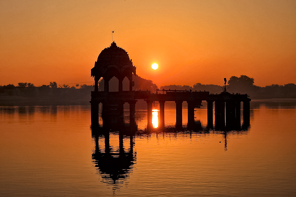
Good day, Syed. As I passed by, I saw this lovely image and decide to stay for a longer view.
A classic sunrise silhouette that is well balanced structurally.
One of dynamics I often see with hard-to-expose scenes like this is "Posturization": here, and a lot of times due to inaccurate post-production adjustments, a less than smooth transition from one color shade to the next is compromised.
A closer observation of the featured scene shows considerable Posturization throughout the sky, all emanating from the Sun.
One way to solve, or at least lesson this undesirable effect, is brightening the image through various means: the example I posted was altered in PSCC Camera RAW using various adjustment with color saturation and luminosity, and the Color Noise Reduction. However, proper exposure at the time the scene was registered through the lens is the best means of dealing with Posterization.
Download the two onto your desktop and view side-by-side to see the differences I refer to. Thank you, Syed.
Lance A. Lewin
PSA B&W Photography Mentor
PSA South Atlantic Area Membership director |
Mar 10th |
 |
| 14 |
Mar 23 |
Comment |
Hello, Ingrid!
Passing by saw this engaging B&W scene, but only to find out it is a composite. In other words, my initial "appreciation" was changed when I learned it is beyond "classic tradition".
However, so I am clear, my reaction to the work is still a positive one ... just that my "appreciation" is now shaped a bit differently.
In this sense, I now amazed at your post-production skills in "crafting" a Hybrid Photographic (or Photographic Composite) composition. Here, we marvel at the efforts to rearrange reality into something far more expressive in a visual sense.
A proper Categorization could be:
Photographic Composite
America @75mph Winter Series
by Ingrid Lockhart
Lance A. Lewin
PSA B&W Photography Mentor
PSA South Atlantic Area Membership Director
|
Mar 8th |
2 comments - 0 replies for Group 14
|
| 16 |
Mar 23 |
Comment |
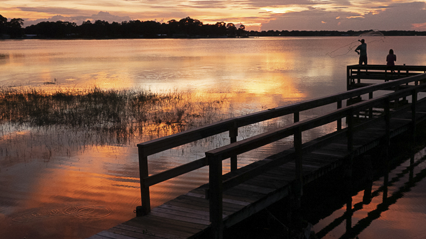
Hi Joan! Passing through the different DD-groups and stopped to take a longer view of this lovely scene!
Sometimes we need to re-crop in post-production to get the best from the registered scene, and it is not always an easy process. I posted another version I suggest helps to define a sense of "place" which is key for fully appreciating where these people are enjoying their evening, and hence, help develops a more sharper narrative.
The edit is a 16x9 ratio for your contemplation. (Alternatively, removing the hanging branch would enable the crop to add more of the sky).
You may also be interested in my article that speaks about defining a sense of "place" in this months PSA Journal.
Lance A. Lewin
PSA B&W Photography Mentor
PSA South Atlantic Area Membership director |
Mar 10th |
 |
1 comment - 0 replies for Group 16
|
| 17 |
Mar 23 |
Reply |
Hi Joe. See my response to your question on the Bulletin Board. Thank you. : ) |
Mar 31st |
| 17 |
Mar 23 |
Comment |
Stunning work!
Noting like getting out early to catch the worm, as it were. Your dedication paid off.
|
Mar 13th |
| 17 |
Mar 23 |
Comment |
A lovely image, Laura!
However, the visual criss-crossing of sun rays seems odd; is this a product of over "Dodging"? It is very common to see a "spray" of beams within a relatively wide (rotating) scope, but here, it looks like some Rays are intersecting which appear as the main sunlight spray which move from the left to right forming a check-a-board.
Interesting phenomenon regardless how it is being manifested.
Thank you Laura.
Lance A. Lewin
PSA B&W Photography Mentor
PSA South Atlantic Area Membership Director
|
Mar 8th |
2 comments - 1 reply for Group 17
|
| 23 |
Mar 23 |
Reply |
Sounds like a plan! |
Mar 24th |
| 23 |
Mar 23 |
Comment |
Hello Richard. Stopped by when I saw this lovely landscape.
The F/22 does wonders in bringing a little more to the creative-table, as it were. My wife loves using her wide angle lens and smaller apertures to create sunbursts.
The original sunset composition is well balanced and engaging, too.
As a result of the work done to "create" this scene, you should also be comfortable in categorizing the work appropriately, especially if being shown at a gallery or online exhibition:
Photographic Composite (or Composite Photography)
Sunrise on St Pete Tidal Pools
by Richard S.
A similar example/comments can be viewed with Will's image in DD-87.
Lance A. Lewin
PSA B&W Photography Mentor
PSA South Atlantic Area Membership Director |
Mar 7th |
1 comment - 1 reply for Group 23
|
| 24 |
Mar 23 |
Reply |
Welcome aboard, Yvonne!! First, really appreciate your kind words, and by all means get out there are capture art in nature: I look forward to seeing your images!
"Art is hidden in nature, and that he, who can tear her out of it, owns her" 16th century painter Albrecht Dürer (1471 - 1528).
(Hope you get to read my article in the PSA Journal March issue ... see link in the Bulletin Board on the top of the page). |
Mar 25th |
| 24 |
Mar 23 |
Reply |
Hi Fed! Appreciate your positive comments! I';m still deciding how to proceed with this image ... on metal ...yes, that would be a very viable option, indeed. |
Mar 25th |
| 24 |
Mar 23 |
Reply |
Hello, Ian ... and thank you for visiting our group ...
yes, I often spend a lot of time visualizing my immediate surroundings to find art hidden in nature, and in urban landscapes as well. However, in this case, the conversion to a blue monotone has transformed the subject into something less natural, as it were.
Really not sure I am falling in love with it ... as it is a bit too inanimate for me. I may go back to the original color exposure for print. |
Mar 20th |
| 24 |
Mar 23 |
Reply |
Thank you, Tom! |
Mar 19th |
| 24 |
Mar 23 |
Reply |
Hi Pinaki! Good question!
Indeed, a smaller aperture would be a better choice, but I was trying to maintain a fairly low ISO, and not having my Tripod ... F/7 maintained a reasonable shutter speed to eliminate any shaking/movement in myself and the plant respectively. It was a poor decision not to carry it on this particular tour. (In the future, perhaps later this year, I will be sure to have my Manfrotto with me). |
Mar 17th |
| 24 |
Mar 23 |
Reply |
Hope you continue to explore the amazing shapes, lines, light and shadow of your current work ... I think it's great! |
Mar 13th |
| 24 |
Mar 23 |
Comment |
Wow! Kudos, on your efforts to create this lovely image!
I love the depth, softness this composition offers ... I can stare at this for hours. Now you must print and frame it, or sell/donate to your favorite doctor's office!
I mean, it is really a very soothing image! |
Mar 10th |
| 24 |
Mar 23 |
Comment |
Holy Cow! It looks like I can reach out and grab a petal!
The textures, lighting making a very 3-D impression for me!
Love it! |
Mar 10th |
| 24 |
Mar 23 |
Comment |
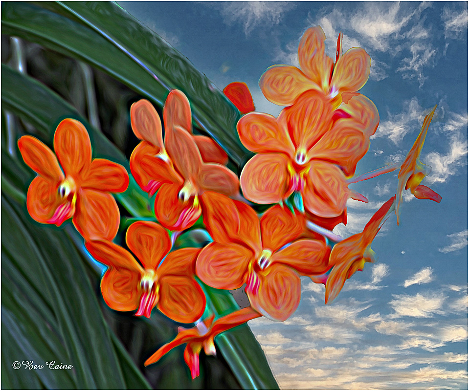
Bev, this is a really cool illustrative design!
I feel I am immersed into a land of fantasy!
However, I felt a bit more focus (or clarity) would benefit this Fantasy, so I altered the the focus/sharpness via NIK Sharpener Pro-3. (Copy and paste both onto your desktop for a truer comparison). Hope you like it ... then, time to make some Spring greeting cards with this image! |
Mar 10th |
 |
| 24 |
Mar 23 |
Reply |
Hey, Bev .... glad you like this one.
Good question: No, the metallic aesthetic is the effect of the blue monochrome treatment ... the color original does not offer this ... 'aluminum sculpture' .. as Tom suggested.
The blue toning was added via Silver Efex pro-3. Thank you, Bev! |
Mar 5th |
| 24 |
Mar 23 |
Reply |
Happy Sunday, Tom! Really appreciate the critique .... yes, did not think about the metallic aesthetic ... an interesting interpretation. Wonder how this image would look printed on metal .... Thank you, Tom. |
Mar 5th |
3 comments - 8 replies for Group 24
|
| 25 |
Mar 23 |
Reply |
Absolutely! |
Mar 24th |
| 25 |
Mar 23 |
Comment |
Bollin, this is a terrific scene! Kudos for maintaining a dark and silhouette like appearance ... the mood was well captured! (What time of the day was this?) |
Mar 13th |
| 25 |
Mar 23 |
Comment |
Hi Eric! In passing saw this interesting image. Quite a play between the abstract of the driftwood and the more stable horizontal lines of the beach and water.
Through the years I have enjoyed time on Longboat Key, Florida searching and registering similar images. At the moment I am putting together a photo essay on the continued erosion and lost beauty on Longboat key.
Please, stop by DD-83 to see my (really not preferred; the color version is better) B&W version of a similar image. I look forward to seeing more like this from you. |
Mar 13th |
2 comments - 1 reply for Group 25
|
| 28 |
Mar 23 |
Comment |
Great eye I seeing this! The play between lines is fabulous! (Have you tried a B&W version?) |
Mar 13th |
1 comment - 0 replies for Group 28
|
| 29 |
Mar 23 |
Comment |
Yes, I like this type of scene: here, a fine record of local vernacular. Perhaps more accurately, a reflection in the everyday, common and underrated.
To help perfect balance, or what we can say is the "Compositional Structure", I have made a very slight edit: the sample maintains the unique horizontal and vertical lines, along with our two subjects, while cropping out, I suggest, unnecessary distraction from the far right-side, that only interferes with spectator enjoyment and contemplation of the majority of the scene.
Hope you get to read my article in the March issue of the PSA Journal that references compositional structure. (Free online from the PSA website).
Well done, Tim!
Lance A. Lewin
PSA B&W Photography Mentor
PSA South Atlantic Area Membership Director |
Mar 13th |
 |
| 29 |
Mar 23 |
Comment |
Gee! I like this a lot! Great play between lines, shapes, light and shadows ... try "Dodging" the clouds just a bit to bring them a bit more attention: ever so slightly, however. Nice work!
Lance A. Lewin
PSA B&W Photography Mentor
PSA South Atlantic Area Membership Director |
Mar 13th |
2 comments - 0 replies for Group 29
|
| 32 |
Mar 23 |
Reply |
Indeed, "rules" often stymie the creative process as it relates to the traditional values (and dynamics) in photography.
Of course, not every image that ventures outside the so called Kodak instructions will fare well, but by all means, venture beyond these borders and explore what creative possibilities lay ahead. |
Mar 14th |
| 32 |
Mar 23 |
Comment |
Very nice composition, Tom.
Love moody landscapes in virtue of both man-made and natural atmospheric conditions, and when the user captures the scene correctly, while imbuing the authenticity within reality.
Fine re-crop and the B&W conversion is most definitely appropriate. |
Mar 7th |
| 32 |
Mar 23 |
Comment |
Hi Stephen!! A Man with Many Talents!
Quite impressive!! Now, register another image of this lovely creature, and be sure to include more of its front left limb.
The B&W treatment is absolutely perfect for the subject and lighting. Thank you for sharing with us this remarkable piece.
|
Mar 7th |
2 comments - 1 reply for Group 32
|
| 37 |
Mar 23 |
Reply |
Hi Lee Anne ... yes, I often try to use a critique as a "discussion Point": in this sense, I am fishing for answers and then can add additional information ....
....for instance, choosing to select (or pick) the Shutter Speed (for instances mainly to Stop or almost Stop Motion) can often prove vital in maintaining a sharp during windy conditions, or of course, stopping the motion of moving animals, for two common examples. Another reason to choose SP is when a tripod is not available at the time of a critical photo-shoot to, again, help alleviate shaking (motion) in instances when the camera is hand-held.
In summary, when I see odd or out of place use of camera dynamics (or their use for seemingly no apparent reason) I try to dig deeper to find an answer, and in most cases, it helps bring new ideas/concepts to readers.
(Also, you may be interested in reading my article in the March PSA Journal; available Free online of course. Look forward to your comments/questions). Thank you, Lee Ann. |
Mar 11th |
| 37 |
Mar 23 |
Comment |
Good day, Lee Ann!
First, the overall composition is very pretty and perhaps as Ricarda notes, a slightly tighter crop may help; but I have another item to discuss others may find interesting/helpful: why did you use Shutter Priority?
Lance A. Lewin
PSA B&W Photography Mentor
PSA South Atlantic Area Membership Director |
Mar 7th |
1 comment - 1 reply for Group 37
|
| 39 |
Mar 23 |
Reply |
Hi Fran ... I am aware you did not add snow: as you state in your description ...'to reflect the conditions I felt' ... In fact, the high-key filter added so much "white" and brightness, it appears as snow. In this sense, you created a scene that did not exist, which is clearly evident looking at the original. From a "creative" standpoint this is fine, but the Filter is in fact changing reality to a significant level, indeed. The scene is not enhanced, it has been visually reconstructed, even the footprints are gone to reflect virgin snow. (I believe this is clear in the Points to Ponder section).
As I already stated, this is far different from wading through the snow during or after a snow-blind condition. As such, my appreciation for the image changed (still in a positive way) but differently from other like images where the conditions were reflective of what was registered through the lens.
Again, beautiful work!
|
Mar 13th |
| 39 |
Mar 23 |
Comment |
Hi Fran!
As I passed by, saw this engaging, soft, and blustery-like image, but only to find out such conditions did not exist at the time of capture; as such, my new "appreciation" is a bit different than before knowing this.
To be clear, my appreciation is still a positive one, just different. In this case, I am amazed at your digital, post-production skills and artistic eye needed to create the featured image, as opposed to alternative means to approaching, setting up, composing, and finally registering the scene through the lens of your camera during a snow shower or right after a heavy fallen snow causing whiteout visual comparisons.
The work is very striking!!
"Points to Ponder"
The difference between Ansel Adams manipulation of, for example, The Tetons and the Snake River (1942), and your featured composition is, Adams famous image is an "enhancement" while the featured park scene "adds" the effects of blustery (or freshly fallen snow), thus, making a very "snowy" condition, where there was none.
Proper categorization goes a long way in improving spectator appreciation for a particular work, indeed. It is most important because of photography's inherent epistemological value (or validity) compared to other art genres.
So, how will (or should) a printed image be categorized in a gallery?
Illustrative Photography or Photography Hybrid
"Softly Fallen Snow"
by Fran Y.
Lance A. Lewin
PSA B&W Photography Mentor
PSA South Atlantic Area Membership Director
|
Mar 9th |
1 comment - 1 reply for Group 39
|
| 43 |
Mar 23 |
Comment |
Hi Andrew! A very creative composition!
Very film-like in its appearance, and for many viewing the work, for example in an exhibition, may think it is a film-based composition.
Your "creative" eye was keen to re-dress the scene this way.
Also, it may be very appropriate to categorize work as:
Digital Fine Art Photography
Sepia Mission
by Andrew L. |
Mar 8th |
1 comment - 0 replies for Group 43
|
| 50 |
Mar 23 |
Comment |
Yes, indeed, the Light and Shadows are the star attraction, or we can say are key creative features in the composition.
Beautiful work! |
Mar 8th |
1 comment - 0 replies for Group 50
|
| 62 |
Mar 23 |
Comment |
Good day, Israel!
Love the color version! Yup, the B&W guy sees more in the color version, though the darker interpretation of bunny's is also interesting.
Well done getting out there to visualize and find beauty in nature. I am not surprised with your results! |
Mar 13th |
1 comment - 0 replies for Group 62
|
| 83 |
Mar 23 |
Reply |
Go back and follow my recipe and I think you will see the benefits. It is important not to over do the process I speak of, so not to disrupt the scene you have posted for us, but the edit will bring out cloud details in a subtle way. Let us know what you achieve. |
Mar 28th |
| 83 |
Mar 23 |
Reply |
Hi Chuck!! So glad you stopped by....yes, I totally agree with your assessment.
For exhibition and/or publication, the original color versions will be used.
|
Mar 21st |
| 83 |
Mar 23 |
Reply |
Margaret, there are so many variables to think about, ideas connected to the dynamics within the art of photography ... the artist-photographer is always in learning mode, and I often rethink and recalculate techniques and concepts in how to portray a subject in a certain manner for spectator appreciation. I would suggest the artist-painter goes through a similar process when in plein air, indeed.
|
Mar 17th |
| 83 |
Mar 23 |
Comment |
Hello, Margaret!
Well, to be honest, the scene does not grab me ... why?
For me, I suggest, the compositional structure does not represent anything that imbues the impact caused by the pandemic. I do not sense the narrative you are trying to present us, and especially when I take your Title into account ... it does not fit, in my opinion.
One of the reasons that "detracts" from the narrative you are trying to capture is the reactions or temperament/posture of both men; in this sense, they do not seem to be "detached" from society or introspective, instead, their demeanor is active, vibrant and thus gives no hint of an ominous alternative to the reality they stand in. |
Mar 16th |
| 83 |
Mar 23 |
Comment |
Hi Jon!
A well documented scene representing a known piece in rural Alabama. Nicely balanced, well composed!
I think the sky portion is OK, but perhaps processed a bit better to bring out the cloud formation, which I think lurks somewhere: in fact, take the original and cut back on Global Highlights for (1) process, then go back and selectively "Dodge" areas you want remaining brighter, or more pronounced. (This is one, of a couple of ways of achieving this, but I suggest, might be the fastest/best).
The result will bring a lot more detail to the sky, and thus the sky's, current, slightly bright aspects, will be eliminated. (I hope Adi agrees with this recipe for improvement). |
Mar 16th |
| 83 |
Mar 23 |
Comment |
Good morning, Adi.
Yes, a scene we do not often enjoy in both reality, or within the frames of an image.
Your creative wisdom, patience and skill catches this touching moment for all to enjoy. Well done! |
Mar 16th |
| 83 |
Mar 23 |
Comment |
Hi Mike, this is a nicely accomplished, studio inspired portrait. Well Done.
Reminds a little of 19th century portrait specialist, Julia Margaret Cameron ... she has few similar illuminated portraits, though most are rendered in a softer aesthetic.
|
Mar 16th |
| 83 |
Mar 23 |
Comment |
Good morning, Debasish.
The resulting image is very cool, indeed. I also hope you go back to rework the subject in all different lighting conditions ... the subject has a lot of potential for further gains.
The only factor that spoils the overall illusion is the fact you are not "centered": this is one of those compositions that needs to be "centered" or symmetrically perfect, and it is not, due to you rushing to take the image with the person (ironically), centered.
In this sense, I hope you have another image of this subject, that is centered, and if not, go back and re-work the subject. |
Mar 16th |
| 83 |
Mar 23 |
Reply |
Lee Anne ... I will likely use all the original color images registered the past few decades for the actual publication of the essay... it would seem more appropriate.
Yes, I will share the final work in the near future.
Also, you may be interested in reading my article in the March PSA Journal; available Free online of course. Look forward to your comments/questions. Thank you, Lee Ann. |
Mar 11th |
| 83 |
Mar 23 |
Reply |
Indeed, there was never any question the originals are far more expressive ... and will be used in the essay.
"Points to Ponder" .. hope the following addresses your inquisition ...
Visual Expression Variables: 1. in a critique room setting it is vital and (expected) for participants to share the entire structure of how they came to a final piece. 2. Within an exhibition setting many (not all) artists include a very shallow description beyond a title/category and signature, and 3. alternatively, other artists (or by choice of the gallery or museum curator) add detailed information about the artist and the project before patrons view the work.
For many patrons of the arts, and artists, articulating the background on how/why an image was designed and presented can only improve the over all "appreciation" of the work. Within the context of 21st century photography compared/viewed against the backdrop of "classic tradition" based photography, makes such background information even more relevant for the modern spectator. |
Mar 6th |
| 83 |
Mar 23 |
Reply |
|
Mar 6th |
 |
| 83 |
Mar 23 |
Reply |
Just as the Sun went below the horizon. (Could not find the original frame ... there is so many, but you get the idea). |
Mar 6th |
 |
| 83 |
Mar 23 |
Reply |
Good day! So, the color is actually a custom Silver-Copper tone that emulates the very unusual sunset via heavy fog on this particular evening in 2013.
However, this particular image was exposed while the fog was shifting: I needed a Monochrome for this DD group, and currently working on a photo essay with this series of images decided to alter this (2013) image that otherwise did not imbue the same Fog embraced aesthetic as the others.
See the original color version (featured work) as the Fog was lifting. Also, see one other original color frames that captures the actual event on this amazing evening.
Thank you for your positive critique!
|
Mar 6th |
| 83 |
Mar 23 |
Comment |
Love it!! The overall compositional structure is balanced and natural, or not staged. It goes a long way in defining the local vernacular in Cork.
This image is a fine example of how we can use High ISO, not just to register an image in very low light, but also, adding Digital Noise to introduce Film Grain aesthetic.
"Points to Ponder":
I also shoot with a 5D Mark II and III, and the III induces much less noise, and thus my choice for many very dark or low-light compositions: however, 12,800 is very high and on my large monitor the Noise-Grain is a bit "untamed". So, I suggest a slight de-noise via Camera RAW Noise Reduction: I tried setting the slider on 12, leaving the others' as is and like it much better.
Alternatively, a small 4x6, 5x7 or maybe 8x10 would show quite nicely on the right paper, and likely without any noise reduction. Experiment and check it out.
|
Mar 4th |
| 83 |
Mar 23 |
Reply |
Appreciate your encouraging critique. Thank you, Mark! |
Mar 2nd |
6 comments - 9 replies for Group 83
|
| 86 |
Mar 23 |
Comment |
Hi Steve! Yes, this is nice! Very engaging piece I keep wanting to look at .... will do well as a large print under a powerful spotlight, indeed. Can't imagine a 35mm camera doing any better ... imagine that! |
Mar 10th |
1 comment - 0 replies for Group 86
|
| 87 |
Mar 23 |
Reply |
Sweet! Appreciate your positive critique, Chuck! |
Mar 21st |
| 87 |
Mar 23 |
Reply |
Lee Ann, first, thank you for visiting the groups I associate with. I really do appreciate your encouraging comments on all my work. : )
Actually, if you flip this (your edit) I think we have our next Sea Creature in an upcoming Sci-Fi Thriller!! |
Mar 11th |
| 87 |
Mar 23 |
Reply |
Hi Bev ... appreciate the positive comments and thanks for stopping bye. : ) |
Mar 6th |
| 87 |
Mar 23 |
Reply |
Alternatively, use can the Dodge Tool in Photoshop for this particular edit. Its the first editing tool I teach in my Workshops. |
Mar 5th |
| 87 |
Mar 23 |
Reply |
Of course, trying (learning) new skills/techniques are part of the fun, and your recent work shows your explorations in this manner is a positive one. We can talk about tweaks for this type of visual aesthetic later. |
Mar 3rd |
| 87 |
Mar 23 |
Reply |
No. : ) |
Mar 2nd |
| 87 |
Mar 23 |
Comment |
Ah, No, No, the Sun is suppose to be an integral part of the overall compositional design: now I need to rethink the images overall design. : ) |
Mar 2nd |
| 87 |
Mar 23 |
Reply |
...and yes, that is a good point ... how HDR can be overused revealing an image that is anything but a reflection of reality. Unless of course the artist directs the viewer to a specific avant-garde series of work, for one example. |
Mar 2nd |
| 87 |
Mar 23 |
Comment |
Well planned and executed shot, Jennifer! Beautiful work!
The higher ISO helped keep the shutter speed high enough to stop motion and the final post-production maintaining dramatic light, and illustrating a Silhouette is creative and fits the subject quite well. |
Mar 2nd |
| 87 |
Mar 23 |
Comment |
Amazing portrait ... actually a facial expression I have not seen from a humming Bird. Quite lovely!
You can also apply a bit more Dodging to just the bird to bring her out some more. |
Mar 2nd |
| 87 |
Mar 23 |
Comment |
Gee!! You are really getting good at this ... these makeshift in-home studio platforms. I really like the overall white-glow and the softness of the final image.
I would look into making a few Holiday Cards using this beautiful image!! |
Mar 2nd |
| 87 |
Mar 23 |
Comment |
A very pretty scene / composition, indeed. It is truly, beautiful work!
A fine example where the 21st century innovations (help) bring out the best in a photographic image.
Can we then categorize the image as:
HDR Photography
"Hemlock Gorge" by Will K.
I argue, these types of (more) specialized categorizations (or photography tagging) can bring a more accurate and fulfilling appreciation for spectators. The idea is at the core of my (in process) essay. |
Mar 2nd |
| 87 |
Mar 23 |
Comment |
Well, this is quite the puzzle, or perhaps, referring back how Will defined his feelings last month ... 'a Rorschach interpretation ' ... may best match the visual display before us.
I love it!! Great imagination! |
Mar 2nd |
| 87 |
Mar 23 |
Reply |
Hi Cindy, and thank you for your encouraging remarks.
I'm not sure about the blue monochrome finish either ... something I need to think about a bit more. |
Mar 2nd |
6 comments - 8 replies for Group 87
|
37 comments - 37 replies Total
|


