|
| Group |
Round |
C/R |
Comment |
Date |
Image |
| 3 |
Feb 23 |
Comment |
Hello, Michael!
Indeed, good eye to frame and capture this little treasure within an urban landscape.
The works key feature is ... its Gestalt factor: here, we take in the whole and immediately begin to form narratives; likely a different narrative for as many who will view it, nonetheless, what I refer to as an images "contemplative structure" is well defined.
It is also important, at least for some images (or a series) for the artist to add a title or better, a short commentary to help lead the viewer to a narrative: I argue, it is often necessary and appropriate to intentionally offer a story line or at least, the ingredients to form one, for viewers. Well done! |
Feb 22nd |
1 comment - 0 replies for Group 3
|
| 24 |
Feb 23 |
Reply |
LOL!!! Thank you, Fred!! |
Feb 25th |
| 24 |
Feb 23 |
Reply |
Bev, I misunderstood your question, as I thought you were referring to the main subject matter in the discussion: that is, natural background bokeh vs. AI based manipulations.
My thoughts on B&W are just a general idea that may or may not work. Thank you. |
Feb 21st |
| 24 |
Feb 23 |
Reply |
Yes, all my comments and teachings are based on film and / or full-frame ratios, and of course adjustments must be made to smaller sized digital sensors, for example.
Regardless, the above compositional notes can be appropriated by various cameras; the ideas are not always camera-specific (or even subject specific), but instead, are key concepts and techniques within the realm of photography: each of us must make adjustments as it relates to our equipment and lifestyle.
|
Feb 21st |
| 24 |
Feb 23 |
Reply |
Absolutely. |
Feb 21st |
| 24 |
Feb 23 |
Reply |
Bokeh-3 |
Feb 21st |
 |
| 24 |
Feb 23 |
Reply |
Bokeh-2 |
Feb 21st |
 |
| 24 |
Feb 23 |
Reply |
Bokeh-1 |
Feb 21st |
 |
| 24 |
Feb 23 |
Reply |
Bokeh-3 |
Feb 21st |
 |
| 24 |
Feb 23 |
Reply |
Bokeh-2 |
Feb 21st |
| 24 |
Feb 23 |
Reply |
|
Feb 21st |
 |
| 24 |
Feb 23 |
Reply |
|
Feb 21st |
 |
| 24 |
Feb 23 |
Reply |
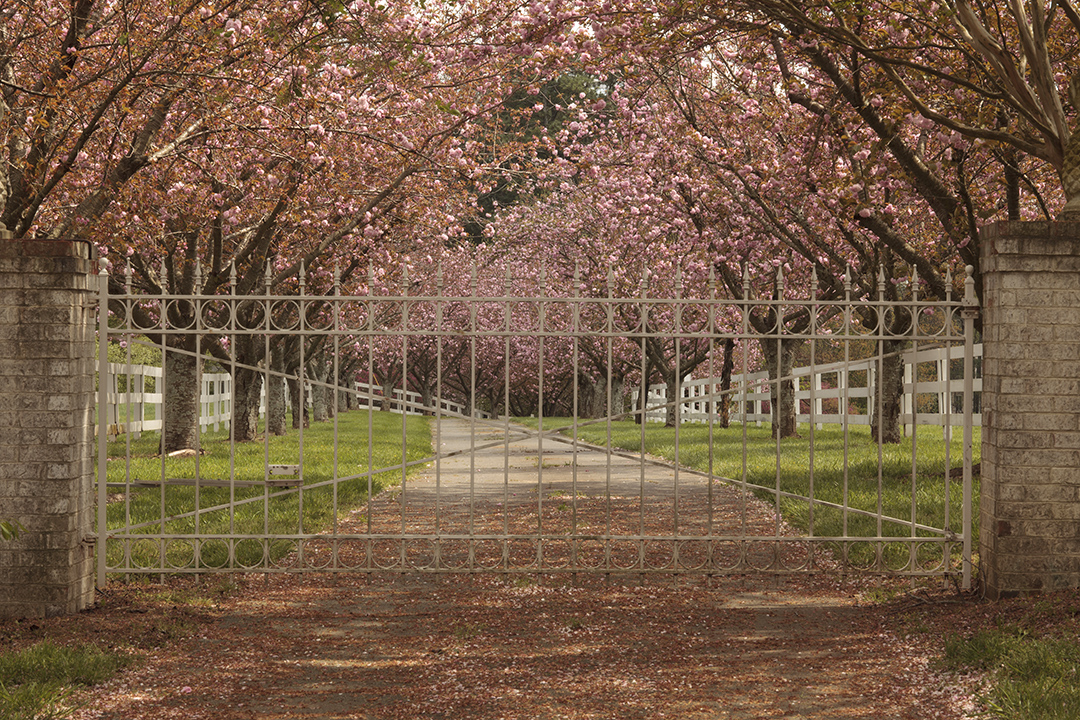
Great question, Bev!
Yes, it is hard to give a very explicit example here, but in my Intermediate Workshops the exercise goes a long way in helping photographers create more effectively from behind the viewfinder. In any case I have provided some examples for this visual exercise:
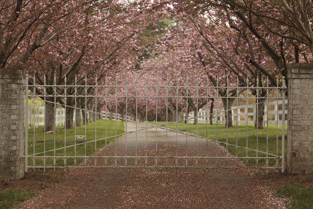
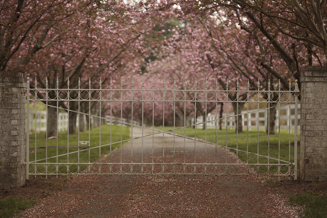
A. The three Gate/Dogwood images are "bracketed" at F/3.5, F/7.1 and F/22:(Tripod was used) At the time of each exposure I looked at a preview (through the viewfinder) of each Aperture Setting using the Dof button on my 5D Mark II.
B. Bokeh-1 is just an example of how I moved and found the right perspective (and F/setting) to create a mostly non-intrusive background.
C. Bokeh-2 is still another example of doing the same (note this image was never used) and other images like it did not make the cut.
D. Bokeh-3 still another example of finding perspective (the best position) and Aperture for the most creative composition as seen through the viewfinder.
Note, the Gate/Dogwood example shows the differences very clearly while the other examples do not show alternates as (I did not press the shutter) while changing F/stop settings and previewing via Dof button/viewfinder.
Hope this helps! |
Feb 21st |
 |
| 24 |
Feb 23 |
Comment |
Love the back-lighting, Pinaki!!
I agree, for this design / subject to work at its best, we need a closer crop: as such, both Bev's and Toms' version help showcase the work, though I do enjoy Tom's maintaining the green background which very much complements the subject.
This is a case where moving the subject to a more suitable position will help create more balance between subject and its background. |
Feb 21st |
| 24 |
Feb 23 |
Comment |
Your talent to mix both graphic arts and photography is Amazing! Beautiful work, Fred! |
Feb 21st |
| 24 |
Feb 23 |
Comment |
Carrol, of course I like the (idea) of the original background, though I will state, in the original frame it is a bit distracting. Alternatively, the Featured work is fine, but for me, the resulting design (may) be better interpreted in B&W. Maybe not.
"Points to Ponder"
The background distraction (in the original) can be rectified before pressing the shutter release button if you have a (Dof) button on your camera, and why that button is so powerful and a key feature on professional DLSR's and all film cameras. If not, then a more careful observation of what is and not behind your subject goes a long way in securing a favorable background for such work that will render it blurred or within the range of lens Bokeh.
This is where patience is very much a virtue for successful images. Indeed.
|
Feb 21st |
| 24 |
Feb 23 |
Comment |
Oh, gee ... I like this design, Bev!
And I think, after the clean up of the small bits of flower and stem here and there, the original design with the, seemingly, three stem-tethers going off on the right is really cool! That said, Tom's version, too, is outstanding! |
Feb 21st |
| 24 |
Feb 23 |
Comment |
Tom, I love the play of lines and shapes in an abstract way .. in this sense, and like other images I have seen from you, you have a good sense of design and compositional structure.
However, the featured work is out of focus, and no amount of sharpening will fix it.
|
Feb 21st |
| 24 |
Feb 23 |
Reply |
Thank you for your positive comments.
What you see as too much highlight, is actually perfect in Print; perhaps I was lucky! |
Feb 21st |
| 24 |
Feb 23 |
Reply |
Hi Tom. LOL!! yes I actually have a few color images, but not many. Bev was pleased to see this, too.
Thank you for your thought-provoking comments:
No. We should interpret this image, or perhaps, ingest this scene as a whole, and not try to narrow our attention just on the focused parts: too much blurring of the subjects sibling would render (it) as just a color blob, and not the subjects sibling.
In this way the viewer slowly migrates their view to the back and then again, back to the main flower portrait. This same "compositional structure" is often scene in movies and TV between both short and long scenes of a conversation between two people, when the Director of Photography decides to keep both in the same shot: if the background becomes too blurry we slide into an abstract narrative and for both my featured work and the example of filming a one-shot conversation, abstract will not work.
The work is stunning under spotlights and adorned my office wall for many years.
|
Feb 21st |
| 24 |
Feb 23 |
Reply |
You are too kind, Bev!! Thank you!!
The K64 slide film always emphasized "reds" and here I was fortunate to come upon this lovely subject and explore this films attributes. |
Feb 17th |
5 comments - 15 replies for Group 24
|
| 83 |
Feb 23 |
Reply |
Nope. B&W is the clear winner! : ) |
Feb 21st |
| 83 |
Feb 23 |
Reply |
Good day, Margaret, everyone!
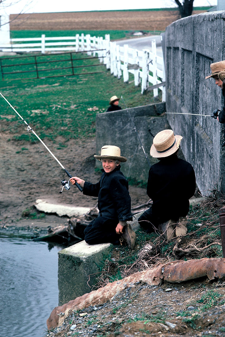
Attached, see the frame a few moments, either before or after, the Featured image was captured: each boy had their own rod.
Not so sure the B&W rendering helped in illuminating more detail or quality ... but nonetheless, as we often enjoy in a B&W image, it sometimes makes for a more powerful statement.
_____________________________________________
Bulletin Board:
For an alternative narrative, see the short piece and image captured during this particular few moments with the boys.
I look forward to your feedback. Thank you. |
Feb 20th |
 |
| 83 |
Feb 23 |
Comment |
A very obedient chap you have there .... the overall high-key interpretation is striking ... I like when these high-lite images tend to blend at certain areas ... well done. |
Feb 17th |
| 83 |
Feb 23 |
Comment |
I especially enjoy the glow around some of the lights ... and yes, would agree another example where B&W brings out a certain aesthetic value.
Also, must note, amazing there is no blur being a hand held shot at 1/13sec, unless any attempt to enlarge this scene proves to be an issue. |
Feb 17th |
| 83 |
Feb 23 |
Comment |
The final image is well composed and exposed ... would be a wonderful addition among others like it ... within a series, as part of a photo-documentary on the subject you speak about. |
Feb 17th |
| 83 |
Feb 23 |
Comment |
A fine example where a B&W rending of a scene truly brings out its hidden beauty! |
Feb 17th |
| 83 |
Feb 23 |
Comment |
Beautifully illuminated and composed image! |
Feb 17th |
| 83 |
Feb 23 |
Comment |
Beauty within elements of Simplicity .... testament we can find interesting forms almost everywhere we look. |
Feb 17th |
| 83 |
Feb 23 |
Reply |
Very good observation, and likely why the image was never used.
|
Feb 6th |
6 comments - 3 replies for Group 83
|
| 87 |
Feb 23 |
Reply |
I like that ... 'miniature geology lesson' .... indeed. Yes, a lot of detail in the rock, and I am even considering printing in the original color to help present the stone's details ... we will see. Glad you like it.
|
Feb 22nd |
| 87 |
Feb 23 |
Reply |
Yes, Art is really hidden in nature and even in large and small scale urban landscapes .. it is fun, but often an arduous task to find her. Thank you for your positive take on the image. |
Feb 22nd |
| 87 |
Feb 23 |
Comment |
Lovely image, Jennifer!
Here we must be careful not to crop too much. Why?
Because we may lose a sense of "place" by taking too much detail out of the scene. The main subject ... the playful-struggle of the two climbers ... would seem empty or too plain without a good serving of the beautiful landscape to frame the arduous efforts of the people trying to conquer the large stone.
In this sense, the featured composition is engaging in virtue of its contrasts in narrative: the beautiful and dynamic landscape for one, against the narrative we try to imagine viewing and contemplating the climbers.
In my opinion, the lack of danger the two people seem to be in, adds to the "playful" narrative I mentioned above. In this case, I feel the featured scene (and the other two crops) maintain this light and cheerful narrative: yes, a most cheerful and light hearted (subjective) interpretation. Indeed. |
Feb 13th |
| 87 |
Feb 23 |
Comment |
This is a case where we have an interesting subject, but is lost in the way it was registered through the lens of the camera.
Will's tighter crop is good start for improvement. Here, another example, (like Chan's featured work) where the optimum compositional structure is "seen" and presented later in post-production. |
Feb 13th |
| 87 |
Feb 23 |
Comment |
The entire scene is beautiful in virtue of most of the items detailed by Chan.
This is a case where people may call this a "Travel Photo" as it is revealing more of the surrounding space that frames the main subject. This is different than the artist photographer cropping more, and focusing our attention on just the falls, its spray and other attributes that make it interesting.
Overall, I think this is a lovely image as presented and would be enhanced greatly as a B&W rendering, in my opinion. Alternatively, if the image file has good resolution, make another image by cropping to focus our attention on just the falls. |
Feb 13th |
| 87 |
Feb 23 |
Comment |
Back to Wills question ... The Snap Shot vs. a Purposeful Artistic Rendering:
Clearly, a well composed"final" from the original registered event (snap shot) that imbues a heavy documentary sense than one of artistic intent.
Another reason to sometimes "take the shot" and in post-production make final adjustments including cropping for perfection.
|
Feb 13th |
| 87 |
Feb 23 |
Comment |
Good question: I have never used the term Travel Images ... and my reference to snap shots is universal no matter the subject, and how (the snap shot) is perceived is clearly objective from one spectator to the next. A lot of photographers tag their ill-captured images as .. 'oh, I was only taking a snap shot' ... which can make many of Garry Winogrand's images seem like snap shots, as do many other "street photography" images, indeed.
The featured work is clearly a well composed (and processed) B&W image of a famous destination and subject. This is very clear in light of the B&W presentation, regardless if digitally converted from color or via B&W film. As such, to tag the featured work as a "snap shot" (under any circumstances on how it was achieved) would seem unpretentious by the user and / or spectator, in my opinion.
Beautiful work, Will.
|
Feb 13th |
| 87 |
Feb 23 |
Reply |
Hi Stephen, hope you are well.
This particular orientation seemed more indicative to engaging the imagination, in my opinion: here, like Will's comments above, I see something "growing out" or even, as I originally imagined it, tree-like in design. At 180 degrees, the visual effect disturbs what we know about certain shapes and patterns, again, in my opinion. I am sure this phenomena in how we perceive objects, shapes and lines has been studied. |
Feb 13th |
| 87 |
Feb 23 |
Reply |
Yes, I will agree ... a tug of war between what actually engages viewer interest in this piece ... it is a legitimate place to be.
There is a lot of detail in the beach-stone and I was considering the only way to really present this composition would be a very large 40"x 40" print, for example, which would pull the beach-stone into the composition more completely. |
Feb 13th |
| 87 |
Feb 23 |
Reply |
It was a n interesting display of these types of artifacts (or seashore arrangements) along this stretch of beach ... I enjoyed a colossal amount of time composing. |
Feb 13th |
| 87 |
Feb 23 |
Reply |
Hi Will ... clever!
Actually, the monotone is a custom Silver-Copper tone I thought emulated the beach that afternoon. |
Feb 13th |
5 comments - 6 replies for Group 87
|
| 99 |
Feb 23 |
Reply |
...well, not "apprehension" in virtue of asking ... 'how an image was created ...', but perhaps creating "apprehension" in virtue of how a subject is presented, such as anxiety, tension, and uneasiness ... as we may feel looking at the work of both Sally Mann (b.1951) and Wynn Bullock (1902 - 1975), for two examples. |
Feb 22nd |
| 99 |
Feb 23 |
Comment |
Hello Peter, yes a very well "sculptured" scene, indeed.
Along with a title the work should be identified as a "Photographic Composite" or "Photographic Hybrid" to alert the viewer the possible inclusion of techniques outside the realm of "classic tradition" photography, or work defined within 19th and 20th century photography, as described by philosopher Barbara Savedoff in her 2000 essay.
The inclusion of a subgenera category will help the viewer "appreciate" the work, and I argue, will help relieve the skepticism, or what I term, "viewer apprehension" when looking at photography in the 21st century.
Thank you for sharing the technique with us, and in this sense I have a special appreciation on how this Portrait was visualized and finished. Beautiful and skillful work, indeed.
|
Feb 22nd |
| 99 |
Feb 23 |
Comment |
Hi Kathleen! Hope you are well!
Love this!! A wonderful framed / composed street scene: I especially like (all) the incidental artifacts that support, and form the images Gestalt. Many see these items as distractions, but are actually the extra spice (ingredients) needed for a perfect recipe. The B&W rendering is gorgeous! Don't change a thing! Well done!
I must comment, if you are using a small point and shoot type of camera I can see why you obtained a very deep and wide Dof ... if registered with a DSLR, I am puzzled with how this was possible with F/4.0. |
Feb 22nd |
2 comments - 1 reply for Group 99
|
19 comments - 25 replies Total
|


