|
| Group |
Round |
C/R |
Comment |
Date |
Image |
| 3 |
Jan 23 |
Comment |
Great visualization, Joan!
A good example of thinking outside the box for a source of creativity.
The play between the geometric shapes is very engaging.
Love it!
Lance A. Lewin
PSA B&W Photography Mentor
PSA South Atlantic Area Director
visualizingart.com
|
Jan 19th |
1 comment - 0 replies for Group 3
|
| 5 |
Jan 23 |
Comment |
Hi Barbara!
I was initially drawn to this very engaging image, one would think was captured through panning, though you did not elaborate on your process, I still would like to know how far you were from the subject and what lens was used, and how the image was focused.
"Points to Ponder"
On further viewing I felt something is off; so, I must ask ... did you "replace" the sky or use some other manipulative process for final piece we see here? Thank you, Barbara.
|
Jan 27th |
1 comment - 0 replies for Group 5
|
| 6 |
Jan 23 |
Comment |
Hi Jim!
Lovely work, Evelyn creates!
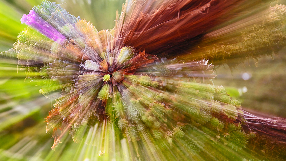
There entire idea (visualization) and "compositional balance" is commendable, but unfortunately my extended comments echo Dick's. The point-of-focus has not been achieved and thus distracts from the images full appreciation.
Manual vs Auto Focus:
Manual Focus should be the choice for (all) Macro or other close up work (and especially when photographing Flora) and may have been the issue here, indeed. (In fact this was an extended subject in the Workshop I conducted on Monday in North George).
I would love to see another image created like this one as a, re-work, as it were, and then posted here this or next month for review, since these types of closed-up imagery I suggest always bring engagement for viewers. Thank you, Jim.
(Jim, everyone, see my short article on this subject on the Bulletin Board in DD-24).
|
Jan 19th |
1 comment - 0 replies for Group 6
|
| 24 |
Jan 23 |
Reply |
Hi Pinaki! Thank you!! |
Jan 27th |
| 24 |
Jan 23 |
Reply |
FYI: See Michael H. in Group 99 where a similar issues has offended his featured image. Read his final thoughts at the bottom of DD-99, which summaries this often overlooked component when viewing our own, and others' photography.
Thank you. |
Jan 19th |
| 24 |
Jan 23 |
Reply |
Hi Carol! Yes, a very viable option ... this looks swell, and your careful application of color filters to make this edit is outstanding.
However, a lot of my creative intentions are to separate my work from others who follow "similar" aesthetics: in this case, my featured work is softer, lighter, fluffy and imbues a sense of calmness. (I often capture and finish portrait work in a similar fashion when photographing the right subject). Nonetheless, the two options offer two exacting finishes, as it were.
"Points to Ponder"
Though your version is pretty, it changes the narrative drastically by offering the flower as the salient object, as opposed to my featured work, which offers the entire scene ... as a whole ... as the subject of focus.
Bob Kolbrener (20th century Landscape Photographer) moves in this direction as well ... that is, less dramatic or instead often offers viewers unedited images from his large format camera.
I always enjoy reading your comments and suggestions, Thank you, Carol.
|
Jan 18th |
| 24 |
Jan 23 |
Comment |
Love your experimental work, Pinaki !!
However, I feel more prominence can be enjoyed with a tighter crop: The bright sky needs to be eliminated to help draw attention to the core visual effects you have created.
See my example of a 9x16 crop and biased to the right-side of the image. In Camera RAW and PSCC I enhanced the already 3D effect. This was mostly done using the "Midtone" adjust very carefully. (Best Viewed on Larger Monitors) |
Jan 17th |
 |
| 24 |
Jan 23 |
Comment |
Stunning! The lighting is marvelous!! |
Jan 17th |
| 24 |
Jan 23 |
Comment |
Well Both Fred and Bev take an otherwise snap-shot image and present it most artistically. Well done!
However, something we discussed before, Tom, the original image is not focused correctly. In this sense, the work is not acceptable. Perhaps some careful Sharpening can save it ... or, since this is a local destination, go back to the store and try again. It would be be great to see a second attempt at this plant or some other. |
Jan 17th |
| 24 |
Jan 23 |
Comment |
Love this, Fred!! |
Jan 17th |
| 24 |
Jan 23 |
Comment |
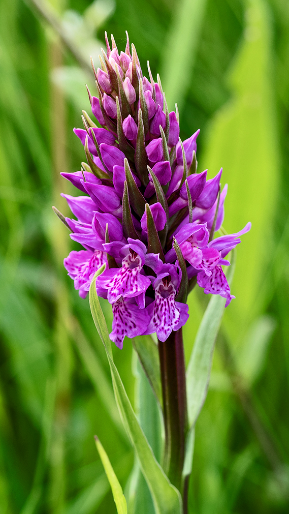
Hi Carol! A lovely Orchid, indeed.
Of course, it was possible to experiment using a larger aperture to create more natural Bokeh around/behind the Orchid. If your camera has a Dof button, then you can preview what to expect after the shutter is triggered.
However, I suggest the Original has all the potential to be presented as captured, but with a few post-production edits, like Dodge & Burning specific areas. (See 16x9 example)
In any case, beautiful capture! |
Jan 17th |
 |
| 24 |
Jan 23 |
Comment |
Holy Cow! A B&W flower by Bev!!
Stunning work! |
Jan 17th |
| 24 |
Jan 23 |
Comment |
"Points to Ponder"
In 21st century photography many have opted to follow a "digital manifesto": in this sense, such users have decided to elaborate on isolating the main subject, for example, a flower, such as my featured work, from its natural surroundings. Instead, most, PSA Flower critique rooms, present more hybrid photographic images, or perhaps more accurate, "graphic art" visualizations. Though these artistic images are valid interpretations, they do not represent "classic era" photography.
My goal working with the PSA and teaching and lecturing at local galleries and camera clubs, is to re-introduce or bring out from the shadows "classic Tradition" values that make this genre of art so compelling. As such, most of my interpretations are directed towards illuminating a more authentic visualization as a means to remind users not to become consumed by these otherwise hybrid, or "photographic mixed medium" images.
This goes a long way to whom the artist photographer is potentially selling the work to, a question I am asked often in the PSA B&W Photography Mentorship program; on Artist-Spectator Relationships. A very important and vital discussion for the serious artist photographer.
To summarize these brief words ��. be aware of separate photography subgenres that lead in two completely different directions; each direction is viable; however, one moves beyond classic photography while the other is a graphic art production.
Thank you.
|
Jan 17th |
7 comments - 3 replies for Group 24
|
| 83 |
Jan 23 |
Reply |
Happy Sunday, Mark, everyone!
So I am clear, I was referencing Adi's No.2 comment: (Steve McCurry in his famous portrait of the Afghan girl). The work became controversial after learning he staged the famous image for better viewer appreciation; as we also learn McCurry was known to stage or rearrange people or events to registered the perfect image through his camera. In light of this, I suggest, perhaps identifying "Afghan girl" with someones image could be deemed as a dubious distinction. |
Jan 15th |
| 83 |
Jan 23 |
Reply |
Thank you!! |
Jan 15th |
| 83 |
Jan 23 |
Comment |
Wow!!! A splendid portrait, Margaret!!
Though it reminds us a bit like Steve McCurry's "infamous" photo, I rather just center on your creative ideas or visualization for this most lovely B&W composition.
Its perfect!!! |
Jan 14th |
| 83 |
Jan 23 |
Reply |
Thank you very much, Debasish! : ) |
Jan 14th |
| 83 |
Jan 23 |
Reply |
Hello, Margaret!
Thank you for your positive comments. Also, very glad you took the time to read about this one, of several concepts within Japanese Aesthetics. |
Jan 14th |
| 83 |
Jan 23 |
Comment |
Good evening, Mark!
Outstanding composition! I love it! I also echo comments offered by Adi. I would like permission to use this image as an example for one of my current participants in the B&W Photography Mentorship program; we are discussing alternatives to high-contrast images (e.g., Ansel Adams for one popular example; he almost exclusively offered spectators bold, dramatic landscapes).
Thank you in advance! |
Jan 14th |
| 83 |
Jan 23 |
Comment |
Good evening, Jon!
I will echo the sediment of Margaret: the viewer is forced to look at the entire image as opposed to "centering" on the Sand Dollar. This indeed, creates intrigue, it is a fine example of what I refer to as a works (any art work) "contemplative structure". Well visualized and composed, aside from the fact you moved the object, which makes me a bit uneasy, indeed.
However, moving on ... I feel a bit more separation between the beach and the Sand Dollar can improve the overall tonal gamut; here, the goal is to help draw the viewer closer for a sustained look. (See my example that is slightly cropped). |
Jan 14th |
 |
| 83 |
Jan 23 |
Reply |
This is very observant, but of course, each viewer claims her own narrative, indeed.
Your observation is a viable one. (See my comments below). |
Jan 14th |
| 83 |
Jan 23 |
Reply |
Yes, it does. |
Jan 14th |
| 83 |
Jan 23 |
Comment |
Lovely composition, Mike! My reaction to Ver.2 is the same as Adi's.
Dodging the clouds a bit really works well. Beautiful work!
|
Jan 14th |
| 83 |
Jan 23 |
Comment |
Hello, Debasish!
Very well balanced composition! As others have mentioned, the road is definitely an overall anchor: in this sense, the the winding road brings a geometric challenge to the static nature of the two mountain slopes ... I love it.
The B&W tonal gamut is lovely. Well done! |
Jan 14th |
| 83 |
Jan 23 |
Reply |
Jon, thank you for your positive critique! |
Jan 9th |
| 83 |
Jan 23 |
Reply |
Hi Mike! Hey, this is a very viable option, indeed. Now, get some warm water running over those fingers! |
Jan 9th |
| 83 |
Jan 23 |
Reply |
LOL!!! Thank you, Mark! |
Jan 9th |
| 83 |
Jan 23 |
Reply |
Good point! Thank you for this clarity! |
Jan 7th |
| 83 |
Jan 23 |
Reply |
Mike, interesting thinking... see my response to Adi below .... |
Jan 6th |
| 83 |
Jan 23 |
Comment |
Hi Adi ... this response was triggered by Mikes comments above: .... Mike's comments about "open space" is most common, in what we can call, Club or Institutionalized photography: here, I see most often, the "Rule of Thirds" as a key point in creating "the balanced" composition; but this rule is too exacting (or is taught this way), which can be misleading.
Klaus Berger (1901-2000) a German Art historian: a paraphrase of his statement on using "open space" in both paintings and photography, �� 'unpeople negative space in fact plays an important part in a carefully planned, overall composition, which reflects a dynamic and rhythmic equilibrium of patterns'.
Here, we speak of so called negative, empty or white space, or a more positive articulation in the term "interval" provided by author and former professor at Rochester Institute of Technology, Dr. Richard D. Zakia (1925 to 2012). Zakia explains �� "I prefer to use the word "interval" since the term negative space seems to suggest something to be ignored or discounted".
Essentially, the "interval" dynamic separates the subject (or subjects) from the background and helps define a sense of place, but can also provoke tension, or otherwise be a thought-provoking catalyst.
Now, we can argue if there is too-much open or white space in the featured work, or maybe, is it too far on one side or another, but the use of this open or extra space is both clever and artistically stimulating.
Adi, I like your visualization; it is a very "Street Photography" like composition. Though I will say, I wish you had thought about keeping the horizontal lines straight while waiting for someone to pass into the frame. In any case, this is wonderful work! |
Jan 6th |
6 comments - 11 replies for Group 83
|
| 87 |
Jan 23 |
Reply |
Hi Dale! Thank you for your positive remarks. |
Jan 17th |
| 87 |
Jan 23 |
Reply |
Hi Steve. I will suggest, your experience with club members (others) that disconnect, or all together dismiss, such components as elements vital to appreciation is likely more common than not, but within the club environment more so than in the world of art on a global scale.
Here is some reading:
Image in the Making: Digital Innovation and the Visual Arts by philosopher Katherine Thomson-Jones, is an essay that may intrigue you. As a matter of fact, this subject is heavily discoursed in the philosophy of photography. |
Jan 9th |
| 87 |
Jan 23 |
Reply |
There you go! : ) |
Jan 5th |
| 87 |
Jan 23 |
Reply |
No. These terms are currently (my) ideas: they are not intended for competitions, but of course they can be implemented for this purpose in some way. It is one of the points (arguments) in the philosophical essay I am writing.
Its more about hanging (within a Gallery/museum setting) this image next to another, that was not created via AI and / or composite techniques. Would not spectator appreciation be different (positive/negative) if one knew the means/methods of producing a particular piece of art?
|
Jan 5th |
| 87 |
Jan 23 |
Comment |
Thank you, everyone. : ) |
Jan 5th |
| 87 |
Jan 23 |
Reply |
Gee, I really like this kind of visualization that cascades features in nature with, in this example, man made light. |
Jan 5th |
| 87 |
Jan 23 |
Comment |
Gee! Love the sharpness in this Blue bird portrait!
As such, I offer this severely cropped alternative of a true portrait. Lovely work, Cindy!! |
Jan 5th |
 |
| 87 |
Jan 23 |
Comment |
Very Creative, Will!
The work is very striking and I can see more than one (hung side-by-side ... in your office) illuminated in large back-lighted boxes. |
Jan 5th |
| 87 |
Jan 23 |
Comment |
This is a terrific idea!
However, for me, I feel the angle is too severe; as a result may be interfering with catching the shadows in a prominent way. But of course, the soft shadow could be due the intensity of light used (and reflective light) bouncing around the space.
One other item nags me: the white spots of dust, dirt or what ever it is, I argue, takes away from the sculpture-like presentation this work resembles: if all we saw was "pure" blacks and eggshell whites, I suggest an "antiseptic-like" aesthetic would bring the work more engagement. In any case, the work represents a well visualized and creative adventure. |
Jan 5th |
| 87 |
Jan 23 |
Comment |
Another amazing transition from the ordinary to the engaging!
Points to Ponder: So, how would we Categorize and/ or "Tag" this photographic image if hanging in a gallery setting?
"Gardens of Gods"
Classic-Digital Hybrid Photography
"Gardens of Gods"
Mixed Medium Photography
Just thinking. |
Jan 5th |
| 87 |
Jan 23 |
Comment |
Very Creative - Fabulous transition from the mundane to the engaging!
|
Jan 5th |
| 87 |
Jan 23 |
Reply |
Yep, always important to read the description first, especially when it is offered, including work in a gallery or museum setting. At several exhibitions at the High Museum of Art they often present a huge wall of information about the work visitors are about to view; it goes a long way in developing spectator "appreciation".
|
Jan 4th |
| 87 |
Jan 23 |
Reply |
Hi Cindy. Just read the description more carefully. Thank you. |
Jan 2nd |
6 comments - 7 replies for Group 87
|
22 comments - 21 replies Total
|


