|
| Group |
Round |
C/R |
Comment |
Date |
Image |
| 2 |
Nov 22 |
Comment |
Hello, Martin!
Picasso would be flattered by the likeness in the overall Gestalt this image offers. Well visualized, crafted and executed!
However, perhaps not a project suited for "General" photography: surely this piece sits more comfortable in "Creative" or "Composite" category of photographic art.
PSA B&W Photography Mentor
PSA South Atlantic Area Membership Director
lance.visualizingart@gmail.com |
Nov 2nd |
1 comment - 0 replies for Group 2
|
| 11 |
Nov 22 |
Reply |
Yes! Indeed, you were in Tripod-territory ... I have done this often myself ... well, the forest is still there ... and I hope you get the chance to study the area and produce other, as engaging work, in the future! |
Nov 4th |
| 11 |
Nov 22 |
Reply |
Though we have our own individual sense of interpretation, most work that reveals more for the spectator to connect to, or as Roland Barthes coined as a photographs "Punctum", or values that "prick" the spectator, are values that set themselves apart from the others.
These are images that often present a Balanced Compositional Structure, or what I refer to "Contemplative Structure", a final photograph (or projected image) that has the ability to "prick" the viewer for further study and contemplation.
The concept has been the most successful within my private and PSA Mentorship Programs.
You enjoy a very good eye for composition, and I look forward to seeing more of your work! |
Nov 4th |
| 11 |
Nov 22 |
Reply |
Wow!!! That's so cool!!!! (Crazy cool!) |
Nov 3rd |
| 11 |
Nov 22 |
Reply |
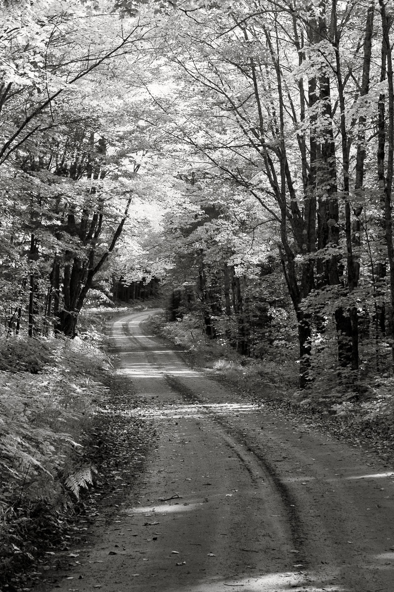
Henry, I do feel the streaks of light add greatly in balancing the brightness within the trees. Also, the road looks more ... inviting or interesting, something we see in reality ... and that can speak loudly as it relates to connecting to the spectator.
See my BW version that imbues a more bright aesthetic and maintains the steaks of light, even into the bushes on there left-side of the road. Both interpretations are valid, I do suggest the new version resembles the vividness of the color one more accuracy, however.
Download this file and review side-by-side with the featured B&W in PSCC for clarity of the changes. What do you think? |
Nov 3rd |
 |
| 11 |
Nov 22 |
Comment |
Hello, Jim!
Another engaging composition from this group this month!
IR has always been a special means in presenting landscapes and here, too, imbues this special aesthetic. The compositional design is wonderful - lines/angles are well visualized.
However, the hand held attempt at 1/8sec has really placed this work in an unusual place: the work needs crystal clarity, and it does not. Likewise, the blurring is not enough for an alternative aesthetic that could be presented as "Impressionistic".
My worry an exhibition size print will magnify these deficiencies.
|
Nov 3rd |
| 11 |
Nov 22 |
Comment |
Good day, Henry! Gee! everyone has brought
these lovely images for November!
Oh, yes, the B&W version just brings the details alive: as you mentioned, the road is brought more respect in B&W and allows for a fuller, viewer enjoyment.
I must ask, why did you remove the bright sun-lite streaks from the road? I was thinking it may bring a more natural feel ..maybe? |
Nov 3rd |
| 11 |
Nov 22 |
Comment |
Hi Allen! Gee, love these types of tree-portraits! (I have a similar one as part of commissioned work for a client).
Very creative crop in virtue of your visualizing skills .. well done.
The post-production maneuvering is within the scope of classic values of Dodge & Burning and the resulting aesthetic is authentic.
I absolutely love the finished piece! Very engaging.
Possible Alteration: (maybe) add a bit more (Dodge) brightening along parts of the tree trunks. Just a thought. |
Nov 3rd |
| 11 |
Nov 22 |
Comment |
Good day, Jim!
Well, I must say your creative/technical skills in post-production are wonderful. The final image represents a lovely, Hybrid Photography portrait, this model would surely be proud of. |
Nov 3rd |
| 11 |
Nov 22 |
Comment |
Hi Michael! Yes, I really like the entire "compositional structure": very balanced and of course, the lovely sun-spray in virtue of the 24mm glass, even within a Zoom lens construction offer this unique and artistic dynamic. the work imbues reality, and its authentic presentation is dramatic.
However, I could not resist, and offer another rendering, though extremely similar to your work, made some subtle changes: 1. I made the foreground Bush more prominent, in virtue of a.making the overall hue/tonal gamut more soft, b. Dodged the Bushes, and 2. The image was placed through a Red Filter (Silver Efex Pro-3) that helped define overall details immediately, including bringing more respect to the those foreground Bushes we discussed already.
Also, the star-burst effect is maintained from your color-2, a very important feature, indeed. Lastly, the image has a custom Silver-Copper tone.
Summary: The resulting effects are less "hard" and separates (some) objects better. By all means, both are viable tonal options, but I see this harder-impression more often than not, so I am interjecting another alternative.
Great work, Michael! |
Nov 3rd |
 |
5 comments - 4 replies for Group 11
|
| 24 |
Nov 22 |
Reply |
I enjoy experimenting with different lenses and the effects of bokeh ... this example ... like you said ... maybe a candidate for the wall ... perhaps a very large 20x20 inch print with a powerful spotlight will do the trick. Maybe.
Appreciate your encouraging words, Tom! |
Nov 21st |
| 24 |
Nov 22 |
Reply |
Indeed, a different "overall" presentation would be the result ..., perhaps better? ... but surely different. I have other frames of this subject all recorded within the 3 minutes working with her ... I will review and see if I have others that present the larger flowers more in focus. On that note, and contrary to your suggestion, I do have the lower (blurred) stems/flowers cropped in a separate frame that offer a very pictorial aesthetic, indeed.
Always appreciate your comments, Carol. Thank you. |
Nov 21st |
| 24 |
Nov 22 |
Reply |
Hi Fred! I am really glad this visual array connects with you .. it is a bit different, and also agree with your nit-pick. Thank you, Fred! : ) |
Nov 19th |
| 24 |
Nov 22 |
Reply |
Pinaki, Focus stacking takes away (on most floral subjects) "depth perspective": the resulting image than becomes flat and usually (in many cases) presents a graphic art like appearance.
"Points to Ponder"
In reality we do not see in this 'flat' sense: we observe with great depth and the camera can see even more of this 'depth' than our eyes, as such, the camera is an extension for our eyes .... "The camera is not only an extension of the eye, but of the brain. It can see sharper, farther, nearer, slower, faster than the eye...Instead of using the camera only to reproduce objects, I want to use it to make what is invisible to the eye, visible." - Wynn Bullock
My work will always side towards Pictorialism ... very much the Modern view within the Art of Photography. |
Nov 10th |
| 24 |
Nov 22 |
Reply |
Hi Bev! Yup, that's why they make Chocolate & Vanilla .. LOL!
"Points to Ponder"
Of course, each interpretation, one with more crystal focus, like (Tom's image this month), and others, like my image, with a mix of focused parts smothered between the effects of lens bokeh, reveal completely different aesthetics: Tom's example is clearly within postmodern art, mine a product most favored in modern and pictorial artistic mindsets. |
Nov 9th |
| 24 |
Nov 22 |
Reply |
Yeah, this is very striking.
To reiterate, the type of "full-focus" attention this flower portrait offers ... it is a visual dynamic that is not "pictorial", but rather it illuminates the subjects true characteristics ... and clearly outside its natural environment.
As it relates to Bev's comments below, not sure it matters, unless of course you are adamant to have your art find its course through such rules. On its own, however, your piece, (with its Black Background) is striking, and even imbues an almost comical narrative as the green leaves seem to be hands ... waving ... "here I am". |
Nov 9th |
| 24 |
Nov 22 |
Comment |
Hi Tom! You are another practitioner that has a 'green thumb" for some of the newer post-production techniques, and this full-focus flower portrait is a fine example of your skillset and efforts.
Some thoughts, perhaps a pure black background will enhance the already illustrative aesthetics the image imbues ... this way, the crystal clear subject will be highlighted even more. Just a thought. |
Nov 7th |
| 24 |
Nov 22 |
Comment |
Hello, everyone! I posted a short article on "Bracketing" on the Bulletin Board. I hope you take time to review it. Thank you. : ) |
Nov 4th |
| 24 |
Nov 22 |
Comment |
Hi Pinaki! Another interesting composition in virtue of the ICM techniques. As usual, very creative. Some thoughts:
Where previous work allowed a good portion of the subject to enjoy some clarity, this work does not.
Though I understand this is an ongoing series of work, as such, we will see different "flavors" of ICM, I recommend the earlier iterations will bring more (and lasting) appreciation, then examples with a lot more movement and less (or no) clarity or focus.
Also, previous examples set themselves apart from other work I see using ICM, which goes a long way in bringing your work more prominence. |
Nov 4th |
| 24 |
Nov 22 |
Comment |
Fred, another beautifully designed and executed photographic project! The featured piece is very ...3-D! |
Nov 4th |
| 24 |
Nov 22 |
Comment |
Another beautiful , creative, piece, Carol.
As I mentioned with Bev's and others' "creative" work of this nature, it is stunning example of Hybrid Photography, one that can be "appreciated" within Graphic arts and / or Photography Mixed Medium.
Lovely work! |
Nov 4th |
| 24 |
Nov 22 |
Comment |
Good day, Bev. Again, another fine idea towards what we can call, Hybrid Photographic work, which sides towards Graphic Arts .. which a lot of "creative" images like this sit comfortably.
Interesting design process, but perhaps change, 1.the green color to a more neutral one, and 2. the flowers needs to be more in focus ... which of course acts like a thorn, thus pricking the overall appeal. (A similar issue interfered with your July Flower, too.) |
Nov 4th |
6 comments - 6 replies for Group 24
|
| 83 |
Nov 22 |
Reply |
Yes, I do agree, and why Version-A is posted above. Thank you, Jon. |
Nov 28th |
| 83 |
Nov 22 |
Reply |
Hi Mark, and welcome to the group!
Indeed, B&W (and most types of Monochrome photographic images) allow the viewer to perceive the compositions gestalt ... and for sure, in many cases a dramatic rendering goes a long way in inviting such aesthetic values. Thank you for encouraging remarks! |
Nov 22nd |
| 83 |
Nov 22 |
Reply |
Happy Monday!
Not likely, Mike. I mention this in my above comments.
This direct, "in your face" approach is the hallmark of this type of impact regardless if shooting a model or this lovely, but common subject on a farm.
Most full-front greetings are often met with a sense of tribulation or anxiety ... and such is the result of these perspectives (which can also be accentuated by the lens being used).
A lot of the work by modern day portrait photographer Platon Antoniou, (or more commonly known as just ... Platon), uses this type of low angle frontal positioning to pull or elicit his sitters personality ... I love his work! |
Nov 21st |
| 83 |
Nov 22 |
Reply |
Hi Adi.
To be clear, I enclosed compositional structure to bring emphasis to the term, but the term is often used across several different areas of studies, though I do not remember seeing the combined term within the Art of Photography. Indeed, the combined term is very logical within the context I am using it.
However, in a recent (Draft essay ... it is under review) I did announce the term "contemplative structure" that more clearly defines attributes that elicit an emotional response from spectators. We may also see "contemplative structure" being the impetus in what Roland Barthes (Camera Lucida 1980) calls a photographs "punctum" ... or a thing, feeling or emotion what Barthes states ... "pricks" the viewer. (As the essay is still in Draft form I prefer "contemplative structure" not be used until the essays official release.) Thank you, Adi.
I look forward to seeing more work like this from you. Love it!
|
Nov 20th |
| 83 |
Nov 22 |
Comment |
Good day, Margaret!
Well, Adi definitely echos my feelings, but I will also add, never feel as an Artist Photographer we are short-cutting by having a bit of "luck" during our photo shoots: in this sense, I must emphasize that "luck" is one of the assets within the genre of photography rarely spoken about ... or in fact, is often looked upon as undermining the "intentionality" of the user. However, perhaps "luck" is a necessary attribute to our craft, and especially when a certain amount of planning or visualization can be interjected into the formula, like for instance the work by painter artist, Jackson Pollack.
It is a very interesting conversation we can continue at a later time.
Beautiful work! |
Nov 20th |
| 83 |
Nov 22 |
Comment |
Hi Jon! As Margaret implies ... indeed, you captured the maximum impact ... or we can say you have captured this particular vehicles inner personality in this most engaging old truck portrait: like working with a sitter, you have seemingly found the subjects hidden or often obscure personality for all the world to see.
In this respect, this particular presentation (framing) is viable. As it relates to backing off ...thus revealing more space to define a sense of place ... would in fact change the characteristics of the subject (perhaps, by virtue of how much space is revealed) thus redefining the image from a portrait, to alternatively, fine art documentary.
Very powerful! |
Nov 20th |
| 83 |
Nov 22 |
Comment |
Hi Adi and again, welcome to the group!
There is nothing in this composition that distracts from the overall visual experience: the images "gestalt" is powerful, complex and spawns a somewhat ambiguous nature, though after careful contemplation, the viewer can finally make sense in its structure.
A lot of my recent work reveals this type of alternative "compositional structure" and is another tool, trick or artistic means in which to offer spectators' alternative views of reality.
In my opinion, as important, is how the composition was (visualized) and created in the absence of post-production manipulation that could alter the subjects authenticity to reality. The only part of this visual presentation that is not realistic, is the fact we are forced to view the work in a perspective that is most unusual and even uncomfortable, two assets (among several) for creating engaging work.
Well done! |
Nov 20th |
| 83 |
Nov 22 |
Comment |
Happy Sunday, Mike!
A really wonderful visualization using the intricacies between Light & shadows, and the complex nature of both vertical and perspective lines ... well framed and presented.
Images like this ... and other nature or landscape work (e.g., Ansel Adams) present viewers, not necessary with defines narratives, but as Margaret notes ... allows the viewer to make their own. The work can also be presented (as Adam's work often represents) as Fine Art Documentary. Well done! |
Nov 20th |
| 83 |
Nov 22 |
Reply |
Margaret, your questions are thought provoking and I attempted to answer you through a short piece now posted on the Bulletin Board. I look forward to you, and the others on this most interesting discussion. |
Nov 17th |
| 83 |
Nov 22 |
Reply |
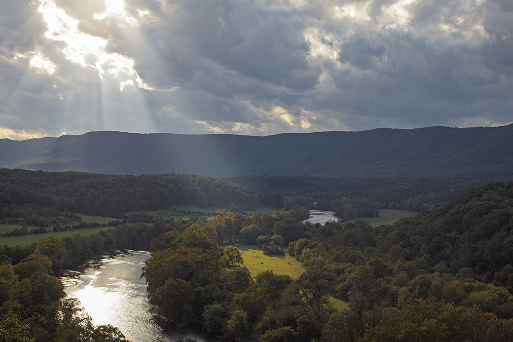
B&W Version-A for consideration ... |
Nov 16th |
 |
| 83 |
Nov 22 |
Reply |
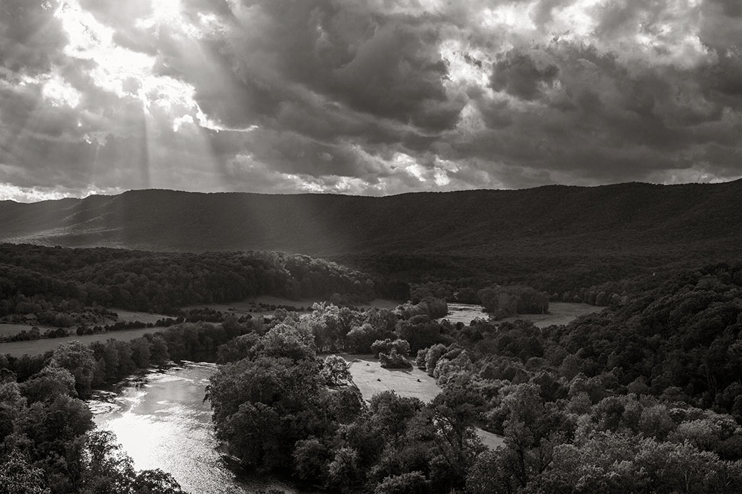
Hi Margaret! Very good observation on where the light is being directed: in fact, the featured image is my "B" edit (I posted the wrong edit) and overly accentuates the effects of light ... I have attached the color original (with slight fix to bring out shadows that were really dark): the increase in exposure to shadows is a more accurate rendering after the eye/brain regulated the extreme exposure ...thus, this color version brings more of the real experience the spectator would have enjoyed over several minutes getting acclimated to the scene.
The new posted B&W example reveals the likely print version which includes less emphasis on the area in question ... representing a closer version to real-time.
Yes, the featured version is a very hard-contrast aesthetic, where the new (version-A) is more authentic, though still bringing more illumination to the area of foliage you (wisely) pointed out.
I look forward to continuing this conversation! |
Nov 16th |
 |
4 comments - 7 replies for Group 83
|
| 87 |
Nov 22 |
Reply |
Good day, Dale!
Really appreciate your encouraging words ... glad you like the composition. |
Nov 16th |
| 87 |
Nov 22 |
Reply |
Yes, in so many situations it is hard or impossible to make changes ... as it relates to focusing, yeah, all my students are made to turn-off Auto-focus as they enter the workshop (recently I even made a group of young students do the same during a really fun gig at the YMCA (Photography Camp) teaching them, The art of Photography. Every shot they made for 5 days was done manually.
But using Manual Focus does need the user to plan ahead: in this case you will get use to pre-setting camera dynamics more diligently and be ready for (almost) every situation .. surly not all.
Hope this dialogue helped you. |
Nov 3rd |
| 87 |
Nov 22 |
Reply |
Awesome job!!!
|
Nov 3rd |
| 87 |
Nov 22 |
Comment |
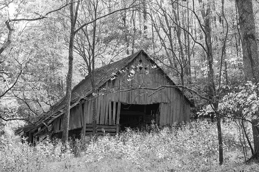
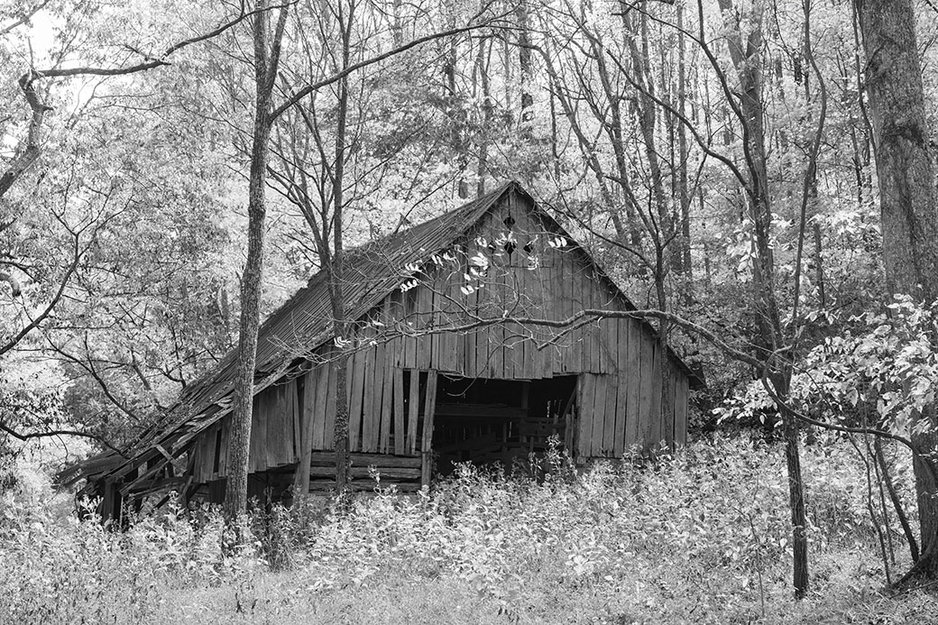
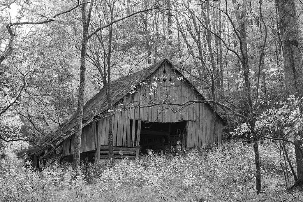
Dale, I could not resist: and as another example for Jennifer ... here see B&W version that has been through a Red Filter.
(Note the color version was run through a polarizing filter first).
Yes, work like this (and my featured work) are similar to impressions enjoyed with Infra Red photography, but those (mostly film-orientated) versions are much more rich and deep in aesthetic appreciation. (Yes, I also erased,the "stringy-things" ... LOL!). |
Nov 3rd |
 |
| 87 |
Nov 22 |
Reply |
|
Nov 3rd |
 |
| 87 |
Nov 22 |
Reply |
|
Nov 3rd |
 |
| 87 |
Nov 22 |
Reply |
Jennifer, everyone that may be interested ... following images are: 1. No filter, 2. Red Filter, and last image, 3. Yellow Filter. The featured work was created through a Green Filter.
These are applied during B&W conversion in Silver Efex Pro-3 (other programs have them) but I suggest NIK software may be the best on the market. Please, reach back out with questions. (See Dales Photo Option) |
Nov 3rd |
 |
| 87 |
Nov 22 |
Comment |
Will, this was well visualized: love the details and atmosphere, or otherwise a natural backdrop for any subject that happens to pass by its (quickly fading) place on this wall and sidewalk.
Agree, more head-room, next time be aware of this through the viewfinder ... we all make this error, (with others like maintaining a level horizon), not an issue here, of course. Another point in Street Photography is placing oneself (position) to allow more open space to help define "place". A very involving subject discussed in my mentoring program with the PSA and personal mentoring classes through my website.
But I like this, and you are using natural effects to enhance the scenes aesthetic values while also hopefully interject some type of narrative. Street Photography, not easy!
You have done well here and hope you decide to develop your eye and overall techniques to find more engaging subjects/narratives.
(P.S. I welcome you to view my current work in DD-92 (and last months) for other examples/styles in Street Photography).
|
Nov 3rd |
| 87 |
Nov 22 |
Comment |
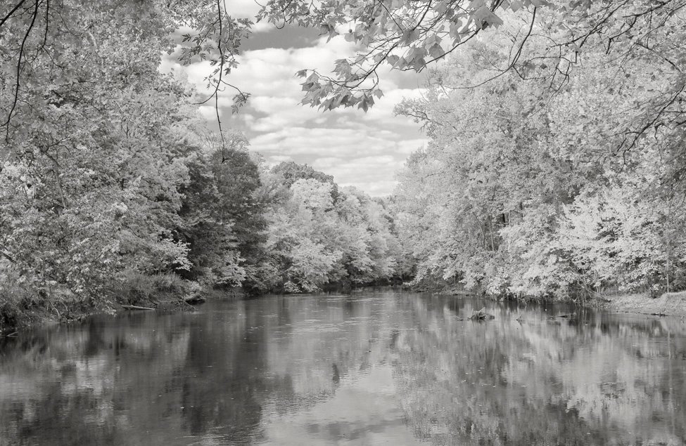
Hi Dale! Gee, what a lovely scene! This fall seems exceptionally abundant with bright rich color!
As I love B&W photography, this composition (may) be a prime subject for such a conversion: where I then go through several different color-filters to choose what best works, if at all. In this sense, sometimes a scene like this will always look better in it natural color exposure.
Great balance, exposure! The addition of the branch to fill-in the open section of sky works ... Love it!! |
Nov 3rd |
| 87 |
Nov 22 |
Comment |
Steve, this is an amazing image!
I love every feature and including the background bokeh.
Questions: at what point did you decide to use ISO1000? Was the camera set on Auto-ISO?
In fact, using the the high ISO allowed you to comfortably use the 1/320sec shutter speed to capture a sharp portrait, but just barely. For such activity I often place the camera on Shutter-Priority to control the shutter speed and "bracket" (see Bulletin Board topic) shots choosing different speeds to review later in post-production. Of course, there are a wide scope of intentionally applied camera dynamics for capturing this most lovely creature.
Well done!!! |
Nov 3rd |
| 87 |
Nov 22 |
Comment |
Jennifer, simply, a most beautiful fall image!
Everything falls into place very nicely, indeed.
Questions: why are you using ISO2000 (is it set on auto ISO)? Also, where was your point of focus ... and how did you focus? These are important questions for the others to contemplate and learn from. Well done! Thank you, Jennifer. |
Nov 3rd |
| 87 |
Nov 22 |
Comment |
Good day, Cindy.
There seems to be something wrong with the image: 1. for all practical purposes the entire image is out of focus, and 2. one half of the frame is blue-tinted and the other no tint.
Questions: what type of window was this? What did you focus on: Auto or manual focus? I am hoping to find solutions for the ambiguous array of aesthetic features. |
Nov 3rd |
| 87 |
Nov 22 |
Reply |
Glad you like it, Will.
I often see Barns both alive, while, like this one, dead and forgotten, and its stance among the overgrowth did indeed, invite me for a closer look. |
Nov 3rd |
| 87 |
Nov 22 |
Reply |
Hi Steve! And indeed, the horizontal branch was Intentional: in this sense I positioned my body to have it in the position you see it.
I worked the scene for about 15min standing in the middle of a 4-way intersection; being in rural TN, maybe two vehicles interrupted me during this time. Though the branch was immediately visible (from this position and a few others) I began to look at it as a means for balance and knew the leaves would add a contrasting spray against the barn. |
Nov 3rd |
| 87 |
Nov 22 |
Comment |
Good morning, Chan!
You are becoming both creative in how to Present objects of interest, while becoming more proficient in the methods to get this accomplished.
Well Done!!
The work, however, in my opinion, does not project a narrative: instead, the image is documentary (or a record of something) and presents viewers an example of a beautiful instrument. The presentation is beautifully executed and presented, but weak in forming a connection which (Pricks) the viewer to (connect) with it. However, its Commercial connection to the world is first class.
Alternatively, if the Dulcimer had been among items (artifacts) we may associate when playing the instrument or where the instrument sits while at rest between being played (e.g., on the front porch, or perhaps laying on a colored blanket in Plein-air) only then can a narrative play a more and deciding prominence directing viewers' to a story, one that promotes deeper contemplation. |
Nov 2nd |
| 87 |
Nov 22 |
Reply |
Hello, Cindy.
As described above ... 'digital green filter' is used in B&W photography to change/affect tonal qualities between White and black. As such, there is no green tint of any kind, but the work was finished in my custom copper-silver toning. |
Nov 1st |
7 comments - 9 replies for Group 87
|
| 92 |
Nov 22 |
Reply |
.... and that is a very good point, Lou. As it does not appear to be staged, it indeed directs our attention to a "street photography" appreciation, but not in the traditional sense.
Again, the proper categorization of different types of visual work go a long way in helping, said work, to achieve a certain degree or level of appreciation: depending upon where a work lies within a certain category ultimately reflects this outcome. |
Nov 23rd |
| 92 |
Nov 22 |
Comment |
Hi Jill!
Really a lovely and comforting image portraying winter fun with the family! Very enjoyable. |
Nov 21st |
| 92 |
Nov 22 |
Reply |
Thank you, Lou! |
Nov 16th |
| 92 |
Nov 22 |
Reply |
Hi Marianne ... it is the component that brings the entire scene together ... which allows for a good gestalt. Very glad you like the work. Thank you. |
Nov 16th |
| 92 |
Nov 22 |
Reply |
Thank you, Ian! |
Nov 16th |
| 92 |
Nov 22 |
Comment |
Hello, Ian!
First, I must comment ... instead of seeing the reflections as a negative ... it is what makes the picture more viable: in this sense, the large window and its, seeming, multi-layer of reflections, light and shadows, are salient features that reinforces the main subject. Since this is a class project I will not make any other comments, other than I like the results of this quick visualization and capture! |
Nov 8th |
| 92 |
Nov 22 |
Reply |
Great question, Marianne: it is actually the Smudging and Melting of lines and shapes within the field of view that calls for examination: this is often the results over 'over-processed' image files. For example, in many cases, can be the result of compensating for a very over-exposed digital exposure ... results tend to Melt and Bloat, otherwise defining features. The result is unnatural often imbuing a graphic art aesthetic quality.
But, by all means, makes a wonderful "Fine Art' image worthy of viewer scrutiny.
Regardless how these features appeared (or was induced) into the finished image, it does not evoke the natural and authentic aesthetics "appreciated" in Street Photography, however.
Question: what type of pre-set did you create? Perhaps this is the culprit?
Thank you, Marianne! |
Nov 8th |
| 92 |
Nov 22 |
Reply |
Hi Beth ... and really glad you like the composition ...my goal was to "immerse the viewer", in this very busy space, and from your comments, I guess this was achieved ... at least through your eyes. Thank you, Beth! |
Nov 8th |
| 92 |
Nov 22 |
Comment |
Chuck, one of the best elements in this composition is (apparently) your shopping cart: its protruding into the space adds terrific balance.
Technically, the Dodging and such reveals a very natural image.
I also suggest this image would do very good in a series of like-images under a theme. |
Nov 6th |
| 92 |
Nov 22 |
Reply |
Happy Sunday, Chuck! Appreciate your positive comments!
The key in this scene was when I saw the stationary legs/feet in the background ... I pressed the shutter release two or three times ... realized the umbrella was going bye, and just hoped all these elements found each other in forming the images gestalt. The stationary legs/feet anchor the composition, that gives perspective and helps elevate my narrative for this series of work. |
Nov 6th |
| 92 |
Nov 22 |
Comment |
Hi Lou!
Colorful and informative, as we are presented, what appears to be locals shopping at one of the markets. You did a fine job in post-production adjusting exposure. Very nice, Lou! |
Nov 4th |
| 92 |
Nov 22 |
Comment |
Marianne, this is a very interesting creation ... one that sits comfortable as a Hybrid Photograph, more inclined to many types of Graphic Art productions.
As such, though it is creative, (and well done, indeed!) it is not really an image (in virtue of the induced or contrived aesthetics) that can be called, or more important, "appreciated" within the Street Photography genre.
|
Nov 4th |
| 92 |
Nov 22 |
Comment |
Hello, Beth! My enjoyment is the play between Light & shadow ... the lines, shapes and of course, the B&W rendering brings all these elements together.
Great "compositional structure". |
Nov 4th |
6 comments - 7 replies for Group 92
|
29 comments - 33 replies Total
|


