|
| Group |
Round |
C/R |
Comment |
Date |
Image |
| 5 |
Aug 22 |
Comment |
Hi Barbara! Well composed illustration ... toning really helps the narrative, too. My only suggestion is to add a pulled spool of thread (just pull it out and drop it wherever) and push the finger-guard over: in this sense I am suggesting messing it up a bit ...make the scene feel ..'in progress", as it were. |
Aug 3rd |
1 comment - 0 replies for Group 5
|
| 6 |
Aug 22 |
Reply |
Good afternoon, Charissa! I am so happy you enjoyed and found some of the ideas in the article helpful, or at least intriguing; my goal when instructing, commenting or mentoring is to help artist-photographers find new avenues for creativity. If I am successful, help them think outside the box, or at least help them move past their comfort zone.
A quick word on using higher ISO values for creating a gran-like aesthetic: early model DSLR's had poor ability to clean-up (via the onboard CPU chip) Digital noise .. and I liked that so I could use this "noise" creatively .. however, newer DSLR's have far greater power to eliminate Noise, and we can shoot up to 12,000ISO and have little noise!!! As such, my Canon 5D Mark II and III will remain as the go-to cameras for the foreseeable future. Also, as you eluded to, a smaller sensor also presents more noise at lower ISO settings ...so this is OK from a creative sense, indeed.
I do agree, lens and of course, the size of the sensor can limit (some) visual effects ...but nothing is set in stone. I look forward to seeing more of your Macro compositions like the featured one; it is so comfortable and relaxing to view. (Try finding and shooting w/a lot of back-lighting more often for a softer presentation).
Kind regards,
Lance |
Aug 5th |
| 6 |
Aug 22 |
Comment |
Hi Charissa! A bit different from the last time I visited to see your peanut butter candy composition ... this flower is simply lovely ... soft, delicate and draws the viewer in ... some suggestions for creating this type of aesthetic: the use of a fast 50mm (F/1.2 or F/1.4) lens or even an F/2.8 longer lens like 85mm or 100mm portrait lenses.
These lenses have the ability to produce soft aesthetics at various degrees while also presenting a bit more detail. See Margret Julia Cameron, 19th century portrait photographer for a fine example Soft-Focus; I am confident you will find her work inspiring.
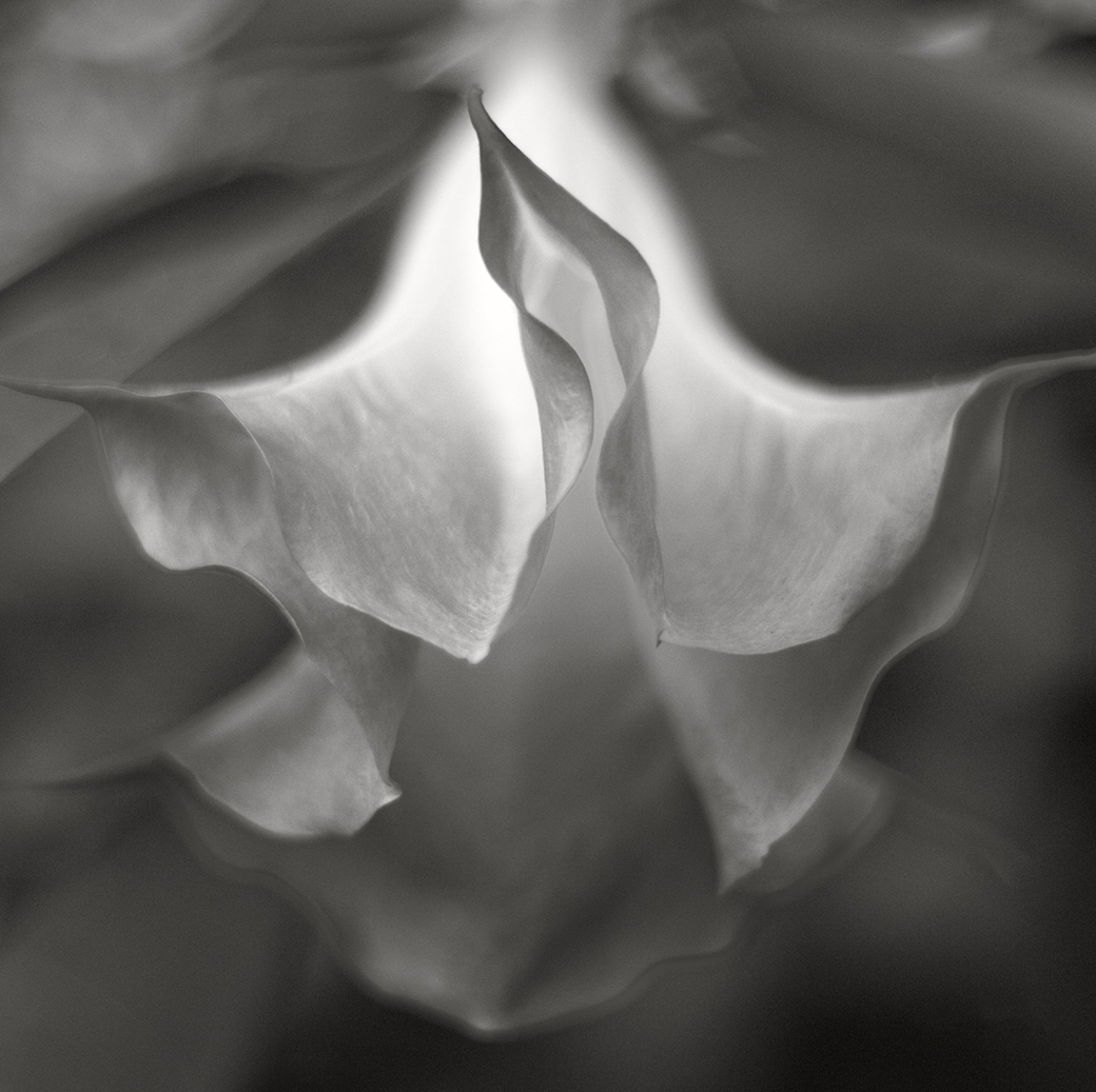
See my Angel Trumpet example captured w/early morning back-lighting: 50mm F/1.4 critical focus near center @ISO640 because of low light and my desire to add "noise" to mimic film grain: higher ISO is an easy way to mute, as it were, some of the antiseptic feel of digital images. I look forward to continuing this conversation and look forward to seeing more images like the featured one!!
Lance A. Lewin
PSA B&W Photography Mentor
PSA South Atlantic Area Membership Director |
Aug 3rd |
 |
1 comment - 1 reply for Group 6
|
| 24 |
Aug 22 |
Reply |
Yes, must agree the featured work looks a bit over-processed; here, Tom's rendering brings back the natural aesthetic of this most lovely flower. |
Aug 24th |
| 24 |
Aug 22 |
Reply |
Good morning, Tom.
Yes, must agree a certain amount of dimensionality is lost through (this) B&W rendering; though more depth is available when the 20"x20" is illuminated by spotlight. Also why there color original is favored, it clearly provides the added dimension you speak of. Appreciate your critique. |
Aug 23rd |
| 24 |
Aug 22 |
Reply |
Hello, Bev! I'm back in town and posting the color version which I am sure you will like (better) than the B&W version; like I said, so does my wife. (Please view on a larger monitor for best results).
The color version did get a little color management and overall exposure was corrected as the flower was a bit under-lit ... as you can image. (Note this frame different from one used for B&W; could not find the other, but for all practical purposes, are the same. |
Aug 16th |
 |
| 24 |
Aug 22 |
Comment |
Hi Lynne! This is a very lovely flower portrait! |
Aug 11th |
| 24 |
Aug 22 |
Comment |
Hi Tom! Overall, I like the depth and feel of the composition ... I feel I can reach out and smell the flower. I also think the low-key or better said, soft appearance in virtue of the muted (true) pink color and light green, is very engaging and relaxing for viewers. Nicely visualized!
Focus: well, it would seem F/6.3 should have helped maintain crystal clarity within a certain area front & back from the point of focus: as such, I suggest the manual focus needed to be more precise. I see this issue come across my desk often due to using auto-focus when shooting floral portraits or any type of still life. |
Aug 6th |
| 24 |
Aug 22 |
Reply |
Hi Fred ! Thank you! |
Aug 6th |
| 24 |
Aug 22 |
Reply |
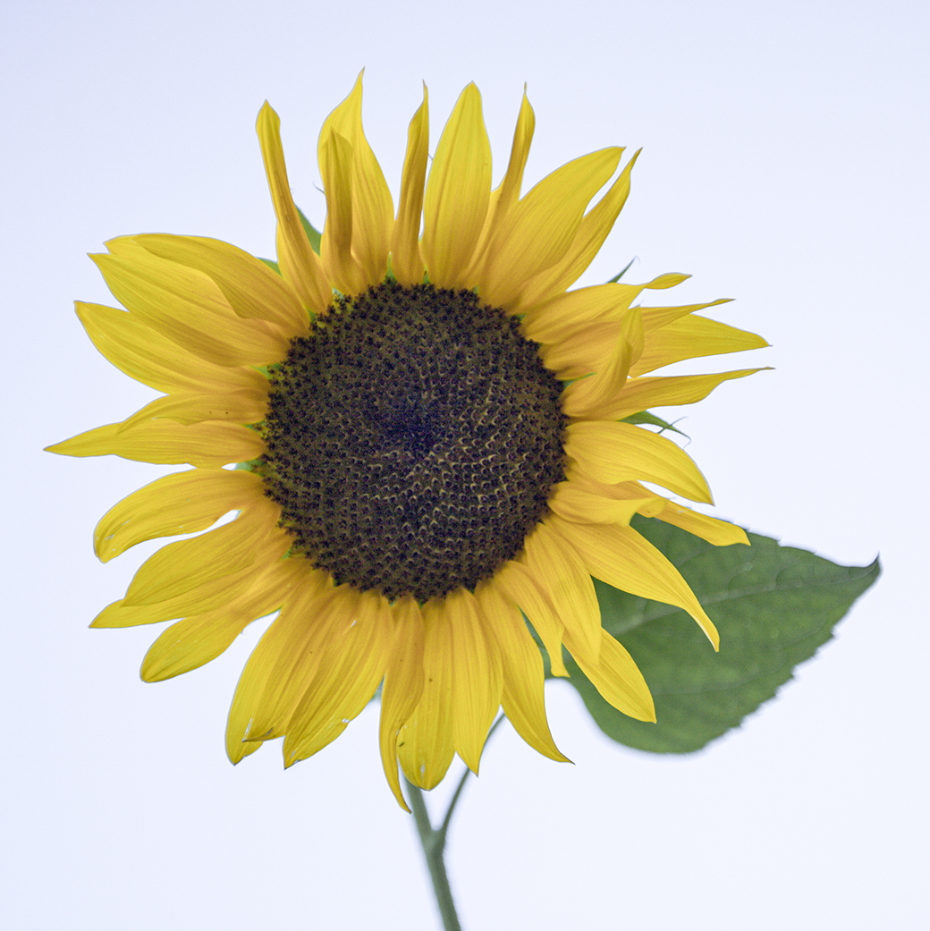
Hi Carol. Yes, a bit more contrast or a "less transparent" could have been achieved, but the color version (which I will post once I am back in Atlanta in a couple of weeks) is also somewhat transparent, but the B&W treatment (and color filter) of course accentuated this. It is the look I was after, otherwise the Sunflower would present itself like others in this respect.
Matte & Framed it looks ghostly under gallery spotlights. Thank you for your insightful comments. |
Aug 6th |
| 24 |
Aug 22 |
Comment |
Hi Carol! Well, I must confess, I like the original as it is presented.
The out of focus background colors compliments the subject ... I think the combination is outstanding and very engaging! It would be nice to see more of these types of compositions from you .. where you are using various degrees of lens Bokeh in the design process. My favorite lens for this type of work is a fast (prime) 50mm. Lovely work!! |
Aug 3rd |
| 24 |
Aug 22 |
Comment |
Amazing visual fantasy! I feel I am on LSD ... just kidding!
Beautiful work! |
Aug 3rd |
| 24 |
Aug 22 |
Comment |
Hi Fred! A beautiful example of a well visualized (designed) photographic mixed medium project, or "hybrid art", where we are combining AI technology with the subject captured in plein air through the lens of the camera; combined and presented in this photographic art. Well done! |
Aug 3rd |
| 24 |
Aug 22 |
Reply |
Hi Bev ... appreciate your positive comments ... on the road at the moment and do not have access to all my files; upon my return back to ATL in two weeks I'll post the color version ... my wife's favorite version, too! |
Aug 3rd |
| 24 |
Aug 22 |
Reply |
Hi Barbara, hope you are well. Thank you for the kind words. |
Aug 2nd |
| 24 |
Aug 22 |
Reply |
Hi Pinaki! Well, first, though one may describe this as a "high key" image, it is not intended to be one: in this sense, I only created what was presented to me, though the B&W version is surely more "illuminating" (in virtue of using color filter in post-production), and thus, "high key".
Yes, maybe the center could have been more clear, (and I wish it was) but the overall aesthetic is soft, and the final print (a 20x20) matte & frame presented very well under a powerful spotlight. It never seemed to be much of a distraction, at least that was the comments from gallery patrons.
Thank you for your thoughtful comments. |
Aug 2nd |
5 comments - 8 replies for Group 24
|
| 32 |
Aug 22 |
Reply |
My pleasure, Stephen!! |
Aug 3rd |
| 32 |
Aug 22 |
Reply |
Stephen, I feel this edition is wonderful! Perfect!
The only thing I did in my example was to separate the tonal gamut a bit more; I too, "burned" the upper right just a little, but the added brightness on the wall (my version) helped balance between the main focal point and the brightness of the sky better ... I placed the image through yellow filter in Efex pro to help define the differences between shades of grey. I also added a custom copper-silver tone.
What do you think? |
Aug 2nd |
 |
| 32 |
Aug 22 |
Reply |
|
Aug 2nd |
 |
| 32 |
Aug 22 |
Comment |
Hi Stephen! Seems you were in the right place to capture this street photograph within a documentary style: I am speaking more about the "original" scene captured through your lens. I enjoy the balance of elements portrayed in the scene. (Perhaps crop out only the baby carriages).
In this case, the two apparent subjects of your focus, and the lady with a very noticeable T-shirt slogan, both support the "whole" narrative. The "street photography" vibe is well displayed with all these people, the trash on the floor, and the background foot traffic: the "gestalt" comes through when the spectator takes in all these components contemplating the work. It feels natural, less staged; the original is open and presents a sense of place, attitude and overall atmosphere on the street.
Alternatively, the featured crop view, focuses only on our two main subjects, while eliminating the aforementioned components. As such, I must suggest, though the featured shot is also well composed, it does not carry the power of narrative as well as the original capture. For examples, again I point to some of the work by Gary Winogrand: see posted Winogrand images: the girl crossing the street is clearly the subject, and the author feels her surroundings say more about her stride and expression than cropping closer �� I think we can agree. The other image includes four main subjects, together create the amusing narrative, for one interpretation. In fact, Winogrand was often lazy as it relates to proper horizon, as his images and their narratives spoke more as a whole (their gestalt) than the images individual parts.
I hope you consider converting the original to a B&W rendering for us to discuss. Thank you, Stephen!
|
Aug 2nd |
 |
1 comment - 3 replies for Group 32
|
| 80 |
Aug 22 |
Comment |
Good day, Kathryn!
I love Sun Flowers and this image is lovely! Amazing what cell phone camera technology can achieve these days!
I am enjoying the depth you were able to capture, this really helps draw me in and want to keep looking at it. Well done!
Lance A. Lewin
PSA B&W Photography Mentor
PSA South Atlantic Area Membership Director |
Aug 4th |
| 80 |
Aug 22 |
Comment |
Good morning, Bob.
Well, I see it a bit different: in fact, I suggest, the digital art creation is more on the side of Japanese Aesthetics where often the under stated, wilted and old are presented as also holding special beauty ... in this case, compared to the original, the work is less alive.
I prefer the original for its Fresh and Cool (in the atmospheric sense) appearance, but also enjoy and appreciate your digital art alternative you have created: 2 for one !!
Lance A. Lewin
PSA B&W Photography Mentor
PSA South Atlantic Area Membership Director |
Aug 4th |
2 comments - 0 replies for Group 80
|
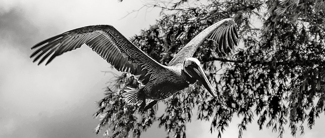
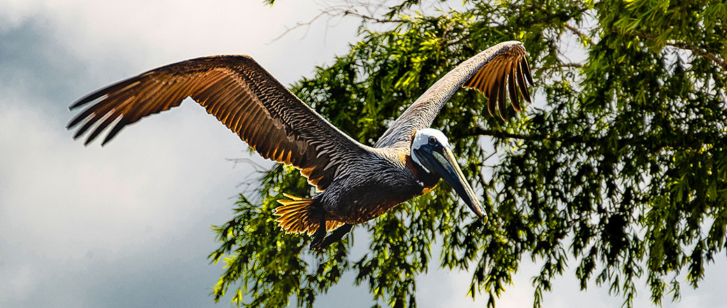
| 83 |
Aug 22 |
Reply |
Hi Jon. Appreciate the thoughtful critique: yes, I may have another shot captured vertically, as I do remember designing the scene through the viewfinder and asking the same questions you are. 50mm captured through the viewfinder and no more room to move back and enlarge the area as you suggest. I found my way up a narrow set of steps to an upper (narrow) deck (seemingly never used) to capture this scene.
No, I did not want to use a wider glass, as that did not fit the aesthetic I wanted at the is location. So, yes, the entire image is a bit, smothered in the sense you suggest.
|
Aug 24th |
| 83 |
Aug 22 |
Reply |
... yes, this is a beautiful subject! The details of the island are clearly outlined by color: in this sense I normally try to find an appropriate (and similar) aesthetic solution in B&W ... if that makes sense. : ) |
Aug 21st |
| 83 |
Aug 22 |
Comment |
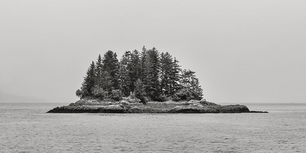
Good day, Jon! Some of my thoughts echo both Tom and Debasish; the use of negative or open space defines the location and solitude of the island.
I must confess however, the post-production treatment is a bit too linear within the tonal gamut: I suggest creating more shades within the foliage (and contrast) and increase contrast of the water. My example shows one such alternative.
Place them side-by-side for careful review. |
Aug 19th |
 |
| 83 |
Aug 22 |
Comment |
Good day, Tom! Well, this is a lovely landscape! Also, its nice when the weather offers the artist-photographer some dramatic background! Great work!
My feelings echo the others; I feel the entire composition is too vivid: in this case, I have no place to relax my eyes; I do not feel comfortable roaming around the frame. The sky is "competing" for center stage, when in this particular composition, I feel it should only be be a supporting actor.
In any case, and for the most part, the work is very successful and would hang nicely as a large print under a powerful spotlight. |
Aug 19th |
| 83 |
Aug 22 |
Comment |
Happy Friday, Mike!
Simply ... A very engaging scene! Well balanced and post-production endeavors look splendid! I actually like the dark areas of the foreground; something Ansel Adams did on several of his landscape work ... I do the same on mine when the composition (subject) call for it. I recently noticed on two mini-series on Hulu and Netflix the Director of Photography using a similar tack: that is, not bringing extra light into the shadows; it is often how our eyes see the moment, and in other cases, keeping the shadows solidified helps viewer interpret the scene. |
Aug 19th |
| 83 |
Aug 22 |
Reply |
Hi Debasish! Really appreciate your detailed critique; I am glad you enjoy the scene.
Thank you. |
Aug 19th |
| 83 |
Aug 22 |
Comment |
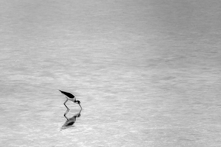
Happy Friday, Debasish! I really love this type of work, this type of out of the box composing. The work is Fresh, contemplative. However, allow mw a few moments to articulate a few points.
Indeed, the use of white, empty or sometimes referred to as White Space is ideal for communicating a sense of "Place" (I often speak about) and sometimes triggering an emotional reaction from viewers as a result. Your featured work embodies an introduction to these values, but I suggest the overall "compositional structure" needs a little sculpting, if I may.
See my example that maintains the large space you designed into your featured work, but I have provided the viewer with a "complication" that is more pointed then yours: the subject is biased to one side; "its position is clear", as opposed to your featured work that almost seems you were hesitant where to place this fine feathered creature. My example solidifies the subject to a certain location within the field of view and from there, the viewer (I suggest) pans to the right to take in the open space that of course, as you have designed, and adds to the works appreciation.
Wonderful work, Debasish! |
Aug 19th |
 |
| 83 |
Aug 22 |
Reply |
I often call all these types of "Digital Processes" as "Dodge & Burning", as for the most part, most of these "tools" render similar results: however, I do agree color filters offer the artist-photographer a more deliberate option regardless if working digitally or in the wet darkroom. Thank you for the clarification. |
Aug 16th |
| 83 |
Aug 22 |
Reply |
Hi Mike! (See my comments above).
|
Aug 15th |
| 83 |
Aug 22 |
Reply |
Good morning, Chuck! A fine example ...but a bit too much contrast across the entire scene for me ... though I really like the Dodge & Burn within the sky.
As it relates to Mike's comment below, I can try a different series of Dodge & Burning to bring out more details, but only in areas that need this attention.
Thank you for your suggestions. |
Aug 15th |
| 83 |
Aug 22 |
Reply |
Hi Tom! So happy you like it. |
Aug 11th |
4 comments - 7 replies for Group 83
|
| 87 |
Aug 22 |
Reply |
Oh, this looks outstanding!! Nice, Chan ! |
Aug 17th |
| 87 |
Aug 22 |
Reply |
.... yes, these are different ... I like this one (2nd one). But this example also emulates (some) traditional lenses.
About three years ago I noticed one or two cinematographers (apparently) using Lensbaby glass (or a similar product) to add a bit of "art" to the scene in the movie.
It does have its place within photography and cinema, indeed. Thank you for these added examples. : ) |
Aug 17th |
| 87 |
Aug 22 |
Reply |
Yup ... a bit lost among the branches, indeed. |
Aug 17th |
| 87 |
Aug 22 |
Reply |
... and I knew you were going to say that....yes, very creative, but I suggest, in this line of thinking (outside the box) on how to present the title .... have the entire title come (out) from the background: in other words, instead of a "flat" title, give it depth: like, coming from the past, and into the current. Just a thought. |
Aug 17th |
| 87 |
Aug 22 |
Comment |
Jennifer! Wow! Great capture! I like the square crop in this case ... it works well.
Well done!! |
Aug 17th |
| 87 |
Aug 22 |
Reply |
|
Aug 17th |
 |
| 87 |
Aug 22 |
Comment |
Good day, Cindy!
Here is two options: both are custom crop at 42x17. Sometimes a custom crop can save or otherwise present a subject in a pleasing way we did not (or could not) compose through the viewfinder. Hope you like them. |
Aug 17th |
 |
| 87 |
Aug 22 |
Comment |
Good day, Will.
Well, I will not hid the fact I am not a Lensbaby fan. In any case, a similar aesthetic or in this case ... a very Impressionistic visual presentation ... could have been made using traditional photographic gear. In any case, I like the design concept, indeed.
"Points to Ponder"
I like Bokeh created through Regular Glass; it provides a better balance between the point of focus and the areas of bokeh, in my opinion, and with a quality "Fast Lens" (e.g., 50mm F/1.2) provides beautiful circular bokeh.
Of course, in your featured work, I fail to see any "sharp" focused point, and I do believe this was your intention, hence the paint-like Impressionistic presentation.
The work would look stunning printed on some type of Japanese or Chinese papers. Just a thought. |
Aug 17th |
| 87 |
Aug 22 |
Comment |
Hi Dale! Well ... 'the early bird catches the worm' ... and indeed, you made the effort to catch another wonderful early morning landscape!
The use of CPF is always a fine option in most landscape photography and its use here as obviously helped secure the beautiful color and details in the sky.
I like the fact you did not feel inclined to make the foreground more bright: I see that a lot and it can "defuse" the overall emotional values seen at the time of capture. Instead, your featured work brings just a hint of detail to the foreground trees and grass, while providing a mostly silhouetted foreground (but not too dark) which works perfectly for this location and time of day.
Love it!! |
Aug 17th |
| 87 |
Aug 22 |
Comment |
Good day, Steve! Actually, the final B&W rendering is very mysterious. I suggest, this narrative/aesthetic fits the overall subject; his stance, his complexion and of course those "dead" eyes. This particular aesthetic may not be for everyone, but I feel it is a viable option and depending upon the reason for capturing this model, in this location, and presented in B&W, the dark eyes may be appropriate.
In any case, the featured crop, tone and expression of the model was well designed and captured! |
Aug 17th |
| 87 |
Aug 22 |
Comment |
Good morning, Chan! The work is easy for viewers to read/view and thus appreciate: well balanced and inviting, indeed. But I do wish the title was in full/complete view.
Terrific use of both photographic and graphic design/art concepts and techniques! My daughter had to complete a similar project for her final at Kennesaw State University in the late 90's and this work reminds me of those efforts.
Very creative work, Chan!!
|
Aug 17th |
| 87 |
Aug 22 |
Reply |
Hi Dale! Yeah, I think we all get lazy at times ... I am notorious for saying that to myself and my wife when shooting. LOL!
This is my intention ... as an artist-photographer, presenting work that involves a bit more contemplation from the viewer; part of the process involved with appreciation, regardless if the work is enjoyed or alternatively, disliked.
Thank you for your positive remarks. |
Aug 17th |
| 87 |
Aug 22 |
Reply |
Hi Steve!! In brighter light, or a bright screen, it is more easy to pick out these particulars you speak of .... appreciate your positive critique! |
Aug 10th |
| 87 |
Aug 22 |
Reply |
Yes, Will ... and pretty much what Chan mentioned in his comments ... I very much always try to present a scene, that perhaps, no one else has done, or has done frequently. Thank you for your positive remarks! |
Aug 10th |
| 87 |
Aug 22 |
Reply |
Hi Jennifer ... so we are clear ...as I just told Cindy, in the description it identifies each image as one to be enjoyed/contemplated separately; they have no relation to each other, other than being compositions resulting from reflections in water.
Only Image-2 would have resulted a bit different with a tripod; the other two images enjoyed more light. Thank you for your positive comments! |
Aug 10th |
| 87 |
Aug 22 |
Reply |
Hi Cindy. In the description I make note each image is for individual observation. It was Chan's initial comments that made me go back and edit my description to include this fact on August 6th. Thank you. |
Aug 10th |
| 87 |
Aug 22 |
Reply |
Good morning, chan!
Appreciate your analysis of image-2: though your assumptions have merit, and practicality ... the higher ISO setting (800) on Image-2 allowed me to use a smaller aperture to capture a deeper Dof. (In other words, I can go small and the shutter was still fast enough for hand-held operation). Another factor in my work is choosing ISO settings that also introduce "noise" or film-like grain onto the image.
In this case, I was aware being close to the bridge and wanted it, and the background in focus: using the Dof button on the camera I was also aware the Bridge was not in perfect focus, but this was OK having it a bit soft, as the background was going to be soft by virtue of being reflected through the water. (Yes, that image is a complete reflection and then flipped!) Not using the tripod limited the shutter speed in which I could hand hold the camera.
Alternatively, (using ISO-100 or ISO-800) using a tripod, and longer exposure (an even smaller aperture) to create a deeper Dof, indeed, would have made the Bridge a bit more sharp.
The entire process of creating Image-2 also involves hyper focal distance principles. If I am critical of myself ... and I often am ... using a tripod would have offered me more visual possibilities.
As always, thank you for your thought provoking comments, Chan. |
Aug 7th |
6 comments - 11 replies for Group 87
|
| 92 |
Aug 22 |
Comment |
Jill, well captured! Indeed, a Street Photography scene that echos work by Gary Winogrand (I mention him a lot). Winogrand's work often offers subtle narratives; his scenes, like the featured work here, offers the viewer options for interpretation.
For me, this is the classic case of the young daughter (perhaps even the women's niece) acting a bit disconnected from the apparent "directions" being offered by the women: not necessarily disobedient, but perhaps rebellious.
Both the color and B&W work, but in this case, I really like the color ... maybe because the color image imbues a nostalgic vibration. Great work! |
Aug 24th |
| 92 |
Aug 22 |
Comment |
Good day, Ian. Well, the featured work is more a pictorial composition than a "street" type aesthetic. In other words, my words echo Chucks.
Alternatively, the original places the viewer more into the realm of what we expect in "Street Photography" ... and this aids in viewer appreciation; that is, looking at an image (they) expect to "look", like a street photography scene.
"Points to Ponder"
In summary, your work is well visualized and captured (both the original and the pictorial crop). Now, you must decide, which genre it should be attributed to. |
Aug 24th |
| 92 |
Aug 22 |
Comment |
Marianne, for me, this image evokes the sense of how we are able to blend, mix or perhaps demonstrated in this scene, adapt to our surroundings.
It seems so clear to me this man travels this same route often (if not everyday). He has settled into his "everyday routine" and the featured work captured this narrative very effectively.
One other note: and in my opinion, everything in the field of view collates by the "Trenton" station sign which of course indicates to viewers this is likely a computer train, and he is traveling (likely home) by his tired demeanor. Nice work! |
Aug 24th |
| 92 |
Aug 22 |
Reply |
Appreciate your thoughts, Lou! |
Aug 20th |
| 92 |
Aug 22 |
Reply |
Awesome job!! : ) |
Aug 19th |
| 92 |
Aug 22 |
Comment |
Happy Friday, Beth! First, I am surprised how well F/1.8 (wide open lens) captured with, for all practical purposes, no bokeh or areas out of focus. Where was you point of focus ...even the guy sleeping in the left-back portion of the frame is clear! Got to love 50mm prime glass!!
Very contemplative: we have people of the right w/masks, on the left without, it is an interesting comparison how we dealt with such things, and especially within close quarters of one another. |
Aug 19th |
| 92 |
Aug 22 |
Comment |
Hi Lou! Wonderful capture of this particular activity within the scope, of what looks like an art festival. Its lively! |
Aug 19th |
| 92 |
Aug 22 |
Comment |
Wow Chuck ...love this street scene. Very, very Gary Winogrand like in how each of the three main subjects all have different expressions (yes, including one with the back to us) and each have different strides. From here we can form so many narratives! Love it!! |
Aug 19th |
| 92 |
Aug 22 |
Reply |
... I think you right! |
Aug 19th |
| 92 |
Aug 22 |
Reply |
Hi Chuck ... yes, I could have waited or pulled the trigger showing everyone ... indeed, it would have helped focus the narrative, if there was one to follow: in this sense, my idea was to focus on the subjects tired expression. It only has some value seeing the space in which he is surrounded by. Regardless, you are correct, No question, I should have included "all" of the sitters.
"Points to Ponder"
So everyone is clear ... using techniques (ideas) that help create "Fine Art" pieces is still very viable within a "Street Photography" context. Again, I have pointed many students of photography towards reviewing (studying) Gary Winogrand's work: many (not all) of his street photography series (e.g., Air Terminal shots is a fine example) work well when defining the "space" around the apparent subjects/s. Note a well trained (skilled) artist-photographer within the Street Photography genre can use negative, white or empty space, as I have explained, within the spontaneousness that is often critical in this genre. Henri Cartier-Bresson is another artist-photography who uses empty, negative (or open areas) within his field of view, that often make the surrounding space a "Salient" feature supporting the main subject. (This will be reviewed in my upcoming PSA article published in the fall).
Remember, everyone, Fine Art pieces are derived from all photography genres, including Street Photography. Thank you for your thought provoking comments, Chuck!
|
Aug 11th |
| 92 |
Aug 22 |
Reply |
Thanks for stopping by, Stephen!
Well, what can I say ... your interpretation is a viable one, indeed! I especially enjoy your expansion on the theme to include the Rodin statue. Again, as I often speak about, there are as many interpretations of art as those viewing it.
Really appreciate your "talking points" discussion, Stephen! |
Aug 11th |
| 92 |
Aug 22 |
Reply |
Good day, Ian!
I often teach about using empty or white space in other genres: this significantly helps define a sense of "place": inadvertently, this also imbues certain emotional responses from viewers, such as, tension ... a powerful emotion that helps define narrative.
In this case, (and in my opinion) it was important to make the space a "salient feature" with the sitter's as supporting actors, if you will. (See my other comments with Beth).
Appreciate your critique. |
Aug 11th |
| 92 |
Aug 22 |
Reply |
Hi Beth! Yes, I am conflicted as well ... and the capture is not one that easily engages the viewer. (I do like Steve's interpretation however...).
If I am not mistaken, raising the camera higher would have exposed everyones head and gestures ... at the time I was not sure if this would work and lowered the camera. One of the things I always speak about in other photography genres is "working" a scene ...but in street photography we often only have a quick moment to visualize, compose and snap the shutter release.
I was on-line getting tickets with my wife and had to move on quickly. Too bad.
Thank you for your thought provoking comments. |
Aug 11th |
6 comments - 7 replies for Group 92
|
| 99 |
Aug 22 |
Reply |
Good morning, Kathleen.
Glad you dropped by to view the "Impressionistic" scenes from Venice.
The slight "crop" Gerard offered is just a slight correction to your beautifully captured work; please, maintain your current workflow and crop behind the viewfinder, you have a good eye. By all means, continue practicing your old habits!
Always try to crop through the viewfinder, but leave enough area to allow for correction: this does mean, taking the time to design and compose the work carefully. keep in mind to .. 'work the scene' ... or 'work the subject'.
"Classic Tradition" (Barbara Savedoff 2000) a term this philosopher coined most of 20th century photographic work. "Mind-dependent" referring to (your) control, the photographers control, over the process of visualization, composing and to some degree, capturing the subject through the lens of the camera.
You can also email the director of Mentoring Services, Sanjoy Sangupta, to register for B&W Mentoring program I lead. He will guide you through the process for this Free program. ssg2801@gmail.com.
You can also reach out to me by email: Lewin.author@gmail.com to continue this conversation. : ) |
Aug 3rd |
| 99 |
Aug 22 |
Comment |
Good day, Kathleen! Bravo for thinking outside the box as it relates to, what I refer to as "compositional structure" ... the work is very engaging! (I do like Gerard's crop).
Kathleen, it is refreshing to see work created through strong mind-dependent actions; in this sense, you are creating through the viewfinder, as it were, and mostly "classic traditional" principles are being applied. I too, enjoy reflection-generated photographic art and hope you visit DD-87 for three recent examples captured in Europe.
Thank you, Kathleen.
Lance A. Lewin
PSA B&W Photography Mentor
PSA South Atlantic Area Membership Director |
Aug 2nd |
1 comment - 1 reply for Group 99
|
27 comments - 38 replies Total
|


