|
| Group |
Round |
C/R |
Comment |
Date |
Image |
| 5 |
Jul 22 |
Reply |
Sounds like a plan, indeed! Well done! |
Jul 31st |
| 5 |
Jul 22 |
Comment |
Hi Mark, just seeing this lovely composition. The sense of place is very immediate, and I like that.
Question, you state the use of focus-stacking to get everything in focus, but you could have also used hyper-focal distance principles, too ... correct?
Another traditional in-camera technique is through the use of a Shift-lenses.
I am noting these examples as alternative (traditional photographic techniques) that place prominence on "mind-dependency" that artist-photographers have tried to maintain the past one and half century's. Thank you.
Lance A. Lewin
PSA B&W Photography Mentor
PSA South Atlantic Area Membership Director
|
Jul 31st |
1 comment - 1 reply for Group 5
|
| 11 |
Jul 22 |
Reply |
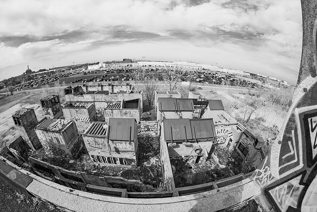
....so we are clear...the contrast is the same as your featured work; What I have done is included the original capture and also help bring equal prominence to the right-side graffiti.... as explained above. Thank you, JH. |
Jul 26th |
| 11 |
Jul 22 |
Comment |
Hi Jim!
Stopped by as I saw this interesting urban landscape...without beating around the bush...I like the original! Why?
It is different, engaging and having the wall to the right adds another unique element the viewer may find "fitting" in this location and time.
What I often refer to as, "contemplative structure" includes both artifacts and overall framing the artist-photographer designs from behind the viewfinder; you have done well here with these attributes, if I may say so, in my opinion.
Using the original image I adjusted exposure including contrast and burned the sky bring out cloud details. Lastly, I worked on getting more detail via contrast and Burning to the right-side wall I speak of.
Guessing this was a 14mm, perhaps....well visualized and captured! Great Fine Art piece
documenting local vernacular!
Lance A. Lewin
PSA B&W Photography Mentor
PSA South Atlantic Area Membership Director
|
Jul 9th |
 |
1 comment - 1 reply for Group 11
|
| 24 |
Jul 22 |
Reply |
Hi Pinaki! Thank you. |
Jul 24th |
| 24 |
Jul 22 |
Comment |
Hello, Pinaki.... a very interesting array of colors, lines and textures in this seeming floral still life. It is only apparent something is askew by the prominence of movement in the center Daisys....closer examination we also see what looks like double exposure or composite overlays, together giving you the artistic vibe you are after. I think the work is very "curious" and in this regard I find joy in it...I appreciate it! (The work also reminds me of the complex structure in Julian Opie... Evening Sun (2011) where the apparent painting or picture suddenly begins to move...your center Daisies give a similar feel).
However, in a gallery setting I would also like to know what I was looking at, so not to be mislead on the skillsets or techniques used, while I also appreciated it next to other work created within a different subgenera of photography.
For example, I recently came a across this situation in a fine art gallery in Atlanta, Georgia and was very mad that I was led to believe the artist captured the work in a "relatively straight" manner, where in reality, the photograph was a construct within the subgenera of composite photography. There was no title or text indicating such processes and the work was surrounded by other more traditional work that I was comparing it to...the curator did make a grunt, and agreed it was a bit misleading, indeed.
In the end, with an appropriate title, I think this work is very engaging and should be appreciated for the visualization in its design, skill and techniques used to construct the final piece. Well done!
Lance A. Lewin
PSA B&W Photography Mentor
PSA South Atlantic Area Membership Director
|
Jul 21st |
| 24 |
Jul 22 |
Reply |
Well, this is a classic example of what I refer to as... "photographic mixed medium" or what philosopher Dr. Claire Anscomb (b. 1992) refers to it as... "hybrid arts"....
"Points to Ponder"
Here, we see a finished product by virtue of 1. traditional photography (per the original) and 2. AI based software that literally transformed any visual issue (in the original) into a clear and appreciated composition. Be aware, these tools can easily negate learning the proper techniques in capturing a subject or event through the lens of our cameras. Alternatively, if using these methods, perhaps the work can be identified as "Hybrid Art" or ... "Photographic Mixed Medium" ... for just two possibilities.
A very interesting discussion, indeed! Thank you.
|
Jul 19th |
| 24 |
Jul 22 |
Reply |
Indeed, a lot of Blur and little in the way of sharpness for most of them....
Since 2009 I have not revisited this type of high-speed technique, but perhaps before the end of the summer I will attempt another similar photo shoot.
Appreciate the critique. |
Jul 19th |
| 24 |
Jul 22 |
Reply |
... then it is pretty much like learning to use different lenses and aperture settings, (along with picking the correct background) in a traditional creative workflow.
Thank you, Lynne. |
Jul 19th |
| 24 |
Jul 22 |
Reply |
|
Jul 19th |
| 24 |
Jul 22 |
Reply |
|
Jul 19th |
 |
| 24 |
Jul 22 |
Reply |
Hey, Tom...I did not find the exact one...but because of your comments I found most of the 2009 collection: here is two new examples...some OK, but I still like the featured one...(seems more is going on...maybe not); however, I need to find it and maybe re-edit it. These examples have a bit more air around the subject...I like them alike because of that.
(There a bit over-sharpened...can't stand that).
Thank you, Tom! |
Jul 19th |
 |
| 24 |
Jul 22 |
Reply |
Hi Tom, and appreciate your positive comments...No, your correct, it is a bit crowded; I need to find the original RAW file and see if I cropped it too much when using the 16:9 ratio. Let me see what I can find.... |
Jul 19th |
| 24 |
Jul 22 |
Comment |
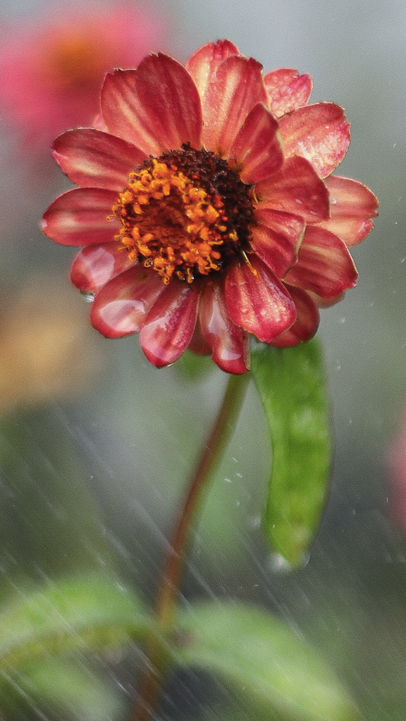
First of all, Lynne, I am impressed with the care and attention you have offered this tiny object of beauty!
The composition is very soothing....the shallow Dof is always a wonderful dynamic in many types of flower compositions...and you did well here is this lovely composition.
I am not a fan of any type of "imitation film", as I believe if one needs a film-like aesthetic shoot film. Alternatively, shooting with a very high ISO on a DSLR will sometimes add "noise" which can look like film, too. (However, modern day cameras are quickly advancing to almost eliminating the effect; a reason why I will always use my 5D Mark II and Mark III; as they still offer me this type of camera dynamic when I am not shooting film).
Question:
What effects are obtained from the LB85, that are not available by choosing different (more conventional) lenses and apertures, if any? Or are the effects the same, but just a different method of achieving the same look...or is there more? Thank you, Lynne. |
Jul 18th |
| 24 |
Jul 22 |
Reply |
Thanks, Fred!! : ) |
Jul 18th |
| 24 |
Jul 22 |
Reply |
Carol, everyone...continuing on this topic as it relates to Shutter Speed and photographic effect...here is another from the 2009 shoot: Captured w/200mm, cropped F/2.8 @2,500/sec !
This was actually printed on high-gloss paper mounted on Board @16x24. |
Jul 17th |
 |
| 24 |
Jul 22 |
Comment |
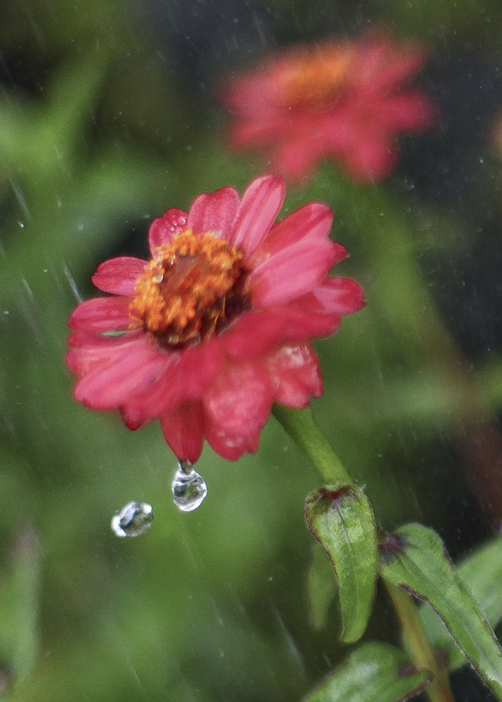
Happy Sunday, Carol.
Well, actually, the experiment during this photo shoot back in 2009 was all about High Speed photography via the 5D Mark II DSLR, as such, the shot was captured in Shutter Priority (as explained in the image description above). The featured image was captured at 1/1000sec, which effectively allows the water to appear flowing.
(Note the use of "slower" shutter speeds, especially captured in weather-events (e.g. snow or rain), help in producing soft aesthetics, like those we may see in Julia Margret Cameron 19th century portraits and theatrical compositions, for one inspiring example, again this is mentioned in the comments to Bev Caine above).
The soft-Lens approach (and effect we see here) is due to the wide open F/1.4 aperture on this magnificent Canon 50mm glass, thus a shallow Dof (or the effects from extreme Bokeh).
An even 'faster speed' would need to be used to make the event more clear, but the resulting Pictorial aesthetic is one that I often use...this melting of color, light and texture is one of my hallmark signatures in many of my portrait and flower compositions; though I do like Fred's extra sharpening...I did not use for some strange reason...and will re-edit others in my 2009 folder.
Indeed, the featured crop allows seeing the spray and integral in helping spectators' level of appreciation.
Thank you for your thoughtful comments, Carol! |
Jul 17th |
| 24 |
Jul 22 |
Reply |
Oh, I absolutely like your presentation! In fact, I like the "sharpening", but would keep my 16:9 ratio, though 8x10 works also... Nicely done, Fred!
Oh, the water was indeed from a watering system outside a restaurant just after dawn. |
Jul 17th |
| 24 |
Jul 22 |
Reply |
Interesting process, indeed. Thank you, Fred. |
Jul 15th |
| 24 |
Jul 22 |
Comment |
Good afternoon, Fred! Gee, what a lovely composition....very bold in virtue of the apparent (adjusted) blue filter used to darken the foliage. I like it a lot; it would sit even more boldly with the proper mate & frame for sure. Lovely work, Fred!
Alternatively, the original enjoys a wonderful blend of light & shadow, some a product of back-lighting that I feel really offers a lot of texture, too. Of course, this type of aesthetic can be maintained through the conversion to B&W by using, for example, an adjusted Green or yellow filter: note I use only NIK Silver EFEX Pro for my conversions to B&W.
Lance A. Lewin
PSA B&W Photography Mentor
PSA South Atlantic Area Membership Director |
Jul 15th |
| 24 |
Jul 22 |
Reply |
...of course I understood that. It has been fashionable to presume the use of pre-sets, sky-replacements and other like-devices to alter the original photographic event...so I was just noting my work does that fit that mold, as it were.
My Bio is already posted, as the same Bio is shared across PSA platforms. |
Jul 15th |
| 24 |
Jul 22 |
Comment |
Bev, a lovely combination of dark green and vivid pink; I suggest the original displays a very engaging set of colors. However, it appears the image is out of focus.
Though the shutter speed is slow, the entire image does not have a pin-point focus area, so I must suggest a focusing issue here. However, the treatment via sharpening has then transformed the image into acceptable one that imbues a beautiful pictorial statement! I would have loved to see this finished piece with the original background, too, I suggest those colors would have an even bolder statement, indeed! |
Jul 15th |
| 24 |
Jul 22 |
Reply |
Good morning, Bev! Thank you for your positive comments. Of course, you do realize the background was chosen through the viewfinder; your comment "chosen" seems to indicate it was manufactured, LOL! I spend a lot of time composing and this includes what the background will look like with different degrees of bokeh. (This is accomplished by both experience and the ever-amazing Dof preview button).
As my bio indicates, my preferences balance between the modernist and Pictorial Aesthetics: in this sense, and as it relates to all types of Flora compositions, my work often imbues pictorial and even impressionistic values. I also tend to bring this optic to portraits, a view mostly influenced by 19th century photographer Julia Margret Cameron and her mostly soft-lens effects. Another inspiration comes from a variety of Japanese aesthetic.
But I also enjoy the sharpness you speak of and often enjoy viewing such images that seemingly allow me to smell the flowers scent in virtue of their realistic presentation. |
Jul 15th |
5 comments - 14 replies for Group 24
|
| 40 |
Jul 22 |
Comment |
Happy Monday, Jamie! Passing by and saw what initially looked like a scene captured on B&W film....but obviously not.
I suggest the blue-hue is a manifest of shooting in either auto-white balance (WB) or the WB was set for daylight or sunlight, and the overcast sky produced the blue color cast: an easy fix in Camera Raw or other basic program...and should be done before conversion to B&W.
I really like the crop that highlights the mountain and sky while suggesting the multi-textured foreground; its different and doing something different sometimes makes for an engaging piece.
Well composed, indeed!
My next words echo Andrew's, as the mountain is completely soft...or seemingly out of focus....maybe a result of the aperture and focus point not allowing both the foreground and background in focus. It is a very common issue that sometimes can not be seen through the viewfinder unless the camera has a Depth of Field (Dof) preview button.
Can you share with us the settings and where your focus point was? Thanks!
Lance A. Lewin
PSA B&W Photography Mentor
PSA South Atlantic Area Membership Director
|
Jul 18th |
1 comment - 0 replies for Group 40
|
| 43 |
Jul 22 |
Comment |
Hi Linda! Hope you are doing well!
Passing by saw this illuminating subject! The overall balance is OK and how
lucky you were to have weather like that ... and with sunlight still striking down to
illuminate the roof! A very successful photoshoot, indeed!!
But I do have technical questions: the image does not seem sharp, and that seems odd, as the shot was captured @1/1000sec. Where did you "confirm" the focus point? If the lack of clarity is due to a very low resolution copy for these pages, can you share the better one.
If the original file is high resolution (thus making the roof crystal clear), then I see no reason to "sharpen" anything. Crop: I would just take out a bit from left-side, as the right-side (including the red door, and part-fence) help form a narrative, at least, they are strong artifacts/positions in helping to define a sense of place. (It is the left-side that can be cropped, and bias to allow more sky than foreground, but some of the foreground is perfect, as another anchor in defining this lovely barn and its intimate surroundings. |
Jul 25th |
1 comment - 0 replies for Group 43
|
| 47 |
Jul 22 |
Comment |
Yes, this was a very good exercise, indeed! |
Jul 18th |
| 47 |
Jul 22 |
Reply |
Yes, I love this interpretation...this is what I was looking for....they are all close, but including the sun glare adds a bit more to the overall scene: in this sense, the sun glare helps identify where the, almost, hazy-like illumination is coming from. I suggest this balance of bright light and the rest of the illumination is a ket attribute to the overall emotional attraction. You did however really sharpen everything and that is OK, but I
would have sharpened it a bit less. Awesome work, Kirsti! |
Jul 18th |
| 47 |
Jul 22 |
Reply |
Good day, everyone!
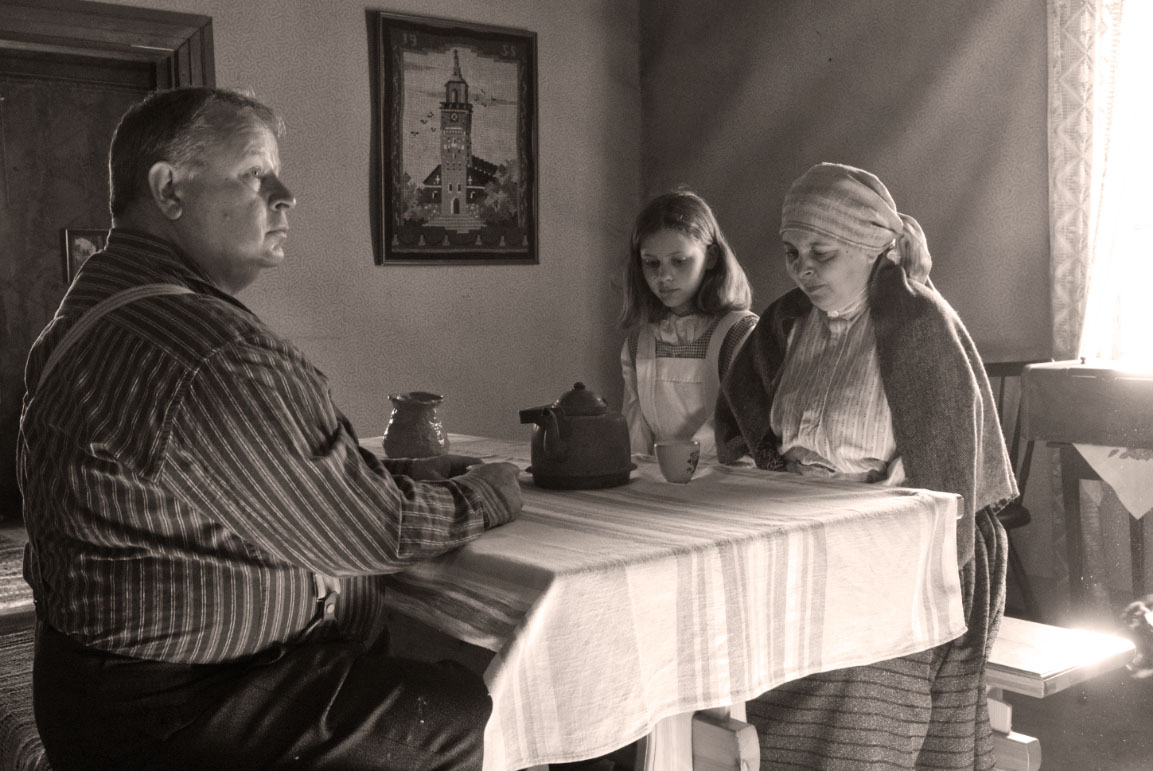
Well, overall, the new version brings more to the table in virtue of supporting (more) of the effects of light, shadow and texture of the original, which is by far the most revealing and suggestive in creating a narrative outside of the color original. Kirsti took some of my suggestions from our talks, but not all are implemented, so your calling out two items is correct, as both the table contrast and light on the mother chest seem overdone. A matter of time before techniques, ideas are perfected more consistently. I am sure you agree.
But, these are specific areas, while on the whole, the more grainy aesthetic and increased contrast (on certain areas) is more real and reflects the dynamics of the color original on the edited version. However, the over-bright expressions are still too dominant; in this respect we must question where the light is coming from, as the original scene allows little light to fall on their faces from room and table reflects; in this respect both Kirsti's versions are too illuminated.
However, one important atmospheric dynamic was not incorporated, the glare of sunlight off the bench that actually makes the scene very real, very natural. The Glare also "pricks" viewers and makes them squint: it has been eliminated in both versions. I am also aware within the sun-glare are possible intervering items, but my example leaves them in for purposes of examination and discussion. Can they be left in? Maybe.
Summary: 1. paying more attention to the background is vital and 2. taking "bracketed" shots using different settings and maybe even adjusting ones position to compensate for background issues is something that needs to be on everyones "checklist" while working a subject. It is also OK to move odd objects from a staged scene like this one in an effort to eliminate interference as discussed above, unless such objects actually help in forming a narrative (which in more cases than not, do!). |
Jul 18th |
 |
1 comment - 2 replies for Group 47
|
| 74 |
Jul 22 |
Reply |
Dick, I am referring to the original and then the featured composition.
Have a great Sunday! |
Jul 10th |
| 74 |
Jul 22 |
Comment |
Hi Dick! I think I like the original crop for one presentation option: I think I feel more immersed in the scene that way. You did a wonderful job in seeing this scene that more than likely is passed by without a second look by others, and instead present us with fine art born from the everyday, wilted and decaying foliage on the forest floor.
Wondering how this would look without any vignetting and in transition to B&W Dodge the ivy crawling up the tree a bit....just some thoughts.
Nice work!
Lance A. Lewin
PSA B&W Photography Mentor
PSA South Atlantic Area Membership Director
|
Jul 9th |
| 74 |
Jul 22 |
Comment |
Good day, Haru! Another Fine Art nature composition from you....your work is truly wonderful. Your eye for balance and structure is excellent.
If you want, Dodge a bit more of the foliage that hangs on the rocks to balance the illumination offered by the falls. Otherwise, Perfect, in my opinion.
Lance A. Lewin
PSA B&W Photography Mentor
PSA South Atlantic Area Membership Director |
Jul 9th |
2 comments - 1 reply for Group 74
|
| 78 |
Jul 22 |
Reply |
Appreciate that...thank you, Brenda! |
Jul 25th |
| 78 |
Jul 22 |
Reply |
Though it is fare to indicate the artist-photographer can choose to present as she wants...it is photographic scenes like this, apparently captured 'as is' through the viewfinder, that equates to such a powerful statement. I miss the sun-glare enjoyed in the featured piece.
"Capturing" or registering the "photographic event" as it existed in real life, is so rewarding, because it is often not easy to achieve. At the same time, a great deal of aesthetic appeal has been shaped by club Competition rules, where Pictorial Aesthetics created within traditional photographic techniques is less popular: my comments are always to help the artist-photographer develop / learn concepts/techniques that are deemed foundational, not just in photography, but in other visual arts, like painting. Thank you, Jason!
|
Jul 25th |
| 78 |
Jul 22 |
Reply |
Indeed, the artist-photographer has these options you speak of...but, it is most hard when the artist-photographer relies strictly on his equipment, visualization, development and presentation skills, all from only what she sees through the viewfinder, including what is also offered from Mother Nature or manmade atmospheric conditions. (Important elements, and skillfully used by photographer Alfred Stieglitz in the first two decades of the 20th century, for an inspiring example of pictorialist at work).
In this sense, the artist-photographer creates as does the artist-painter, but without the ability to "rearrange" as the latter artist is allowed to enjoy. But this idea also initiates questions concerning all post-production accentuations; and so this discourse is currently hotly debated since the onset of 21st century photography.
Again, beautiful work from which you visualized and then captured so delicately. |
Jul 16th |
| 78 |
Jul 22 |
Comment |
Good day, Jason! Passing by saw this lovely, and very modern-day Pictorial view of an early spring morning!
You captured the scene as we actually see it...unclear as we squint through haze and the glare of sunshine....it is a beautiful image and I suggest (no edits) to maintain the aesthetics Mother Nature has offered you and you did so well to capture.
For reference, the main reason Monet began painted, in what was later called, Impressionism, was his desire to show how we really see: in this sense both natural and manmade atmospheric conditions dictate how we really perceive the world; an unfiltered view perhaps can be taken from this.
The finishing touch is to have a Fine Art Print created on water-color or perhaps a smoother 100 percent cotton rag, matte & frame with care.
Lance A. Lewin
PSA B&W Photography Mentor
PSA South Atlantic Area Membership Director
visualizingart.com |
Jul 9th |
1 comment - 3 replies for Group 78
|
| 83 |
Jul 22 |
Comment |
...more of the foreground wall is visible, thus increasing the depth I speak about.
What do you think, everyone? |
Jul 13th |
 |
| 83 |
Jul 22 |
Reply |
No, not the Rum & Coke talking...LOL!
Here is the less cropped version, almost the same. Guess the lesson here is after we see and feel a particular composition, take the shot, then step back and take another; this "bracketing" always allows options in post-production.
I'm back...and going back to bed soon! LOL! |
Jul 13th |
| 83 |
Jul 22 |
Comment |
Hello, Jon! At the time of this review I am not home and later will send you images of Long Boat Key..more about this later...
The featured work is a well designed and illustrated documentary type photographed image that allows viewers' to sense dramatic changes that are happening to our coastlines. In a similar situation I am very concerned with the effects of erosion to beaches along long Boat Key, Florida.
This type of image is best illustrated through B&W and the tonal gamut makes the reviewing and contemplating the scene very comfortable. In my opinion, this is well balanced work!
|
Jul 12th |
| 83 |
Jul 22 |
Comment |
Good day, Ally! I'm reviewing this while in-flight back to the USA.... I always enjoy looking at architecture when captured with imagination: in this respect the artist-photographer contemplates the best position and lens to use to create (or reveal) an interesting view of the subject.
Though I suggested the featured (cropped) view brings us closer to the subject, I also feel the slightly less-cropped view (see attached) allows your original capture and thus reveals a bit more depth, if only a slightly.
Sometimes a second look at Art brings a slightly different interpretation to the table. And here in flight I am seeing this a bit differently..maybe its the Rum & Coke!
On the whole, your recent work (and this one) is well visualized and captured!
|
Jul 12th |
| 83 |
Jul 22 |
Comment |
Happy July, Tom!
Love this very cute country landscape that also portraits these seemingly constant figures along the road...you lucked out to have the wonderful sky (weather is such a great friend to photographers) and the high contrast interpretation is engaging. |
Jul 10th |
| 83 |
Jul 22 |
Comment |
Hi Mike, another destination I need to visit in the future!
Several items help create a balanced and interesting scene: the lone figure walking provides perspective (size/distance) and I love the slightly washed out appearance of the rock formation sitting in the spray/mist of the water and muted grey sky; it contrasts comfortably with the sand formations.
Question...what is the object in the middle..a Troll Doll? Thank you, Mike! |
Jul 10th |
| 83 |
Jul 22 |
Comment |
Hello from Austria, Debasish!
The first compositional design feature I love here is the very low placement of the horizon...it immediately grabs viewers' attention!
The Bold contrast works very well here and sits nicely with the bright clouds.
In my opinion, we have the mountain as our main subject, but helped enormously by the supporting actors (horses): in virtue of this support, perhaps we can also take in the "Whole" and enjoy this compositions "Gestalt".
|
Jul 10th |
| 83 |
Jul 22 |
Comment |
2. "What is beyond the Steps" a fascinating hike in the north Georgia community known as Blue Ridge, hikers come across these very steep steps (stone and wood rail) that lead hikers to a beautiful and often fast-moving river. In August of last year the forest seemingly absorbed this area and this double exposure tries to capture this feeling.
Tech: Eastman Double-X/5222 film stock; 24mm lens; Negatives scanned and then basic Dodge & Burn techniques in Silver EFEX Pro-3; custom silver-Copper Tone that I usually give all my B&W work. |
Jul 10th |
7 comments - 1 reply for Group 83
|
| 87 |
Jul 22 |
Reply |
Well, by the sound of it, you and JuDeane had a successful career without over stressing your selves, and within wedding photography career options, that is hard to do. But I am sure it was still stressful, but not as bad as to expand to incorporate assistants, for example.
I did maybe four weddings my entire life; I incorporated classic poses (late 1970's to early 90's, and the one featured here in 2009, my last gig). But I agree, the wedding photographer was a problem solver, indeed. After my first job, I decided the level of stress was not my thing (remember, we were shooting film back then) so an entirely different method of planning and shooting the event was much different from today.
Love hearing about your career in this demanding field...thank you, Chan! |
Jul 17th |
| 87 |
Jul 22 |
Reply |
...indeed, Thelma should share in the credit....its always great to have a great/educated model in front of the lens....makes things so much more fluid. |
Jul 15th |
| 87 |
Jul 22 |
Reply |
Good day, Chan! Really appreciate your positive and encouraging comments.
Chan, do you have some old images you think would fit into this "street" photography conversation. Alternatively, maybe a short article for the Bulletin Board about the ups/downs of wedding photography....just a thought. Thank you, Chan! |
Jul 15th |
| 87 |
Jul 22 |
Reply |
Hi Dale....and always appreciate your positive and encouraging words. |
Jul 14th |
| 87 |
Jul 22 |
Reply |
...its true...so many times I do (not) have my camera with me and I complain to my wife... 'oh, wish I had my gear...' However, I guess my statement implies my cell phone camera is not part of my gear.... that needs to change. :) |
Jul 13th |
| 87 |
Jul 22 |
Reply |
Hi Chuck! Stops for stopping by....appreciate your positive comments. That is a good observation...the white shirt is balancing with the sign....I did not think about that. Thank you! |
Jul 13th |
| 87 |
Jul 22 |
Comment |
Hi Cindy!
Great capture! The only suggestion would be some pin-point Dodging on the each plane. |
Jul 12th |
| 87 |
Jul 22 |
Comment |
Great capture, Jennifer!!
The colors, the dancers expression all culminate into a very delightful image that makes anyone looking at it smile! Well done, Jennifer! |
Jul 12th |
| 87 |
Jul 22 |
Comment |
Hi Will! These are wonderful images!
Without beating around the bush, I will suggest the featured image is my least favorite because there is nothing that shouts out or pricks my interest like the others. In this case, for me, the middle of the three extra images is really a great capture; this is based on the boys position, mannerism, lighting and overall composition.
I look forward to seeing more from this amazing journey through Jerusalem. |
Jul 12th |
| 87 |
Jul 22 |
Comment |
Hi Dale! Wow! This is a wonderfully visualized and composed image!
What is especially important to note is the captured "photographic event" is not crushed with post-production embellishments.
Dale....a wonderful landscape image I hope sees an appropriate Matte & Frame! |
Jul 12th |
| 87 |
Jul 22 |
Comment |
Good day, Steve! Seems you enjoyed a fine vacation and once again you show us the amazing abilities of todays cell phone cameras....the capture and post' is fabulous!
Another fine example of what good light and atmospheric conditions bring to both the artist-painter and artist-photographer. Beautiful work Steve! |
Jul 12th |
| 87 |
Jul 22 |
Comment |
Hi Chan....a lovely and delicate feel to this portrait, your wife must be very pleased with your work. Well visualized and presented!
|
Jul 12th |
| 87 |
Jul 22 |
Reply |
Hi Steve, great questions.....and thank you for your positive comments...
Though my camera was slightly askew, the older building was also slightly askew; only slight distortion from the 28mm setting on the (16-35mm) lens. Correction is completely unnecessary, in my opinion, and especially within a "Street Photography" context, the user would likely not alter the composition, unless a serious mistake was made at the time of capture. As such, I suggest it has not interfered with viewers' contemplating the scene, again, in my opinion.
Flash was modeled to my right w/ (white) Gary Fong diffuser: it was set, around 1/2 power setting.
|
Jul 10th |
| 87 |
Jul 22 |
Reply |
Hi Cindy! Thank you for your encouraging comments! |
Jul 8th |
| 87 |
Jul 22 |
Reply |
Hi Bev, and thank you for your positive comments.
I hope your husband is recovering; perhaps soon you will have time in the near future to get some shots off. |
Jul 8th |
| 87 |
Jul 22 |
Reply |
Stephen, if you get the chance, please stop by DD92 and join in on Marianne's featured work; the image and conversation is similar to the one here. Your comments would be welcomed. Thank you. |
Jul 7th |
| 87 |
Jul 22 |
Reply |
I recently joined DD-92 to get more involved in "Street Photography". |
Jul 6th |
| 87 |
Jul 22 |
Reply |
Happy July, Stephen!
The discussion about what is, and is not proper "Street Photography" is always debated. I feel a supporting element (regardless if a human, animal or object) is necessary for some type of narrative (in Garry Winogrand's work his images enjoys these elements, but also vague in what the narrative suppose to be; perhaps it is up to each spectator to invent their own). Nonetheless, these elements are part of the frame.
Yes, your Airport image is well framed and the B&W tonal gamut is perfect, but to present the viewer with more than just a documentary, one of the elements I speak of will help form a story, or at least (like Winogrand's work) allow the spectator to form their own. For example, in your image, just a single person peering out the window, or alternatively, a single person sitting and looking exhausted or with their head in their hands will allow viewers to pause and contemplate the scene.
What do think? |
Jul 6th |
6 comments - 12 replies for Group 87
|
| 92 |
Jul 22 |
Reply |
Hi Jill and thank you for stopping by....appreciate your subjective, though constructive comments. Perhaps I could increase the ladies contrast while "Burning" a little of the dazzling lights. |
Jul 25th |
| 92 |
Jul 22 |
Reply |
Good day, Beth...and thank you for your careful and positive comments....
...another important comment you make as it relates to "street photography"...'I define as recording humanity in a public place'... I really like this point and for sure helps me to separate journalistic type narratives from ones that illustrate "humanity" in the context you elude to. Another interesting aspect within the "street photography" discourse. |
Jul 14th |
| 92 |
Jul 22 |
Reply |
Both...please send me the piece when it is done, if you don't mind...and I will also add link to the rooms I Admin. Thank you, Stephen! |
Jul 14th |
| 92 |
Jul 22 |
Reply |
Good day, Marianne!
The types of photographic-decisions you speak about are common for every photographer and sometimes it is all about experimenting: in this sense, the artist-photographer is not powered, or guided by "competition" rules, but more about making ones own statement for the sake of art...or if telling a specific story...an artistic approach when capturing a documentary subject or event. Please, read the entry below by Steve (DD-32) and my comments in response...all to help answer your questions. However, feel free to ask for a deeper or more visual explanation. Thank you, Marianne! |
Jul 13th |
| 92 |
Jul 22 |
Reply |
Hello, Steve, and I am so pleased you stopped by to add these very thought-provoking discussion points!
Frankly, you have hit the nail squarely on the head pointing us to these different interpretations "street photography", and also, of course, all art, are capable of expressing.
You have elaborated on the use of a 'supporting element' or sometimes I use, ..."supporting actor"... to tie the composition together. It is also important you have directed our thinking towards the connection between these 'supporting elements' and how each spectator finds and interprets all these elements in creating a narrative, or none at all: in this light both the artist is applying an anchor of some sort (or none at all) and each spectator, as mentioned before, have their own interpretive solutions to what they see in, for one example, "Street Photography" compositions.
... interesting side note (and I think I mention this somewhere before) Garry Winogrand (1928-1984), in my opinion, often left out these 'supporting elements' (I assume) in hopes the spectator created their own narrative: actually, I am not sure exactly what Winogrand is providing, thus I am not a big fan of his work, though a lot of other Winogrand compositions imbue the qualities Steve elaborates on today. (Also, I suggest reviewing Garry Winogrand's work online to help assimilate the contents in this discussion).
I hope everyone visits DD-87 and Steve's (DD-32-June image) to view the work/comments in question and then come back here to continue the conversation. I look forward to everyones interpretations on this lively subject!
Thank you again, Steve!!
|
Jul 13th |
| 92 |
Jul 22 |
Reply |
Good day, Lou! Appreciate your positive comments and glad you enjoy its energy!
"Points to Ponder":
As it relates to traditional "Street Photography", and as an artist, I try to maintain distance from strict protocols that may govern the limits in this genre (or any other). In this sense, the work is part of an avant-guard interpretation, though there are limits, indeed. This is another installment to an interesting discourse on the subject. |
Jul 12th |
| 92 |
Jul 22 |
Reply |
Great focusing technique, Beth...I need to start using that function more often!
|
Jul 10th |
| 92 |
Jul 22 |
Comment |
Good day, Chuck!
Love the colors and a fine capture/record of a local (small-town) event. |
Jul 8th |
| 92 |
Jul 22 |
Comment |
Hello, Jill!
Well, my feelings echo's everyone else: here you have provided a lot of open (or also called "white") space that is really the defining factor in helping to form a narrative.
The contrast between her stride, and her seemingly carefree gesture is a strong contrast to the emptiness surrounding her. A strong narrative.
Well visualized and captured! |
Jul 8th |
| 92 |
Jul 22 |
Comment |
Good day, Beth! Most important in (most) portrait oriented captures, is having at least one eye in perfect focus...I am interested in how you managed the focusing. Our subject is dead-clear, indeed!
The composition is well structured and offers the viewer a canvas on which to enjoy and contemplate. (Note I would have left the background posters "as is"...as I like the more crisp (relatively speaking) of the original as I suggest it balances better with the our subjects white robe and the Bright Red sleeves of each women).
Great work!
|
Jul 8th |
| 92 |
Jul 22 |
Reply |
Lou, seems you are torn between ideals that dictate the proper virtues within the street photography genre, as a moment ago you agreed with the emotional values seen in your own work I commented on. The general conciseness (and including philosophical ones) will argue strongly that (all) photography, as well as other art genres need to illicit some reaction from viewers'. Even a well composed documentary style photograph will illicit a reaction from a viewer.
Though I often say ...'there is as many interpretations of a piece of art as those looking at it'... it is clear, an emotional response, or as Roland Barthes (1950-1980) calls, the "punctum", are powerful attributes for any work of art and goals of serious artists.
Even though a lot of the work we see does not "prick" or move us, does not mean the artist-photographer did not attempt to make some type of statement or illicit a reaction from viewers: this is different from not composing behind the viewfinder with intent to initiate this reaction. |
Jul 8th |
| 92 |
Jul 22 |
Reply |
Thank you, Lou!! |
Jul 7th |
| 92 |
Jul 22 |
Comment |
"points to Ponder":
"Visual Tension"...in all Art Genres (and including photography) sometimes creating a narrative is through making the spectator feel uneasy, or sad, or happy....the list goes on.
When I speak about a scene making me "uncomfortable", as I stated above, this is a "good thing" in my personal interpretation: here I am pointing out a possible area where the whole street scene forms a narrative.
One the most provocative Street Photographers in the 20th century, Diane Arbus (1923-1971) captured portraits and many (street photography style) images that often highlighted wild, crazy, odd, handicap, and strange people of life....in many of Arbus's images the viewer is markedly disturbed or uncomfortable...which was part of her formula to shock or bring attention to otherwise often passed over members of our societies.
Thank you. |
Jul 6th |
| 92 |
Jul 22 |
Reply |
Hi Lou....well, our culture deems this type of activity as uncomfortable to see in public....but that is a completely different topic, indeed. This political fact still allows a certain amount of drama, and the additional sitter smiling over intensifies or pricks the scene.
I am glad the work was not cropped....great work. |
Jul 6th |
| 92 |
Jul 22 |
Reply |
Marianne, I am so glad you can feel the cold, wind and Christmas spirit in this image; it is one of my favorite images! Yes, NYC is simply Magic at Christmas!
We can discuss more about using wide angle glass perhaps in a Bulletin Board discussion later in the month. At the moment I am traveling abroad.
Thank you for your insightful comments and enthusiasm! |
Jul 6th |
| 92 |
Jul 22 |
Reply |
Hi Chuck....well, another way to "see" and appreciate a lot of work is taking in the "whole". Of course, B&W photography has always allowed this feature in our perception of many different types of photographic compositions.
In this sense, the moving lines, and the moving people are, together, defining the narrative. Walking the Brooklyn Bridge at Christmas imbues the pure sense of what it means to feel, taste, and of course, see, the holiday spirit, in large cities like NYC, in this example.
In summary, the spectator sometimes needs to contemplate a composition longer to find an interpretation; but, too, many compositions do not reveal something to everyone.
There (can) be as many interpretations as people viewing the work.
Really appreciate your comments and important talking points. |
Jul 6th |
| 92 |
Jul 22 |
Comment |
Hello Lou!
Yes, New Orleans is surely a melting pot of interesting people, events residing in a unique atmosphere. First, I like the fact you did not crop towards your subject (as we often see) and instead you are allowing the viewer to get a sense of "place".
In a gallery setting it would be unusual to also place a picture of your inspiration for a "street" photo composition, so I suggest viewers' need to rely on the title and what is presented to contemplate a narrative. What do you think?
In this sense, I see a very uncomfortable scene: and I mean this as a positive, as it relates to the artist-photographer generating a response from viewers. Uncomfortable because seeing strangers sitting in open public spaces and engaging in personal hygiene, well, is simply uncomfortable. However, this feeling is then pierced by the fellow looking on, and smiling at that! You have captured, what I feel, may be a common scene in these parts, and that alone makes me uncomfortable.
Well done! |
Jul 6th |
| 92 |
Jul 22 |
Comment |
Good day, Marianne!
Pre-Covid...interesting we see a scene we would associate within the Covid-19 outbreak and subsequent vanishing of crowds....the work is very documentary in style.
The discussion about what is, and is not proper "Street Photography" is always debated. I feel a supporting element (regardless if a human, animal or object) is necessary for some type of narrative (in Garry Winogrand's work his images enjoy these elements, but also vague in what the narrative suppose to be; perhaps it is up to each spectator to invent their own). Nonetheless, these elements are part of the frame.
The B&W tonal gamut of your featured work is beautiful, but I am in the camp one of the elements (or combination) I speak of is necessary to initiate a visual dialogue between the artist-photographer and the spectator.
(This very question was asked of me by Stephen - see his question and my response on DD-87 July).
What do you think? I look forward to continuing this conversation.
Lance A. Lewin
PSA B&W Photography Mentor
PSA South Atlantic Area Membership Director
|
Jul 6th |
6 comments - 12 replies for Group 92
|
| 99 |
Jul 22 |
Reply |
Michael, choose any color on the dropdown (except Blue!!!) and then be sure all the tone-controls are showing; from there fine tune colors. For me, I choose Copper No.16 and then make a custom blend...I can tell you what that is, but then I would have to ...well, you know!! (Weather in Austria is awesome!) Night! |
Jul 9th |
| 99 |
Jul 22 |
Comment |
Good day, Michael!
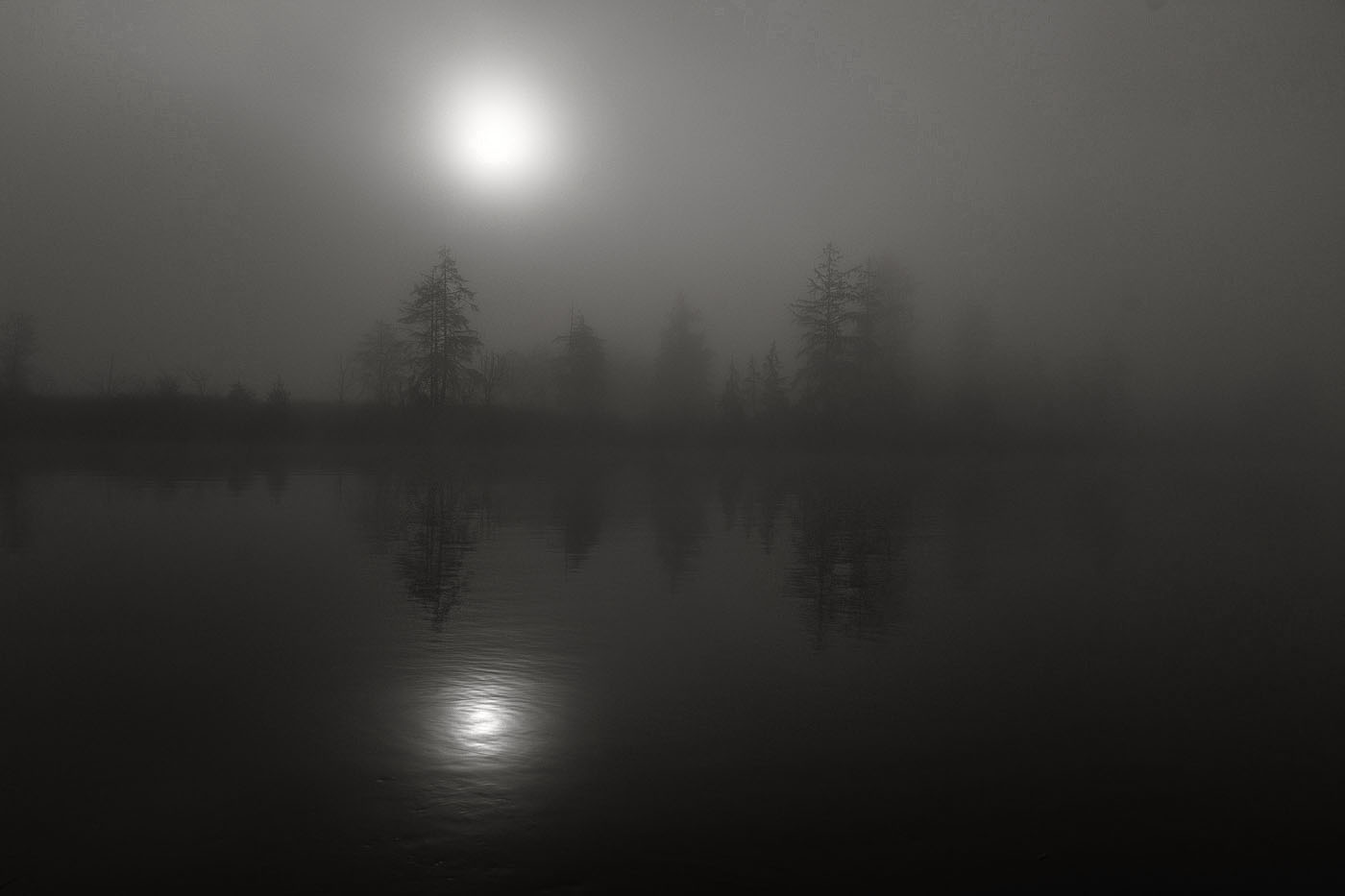
My comments echo Linda's, as I like the pure capture of the original. The scene immediately reminded me of Edward Steichen 1933 photograph, Moonrise: a scene where the moon is rising over a pond. However, like your Featured/edited version, Steichen created the piece via manipulation including the use of multiple negatives and hand coloring, though your work has far less manipulation, I suggest the original capture is a worthy composition, with some of the edits Linda suggested.
My posted version was created in Silver Efex Pro-3 and includes custom Silver-Copper tone and, like Linda, added detail, but I limited to just two or three trees and far less "detail" because I suggest the Impressionist interpretation of the original capture needs to be maintained, in my opinion.
A finishing touch would be printed on torn-water color type paper (or perhaps a bit smoother) and matte & frame with care. |
Jul 9th |
 |
1 comment - 1 reply for Group 99
|
33 comments - 48 replies Total
|


