|
| Group |
Round |
C/R |
Comment |
Date |
Image |
| 11 |
Jun 22 |
Reply |
Peter, first, some of the steps taken was because the image file was very low resolution, however, here is the process I used....
In Camera Raw (PhotoShop) I increased the exposure using both an increase in Shadow and Exposure sliders.
Still in Camera RAW, using Color Mixer, I (increase and/or decreased) "illumination" the colors in the marble grain to wash them out a little, but this is likely because of the low resolution.
The finishing technique is carefully "Burning" some of the brighter marble to bring out detail.
So in summary..."I over exposed, then carved some away to reveal texture". With a high resolution image I would guess, leaving out Color Mixer step is possible. |
Jun 27th |
| 11 |
Jun 22 |
Comment |
Hi Peter!
I really like this composition and the B&W treatment. Your version allows a lot of the Marble Texture to come through and adds to the overall attractiveness. I am not a believer about flipping scenes (most of the time) and this is another one where I feel your original orientation is fine. (I do however often flip pictures that are constructs using reflections from water).
Food for Thought: I was thinking about Edward Weston's still life compositions when looking at your work, and decided to try a lighter approach: see my example that is alternatively smooth, soft and extremely minimalist.
Your featured work is wonderful and I hope to see more like it in the future.
Lance A. Lewin
PSA B&W Photography Mentor
PSA South Atlantic Area Membership Director |
Jun 27th |
 |
1 comment - 1 reply for Group 11
|
| 50 |
Jun 22 |
Comment |
Hello, Cindy! Stopping by before we head into July...
This is a very contemplative frame: it is true, sometimes (when a scene is composed correctly) simplicity (a.k.a. minimalist approach) brings strong vibes and maybe even a narrative for the spectator to contemplate.
Indeed, here we most certainly admire the walls, lines, and textures more fully, then its color original. This particular architecture reminds me of the public schools I attended in Brooklyn, New York in the 60's. For me, seeing this picture is very nostalgic.
Perfect!
Lance A. Lewin
PSA B&W Photography Mentor
PSA South Atlantic Area Membership Director |
Jun 27th |
1 comment - 0 replies for Group 50
|
| 62 |
Jun 22 |
Reply |
...my pleasure....I exclusively use Silver Efex Pro for all my B&W conversions and even minor adjustments to scanned B&W images on film.
1. "Control Points" allow very minute adjustments to both large and small portions of an image.
2. Toning: the user has the ability to custom make toning hues/colors. I used my favorite mix of Copper and then reduced it towards a silver hue; hence, the Silver-Copper Tone in this example and most of my B&W images. |
Jun 27th |
| 62 |
Jun 22 |
Comment |
Hi Bunny!
A perfect scene that defines how we can find Art in everyday objects or those things in life we may see as austere, simple or plain. The B&W conversion is perfect! |
Jun 27th |
| 62 |
Jun 22 |
Comment |
Hello, Israel! Once again you show your wonderful skills and eye for composition in this very powerful scene!
ISO-6400 was perfect in capturing just enough detail and the entire mood of the ceremony. I will also say, of course you can always make this into a "portrait", but the then the powerful narrative is lost: this scene is all about the ceremony (and) the Monk.
I do offer a slight edit: in Silver Efex Pro I used a tool to selectively increase contrast and exposure on the dripping wax over the Monks hands; indeed, this is a powerful statement within the narrative you have created. I also used the same tool to add contrast just to his eyes and nose. Lastly, I added my custom silver-Copper tone.
Well done Israel! Again, fabulous work!
Lance A. Lewin
PSA B&W Photography Mentor
PSA South Atlantic Area Membership Director |
Jun 27th |
 |
2 comments - 1 reply for Group 62
|
| 74 |
Jun 22 |
Comment |
Hello, Don! Yeah, this is really a very good transformation to a dark, bold composition! The structure (placement of the sun glare and buildings) is wonderful!
The super bright glare juxtapose to the deep blacks is key in creating a lot of interest in this scene. I often look to the sun to add an abstract "prick", if you will, to many of my Intimate with Nature series of work.
Beautiful work! |
Jun 28th |
| 74 |
Jun 22 |
Comment |
Good day, Haru!
The composition very much sides with Japanese aesthetics within the realm of Wabi Sabi and other categories that reveal beauty within the objects we may not notice in are hurried pace, the austere, wilting or in decay. Do not be discouraged from continuing your quest to reveal beauty hidden within shadows, too.
The 9x16 crop is surely a very appropriate first step in presenting the work, perhaps a more narrow (such enjoyed within Hashira-e, for just one example. Follow this link to see other popular print sizing: https://www.artelino.com/articles/japanese_print_sizes.asp.) Keeping in mind the variety of crop-options available will allow you to capture nature scenes like this from a more diverse optic: your sense of visualization will expand, and thus your creativity.
What I call, "Contemplative Structure", spend more time and "work" the subject of interest longer. I suggest there is many decisive compositions within this most beautiful example of nature you present to us this month.
Lastly, search images captured by Nobuyuki Kobayashi for a fine example of low key nature compositions, and his eye for abstraction in nature.
Your work is beautiful; I hope to see more of these low-key, intimate nature scenes from you in the future.
Lance A. Lewin
PSA B&W Photography Mentor
PSA South Atlantic Area Membership Director
|
Jun 28th |
2 comments - 0 replies for Group 74
|
| 83 |
Jun 22 |
Reply |
Jon, that is very descriptive; after reading this, I now also smell the early morning air....which I did at the time of capture. Thank you for your thoughts. |
Jun 25th |
| 83 |
Jun 22 |
Reply |
Thank you, Mike!! |
Jun 22nd |
| 83 |
Jun 22 |
Reply |
...at least you had your camera...how often I have not, and missed.."The shot!"
It is a beautiful scene, Mike! |
Jun 22nd |
| 83 |
Jun 22 |
Comment |
Ally, what a lovely scene! First, I do like a lot of water surrounding the two subjects, many would have cropped closer. The water adds a key element in the overall appeal and the feather is an added component that keeps the viewer contemplating the scene longer.
As it relates to focusing, the right-side duck is less in focus and the only thing I can image is 1. using auto-focus can often reveal less than perfect focus, and 2. simply not focusing carefully: one trick is to open both eyes when focusing manually. Of course, even with 1/640 sec shutter speed, if the duck moves in a sudden way, this too will cause a very slight blur.
Of course, if you decide to print these lovely creatures, a smaller version will surely be a successful one! |
Jun 21st |
| 83 |
Jun 22 |
Comment |
Good day, Jon! Indeed, with the back story the featured work can be part of a series of images documenting the storm and its effect on coastal landscapes. The overall B&W treatment is appealing. Well done!
"Points to Ponder":
Alone, the work is a fine abstract-like composition and I suggest leaving out the details mentioned in your description. Alternatively, you can use a title that only reflects the finished piece: using a title that does not hint on the subjects location, but more about how the viewer may interpret the subject. Watching Ally's suggested video sounds like another good source for ideas.
I suggest, the foreground balances the skeleton of the trees. Perhaps more sky above the subject would also add to helping create interest. |
Jun 21st |
| 83 |
Jun 22 |
Comment |
Good morning, Tom! Simply beautiful composition! The tonal gamut is dramatic, fierce even, I like it with these particular trees! |
Jun 21st |
| 83 |
Jun 22 |
Comment |
Hi Mike! A lovely B&W Landscape and the two individuals bring interest, indeed. But also the overall balance of the foreground plants and large sky....I like that, too.
My only concern is though the foreground flora are prominent, they are out of focus: a common result when designing (framing) scenes like this. Here, the use of Hyper Focal Distance focusing would have helped greatly. 1. though difficult via hand-holding the camera in this light, HFD focusing could have worked, 2. while using a tripod and closing the aperture and using similar HFD procedures would allow even more focus of the foreground flowers: the reason this is so important in (this) composition is the fact the right-side flowers are balancing the upper-right sky. In this sense viewers' flow to each of these prominent points within the composition when contemplating the work.
Beautiful scene, Mike! |
Jun 21st |
| 83 |
Jun 22 |
Comment |
Debasish, though the Stagecoach Balloon is prominent near the top (or top-heavy) as Ally suggested, the 1. placement of the balloon (larger) ballon in lower-left balances it to some degree (as Tom eludes to) and 2. the very Stagecoach Prominence in itself makes the scene intriguing.
The B&W rendering is luscious in tonal gamut! |
Jun 21st |
| 83 |
Jun 22 |
Reply |
Good day, Ally...yes, and funny, a recent exhibition had Charcoal landscapes and I immediacy thought of these series of shots. Another reason for my interest in the history of art; as inspiration for photographic narratives. Appreciate your positive comments. |
Jun 21st |
| 83 |
Jun 22 |
Reply |
Hi Debasish....yes, "weather" is always a good friend to photographers! It really helped create the overall look or aesthetic in this sense. Thank you for your comments. |
Jun 21st |
5 comments - 5 replies for Group 83
|
| 87 |
Jun 22 |
Reply |
Bulletin Board: everyone, see my last response via the Bulletin Board. Thank you. |
Jun 22nd |
| 87 |
Jun 22 |
Reply |
A very arduous process, indeed! |
Jun 21st |
| 87 |
Jun 22 |
Comment |
Jennifer I am really impressed with your crop of photos from the workshop! I for one rarely shoot wildlife, but gee, this must have been hard!
However, I tend to position myself much loser to these types of subjects and from advice of other photographers never use a 'converter'. I use Prime 100mm, and 100-400mm; all my shots are Manual Focus, though I plan trying auto focus in the near future. : ) |
Jun 21st |
| 87 |
Jun 22 |
Comment |
Wow! Very neat imagery Cindy!
I like the advice Steve mentioned... that is, "pre-focus" using another object at a similar distance, but gee, that wold be hard in this case. Will brings up other concerns and advice...yes, practice makes perfect. : ) |
Jun 21st |
| 87 |
Jun 22 |
Comment |
Kudos to you for even seeing this lovely family gathering so far away....but I will confess the final image does not reveal as a successful one mostly due to the lack of crystal clarity in the subjects eyes. However, the featured work is a fine record of local bird activity and a welcomed prize within an assortment of family and travel imagery most perfect for a future photo album. |
Jun 21st |
| 87 |
Jun 22 |
Comment |
Hi Steve! I like this quite a bit! In fact I am about to embark on a photo-shoot at a local National Park where during a recent hike I found an area with similar subjects. Wonderful B&W rendering!
As Chan already brought up...a closer engagement to the subject would have helped; I also run into similar situations where I often back off so I can crop later: it is a very wise practice, but perhaps in the future you will capture two images, one a bit closer in case you decide to go the way of Abstract.
|
Jun 21st |
| 87 |
Jun 22 |
Reply |
See work by Helen Levitt (1913-2009) for another example, while work by Garry Winogrand has less of these supporting elements; Winogrand's work is intriguing because it is often hard to form a narrative...as such, I am not a fan of Winogrand's work! Even after buying and reading a book on his work..."The Street Philosophy of Garry Winogrand", I am not anymore intrigued with his style....another discussion perhaps for the future. |
Jun 21st |
| 87 |
Jun 22 |
Comment |
Each image by Cartier-Bresson includes a supporting element: the last image includes other people lying about, the boy is "obviously" walking and both his seemingly inappropriate attire and maybe haste invite narrative, and the three Sisters are looking out onto the vastness in front of them. |
Jun 21st |
| 87 |
Jun 22 |
Reply |
|
Jun 21st |
 |
| 87 |
Jun 22 |
Reply |
|
Jun 21st |
 |
| 87 |
Jun 22 |
Comment |
Street Photography: Well Chan, you have brought to the group an interesting subject and hence an engaging discussion.
Let me start at the end, with my reaction to your featured piece. The post-production Dodging is appropriate and being in color I suggest works very well. A B&W version may have helped bring (initially) more attention to the entire scene. (A project you should try and then share with the group in the future). I also must say, though I do not feel the vendor looking away is too distracting, it is also "not adding enough" (in the way of intrigue) to make me stay and study the scene. However, the scene is (interesting) and worth every dollar as a fine recording of local vernacular, indeed! Kudos for seeing and capturing the scene!
Chan, everyone, attached are examples of Henri Cartier-Bresson (1908-2004) "street photography" some you may have seen other not so much. These examples I am comparing to Chan's subject (or perhaps the vendor is just a supporting actor) in his featured image.
If we could have seen more space towards the vendors line of sight, viewers may have been "pricked" more forcefully. Instead, there is no object of interest that helps support the vendors line-of-sight that projects outside the frame: in this sense our reaction seems to be abruptly halted! The scene needed another artifact or "dynamic" to allow viewers to formulates some sense of intrigue.
In each of the sample images even when the subjects back is towards the viewer, we are "intrigued" by our ability to form narrative. In "street photography" we are always looking to frame a scene (mostly candid shots) that will allow viewers to stop them in their tracks... or maybe better said, make them come back for a longer look and contemplate the scene and form a narrative.
|
Jun 21st |
 |
| 87 |
Jun 22 |
Reply |
Hi Steven! This image of Isla is truly my all time favorite...really appreciate your encouraging words.
Yes, a good point, as you said, not seeing all the details allows viewers' to imagine.
Thank you, Steve. |
Jun 5th |
| 87 |
Jun 22 |
Reply |
Good day, Chan! Always enjoy your view or interpretations: No. The perfectly focused eyelids act as an anchor for the rest of the, as you state, otherwise very soft imagery, and moving for another angle was not necessary, as I was very satisfied with this one exposure as seen through the viewfinder (cropped, slightly tighter, to eliminate extra space on photo-right).
Indeed, the immediate vibe or reaction, or interpretation, should be one of "intimacy".
Alternatively, if we had seen more of the eye, I will suggest, the image would not be more or less of intimate, but perhaps seemingly more intrusive, as you mentioned. Excellent observations, Chan! |
Jun 4th |
6 comments - 7 replies for Group 87
|
| 92 |
Jun 22 |
Reply |
Lou, you may be also interested in a short article on DD-83 Bulletin Board.."Who is Commenting on Our work"?... posted on 8/22/2021.
Scroll down and read it and the comments; I suggest you will find the conversation to your liking. Let me know your thoughts. Ciao. |
Jun 26th |
| 92 |
Jun 22 |
Reply |
One more important element I forgot to speak of: the women in the foreground is a powerful anchor: the women both balances the male (in white pants) and the brilliance of the background, she also acts as a leading line and adds a bit of depth to the entire scene. |
Jun 26th |
| 92 |
Jun 22 |
Comment |
Lou, really appreciate your feedback...
In a lot of photography (and paintings) we are, more often than not, trying to create compositional Gestalt: in this sense, the artist is more interested in the "whole", rather than just individual parts within a given composition. (In fall or winter the PSA will publish an article I wrote on Gestalt theory). |
Jun 25th |
| 92 |
Jun 22 |
Reply |
...and if you slightly saturate the women's orange clothes it may balance (even better) with the guys orange shirt.
Example: In this Garry Winogrand shot, the yellow chair may be called by some as distracting, but instead, it anchors the rest of the picture. The guys orange shirt does a similar job in balancing the scene. Without it, well then the space the guys is occupying may be less than interesting and seem out of the main narrative. |
Jun 25th |
 |
| 92 |
Jun 22 |
Comment |
Good day, Chuck! Yes, will agree with the others the extra attention to having the workman really helped supply the component that helps make the image work. I also agree with Jill...about turning back the saturation of the pole. |
Jun 25th |
| 92 |
Jun 22 |
Comment |
Hello, Lou! The original capture is a very engaging and a contemplative scene! But let's talk about a few ideas that do not crop as much as you did....though the cropped image is engaging, there is an alternative version that hides elsewhere...
I suggest the original composition defines a more powerful one! Why?
As part of the allure of some street-photography is sometimes denoting the location: in these instances (and I suggest your work is one) defining a sense of "place" is most powerful in helping to form a narrative: use more of the surrounding space to help define a sense of place, including artifacts we first feel need to be omitted. (I gave a lecture on this three months ago).
In the original scene the background, including other people and architecture, very much help to define a sense of place. (I cropped it a little to pull out the van and bottom-left cone and left the rest).
I actually Dodged the background to help illuminate it, as apposed to shunting its details. With all this, these women are a strong supporting anchor; the subject, is in fact the the entire scene. A vernacular record that imbues a lot of feeling, emotion and the often busy activity of most New Orleans streets. Great capture, Lou!! |
Jun 25th |
 |
| 92 |
Jun 22 |
Comment |
Hi Beth! Gee, the crop and exposure to both chromatic and overall exposure is awesome! The photograph works well and would be wonderful as part of a photographic essay on this part of Mexico and the effects of Covid...that an idea.
Alone it works just as meaningful; a delightful spray of colors within the balance of supporting artifacts in the scene. |
Jun 25th |
| 92 |
Jun 22 |
Comment |
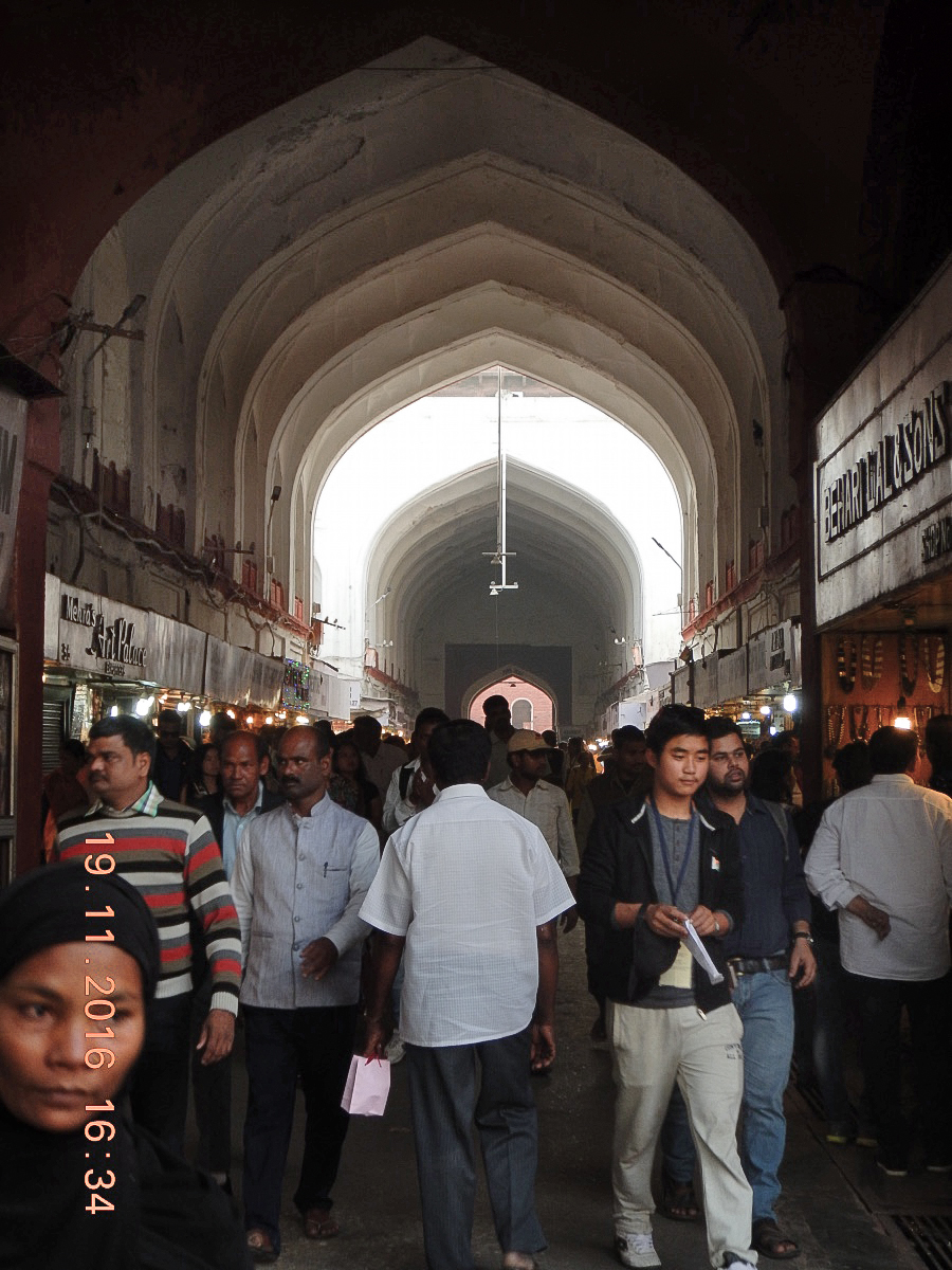
Hello, Ian!
Kudos to you for the well captured for an overhead shot! Really a wonderful image the records local vernacular quite well!
Next, I especially like the blown out background, it really helps the viewer feel the sense of being in this section of the enclosed market. I see you took this out and also added a lot of exposure to the dark areas; I suggest another version would maintain this darkened space, as it really does create a wonderful narrative, along with the bright background. The attached sample (I left the the time/date stamp as we can easily see my edits through them) illustrates this more dark approach. How do you feel about these particular ideas?
The process included Dodging the ceiling and foreground shoppers and neutralizing the red hue some. |
Jun 25th |
 |
| 92 |
Jun 22 |
Comment |
Hi Jill! Very cool capture! Guess the guy will never know he was, for a moment, being checked out from all the other "fish" in the sea! |
Jun 25th |
| 92 |
Jun 22 |
Comment |
Hi everyone, thought
I would drop by just as end June reviews; I look forward to hanging out here!
Visually, the B&W aesthetics are beautiful and very much add to the overall composition. The work is beautiful!
I will echo Jill's words, perhaps a quick step to one side or the other may have helped separate the water tank from the light post, but by and large the image still feels pleasant. However, I wish we were able to read "Luck Strike".
Again, though in a lot of street photography settings getting off the shot quickly is key to success, other times it is better accomplish by waiting, changing position, including bending or sitting on the ground. If you have access to this location throughout the year, this may be a fine project to go back and try it again. Perhaps in winter the tree will be void of leaves, for one possible alternative. |
Jun 25th |
7 comments - 3 replies for Group 92
|
| 99 |
Jun 22 |
Comment |
Good day, Randy! Just passing by before we get into July and saw this well composed Street Scene.
I agree with your inclusion of the student deciding to take a break; her obvious lack of participation with the others works as a counterpoint (gentle) distraction I suggest helps make the composition so interesting. I keep coming back to see what each student is doing, and including the student that seems out-of-it.
Here's my thoughts on the Omega sign: Burn it a little, and instead Dodge the image of the Watch in the window. Using Silver Efex Pro you will be able to fine tune its exposure, contrast and detail; with subtle changes to bring it more prominence, it will help balance the student leaning against the glass window frame. Intriguing work, Randy. |
Jun 27th |
1 comment - 0 replies for Group 99
|
25 comments - 17 replies Total
|


