|
| Group |
Round |
C/R |
Comment |
Date |
Image |
| 8 |
May 22 |
Comment |
Good day Alastair! Upon seeing this image I immediately referenced Maier work...I saw an exhibition of her color work in a private gallery in Atlanta last year. Quite the story surrounding her life.
The featured image is absolutely balanced in every way....and I do mean from the point of creating a narrative...or perhaps better said, a contemplative image. I hope you bring more of your early work to this page, and wondering if you plan to begin shooting like this again, either digitally or via film stock? Can you elaborate on the book you are writing? I am currently inside 4 years of research for mine. Thank you, Alastair.
Lance A. Lewin
PSA B&W Photography Mentor
PSA South Atlantic Area Membership Director |
May 3rd |
1 comment - 0 replies for Group 8
|
| 15 |
May 22 |
Reply |
Good day, Kirsti....you could join the (Free) B&W Photography Mentorship program where we could discuss almost anything related to developing or improving techniques. It is not just about B&W photography. The program does not have a minimum length, but usually does not extend past 3 months.
If you are interested, please reach out to the Director of the program Sanjoy to move forward: ssg2801@gmail.com. Talk with you soon, Kirsti.
Lance
Lewin.author@gmail.com |
May 12th |
| 15 |
May 22 |
Comment |
Hello Kristi!
First, this is a stunning capture of your Granddaughter contemplating life....you captured the feeling, emotion and pure beauty of her soul: no, I am not overstating the fact, it is just that lovely. Period.
The original has the subject off-centered and in many cases this is OK in helping to define a sense of "place", but the close-crop really is what we need here, as such it is perfect.
The (slightly) bright aesthetic very much complements the subjects expression and her white or off-white attire: in this sense I suggest the "illuminating" look is well designed, and I especially like the highlights in her hair. I hope this is printed on 100 percent cotton rag, matte and frame and displayed proudly in your home. (You may enjoy my granddaughter in DD-87 March Round).
Lance A. Lewin
PSA B&W Photography Mentor
PSA South Atlantic Area Membership Director
|
May 10th |
1 comment - 1 reply for Group 15
|
| 16 |
May 22 |
Reply |
My pleasure. : ) |
May 12th |
| 16 |
May 22 |
Comment |
Good day Joan! A scene often not given the proper attention or contemplation, but instead you captured what is referred to as "Yugen", one a a few Japanese aesthetics, like Wabi Sabi, for another example. Yugen can be thought of as...'where ones imagination takes over or goes beyond what are eyes and brain see...'
I will also suggest the original (crop) captured through the viewfinder serves this aesthetic more: the original scene is well balanced and includes more open or empty space in which the viewer can wonder, contemplate and imagine; here the open space defines a sense of "place". Hoping to see more like this from you...perhaps early morning fall or spring hikes in nature may provide similar opportunities to bring Yugen through your lens.
Lance A. Lewin
PSA B&W Photography Mentor
PSA South Atlantic Area Membership Director
|
May 12th |
| 16 |
May 22 |
Comment |
Hi Terry!
The featured image is lovely and for the most part I feel it imbues a sense of intimacy. But I have several "Points to Ponder".
The 1/1000sec is too fast a speed for the lighting: in this case, though the scene may have been lighter in real-time, the onboard CPU always determines exposure on the brighter areas, so more darkening of the shadow (where the boy is standing) will result.
Of course, choosing higher ISO, or adding exposure-compensation, or even fill-in Flash would likely solve this issue, and perhaps with a larger aperture, too. As such, the original is too dark and an extra amount of exposure adjustments are necessary. Your edit is great, but I suggest more "Dodging" of the large feet to bring them more prominence as it is vital to the narrative you are after. In my opinion, having the boy look away makes the composition more candid. It also adds to the boy/giant narrative as they could be imagined they are both looking at the same thing.
In the end, you saw and captured this lovely, and likely fleeting moment of pure joy.
Lance A. Lewin
PSA B&W Photography Mentor
PSA South Atlantic Area Membership Director
|
May 10th |
2 comments - 1 reply for Group 16
|
| 40 |
May 22 |
Comment |
Good day, Andrew! I always enjoy the play between light and shadow and here you have combined aspects of both Abstract and perhaps the seeds of narrative. Some notes for your consideration:
You describe removing peripheral objects, some of them may have defined the shadowed objects more clearly (within its space), thus presenting more narrative into the piece. Maybe not, but something to consider on (some) compositions like this. I would have loved to see the clothes-line more prominent, for one example. Just a thought for an alternative compositional structure. I look forward to seeing more like this from you.
Lance A. Lewin
PSA B&W Photography Mentor
PSA South Atlantic Area Membership Director |
May 3rd |
1 comment - 0 replies for Group 40
|
| 62 |
May 22 |
Reply |
Well, its a pleasure to see this type of work from you...through the months it is evident you have a fine eye for compositional structure. |
May 5th |
| 62 |
May 22 |
Comment |
Good day, Israel! Quite a spectacular service, indeed!
ISO-4000 seems perfect in providing just enough detail in virtue of the relatively fast shutter speed (with a steady hand).
Simply, the B&W conversion is perfect: the super rich blacks and the smooth medium grey tones are perfect, in my opinion: the final B&W conversion is bold, and allows only some near-field details while continuing the illumination of the main subject. I love this composition!
However, I would have preferred you did not use "Agfa" layer. I suggest, 1. a little noise from the high ISO, and 2. the mere smearing of light within the church (seen clearly in the color image) would suffice in maintaining a similar look.
If you want enjoy the benefits offered through film, then try shooting in film. I feel a lot of the work I have seen you complete would also be wonderful shot on film stock. (Note I use Silver Efex Pro-3 for all B&W conversions, though I also shoot 60 percent of my work on film). Just a thought.
Lance A. Lewin
PSA B&W Photography Mentor
PSA South Atlantic Area Membership Director
|
May 3rd |
1 comment - 1 reply for Group 62
|
| 74 |
May 22 |
Reply |
...yes, absolutely makes sense. I like you thinking the scene through before capturing it. Where was this captured? Thank you, Haru. |
May 3rd |
| 74 |
May 22 |
Comment |
Simply beautiful composition! Yes, I feel the depth, the air, mist, tropical humidity while looking at this scene. The sense of "place" has been well achieved.
Question: why is this a 3-photo merge? Why could you not get this scene with the 24mm as a single exposure? (Though I will say, getting complete front-to-back Dof would be a challenge, but not impossible).
Thank you, Haru!
Lance A. Lewin
PSA B&W Photography Mentor
PSA South Atlantic Area Membership Director |
May 2nd |
1 comment - 1 reply for Group 74
|
| 83 |
May 22 |
Reply |
....and I do recognize and appreciate your feeling, I perhaps interpreted....'it feels unsettled to me'... as a scene that repulsed you, instead of inviting you in. It is always nice to hear that I have inspired thinking outside the box in someones creative process. Thank you, Jon. |
May 23rd |
| 83 |
May 22 |
Reply |
Good day, Jon and thank you for your thoughts....
The photo is actually presented in the proper plane relative to my flat position and the subjects awkward one. I do not share the uneasiness you feel, but the image does provoke my senses: I am looking to find beauty in subjects often perceived as ugly or unworthy of a second look.
Yes, you are the second person to ask about the "Cold" look and indeed it is opposite of how it appeared in real-time: that is, "Warm". I am still struggling with the presentation, and it is not too often I present Monochrome examples of my work. But, like you suggest, does add to the complex nature/narrative. This is definitely something I need to examine before making a final print. Again, appreciate your pointed questions and critique. |
May 23rd |
| 83 |
May 22 |
Reply |
Really appreciate the lead to Alice Austen. Though I do not see her (work) as avant-garde, I do appreciate her ability to record some of the best vernacular based work I have enjoyed, including those captured by Walker Evans. I look forward to reading more about her in the coming weeks. |
May 16th |
| 83 |
May 22 |
Reply |
Looks spectacular! |
May 16th |
| 83 |
May 22 |
Comment |
Indeed, Welcome to the group, Ally! Great to have you here!
I need to visit this area, actually, I need to spend some quality time in your neck of the woods, as I only enjoy a small footprint there. This a very fine example of presenting local vernacular; it is fun to look at and entices the viewer to see more.
Sorry, Mike, Ally, the digital "frame" must go! LOL! Very tempting, and I also used it on a few of my pieces several years ago. However, I do agree, for purposes of showing an example of an actual matte and frame piece, adding a fake gallery frame is worth while for demonstrations purposes.
"Points to Ponder": some simple nick-picking... I would like to see more of the top edge of the mountain....and contrary to what Mike mentioned, I am very much all about keeping peripheral artifacts in a scene (for the most part) so I would not worry it artifacts come into play, some can be used to support the overall narrative: so, backing up to capture more of the distant hill/mountain could prove to be a good thing... I like the toning, but would go back and experiment with both Dodge & Burning specific parts of the composition to bring out a bit more contrast/detail: see the sample posted where I spent 7 minutes strategically applying Dodging and Burning.
The difference from the featured work is more, but subtle detail; I mostly "Burned" certain parts.
(DL to your CPU and view both for side-side comparison).
Beautiful work, Ally! |
May 15th |
 |
| 83 |
May 22 |
Comment |
Happy Sunday, Jon! I like the whole scene!
Yes, we can bring down the distant brightness, but I must suggest, only very little. Why? I feel the powerful illumination really sets the stage for the carriage to be in silhouette: this feature highlights the overall composition, including the contrast between the bright background and the structure. This a fine composition, Jon!
Though Debasish attempts to bring this illumination down (and I agree it should be) I feel it is too much. I suggest we need to maintain a great deal of the "contrast" between light and dark to allow the full artistic nature (in a natural way) present itself.
So, in PSCC "Burn" the bright areas gently using these settings: 1. small brush with 5 percent for Highlights, then, 2. continue with 5 percent for Mid-tones on just the darker portions within the bright area. The result will allow for large screen (and print viewing) without stress and keep the highlights strong enough to maintain the reasons in the aforementioned comments.
Perhaps Debasish can do the same using his described method. |
May 15th |
| 83 |
May 22 |
Comment |
Mike...Larry's portrait is simply marvelous! (And I bet he likes it, too!!)
Tack Sharp: I always mention this...when capturing both human and animal portraits, most important is to keep the eyes (or at least one eye in certain compositions) crystal sharp! Even if the rest of the image is blurred or surrounded by lens bokeh, a sharp eye will more often than not, make the work a "keeper".
Alternatives to this advice is work within the realm of the avant-garde. (e.g., 19th century photographer, Julia Margret Cameron, comes to mind. Google her work if you are not familiar).
|
May 15th |
| 83 |
May 22 |
Reply |
...if you want...it would be cool to see your color version, you can post a (1040px longest side and not more than 700kb) size photo in the comment box. |
May 15th |
| 83 |
May 22 |
Comment |
Debasish, I must echo Ally's words, the tonal gamut does a fantastic job in presenting this amazing landscape to spectators.
As important, the tree poses to create narrative: in this sense we stop, see this grand landscape, but then stay to contemplate the tree clinging for its life in the ever eroding space it is rooted.
Though low resolution, it appears both the background and our foreground subject are in focus: is this accurate? If so, what focusing technique did you use, or "where" did you pin your focus? |
May 15th |
| 83 |
May 22 |
Reply |
Happy Sunday, Debasish! Good question....
Simply, I feel it best added highlights to the composition.
I first tried my regular Copper-Silver custom tone, but I wanted to extract more in helping to engage the viewer. Alternately, (see attached), a slightly different composition from the same photo shoot: this one I moved ever so slightly to get sun-glare in the frame: this final is finished with the custom Silver-Copper tone. With a properly matte and frame it would work, too. I think?? |
May 15th |
 |
| 83 |
May 22 |
Reply |
Hi Ally, yes, and for me this was more processed than I usually care to do, but here it is. This is something we can discuss later, as well. |
May 10th |
| 83 |
May 22 |
Reply |
....you bring up important topics: 1. how do we learn to "appreciate" art, and 2. in so many words, you are referencing..there are as many interpretations as there are viewers of any particular piece of art. Indeed.
However, you also elude to, 3. the fact that each spectator has a particular agenda (or simply a certain fondness) to certain art, or in this case, specific types of photographic art (e.g., portrait, basic landscape, abstract...). As such, that person approached the art with a certain bias, as it were. All this is Ok, and my comments to your critique hopefully reflect my clarification of my "purpose" or "intent" to present a certain photographic composition.
As it relates to "appreciation", this is something I feel may be a good topic for our next Bulletin Board discussion. |
May 10th |
| 83 |
May 22 |
Reply |
Hi Mike. Very good talking points: Though the process is (slightly) reminiscent to alternative developing processes, most popular in the late 19th century, that was not my intension. Also, I agree, in a different type of composition, allowing more space around the subject would define the location, this again is not the intention of this composition: instead, I am focusing on the "abstract" sense within these very familiar objects: to pull back and allow the spectator to see more of the surroundings would then constitute a different compositional structure, and one that would be viable, but perhaps not as engaging. Thank you for your comments. |
May 9th |
| 83 |
May 22 |
Reply |
Good day, Jerry. Really appreciate your comments...this type of work was inspired through the Japanese aesthetics of Wabi Sabi: seeing beauty in the understated, and within common place objects and scenes we normally do not give a second look.
As you comment, indeed, it can be about making sense and order from chaos. As a project, perhaps you will begin the process of passing by this area "Woodlot" at different times of the day and weather in search of engaging subjects for composition.
|
May 6th |
4 comments - 10 replies for Group 83
|
| 87 |
May 22 |
Reply |
Thanks for stopping by, Debasish! Yes, the slightly muted waves looks really good! |
May 25th |
| 87 |
May 22 |
Comment |
Hello, Cindy! Another beautiful, calming scene! I really like this...and do suggest a custom 22x8 crop, matte and frame to complete the work will highlight our subjects and the space they live. (These types of narrow crops (and framing) are inspired through Japanese aesthetics). |
May 15th |
 |
| 87 |
May 22 |
Comment |
Happy Sunday, Jennifer!
As Chan mentioned, the Abstract feel goes well with the subject; where the water is closely resembling the gators body....very interesting! Yes, 16x9 is well suited for this shot...I also suggest, if the original allows it, more open water in front of the gator.
Great work with limited tools! |
May 15th |
| 87 |
May 22 |
Comment |
Happy Sunday, Dale! There scene imbues tranquillity...and this is really beautiful to gaze at.
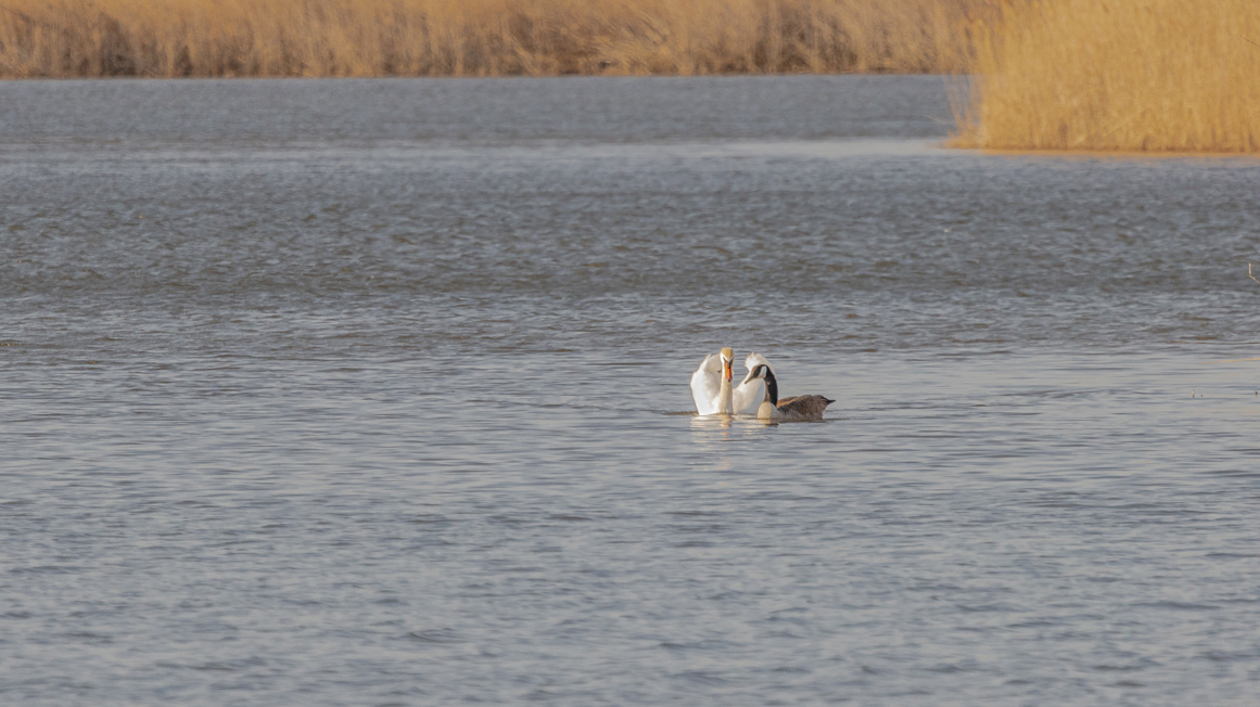
I also will echo a lot of what Steve is speaking about: some notes; ISO800 was not necessary, where ISO100 would keep digital noise to a minimum. My observation makes me believe the focus was on or close to the subjects as both foreground and background are out of focus or within the limits of Dof; a very noticeable characteristic on most zoom lens. For this reason I thought a 16x9 crop may help accentuate the whole scene. |
May 15th |
 |
| 87 |
May 22 |
Comment |
Gee!!! First, it is a wonderful image of this most amazing pieces closest to our own! As Will stated, the lighting is marvelous! Now wait!! This was accomplished with ISO10,000 !!!! OMG! The Humanity!
In 2011 was the first time mentioned to a class I was teaching...' in the near future camera companies will be marketing how amazing their onboard CPU's are, and less about how many Megapixels...' seems we are here. Great shot, Steve! |
May 15th |
| 87 |
May 22 |
Comment |
Steady Hands, indeed! The ISO2500 has surely captured the soft and intimate nature of this most solemn space. This crop is needed to move the image from documentary to more within the realm of art (even though many documentary images can be interpreted, also, as art).
"Points to Ponder": However, I must suggest, a tripod would go a long way in making the image even more clear in virtue of 1. no movement and 2. allowing for a faster shutter speed, but at least (2.) could have been accomplished with a much higher ISO.
Thank you for sharing this lovely image, Chan! |
May 15th |
| 87 |
May 22 |
Reply |
Happy Sunday, Barbara! Thank you for stopping by....
The work does (and suppose) to imbue calmness; calmness we may feel when observing the night sky or a stroll in the plein-air. Work like this is inspired through my continued studies and practice of Japanese aesthetics. The element of water always acts as a natural catalyst for presenting images with sense of softness, even painters aesthetic we interpret as calming. |
May 15th |
| 87 |
May 22 |
Reply |
Hi Chan! Yes, the work can be a bit absorbing...please, read my comments to Will.
The work on the DD83 group page is completely different of course: there, a common object is focused and framed per my artistic likes and then, not common to most of my other work, a bit over processed, but that only means I used extensive Dodge & Burn, contrast tools, and Polarizing effects, No Layers or other pre-sets were used. |
May 15th |
| 87 |
May 22 |
Reply |
Happy Sunday Will, everyone! Appreciate your comments....
Yes, I think that is a viable option, and I tried it and think it is Ok. however, because the image is basically cropped through the viewfinder I will sacrifice a small portion of the trunk and right-side of composition to do this. My intentions was to allow the bottom row of of assorted flora to represent a base, or ground.
After one hour of visualizing the landscape I viewed a few peculiar visual reflections which inspired the Alternative Reality narrative. The finished work is a result of flipping the image 180 degrees and carefully adjusting color and hue for most natural chromatic effect. |
May 15th |
5 comments - 4 replies for Group 87
|
16 comments - 18 replies Total
|


