|
| Group |
Round |
C/R |
Comment |
Date |
Image |
| 3 |
Apr 22 |
Comment |
Making my rounds across all the groups and stopping by to comment: my immediate reaction to viewing Michael's featured work was, indeed, one we can tag as digital art or perhaps better categorized as a "photographic hybrid". In PSA terminology, "Creative".
The visual appearance, its "hyper-reality aesthetic" was Obvious: here, we are clearly looking at work the PSA defines that will fit neatly in the "Creative " digital dialogue groups. (Go to any Creative Group page and read the Description). But it is true, so I am told, that local clubs can often modify rules, and thus make creating photographic art an even more arduous endeavor....as this can leave students of photography with unclear or conflicting ideas, concepts and techniques, as well, leaving photography-artists less confident in their work, their abilities. Actually, these sentiments come across my desk throughout the year.
But maybe there is another avenue for creative goals: focusing towards creating art for the sake of Art.
As a result, I suggest a more definitive sense of ones artistic style or at least, finding a sub-genre (e.g., creative, digital-art, classic-era portraits and landscapes...the list can be extensive...) an artist feels most comfortable in exploiting, will provide a richer, if not more complete version of their artistic goals.
This has been, and will continue to be, a source of deep and contemplative discourse. I look forward to continuing the conversation. You can also reach out to me via PSA or Lewin.author@gmail.com
Lance A. Lewin
PSA B&W Photography Mentor
PSA South Atlantic Area Membership Director
|
Apr 5th |
1 comment - 0 replies for Group 3
|
| 6 |
Apr 22 |
Reply |
My pleasure, Charissa. |
Apr 7th |
| 6 |
Apr 22 |
Comment |
Hello, Jim. Upon initial view, it seems there is a focusing issue: The featured "compositional structure" (or design) appears to indicate the main focus point should have been the yellow flower. The focus point should have been dead center....and with F/5.6 opening, would have slowly decreased Dof (or created Bokeh) increasing outward from that point.
If more of the flower and accompanying droplets (and the lower left droplets) suppose to be, also, in focus, then a smaller aperture would need to be used, along with very careful choice of focus point.
It is an exercise I often come across in a lot of my own flora portraits, and always seem to capture more irregular images then I thought I did when reviewing in post-production. I try to maintain a "checklist", especially when using my 100mm Macro, to avoid issues we are discussing here.
Thank you, Jim.
|
Apr 7th |
| 6 |
Apr 22 |
Comment |
Good day Charissa...indeed,photographing engaging images for the food industry can be an arduous process. However, by this image seems you are a fast learner...very delightful aesthetics.
"Points to Ponder"
Though I can appreciate the off-center design, however, without for example, a related cooking utensil sitting in the open space in the featured orientation, I suggest the current off-center setting does not work effectively.
Instead, perhaps a folded napkin and cooking tools or a handful of peanuts (to maintain "elegance") can lay in the open space, alternatively, two or three unopened candy pieces, either example to present a more complete narrative. Of course, we can eliminate the white space, and shoot a Centered portrait.
Lance A. Lewin
PSA B&W Photography Mentor
PSA South Atlantic Area Membership Director |
Apr 7th |
2 comments - 1 reply for Group 6
|
| 9 |
Apr 22 |
Reply |
...I'm sorry, your description mentions.."shutter varied in the 5 HDR exposures". How and why did the Shutter Speed vary between all 5 exposures?
Thanks, Bill. : ) |
Apr 9th |
| 9 |
Apr 22 |
Reply |
...and after the one exposure...what about the other 4? Thank you. |
Apr 8th |
| 9 |
Apr 22 |
Comment |
Hi Bill! Stopped by when I saw this lovely landscape....the featured work is pretty in virtue of the wide range of colors and textures, including the main subject sitting on its pedestal, as it were.
Questions: why did you not take a single exposure? Why capture this scene with the elaborate workflow described? This said, why did you change shutter speed for each of the (5) exposures; would not changing focusing points be more effective, especially since you are capturing this wide landscape view.....look forward to your insights. Thank you, Bill.
Lance A. Lewin
PSA B&W Photography Mentor
PSA South Atlantic area Membership Director |
Apr 8th |
1 comment - 2 replies for Group 9
|
| 10 |
Apr 22 |
Comment |
Mark...I love this! From a pure technical standpoint, I appreciate the fine (natural) detail in the water, and including the color....from a structural point of view, I may want to crop just a bit more, from the top-right corner...but just a little..if at all.
In any case, it is a very viable water-abstract that looks delicious!
Lance A. Lewin
PSA B&W Photography Mentor
PSA South Atlantic Area Membership Director |
Apr 10th |
1 comment - 0 replies for Group 10
|
| 11 |
Apr 22 |
Reply |
..interesting...so, can you share what the settings were for each of the 5 exposures? Thank you, Henry. |
Apr 5th |
| 11 |
Apr 22 |
Comment |
Allen, this is a fine subject for B&W and your framing and processing is really excellent! The green filter was used very well, a lot of people never use them at all, and they are actually a great set of tools in Silver Efex Pro.
If I make only one suggestion, I sometimes take my color image into Color Efex Pro and apply a ND filter over the sky to see if it helps bring out more "form" with cloud formations as you have here: I use it carefully, but can assist in B&W conversions. Just a thought. |
Apr 5th |
| 11 |
Apr 22 |
Reply |
....yes, this looks good Stephen. |
Apr 5th |
| 11 |
Apr 22 |
Comment |
Good day, Henry! Great eye to see this wonderful play between light and shadow, I really like scenes like this, and you have captured a really engaging perspective to show it off. Questions....
When you say 5-shot composition, both How, and Where did you focus the lens and which, what I call camera dynamics, did you use other than the F/18 and very slow 1/15sec, if changes were made. I can only assume the 5-shot technique was used to maintain focus from one end of the hall to the other? (Other variables that come up in this scenario/conversation would be using hyperfocal distance techniques).
Look forward to your feedback. Thank you, Henry. |
Apr 5th |
| 11 |
Apr 22 |
Comment |
Happy April, Jim, everyone!
Oh, yes, the original composition is absolutely wonderful! Don't change a thing!
I especially like the snow that acts to balance both the sky and the IR (illuminated) trees...perfect!
|
Apr 5th |
3 comments - 2 replies for Group 11
|
| 14 |
Apr 22 |
Comment |
Goo day,Tom! Passing by and was surprised to see the amount of work done on the original capture for this presentation. Very intense, robust and full of action...a very engaging example of what I often refer to as "Photographic Mixed Medium" or otherwise hybrid-photography. This image would also be relished in the DD-Creative groups.
Wonderfully created!
Lance A. Lewin
PSA B&W Photography Mentor
PSA South Atlantic Area Membership Director
|
Apr 7th |
1 comment - 0 replies for Group 14
|
| 16 |
Apr 22 |
Reply |
My pleasure. |
Apr 13th |
| 16 |
Apr 22 |
Comment |
Good day, Joan. Gee, what a striking Fine Art Photograph.
Well conceived and developed!
Lance A. Lewin
PSA B&W Photography Mentor
PSA South Atlantic Area Membership Director |
Apr 8th |
| 16 |
Apr 22 |
Comment |
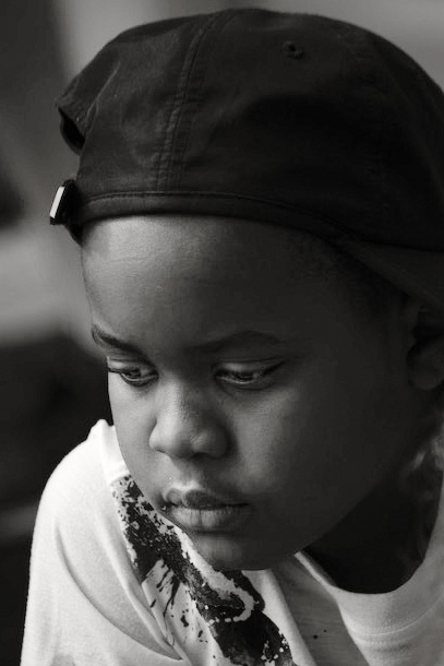
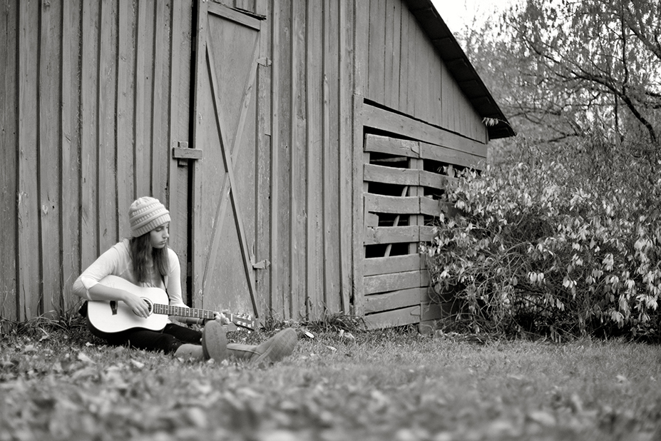
Hi Terry! Passing and was intrigued by your portrait.
The particular aesthetic is something we use to see in Magazine Ad's several years ago, and brought criticism for its Hyper-reality aesthetic or narrative. However, in the last three years I have seen photography-artist implement this type of "artistry" outside of commercial use and into galleries. Of course, this alternative creative style is also a very viable option, and recently adorned the walls of a local museum in Georgia with an exhibition by Photography and Writer, Randy Bacon: "The Road I call home".
Though the effect is dramatic, bold, it does not portray authentic and natural characteristics of sitters: instead of capturing the soul or essence of the subject, it is seemingly, injected into the subject.
But, for a moment, allow me to echo Steven's words and feelings: indeed, you seem to have a fine instinct, and artistic eye to search, see and then capture unique personalities, sometimes only noticed fleetingly, as you have done here in capturing this young man, but we also feel there is a lot of room within the original capture to reveal an authentic personality. I too, did a couple of revisions (very low resolution) and posted a BW example. So much more can be done, but this is just a sample. I look forward to continuing this conversation.
Thank you, Terry.
Lance A. Lewin
PSA B&W Photography Mentor
PSA South Atlantic Area Membership Director |
Apr 7th |
 |
2 comments - 1 reply for Group 16
|
| 17 |
Apr 22 |
Comment |
Hi Sheldon! Well, by the looks of this image, my impression is that the image was either framed through the viewfinder, or maybe cropped in post production, both of which are techniques we enjoy in photography. Visualizing this Art, as it were, was well conceived and captured.
Otherwise, the exposure and color look authentic enough, even if you had to adjust these in post-production (e.g., Dodge and Burning, for example).
In summary, I really like the interactions between lines, shapes, light and shadow! Bravo on a particularly fun piece to study. |
Apr 5th |
1 comment - 0 replies for Group 17
|
| 31 |
Apr 22 |
Reply |
What a wonderful history....hope you enjoy this fine piece of workmanship.
I look forward to having stop by. Thank you, Ella. |
Apr 5th |
| 31 |
Apr 22 |
Comment |
Ella, I love collecting (new) watches, and the Hamilton is a sweet piece...the photograph is stunning and worthy of any high-end commercial use!
Is this a new or old family pocket watch? Beautiful piece! Thank you, Ella. |
Apr 5th |
| 31 |
Apr 22 |
Comment |
Good day John! Gee, quite the engaging scene...on my large screen it is mesmerizing! Allow me to comment, a bit refreshing to see a less-contrast interpretation, where it would be tempting to crank up more blacks: though both interpretations are viable options, your softer, or lighter interpretation is relaxing and mates well with the subject, indeed.
Lance A. Lewin
PSA B&W Photography Mentor
PSA South Atlantic Area Membership Director |
Apr 5th |
| 31 |
Apr 22 |
Comment |
Good day, Peter...a very beautiful image that emphasizes light and shadows and a wonderful range within the BW tonal gamut. It is also a fine example of Hybrid Photographic Art or what I refer to as "photographic mixed medium".
Stunning creation!
Lance A. Lewin
PSA B&W Photography Mentor
PSA South Atlantic Area Membership Director |
Apr 5th |
3 comments - 1 reply for Group 31
|
| 32 |
Apr 22 |
Comment |
Happy Friday, Stephen! I'm making my early rounds across all the groups and stopped by to admire this lovely Perspective....you have a great eye and especially for capturing architectural designs. More than once we have been privy to your use of light and shadow to bring beauty to a scene many would have passed by.
I did however make a change in how the final piece was edited: I manually Dodged and Burned many select areas in PSCC and also did my best to diminish the heavy vignetting (or lesser known, barreling) framing the scene. BW conversion was also accomplished manually via Silver Efex Pro-3 and added a custom Copper-Silver tone. Did the best I could (with the low resolution file) but hopefully you see the differences in the two presentations: one more bright, but still maintaining the center glow of the sun and your BW version that interprets with darker tones.
"Points to Ponder":
I applaud you for not deleting the people, and in fact I "Dodged" them to give them prominence: why? Because if we are to keep them as part of the overall composition, it is better to at least show we are not trying to hide them. |
Apr 1st |
 |
1 comment - 0 replies for Group 32
|
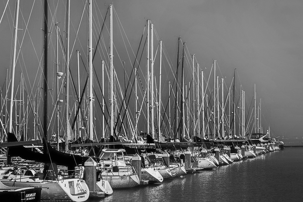
| 62 |
Apr 22 |
Reply |
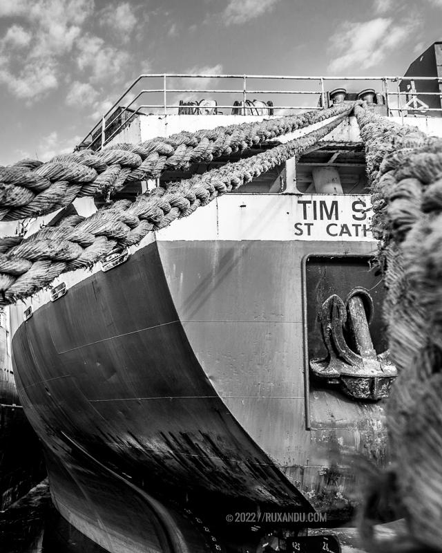
...yes, bunny, but I was thinking we still need to keep a portion of the right-side ropes to maintain Nick's perspective that elicits the interest and power in the image.
It is why I like the original even better, in the original even more of a sense of "place" is revealed, and in my opinion added even more to the story.
Both are viable alternatives, however. |
Apr 5th |
 |
| 62 |
Apr 22 |
Comment |
Good day, Nick! A striking photograph is both a construct in presenting the subject, and most of the time, how it is presented to viewers: you most certainly enjoy a creative eye in seeing this rather complex and very engaging "nautical" scene, and I am referring to the original scene through the viewfinder.
What I refer to as "compositional structure" is all about proving enough space (and supporting artifacts) to create a narrative. Though most Abstracts do not follow this rule, and for obvious reasons, and even though your Featured work entices the viewer into an interesting perspective, I will suggest the original frame works a lot better and should be your focus, at least on this particular photograph.
Technically, and for the most part the original crop (composition) is well balanced, except for the excessive blur of the out of focus rope (due to the foreground being outside the Dof range), as such, I suggest cropping just a little off the right-side of the original print and then convert it to a BW rendering. I feel there will still be enough of the scene intact that offer viewers a terrific composition/narrative. Thank you, Nick.
Lance A. Lewin
PSA B&W Photography Mentor
PSA South Atlantic Area Membership Director |
Apr 2nd |
| 62 |
Apr 22 |
Reply |
...yes, this opens the view more....thank you, Oliver. |
Apr 1st |
| 62 |
Apr 22 |
Comment |
Happy Friday, Emil....another view many may have past by in their hurried pace: the perspective and overall (original) composition is well balanced, except maybe not waiting for the car to pass: for the photographer, patience is a virtue, indeed.
"Points to Poner"
The Original frame is a prime example of a well executed composition presenting local vernacular: in other words, maintaining peripheral artifacts, we may otherwise think need to be removed, are in fact the source in completing a narrative. As a BW photograph it would still imbue a great sense of fine art, as does the featured work you present here.
Thank you, Emil.
Lance A. Lewin
PSA BW Photography Mentor
PSA South Atlantic Area Membership Director |
Apr 1st |
| 62 |
Apr 22 |
Comment |
Good day, Israel...stopped by to admire this lovely landscape.
First, it is refreshing to see a composition through a more natural lens, as it were; less digital presense, for example. The toning is appropriate, but since this not a film based composition, would omit the frame.
The original includes more space in front of the left-side tree grouping and this is much better; it seems adding the "frame" covered this area. I suggest the piece will work as well (perhaps better, in my opinion) adding back the space (or area) in front of the trees. Thank you, Israel.
Lance A. Lewin
PSA B&W Photography Mentor
PSA South Atlantic Area Membership Director |
Apr 1st |
3 comments - 2 replies for Group 62
|
| 64 |
Apr 22 |
Comment |
Hi Jerry! First, I was first attracted to this photograph for its simplicity: not sure if the crop is square, but should be...now let me join the technical discussion:
1. it is true, the image would be acceptable with all the sun-drenched areas of the moon in perfect focus: Why are they not?
2. as mentioned above, I would always use a tripod no matter the speed for this type of long-lens shot, and engage "mirror-up" as John suggests.
3. can you help me understand the...'flexible-spot focusing' ...as opposed to manually focusing for this shot? Is this where focus issues materialized? Thank you, Jerry.
|
Apr 22nd |
| 64 |
Apr 22 |
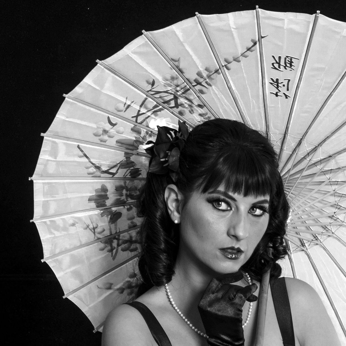
Comment |
Don, this photograph is stunning! Most important when the human (or wildlife) define a scene, the eyes are perfectly focused! The super Rich Blacks and Details are luscious! Beautiful work!!
Alternative Presentation:
If you do not mind, I keep focusing on the models face and her gaze to her right: see my alternative crop that brings her beauty front and center, while I off-set the umbrella: the left-side black balances the models hair and eyes, the white umbrella acting as a supporting visual structure.
|
Apr 5th |
 |
| 64 |
Apr 22 |
Comment |
Hello, Hellen! You continue to see these often missed opportunities to find art in nature, most, barely hiding in our view, but we tend to pass it by....Well captured and presented!
Idea: try re-cropping with 9:16 ratio, start from the top of image, cropping at the bottom. Just a thought. Ciao. |
Apr 5th |
3 comments - 0 replies for Group 64
|
| 76 |
Apr 22 |
Comment |
Ian, I love this image!! I am a dedicated fan of IMSA (and other Global) sports car racing! (Ladies, so is my wife...just saying.....).
Ian, it is a very important technique you just described, how you set up and pre-focused in the spot (or space) the subject will cross. It is a technique not often discussed or known within 21st century photography, and happy you bring it up here. Your action packed shot just reminded me its an F1 weekend in Australia, but you already know that! Thank you, Ian!
Lance A. Lewin
PSA B&W Photography Mentor
PSA South Atlantic Area Membership Director |
Apr 8th |
1 comment - 0 replies for Group 76
|
| 83 |
Apr 22 |
Comment |
Happy Sunday, Jon! You have described exactly what this type of image suppose to convey: creating a sense of "place" which helps define narrative. As you say, you start at the subjects face, then move all over, then back to the singer. In this regard the viewer is suppose to take in, not just our singer, but also absorb all that is around him.
As you say...'it is all needed to set the scene and provide the mood'. "it" being all the artifacts within the subjects space that define him, his location, and indeed helps the viewer feel the mood or perhaps, seemingly experience this particular event.
The lights were very powerful and very much "pricking" the scene, as such, I try to convey this as well. Appreciate your thought-provoking comments, Jon. |
Apr 17th |
| 83 |
Apr 22 |
Reply |
Hi Mike...and one of the reasons it was a bit easier in this shot, the color lights illuminating part of his face, and reacted well when put through color filters in Efex Pro-3. Hope that makes sense.... |
Apr 8th |
| 83 |
Apr 22 |
Reply |
Hi TJ, appreciate you stopping by... Many of the Flaws you suggest were actually implemented on purpose as Creative Elements, not Flaws: Creative-Flaws, as it were.
As such, it might be a bit misplaced to suggest as a "blanket" comment that we use to try and take out aberrations such as Grain and Flare in the wet darkroom...as this was only for subjects that needed modifications for those photographers who made mistakes in choosing the wrong film or not aware of Flare and Ghosting through their viewfinder the particular subject did not need or the artist wanted...I have done that quite often myself. (Of course, this is evident as seen within the wide array of films, from very fine grain, to ones that produce coarse grain and dramatic contrast: a vast variety of artistic possibilities).
The reason onboard CPU's are getting better to eliminate digital noise, is all about making better signal-to-noise ratios. Period. This is why NIK software from the very start added dozens of Film-like presets, so these types of "characteristics" can be added back into an artists composition. Unfortunately, many photographers are not aware, care, or realize the positive affects Noise can have on a well visualized digital composition: so, it has nothing to do with eliminating film-grain like characteristics, it is all about making a better functioning machine. (I can't image a manufacture not improving the CPU processing to maintain a certain amount of Noise for artistic reasons...though that would have been a cool option via a button!). Just saying.
21st Century photography-artist do indeed, as you pointed out, look to re-introduce these various film-like characteristics, but most are being accomplished via presets or other AI software. My methods of teaching reintroduce many 20th century techniques that can employ these "characteristics" from behind the viewfinder, or in post-production, in a fashion similar to those in the wet darkroom. Thank you, TJ. |
Apr 7th |
| 83 |
Apr 22 |
Reply |
Yes, this is more towards my suggestion. Very nice. But here is how I feel when I see these beautiful sailing vessels....see attached version which lessons the dark vignetting while I bring, even more, prominence to the Whites.
Both are viable options, indeed! |
Apr 6th |
 |
| 83 |
Apr 22 |
Comment |
Hi Tom! Well, at first glance we have a very fine art portrait of this most lovely Horse. Either the animal was in this position for some time, or you had a lot of patience and waited for this perfect pose, regardless, well seen and processed.
I do have a comment on the high ISO used to capture this photograph: first, why did you choose such a high ISO? Also, is the resulting "texture" added or due to the high ISO, it appears to have large-particle noise (or layer)....I like the outcome, but interested how the texture is so dominant over, seemingly, the entire scene.
In the end, a lovely Fine Art piece. Thank you, Tom. |
Apr 6th |
| 83 |
Apr 22 |
Comment |
Hello, Jon. Very soothing image....pleasant, serene.
Kudos! For visualizing these shapes, and the interaction between light and shadow. Someone in a less, artistic frame of mind, would have never saw this abstract of serenity. |
Apr 6th |
| 83 |
Apr 22 |
Comment |
Good morning! A rather interesting perspective, but I feel it is missing something: perhaps if the scene can be re-processed to illuminate more detail or at least, make the Whites more prominent and thus evoke more of the abstract feel I sense in this image. Thank you, Debasish. |
Apr 6th |
| 83 |
Apr 22 |
Comment |
Good morning! The scene is vibrant, active and is illuminated in soothing (rather than stark or dark) tones. A fine example of recording and presenting local vernacular. Well done! |
Apr 6th |
5 comments - 3 replies for Group 83
|
| 87 |
Apr 22 |
Reply |
...yes, and of course, I am suggesting putting the camera in Shutter Priority prior to encountering the subject. |
Apr 13th |
| 87 |
Apr 22 |
Reply |
"Points to Ponder": (great talking point Steve)
It is interesting how in Life ('a day in the life...') we are so familiar with the many artifacts, mostly, small, lesser interest, but nonetheless common elements within the larger scope of any landscape or event that do not hinder our appreciation for such scenes or events: until you mentioned the wires in Jennifer's image, my eyes and brain automatically inscribed them into the scene as normal consequence of urban vernacular. Upon viewing this spectacular scene again, I had to find the wires, but still was not effected by them.
Seeing and worrying about objects like these wires have never been an issue in photography, many from the masters of both the 19th and 20th century, like Walker Evens work, for one example.
In my opinion a lot of Fine Art Photographic Images are designed around the belief only pure, clean, balanced, or otherwise unobstructed subjects can be deemed fine art; I suggest, instead, add to the recipe for creating narrative in many compositions. Not all, but something we should not try to delete or discount as 'baggage' in ones composition.
In the past, the rules of photographer included being aware of the background within the framed scene through the viewfinder: if it was being infiltrated by a particular artifact not appropriate, then the photographer moved their position, or at least moved the camera, perhaps change a lens. Thank you, everyone. |
Apr 13th |
| 87 |
Apr 22 |
Reply |
Hi Steve! Happy Spring! Appreciate your view of this image...and yes, will take a look at the slightly bright area as you suggested, as in an enlargement may very well amplify. |
Apr 13th |
| 87 |
Apr 22 |
Reply |
Well thought out, Chan...appreciate the advice! |
Apr 7th |
| 87 |
Apr 22 |
Reply |
Good day, Chan! A very relevant criticism, indeed. As such, I hope you like this alternative better: cropped to delete some of the foreground while maintaining the open space of the featured piece. Appreciate your alternative view. |
Apr 7th |
 |
| 87 |
Apr 22 |
Reply |
Understood, Will....very interesting experiment. Hope you continue to develop the technique and present the group with what you come up with...perhaps related subjects, but captured at different times and locations. It would be fun and educational to see what can be done with the use of digital in-camera multiples.
The only time I have used these features on my 5D Mark II is doing trick photography: where resulting shot sees me looking at myself as we seemingly sit side-by-side. Thank you, Will |
Apr 7th |
| 87 |
Apr 22 |
Comment |
Hi Cindy! This is a wonderful opportunity for you, and you have done well in capturing the essence of this beautiful space. |
Apr 6th |
| 87 |
Apr 22 |
Comment |
Hi Dale! Gee, what a lovely spray of colors to frame this young man. Nice you were able to be far from him and thus capture his natural expression. Everything about the composition is beautiful, including only a touch of vignetting, where overuse is more commonly seen in many types of photography nowadays.
I must comment on something that should be part of your checklist, as it were , when photographing moving objects, humans, wildlife..... being sure that Shutter Speed become your Priority: in these types of action photos it is vital eyes and / or facial features are in perfect focus, (unless some type of abstract aesthetic is part of the design).
In the case using your image, at least 1/250sec or even better, 1/350sec should have been a (minimum) Shutter Speed value manually dialed into the camera, using "shutter priority" mode on your camera. Turning up the ISO to 800 is fine, and would help the camera use a smaller aperture. As a result of your 1/160sec in the featured work, an enlargement will show less than adequate clarity. As a small print or screen projection, however, the image works satisfactory, indeed. |
Apr 6th |
| 87 |
Apr 22 |
Comment |
Hi Will! Well, while I appreciate your interest in experimenting with different ideas and techniques, in this example, no, it does not replicate anything close to "Impressionism". Perhaps the technique can be used with a different subject, or perhaps a different crop, in which case the intended aesthetic will come through.
I use in-camera multiples with my film camera, here I am developing avant-guard compositions. On another note, my work does do not have the precise, clear and seemingly automated presentation in your featured work. As such, can you elaborate on your entire process? This will be a great topic. Thank you, Will. |
Apr 6th |
| 87 |
Apr 22 |
Comment |
Hi Jennifer! Very cool perspective (as Stephen mentioned). Very dramatic! The high contrast aesthetic works in these types of architectural subjects (though not the only one) and you finished this fine art presentation rather nicely.
Interesting you mentioned not using autofocus, and as a matter of fact, where did you focus your lens? Thank you, Jennifer. |
Apr 6th |
| 87 |
Apr 22 |
Comment |
Very creative, Chan! Though not an example of Japanese art (or aesthetics) the work is a well thought out design, nonetheless. I am glad some of our discussions on alternative ways to present work helped you design this month presentation.
Some notes: to properly present this type of work (separate sheets or panels) and, we can assume, side-by-side, I suggest they maintain a constant size. In this respect, these three separate frames will not work. Alternatively, grouped in a similar fashion as the featured work, I can see this as a viable option, but keeping them closer together, in my opinion.
One other item....the frame that includes the hat is not a good perspective. It appears you were not (on top) of the selected items, and therefore this frame does not work. Look closely and you will see this frame interferes with the likeness and (easy on the eyes) aspect seen in the other two; the one I question is skewed. Thank you, chan! |
Apr 6th |
| 87 |
Apr 22 |
Reply |
....my pleasure. Thank you for stopping by, Stephen. |
Apr 2nd |
5 comments - 7 replies for Group 87
|
| 99 |
Apr 22 |
Comment |
Hi Linda! My wife and me recently walked past this spot on our way to listen to jazz...very neat town! Your edited composition very much transmits what this structure offers its visitors. The weather helped in providing a very even light, but killed a lot of the shadows: however, your post-production work and BW rendering helped reveal hiding shadows. Nice piece! |
Apr 9th |
| 99 |
Apr 22 |
Comment |
Hi Barbara, hope you are well! Another fantastic transformation that hardly resembles the original model. The resulting Glow is unique and I like this a lot...with so many people trying their hand at this type of creative photographic art, it is very important to think hard and design a "look" or emotion that you can call your own. Your featured flower portrait reveals an almost "Rembrandt Glow".
Well done! |
Apr 9th |
| 99 |
Apr 22 |
Comment |
Hi Michael! Let me see....when I look at this image I see and feel a sense of calmness encased within something exuberant! Is this possible? I say it is...a very creative photographic hybrid that easy elicits emotion and perhaps a certain amount of energy from spectators'. Well designed and presented!
|
Apr 9th |
3 comments - 0 replies for Group 99
|
36 comments - 19 replies Total
|


