|
| Group |
Round |
C/R |
Comment |
Date |
Image |
| 5 |
Mar 22 |
Comment |
Good day, Candia! Passing by saw this stunning image....my first thoughts echo Oliver Morton, on initial view was thinking a studio (photographed) Abstract. In this case, maybe a title like..."Architectural Abstract Study: The Broad"...would better identify the piece.
In any case, your visualization skills and artistic eye have created a formidable study within Black & White Photography. Crisp, sharp, with rich blacks and super whites....lovely composition.
Lance A. Lewin
PSA B&W Photography Mentor
PSA South Atlantic Area Membership Director |
Mar 17th |
1 comment - 0 replies for Group 5
|
| 10 |
Mar 22 |
Comment |
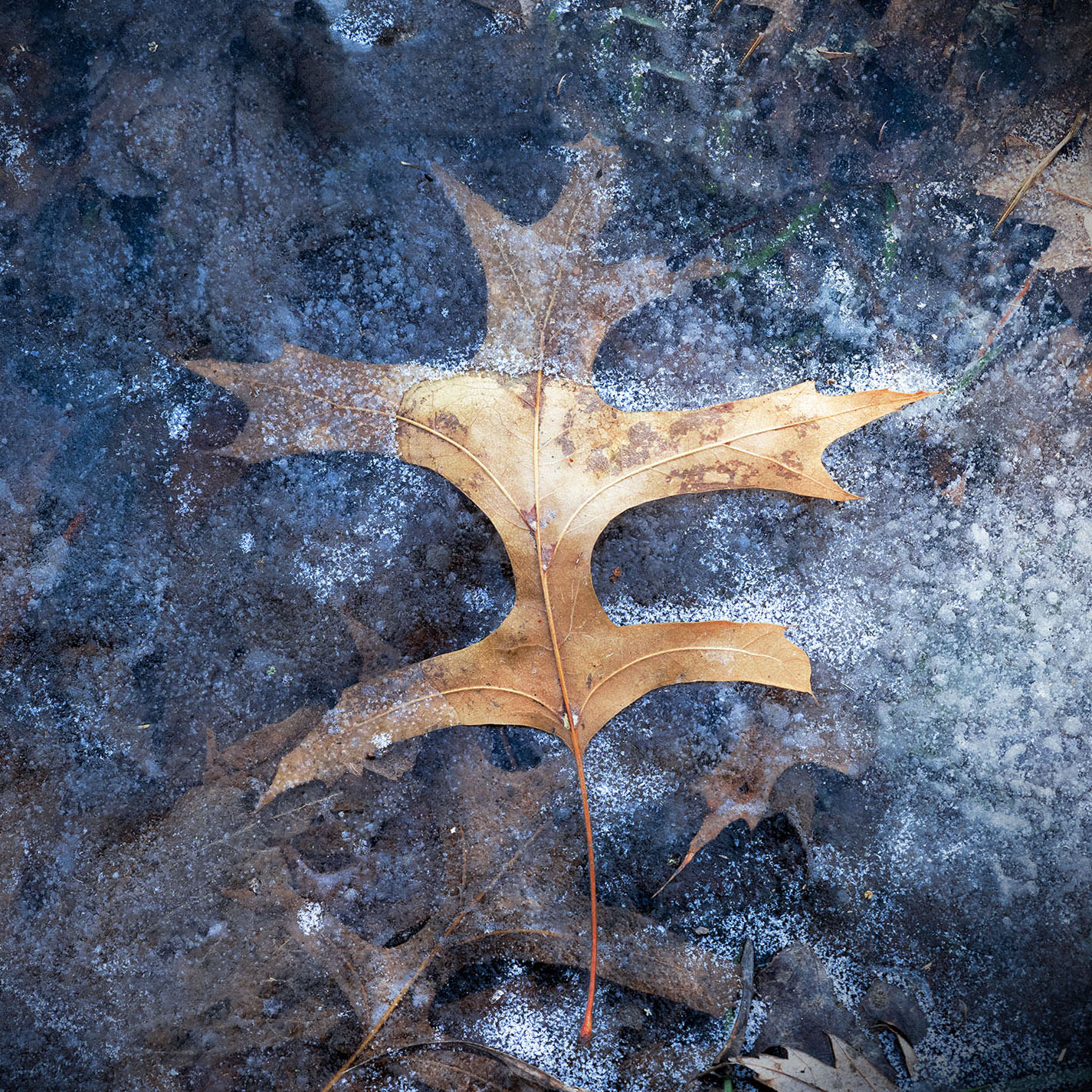
Good day, Carrie! Passing by saw this lovely winter scene....and my interpretation falls more on the featured work: here, the glowing leaf seems very deliberate, as it is frozen in place by these wonderful multicolors of Winter-Earth.
In my opinion, the exposure is fine; you have maintained the leafs prominence. My only suggestion, reframe the as a Square composition and center the leaf. It is not always advised to center subjects, but I feel this composition will work better in a square format. Ideally, perhaps a lot more space around the leaf may have been better, but the current work will prove to be an absolutely beautiful framed piece. (See my suggested square format)
Lance A. Lewin
PSA B&W Photography Mentor
PSA South Atlantic Area Membership Director |
Mar 17th |
 |
1 comment - 0 replies for Group 10
|
| 11 |
Mar 22 |
Reply |
....I was aware we were looking up, but that commentary still does not alter my sense of perception....I think its a really neat effect or better said, sensation. |
Mar 25th |
| 11 |
Mar 22 |
Comment |
Hi Peter....your featured work is actually very intense! Every time I look at it I feel like falling! It is a very well conceived and captured/cropped abstract-like composition.
The entire power of this photograph lies in virtue of the space surrounding the people: I suggest, the people are not the subject, but part of the the whole story or how the abstract narrative is being created.
My only critique on exposure, keep more of the "white" on the walls: the featured work is blending too much with other grays and it is loosing its part in this play as a supportive actor, if I may. |
Mar 24th |
| 11 |
Mar 22 |
Comment |
Hi Jim...loving this scene....and the IR aesthetic works very well here, as Allen already commented.
But other then a special custom crop to take out (just a little) of foreground grass, I suggest, the trees that fill the right-side in the original are kept: in my opinion, the further identification of the space (the location) increases the sense of "place" and thus your interpretation of abandonment. In this scene (and within your planned narrative) a larger portion of empty space beyond the subject/s, can offer more contemplation for viewers'. |
Mar 24th |
2 comments - 1 reply for Group 11
|
| 47 |
Mar 22 |
Comment |
Hello, Jeff. Stopping by after I saw this very engaging abstract study....
The Final Crop is perfect. This is a good lesson on pulling back and capturing more around a particular subject (or interest) and then fine tuning in post-production. The play between light and shadow are well developed (and authentic) in the final B&W rendering. It is very clear you visualized these various interactions of luminosity (which you also eluded to in the description) and consequently, stopped and made the effort to capture the scene. Bravo!
Lance A. Lewin
PSA B&W Photography Mentor
PSA South Atlantic Area Membership Director |
Mar 26th |
1 comment - 0 replies for Group 47
|
| 53 |
Mar 22 |
Comment |
Good day, Brenda! Just passing by your group page and saw this lovely scene.....the work is well composed and allows viewers to see what we often miss in our hurried pace.
I love the use of backlighting and you did well to utilize the many aesthetic benefits it can provide. I too, use Silver Efex Pro and was wondering if during post-production you experimented with different color filters to test the effects they may bring to your subject? Look forward to continuing this conversation. Thank you.
Lance A. Lewin
PSA B&W Photography Mentor
PSA South Atlantic Area Membership Director |
Mar 26th |
1 comment - 0 replies for Group 53
|
| 59 |
Mar 22 |
Comment |
Good day, Hans! Passing by and saw this most interesting (outside of box) perspective! First, Kudos for thinking outside the box, a trait as photography-artists, we must learn to do more often to create engaging compositions from behind the viewfinder.
Though I also like Issac's crop, I mat be convinced your wider view is better in virtue of allowing viewers' to get a sense of "place" and thus help identify or create a narrative. I look forward to continuing this conversation. Thank you.
Lance A. Lewin
PSA B&W Photography Mentor
PSA South Atlantic Area Membership Director
|
Mar 26th |
1 comment - 0 replies for Group 59
|
| 64 |
Mar 22 |
Reply |
Thank you, John. : ) |
Mar 25th |
| 64 |
Mar 22 |
Comment |
Love this wildlife portrait, Stan...and another use of lighter grey-tones...refreshing to see another work not fixed on heavy contrast: the picture is striking and suggest will look stunning with the proper matte & frame combination.
Technical: if I did any adjustment to contrast, as a means to make more separation between the subject and the background, it would be adding contrast or just Burning the main subject, ever so slightly, in my opinion. Thank you, Stan. |
Mar 24th |
| 64 |
Mar 22 |
Comment |
A very beautifully executed photography, John! The water looks luschious within the surround grey-tone gamut....it is refreshing to see work without heavy contrast...lovely composition!
Technical: I have a question, data shows you used F/22 (was this the F-stop on all three HDR images?). I say this, as the color original is not as sharp as one would expect a scene like this to be, captured with a small aperture. If this was captured with just one shot, then a cause may be where the point of focus was: in this case, the hyperfocal distance focusing techniques would have solved the focus/Dof deficit I see in the color original.
But taking 3 images of the scene (with F/22), I would assume this, too, would maintain clarity/focus throughout. Your insights are appreciated. Thank you, John. |
Mar 24th |
| 64 |
Mar 22 |
Comment |
Hi Helen. Stopping by as I saw this dramatic landscape - overall tonal gamut looks well balanced, and mostly clear. I was surprised to hear you replaced the sky: your description of the issue in the original sky is pretty much a case of "Posterization". We see this once in a while on TV screens, too.
As it pertains to photography, there are a few very good tools to fix this effect that is sometimes caused by low bit rate or overexposure; sometimes it looks worse on one persons screen and perfectly fine on another. I have experienced Posterization from time to time and just selectable Dodging the area can reduce the effect. |
Mar 24th |
3 comments - 1 reply for Group 64
|
| 76 |
Mar 22 |
Comment |
Happy Friday, Trey! I too, enjoy searching and finding the amazing artistry within the space of frozen lakes, ponds and creeks, they offer a wealth of beauty for those willing to go out in the cold and venture carefully across the rocks and sometimes frozen moss. The featured work, from a compositional or structural point of view is well conceived. But allow me to offer critique/comments regarding the scenes capture.
Assuming you are using a tripod (and in this particular situation, it would be highly recommended, especially using a 200mm lens) the small F/22 aperture should have helped in gaining better clarity within the scene by offering a deeper Dof. But the most important points within the frame are not clear. Why? One main reason is choosing your focus point, especially when small apertures will likely result in slower shutter speeds (and here you state it was 1/5sec) which is very slow. Yes, it will "soften" the water, but it can also blur details from camera shake or improper focus points.
"Points to Poner"
If your intentions were to soften the water (or blur the water) then a better choice would have been to choose a specific "shutter speed", and not circumnavigate the process through a small aperture. In this way you can better control the movement of water or create an effect of rushing water (and only in the case if the water is moving with some type of velocity). Very still water will not give the best results for obvious reasons.
I look forward to seeing more of this series of work from you, you most definitely have a creative eye for these types of compositional abstracts. I hope we can continue the conversation. Thank you.
Lance A. Lewin
PSA B&W Photography Mentor
PSA South Atlantic Area membership Director |
Mar 25th |
1 comment - 0 replies for Group 76
|
| 83 |
Mar 22 |
Reply |
Oh, yes! I like this so much better....it stands firmly on its own (aside from the added clouds). Very balanced, engaging, and prompts viewers to form narrative. |
Mar 15th |
| 83 |
Mar 22 |
Reply |
...and that is a very viable point.... |
Mar 15th |
| 83 |
Mar 22 |
Reply |
Hi Debasish.
Well, it is very evident the color image is not clear enough in the background. This brings up a host of technical questions. 1. with an F/6 aperture, where was your focus point? 2. I will suggest, a scene like this would greatly benefit by using hyper-focal distance focusing technique, something we have discussed in DD-83 in the past, and again in my DD87 group.
With the mountain range having less than critical focus (or detail) processing it can sometimes (actually, quite often) deteriorate the scene more. I think we are seeing this in there BW conversion.
Remedies: not sure if careful "sharpening" will fix this (meaning to sharpen the image while still a color file). Sharpening can only go so far to fix unfocused details. (Another technical aspect that causes lost of detail in distant objects is pixel or aperture diffraction, but with F/6, this can't be an issue, but something to be aware of if using smaller apertures past F/9).
|
Mar 14th |
| 83 |
Mar 22 |
Reply |
Very strong and viable points, indeed, Gerard.
Though I agree that sometimes reality does not offer the best "engagement" or "appreciation" for spectators, as photography-artist, I hope we try not to go too far beyond the normal, or beyond those virtues that traditionally anchored photography as a proprietary genre of art. Here, the photographer can "enhance", as we speak about in my featured work. I only ask we maintain an authentic canvas, unless we decide to move beyond, and enter the realm of hybrid-art and / or what I call (or categorize) as "photographic mixed media". "I do not object to retouching, dodging or accentuation as long as they do not interfere with the natural qualities of photographic technique". 20th century art critic (and close to Alfred Stieglitz) Sadakichi Hartmann (1867-1944).
However, we are not painters, (a completely different genre of art), and even more different from artists who carves and cuts into stone, instead, our canvas is seemingly already painted, and shaped, and modeled, as such, it is our responsibility, as photography-artists, to search, compose and expose the Art other do not see in their hurried pace. As such, our art can even be seen as most difficult to obtain.
"Art is hidden in nature, and that he, who can tear her out of it, owns her" 16th century Artist Albrecht Duer. |
Mar 14th |
| 83 |
Mar 22 |
Comment |
My feelings echo Tom's as the structure elements seem well organized, but must make a critical comment on what I see as "over processed": the mountains do not look natural or real. Is this because the work is very low resolution, or attributed instead to focus or over processing in post-production?
The resulting image shows a kind of melting of tones and details within the mountain.
Alternatively, if the original image file does not have the mountain in perfect focus, post-processing could then add this melting and degradation of detail even further.
If you want, can we see the original file and work from there? |
Mar 13th |
| 83 |
Mar 22 |
Comment |
Tom, this is a well visualized and presented composition, and especially from a "structural" orientation. The work imbues the qualities most desired within the narrates of local vernaculars: I hope you consider, if not already, to continue a series of work like this.
However, allow me to make one further critique: either remove altogether, or lessen, the barreling or vignetting; I suggest this composition sits firmly on an already solid foundation. Just a thought. |
Mar 13th |
| 83 |
Mar 22 |
Comment |
Good day, Mike!
A very creative "photographic mixed medium" that brings a certain and most definite narrative to the subject. Well visualized and creative from a digital-creation perspective. Are you also a member of the "Creative" Digital Dialogue group? You may very well get more focused (technique based) comments there. (You are allowed to be a member of more than one DD group).
|
Mar 13th |
| 83 |
Mar 22 |
Reply |
Hello, Gerard, and thank you stopping by...yes, indeed, bringing more contrast or darker tones to the mountain would perhaps reveal them more prominent, but I decided to go with this, "closer to reality" interpretation: 1. it comforts me, and 2. seems everyone "darkens", and I want to present something different, but still engage the viewer.
I feel, to a certain degree, spectators are trained on what to see, or better stated, what aesthetic to appreciate; I for one try to break this model by offering work a bit less processed. This is not to say I abandon the High Contrast aesthetic altogether, and indeed enjoy its attributes to presenting beauty on many different types of compositions. (For another example, see the work of 20th century Landscape photographer Bob Kolbrener, where all work is presented with little or no editing). |
Mar 13th |
| 83 |
Mar 22 |
Comment |
Appreciate the positive comments! Thank you, guys! |
Mar 13th |
4 comments - 5 replies for Group 83
|
| 87 |
Mar 22 |
Reply |
....I very much appreciate your encouraging words. Thank you, Chan! |
Mar 25th |
| 87 |
Mar 22 |
Comment |
Hello, Jennifer.
Kudos in seeing this "Abstract", I feel most would not venture towards creating a piece like this, so I applaud your efforts.
However, I feel the subject is not working as good as it could: though you used F/16, a small aperture, Dof is shallow enough that the background steel (as that what it appears to be) is out of focus. I suggest this one attribute interferes with the Whole of the composition. This could have been remedied with more careful focusing, and of course using, "hyperfocal distance" techniques to (maybe) achieve a different more cohesive abstract. (I also mentioned this to Dale in his featured March photograph).
On another note, I like the use of ISO1250 as this may have added noise which helped give the scene just a bit of grit, or at least it may if this piece was eventually presented in an enlargement. Why did you choose ISO1250? Thank you, Jennifer. |
Mar 18th |
| 87 |
Mar 22 |
Comment |
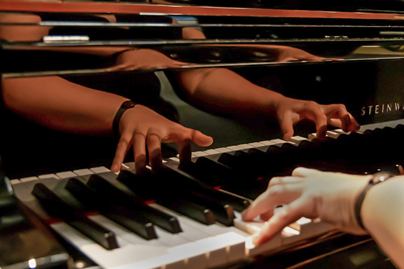
Hi Cindy. Love the fact you have a great eye (creative eye) to see what most people will not in their daily lives: one of the many benefits of creating artistic visual displays with the camera is its ability to get close and find these interesting (Macro) subjects, within a subject, as it were.
I feel with ISO12800 is the reason the hands are so bright, but a quick "Burn" like Steve did does the trick. Why did you choose such a high ISO setting, or was this in Program Mode?
I posted an alternative version for you to contemplate. Here, I am bringing more of an Abstract-feel by getting in closer and Exposing the Beauty within a more narrow window or frame, as it were.
Editing: included the following: precise Dodge and Burning in PSCC and in Camera RAW adjusted the yellow and orange colors to help calm down the musicians hand, while increasing luminosity in the reflected hands. In affect, adjusting these colors (in this way) acted like Dodge & Burning. |
Mar 18th |
 |
| 87 |
Mar 22 |
Comment |
Love this, Will! Very creative! As Steve said, Kudos for not centering the image, as such, the work is so much more engaging. I particularly enjoy the texture that is being created....it is creating "depth".
And yes, this was similar to Steve's work last year. |
Mar 18th |
| 87 |
Mar 22 |
Reply |
....and considering your vision for this scene, your narrative, this makes perfect sense, indeed. Thank you for pointing this out to me.
It is indeed a learning process: I often stress to make a "check list" like pilots do when going out into the field. This will help photographers get in certain habits. |
Mar 16th |
| 87 |
Mar 22 |
Comment |
Hi Dale, let me speak on both structure and also some technical points:
1. seeing and deciding to capture this structure was well conceived. I like that fact it is not centered, but in fact, centering could have also been a viable option (wondering if you took this perspective, too). It is a very calming and lovely scene.
2. we need to talk about the settings that do not make a lot of sense: why ISO800 on a bright and sunny day, even if the foreground structure was in shadow, it is not necessary. The higher ISO invites a small degree of "Noise" though todays cameras seem better at keeping this at bay. In any case, ISO-100 would have provided the default setting for this camera and the least amount of digital noise: this can become a factor if the resulting image is displayed as a large print, where screen projections are not prone to exhibiting small irregularities.
The F/11 setting is OK, but focus was not precise as the distant trees are out of focus, and for a composition like this (and with these settings) one would hope for a crystal clear background. F/11 should have been OK to keep a lot of the foreground and background in focus: here you are also controlling the Depth of Field (Dof). This brings us to the focus point: we may need to use "hyperlocal distance" techniques for more accurate focusing. In other words, where you focus is critical. A combination of F/11 and a certain focus point will produce different degrees of clarity within a scene. It is a subject we have discussed in the past, but it is worth reinvestigation, indeed.
|
Mar 16th |
| 87 |
Mar 22 |
Comment |
Steve, yes, it would be ideal to be square for this type of composition, in my opinion.
This said, the work still illuminates a strong contemplative-structure: here the spectator can spend some time on creating a narrative, one likely far different from the photographers.
Here is an opportunity for you to navigate across town and produce more in an ongoing series. If you at first do not feel or sense a specific theme, one may manifest itself after shooting several scenes. Just a thought. |
Mar 16th |
| 87 |
Mar 22 |
Reply |
...perfect! |
Mar 16th |
| 87 |
Mar 22 |
Comment |
Chan, I suggest this is a good start for a series of work: perhaps how subdivisions or communities control use of ponds and small lakes; their up keep and sustainability.
|
Mar 16th |
| 87 |
Mar 22 |
Reply |
Hi Steve....well, on my large monitor I do not sense or feel anything significant is distracting...however, your version works just as well. In this case, I will not alter the image unless a test print indicates otherwise.
Steve, always appreciate your insights. Thank you. |
Mar 2nd |
6 comments - 4 replies for Group 87
|
| 99 |
Mar 22 |
Reply |
Michael, the composition is so striking, and as a "projection" I feel a lot of viewers will overlook this blemish, but it may altogether be prominent within an actual print of significant size (e.g., 16x24 for example). |
Mar 16th |
| 99 |
Mar 22 |
Comment |
Good day, Michael! Well, you know I love this bold and in your face abstract! The extreme contrast works very well here, indeed. The play between light and dark is beautiful!
From the original the crop is perfect, but need to be critical of the dark-smudge on the very top point that pricks the sky: an effect of post-production that needs to be addressed.
"Points to Ponder"
Overall, the subject/composition is well visualized and presented, but with one more technical critique we talked about in the past: using F/18 (very small aperture) the bottom right of structure is still not dead-clear...there is clear "melting" of detail... Why? 1. where was you focus point? 2. are you on a tripod w/timer?
1. suggests maybe using hyper-focal distance techniques, and 2. suggest the possibility of movement with hand-held camera, but not likely at 1/200sec, but also, not impossible. |
Mar 15th |
| 99 |
Mar 22 |
Comment |
Good day, Gerard. Well, first, I suggest the de-noised version is, well, too smooth, which is often a characteristic of de-noising luminance or color values, though I do like sometimes adding a small amount (very little) of de-noise of chromatic values, these AI algorithms seem better to my eye, in my opinion.
So, in this case, I like the look of the featured photograph. Sometimes, grain or noise presents a subject or event very close to the way we actually experience it in reality, as such, viewer interaction is more normal and comforting. This is one of the reasons Monet painted the way he did during the start of the Impressionistic era in painting aesthetics: to help reveal the way we see in our daily lives; not so clear and precise as we may otherwise image.
I like the experiment Michael proposes. (Also, with your visit to my group, you inspired me to write a short piece on DD-83 Bulletin Board, hope you visit and have a read). |
Mar 15th |
2 comments - 1 reply for Group 99
|
23 comments - 12 replies Total
|


