|
| Group |
Round |
C/R |
Comment |
Date |
Image |
| 10 |
Feb 22 |
Reply |
...a subtle difference, but the original left-side (white) space helps tie together the right side. Thank you. |
Feb 15th |
| 10 |
Feb 22 |
Reply |
Here is the 8x10 crop...it maintains the left-edge. Indeed, your version is viable and actually very pleasing with the white (or empty space), but this is just another option for this particular composition. Again, I hope you investigate back-lighting to add to your already growing palette of techniques. Thank you, Donna. |
Feb 15th |
 |
| 10 |
Feb 22 |
Comment |
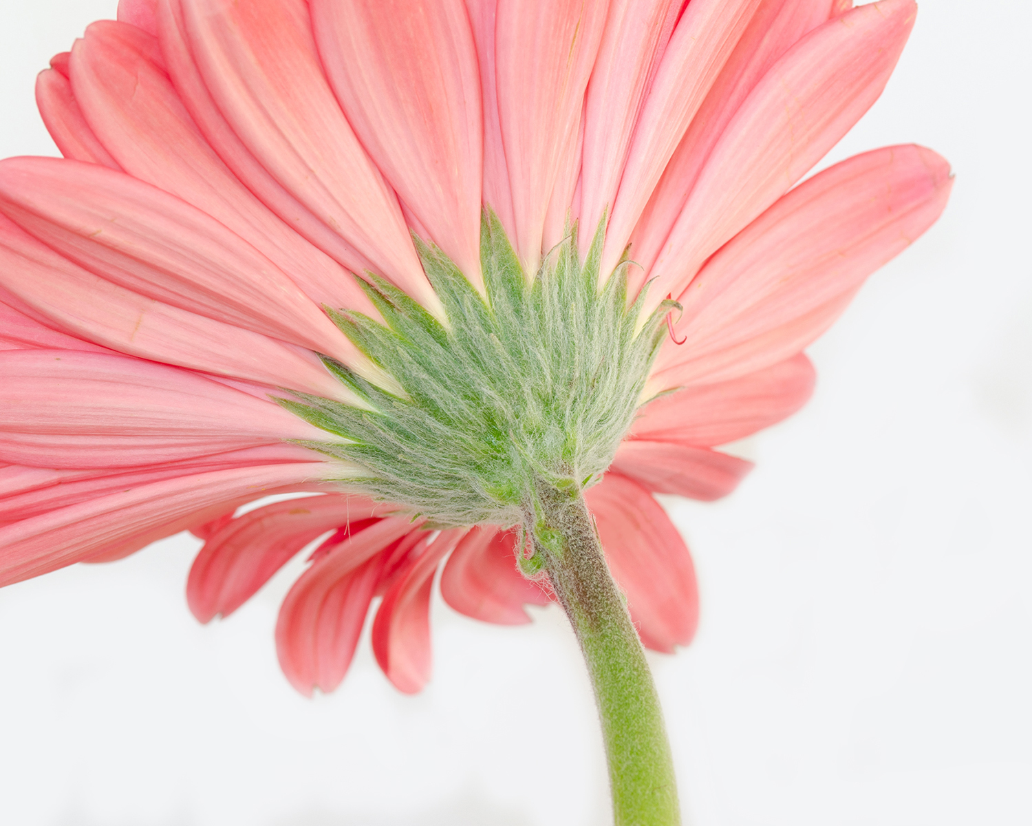
Good day, Donna. As I was passing through all the DD groups your lovely Daisy reached out to me. Some thoughts:
My initial impression assumed "backlighting" was the main attribute in this composition, but your description and a closer look reveals a more traditional (but over lit) exposure creating this lovely flower portrait. In any case, the resulting textures and color are delicious. However, though I truly like the off-center placement and use of (literally) white-space, it just feels a little too much; perhaps try a 8x10 crop that will take out more white-space.
By the way, one of my visual hallmarks in a lot of my flower portraits use "backlighting" and something you may also be keen on investigating, if you have not already. Lovely work, Donna and hope we can continue this conversation in the future.
Lance A. Lewin
PSA B&W Photography Mentor
PSA South Atlantic Area Membership Director
Admin DD83 & DD87
visualizingart.com
|
Feb 5th |
1 comment - 2 replies for Group 10
|
| 17 |
Feb 22 |
Comment |
Good day, John! Passing by and was attracted by this intriguing abstract! I enjoy the play between bright, dark, lines and curves; I especially enjoy the horizontal post that "pricks" the scene. Well visualized and captured.
"Points to Ponder" - I suggest ever so gently cropping the very top edge, it is distracting. Also, my monitor reveals less that perfect clarity (or focus) on the brick and wood post: this is due to the low resolution mandated by the PSA or is it focus and / or Depth of Field (Dof) issues? look forward to your insights. Thank you, John.
Lance A. Lewin
PSA B&W Photography Mentor
PSA South Atlantic Area Membership Director
visualizingart.com |
Feb 5th |
1 comment - 0 replies for Group 17
|
| 27 |
Feb 22 |
Comment |
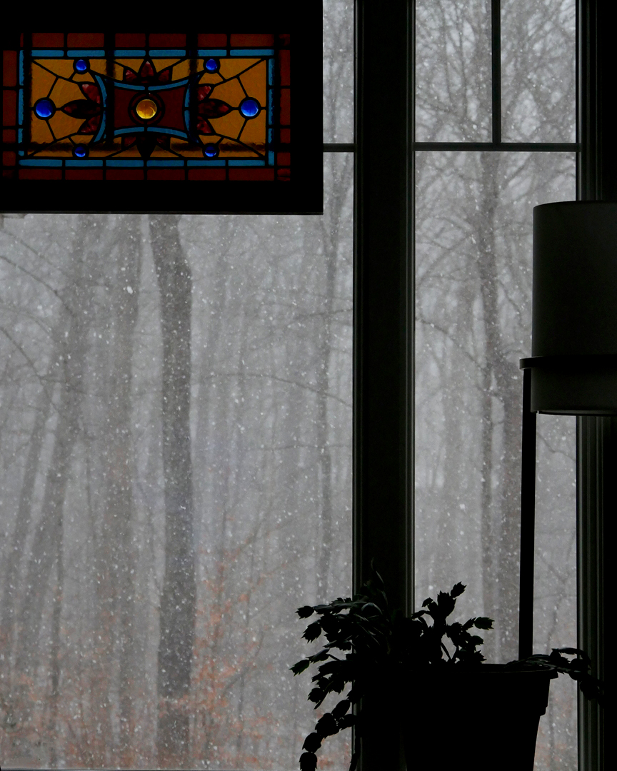
Good day, Becca! Passing by and saw this interesting, actually quite intriguing scene. I always enjoy compositions that reveal a sense of "place", in many cases seen within the vernacular of domestic landscapes, for one example. You have captured a most down-to-Earth example of suburbia home life.
The scene is well visualized and conceived: the crop is perfect. The interaction (or balance) between the subtle, background color and the stained glass is well placed.
The only edit I thought enhanced the composition was to ever so slightly increase exposure and induce contrast: the subtle, softness of the backyard trees (by virtue of the falling snow) is still maintained, but I thought bringing more prominance between the stained glass and colored tree limbs was important. I look forward to your feedback.
Lance A. Lewin
PSA B&W Photography Mentor
PSA South Atlantic Area Membership Director
visualizingart.com |
Feb 5th |
 |
1 comment - 0 replies for Group 27
|
| 32 |
Feb 22 |
Reply |
...I will surely look for that conversation.
|
Feb 5th |
| 32 |
Feb 22 |
Comment |
Hi Stephen! Very inviting scene: the scene I feel is majestic in virtue of the religious narrative through the recording of this most beautiful Mosque, and the use of space, that defines a sense of "place", a concept I often speak about.
I'll say, it is refreshing that you kept a (relatively) soft feel or aesthetic, where many would have jumped at the chance to render the scene with harden contrasts. The early evening scene invites the viewer (or spectator) into the stillness that silently echos through the use of soft grey-tones.
Lance A. Lewin
PSA B&W Photography Mentor
PSA South Atlantic Area Membership Director
|
Feb 5th |
1 comment - 1 reply for Group 32
|
| 83 |
Feb 22 |
Reply |
Hi Dianne! I am asking the artists' to (also) cook with less spices, as it were, and create with fewer embellishments (as sometimes they can be interpreted as...) to reveal a more natural aesthetic. It's a balance between the two, or with Bob Kolbrener's work, we see (only) untouched frames from his large format camera.
I appreciate your insights and continued participation in this conversation. |
Feb 28th |
| 83 |
Feb 22 |
Reply |
Mike, I think this edited version can be accepted, it's an alternative view: the featured view, with the bottom section, invites and leads the viewer to main show, as it were. The bottom section helps define a sense of "place", where removing it, removes this reference. I like both. |
Feb 21st |
| 83 |
Feb 22 |
Reply |
Good day, Mike, these are all viable questions and have been discussed here for some time: please, let me refer you to the Bulletin Board discussion titled, "Who is Commenting on our Work" Read both the content and comments. Yes, the featured work is very much a viable production, but not likely for todays 21st century inspired dialogues on the art of photography.
Outside of most club and online competitions, including the PSA, more often than not you can enjoy photography-art without over processed aesthetics, but unfortunately, it is still very prominent and growing with ever increasing popularity. Indeed, the very fact judges accept and honor photographs with extreme visual nuances, including high contrast and bursting with "Structure" is why everyone else needs to follow. I am in the camp of photography-artists that wish to explore the "classic traditional" virtues that have been embedded in the Art of Photography before the 21st century digital revolution in photography.
One final note before I leave you to read the short piece on the Bulletin Board: for an example of high contrast work we immediately refer back to Ansel Adams Landscapes, a lot of my work shares his post-production touch, but a major difference between Adams work so called, "Popping" (and I hate that word!) is that, his work, and my featured work above, are more authentic; a scene that most likely "could" have been registered and collaborated between our eyes and brain. A lot (not all) work that in todays definition of "popping" explore aesthetics that present work that moves past the authentic.
My task in the PSA and where ever I lecture is to reinvigorate "classic" thinking while still embracing 21st century ideals. A mixture of both will yield a stunning collection indeed.
Please, review all the work by Bob Kolbrener, 20th Century photographer - I have seen him and his work twice in the past 5 years - there is no post-production in any of his large format work. Another wonderful catalogue of work can be seen through the Japanese photographer, Nobuyuki Kobayashi, who limits post-production to a minimum. Look forward to continuing this conversation. |
Feb 21st |
| 83 |
Feb 22 |
Comment |
Happy Friday, Dianne! Yes, this is a wonderful play between lines, shapes, curves, light and shadow, you have a wide scope of visual peculiarities in this composition! The textures and tonal gamut is sumptuous!
But, I may shock you to state, I strongly suggest the image is viewed better with the walker in natural orientation to the viewer: Why?
Because the walker is so "identifiable", it actually distracts from the "whole" complex visual structure: in this sense, I am suggesting the abstract nature of the picture (the combination of aforementioned visual attributes) stand very well with the walker in normal orientation, by virtue of the viewer (not) assuming the picture is mistakenly upside down, and presented that way on purpose.
In other words, the abstract features,and including the walker, will be interpreted without a sense of confusion, and thus equate to a more friendly abstract, as it were. |
Feb 18th |
| 83 |
Feb 22 |
Comment |
Jose, I really love this composition! A true pictorial photographic creation by virtue of Mother Nature and human agents creative eye. Great visualization and capture, Jose!
The BW rendering enjoys a wide range of grey-scale or Tonal Gamut which looks delicious. My favorite object is the center-tree "pricking" the scene and giving the entire composition a lift. Terrific!
|
Feb 18th |
| 83 |
Feb 22 |
Comment |
Mike! Very cool photo! And what a car, what a legend! As a muscle car fan and international race enthusiast, I will also comment, Ferrari introduced the GTO on its famed 1962 GTO sports car, for the most part is likely the most sort after car in the world by collectors.
Your search and capture of the featured image is wonderful. Indeed, it is a digital-pictorial representation and brings the spectator right into the heart of the subject. I like this a lot!!
Alternatively, a less edited version would maintain the rust, and other artifacts originally captured, I suggest this too, would offer spectators another interpretation.
One other technical idea: cranking up the ISO to induce "Noise" or grain as it were, would be worth experimenting to create a natural "layer": the induced digital noise may reveal a more film nor like aesthetics. Just a thought. |
Feb 18th |
| 83 |
Feb 22 |
Comment |
Very contemplative image! An artistic-Documentary record of a most interesting piece of structural engineering!
Very much appreciate the contrast between the main subject and background buildings, but I am not a fan of the boat...I think. The feel the boat is interfering with the "Abstract" or artistic nature....any thoughts?
In any case, the BW representation fits the subject and the location. |
Feb 18th |
4 comments - 3 replies for Group 83
|
| 87 |
Feb 22 |
Reply |
Thanks for stopping by....yes, the color really does work for this subject...appreciate your input! |
Feb 26th |
| 87 |
Feb 22 |
Reply |
...more Sky.... |
Feb 18th |
 |
| 87 |
Feb 22 |
Comment |
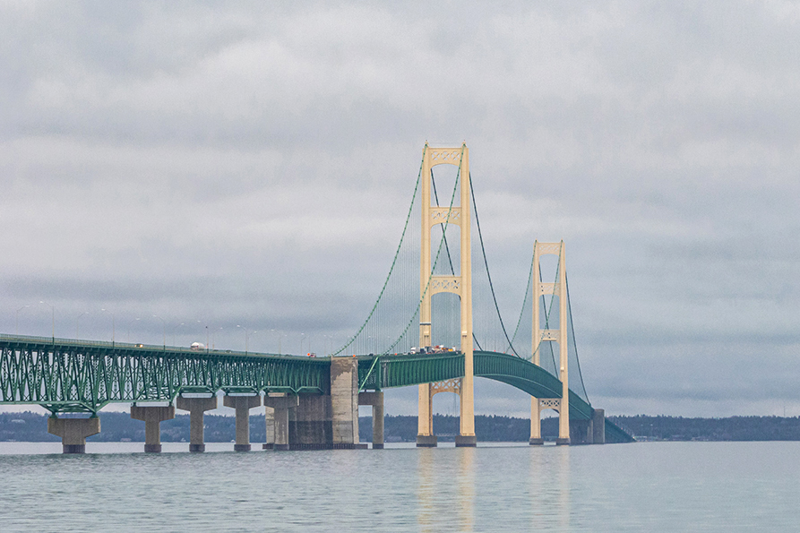
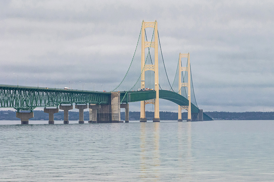
Two Examples: Presenting more water (which seemingly lifts the bridge) or more of the sky for different interpretations. |
Feb 18th |
 |
| 87 |
Feb 22 |
Comment |
Happy Friday, Dale, everyone! Well, another great round of very constructive comments - I love this group!
During my biking trip last summer really enjoyed this area of Michigan and then crossing the bridge (no, I did not take photos of it...should have..) to the "UP" as they all say up there.
I like Steve's idea to make a special narrow horizontal crop and indeed, though we all know the use of "space" is important in many types of photography, just a little crop off the right side would still allow a sense of place and make the bridge a bit more prominent.
One other suggestion: we can also experiment with changing the horizon line: 1. capture more water, 2. capture more sky. Each offer a slightly different interaction with the viewer. Great work, Dale! |
Feb 18th |
| 87 |
Feb 22 |
Comment |
Hi Jennifer! Well, to I must say, it is evident you have a good eye for finding engaging lines and shapes and placing them all together, but echoing mostly Steve's words, shooting wildlife is hard and involves so many variables that are dictated by Mother Nature and the these beautiful creatures live. So, yes, as Steve mentioned, learning flying patterns will go a long way in capturing future creative scenes like this one that "prick" or otherwise reveal more interest.
It is a location I hope you plan to revisit and "work". It would be a fine project to engage. |
Feb 17th |
| 87 |
Feb 22 |
Comment |
Good morning, Steve....yes, a classic expression that we can stare at all day, very inviting, powerful! It is nice to read your set up for this shot, it shows sometimes how much prep (thinking) goes into capturing a subject of event.
I must echo Jennifer, as I really like the choice in aperture and resulting bokeh. Great shot Steve! |
Feb 17th |
| 87 |
Feb 22 |
Comment |
Good morning, Chan! Well done! Very creative use of subject material, frame size, and orientation, very much borrows from Japanese Aesthetics.
Seems everyone really has fantastic suggestions, and I agree most are viable options for experimentation. Why and how does this version work: the compositions gestalt brings the entire artistic vision into focus: that is, (and without looking at Chan's work study or set up in this case) focus only on the end result.
Here we see balance between the part/handle and full reel with the scale at the top; I like the way these two artifacts balance each other. The Vertical format is "contemplative" a term I am using more in describing photographic work. The mere presentation of the subject in the vertical is thought-provoking.
In my opinion, a major change in the works appeal may be to 1. convert to BW and 2. create a total of three different "Fishing" narratives that would be displayed side by side (but not necessarily as a triptych). Alone the work is fine....I suggest subjects like this are interpreted more appreciably by spectators when presented in a group or series, regardless if color or BW. Great work, Chan!! |
Feb 17th |
| 87 |
Feb 22 |
Reply |
Good morning, Dale....and thank you for these kind words.
Yes, it is one of those subjects/compositions that straggle between color and mono for acceptance. If I printed large pieces and displayed them side by side I might tend to think the color version would be acceptable in transmitting the experience, and likely because of the "minimalist" structure. |
Feb 17th |
| 87 |
Feb 22 |
Comment |
First, lovely feathered creature you have come upon and captured. Dare I suggest a fine candidate for a Black & White rendering. : )
I also want to say, wow! what a variety of great insights from the other members on how to approach a scene like this in the future! Let me highlight just one, Chan's comment on opening up the area to where the subject is looking.
As it relates to most wildlife compositions, and from a spectators point of view, it will appear more comfortable to open the space towards the direction the subject is facing to give a sense of completion or purpose, or perhaps a sense of continuation or progression... The only time I deviate from this concept is to intentionally cause "tension" in a composition, and usually within the portrait genre of photography.
With a good eye of "seeing" engaging scenes like this, I look forward to seeing more compositions like the featured one in the future! Thank you, Cindy. |
Feb 10th |
| 87 |
Feb 22 |
Comment |
Jennifer, everyone. So, as an alternative to just relying on the color original..and as it relates to the subject, structure and the Monotone-orange-pink of the morning sun, adding a similar color via Toning brings an equally soothing aesthetic.
Again, so I am clear, I often preach we need to "disengage" with the color original when engaging in Digital B&W photography, unless (like this example) the color version screams to be viewed in color: in this instance, I have converted to B&W, but added toning to reveal the color/mood at the time of capture. |
Feb 7th |
 |
| 87 |
Feb 22 |
Reply |
Hi Chan! This is a great response! In fact, I am usually the one to comment as you have just outlined; enjoying B&W to enjoy a pictures gestalt or whole, but of course, requires the shapes, lines, exposure and textures to reveal such singularity.
Your comments and reasoning are sound and useful declarations, indeed.
However, in light of my Image Description, I thought better to experienced it as a color version, and of course, after Jennifer's comments.
Now, this brings up a very important Discussion Point: in such images, like the one being critiqued here, I have always converted the scene to B&W, but added a Color Tone that augments the salient (color features) of the original. Here, I never thought about doing this, but after this conversation will re-process and present an example on Tuesday sometime.
Thank you, Chan! |
Feb 7th |
| 87 |
Feb 22 |
Comment |
..yes, I believe these are sweet and sour candies...they come in a box like Good & Plenty - am I the winner!!!? LOL!
Really cool photo capturing intense textures and color! Guessing you would excel at photographing for restaurants! |
Feb 7th |
| 87 |
Feb 22 |
Reply |
Jennifer...it is quite lovely..and actually, I prefer the color version, in fact its the only way to enjoy this composition. Thank you for questioning this! I revised my Feature photograph to the original color version! |
Feb 6th |
 |
8 comments - 5 replies for Group 87
|
| 99 |
Feb 22 |
Comment |
Good day, Linda! Indeed, a fine portrait, and enjoying your use of "space" to define a sense of "place": the subject is off-center, but I think, I would also have included the back of his chair and wall: Why?
I feel it will add even more in defining the subject by giving the viewer more to assimilate in helping to form some type of interaction with the subject, the whole scene.
The B&W conversion is well designed with the exception of a, slightly heavy hand on the sitters complexion. Just a tad back the other the way (like the example from Gerard, which also maintains more background detail) I too, suggest is a pleasing alternative.
Overall, and most important, your visualization and final design (or crop) is well balanced, with the exception of my crop-alteration about the chair, great work, Linda! |
Feb 26th |
| 99 |
Feb 22 |
Comment |
Hello, Michael! Really like this BW abstract! The visualization and final square crop is well done. The intersection of diagonal lines along with the variation in tonal gamut (or grey-scale range) is contemplative. I especially like the one and only object (or artifact) that seemingly "pricks" the viewer to stop, think, and think again. The battered Hinge is a wonderful supporting player against the salient (or dominant) diagonals.
However, I must make one comment about the near-field diagonal (perhaps a wall of some sort) that is "out of focus". In my opinion, this one item blemishes the composition: Why? I suggest it interferes with the rest of the pin-point clarity and striking Blacks, Whites and Gray tones; it "distracts" our otherwise ingestion of the whole. This will be clearly visible if printed as a 10x10 or 12x12 or larger.
If this was a DSLR for example, we can suggest using a tripod and increase Dof by using a smaller aperture, or perhaps Flash, but within the scope of the iPhone we need your input to suggest alternative solutions for future compositions like this one. |
Feb 26th |
| 99 |
Feb 22 |
Comment |
Good day, Barbara...hope you are well. Well, what is not to like with this lovely floral arrangement: though I rarely comment on the color version within the scope of its black and white conversion, I must say, I really like the lighting on the initial capture. My love of Japanese aesthetics leads to me to the following comment:
The shades of green and yellow, and as Gerard stated, the position, together, presents a genuine composition within Japanese aesthetics. Printed on Watercolor Rag or perhaps a Japanese paper, either one would help reveal its soft nature and support the textures you have captured. (In fact, I will breifly speak about this in my Lecture with the Louisiana Photographic Society in March).
The B&W version is also unique, but in a completely different way: here I sense a more abstract narrative: bold, direct, not subtle. A striking artistic variant. |
Feb 26th |
3 comments - 0 replies for Group 99
|
19 comments - 11 replies Total
|


