|
| Group |
Round |
C/R |
Comment |
Date |
Image |
| 11 |
Aug 21 |
Reply |
Really a wonderful composition from both its perspective and finished aesthetic interpretation: here a darker, more contrast view I feel almost replicates the color narrative, but I would Dodge the background trees and patches of the (green) moss to slightly brighten the scene. In any case, your interpretation is well suited for matte & Frame illuminated by a strong spotlight.
Look forward to seeing more from your Drone series. |
Aug 14th |
0 comments - 1 reply for Group 11
|
| 32 |
Aug 21 |
Comment |
Hi Jennifer!
Well, I feel a bit different about the "perspective" discussion, and actually like some of the distortion as a mode of artistic expression. In fact, I often engage very wide angles in both architecture and some landscape work (e.g. 14mm, 16mm and 24mm) to exaggerate the field of view. In your featured photograph I feel little to no correction to the right side (as already indicated by the other comments) is a viable option. I do not feel cropping the scene will make it better, but take away the aesthetic and narrative grandeur, in my opinion.
As it relates to the foreground trees being too bright or distracting the viewer from the falls, well, I feel the Falls is a supporting actor, as it were, and perhaps the foreground trees are the main subject. Another way to interpret this piece is looking at the "whole" or finding the compositions gestalt: here, we see the entire scene and later find time to examine individual points of interest.
A lovely composition!
Lance A. Lewin
PSA BW Photography Mentor |
Aug 14th |
1 comment - 0 replies for Group 32
|
| 38 |
Aug 21 |
Reply |
My pleasure, Art! |
Aug 19th |
| 38 |
Aug 21 |
Comment |
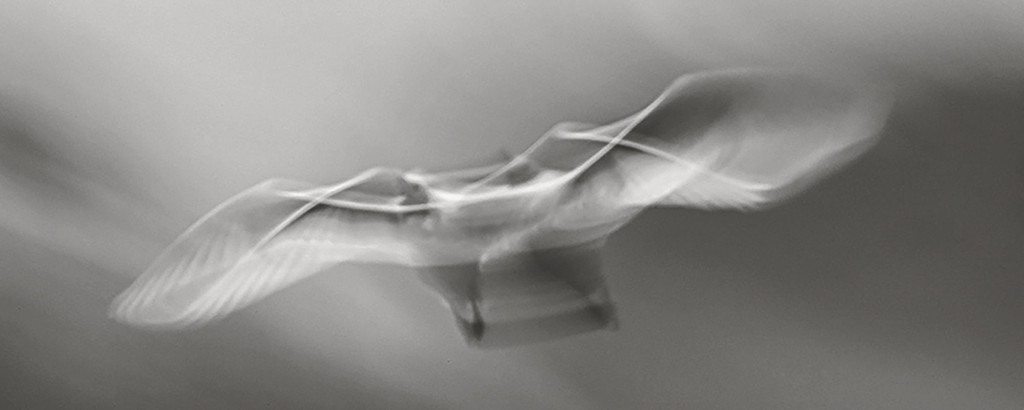
Good day,Art. Thought I would stop by and have a look at this most intriguing image. Well, to echo a little from what Gabriele mentioned, it is often too easy to use digital software to re-create illustrative-photographic compositions, but I do admire your attempt to create this photographic abstract. The following will illustrate, in my opinion, the original captures the essence of what you were after....
"Points to Ponder": out of the gate, in my opinion, the original blurred image is more clearly recognized (in this case, a bird, with somewhat clear detail of its head) and as such, better qualifies to being more engaging and receptive by a wider range of viewers. I will now suggest this image was over-processed by mirroring the left-side, as you indicated, and the resulting symmetry does hold up to the asymmetrical "design-in-flight" of the original.
Using the original image I made a custom crop, then processed the image in Silver Efex Pro-3 and added a custom copper-silver tone. I think the lines, shapes and lighting make an amazing photographic abstract with absolutely no other editing except crop and basic Dodge & Burn techniques.
Lance A. Lewin
PSA BW Photography Mentor
Admin DD87 and DD83-Mono |
Aug 18th |
 |
1 comment - 1 reply for Group 38
|
| 77 |
Aug 21 |
Comment |
Hello, Witta. Just a note to let you know I commented on your last Bulletin Board post. Thank you. |
Aug 22nd |
1 comment - 0 replies for Group 77
|
| 83 |
Aug 21 |
Reply |
Hi Dianne...thank you!! |
Aug 28th |
| 83 |
Aug 21 |
Reply |
Indeed, the composition presents a less than ideal engagement, at least on the initial view: as a result of both you and Debasish's remarks (and my own question of its ability to hold up) printing is planned in the next two weeks. I will likely do a test print and go from there.
I will post my review on the Bulletin Board next month.
Thank you, Jose. |
Aug 24th |
| 83 |
Aug 21 |
Reply |
Well done, Jose. This really helped to create more grey-tones across the entire scene, as a consequence creating a more engaging image. |
Aug 24th |
| 83 |
Aug 21 |
Comment |
Good question, Debasish.
First, I think viewing images on screen can be more bright than in a hard-copy print, but that is not an absolute statement, but at least one to consider.
Another point, when viewing film based photography (and many more paintings) within home or gallery settings, it is very important to step back from most work (unless they are framed as 4x6 prints, for example), to see them clearly. The one posted here is a prime example.
Printing: a test print would surely prove beneficial in light of your question, and something I will likely do. In the case the background is piercing, I will then carefully "Burn" (Not Dodge) the background. Burning will soften the highlights and thus reduce their prominence within the composition. Really appreciate your input. |
Aug 23rd |
| 83 |
Aug 21 |
Reply |
Hi Dianne. Its all about presenting work a certain way: from the artist view (or what narrative) is he/she trying to present us? Abstract? Where we contemplate the juxtaposition of lines, shapes and shadows as the subject: in these pieces, if the work was composed well, will need little (in the way of added artifacts) to convey the narrative. They sit well on their own. Such was my recent project I asked you all to do related to Shadows, for example.
Alternatively, having a model dressed in a gown flowing down the stairs then presents an entirely different narrative. If the model was instead a figure relative to the background (or to the location, such as a nun or priest in a church, for example), then having them in the scene projects a "story line" thus abandoning the Abstract version, indeed.
|
Aug 22nd |
| 83 |
Aug 21 |
Reply |
Yes, the leaf was very important to establish an anchor for the flower, otherwise it would seem to float aimlessly. It defines a likely start point (planted somewhere) as opposed to a more abstract intension that may otherwise be interpreted by the viewer. Great observation, Dirk. |
Aug 22nd |
| 83 |
Aug 21 |
Reply |
Exactly. : ) |
Aug 22nd |
| 83 |
Aug 21 |
Comment |
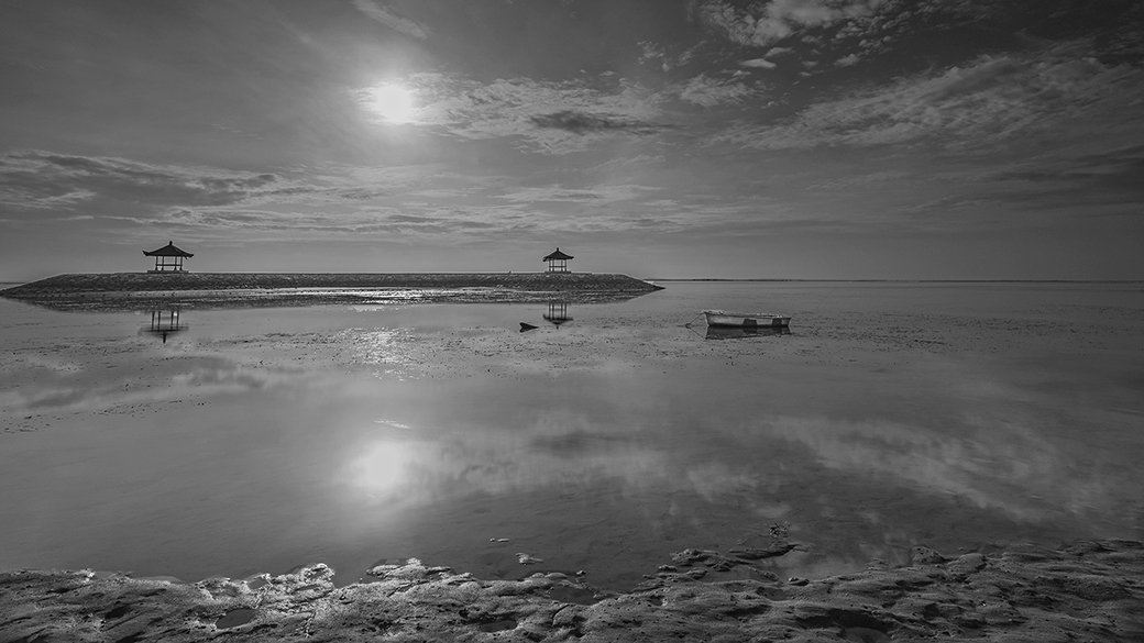
The photograph has interesting aspects to it: the dark aesthetic emanates a dead-quiet narrative. For me, it is too dark, and more exposure may well (help define details and separate objects). In any case, the compositional structure is terrific and if you live relatively close to this beach, hope you take time to create more from this location.
"Points to Ponder":
My edit increased overall exposure and I also Dodged the boat (which was likely incorrect, but left it for this discussion)and also dodged clouds and near-field water.
Question: why Dodging the boat "too much" was incorrect? |
Aug 20th |
 |
| 83 |
Aug 21 |
Comment |
Along with Jason's comments, I feel this is one of those photographic compositions that may actually work well as a 4x6 print and then centered within a very large black (or grey) matte and frame. In other words, present the viewer a large platform to view this particular work. This type of presentation usually makes the viewer stay longer and look deeper for details and contemplate the "whole". I like it!! |
Aug 13th |
| 83 |
Aug 21 |
Comment |
Jose, I like the low horizon and big sky in this scene, and actually the sky is really our supporting actor, as it were, in this beautifully composed snap-shot of the tropics.
Though I agree with Jason the near field and even the beach sand to the right are a bit strong, I would likely only tone down the beach sand as I feel in print, the water will be fine. On another note, this particular bright and contrast shot works extremely well for this particular subject and composition. Love it! |
Aug 13th |
| 83 |
Aug 21 |
Comment |
Well Dirk, this composition just doesn't prick me, or excite me. I feel it's a contribution to both the perspective (crop) and the very hard (and seemingly too dark) presentation.
The birds are not detailed enough and I suggest the sky-subject portion of the frame is not balanced in a positive way. Perhaps cropping off more of the sky and then Dodging the birds would help some. |
Aug 13th |
| 83 |
Aug 21 |
Comment |
Gee! What a lovely capture, Debasish.
Great vertical crop that exploits both our subject and lines shapes and intricate details that frame this handsome young man. However, though this hard-contrast aesthetic works well, for myself, I would likely bring down the overall exposure (or perhaps just the boys face) just a tad.
However, printed, matte and framed, and viewed on the wall (as opposed to viewing on a monitor) will likely be an outstanding piece just as it is here. Well done! |
Aug 13th |
| 83 |
Aug 21 |
Reply |
....indeed, film often reveals realism, authenticity, and the emotional connection to life, where digital (for the most part) can seem too clear and vivid, as such, in many cases the scene can seem contrived.
However, there are many camera dynamics and the use of natural and man-made atmospheric conditions that can alternatively, make an otherwise sterile digital image, more compliant to the way we actually see reality in our daily lives. |
Aug 13th |
| 83 |
Aug 21 |
Comment |
Once again, Welcome Jason!
Yes, the technology these phones have still amazes me and seems to get better every year.
Here a traditional vernacular study of this well known Michigan institution wonderfully explored through Black and white photography.
Of course, the low resolution makes it hard to see details clearly (and I am not sure if this was the same for your original capture) but the composition is well conceived. Thank you, Jason!
|
Aug 13th |
7 comments - 7 replies for Group 83
|
| 87 |
Aug 21 |
Reply |
Hi Jennifer...yes, when I was there I felt like I was in the past....something from the 50's or 60's. All you describe created an interesting space. I decided this perspective emphasized this feeling. |
Aug 16th |
| 87 |
Aug 21 |
Comment |
Hi Cindy! Yes, I agree with Chan, the selective focusing and overall composition is striking! In the future, and of course if you have the option/means to move about, selecting more of the trumpet would have proved beneficial, indeed. Alternatively, the music sheet may have served as a good subject with the other instruments in the background....many possibilities. I hope we see more like this from you. |
Aug 11th |
| 87 |
Aug 21 |
Comment |
Gee! I really love this composition! Everything adds to make it "different" and conversational: the reflections, framing from the plane, and of course, the particular view from high above the clouds...well conceived and executed, Jennifer! |
Aug 11th |
| 87 |
Aug 21 |
Reply |
...yes, a bit of selective-Dodging of the snow will bring more vibrancy. |
Aug 11th |
| 87 |
Aug 21 |
Comment |
Very cool composition Will!! Very vivid and detailed...engaging piece of illustrative art. |
Aug 11th |
| 87 |
Aug 21 |
Comment |
Hi Dale! Outstanding BW composition....though there is some distraction with the background on one of the birds, the whole shot is engaging. Well conceived and executed!
"Points to Ponder": in the future, keep in mind (be aware; easier said then done...) of background shapes and patterns as they are as important as the subject. In this way, you can experiment (as Will suggested) by taking several different shots (known as "Bracketing") using different camera settings (E.G. aperture setting) and chose the best in post-production. |
Aug 11th |
| 87 |
Aug 21 |
Comment |
Steve, I have another idea to present this lovely captured creature: The sharp focus and excellent background blurring, along with this particular subject/composition, may work very well in the tradition of Japanese art: here, create a narrow vertical format (crop): the off-centered subject and the two or three in-focus vertical branches scream for this type of presentation.
In the future, I hope you take a few shots keeping this idea in mind. Then, in post-production have the space to re-crop as I suggested. : ) |
Aug 11th |
| 87 |
Aug 21 |
Comment |
Chan, the colors and vignetting produce an outstanding image...but I still like the artistic aesthetic of last months IR rendering, and the resulting edits. This months featured image is a completely different aesthetic: here we are more about local vernacular in a documentary-form, while last month takes the viewer a bit deeper into the architectural design from a artistic point of view.
Each representation is a viable option, but each one results in a completely different emotional response from the viewer. |
Aug 11th |
| 87 |
Aug 21 |
Comment |
Yes, the composition is more about lines, color and mood....and our line cook serves as a perspective, if I may. The extreme angle emphasizes all that is important in revealing mood, and as important, the "space". Higher ISO allowed for me to maintain the moody-lighting and color; the added noise adds graininess.
Thank you, guys!
|
Aug 11th |
| 87 |
Aug 21 |
Reply |
Steve, see my reply below.... |
Aug 11th |
| 87 |
Aug 21 |
Reply |
Chan, see my reply below..... |
Aug 11th |
7 comments - 4 replies for Group 87
|
| 91 |
Aug 21 |
Comment |
Hello, Chan...and another composition from the Mill Series I see...well, from a compositional standpoint I am a little disengaged: in my opinion, I feel more of the Press (length or height) would better cooperate with the vertical tree trunks, especially the supporting larger one in the mid-foreground. Overall, I like the boldness and subject standing out front...I like that a lot!
Yes, as Chuck pointed out, (part, not all) of the background is washing out a bit...and some simple "Burning" may attend to this issue.
Lastly, let us discuss focusing and Hyper-focal Distance: the Press is not sharp enough. You should have engaged the hyperlocal focusing technique, where you focus some where past the Press, and using a higher F-stop (or smaller aperture) to create a deeper Dof: in that case, both the background and Press would be tack sharp. I have an article posted in either DD83 or DD87 Bulletin Board on this subject, I will find later and repost if interested. Talk later. |
Aug 15th |
1 comment - 0 replies for Group 91
|
18 comments - 13 replies Total
|


