|
| Group |
Round |
C/R |
Comment |
Date |
Image |
| 11 |
Jul 21 |
Comment |
Very interesting subject and sad to see this type (level) of decay in a space once dedicated to preserving Hope and Love.
The color version very well defines a space that lies in despair. On the other hand, I do not enjoy the details of decay within the BW version as much as in the color version.
The lens distortion is kind to this piece and helps define the narrative the others are speaking of.
Please, see my edit that tries to maintain the same amount of (overall) luminance and hence (hopefully) more detail. I did include several areas of targeted "Dodging". Also, a custom copper-silver toning was applied. BW conversion via Silver Efex Pro-3. |
Jul 9th |
 |
1 comment - 0 replies for Group 11
|
| 39 |
Jul 21 |
Comment |
Well composed and processed. A very engaging Fine Art Photograph that I hope sees a matte & frame and illuminated by a spotlight. One of my favorites destinations in all the world; great for mountain biking! |
Jul 10th |
1 comment - 0 replies for Group 39
|
| 83 |
Jul 21 |
Reply |
Hi Dianne. In the text it explains Isla suffers from Autism: this was captured during a fund raising event last week. In this case, Isla was trying to be pleasant with me, allowing me in her space, other times, her smile is clean, natural and uplifting or more receptive to my camera lens.
The other two photographs show a better representation of her mood, and where she wanted to be. My wife and me loved this Hammock so much (both for Isla and for a prop in photography) we purchased the same one a few days ago. |
Jul 13th |
| 83 |
Jul 21 |
Comment |
Very cool (and I mean both within the subject & color) commercial/documentary style work. For me, I wish this scene presented more detail within the intricacies of the steel.
Also, not sure the bright sky is complimenting the shadows in this particular composition. Surely the camera is under-exposing the shadows and perhaps a different exposure setting would have yielded something less abstract?
Alternatively, a good amount of Dodging will help bring shadows back, if in fact you want to alter the current scene.
In itself, your rendering is a viable option and lend itself to the dramatic (even abstract), but (I) would love to see it reveal more.
Well Visualized!
|
Jul 12th |
| 83 |
Jul 21 |
Comment |
Brilliant composite! I like that the foreground is equally illuminated as the sky. |
Jul 12th |
| 83 |
Jul 21 |
Comment |
An interesting/engaging composition of this location: frankly better than many similar versions. Finding the right position and lens is always key in producing good art. Someplace my wife and me need to visit someday.
The Halo's are usually evidence of Cloning tools: were you cleaning up the sky or fixing exposure around the pillars.
I am not sure what the fix is for these imagery artifacts. |
Jul 12th |
| 83 |
Jul 21 |
Comment |
Hi Dianne!
Lets discuss Composition: off the bat I think I like the dramatic (and large) sky within this scene: I feel it compliments (maybe balances) the (correctly) off-centered horsemen. At the same time, Jose's "crop" also works in a more traditional manner.
In a lot of my work I often exaggerate foreground or sky for dramatic purposes or to directly define a narrative, and your original offers this type of interpretation.
As discussed often on online groups here within the PSA and other local clubs, perhaps your featured composition is not what often wins Club Ribbons, but would surely be a piece that would catch the eye of patrons of the arts (and fellow artists) within a gallery setting.
Well Visualized. |
Jul 12th |
| 83 |
Jul 21 |
Comment |
Again, welcome to the group, Titi!
1/6 sec, Tripod, indeed! A very pleasant and relaxing scene that even provokes an imaginary sound of the cascading water over the rocks. The rich grey-scale tones work well with the surrounding stone, foliage and water.
"Points to Ponder": In my opinion, the human element within the frame promotes a documentary (or commercial) narrative, while also being very much a Fine Art image. As such, did you try to move your position (or lens choice) that could have eliminated the hand-rails from the frame? Lastly, of course, a completely different Crop can be used, but then the narrative will be drastically altered as well.
|
Jul 12th |
5 comments - 1 reply for Group 83
|
| 87 |
Jul 21 |
Comment |
Gee, sorry I never commenting on this....indeed, it really hits the viewer in the face that it is over-processed, but after viewing the original, I feel it is more about resolution that being over processed.
I am not sure it holds great interest: The main reason is because the location (background) is not engaging. Perhaps choosing another location would have been more fruitful in this regard.
However, technically you did a great job capturing this lovely creature. If possible, would like to see more like this but perhaps from another angle and location. |
Jul 30th |
| 87 |
Jul 21 |
Reply |
Better late than never, Dale.
Really glad you are enjoying this "trickster" image. Sometimes it is fun to view images that present themselves as ambiguous. We see a lot of this type of (unclear-narrative) within abstracts and some of the work we have discussed with light & shadow, in recent weeks. |
Jul 30th |
| 87 |
Jul 21 |
Reply |
Thank you, Cindy!! : ) |
Jul 13th |
| 87 |
Jul 21 |
Reply |
Immediately, we see less blue splashing onto the buildings, and i also Dodged the trees to bring them more prominence.
From here may be a good place to start trying a BW conversion if so desired. |
Jul 13th |
| 87 |
Jul 21 |
Reply |
|
Jul 13th |
 |
| 87 |
Jul 21 |
Comment |
In PSCC I adjusted the White Balance: it is very common for most DSLR's to have issues with WB in an array of photographic situations, and these digital tools help balance the results; these are similar results to playing with filters and such within wet darkroom procedures or using certain film stocks to balance color depending upon its use (E.G indoor or outdoor). I posted both your original and my new WB corrected version for review. 1. original 2. Edited WB |
Jul 13th |
 |
| 87 |
Jul 21 |
Reply |
Welcome back! Hope you captured some treasured compositions to share with us in the future. : )
Wow...very creative thinking, Jennifer! Indeed, the entire frame resembles neurons and synapse!
I looked at the composition on being very structured; perhaps an image that equivocates its true meaning.
It is these very structured and diverse "interpretations" that allow art to bring so much to so many people: sometimes there are as many interpretations as the people viewing the work. |
Jul 9th |
| 87 |
Jul 21 |
Reply |
|
Jul 8th |
 |
| 87 |
Jul 21 |
Comment |
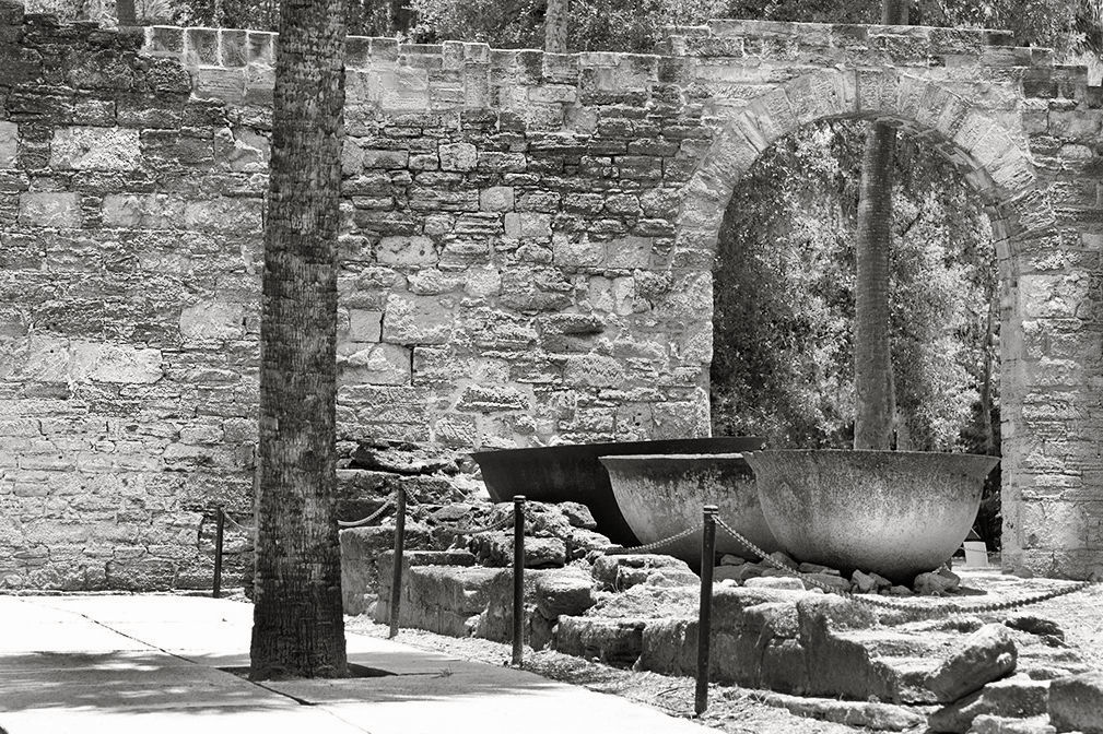
Hi Chan! Well, of course I am not a fan of removing details like you did here, but indeed it helped the composition. Next, in my opinion, the Toning is too rich and I would likely make this piece as a Black & white rendering.
Original Photograph: was captured a bit too bright and has a slightly washed out appearance; this brightness seemingly covers the entire field of view with a grey or white sheet. (The ISO-320 was likely the dynamic that spawned this effect).
However, another method that could have been used to Spice up selected areas, instead covering the whole frame is the Sponge Brush in PSCC, I would hope LR has a similar tool.
I first slightly cropped the original (less than your version) and than "Burned" (or darkened) the sidewalk and larger stone pad. Next, I "Dodged" the first two large bowls and the tree sitting to left.
Then I applied the "Sponge" carefully set at 10% and covered the entire stone wall and green trees behind the (removed tree), which I kept). (Note I did not "Sponge" the tree to the left to keep color intensity different from the stone wall).
See both edited Original and BW version with slight copper-silver toning.
|
Jul 8th |
 |
| 87 |
Jul 21 |
Comment |
Details, details and details! Nice capture. Especially enjoy the similar angles of both Bird and Branch and the extreme Bokeh washing and smearing greenery. : ) |
Jul 8th |
| 87 |
Jul 21 |
Comment |
Hi Jennifer! Yes, an engaging scene and most surely anchored by lens distortion. I too, like the sun-glare peaking through and even more would be bold, but may have created even more of a dramatic composition from such simple and common placed subjects. Well composed!
As Steve pointed eluded to, some sky-blue is reflected onto the buildings and likely normal, but perhaps some (selective) fine tuning in PSCC or LR could have re-balanced buildings to a less blue. Alternatively, before any processing, check to see if adjusting the Global White Balance would change things. I may take your image and try this. |
Jul 7th |
| 87 |
Jul 21 |
Reply |
Thank you, Chan. |
Jul 5th |
| 87 |
Jul 21 |
Reply |
Oddly enough...the tree and shadow resemble an "A" Bomb mushroom! |
Jul 5th |
| 87 |
Jul 21 |
Comment |
Cindy, I agree with the others, a different crop may work better here to highlight the tree shadow: Chan's version that is posted is surely one example and (I attached a Square Cropped version) for another way to present the work. The shadow is very engaging and artistic, and appreciate your eye in seeing and capturing this, but there is more to discuss here....
"Points to Ponder"
At the time of capture, and unless you are trying to capture local vernacular (or even documentary) (as opposed to an artistic rendering), artifacts like the chair need to be moved before composing the scene. The other item I will mention is using the particular camera dynamics metadata reveal: why did you dial in a high ISO, but only used F/4? Was the camera set on Auto ISO?
I'm questioning this because there are reasons to do this, and other reasons not to...let the discussion continue... :)
|
Jul 5th |
 |
| 87 |
Jul 21 |
Comment |
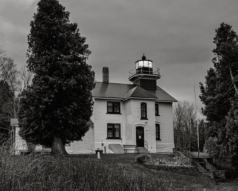
Happy Fourth of July, Dale, everyone!
Dale, appreciate the subject as a truly engaging one, you have attempted to capture the mood (or vibe) of the scene at time of capture, and it is done well. It is important to me you have decided to capture the scene as is, except for using the preset and heavy gold toning, which are both fine. Here, we are presented the aesthetics of American vernacular: finding beauty/interest within both nature and man-made subjects that reflect the history of the area. This is why photographers like Walker Evans, for just one example, did so well in bringing attention to America: one of his great skills (or great artistic eye) was seeing more within the very common or everyday and capturing this on film presenting viewers with "more". Reading about the lighthouse and reexamining your composition reveals even more. Well done.
Alternative Solution: Attached, a more straight BW renderings: I also Dodged several areas and even "decreased" structure to remove some of the grain...just because.
|
Jul 5th |
 |
| 87 |
Jul 21 |
Comment |
Yes, Steve....everyone...as the description indicates I enjoyed a pleasant stroll along Rainbow River this fine afternoon and as part of my "Intimate with Nature" study, spent a lot of time studying and enjoying parts of nature we normally do not see in our hurried pace: here, the composition is a combination of, in my opinion, an interesting group of tree branches spread over the river at this particular spot: the final image is then rotated 180 degrees. A bit sneaky of me, I know. Again, the composition is inspired by Japanese aesthetics. |
Jul 4th |
| 87 |
Jul 21 |
Comment |
This Edited Version by Cindy per Chan's suggestion: as a reminder, additional (edited or other) photos can be posted by group participants via Comment Box. |
Jul 4th |
 |
| 87 |
Jul 21 |
Reply |
Hi Chan...yes, a bit overpowering and one that needs extra time to view. Of course, its up to the viewer to decide how they want to interpret the composition (outside of it being within nature). A lot of my recent work (past 18 months or so) is inspired by Japanese aesthetics, which we have talked about here and in DD 83-Mono more than once.
I hope you also find it engaging, regardless if that is on the side of harassing your emotions or alternatively a joyful/playful encounter. |
Jul 2nd |
9 comments - 9 replies for Group 87
|
| 91 |
Jul 21 |
Reply |
Judy, your crop of just a section of Chan's work is right on. A very interesting frame, indeed. And of course, finding engaging scenes within a whole helps eliminate artifacts (like chain-link fences) from the composition. |
Jul 10th |
| 91 |
Jul 21 |
Comment |
Chan! I love this location and composition! However, I wish you had kept the stark-white (foliage) that defines the aesthetic within IR photography: in my opinion, it has been muted from the original. Otherwise, the dark contrast is a very dramatic rendering and fits this archaeological study.
On the other hand, the softer Whites of IR would also be a viable option and the one I think you were looking for: see my edited version: here I color corrected the pink-hue and then helped balance what was left of the IR aesthetic. |
Jul 9th |
 |
1 comment - 1 reply for Group 91
|
| 98 |
Jul 21 |
Comment |
Hello, Zina.
First, this BW rendering really fits this type of landscape and the grey-tones look terrific that help reveal atmosphere, feeling or emotion this location must have surely triggered at the time of capture. Well composed!
So I am clear, is the original a stitch-panoramic, or a special crop from a larger view of the (actual) original image file?
My next question, why did you chose ISO2000? Thank you. : )
Lance A. Lewin
PSA BW Photography Mentor
Admin DD-83-Mono & DD87-General |
Jul 24th |
| 98 |
Jul 21 |
Reply |
Hope you enjoy a successful trip! : ) |
Jul 22nd |
| 98 |
Jul 21 |
Comment |
Hello, Kathy! I am visiting from DD87 and DD83Mono.
First, you surely made good use of your time on this trip preparing for this shot, I hope you have others to share with us. My wife is an accomplished deep sea diver/photographer and look forward to showing her this when she gets back in town. A lovely composition!!
On the technical side I have a few "Points to Ponder": from the aspect of balance, the work is, for all practical purposes, perfect: the subject is slightly bias to the right-side, and the falling water/spray leads out to the center and left for balance. This also provides "direction", thus initiating movement and also denoting a sense of "place". (In my opinion, further cropping would eliminate this important dynamic).
But the most obvious cause for pause is the overall exposure: aside from the fact most of us have to post low-res photos on the PSA website, other factors may be causing the seemingly over-processed aesthetic: 1. over-processing. 2. The data appears to show you shot in an auto-mode or at least in Auto-ISO mode, and this of course can render exposure not necessarily correct or otherwise ideal.
A good question to ask one self: What are my artistic motivations for a particular set of camera setting? I Look forward to following through with the conversation. : )
Lance A. Lewin
PSA Black & White Photography Mentor
Admin DD87 and DD83-Mono
|
Jul 14th |
2 comments - 1 reply for Group 98
|
| 99 |
Jul 21 |
Comment |
Hello Linda. As a Digital Art (photographic) Composite, this work is surely a success, (maybe something that could be explored more in a Creative Art dialogue group).
So, I will echo Gerard's alternative solution in bringing more to your original by post-production manipulations: A work that can be studied (if you already have not in detail) is Ansel Adams well known piece (Moonrise, Hernandez, New Mexico 1941) where a late afternoon exposure left a lot on the table for being extra engaging: Adams spend a lot of time in the darkroom to turn it into a more Dramatic piece by extreme Dodge & Burning. The results are remarkable (and frankly many well know landscape artists do similar manipulation ( a lot of my earlier work was created in this way), and a simple example of improving by playing with exposure: modifying both chromatic and luminance variables in bring about a different and hopefully more engaging narrative.
Note: you used F/22 and this also can bring "Diffraction" or otherwise introduce less clarity then one believes a small aperture should do. I believe the Nikon D500 and other similar DSLR's begin showing some disturbance at F/11. This disturbance is also regulated by the type of composition/subject photographed of course. |
Jul 12th |
1 comment - 0 replies for Group 99
|
20 comments - 12 replies Total
|


