|
| Group |
Round |
C/R |
Comment |
Date |
Image |
| 11 |
Mar 21 |
Reply |
"Points to Ponder": I feel the artifacts defining the space are in fact, the very items creating this thought provocative narrative, as I speak about above....
In this alternative critique, we see the Antenna not interfering, but rather adding balance and perspective to the Eiffel Tower in the distance.
|
Mar 24th |
| 11 |
Mar 21 |
Comment |
This is a wonderful "creative" composition through the virtues of having a Good Eye to "visualize" this particular juxtaposition of an iconic structure against local vernacular: here we are invited to see the city (the amazing landscape dominated by the iconic Eiffel Tower) from a point of view seen mostly by locals and less by travelers.
The scene "constructs" a specific narrative (at least in my interpretation) making the Eiffel Tower more interesting and important than I have seen it before. Well done Henry!
"Points to Ponder": though I really enjoy the full-frame original, the crop is OK, but perhaps I may have liked to see just a bit more space below the chairs on the terrace. (Not sure if a little more "tree" in the scene would hurt. |
Mar 9th |
1 comment - 1 reply for Group 11
|
| 32 |
Mar 21 |
Comment |
Nice scene...the IR brings a different and more dramatic narrative to this, (and most subjects), captured in this light.
Minor White after moving to upstate NY engaged in IR photography, especially for his collection of Barns.
Your photograph reminds me of some of his work. Well done! |
Mar 24th |
1 comment - 0 replies for Group 32
|
| 60 |
Mar 21 |
Comment |
Hi Dianne...very cool image! A great conversation piece for these groups. Well conceived. In fact,(clicking) and viewing the image on my large monitor I feel the lack of focus (or shallow Dof) is actually creating a lot of the "depth", thus helps in generating interest.
But of course, as Jane points out...it is one of those shots we need to see the alternative version to make final judgment..but, I Vote for the shallow Dof.
Focusing Note: as an alternative to dialing up a higher F-stop, for a deeper Dof, this is a situation where Hyperfocal Distance principals come into play. You most likely focused on the very front surface, (so even at F/9.0 the back edge of the subject is blurred) but at F/9.0, if you had tried a couple of different "focus-points" (deeper into the subject)...may have included both foreground-view and background-view in focus. Maybe not at F/9.0. :) |
Mar 19th |
1 comment - 0 replies for Group 60
|
| 83 |
Mar 21 |
Reply |
Hi Cecelia! See my response above w/Dianne. :) |
Mar 16th |
| 83 |
Mar 21 |
Reply |
No, you are surely not over-thinking it, Dianne; your points are very productive for these versions and future work that might have more than one narrative to chose from.
My favorite is the full-frame version: and seems both you and Cecilia see more of a narrative (and visual balance, as Cecilia points out) in the full-frame (un-cropped) version....and so, I agree we "see" more in the full-version, ideas I have spoken on these pages in the past; defining a "sense of place" as opposed to the cropped version. Thank you, ladies! |
Mar 16th |
| 83 |
Mar 21 |
Reply |
...and I appreciate this reinforcing analysis...thank you, Dirk! |
Mar 15th |
| 83 |
Mar 21 |
Reply |
Well, though I like your original Featured photograph...I am only making suggestions for alternative aesthetic ideas: the example/edit posted here is more of what I was suggesting as an alternative aesthetic, that actually keeps the same narrative as yours, just a bit less "stark" between light and dark. :) |
Mar 15th |
 |
| 83 |
Mar 21 |
Reply |
Happy Monday! The default ISO setting will have the least (or actually NO) digital noise in the resulting picture.
Canon's default is 100 (for most models) and I believe Nikon is the same. Alternatively, some APS-C sensors may use ISO250 as default. As we move "away" from default we introduce more "noise" into the picture. (Note in the past 4 years advancement in technology has lessened this as an issue, but for cameras pre-2016 I suggest close attention to starting off on default settings would be a prudent objective).
But the reason I bring this up is to supplement my thoughts on being careful when shooting into dark areas: like capturing the unique qualities found in shadows. With a tripod we can then use a default (or an ISO not far off default) to maintain a picture with as little digital noise as possible, unless of course the user wants to present a scene with more Noise to emulate the Grain in film, an idea I have discussed many times on these pages and in group DD87. Hope this helps clarify my use and discussion on ISO settings. :) |
Mar 15th |
| 83 |
Mar 21 |
Reply |
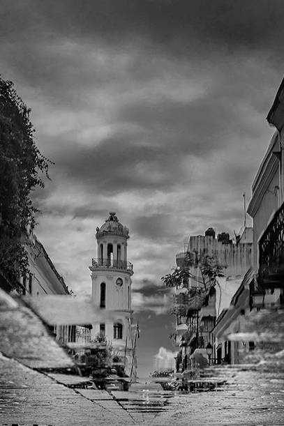
Indeed, there may be confusion in which photo is which: if the posted Original-2 is actually the "original", then you have successfully decreased the posterizaton seen in Original-1. Excellent. To further clarify, the BW version, (and only due to it being BW) seemingly adds to the blowout effect, and nothing more.
In any case, the rest of the dialogue holds as it relates to possible causes/remedies for the Blowouts captured in the original. Looking forward to seeing new shots of this subject, it will be a fine workshop like exercise. Thank you for your feedback and corrections. |
Mar 13th |
| 83 |
Mar 21 |
Comment |
Inverted and Cropped: |
Mar 13th |
 |
| 83 |
Mar 21 |
Comment |
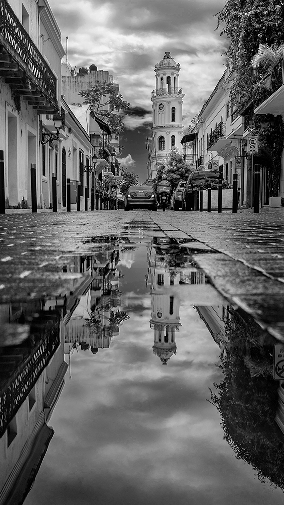
Jose, structure details look terrific against this strong contrast scene. Beautiful scene...well almost.
In my opinion, though very much an acceptable documentary composition, overall, I am distracted by both the man and the sign he is next to: again, perfect artifacts that reflect local vernacular, but the sense of art can be better appreciated with an alternative crop: I have posted a 16x9 narrow version I feel will reveal the positive details but eliminate, in my opinion, unfavorable distractions (except the car).
The second Inverted scene (abstract-like) is a bit avant-garde, but created by pure photographic technique. |
Mar 13th |
 |
| 83 |
Mar 21 |
Comment |
From a documentary point of view...the scene is a classic vernacular document and reveals a certain amount of emotion and interest. The window reflections is a great artifact in this scene and kudos to you for identifying and incorporation it into this composition. But the scene is enough to "prick" me, in my opinion. Perhaps a higher contrast (hotter) aesthetic will reveal more.....
....Dianne, one interpretation of Hot, is to have strong contrast between white, grey and jet-blacks. And in post-production is achieved, rather easily, but can also cause other exposure issues if not done carefully. In some cases, the original file (or film negative) may not allow a satisfying high-contrast aesthetic without blowing out sky or causing excessive Noise in dark shadows. Selective tools (both digitally and in the dark room) is a good choice for controlled editing, as opposed to Global Edits in digital post-production, for example.
"Points to Ponder":
This brings up another case for keeping full-control over camera dynamics: setting ISO to default of very close to default (and especially on older pre-2016 digital DSLR's for example) will help maintain very low or no visible "noise" even in enlargements. This will also aid in post-production manipulation like the one we speak of above. For more accurate work carry a tripod. :) |
Mar 13th |
| 83 |
Mar 21 |
Comment |
Hi Cecilia! Pretty scene and well composed for our subject trees! The BW version allows the viewer to take in the "whole" scene. :)
A technical issue can bee seen in the originals and BW version: Posterization in the sky has seemingly increased during the BW conversion: (Note Original-2 has a lot more).
Because you encountered camera issues, if you are close to this area, I look forward to you experimenting with the same subject, and on a bright day with clouds, maybe with different setting that may will result in a more linear exposure across the board. |
Mar 13th |
| 83 |
Mar 21 |
Comment |
And you know I am a race fan...so I love this shot!
Well composed! Note the far, far background sign needs to have less exposure...perhaps a quick Burn will do the trick.
|
Mar 13th |
| 83 |
Mar 21 |
Comment |
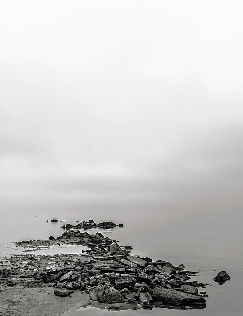
iPhone technology! Aside from the technical aspects, let me comment on this Moody image: Well conceived and composed, Debasish. The use of more sky (fog) is stimulating my senses in formulating what it must have been like in person at the time of capture...and I like that!
"Points to Ponder":
Note you have chosen a stark/contrasted version, and in itself is fine, and your artistic version, but wondering if lighter grey tones within the rocks, may have helped in sensory perception thus defining the sense of place more vividly. |
Mar 13th |
6 comments - 6 replies for Group 83
|
| 87 |
Mar 21 |
Reply |
...yes, it appears the Auto-ISO was on....happy you have subsequently turned it back off. :) |
Mar 25th |
| 87 |
Mar 21 |
Reply |
ISO and Speed: the original image clearly indicates a very bright/clear day and with the extra reflective properties of the show car paint overwhelmed the sensor/on-board CPU to compensate for the very high ISO-500 (on this bright day) with a 1/4000sec shutter response.
"Points to Ponder":In the future, take your ISO off auto...always manually choose the ISO to help control the creative process: this is achieved through the level of Noise (or Grain) in the resulting image. Alternatively, the shutter speed, too, is active within the creative process; here controlling the ISO (and of course Aperture) also helps control the shutter speed.
The only space or environment that responds well to auto-ISO is underwater photography, in most cases. |
Mar 25th |
| 87 |
Mar 21 |
Comment |
Gee, this is a very thought provocative activity you describe here....and must say that resulted in a visually appealing image. Can you explain a bit more, or rather, so I am clear, how the perfectly round bubbles appear seemingly pasted on top of the main background. (I am sure, Steve is liking this...)
A very interesting (and somewhat perplexing) result.
Well conceived and executed, Will. |
Mar 24th |
| 87 |
Mar 21 |
Comment |
A Kaleidoscope of color and disorienting shapes present a most vibrant visual cluster...indeed.
A fine piece of work that shows your skill in sharing both photographic and digital assets in combination that result in a modern 21st Century piece of "creative" art.
Well done, Jodi. |
Mar 24th |
| 87 |
Mar 21 |
Reply |
Hi Dale! Its so important to try challenging projects, even if that includes going out into the weather (and do not mean a lighting storm!). But of course, it also includes trying photographic concepts one has not investigated before.
Thank you for your encouraging words. |
Mar 19th |
| 87 |
Mar 21 |
Reply |
Wow! Amazing how (any) particular scene changes from season to season and other atmospheric conditions. |
Mar 19th |
| 87 |
Mar 21 |
Reply |
...and you bring up an important point...something we all do from time to time...we forget about the background! |
Mar 18th |
| 87 |
Mar 21 |
Reply |
....gee..yes, this "feels" so much better. Nice find! |
Mar 18th |
| 87 |
Mar 21 |
Reply |
...and that is a very good idea, Jennifer. Omitting a frame may be key in presenting this set. Indeed, they will need to be close with little space, more closer to the red example than the featured example for sure. I am glad you enjoy these sometimes outside-the-box (or norm) discussions on Art.
And thank you for your contributions! |
Mar 13th |
| 87 |
Mar 21 |
Comment |
Chan, anyone, next time we are confronted with a possible subject, we may consider alternative perspectives: to do this, actually get in there...and put your eyes low and within the shapes, light and shadows...amazing things can sometimes happen. :) |
Mar 12th |
| 87 |
Mar 21 |
Comment |
(c.) Japanese Print size |
Mar 12th |
 |
| 87 |
Mar 21 |
Comment |
(b.) Square |
Mar 12th |
 |
| 87 |
Mar 21 |
Comment |
Chan....it is not as easy as just cropping your current photograph, as you have already dictated the perspective or solidified the position in which the subject has been captured. At this point cropping from your current version extremely limits what one "could" have been done.
1. Within this subject we can also move closer (literally) and bend down to see how the insects or small animals see the potted plants: this is part of what I teach in workshops under "Visualization".
2. If you want to use your current version, and crop, well it is very limiting, in my opinion, of course.
3. In any case, here is 3 examples, but of course limited to a very small section: this illustration ONLY to provide a means to explain what I talked about above. A special note, I love the "grainy" appearance of the cropped examples. (a.)5x7 (b.)square (c.)long and narrow as seen in Japanese prints.
I hope this discussion helped you. :) |
Mar 12th |
 |
| 87 |
Mar 21 |
Reply |
Steve, try re-saving at a smaller size: 1024 on the longest side. Then "Save as" not larger than 900kb. On my monitor your edited version is too large and is pixelating.
First, the entire scene is magnificent, Jennifer!! Thank goodness you stopped and grabbed the shot! LOL!
Chan picks out a very important factor which makes this scene work and Steve is right-on here...as the yellows are blending together...fix this and your all set. :) |
Mar 11th |
| 87 |
Mar 21 |
Comment |
Gee! I love these cars..like I told you in the email.
I actually like the background definition along with the Mustang - it just seems to work in this composition. However, if this was a BW renderings, a less "structured" background may be the right approach. |
Mar 11th |
| 87 |
Mar 21 |
Comment |
Beautifully composed and finished, Steve! Post Card Perfect!
Need to comment the "stage" like appearance I am feeling in how I am interpreting the "whole" scene. I am guessing this may have to do with combining three shots: in my opinion, this technique can sometimes present a less natural aesthetic, but nonetheless, one of incredible depth and beauty. I do believe each subject/scene reacts differently to this and other techniques (i.e. focus stacking) for another example that can sometimes make void the very "out of focus" view we see in real-time.
|
Mar 11th |
| 87 |
Mar 21 |
Comment |
Chan, indeed a very relaxed and simple scene - but I feel maybe indeed, a closer crop my bring more engagement. Of course, a closer (tighter) crop will also change the narrative from one that explores a common vernacular, to one that would eliminate the background and thus may actually hinder what you have accomplished here. |
Mar 11th |
| 87 |
Mar 21 |
Reply |
Hi Stephen, always enjoy your feedback...you are right-on with your opinion as it relates to the original having a more engaging narrative, while my attempt to present a Hashira-e like print seems to get lost in its own confusion.
Nonetheless it is a project that still hold merit, as long as I can find the right formula in a printing/presentation style as you are eluding to.
In the end, and especially how it relates to presenting work in this and other critique groups, its all about exploring new and often not heard of photographic practices.
Thank you, Stephen!
|
Mar 11th |
| 87 |
Mar 21 |
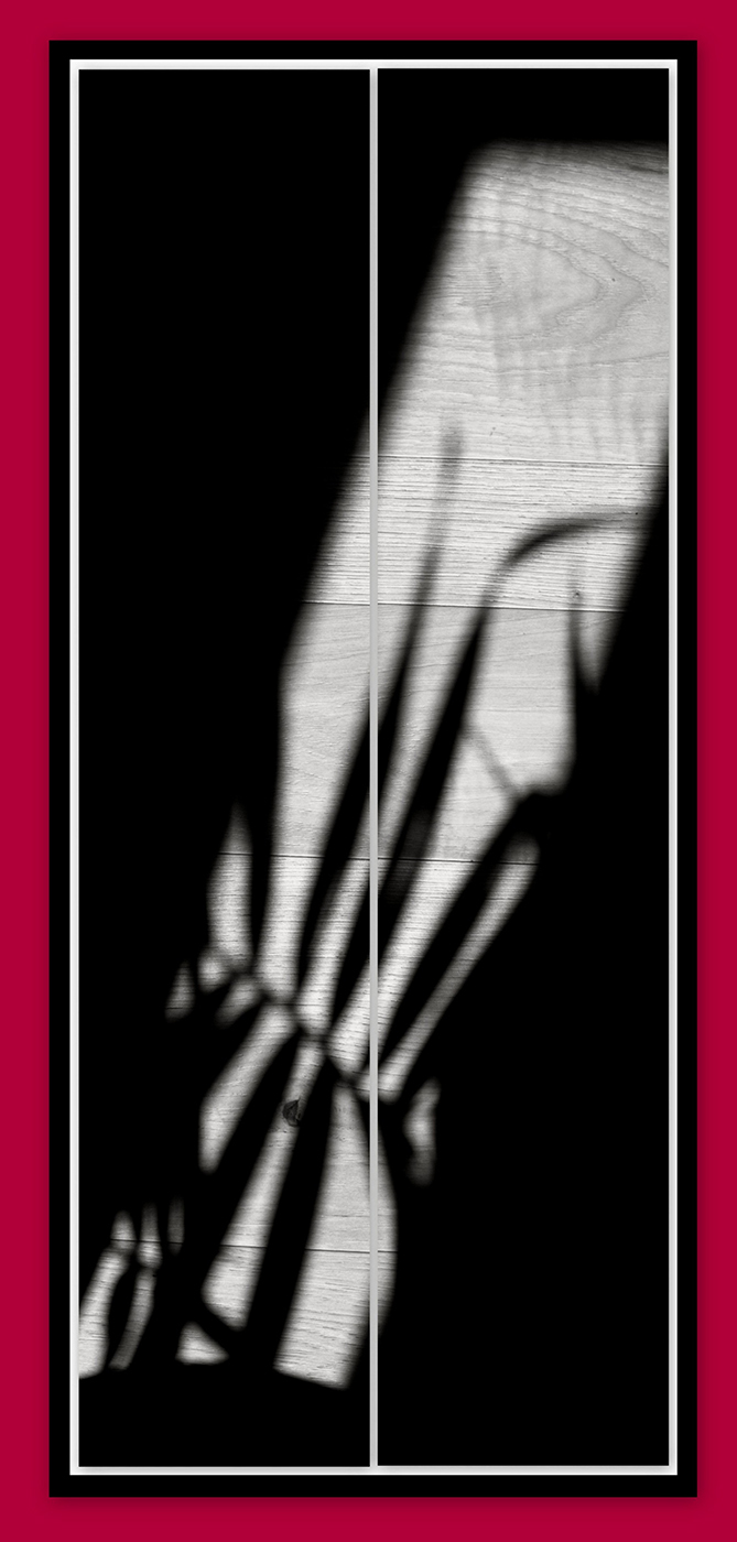
Comment |
Happy Sunday! So, as I continue to re-read In Praise of Shadows by Junichiro Tanizaki (1933), (see this and other book recommendations on my website) I was inspired as Light & shadow began to paint images on the floor...again, I created two 5x24 inch panels and the mock framing is for illustrative purposes. Of course, I am challenging you to look everywhere for beauty..even within Shadows; Japanese culture is dominated by (and by items that create shadows, especially in architecture) as a soothing and meditative aesthetic. Enjoy. |
Mar 7th |
 |
| 87 |
Mar 21 |
Comment |
A less definitive line separating the individual panels will likely be the best way to move forward...but we will see. |
Mar 5th |
| 87 |
Mar 21 |
Reply |
...Steve, I responded above... |
Mar 5th |
| 87 |
Mar 21 |
Reply |
Yes, this was just an illustration - and I agree the "bar" look is too heavy. Planning the type of matte (if any) and choice of paper (as Steve suggests) will be key to finding an match that presents the type of look (Japanese aesthetic) I am looking for. Really appreciate your feedback, guys! |
Mar 5th |
| 87 |
Mar 21 |
Reply |
Hi Damon! Absolutely...we have a variety of subjects on our Bulletin Board I hope you find interesting as well as educational. I look forward to your feedback/suggestions.
you can also reach out to me, here: lewin.author@gmail.com |
Mar 4th |
11 comments - 12 replies for Group 87
|
20 comments - 19 replies Total
|


