|
| Group |
Round |
C/R |
Comment |
Date |
Image |
| 11 |
Dec 20 |
Reply |
Excellent! :) |
Dec 27th |
| 11 |
Dec 20 |
Reply |
Happy Holidays, Allen, everyone!
Your composition defines a sense of Place:
I feel too often club-rules have occasionally (ah, maybe more often than not...) steered 21st Century photographers away from other relevant (and actually sometimes more relevant) compositional dynamics: in this case, your composition defines a clear narrative: here, the open space actually "defines a sense of place".
Along with the "leading-line", that helps direct focus momentarily to the horizon tree-line, after several moments, hopefully viewers will take in the "Whole" scene (its Gestalt)* and experience the beauty you enjoyed in real-time at the time of capture. The camera-left tree-line balances the larger foreground tree, and this in itself, even without the Path (as a leading line), makes the photograph work.
* One of BW precious traits (or visual dynamics) is allowing viewers' to see the "Whole", instead of being distracted by color. |
Dec 26th |
| 11 |
Dec 20 |
Comment |
Good day, Jim. Gee, sad and unfortunately a scene we are seeing more often across the United States these past years.
You have captured a very engaging and moving subject. Simply, the capture of Light & Shadow is lovely and allows the viewer to experience many different emotions.
"Points to Ponder": the color version presents a very full range of light, shadow, color and texture. The current version, though engaging, does not present itself in the same light (pun intended) as the exquisite color original. I therefore offer this version I edited in Silver Efex Pro-2: I added a custom Copper-silver tone and also placed the image through a Blue Filter: here, the blue filter magnified the "light" piercing through the shadows as we see in the color version. Next, a good amount of careful "Dodging" helped maintain all the detail (relevant in making the color version engaging) in this alternative edited BW version.
Its a case where we see the differences between the often used heavy BW contrast and less of more subtle grey-scale tones.
Please, DL my version and place it next to the original color for more direct comparisons.
However, in the end, it is all a matter of personal taste in how to present the viewer with the Experience we enjoyed in real-time. This is just another way of presenting the work.
Thank you, Jim! :)
|
Dec 8th |
 |
1 comment - 2 replies for Group 11
|
| 31 |
Dec 20 |
Reply |
Happy Holiday,s Michael!
Really appreciate the details on how you captured this lovely composition. Thank you! :) |
Dec 26th |
| 31 |
Dec 20 |
Reply |
Oh, yes...I hiked a couple of years ago without my camera and ended up writing a short piece titled..."The Missed Shot" LOL!!!
Actually, I just finished posting on DD-87 General Bulletin Board a portion of a piece I am writing for the NANPA on Hyperfocal Distance principles, so I was curious about what technique (including the possibility of Focus Stacking) in your very engaging shot.
In any case, the 24mm (and wide lenses in general) enjoy a remarkable wide and deep Dof, so you had the perfect lens for that shot.
Oh, by the way, the best Photography Assistant in the World, is Luck! :) Happy Holiday, Ian! |
Dec 10th |
| 31 |
Dec 20 |
Comment |
Hello, Ian. A very engaging composition - I like how both the foreground (vertical lying) rocks balance cleanly with the towering vertical Lighthouse subject: in other words, one facet of the composition does not over power the other. I "feel" there is unity and taking in the whole scene is pleasant.
Question: focusing: can you explain the technique you used to enjoy the seemingly seamless focus from the foreground to the background? Thanks, Ian. :) |
Dec 8th |
| 31 |
Dec 20 |
Reply |
Interesting: 3 stitched exposures...why? Thank you. |
Dec 8th |
| 31 |
Dec 20 |
Reply |
...and I figured that? Perfectly executed. :) |
Dec 8th |
| 31 |
Dec 20 |
Comment |
Hi Paul! The minimalist aesthetic is engaging when done well, and you certainly have a keeper, here.
Interestingly, I noticed you used Shutter Priority to capture this shot...why? Thank you.
Lance A. Lewin |
Dec 6th |
| 31 |
Dec 20 |
Comment |
Happy Sunday, Michael. Always to see well composed IR photographs, and this scene is a true delight.
"Points to Ponder"
I must comment on the very low resolution and unfortunate pixelation I see on some parts of this image. I believe your image is only a scant 135kb and that is far too small for a critique group. On the other hand the color version is perfect at almost 1MB. |
Dec 6th |
3 comments - 4 replies for Group 31
|
| 32 |
Dec 20 |
Reply |
Hi Jennifer!
The posted BW image is nice, and indeed we see the smoke and haze (and looking at the color version, we see a proportional amount in the BW version). In other words, there is no reason to falsely add/delete Haze or Smoke. In any case, this is a very lovely Landscape scene.
"Points to Ponder":
As it pertains to the particular BW contrast you have selected, well, it surely captures the differences we enjoy in the color version, so indeed, this is lovely. Of course there is always an alternative narrative, and it depends on the experience you had in real-time: more dramatic (current BW version) or perhaps a more relaxed, meditative experience, which would better be represented by a smoother (and lighter) grey-scale BW presentation.
The choice is yours. :)
Lance A. Lewin
visualizingart.com
|
Dec 8th |
0 comments - 1 reply for Group 32
|
| 39 |
Dec 20 |
Comment |
Happy, Friday, Mohammed! And another striking abstract themed composition! I do appreciate the "framing" example and hope you have more like these to matte and frame: under a spotlight will present very well, indeed.
Soft and fluid curves provide a most provocative and sensual aesthetic: the use of Light & shadow is suburb. Well crafted.
Best Regards,
Lance |
Dec 11th |
1 comment - 0 replies for Group 39
|
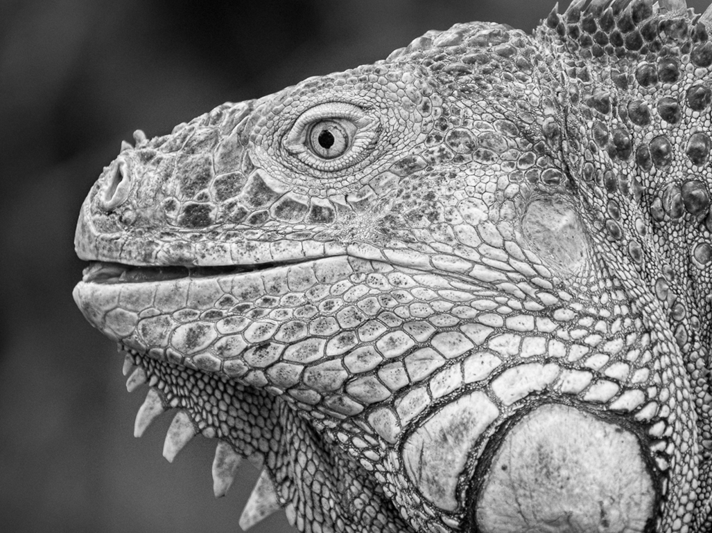
| 47 |
Dec 20 |
Comment |
Happy Holiday's Adrian!
Gee, really love this Iguana portrait!
So, a few words on BW grey-scale alternatives: the color version we must all agree is beautiful, and converting to BW hopefully mimics the impact of (this) multi-color version (other times, BW images actually create the narrative, rather than mimicking a color one).
Though your Final piece is Bold and Dramatic, I feel we can still maintain the drama (drama by virtue of this in-your-face portrait of a very intimidating animal) while also mimicking the color-scale seen in the original. My edited version puts the color version through a Green Filter in Silver Efex-Pro-2, then I actually decrease the Contrast to soften the animals Scales (or the lines dividing them). "Structure" was also Decreased by Negative-5.
Also, over the front-nose area I selectively increased Fine-Grain and a hint of Contrast. Lastly, a custom Copper-Silver Toning was added.
I suggest, this version, though not as bold as your Final, does indeed mimic the color version by seemingly revealing a wider grey-scale on the BW version. |
Dec 26th |
 |
1 comment - 0 replies for Group 47
|
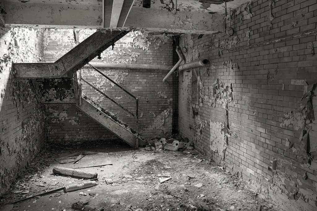
| 74 |
Dec 20 |
Comment |
Happy Holiday's, Haru!
Fill-In Flash:
Your Visualization in seeing and capturing this scene is well conceived. As it relates to the very dark overhang that unfortunately makes an odd (but I will also say, intriguing) frame, but even after several views does not seem to add anything, even when looked at with an Abstract point-of-view.
Anyway, this is a great example for using Fill-in Flash. Set on the camera and pointed up...would have illuminated the overhang perfectly. By all means if possible, revisit this amazing space and recapture using a fill-in Flash on a low-power setting. Look forward to seeing more of this type of work. :) |
Dec 26th |
1 comment - 0 replies for Group 74
|
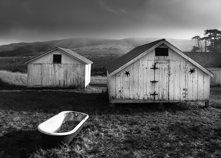
| 83 |
Dec 20 |
Reply |
Yes, I am confident 2021 will be a remarkable improvement over 2020!! HAPPY HEW YEAR! |
Dec 30th |
| 83 |
Dec 20 |
Reply |
Happy New Year, Jose!
I too like the other two examples, and especially the Original-2. We can almost hear the groans emanating from the tree as it struggles to gather light for survival.
A work in progress as I will continue on this project into 2021.
Thank you for your comments, Jose. |
Dec 29th |
| 83 |
Dec 20 |
Reply |
The more I look at it, I must agree....
...yes, and I too like the 3rd set of diagonals. Not just that, the trees and brighter sky area balance the tub, and this is a very important dynamic in this composition.
Again, a very well conceived composition in great lighting! |
Dec 29th |
| 83 |
Dec 20 |
Reply |
Happy Holiday's, Dianne!
When DL to my 36" diagonal monitor, your (PSA low resolution) image does show a bit brightness in the tub that could be "burned" some, and the its shadow is almost perfect, but indeed a slight "Dodging" in this area would be helpful as long as each of these corrections was done in small quantities.
"Points to Ponder" - everyone, if a particular photograph grabs you and you want to Print, but not sure if the composition is truly ready, by all means have a local photographic shop (not Walgreens or other retail store Quick Photo section) print you a fairly descent photo for a test. Thank you. |
Dec 29th |
| 83 |
Dec 20 |
Reply |
Judy, your identifiable (list) of visual ques one can see in a BW photograph are not all "schools of thought".
Points to Ponder: (and these points have nothing to do with Dianne's photo)
For the most part you are describing different types of BW images that are finished wrongly, other "schools of thought" you mention are creative aesthetics directed by the photographer whether captured behind the camera or in post production. In this sense, they are not all "schools of thought".
For example, there is No "school of thought" that states...'if it appears natural, then do not worry about blown out highlights'. A photographic composition with this description needs to be altered or captured over again, it is not an actual aesthetic that is acceptable, no matter what that photographer says.
As PSA's new BW Photography Mentor, I strive to introduce to students of photography (all levels seeking advice) they first understand basic differences between Real Aesthetics and Imperfections the artist thinks he/she can get away with. Thank you.
|
Dec 29th |
| 83 |
Dec 20 |
Reply |
Judy, here is your quote from the featured image description: this why the conversation regarding Journalism and Creative intent is showing up in comments of your work.
"I considered taking out the score sheet stand on camera left but wanted to create a more journalistic style image, not an art piece".
You can also review my comment to Debasish comment, it covers a little more on this subject. Thank you. |
Dec 28th |
| 83 |
Dec 20 |
Reply |
Happy Holiday's Dianne!
Yes, Judy brings up the same issue - and I must agree more should be tried to bring more contrast between the leafs and the boulder. I will attempt later next week to try an alternative color-filter in Silver Efex Pro-2. Stay tuned! :) |
Dec 26th |
| 83 |
Dec 20 |
Reply |
Debasish, this is a very good "technical" point. That is, a true "Journalistic" composition would have shown the faces of the singers and in general a larger scope of view of the stage: so in fact, we look at Judy's photograph more from a creative style than a record.
We should all understand, most of the work posted by each member of this group are "Creative" in nature. It does not take editing in LR or PSCC (including cropping part of an image) to make a work "Creative". This (limited-editing workflow) was first seen through the later-work by Stieglitz and all the work by Ansel Adams. Remember, the mere act of Cropping is a Creative Process. Thank you.
|
Dec 26th |
| 83 |
Dec 20 |
Comment |
Hi Jose!
Another interesting submission that has the ability to speak to the viewer inciting as many narratives, as there are people viewing the work.
I do not agree cropping out the camera-right portion helps the subject in this particular compositions: here is a very good example where defining the space around the subject helps define it. (In cases, it does not).
In this case, the viewer keeps looking at the background and then back to the subject in helping to create a possible story; without the background I sense a lost in this regard will ensue. |
Dec 12th |
| 83 |
Dec 20 |
Comment |
Good morning, Dianne!
The first item I will remark is the evidence of progression in your work right up to the featured piece: I say this as the Featured image uses the weather (and time of day for light & shadow) in helping to create a narrative. I also feel the "whole" image is more creative while still being documentary.
In itself, Documentary is fine, but the Pictorial effects through a good sense of light & shadow (and Mother Nature) are even better in presenting an engaging composition.
The Featured piece also enjoys a bit of "positive-distraction" in the tub's haphazard placement within the framework of the very uniformed shaped structures, that are facing right at the viewer seemingly mocking the odd shaped object (the tub) within their space.
The only design element I will (suggest) is to crop-out all or some of the background buildings on camera-right. I have posted a cropped version for an example. It still keeps enough space surrounding the main subjects to define a sense of place, but it unfortunately eliminates one set of diagonals. I am still not convinced, but still like the cropped alternative.
Well constructed, Dianne!
|
Dec 12th |
 |
| 83 |
Dec 20 |
Reply |
Gee...I hope nobody here engages in Replacing Anything! LOL!
However, Judy does bring up a case for (Possible) or potential areas for Exposure Correction: in this example you may even try a small amount of "Burning" (with 3 percent set in PSCC) for example. Another would be to "Dodge" the White Lines in the street (I love those, by the way!) and even some of the Steel, both to balance the rather bright sky.
In any case, Joe, this is a fine documentary composition injected with a Splash of Drama! :) |
Dec 10th |
| 83 |
Dec 20 |
Reply |
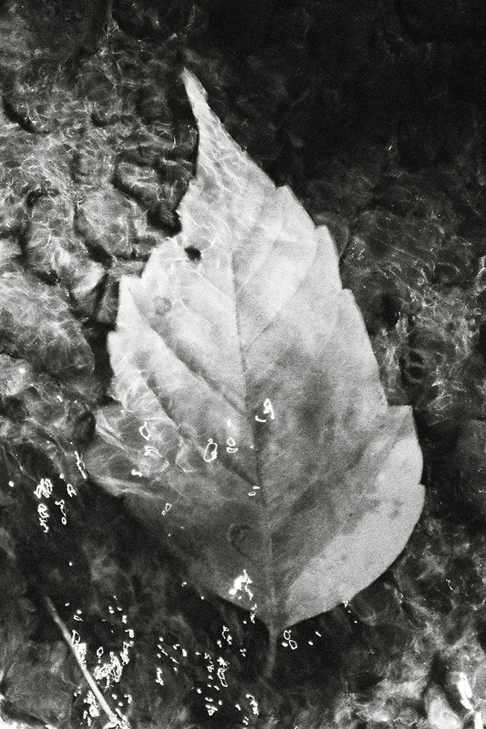
Indeed.
I will also add, if perfection is not found in this photograph (or in any photograph) the photographer-artist must be willing to pursue getting another, more productive outcome. I will surely be working the field as I try to capture the essence within Wabi-Sabi and Zen Buddhism aesthetics more vividly in the way they represent my artistic ambitions. |
Dec 8th |
| 83 |
Dec 20 |
Reply |
Hi Judy, and thank you for these thoughtful and constructive comments: As it relates to the featured composition, it is intentional not to (add) more contrast between the relatively smooth (but textured stone boulder) and the leaves. I did not want to create anymore separation between details.
This piece best represents my work (ongoing study) how to capture nature in the Japanese aesthetic of Wabi-Sabi and even more relevant in other Zen Buddhism inspired aesthetics, like Ukiyo-e, for one more example. Thank you, Judy. |
Dec 8th |
| 83 |
Dec 20 |
Reply |
....and that's fine! an amazing capture with that lens!
As it is, I feel works very well |
Dec 6th |
| 83 |
Dec 20 |
Reply |
Understood.
And yes, I love it too,but only when a particular subject warrants it, per a specific design or narrative. :) |
Dec 5th |
| 83 |
Dec 20 |
Reply |
Hi Joe....well, that is the second time you made that statement from Rick Sammon: no disrespect to Rick, but Contrast is Not king. Here is my comment about this from last month:
On the thoughts that "Contrast is King" in BW renderings: actually this is a very misleading and can make an otherwise soft, mellow, relaxing, linear or otherwise "Low Contrast" compositions be wrongly interpreted by students of photography.
Again, it is misleading to Tag BW photography with any one aesthetic. This is revealed in my notes below:
My methodology for instruction combines both the compositional aspects in creating a BW photograph and direction on how to obtain the best tonality for a particular composition: whether trying to reveal drama in a landscape or abstract piece, or the tenderness in a portrait of a baby, we will discuss how to effectively control the emotional aspect of your work before you even hit the shutter release button, and also discuss and practice work-flow suggestions for converting color image files to BW renderings in post-production, successfully.
|
Dec 5th |
| 83 |
Dec 20 |
Comment |
Hi Joe...your going to make me plan a trip back to NYC to visit Coney Island (after the covid-19 scare has passed).
Another engaging scene helped by the strong contrast which works so well with this subject. Well Done! :) |
Dec 4th |
| 83 |
Dec 20 |
Comment |
Happy Friday, Judy!
A very engaging composition! And yes, B W works better here, in my opinion. It is a prime example of allowing the viewer to Interpret the Whole: in this case, seen and ingested together (the conductor and choir) work as one and reveal a very pleasing visual experience.
The toning and mellow contrast are perfect, in my opinion, for this subject and specific composition.
"Points to Ponder":
Though I am not too concerned with the far-far left music-stand, an alternative crop may include more of it, so it helps define the narrative instead of interfering with it. |
Dec 4th |
| 83 |
Dec 20 |
Comment |
Hi Dirk, initially my thoughts went to similar aesthetics seen in Wynn Bullock (1902-1975) work: he loved the light and texture from these types of vegetation.
Not sure if I like (all) of the dark branch coming across the view, but I like it! It is part of the appeal. Perhaps it can be cropped a bit differently.....
In any case, all or part of it is a must. The heavy contrast works well and (with the diagonal branch I keep questioning) brings a kind of drama to the entire composition.
Well done! :)
|
Dec 4th |
| 83 |
Dec 20 |
Comment |
Happy Friday, Debasish!
You have composed a very lovely and intriguing composition that sides a little on the abstract (and I like that). The play between light & shadow is striking and your use of heavy contrast works perfect in this composition.
Well conceived and executed! :) |
Dec 4th |
6 comments - 14 replies for Group 83
|
| 87 |
Dec 20 |
Reply |
Happy Holiday's, Jennifer!
Just a heads up, if you did not already see it, the subject you asked about, "Hyperfocal Distance" principles is posted on the Bulletin Board. It is a brief outline, but one that easily introduces you to the technique that was a common stable for seasoned 20th Century professionals, but seemingly less spoken about in the 21st Century, in my opinion. Nonetheless, a very useful and powerful tool for all photographers.
The entire article will be completed at the end of January. |
Dec 30th |
| 87 |
Dec 20 |
Comment |
Chan, the bottom two captured on film. |
Dec 4th |
| 87 |
Dec 20 |
Comment |
|
Dec 4th |
 |
| 87 |
Dec 20 |
Reply |
|
Dec 4th |
 |
| 87 |
Dec 20 |
Reply |
|
Dec 4th |
 |
| 87 |
Dec 20 |
Comment |
Chan - these are very important questions and similar questions were also asked in DD-83. So, for the second part of your question as it regards to Manipulation (and adding Vignetting and other "layers") I will refer you to the Topic currently at the top of the Bulletin Board on DD-83 mono. Its a lengthy read.
Next: As it relates to defining a well composed photograph that is based on the Japanese aesthetic of Wabi-Sabi, it is a bit more complex. In fact, your question is equally associated with "any" type of photographic work - and in any genre. Simply, outside Photography Clubs & Guilds (and online facilities like the PSA) photographers rely on both "Visualization" and "Composition" while in the field and less, or No post-production manipulation to create their final piece.
No. simply capturing a single large or small object does not nearly come close to defining work in the Wabi-Sabi aesthetic.
The successful photographer-artist must compose/create a piece that defines what Henri Cartier-Bresson (1908-204) identified as "the decisive moment" or a photograph that "Pricks" the viewer, that was eloquently spoken by Roland Barthes (1915-1980). In these cases, things like "leading lines" and other jargon that have become over-used (and emphasized) the past 10 years is placing in the shadows (for new students of photography) the real tools and skills (visualization & composition), understanding light & shadow and being able to identify these natural phenomena in nature as the ingredients for creativity.
Please, follow this link to Nobuyuki Kobayashi website to review his work based on the Wabi-Sabi aesthetic and here are my recent examples attached below. http://zenne-inc.com/en.html
This is obvious a very involved and worthwhile discourse we need to continue, and I thank you for asking these types of questions, Chan.
|
Dec 4th |
 |
| 87 |
Dec 20 |
Comment |
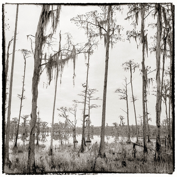
Hi Chan, Love Florida for its diverse collection of plants, from the magnificent Bald Cyprus Trees to the varied green and colored wetland flora, it is a beautiful juxtaposition of different colors and textures that are a photographers delight, and you have captured a fantastic example of what can be found in these parts of the country. Well done!!
Question, I tried blowing up the photograph but the resolution is too small...is that a Bird (blue'ish feathers) in the lower-left section, somewhat invisible? |
Dec 4th |
| 87 |
Dec 20 |
Comment |
Jennifer, a fine example of using leading lines to bring interest into a composition.
"Points to Ponder"
I would have liked not to have seen the tree branches (or bushes) on the right, as I feel they distract from the rest of the scene; was there a different position you could have tried that may have conveyed a similar narrative without the foreground branches?
Also, the heavy Blue color cast needs to be corrected in PSCC to bring a more neutral color to, at least, the sky and clouds, in my opinion. |
Dec 4th |
| 87 |
Dec 20 |
Comment |
Again, wonderful composition, Steven! And a fine example of using the Hyperfocal Distance principle in manual focusing. As such, I just posted part of another piece I am writing for the NANPA. Hope you all enjoy the read and add comments/questions.
As Chan has already pointed out, and I agree, the large Drawbridge and the beautiful (detailed) Skyline do not distract from one another and form a delightful and rather powerful image. I love it! :) |
Dec 4th |
| 87 |
Dec 20 |
Reply |
Very interesting experiment - well done!! really happy you shared it with the group!
Using the native or factory calibrated ISO (i.e. 100 or 250 for most manufactures) is always the best way to take photographs when at all possible.
But turning up the ISO is just another photographic technique worth its weight in Gold for helping to create pictorial effects in a natural way (well, as natural as we can be in the middle of the digital photography revolution). :) |
Dec 4th |
| 87 |
Dec 20 |
Reply |
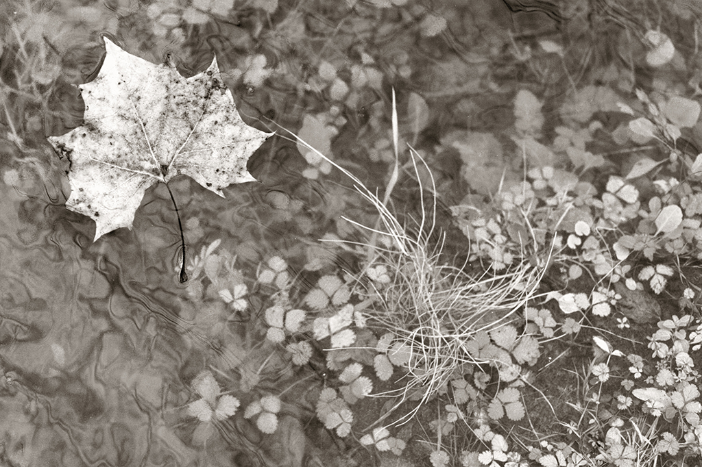
Steven, I went back a few months when you brought up the reasoning I use in not deliberately focusing more on the main subject: here is part of my answer from the last time we discussed this, I feel is relevant now:
"The idea is for the viewer to roam: it not always necessary to find a main focal point in any type of visual art: in this case, the entire frame is the subject. The 24mm fixed glass was used to capture the "whole" scene and not just the leaf. Without the other parts of this photo, (the out-of-focus background), an entirely different narrative would ensue, one that I feel would not be as interesting, at least not with this subject on this day".
Thank you, Steven! |
Dec 4th |
| 87 |
Dec 20 |
Reply |
Hi Chan! Really appreciate your confidence in my work philosophy.
Yes, there is so much beautiful and interesting things that inundate our daily space, we just need to slow down and take the time to "see" them.
I want you to go to the other group I administrate, DD-83 Mono, and on the "Bulletin Board" scroll until you see the topic on
"Wabi-Sabi". I feel you will benefit from what is discussed there.
I look forward to your feedback on DD-83. Thank you, Chan. :) |
Dec 4th |
| 87 |
Dec 20 |
Reply |
Happy Friday, Steven! Always like your analysis and happy your like the composition.
As it relates to Dof buttons: I waited for a digital camera to come on the market that I thought mimics a film camera before I shifted to digital: in 2009 5D Mark II (still my present workhorse) came on the market. The Dof button is a vital tool (just like the Exposure Compensation button) for photography and there is not too many well crafted film cameras without both.
(I mentioned your remark's about film grain in Jennifer's comments above). |
Dec 4th |
| 87 |
Dec 20 |
Reply |
Hi Jennifer - and happy this image attracts you. Referring to what Steven states below, it is true in 21st Century photography there are so many Film-type presets to add back into a digital capture the sumptuous/rich effects Film offer to many different types of compositions: to maintain a more traditional Photographic Technique, I add a bit of Grain/Noise via upping the ISO. Funny thing is, as DSLR's become more advanced (since 2015 or so) onboard processors have done a great job to lessen digital noise even at very high ISO's, (like my 5D Mark III), so this trick is harder to do unless I really crank up the ISO very high, indeed. |
Dec 4th |
| 87 |
Dec 20 |
Reply |
Good you pointed this out - I too noticed the over-spray, as it were, onto the otherwise BW portion of this photograph.
However, I still like Dales version, for the reason you mentioned: Smoother Transition. |
Dec 3rd |
6 comments - 9 replies for Group 87
|
19 comments - 30 replies Total
|


