|
| Group |
Round |
C/R |
Comment |
Date |
Image |
| 64 |
Oct 20 |
Comment |
The methods used were Traditional Photographic Techniques. The editing process did not include "deleting" or using digital software tricks or presets to achieve the edited version. (I am sure it will work 100 times better using your original Raw file). :) |
Oct 25th |
| 64 |
Oct 20 |
Comment |
This is a bit better, but still this example on this DD page is very bright, indeed. |
Oct 25th |
 |
| 64 |
Oct 20 |
Reply |
Unfortunately, the example is showing up too bright and is a False representation of what was achieved. I will try and post a better representation shortly, or you can send me your email to lewin.author@gmail.com and I will send you my 350kb file. Thanks, Jerry. |
Oct 25th |
| 64 |
Oct 20 |
Comment |
Good morning, Jerry. That is a fair question, but I am afraid my answer will be a bit conflicting. However, on second thought and experimenting with this image I went ahead and Applied Heavy Dodging, but not enough to wipe out the shadows.
The result has Muted the stone artifacts cleanly and now think it Balances well with the Rocky center (as it relates to contrasting with the smooth areas). Along with a suggested framing....it looks ready to hang. So, I may suggest that in fact, a bit of Dodging will work fine to balance the entire piece.
Post-Production: Global increase in overall exposure and then using the Dodging Tool in PSCC to selectively "wash-out" some the stone signature: maintaining the stone signature, but reducing its prominence. |
Oct 25th |
| 64 |
Oct 20 |
Comment |
Gee, Jerry, nice capture! They are a beautiful Bird and you have done well to capture its beauty, indeed. :) |
Oct 24th |
| 64 |
Oct 20 |
Comment |
Hello, Helen! Gee! I am getting dizzy looking at this photograph! Wonderful perspective! Quite amazing the clarity for a shot triggered at 1/20sec! Tripod? Or are you that steady!? :) I was years ago...(decades ago), now I can only keep a steady hand using my film camera. |
Oct 24th |
| 64 |
Oct 20 |
Comment |
Hello, Stan! One of my favorite genres of photography "Landscape" is well presented here. A lovely composition that includes a seemingly wide and deep Depth of Field (Dof): it is hard to investigate in PSCC because of the very low resolution.
In any case, what focusing technique (if any) was utilized?
Thank you, Stan. |
Oct 24th |
| 64 |
Oct 20 |
Comment |
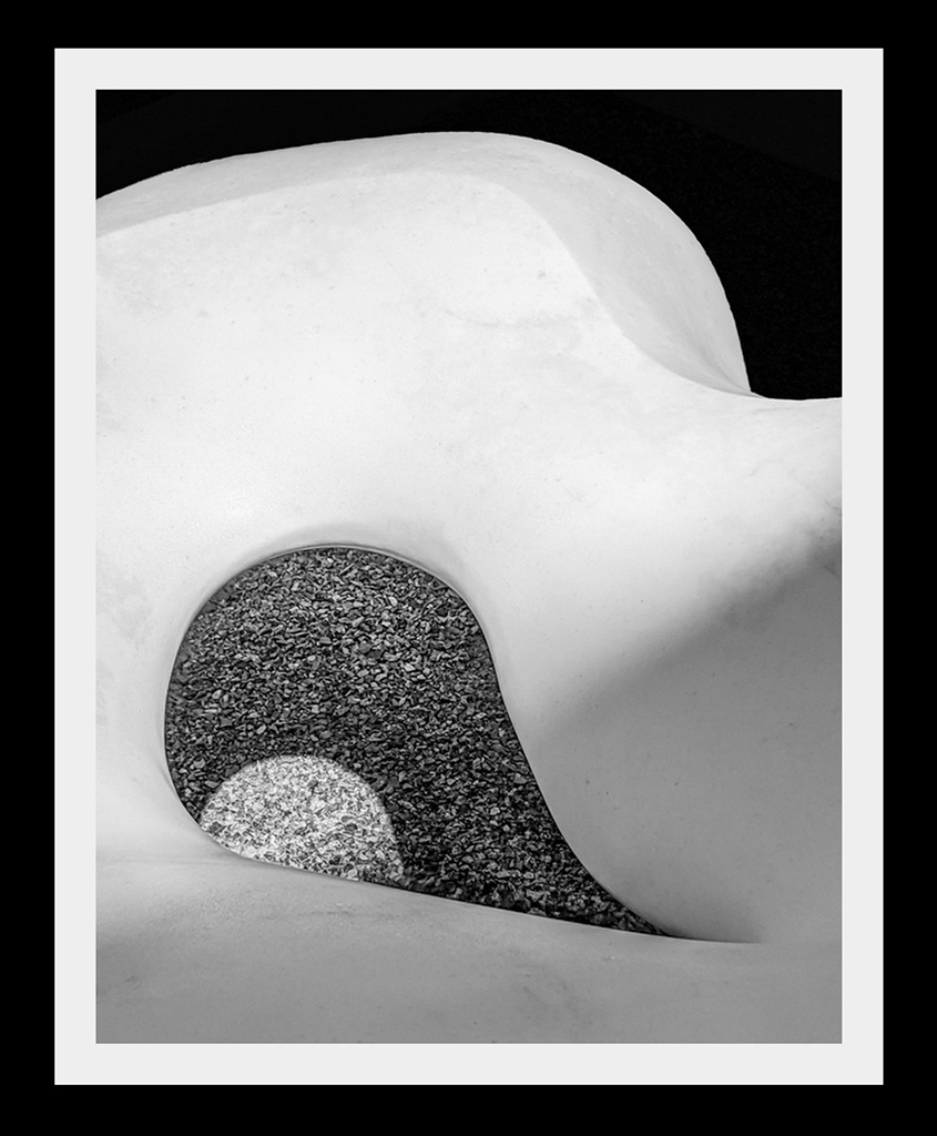
Hi Jerry! Very Edward Weston like in "construction": as opposed to other comments to crop out the Rich Black top and Shapely edge, I suggest alternatively, the current piece reveals a very attractive abstract. The Top Shapely Black Space compliments the shapely Grey-tone at center offering Balance and framing, not distraction.
Jerry, this piece was well designed through your viewfinder, and I like that! Your artistic eye seems keen. However, I have some caveats:
In my opinion, as a whole, I do not feel the piece is strong: I wish the white area of the marble was pure and not littered with its inherent and embedded artifacts; the composition calls for a smooth piece here. In this way the shadow, too, would be more appreciated or accepted. (I am not suggesting to manipulate-out the natural surface artifacts).
Food for Thought: Perhaps approaching this subject with a strong off-camera Flash would change the "complexion" of the white stone in a more White-Wash interpretation. Thanks, Jerry! |
Oct 24th |
| 64 |
Oct 20 |
Comment |
Hello, Don! A well conceived composition with deep rich blacks and subtle greys. I am especially enjoying the rope reaching out into the Black Void. An interesting piece! |
Oct 24th |
| 64 |
Oct 20 |
Reply |
....but also don't forget the upper Black space is the very "Void" the rope is leading us to...a mysterious vibe, indeed. |
Oct 24th |
| 64 |
Oct 20 |
Comment |
Wow! Very engaging landscape! Absolutely love the deep rich blacks for this subject. Having part of Dock in the foreground actually helps reveal perspective and a sense of"place". Beautiful! |
Oct 24th |
| 64 |
Oct 20 |
Reply |
Stuart, I posted a short piece on your Bulletin Board you may enjoy. Thank you. |
Oct 24th |
| 64 |
Oct 20 |
Reply |
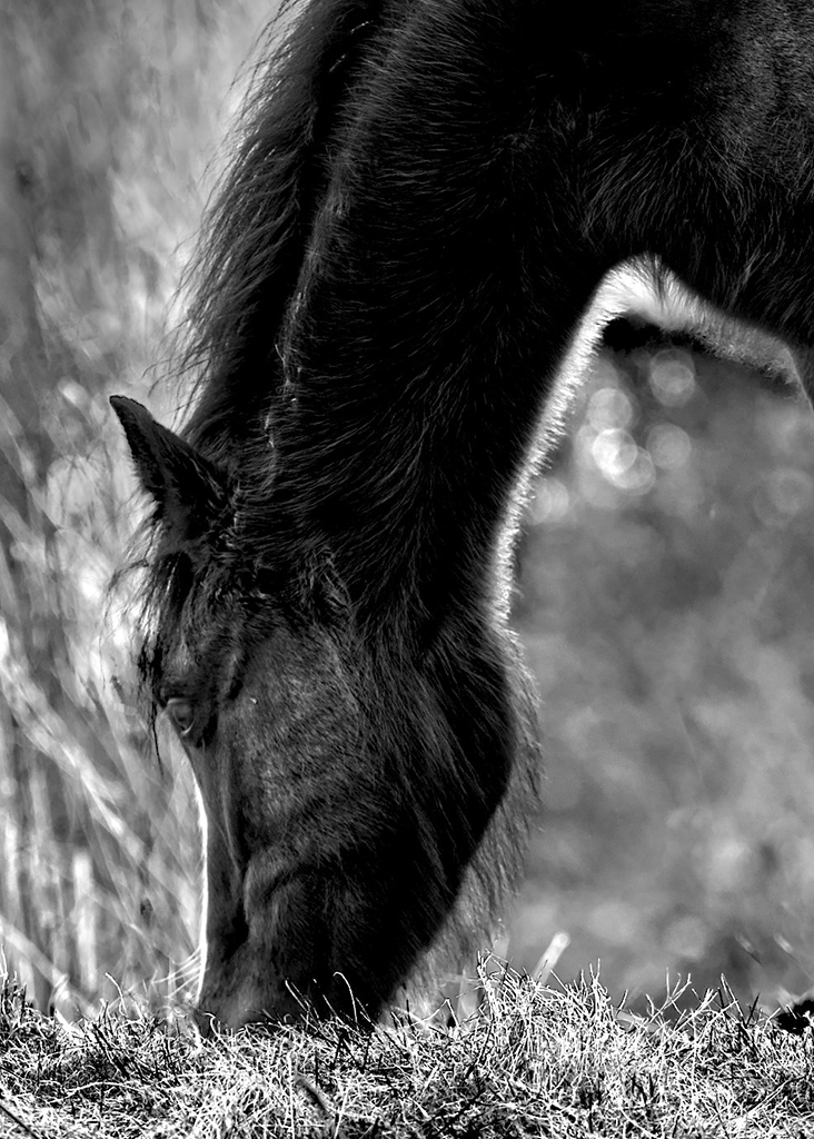
Stuart, always glad to hear and see when my words have inspired further thought and practice: this composition I really like! I especially like our friend peeking up at the lens of the camera - it gets real personal when a gaze of this sort is captured. Depth of Filed (Dof) has created a wonderful background bokeh and the overall Silhouette-like has offered the viewer a delightful scene.
On the other hand, "Black Beauty" is not as engaging and part of this, in my opinion, is because the Horses legs add nothing to this extreme silhouette: instead, I would have preferred to see just head and neck without the any reference to the legs. (see attached sample). In any case, again, your "Visualization" to "see" and capture the effect of light and shadow as it presented itself is well done! |
Oct 24th |
 |
| 64 |
Oct 20 |
Reply |
Good day, Stuart.
Or, you can go back and complete another photo shoot using different camera settings or at a different time of day to get more illumination that would highlight the eye more prominently. "Points to Ponder".
In any case, I really like seeing good Horse Portraits in BW and love the rich blacks you have gone with in this example. |
Oct 22nd |
10 comments - 5 replies for Group 64
|
| 83 |
Oct 20 |
Reply |
Thank you, Judy!!! |
Oct 30th |
| 83 |
Oct 20 |
Reply |
Jose, very good observation; the Halo a consequence of poor Dodging Technique on Pete's head and body.
I will surely redo this part of the edit to eliminate the halo.
As always, really appreciate your constructive criticism. |
Oct 30th |
| 83 |
Oct 20 |
Reply |
Hi John! Appreciate you coming by and visiting!
Thank you for your kind works! :) |
Oct 27th |
| 83 |
Oct 20 |
Reply |
Glad you are reviewing and thinking hard about this composition: I was lucky to see Pete on the beach as you see him, wet, cold and resting after being in the surf. I introduced myself and ask if I can capture some photos of him...he agreed. (The shot is not posed like all the other frames I have in this series of Pete).
I agree with the fact Pete represents a Strong Contrast to otherwise Soft aesthetic. Except for Pete....the composition is soft and contemplative as it reflects the vibe I felt upon approaching the scene.
Without shooting with fill-in Flash I was going to have to accept Pete to be Silhouetted against the water and sky - and frankly, I was satisfied during this very casual meeting and stroll along Lake Michigan: in this case, the shot represents a less than maximum effort to capture the Entire subject, which in this case is the Beach, and Pete as a prop.
By all means a more Contrast Interpretation is also an option, but the Mood will change drastically. Perhaps I will try this and post later this weekend. Appreciate you constructive critique, Dianne. |
Oct 23rd |
| 83 |
Oct 20 |
Reply |
LOL!!!! Its all good, Joe!! :) |
Oct 22nd |
| 83 |
Oct 20 |
Reply |
...No...I never suggested to Manipulate the Moon...my words are directed towards getting into a different position or time of night/day to effectively balance the moon.
On getting Horizons straight: this is most important for most photography (i.e. traditional landscape and seascape compositions) but of course can be skewed in other genres (i.e. portrait and of course, Abstract) for two examples. |
Oct 22nd |
| 83 |
Oct 20 |
Comment |
"Points to Ponder"
The entire image speaks for itself in an Abstract vibe. However, if I must point out a visual component that disturbs me...it is the Moon not being centered behind the antenna pole. With all the time and effort to position one self for this shot...I would have at least Centered the Moon here. (I am sure on a subsequent visit this can be achieved).
This particular disturbance is more important than any type of Dodging of black areas I see in this photograph - and I have a large-size file on my desk top CPU to review.
As PSA's new Black & White Photography Mentor - this is one aspect of compositional and technical critique I will be discussing.
Of course, there is nothing in photography that is set in stone: as artists we either find pure resolution in our interpretations or discomforting discourse in the way we ultimately "see" a photograph. My challenge is too help students of photography prioritize the important aspects within the composition and build from there. Thank you. |
Oct 22nd |
| 83 |
Oct 20 |
Reply |
...thank you, John!! |
Oct 20th |
| 83 |
Oct 20 |
Reply |
Interesting...I am not familiar with these App's?? Thank you. |
Oct 18th |
| 83 |
Oct 20 |
Reply |
Thank you, Joe...and the other question..."how long did it take you to find the right spot to set up your tripod, the very first time you tried this?" Thank you. |
Oct 18th |
| 83 |
Oct 20 |
Comment |
Welcome to the group, Joe!
I immediately like the very Rich Blacks in this composition.
The symmetrical balance is interesting and somewhat unique with this particular subject; I do not believe I have seen this scene designed in this matter - and for this alone is very creative, Joe. The clouds are illuminated and this is wonderful - I will guess this was due to the full moon and perhaps a bit of "Dodging"? In any case, the post-production conversion to BW is completed well. Well Done, Joe!
Question: how long did it take you to find the right spot to set up your tripod, the very first time you tried this? |
Oct 17th |
| 83 |
Oct 20 |
Reply |
...I appreciate this, Jose! Well executed composition and even better translation to Black & White. Bravo!
|
Oct 14th |
| 83 |
Oct 20 |
Reply |
Judy, the Dodging of the Horizon actually seems to bring out more clarity - I like the change in exposure, however, do not like the flipping of the image. |
Oct 14th |
| 83 |
Oct 20 |
Comment |
Well done, Jose!!
There is nothing I do not like about this photographic composition - it is bold and the 3-Dish visual display is well created! The "slightly" bright artifact in center-background helps add to the "Depth" of the scene - a true hallmark in making this piece be so engaging, as is the stark contrast in light & shadow. The final piece of this artistic portraiture is the slightly out of focus stream of water - for me being an important "Anchor" for pulling this composition together successfully.
And only in my opinion....the shot (and your description) indicates this was captured as seen through the viewfinder - and little or not exaggerated post-production manipulation was used - making this even more enjoyable to view. |
Oct 14th |
| 83 |
Oct 20 |
Comment |
Good morning, Dianne! Hope you do not mind the lengthy post.
And a lovely artistic view from behind your viewfinder! I like this very much for both your creativity and most of the technical aspects: as Judy suggested, I would likely "Dodge" or lighten a few selected areas, but ever so gently, as we still want to maintain this heavily contrast composition; the very hallmark of making it engaging (and different).
Flipping the image is not a good idea - and for the reasons Judy stated.
Adding any type of Vignetting (or barreling, as term rarely used anymore) will detract from the overall scene: the scene does not need any more dark shading or image-focusing trick - the original shot as seen here allows the viewer to take in the "whole" scene.
How Dark is Too Dark:
Frankly, the only time I worry or need to correct a portion of a photograph is to help separate particular artifacts from the background - and only in cases where the two objects are completely "melted" into one another and "Detracts" from the narrative I was trying to create. Alternately, Extreme Black areas are a wonderful visual dynamic I especially like in Abstract work - and in many cases increase the black areas until no details can be seen!
(See my two Abstract Examples from New Mexico on the Bulletin Board posted a month ago.)
Focusing: hyperfocal focusing: just a short word on "manually" focusing Landscape compositions and using the Hyperfocal technique: though you are using F/13 and surely allowing you to have a deep Depth of Field (Dof), we use Hyperfocal technique (instead of the new focus stacking) to quickly, I may add, keep more in focus from front to back within a composition. Looking at your work in PSCC the horizon area may be a bit blurred to focusing issues (and pixel defraction) these two subject we can discuss later on the Bulletin Board.
Most important was your creativity to search, see, and capture this lovely morning scene. Great job! |
Oct 14th |
| 83 |
Oct 20 |
Reply |
IMAGE RE-SIZING:
Judy, re-check the image size: 1024 on the longest side and then Save not larger than 900kb. This image seems to Open too large to properly view details. Thanks. |
Oct 14th |
| 83 |
Oct 20 |
Reply |
These are good suggestions, Judy.
Yes, I saw these over bright areas, they need to be toned down.
As for the negative space, though I like your crop, (and very much a viable option) I still want to maintain the great expanse in both the sea & sky: in this case, the darkened clouds (and the large area of sky) both create great drama - and maintains the subject as only a part of the composition (not necessary grandstanding) but part of the overall Grandscape experienced in real-time. |
Oct 13th |
| 83 |
Oct 20 |
Comment |
Judy, this is a very engaging image! There is so much happening in the scene, but it is not over powering. The range of grey-scale is beautiful. Well composed and edited into BW. Well done! |
Oct 12th |
| 83 |
Oct 20 |
Comment |
Hello, Debasish! Well, I must commend you for composing this very abstract piece - as water can be very difficult to "tame" as it were in providing a reasonable engaging image.
This type of composition needs to be printed very large - both paper or metal needs to be investigated for the most powerful results. I also feel several more images like this one (keeping to the same style motif) next to each other will likely result in engaging more viewers. |
Oct 12th |
6 comments - 13 replies for Group 83
|
| 87 |
Oct 20 |
Reply |
Welcome to our page, Jerry.
Yes, I was thinking about creating a new composition by cropping this one....it is surely a viable idea. The results would be more abstract than what we have here...it might work well. I'll look at this. :) |
Oct 27th |
| 87 |
Oct 20 |
Reply |
Good morning, Chan. This is true, as you stated..."Sometimes what is not included serves to lead the eye to the primary subject"...which in this photograph draws the viewer to the center and then outward....appreciate you sharing this thought. |
Oct 20th |
| 87 |
Oct 20 |
Reply |
Good morning, Dale...well, I appreciate that...thank you! |
Oct 20th |
| 87 |
Oct 20 |
Reply |
Love hearing this, Chan! |
Oct 17th |
| 87 |
Oct 20 |
Reply |
Thank you, Chan! |
Oct 16th |
| 87 |
Oct 20 |
Reply |
Yes, exactly. Good point, Steven. |
Oct 16th |
| 87 |
Oct 20 |
Reply |
Allow me to interject: I feel lightening his face will cause the viewer to pay too much attention to him: in my opinion, I feel the entire composition draws on its ability to focus on the whole, where a great amount of Depth is realized.
Illuminating the person may detract from this engaging perspective. "Points to Ponder". Thank you. |
Oct 16th |
| 87 |
Oct 20 |
Comment |
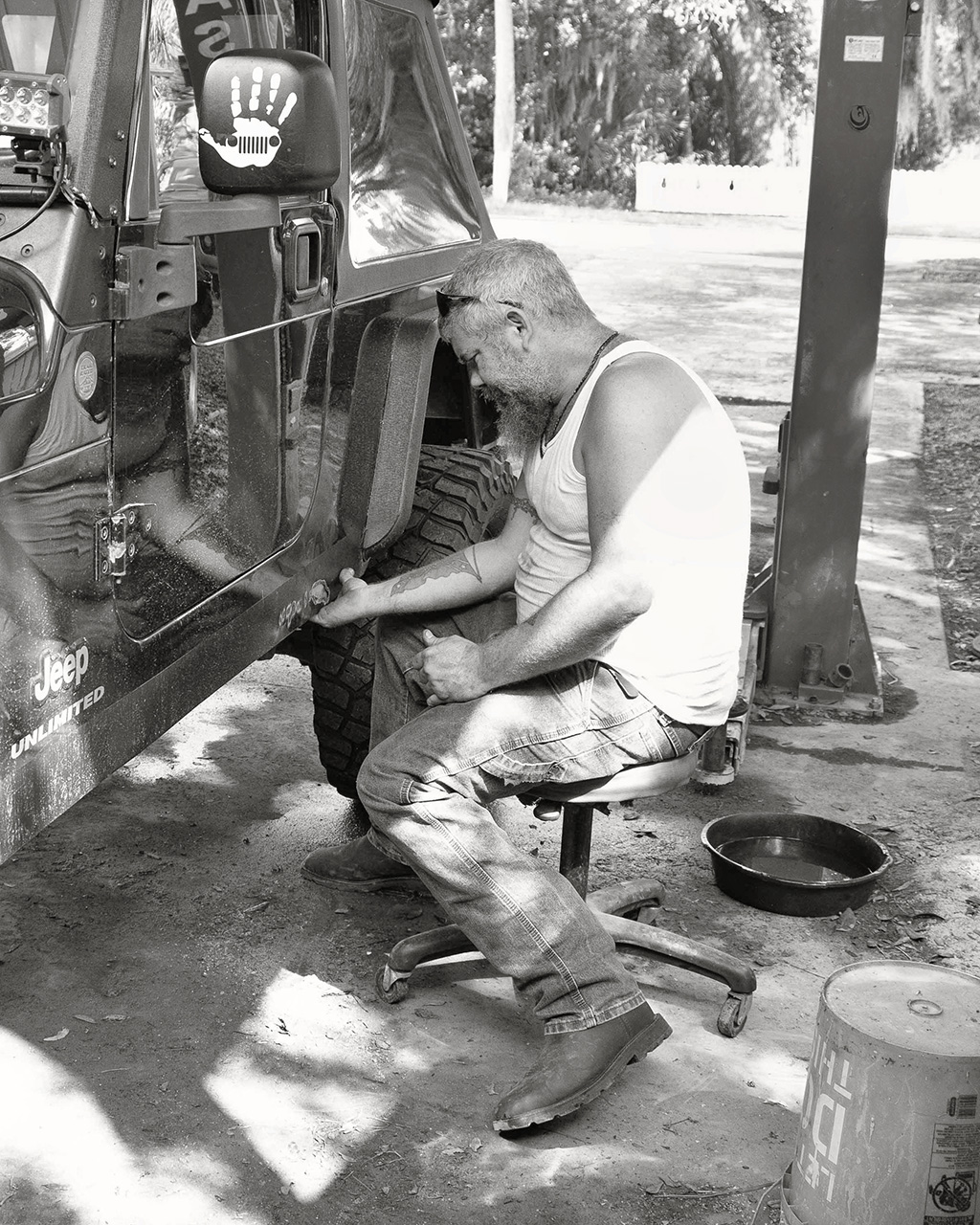
Here, we see all the interesting shadows, ground dirt, oil pan, and Dennis's boots. The shadows within his jeans adds texture. I Dodged & Burned several areas.
Again, just an alternative narrative I wanted to share. |
Oct 13th |
| 87 |
Oct 20 |
Comment |
Hi Chan!
Your Main photograph is a well detailed photograph that reveals a lot of natural "grit" - and I like that. Also, I love the reflection of Dennis in the Jeep door - it adds incredible amount of interest, indeed. The background is limited, but I like the out of focus light & shadow. The piece is well conceived and executed!
Technical: So, an alternative version that Shows Off more of what Dennis is engaged in, is to back off and include the very interesting artifacts that "define" the space he is working.
The closer cropped versions are taking out both minute and also significant details that in fact are hiding Dennis's personality. In stead, Open Up the view in these types of shots to include the subjects surroundings.
Of course, a close-up version also works, but for entirely different narrative; a portrait, instead of a shot that focuses both on the sitter and his craft...or whatever.
|
Oct 13th |
 |
| 87 |
Oct 20 |
Comment |
First and foremost, I am really enjoying the scene: another well crafted documentary landscape only a BW (in my humble opinion) can illustrate.
Technical:
F/18 really helped in keeping the buildings crystal clear (and so did the blending) - and love the darker grey-scale - it works very well.
However, the top portion of the sky in the original color image, needs to also be maintained in the BW crop: the sky is a very important component within your frame and cropping some of it out takes something away.
Can you try a "Square" crop or other ratio to keep the entire sky and also manage to be close to the current BW version? |
Oct 13th |
| 87 |
Oct 20 |
Comment |
Hi Dale! Love this guy!
Dale, this is a very well composed and illuminated scene.
Technical:
I absolutely love the scope of grey-scale in both Ario and the chair; they mend together gracefully.
However, I am not a fan of extra "structure" and feel it places this type of photograph more closer to a commercial feel, (or Poster-like) in its visual aesthetic, rather than a family portrait.
In any case, this is a beautiful photography! |
Oct 13th |
| 87 |
Oct 20 |
Comment |
Graham, I really like this composition! A very attractive and just as important, informative/documentary (vernacular) description of the San Francisco area. Well conceived and captured!
Technical:
Like Steven mentions, I feel like I am in the scene - in fact on first look, I was slightly light-headed! The very dark contrast (and including the man crossing in front of us) works very well to illuminate (or create) this very engaging perspective. |
Oct 13th |
| 87 |
Oct 20 |
Comment |
Jennifer, this is a well thought out composition: most striking is the contrast between the horizontal lines of the water, and the vertical statue of the Egret. The special vertical crop just adds to the aesthetic. Well done!!
This is a perfect example when we speak of the Gestalt of a composition: where the Sum (of the entire composition) is greater than the individual parts: that is, we take-in (visually) the "Whole" and recognize the photograph, painting or drawing as very engaging.
I believe months earlier I spoke about the Gestalt Theory in Art - and now that we have the Bulletin Board, may re-introduce this concept to everyone. |
Oct 13th |
| 87 |
Oct 20 |
Reply |
Hi Jennifer! Indeed, we have a here a very Cold and Winter day in Alabama. Of course the extreme abstract lines created by the tree branches is what sparked my interest - I am glad you like it.
Our internal perceptions on making things complete unfortunately question this particular crop - and as Steven asked, I do not have another view that includes the top/bottom of the tree. As such, the photograph will be deemed less than perfect.
In any case, I still like it and think it works enough to Matte & Frame. |
Oct 13th |
| 87 |
Oct 20 |
Reply |
Hi Steven! I was wondering the same thing as it relates to everyone posting a BW image....I like this!
Good question - I normally crop through the viewfinder, but not always. I will need to look through the original DL's to see if this was cropped in post-production. And yes, it is the only caveat to this composition - but I hope it is still engaging.
In the mean time, please fill-in with your imagination. :) |
Oct 10th |
6 comments - 9 replies for Group 87
|
22 comments - 27 replies Total
|


