|
| Group |
Round |
C/R |
Comment |
Date |
Image |
| 29 |
Sep 20 |
Reply |
.....I agree....the motion is expected, but without any "Bolts" within the main portion of the frame (within the main portion of the clouds) the movement is "alone" and not productive, in my opinion.
But indeed, it is natural and I always like that. Can't wait to see more of this type of work from your deck next month.
Very cool series of work, Bob. :) |
Sep 9th |
| 29 |
Sep 20 |
Comment |
Hi Bob.
A very interesting color (toning) that was either natural or added in post-production - in any case, really very cool. The Tree-line adds a perfect point of perspective as it relates to distance and scope of the field of view...i really like this idea, too!
However, the main part of the image (actually the entire field of view) except for the lightening bolt, is very blurred due the timed-exposure - and though I love experimenting with "Bulb" exposures...here this does not work, Bob: the Distraction of the large blurred portion of the frame is made even more noticeable with the contrasting, extremely "sharp", lighting bolt in the lower right...in fact, this part of the frame is Spectacular! As Kathleen already suggested, I would at least Crop out the Lighting bolt and save-as a separate photograph - assuming the the main image has enough resolution to do this successfully.
Wondering, was there vibration on the deck...perhaps if you or someone moved during Exposure that may have added to the blurriness?? Just a thought.
Alternatively, perhaps a faster shutter speed (and higher ISO) - triggered remotely (or via timer) may have rendered additional frames with a different outcome.
I am sure there will be more opportunities as we head through fall and again in spring to experiment with this - especially having this wonderful view fro your Deck.
|
Sep 6th |
| 29 |
Sep 20 |
Comment |
Good morning, Kathleen!
First, and most important - your ability to search and "see" this particular subject - not an easy find - is wonderful!. I really enjoy getting down close and personal with nature...'see as the insects see'...but the shot has caveats.
1. I would like you to begin taking your camera off Program and use either the Aperture or Shutter Priority Mode: for nature and landscape AP Mode will be the correct decision. In this way, some of the "out of focus' concerns Bob Legg has mentioned can be better controlled: in fact, in AP Mode The User (you) are in control of Depth of Field (Dof) and thus a large degree of the "creativity" you have control over - (this is something that should have been discussed in any Landscape and Nature course you have taken).
2. Really, at this point, I feel after you begin taking more control over what Lens opening (or Aperture) some of the issues discussed here will be fixed.
I must also agree with Bob to DELETE the bug (or dust) on the snail - though I use this type of software and USE very carefully and sparingly. Feel free to reach back to me for continued discussion on the items I speak of today.
Lance
Admin DD-87 and DD-83 Mono |
Sep 6th |
2 comments - 1 reply for Group 29
|
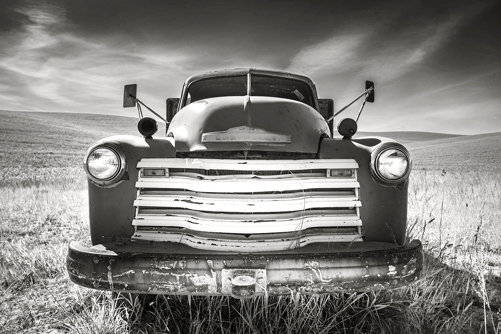
| 39 |
Sep 20 |
Reply |
In this way, I kept the BW conversion as close as possible to mimic the color version: keeping the grill bright, but also emphasizing the sunlight that is illuminating the bottom of the front bumper....and area around it. |
Sep 10th |
| 39 |
Sep 20 |
Comment |
Hi David! I really like this perspective....well conceived and executed composition.
Though the heavy contrast works well here - Jerry brings up a valid point towards "Dodging" the dark area at bottom right: I went ahead and made a new BW conversion that equates to a slightly less "dark" aesthetic. I also addressed the bottom right by increasing the exposure "overall" and then Dodging the area in question.
A custom Copper-silver toning was added.
|
Sep 10th |
 |
| 39 |
Sep 20 |
Reply |
Hi David. In this case - with this subject and in this particular light - I feel it is leaning toward a more abstract theme.
But by all means, often a wider view is needed to define the "Space" or location...but not here. Appreciate your encouraging comments, David. |
Sep 10th |
| 39 |
Sep 20 |
Reply |
I look forward to seeing more photographs from this shoot! :) |
Sep 10th |
| 39 |
Sep 20 |
Comment |
Another beautiful IF composition! This is well balanced and engaging, Jerry. Love it!!
Can you share with us what type of paper you would use if/when you decide to print this beautiful scene? Thank you. |
Sep 9th |
| 39 |
Sep 20 |
Comment |
Gee, this is a fine composition, Larry. A prime example of using Light & Shadow to "create" something more than initially meets our eyes.
The scene very much reveals the vernacular of this location, its people and way of life - well done. |
Sep 9th |
| 39 |
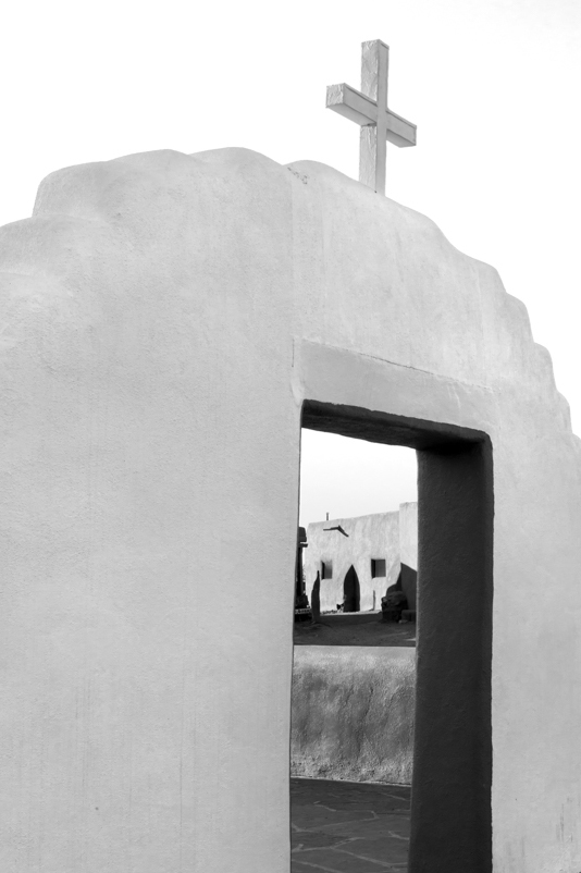
Sep 20 |
Comment |
Hello, Steve, thought I would stop by....one of the more iconic locations to visit and shoot, indeed. A favorite location I visited myself, in 2017.
As someone who enjoys capturing scenes (and many iconic scenes) from a new or different perspective, I was immediately drawn to your piece, I like the visual creation you are heading towards: some notes and ideas:
The Washed out sky and White entrance is very appealing idea that focuses on using Light & Shadow to engage the viewer. The second part of this composition that adds to its appeal is the framed architecture seen through the opening...well framed and conceived.
However, effects of this Light & Shadow, and the distance structure (with its light/shadow effects) lends itself more towards an abstract theme.
In this case, I would liked to see a shot (cropped through the viewfinder) that would "abstract" or take out more detail from this particular shot. Of course we can Crop the current image - and this is perfectly fine - but I am suggesting for the future we all spend more time to "see" more than initially meets the eye; that is, sometimes we need to step outside the box of conventional ideas to capture a composition that "Pricks" the viewer, as Roland Barthes so eloquently quoted of photographs that engage and spark interest.
I took your picture and cropped it to show an example that takes full advantage of the Light & Shadow you have captured and presented. Of course, a similar composition created on site (through the viewfinder) would have yielded a more balanced scene - but you get the idea I am discussing here. |
Sep 9th |
 |
4 comments - 3 replies for Group 39
|
| 47 |
Sep 20 |
Comment |
Good day, Don.
Beautiful scene! And frankly, I really like the portrait crop. The only caveat, in my opinion, is the entire scene is distracting.
I am not sure if its the heavy contrast or too much post-production alternations that has me forcing myself to find and enjoy the different shapes, lines shadow and light we see here: the composition seems too busy. Perhaps this how it is presented on my monitor and a printed version would reveal a more authentic aesthetic.
|
Sep 9th |
| 47 |
Sep 20 |
Comment |
Hi Jack! A very emotional statement as we are all aware of the latest news coming out from the west coast.
This is a well composed Documentary Fine Art example what can be done when we choose to tell (or report) a story while also hoping to create an engaging piece worthy of Print.
The authentic presentation is refreshing to see: you have decided not to add too much spice to the recipe - and in doing so have retained the natural "Drama" that reveals itself here. Well done!
"Points to Ponder" - an alternative presentation may include a more Contrast version overall - but only just a bit. Just a thought. |
Sep 9th |
2 comments - 0 replies for Group 47
|
| 62 |
Sep 20 |
Comment |
Hello, Emil!
Yes, a wonderful idea - well visualized, conceived and executed. A very "Garry Winogrand" like photographic style and the BW version is dramatic. Well done, Emil!
However, I do not agree with the other members: removing all the artifacts from what was captured in real-time also removed the part of the "foundations" that define the this particular Space. The BW conversion is very "strong" due to its heavy contrast in combination with the perspective, indeed, but more strength can also be attributed to common artifacts commonly seen (and native) to certain spaces/locations.
"Points to Ponder"
In this type of work - the artifacts you removed actually kept in place can help add to the "character" of the scene - of the this particular space.
|
Sep 10th |
1 comment - 0 replies for Group 62
|
| 83 |
Sep 20 |
Reply |
Hi Dirk!
It was amazing to see in real-time - especially through the viewfinder....I am glad you like this composition - as always, really appreciate your comments. |
Sep 28th |
| 83 |
Sep 20 |
Reply |
Good day, Debasish! Really appreciate your analysis. Yes, this image very much represents the amazing visual experience seen during this hike.
Some Notes:
In post-production I had to "Dodge" the base of the tree to bring out detail - but the slightly overexposed top-end and grey-scale range is the hallmark of the shot - and so this is left untouched.
|
Sep 28th |
| 83 |
Sep 20 |
Reply |
Hi Jose. I always like your insights on everyone's work - and I appreciate your comments here: I still like #2, and very fond of the Main Photo & #3 as you do. Photo #1 is barely appreciable, but none the less a good choice for discussion.
Thank you, again, Jose! Have a great day.. |
Sep 17th |
| 83 |
Sep 20 |
Reply |
Yes, indeed...you make very logical and thoughtful observations and comments. I am also happy these types of work and conversations are challenging your creativity.
My first attraction to these scenes is most definitely the Shapes and Shades of the leaves and branches - how they reveal themselves (by the direct and indirect) light, and the accompanying shadows. The tone range is very interesting and why I go after this aesthetic (through film).
Now a word about image quality and how they look especially on PSA pages: on my fairy large desk monitor it is very important I only observe these 4 images 'as they are posted'. If I Click on the image they are too large and do not have the resolution to sustain the aesthetic of the actual photograph. So be sure not to click on these.
This said, back to your thoughts on the Sun being a distraction: yes, I can see where this actually can/has muted the other details (which was part of my experiment) but I also like the effect seen in #2, where in fact, details are maintained. It is something I will need to challenge myself further to find out if this is something that will eventually work as "engaging" on a more consistent basis.
In the end, I still like #1 for its grandeur and unique Glow. I will do a test print at 16x24 to see if this works. I will share the results later in fall.
Thank you for your comments, Dianne.
|
Sep 14th |
| 83 |
Sep 20 |
Reply |
Hi Judy.
It is all three variables. The Light & Shadow are the key components: all the examples are a play on light & shadow and perspective (with the Rokkor-X 24mm lens) that creates grandeur.
The other main component was finding and using the Sun directly, not just to illuminate the scene, but be part of the actual composition: an actual component or artifact.
My experience with both Digital and film finds this creative blend works best shooting in film - but by all means is not impossible through a digital sensor. |
Sep 13th |
| 83 |
Sep 20 |
Reply |
Good. Also, I like that in some cases the change between the different color filters are very subtle - and I like that. |
Sep 11th |
| 83 |
Sep 20 |
Reply |
Correct, Judy. Each filter can add or delete a certain amount contrast in BW photographs. In some cases dramatically changing the entire aesthetic! And I will add, I feel all these particular "digital tools" (mostly) stay true to traditional photographic technique. |
Sep 11th |
| 83 |
Sep 20 |
Reply |
....and to be more clear...the use of a RED Glass filter with film is to dramatically increase contrast when shooting BW film. (Three (test) examples can be seen on my website in the Eastman/5222 folder). |
Sep 11th |
| 83 |
Sep 20 |
Reply |
In the future - one of the best color filter systems is the array in Silver Efex Pro-2 - I normally go to the Red first (as I often use a Red Glass filter on my film camera when shooting) to review blue sky's turning black, for example.
They have a very similar effect between them (glass/digital filter) - though of course you have the option in Efex Pro to adjust intensity, too - like your Slider, I guess. |
Sep 10th |
| 83 |
Sep 20 |
Reply |
Very good description of your visualization in finding (and interpreting) this scene: the title is perfect as the towers are seemingly ready to crumble to the ground.
A fine example of seeing more than initially meets the eye; we are constantly surrounded by amazing beauty, from all sorts of objects that fill our immediate environment - again, well conceived and executed. |
Sep 9th |
| 83 |
Sep 20 |
Comment |
A terrific composition that reveals the differences in texture; a direct influence from strongly illuminated wall and a complete alternative (smoother) texture in Shadow...I really like this, Dirk!
Also, this is another fine example of learning to "see" these otherwise common-place artifacts that surround our space, but in most cases, go unnoticed. A well conceived and executed composition, Dirk. (Another example that may spark conversation on the latest Bulletin Board discussion). |
Sep 8th |
| 83 |
Sep 20 |
Comment |
Hello, Jose!
A fine example of capturing the "Space" to define the location or "Place". (Good Directors of Photography in movies and Television can make an ordinary shot be more engaging and informative by backing-off with a wider lens...I drive my wife crazy while we watch movies and TV shows!! LOL!!)
I am guessing this scene is natural; a vernacular of the life and pulse within this city? Can you add some more information about the location?
The shot is very "Gary Winogrand" as we can begin to interpret what is actual happening here: is the man visiting the artist or actually the subject.
Technically, I feel it captures the mood/lighting very well, however, a slight increase "Dodging" of the interior could prove beneficial, but surely not necessary.
In any case, well captured, Jose! :) |
Sep 8th |
| 83 |
Sep 20 |
Comment |
Again, welcome to the DD-83 Dianne!
First, this is a great example of working Light & Shadow (and works as an example with the new discussion I posted on the Bulletin Board).
Many fine photographs are conceived (found or otherwise Visualized) only after the frame is captured. I often tell students of photography not to be afraid to "back-off" the intended subject when not sure - and to crop later in Post-Production (both Darkroom and digital counter alternatives) in hopes of fine tuning or in your example, finding the actual Composition!
A very well executed piece, Dianne! The BW rendering fits this type of work so perfectly, as BW photography emphasizes Light & Shadow so well. The Abstract is very engaging!
The dark sky is contrasted against the mid-shade (grey) leafs; comforting and not being "hard" - and I like that, in my opinion. (Can you share with us if you used a color filter in Silver Efex Pro...it looks like RED filter may have been used).
Jack is correct, an alternative would be to make the sky portion Jet-black - but I feel this would make the piece very "edgy" but surely a viable option, indeed.
I think this type of work will be "within" your comfort zone going forward. Well done! |
Sep 8th |
| 83 |
Sep 20 |
Comment |
Good morning, Debasish.
I am currently working on a very involved water-reflection chapter within work from my 'Intimate with Nature' series and like this very well conceived reflection-study - I like this very much! The composition is recognizable while also being abstract: it is cerebral. Well done!
Can you elaborate on the process you used to "see" this subject in this way? I feel it is important for others to know a little about the back-story to understand how sometimes we find and compose pictures (and in this case)a very appealing water-reflection composition.
Thank you, Debasish.
|
Sep 8th |
| 83 |
Sep 20 |
Reply |
Hi Stephen! Well, to answer your question directly...light painting has the ability to allow the artist to Add (or leave the subject in Shadow) at different degrees (or levels of intensity) then a normal Studio-like set up.
As important, light painting also allows the artist to pin-point exactly where the light will be used...far more accurately than the tools we normally use to add, diffuse or otherwise create light effects in a scene. |
Sep 2nd |
4 comments - 11 replies for Group 83
|
| 87 |
Sep 20 |
Reply |
No....this is all news to me...creepy stuff! LOL!! |
Sep 3rd |
| 87 |
Sep 20 |
Reply |
...how interesting! And if I may, who is the Painter? I work with a lot of artists in the Atlanta and North, Georgia region. |
Sep 3rd |
| 87 |
Sep 20 |
Reply |
Absolutely! |
Sep 3rd |
| 87 |
Sep 20 |
Reply |
Thank you, Jennifer! :) |
Sep 3rd |
| 87 |
Sep 20 |
Reply |
....I did not know my digital camera can do that! Who knew?! LOL!!
Good questions: As this is NOT captured with a Macro lens, but seemingly exhibits similar visual ques - the tallest Dancer, if I may, is about 2" tall..maybe 3 if we add the curved portion.
This is actually a funky moss that was growing on the tree limb in Central Florida - I only saw this one tree with the strange growth, however.
Appreciate your comments, Steven! :) |
Sep 3rd |
| 87 |
Sep 20 |
Reply |
Cool! :) |
Sep 3rd |
| 87 |
Sep 20 |
Comment |
Quite the change from the original...yup, a good example of the effects viewed by pictorial work, but of course here, the 21st Century technique is purely digital.
Well conceived and created, Chan.
Everyone: Please, see my piece detailing Pictorial Techniques on the Bulletin Board. Enjoy. |
Sep 3rd |
| 87 |
Sep 20 |
Comment |
Great shot, Dale! She is so lovely!
Great idea to capture her while eating the Donuts...it adds the perfect amount of "added" interest. Well done!!
The only thing I may do is make the overall Exposure slightly higher....what do you think? |
Sep 3rd |
| 87 |
Sep 20 |
Comment |
A beautiful space, indeed, Graham.
Nicely balanced composition that captures the essence of this amazing garden. Well done!
Points to Ponder: I would likely "Dodge" some of the areas in shadow: Just a little, so to keep, and allow the viewer to still appreciate the Light & Shadows that are one of the hallmarks that make this scene interesting and so, so beautiful.
Perhaps you can Dodge some and post the results. Thank you, Graham. |
Sep 3rd |
| 87 |
Sep 20 |
Comment |
Hi Steven! Yup, Dirk has some very interesting compositions in DD-83 Mono - and your color interpretation (and composition) is wonderfully conceived and captured!
Gee, i love the rich deep color in this type of shot! Well, done! |
Sep 3rd |
| 87 |
Sep 20 |
Comment |
Really like this, Jennifer!!
A sorrowful looking Sun Flower, indeed - but part of nature's cycle of life - and yes, the tell-tale signs summer is near its end...dear I suggest a BW version!
Well visualized and captured! |
Sep 3rd |
| 87 |
Sep 20 |
Reply |
Indeed, Beauty found in the understated or even the old and broken: a Japanese Aesthetic known as "Wabi Sabi" - a discussion we have enjoyed at some length in my DD-83 mono Group. |
Sep 3rd |
5 comments - 7 replies for Group 87
|
18 comments - 22 replies Total
|


