|
| Group |
Round |
C/R |
Comment |
Date |
Image |
| 83 |
May 20 |
Comment |
This composition reveals a strong sense of isolation. The treatment to render the (likely crystal clear blue)sky dark, is very compelling against the white walls and also mate well with the dark shade and black void within the frame of windows, thus the ingredients to help define the powerful narrative.
Nicely visualized. |
May 8th |
| 83 |
May 20 |
Comment |
My son and me traveled extensively between 2013 and 2018 crisscrossing the Southeast and Midwest for our business - and this scene reminds me of many early morning treks up and down roads exactly like this: the early morning hours were our favorite because of the beauty and mystery of light and shadow, as it tried to pierce fog or mist. I find this photograph a great example showing (documenting) the vernacular associated with small towns settled, seemingly, far from a major city.
A well executed composition. |
May 8th |
| 83 |
May 20 |
Comment |
Hi Dirk!
In my Group-87 I was just asked the same question - how funny! First, I love this very unique composition - very abstract in an obscure way.
I often convert flora to BW, but I will tell you, not every color flower, tree and bush works well as a BW rendering.
It already seems some extensive work (or polarizing) was done to the color version - and in this case, I feel the BW version needs more work: I find on my large desktop monitor the BW version extremely washed out: but again, I see the color version a bit washed out, too.
Is there RAW file original - this may be more apt for converting to BW.
|
May 4th |
| 83 |
May 20 |
Comment |
A splendid artistic presentation - I like it a lot. Very soft, intimate and inviting: would be a welcomed piece framed and placed under a spot light. :) |
May 1st |
| 83 |
May 20 |
Comment |
A very good discussion. Thank you, guys! |
May 1st |
| 83 |
May 20 |
Reply |
...that is a good crop, Georgianne. |
May 1st |
| 83 |
May 20 |
Comment |
Yes, it is boring, indeed. And yes, it did serve its purpose for the class project. :) |
May 1st |
6 comments - 1 reply for Group 83
|
| 87 |
May 20 |
Reply |
Hey, Steven...thank you! I am glad you like this shot..it is one of my favorites. |
May 24th |
| 87 |
May 20 |
Reply |
Hi Graham! I can see your point of more contrast, but I feel this will lessen the soft aesthetic too much. And the Trumpet composition is my favorite picture to date! I appreciate your kind words, thanks! |
May 24th |
| 87 |
May 20 |
Comment |
This is simply a "darling" image. The lighting or highlights are well designed and the entire feeling is of pure joy.
Thank you for sharing this lovely photograph, Jo. |
May 24th |
| 87 |
May 20 |
Reply |
..yes, the use of Blue Hues works to help define the space well: a cold and frigid day. |
May 19th |
| 87 |
May 20 |
Comment |
Hey, Graham! Yes, my reaction is similar to Judy's: a very peaceful scene....really like the subdued colors - captured or created via post-production - in any case, defines the tranquility, as well as the cold weather: its looks very frigid. Well composed, Graham! |
May 18th |
| 87 |
May 20 |
Comment |
Guys...this is a wonderful conversation....you all have great ideas...love this interaction between everyone in the group! |
May 6th |
| 87 |
May 20 |
Reply |
Hey, Jennifer, thank you!
So, yes, a wide open lens, natural light and careful composition will sometimes render a beautiful "glow"...I especially enjoy this in my portraiture. in fact, I think you all had a link to one of my articles focusing on how I capture portraits in a very pictorial manner, but only using natural dynamics (i.e. natural light, fog, rain, etc...) and a varied assortment of camera dynamics (i.e. aperture, shutter-speed, ISO settings, etc...).
https://photopxl.com/softer-digital-interpretations/
|
May 6th |
| 87 |
May 20 |
Reply |
Good evening, Dale! Appreciate your feedback - and yes, rain or any type of water source can be a wonderful natural dynamic that can add interest to many different types of subjects...Landscape and various Flora compositions normally do best. Of course, some very provocative Portraiture are the results of including rain in some form.... :) |
May 6th |
| 87 |
May 20 |
Reply |
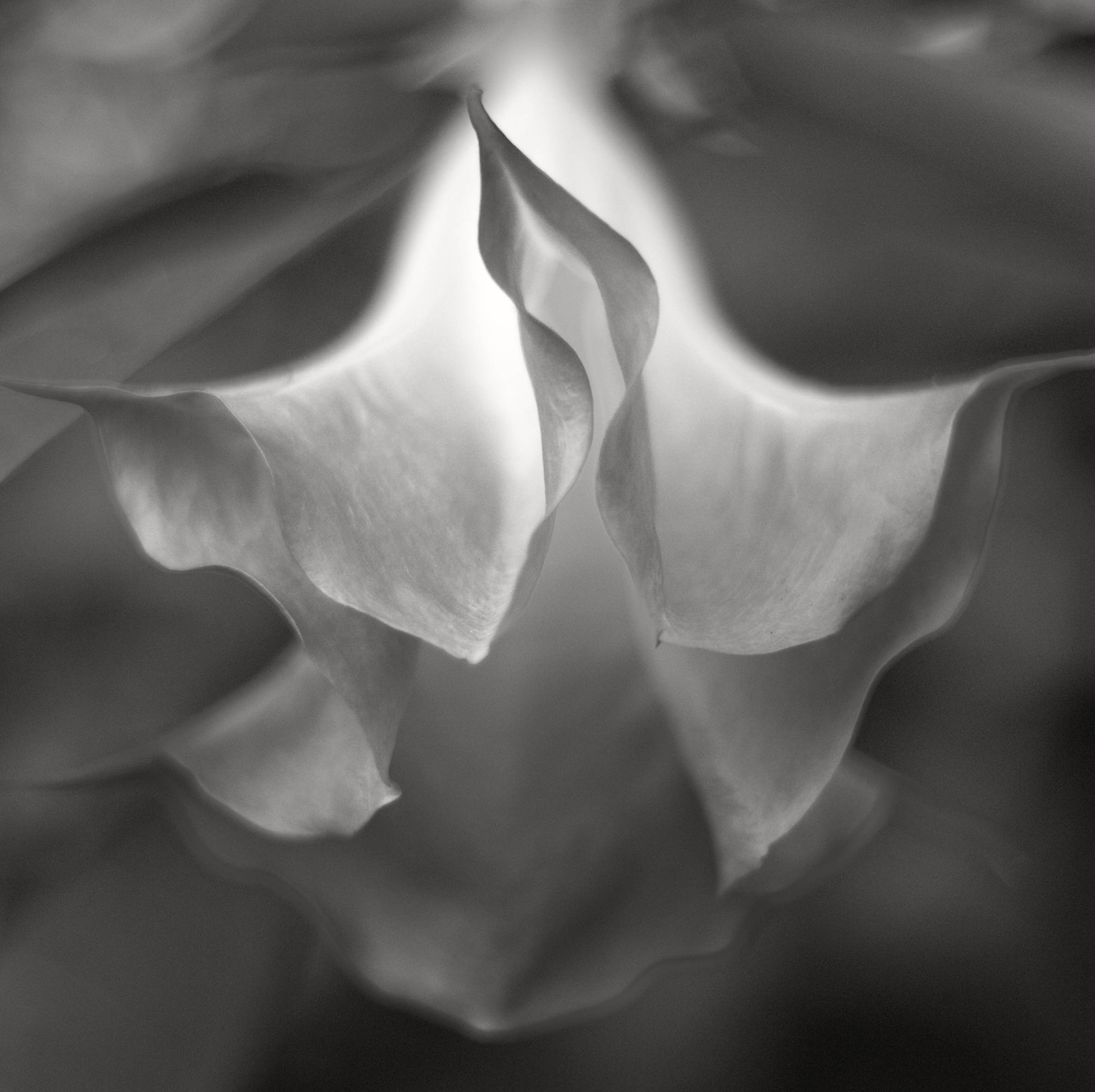
Hi Chan...yes, your assessment on my artistic vision is correct, and a trademark what viewers will see looking at most of my flora and portraiture compositions. I am happy you like the it. Thank you, Chan.
Attached, another work printed and framed in my last show. "Angle Trumpet" created using early morning back-lighting and a wide wide open lens for maximum Bokeh. Hope you enjoy. :)
NOTE, do not click it appear too large on screen. Thank you. |
May 6th |
 |
| 87 |
May 20 |
Reply |
It would be nice to review 2 photos, as 30 days is long enough to review one. But I understand your point, too.
Appreciate your feedback! :) |
May 4th |
| 87 |
May 20 |
Reply |
Its just one option...I am sure you will find new and even more interesting perspectives upon revisiting the site.
Good luck, and keep us posted on new images from this location! |
May 4th |
| 87 |
May 20 |
Comment |
Hi Jennifer.
First, I like the (overall) exposure to the Lion, and yes, Steven, your example is a bit too much, indeed. But Steven is correct in maybe playing a bit more with the scene: on my large desktop monitor some of the Lions face is too bright - here I would "Burn" or otherwise make less bright, and thus bring out additional detail, below the Lions chin area.
Also, I like the sense of "place" and the blurred background offers an engaging touch to the whole composition.
Well executed. :) |
May 4th |
| 87 |
May 20 |
Comment |
Hi Dale!
Yes, you saw an interesting scene to work with, indeed.
However, I am a strong advocate photographers maintain a strict workflow that keeps within the bounds of the photography genre and apposed to any Adding or Deleting artifacts in a scene: instead, work the scene more thoroughly even if this means going back another day.
I agree with Steven pointing out to the blurred background - it really does add a lot to the composition.
If you have alternative shots, post them for us to see - just be sure they are a little less than 1MB (500 to 800kb is usually a good size for view on this website. |
May 4th |
| 87 |
May 20 |
Comment |
Checkmate! I really like this very intimate composition: very cerebral. And, as Jennifer pointed out, I like the the (Long Lead-up) to: the King; in my opinion, any less and the photograph it will lose impact.
Well done! |
May 4th |
| 87 |
May 20 |
Comment |
Hi Steven - really appreciate your kind words, and overall enthusiasm in this group - and appreciate your really good questions:
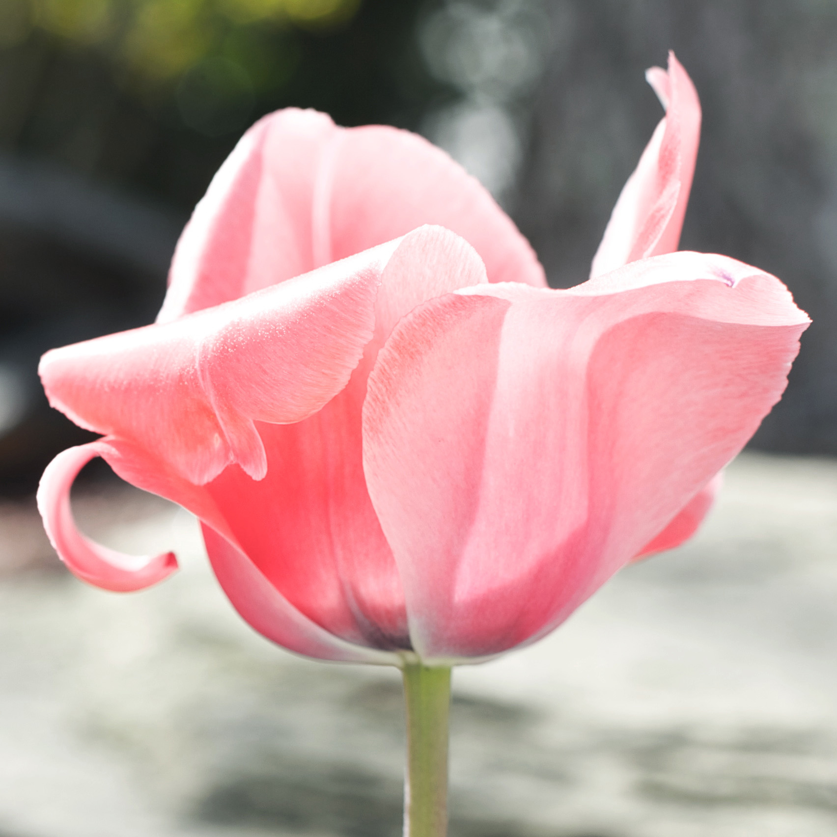
1. Silver Efex Pro-2, for all practical matters, is viewed as one of (or frankly) the Best BW conversion software on the market. It is the only one I use. (I will post my workflow for the group to see later this week, which includes color correction-management before converting to BW.) And not every color flower photo will transfer to BW nicely.
2. Tulip: see color sample ATTACHED. Note a lot of back-lighting was utilized: shooting early or late afternoon offers more back-lighting opportunities, which almost, always makes for more engaging compositions, if exposed correctly.
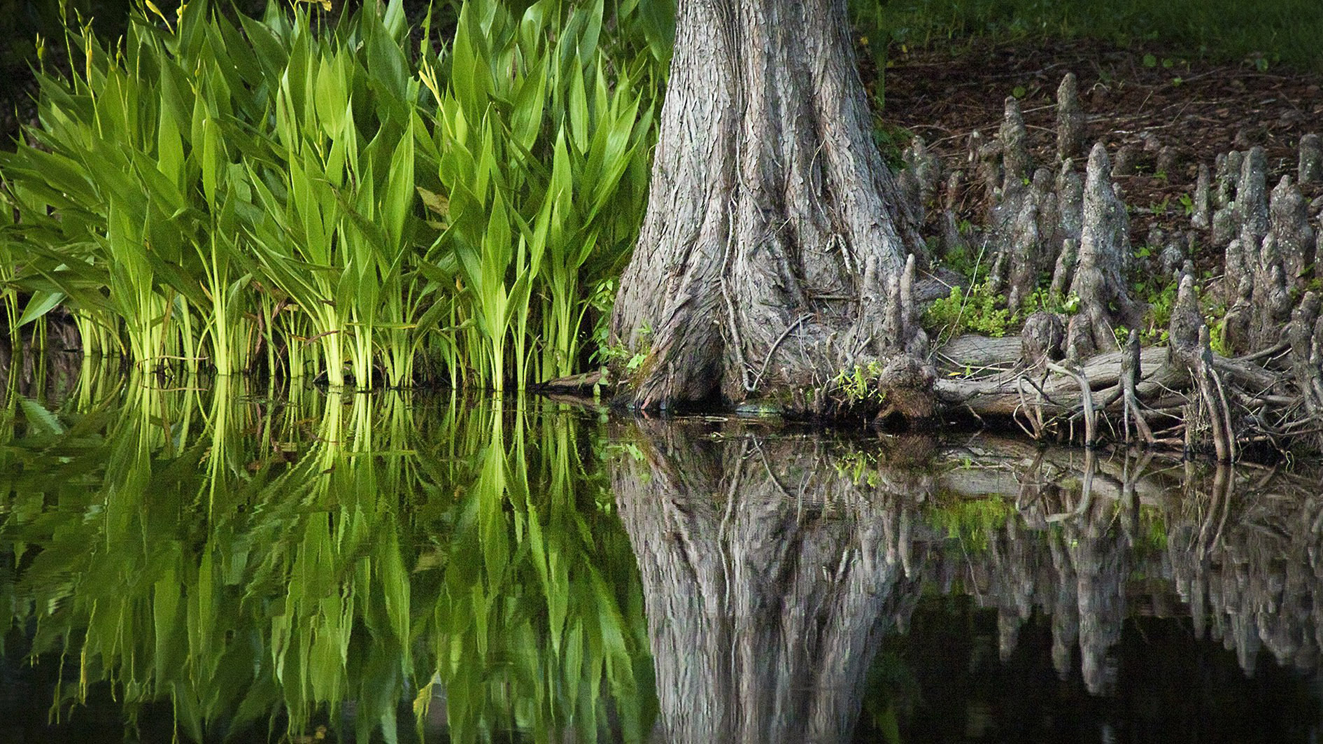
3. The Water shot was taken at a distance with a 50mm. I cropped in post-production, thus creating the composition. I normally crop through the viewfinder, but under these (particular) wet conditions I could not with this lens. I could have changed to a 100mm, but the 50mm offered the F/1.4 glass needed (and wanted) in terms of shutter-speed, lighting and Bokeh to create the effect. Actually, this scene is outside a restaurant in Whistler, Canada, while the garden was being sprayed with the auto-sprinkler system.
4. As far as viewing-discussing two photographs, I have (4) options open positions for each participant each month! |
May 4th |
 |
| 87 |
May 20 |
Reply |
Good day, everyone.
Steven, in fact I see a lot of people point Horizon levels out quite a bit - soon as I saw this image I knew it was very straight (or level) from the cameras position.
Chan, I agree with Steven, a very nice scene - the difference in color, shape and lines makes an interesting subject, which you saw and captured. However, even though (every) picture is a document, I wanted to make it less documentary, if you will - to highlight more the shapes, color and lines you found more engaging to viewers, I suggest a custom (narrow crop).
See ATTACHED sample that also includes a very-slight vignetting or (barreling) a term not used too often - I also made adjustments to color and Dodged both the below and above water flora. |
May 4th |
 |
| 87 |
May 20 |
Comment |
Notes: After Clicking on Tulip, I suggest Decreasing size on your monitor for proper resolution/size for review. Thank you. |
May 2nd |
8 comments - 9 replies for Group 87
|
14 comments - 10 replies Total
|


