|
| Group |
Round |
C/R |
Comment |
Date |
Image |
| 11 |
Apr 20 |
Comment |
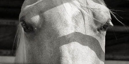
Hi Lisa. Cute Horse. Crisp color and exposure! Well done.
Points to Ponder:
I must suggest, in the future, try to find a better angle to capture similar animal portraits, as it were. Alternatively, if you are capturing this composition as part of a photo essay on animal caging, or some other animal story, this photograph is OK, and may be accompanied with text describing the issue, if such the case.
However, if I am faced with a difficult situation (that is not likely to change) I look for another narrative: in this case, perhaps a very close examination of the horses eyes placed in a very narrow and custom crop. (Here, Dodging of the Horses right eye area and a slight cooper-silver toning).
Regards,
Lance
|
Apr 20th |
 |
| 11 |
Apr 20 |
Comment |
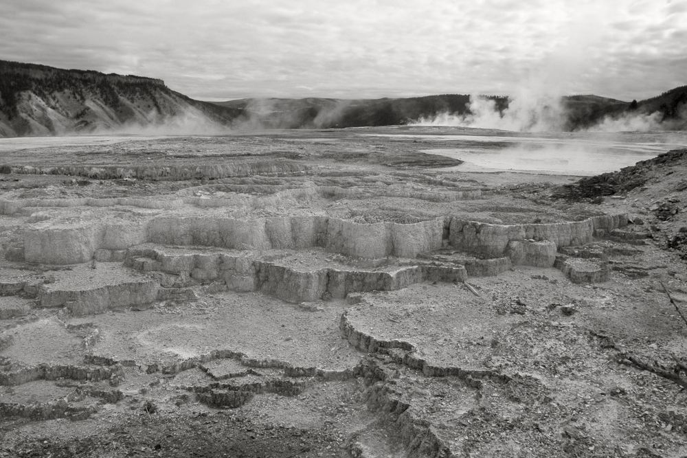
Hi Jim...absolutely love this scene! You have a great eye and hope to see more of your Landscape compositions!
Points to Ponder:
However, I feel a better exposure should have been completed in real-time, and especially using a tripod. Through the process of "traditional" Bracketing and Exposure compensation settings, a brighter (1st shot) could have been realized..though not perfect, but at least more photons to help edit in post-production.
I took your original and threw it into Camera RAW and made modifications to both Chromatic and Luminace variables. From there enjoyed time Dodging near-field stone and the distance sunlight projecting onto the cliffs. BW conversion via Silver Efex-Pro-2 and passed through a Yellow filter, custom copper-silver toning.
I used all basic "Dodge & Burn" techniques, with a little tweaking of color at the beginning. (The process was 5 minutes or less.)
The final aesthetic can be either more contrast or less, which would offer viewers a more soft composition....I decided to go mid-way for this example.
(anyway, this is the best we can do using such low-resolution image files - I am on a quest to get this rectified.)
Kind regards
Lance
Group-83 & 87 Admin
|
Apr 20th |
 |
| 11 |
Apr 20 |
Comment |
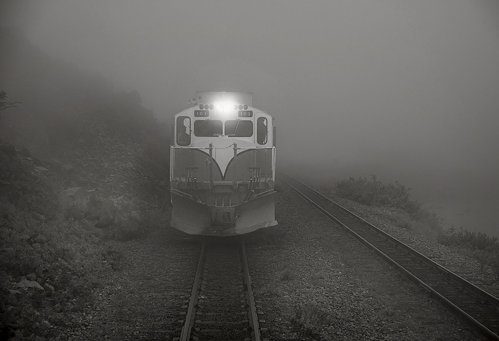
Good morning, Jim!
Another fine Train or Locomotive composition. I love trains, but rarely photograph them...this needs to change.
For being confined in one position on the back of your train...this is a fine photograph. I especially like you have kept (in your re-work version) the authenticity and did not engage, as so many compositions, toward commercial-like or hyper reality. Very refreshing to see.
I attached my version...similar to yours, but kept the original fog...and even squelched a bit out...then used a bit Dodging all around the grounds to highlight the stones and rail....conversion via Silver Efex Pro-2 with a copper-silver custom tone. At least this is the best we can all do working with such small image files.
Thank you.
|
Apr 20th |
 |
3 comments - 0 replies for Group 11
|
| 31 |
Apr 20 |
Comment |
Hi Peter, this iconic scene is well captured! The color version appears to have a good sense of authenticity and I like that. I would like to see more of your work, indeed!
However, the BW version, is too "structured" and lends itself towards a hyper reality aesthetic. Of course this is fine and worthy most commercial photographers (or clients want), but unless this is the end user, I prefer the more natural color interpretation, even if it is a high contrast one. The BW version is extremely busy thus a bit confusing between the highly-structured textures.
Kind regards,
Lance A. Lewin
|
Apr 20th |
1 comment - 0 replies for Group 31
|
| 50 |
Apr 20 |
Comment |
Good day, Lorna.
Well, I like the initial impact the the space between the upper right sky and tree line: in fact, this could be the perspective in making this image appealing.
Food for Though:
It is an interesting study: my eye immediately focuses on the strong disappearing line that defines the questionable area that Cindy cropped...both versions are fine, but I still feel the Lorna's composition looks more inviting...it correlates well with the equally disappearing line of the stone wall.
That said, Cindy's does well in this regard, too, as a small area in the distance keeps the infinite line of trees well coordinated with the wall.
If applicable, I would go back to this location and try alternative perspectives that keep the tree-top line intact. Good experiment, indeed. |
Apr 20th |
| 50 |
Apr 20 |
Comment |
Hello, David.
Wonderful composition - very balanced. I especially like that you did not transform this very authentic scene: many love creating subjects like this (especially trains) into more of a commercial narrative - here, you have maintained a natural setting. The BW rendering really does help viewers to see the "whole" and thus have a more immediate reaction to the photograph...and that's what BW photography is all about.
Well done. |
Apr 20th |
2 comments - 0 replies for Group 50
|
| 83 |
Apr 20 |
Reply |
Hi Georgianne!
Yes, on some subjects I prefer less contrast - especially when subject and background may clash. Your sample is well appreciated and another acceptable version, indeed! :)
Thanks!! |
Apr 27th |
| 83 |
Apr 20 |
Comment |
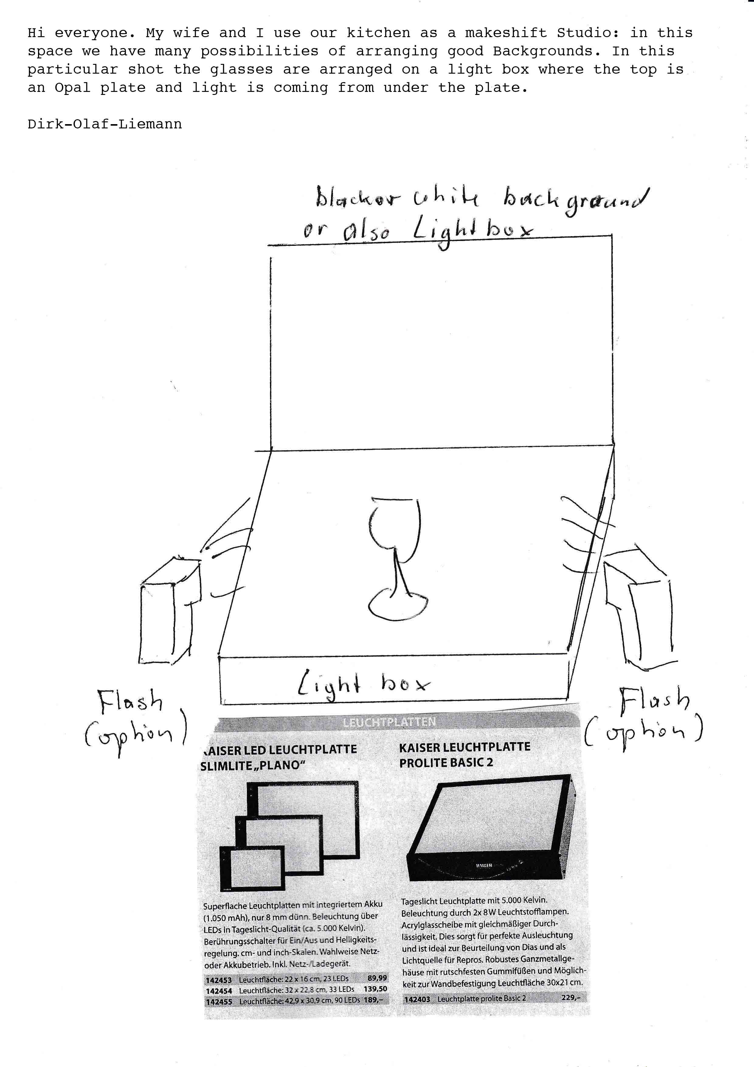
Hi Everyone! I asked Dirk to share his method for shooting this shot - it is always fun and surely, educational to view how others work. See posted document for details. |
Apr 7th |
 |
| 83 |
Apr 20 |
Comment |
Good day, Debasish.
I always enjoy viewing compositions like this; work that involves sometimes thinking outside the box. The work is well conceived and framed.
Notes: In my opinion, I wish the background was more in "play". That is, the raindrops are overpowering the scene, in my opinion. No matter how I study the the scene, it seems to be an effort to take in the "whole" scene.
The F/2.8 is a big culprit here, as the wide aperture is creating a very shallow Depth of Field (Dof). By chance, did you capture several other frames but with different F-settings? Of course, unless you dial up the ISO-setting, you may not have enough light to pull that off. Another option, try to Selectively Dodge the city street and buildings. We have a couple of participants in this group that do this well and hope they recommend a process.
This example brings up an important photographic tool: "Bracketing" your shots with different F-settings (or other camera dynamics) such as changing ISO as needs dictate. Be flexible in how you approach a subject and (take several shots of the Exact Same Compositional Frame, without looking down at the review screen after each shutter release = Bracketing).
|
Apr 6th |
| 83 |
Apr 20 |
Comment |
Hi Jose.
Really enjoying your Studio Portraits: you try and experiment with different lighting and pose - your visualization is wonderful.
As it relates to this shot, I would have preferred a full-length version which I feel may have reveal more impact. |
Apr 6th |
| 83 |
Apr 20 |
Comment |
Another well executed Still Life composition, Dirk. Your work in this genre is excellent, especially in the realm of abstract and product compositions. |
Apr 6th |
| 83 |
Apr 20 |
Reply |
Yes, Judy...I will try that. Thanks! |
Apr 4th |
| 83 |
Apr 20 |
Reply |
My mistake...this is a Heron! I can see where initial view may seem a blending of tones...but this is what I like in this rendering, though the color version enjoys more contrast. See my color version on Critique Group-87. |
Apr 4th |
| 83 |
Apr 20 |
Reply |
Georgianne, regardless of the method used to a High Definition Rendering produces the same aesthetic characteristics: the slight differences in results, for all practical purposes, is indistinguishable from one another, and any degree of discern between the two is nothing more than semantics.
Again, a lovely composition - and in the future you may try capturing both the HDR version and one with no "filtering" so you have more options for any further post-production, if necessary.
In your example, the BW version is likely (maybe) presenting the viewer a "busy" scene compared to its color counterpart because of the added "structure" which is one of the key components in HDR.
Thank you.
|
Apr 4th |
| 83 |
Apr 20 |
Comment |
Georgianne, really do love this subject and the entire framed composition - the depth (or 3-D'ish feel) is also very cool. You have a very good eye for finding engaging subjects.
My sediments reflect Jose's, as the the BW rendering is a (bit) too involved, or busy: in my opinion, a smoother, more relaxed presentation would have been possible if the (original-1) color image file had been processed without a High Definition filter before converting to BW.
It is advisable to start from a linear starting point, and then begin adding any type of post-production as needed or artistically envisioned. I like to use the Kitchen Recipe analogy: start with the basics and slowly add new and inventive ingredients, taste, and continue the process.... |
Apr 3rd |
5 comments - 4 replies for Group 83
|
| 87 |
Apr 20 |
Reply |
Hi Chan...I am glad it connects with you.
Important item you bring up - and a good observation - in many situations it is just as important to allow the viewer see the location: creating a sense of "place" by showing more space within a frame. This is a Mild example, but still a useful example in this discussion. Thank you, Chan. |
Apr 8th |
| 87 |
Apr 20 |
Reply |
Very cool, Jo! It is not required you add these details...it just completes a visual documentary of how work is completed which goes a long way in helping others learn. You work is very creative - well done!
I Admin Group-83, too and suggest you view Dirks work: he is very much involved with studio portrait (and still-life) photography and you may find his work of interest. Later today (3pm East Coast USA time) I will post one of his illustrations on how a particular work was accomplished in his makeshift (kitchen) studio. Look for it late today or tomorrow. |
Apr 7th |
| 87 |
Apr 20 |
Comment |
Hi Jo, very powerful image, indeed. Very engaging, and one that easily provokes an emotional response from the viewer. Well, done.
As far as the background...is this a "layer" added in post-production? Otherwise, what type of studio set up to do have? We always enjoy, and like the instructional value of "behind the scenes" details and illustrations. :) |
Apr 6th |
| 87 |
Apr 20 |
Comment |
Brilliant! Well composed and executed, Jennifer! The back-lighting presents a very soft aesthetic, while your close crop offers a striking abstract. |
Apr 3rd |
| 87 |
Apr 20 |
Comment |
Well, done Mike! Thanks for including the studio setup! |
Apr 3rd |
| 87 |
Apr 20 |
Comment |
Great color! Really like the Leather and its contrast (or rather its compliment) to the Candy Apple Red paint. Nice exposure, Chan. |
Apr 3rd |
| 87 |
Apr 20 |
Reply |
Thank you, Jennifer! :) |
Apr 3rd |
| 87 |
Apr 20 |
Reply |
Indeed. A Heron, it is. Appreciate your comments and the heads up on identification. Yes, as I stated above...AF for sure, with flying or running animals for continuous and successful focus. :) |
Apr 2nd |
4 comments - 4 replies for Group 87
|
15 comments - 8 replies Total
|


