|
| Group |
Round |
C/R |
Comment |
Date |
Image |
| 83 |
Mar 20 |
Reply |
Much better! And the original aesthetic is basically retained. :) |
Mar 24th |
| 83 |
Mar 20 |
Reply |
Yes, this was a good lesson on the intricacies in creating a specific narrative (or specific visual aesthetic): your version has completely reconstructed my aesthetic: cropping out the upper-right takes away the "Depth",immediately, which is the main theme in this composition. Though I am not in love with the "whole" subject, detracting the "depth" further mitigated the "life" or interest in this piece.
But it is important you tried - so we can view first hand any benefits or negatives in a series of re-edits.
Thank you, Judy!
|
Mar 24th |
| 83 |
Mar 20 |
Reply |
Yeah, not one of my favorite images,(this flower was not am important subject at the time, and I did not spend time adjusting position or settings) but the overall effect is what I was looking for - and what I observed through the viewfinder (via Dof preview button). As far as focus stacking - No, I rather adjust and play with aperture and "point of focus" to alter the dynamics. However, there are other types of Macro work I think I may be interested in applying the technique. Something for the future, for sure, Georgianne. :)
Yes, I agree, the brighter top-right area could be cropped out or perhaps "burned" a bit.
Appreciate your input! :) |
Mar 23rd |
| 83 |
Mar 20 |
Comment |
Really love this perspective, Debasish.
I especially enjoy the noise (or Grain) in this scene...it adds greatly to this early morning and (moody) scene. The special horizontal crop completes a fine composition. Well done. :) |
Mar 22nd |
| 83 |
Mar 20 |
Reply |
(seems I screwed up and Deleted my last replay)
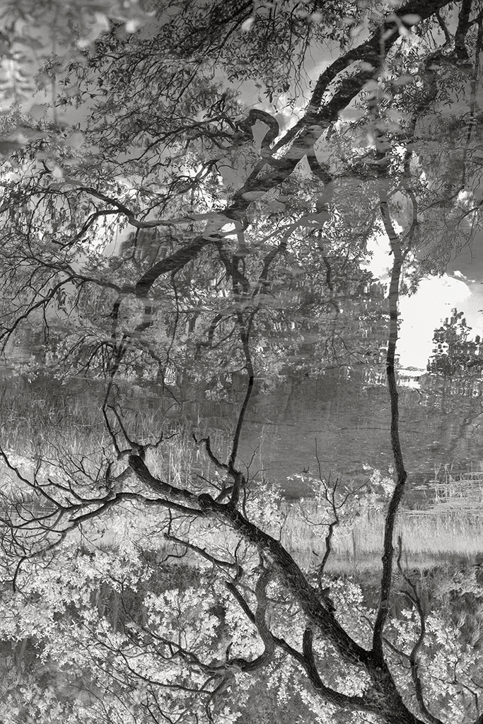
Yes, I see more of the Trunk - this works fine, indeed. Though a darker more Contrast version is possible...I feel this more natural aesthetic is more inviting for this particular scene. |
Mar 22nd |
| 83 |
Mar 20 |
Reply |
However, a tighter crop will diminish the sense of "Place". If the Nun had been in some other position or mood - perhaps cutting away more of the Mission Church may have been OK.I do not feel the Nun carries enough weight (or appeal) to carry the scene, in my opinion.
|
Mar 22nd |
| 83 |
Mar 20 |
Reply |
Yes...this is much better! The trunks are more clear and I feel balance the whole composition better.
This said, another version of this scene could have been an extreme dark and contrast like visual aesthetic - but I like the softer version you have presented us. :) |
Mar 21st |
| 83 |
Mar 20 |
Comment |
Good day, Georgios.
My first reaction to this composition is positive towards the architectural simplicity: the overcast sky helped me to focus on the Missions beauty. The foreground appears to be in focus and obviously gives the viewer a sense of space or location.
However, for me, the Nun does not evoke or emanate an emotional vibe: In my "read", the Nun seems very alert in how she is descending the steps very carefully, similarly to how or anyone else would descend a path of stone and possible uneven ground.
However, the "Whole" composition is a well executed Artistic record of the Mission Church: the perspective is engaging and again, I especially enjoy the White Walls against the White Sky. |
Mar 21st |
| 83 |
Mar 20 |
Comment |
Hi Georgianne!
I know this location very well...across the street one of the best restaurants in the area: "Cajun Corner". I hope you had time to get lunch or dinner there. :)
Yes, the city has a lot of charm - and again, your special ability to use these Textures to bring out a subjects personality is seen here. Well done! |
Mar 20th |
| 83 |
Mar 20 |
Comment |
Hi Judy!
Simply...I think this is a well balanced composition...I agree with the crop to eliminate the tracks seen in the original color version. And yes, perhaps a skier moving into the image (or away from the viewer) would have added another dimension...
On my desk top monitor your updated version still looks a bit dark in the tree trunks - perhaps its my screen or maybe a bit more Dodging will bring them out. :) |
Mar 20th |
| 83 |
Mar 20 |
Comment |
Gee, Dirk, the technique sounds really innovative, for sure. Absolutely love this series of images!
Though I present most of my work in BW, some are always kept as color renderings - sometimes, it just works better (or conveys a better narrative) in color: the color version you posted is one of those images: I dare say...I think it works better in color.
The color rendering really jumps out at the viewer! Well done, Dirk! |
Mar 20th |
| 83 |
Mar 20 |
Reply |
Hi Dirk! Yes, agree. Appreciate your input. :) |
Mar 20th |
5 comments - 7 replies for Group 83
|
| 87 |
Mar 20 |
Reply |
No...I like this a lot, too. A brighter version. I did the same last evening. Most important to me is keeping the reflected Spots in the top portion of the frame incidental.
Anyway, I removed the Vignetting and Dodged more areas of importance. I agree, a good candidate for Infrared, indeed! |
Mar 22nd |
 |
| 87 |
Mar 20 |
Comment |
Hi Mike. We are led to believe (in the past several years and part of a new digital culture, in my opinion) a "subject" or Main Character needs to be in a composition, but this is simply not true: the image "itself" can sometimes be the subject - this is especially true with Landscape and some Nature photography.
Yes, I agree the BW version is hard in separating the different plants as compared to the color original: the photo has already gone through a lot of Dodge and Burning and color alterations in helping to bring out detail, especially in the (reflective) section. However, adding more detail changes the entire aesthetic from a Soft one to a vividly and confusing one, which was not the experience in Real-time at time of capture, last week.
Appreciate your feedback and will go back and see if I will reconsider adding more detail, either via adding contrast of through adjusting color values again. :) |
Mar 21st |
| 87 |
Mar 20 |
Comment |
Hi Mike! Nice image, indeed! The vivid color is dramatic.
On another take...let us look back at the original: we can see fallen leaves brown and dry, as the new and colorful Growth break their way through, and above the layers of Winter. Perhaps very delicate cropping (either via original ratio or maybe Square) but keeping a lot of this original Space - it is an interesting narrative - story. :)
Well done, Mike. I love it! |
Mar 20th |
| 87 |
Mar 20 |
Comment |
Hi Jennifer. Is it not amazing the level of quality cell phones offer us! Spring has Sprung...as seen in this very intimate photograph of these spring buds. :) |
Mar 20th |
| 87 |
Mar 20 |
Comment |
Hi Chan! Really neat composition! And the colors have this very natural tone to them...yes, a smaller aperture would have helped get both the Bud and Stem into focus...for this particular composition FS is not necessary, but a viable option nonetheless.
Point to Ponder:
I see a lot of talk (everywhere) recently about focus stacking, especially when shooting with a Macro lens, but also note many use the extreme shallow depth of field as a creative dynamic. I personally use a Canon F/2.8 100 Macro glass for some of my Intimate with Nature series photos: here is just one example: the extreme Bokeh (and placement)is used is intentionally for helping to create a narrative . Points to Ponder! :)
ISO-800 EF100mm F/2.8L Macro IS USM at F/4.5 1/30sec.
|
Mar 20th |
 |
4 comments - 1 reply for Group 87
|
9 comments - 8 replies Total
|


