|
| Group |
Round |
C/R |
Comment |
Date |
Image |
| 83 |
Feb 20 |
Reply |
Hi Jose. Appreciate your thoughts....yes, initially this piece was completed as a Pure BW rendering, and frankly, with the sky and clouds, is quite striking. However, later I added the toning - and not sure which way to lean. :) |
Feb 17th |
| 83 |
Feb 20 |
Comment |
Splendid!
This symmetrical Still-life abstract is well conceived and composed, Dirk. Well done. |
Feb 8th |
| 83 |
Feb 20 |
Reply |
Hey, Stephen, hope you are well...thanks for stopping by.
No. Your version loses that aesthetic.
Yes, I especially use wide angle lenses, (and in some cases, extreme wide angle) to create the "soaring" or a type of "Grandeur" to a scene.
I never Correct Perspectives, as what you see is the interpretation I was after. In my opinion, it is just one way (tool) for the photographer to elicit the "grandeur" as experienced (or perceived) in real-time.
Happy you initiated this conversation, it is an important key in photographic discussion on this type of style, and use of photographic tools, lenses, etc. :) |
Feb 5th |
| 83 |
Feb 20 |
Reply |
....and this is very important - our comments should almost be strictly about the Black and White rendering, as BW imagery are specific in their aesthetics when compared to color alternatives.
However, there is one exception: when speaking about digitally created BW work (which is 99 percent of what we do in PSA groups; I may represent a small percentage who occasionally post film related BW work) it is vital and helpful to learn from one another the process/s we use (if any) to convert our color image file to black and white.
In my case, when converting color files to BW, I work hard to adjust and create the best color photo I can - one that best represents what I feel captures the scene both how I saw it and perhaps some part imaginary. Only then do I begin the process of converting to BW, and this begins an entire new process. |
Feb 5th |
| 83 |
Feb 20 |
Reply |
Oh, Gee! This is lovely, Judy.
Details are clear, the gold bracelet adding contrast and even picking up the yellow-gold in the quills. A very good choice for the DDG Showcase. Well, done! |
Feb 4th |
| 83 |
Feb 20 |
Comment |
http://visualizingart.com |
Feb 4th |
| 83 |
Feb 20 |
Reply |
Agree!
And why the the Main image was posted....there is more going on in the Feb posted image and you detailed that very well. Thank you!
Yes, guess you can say one of my favorite perspectives is looking up with different types of lenses. Another, is my use of extreme Bokeh in both portrait and flora compositions which can be seen on my website. |
Feb 4th |
| 83 |
Feb 20 |
Reply |
Hi Georgianne.
I believe we both were speaking of the intensity of the Layer: This new version is less dominant when compared to the other composition, and now favors much better in allowing the viewer to see and enjoy the Whole composition.
However, the tint has drastically changed the the grey-scale to something new: though inviting in a calming manner, I still like the more Rich tones from before. Anyway to maintain the original tones with this new or alternative overlay?
Though I am not a fan of overlays, I understand and appreciate their skillful use on the right subject, and its marketing and intended distribution.
Your skilled work in this area has been well documented in these Groups and I hope you continue to explore new ways of using them, while exploring other photographic aesthetics, as well.
With the advent of the digital photography revolution, I always suggest we approach these new skill-sets like a kitchen recipe: just a pinch here, and a pinch there, step back and taste the formula, then add more if necessary. Its a collaboration of ideas, concepts and tools. |
Feb 4th |
| 83 |
Feb 20 |
Comment |
This was another angle in the same area of the plant - as I hiked along the highway to find good perspectives in the limited time I had to get them. (Marshall Steam Plant Operations in North Carolina).
|
Feb 3rd |
 |
| 83 |
Feb 20 |
Comment |
....and you captured (and isolated from everyone else) the Energy of this musician...symbolizing all the energy that pours through this part of the city.
On the technical side, I may Dodge some of the lighter grey points in and around the frame - not sure where - would have to feel it - and though the foreground is a must in conveying direction and helping to define a sense of place, the odd dark swatch on its lower left should be Dodged to lighten it up.
Overall, I like the photographs Pace...energy. Nicely done. |
Feb 3rd |
| 83 |
Feb 20 |
Reply |
Here you go.
Yes, I especially like you adding more of the Mantel while enlarging the space for the scarf. Yes, the Mantel detail and the amount shown is well balanced with the handbag.
The only other alternatives within this exact frame could be:
1. place scarf back in original position and place a used, but empty Martini glass (or set of earrings & bracelet) in the open space.
Remember, keep Leather alive, keep the scarf textures clear; this is what we are selling.
This was a great exercise! Love it, Judy. I think you have inspired me to re-engage still life compositions. :) |
Feb 3rd |
| 83 |
Feb 20 |
Comment |
Hi Georgianne.
The BW shades really work on your Tug...no question about that. It makes the Tug, rich.
The sky overlay is different and interesting, but perhaps if toned-down in its intensity may not be so dominant.
Similarly, the sky in the color version is exciting and adds drama, the overlay, too, adds this drama, but I suggest too much, and thus over-powers the tug.
|
Feb 2nd |
| 83 |
Feb 20 |
Comment |
Well, I must say, Judy, you describe above quite a process: well planned and executed, as the final shot really looks delicious...strange adjective, but the Leather looks scrumptious! Whoops...there I go again!
Though you have cropped better than last months example, the slight hint of space on the right-side of this photo perhaps call for: 1. more crop or 2. open up more space and add a contrasting object....
Otherwise, love the Lighting, Love the textures in both the Handbag and Scarf...well executed. :) |
Feb 2nd |
6 comments - 7 replies for Group 83
|
| 87 |
Feb 20 |
Reply |
Hey, Chan.
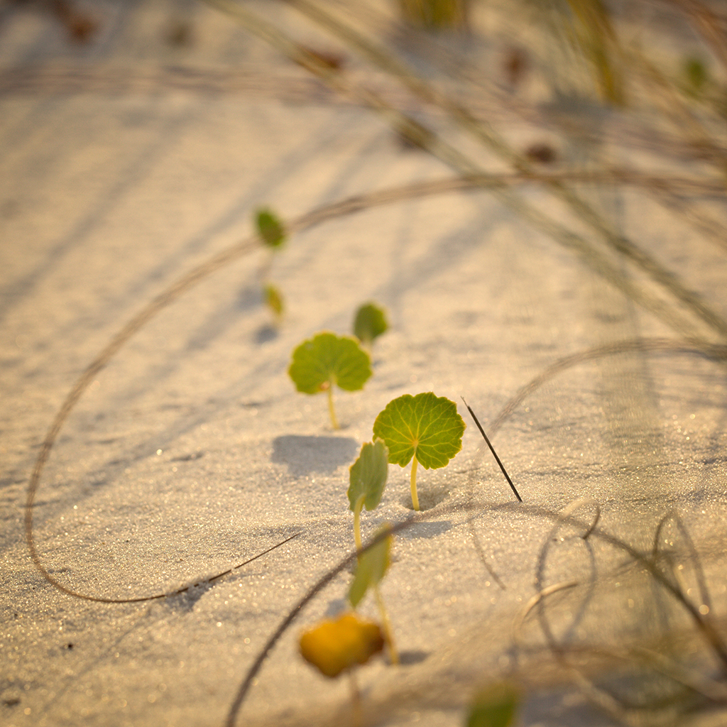
Yes, in this case I should have been even more explicit: seen that both you and Steven mentioned the same thing. However, I did state in my opening description..."At day break I spend an hour arduously crawling on my belly".
So basically, I saw an area that intrigued me, then got onto my belly, slowly crawling and peering through the viewfinder to compose. The hardest part was moving slow as not to disturb the ground and spray sand onto the camera and lens. It was a very tiresome exercise. |
Feb 3rd |
 |
| 87 |
Feb 20 |
Comment |
However, can't seem to get the correct resolution for easy viewing...so, by all means save a copy and take a look. |
Feb 2nd |
| 87 |
Feb 20 |
Comment |
OK, OK, I Deleted the offending grains of sand....also, two orange grains that sat on the extreme lower left in the frame. :) |
Feb 2nd |
 |
| 87 |
Feb 20 |
Reply |
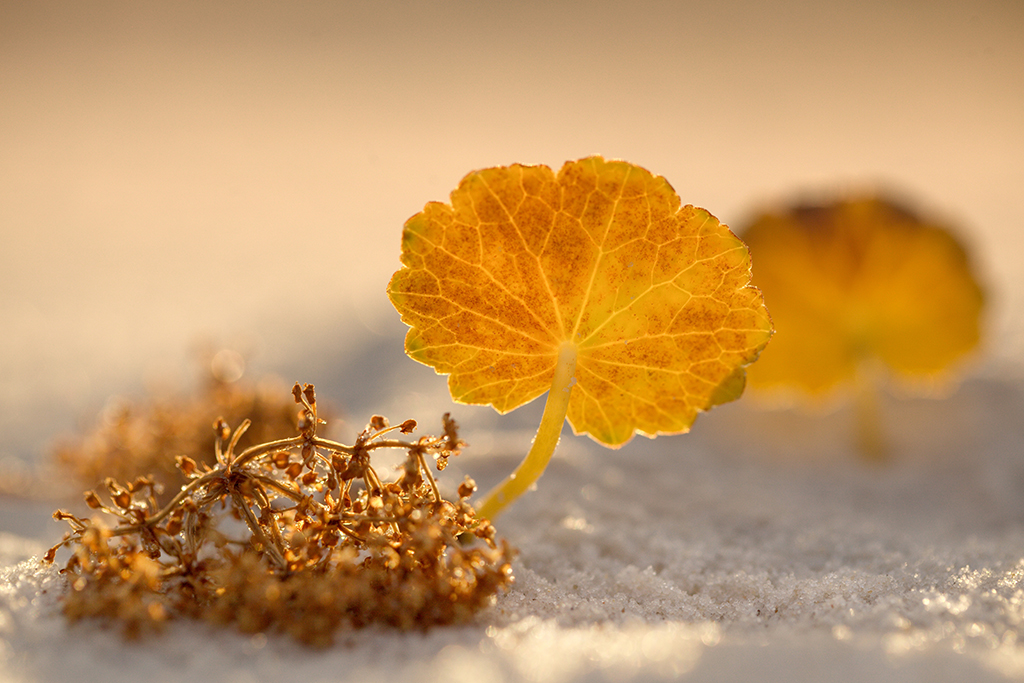
Yes....very similar to Steven's, but you cropped it tighter, and that is better. The toning is perfect for the Fall scene, too.
Well, guess this can be a side project in the future - try composing spring and summer foliage this year - and share it with us. :)_ |
Feb 2nd |
| 87 |
Feb 20 |
Comment |
Oh, I'm no plant authority - but I try to look up the species I am shooting - most important to be able to discuss a subject in detail. My photo title normally includes the plant or animal species if applicable.
After the photo shoot I was able to find a USDA booklet on Florida Beach Vegetation - now my reference book for almost any plant life found on North American beaches. |
Feb 2nd |
| 87 |
Feb 20 |
Reply |
Sweet! |
Feb 2nd |
| 87 |
Feb 20 |
Comment |
Hi Jennifer.
Well, this composition is not working for me: There is too many elements within the frame that I find do not "weave" a comprehensive whole.
However, as you suggested, lets focus more on the droplets in just one portion of this frame: Steven has already posted one version, and if you can try cropping another that would be worthwhile for sure. (Of course, be sure to use your high resolution file to do this.) |
Feb 2nd |
| 87 |
Feb 20 |
Comment |
Welcome, Chan!
We are very happy you continue to "Hang in there!" :)
Indeed, the "pierced" leafs create the narrative, as I am sure this is what sparked your attention through the viewfinder at the time of capture. The background Bokeh-color, and color in the leaves, blend nicely, too. |
Feb 2nd |
| 87 |
Feb 20 |
Comment |
Steven - Yup - the black background really sets this composition off. The purple edging almost looks like the plant is in ultraviolet light, and hence, the Black background grabs it nicely. Editing was necessary and works perfectly. May make for a very engaging print - but needs to be matted properly and viewed with high powered lights. :) |
Feb 2nd |
| 87 |
Feb 20 |
Comment |
Hi Mike! Yup! Really like this, too. And looks fine in grey-scale, too. Great capture. Do you have others? (Post them, but first re-scale at 1024px at its widest).
If I am not mistaken, these are Banana Leaf plants, and we have them in our kitchen. When the sun burns through them it is quite the site, indeed.
Well done, Mike!
|
Feb 2nd |
| 87 |
Feb 20 |
Reply |
Hi Steven! Really appreciate your comments and hunger to engage in conversation. With two new participants, you and Chan, I am confident this Group-87 will be most productive in learning about photography.
As I have talked about in the past - it seems nowadays a lot of photographers (or photography-artists) try and find distractions in a photograph when some of those 'perceived annoyances' are in fact part of the "Whole".
I do however see the disturbances you point out, (Sand Grain) and if taken each by themselves, agree with your assessment. I may delete them if I decide to go to Print.
As the title suggest, the "couple" is on a date - and as you pointed out, the near-field leaf seems to be timid - and why both "Largeleaf Pennywort" create the narrative. (The plant is a creeping, succulent perennial that occurs throughout the south Atlantic and Gulf coasts but is more common in the more northerly locations of the state). This recent photograph was captured on the Alabama Gulf Shore, Orange Beach, Al.
I attached another photo from that shoot - a bit more perspective to show you where they thrive. |
Feb 2nd |
 |
| 87 |
Feb 20 |
Reply |
I like this, Steven. |
Feb 2nd |
7 comments - 5 replies for Group 87
|
13 comments - 12 replies Total
|


