|
| Group |
Round |
C/R |
Comment |
Date |
Image |
| 32 |
Oct 19 |
Reply |
Yes, our digital world has certainly made us more lazy, on many occasions-situations, I am a victim of this as well? LOL!
On Focusing: you shot at F/8.0 which gave you a deep depth of field (Dof), but the Stigma is still out of focus. When you get the chance, find a similar floral example and "bracket" (take 3, 4 or 5 shots) but try (ever so slight) picking different focal points. Oh, and if we are not being lazy that day...LOL...use a tripod and 10sec Timer. This "bracketing" is NOT for focus stacking, but to give you several images that will exhibit a slightly different interpretation. If you have a Fixed 50mm (my favorite glass for flora) try it. The exercise above is similar to Hyperfocal focusing for landscape work. As you can sense, I am a strong advocate for the sustainability of traditional photography virtues.
lewin.author@gmail.com
www.visualizingart.com |
Oct 14th |
| 32 |
Oct 19 |
Comment |
Jennifer, lovely composition and capture. Actually, in another critique group someone had a similar question regarding the surrounding leaves in also a similar composition: No, I agree, in this particular case, the background petals are very dynamic in defining the space and "framing" the Hibiscus blossom. My only comment, you may want to experiment with the exposure (or luminosity) of these petals. In any case, this photograph is beautiful!
Also, allow me to comment on your use of Auto-ISO: not a good idea unless you are capturing under-water (scuba diving) photographs, like my wife Anne. ISO is a powerful tool and used to help "create" an interpretation when called for. On another note: I captured a "Trumpet Horn" a year or two ago with 6:45am morning sunlight: from experience I dialed in ISO 650 for both a higher shutter speed and to help create a soft interpretation. Points to Ponder, everyone. |
Oct 13th |
| 32 |
Oct 19 |
Reply |
Oh, absolutely! And each version is appealing in a specific way. :) |
Oct 9th |
| 32 |
Oct 19 |
Comment |
As it relates to "Space" and what I spoke about above: both cropped versions take away from the "location".
1. The version from Stuart still allows a good amount of space and thus the photography still reflects the space the subjects are in. In addition, both the wildlife and distance shore details remain to also define the space.
2. In Diana representation (though lovely) sometimes its not "all" about the subjects, but in what environment (space) the subjects are in that create a dynamic or otherwise interesting narrative; a narrative that separates itself from a snap-shot. |
Oct 9th |
| 32 |
Oct 19 |
Reply |
Yes, did not think of completely changing the format, but this special crop looks good, Stuart. |
Oct 9th |
| 32 |
Oct 19 |
Comment |
Hi Tom. Lance here from Group-87 and Group-83, stopping by to look at everyone's work up and down the list of groups.
Lovely, dramatic details. Yes, the changing to BW can normally improve or otherwise change the characteristics in the sky. I love the grainy feel to it. The composition is excellent!
Some alternatives in creating dynamic Composition: I speak about this a lot and have an article ready for publication on this - the use of "space" to help form a visual narrative is not talked about enough, in my opinion.
In your scene (and assuming unsightly artifacts would not compromise the composition) pulling back and grasping the entire location in your composition may have invited a more dramatic scene. Using a wider angle of view and moving in closer to the barn may have designed a completely different narrative. Just a thought.
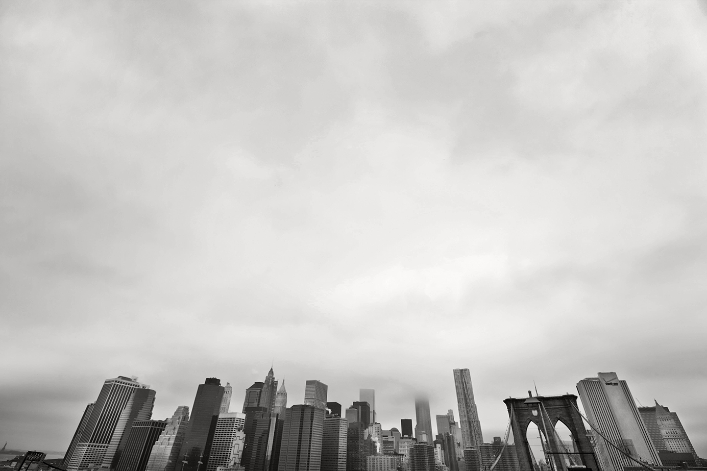
Sample Attached, is a NYC skyline: I drastically moved the horizon to emphasize both "place" and offer an alternative dramatic view using 16-35mm lens: captured at 16mm. (Seems I can not make the image appear normal if you click on it. sorry). |
Oct 4th |
 |
| 32 |
Oct 19 |
Reply |
Post-production: Silver Efex Pro2 to change hue of BW; otherwise in Camera Raw and Photoshop I used only "Dodge and Burn" techniques to bring out contrast in details, make blacks richer and whites a bit lighter.
LAL |
Oct 4th |
| 32 |
Oct 19 |
Comment |
Stephen, I reprocessed your photo to a richer BW: you may or may not like it - I think it defines the little details more and creates more drama. Look forward to discussing this. Feel free to email me, too. lewin.author@gmail.com |
Oct 4th |
 |
| 32 |
Oct 19 |
Comment |
Hi Stephen! Lance here from Group-87 - first, converting to BW for this composition was a good choice. Nice work!
1. I like the the original crop as it emphasizes the location and gives the photograph a sense of "space". I understand you cropped the original to take out the people on the left (and so happy you did not pluck them away via Photoshop). All good.
2. As such, the composition is still strong (and the BW version is helping this), thus, taking out the street-diagonal would diminish the composition by redefining the location (the space) to a less interesting perspective.
The only other comment I have is to try a different BW tone - something very white and black - omit the slight blue hue seen here. A deeper BW color may really let this pop!
Kind regards,
Lance A. Lewin Admin Group-87
|
Oct 4th |
5 comments - 4 replies for Group 32
|
| 39 |
Oct 19 |
Comment |
Hi Larry - just visiting - I am from Group 87 and 83.
For the type of Landscape or Travel photograph this represents, I like it! The sense of space is key in presenting to the viewer the location and what you experience emotionally at time of capture.
Tip: Perhaps you can go back into Silver Efex Pro 2 and place the "structure" at zero, but instead, add "control points" strategically and add "Contrast" (just a little at a time). With more contrast strategically placed the image will likely pop, as it were. Just a thought. |
Oct 14th |
| 39 |
Oct 19 |
Comment |
Hello, everyone. Just scrolling through some of the other groups: I am the Admin for Group 87 and participant on Group 83.
Like David, just not a fan of any type of texture or masking that eliminates the background.
However, as you are a Pictorialist, your work speaks for itself: A very rich and dynamic composition, indeed. Nice work! |
Oct 14th |
2 comments - 0 replies for Group 39
|
| 62 |
Oct 19 |
Comment |
Hi LuAnn.
The juxtaposition of the infant swing and ominous electrical grid make a powerful image for sure. Well, done. :) |
Oct 14th |
| 62 |
Oct 19 |
Comment |
Hi Oliver. I am visiting from Group-87 and 83.
I must admit - I am a bit confused. The original looks like it was shot at 50mm, but the posted final looks like it was captured at a different location and position along the road and maybe with a wider lens, yes?
Kind regards,
Lance A. Lewin |
Oct 14th |
2 comments - 0 replies for Group 62
|
| 64 |
Oct 19 |
Reply |
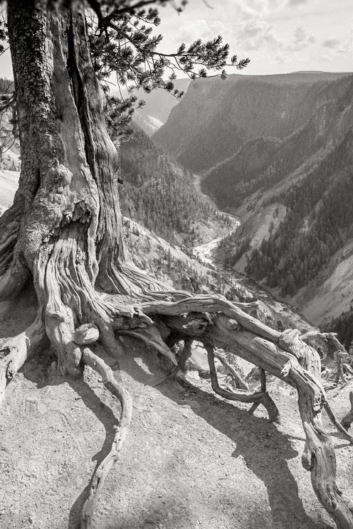
No. I already did - just little. I feel the sky in this composition is strong enough to compliment the whole. And yes, the roots tells the story of erosion, but also adds a dramatic element: The Roots flow with the river, while your camera perspective is also emphasizing depth or distance.
Lastly, in this crop (with this wonderful perspective you captured) creates or highlights the space. And that is key. |
Oct 24th |
| 64 |
Oct 19 |
Comment |
Hi Jerry. I completed an alternative version of the wider view - after viewing the others again, I love the dynamics this composition offers over the others. The elongated roots follow the river - it just works for me. Used PSCC for color adjustments and Silver Efex Pro-2 for conversion to BW.
Regards,
Lance |
Oct 24th |
 |
| 64 |
Oct 19 |
Comment |
Hi Jerry. I am visiting from Group 87 and 83.
Will agree with the other comments - the color separates details better, as such, the original (color-1) both color and composition is wonderful. In any case, this image is beautiful and represents another important space so precious to us. Well, done, Jerry.
Tip-Suggestions: I would like to see the Origianl-1 (as is) in black and white. Be sure the "structure" is set to zero in Silver Efex Pro-2 or maybe even take out a little structure. This and maybe a different color filter may create a better gray-scale.
Best regards,
Lance A. Lewin
|
Oct 14th |
2 comments - 1 reply for Group 64
|
| 74 |
Oct 19 |
Comment |
Hi Arne. I am visiting from another group.
Love it! What I like best, it appears you did not over process this composition - it looks real. The modifications to both the crop and adding the barrelling is done nicely.
Omitting extreme "structure" or other "layers" that interfere with the authenticity of the actual location and scene is refreshing. Well, done!
If you have time, tell me more about using the tilt/shift lens. I have never used one and maybe rent one in the near future to test. Your thoughts on usage. Thank you.
Lance A. Lewin
visualizingart.com |
Oct 14th |
1 comment - 0 replies for Group 74
|
| 83 |
Oct 19 |
Reply |
Hi Jane. Seems all these variations are very close - but I still enjoy and prefer my custom color dip - its the same for 95 percent of my BW renderings, including film.
Yes, I agree calming down the brighter area to left is worthwhile, as long as we do not remove it too much.
Nice alternatives, everyone! Thank you. |
Oct 29th |
| 83 |
Oct 19 |
Comment |
Welcome to the group, Emmy!
And the amazing imagery we can process (and capture) with cell phones is still dazzling, indeed. The composition is well thought out: I especially like the (slightly blurred) crushed steel above the window which acts as a connection (or perhaps an interlude) to the blurred landscape reflection. Great perspective, Emmy.
Comments:Assuming you have not already done this: Though I am not sure what limitations you may have in Aperture Priority (AP) Mode, this composition is a great situation to "bracket". That is, take 3 or 4 shots of the (exact) same composition, but change either your lens opening or shutter speed - in this case, likely lens opening. (On your camera you may have to use Manual mode for this). This way, you get different visual interpretations due to the change in depth of field (Dof) and the corresponding bokeh (or blur) surrounding the point of focus.
Kind regards,
Lance |
Oct 19th |
| 83 |
Oct 19 |
Reply |
Hi Jane, appreciate the clarification. Well, let me be honest, the Fog won't due to the fact it is a "weather dynamic" that was not part of reality at the time of capture: it was NOT an integral part of reality you experience in real-time.
As we head deeper into the digital photography revolution we all share a responsibility to help maintain Traditional Photography virtues. This is a serious discourse, indeed, and one that must be discussed seriously and with an open mind for both the traditionalist and their digital cousins.
I must confess digital tools that allow the adjustment of luminosity and also chromatic alterations in a picture is wonderful, and used carefully, must be a tool that is allowed in everyone's camera bag, as it were. I also see no issue in "removing" artifacts from an image, as long as they were not in any way an integral part of the scene. (i.e. yes, remove a paper cup from a bush, but not the bush). But this brings up other Traditional Photography Values: learn to capture the scene without these issues (i.e. artifacts) in the frame in the first place. There is a lot to discuss here. Points to Ponder, Jane. Everyone. I will leave you with this quote by well known portrait photographer, Platon Antoniou.
"With all this amazing technology, the tools must never dominate us". Platon Antoniou
|
Oct 13th |
| 83 |
Oct 19 |
Reply |
Oh, gee...that's much better! Thank you, Jane. |
Oct 11th |
| 83 |
Oct 19 |
Reply |
Note: as usual, the color version posted here does not display correctly. Sorry. |
Oct 9th |
| 83 |
Oct 19 |
Reply |
Thank you, Judy! No boat - but my wife stood by my side with an umbrella along the shore line.
AS in all my BW conversion work, I adjust the color version that best represents what I visualized through the viewfinder at time of capture. I feel this normally renders the best BW conversion. Then, after the BW Conversion, yes, I dodged (left-side branches)a bit to bring out detail and to capture the luminosity I feel was inherent in the color version.
For the most part, this works well as a color photograph. I plan to print this Color version shortly. |
Oct 9th |
 |
| 83 |
Oct 19 |
Reply |
Nicely done. I like more of the pants, too.
LAL |
Oct 9th |
| 83 |
Oct 19 |
Reply |
In the end, you have two perfectly nice interpretations. One a bit softer (muted, maybe) and the new one, a bit brighter more revealing. I still like the first one. Maybe we would all feel different once printed, however. :) |
Oct 9th |
| 83 |
Oct 19 |
Comment |
Jane a bit confused after reading your description: so, the original image posted is not the original? You said you added Fog - and the original image posted has fog???
In any case, the composition is engaging. My immediate response to this photography was, this is a very Wynn Bullock in its character. |
Oct 9th |
| 83 |
Oct 19 |
Reply |
Good point, Jane. |
Oct 9th |
| 83 |
Oct 19 |
Reply |
Yup - I like this revised version.
LAL |
Oct 9th |
| 83 |
Oct 19 |
Reply |
Really glad you like the scene - and no, it is not infra-red and it was captured in early fall: Jane will post the color version, soon.
As you said, the fog adds a lot as it relates to softness, but the key ingredient was the heavy rain. The rain acts like an invisible filter; the slower the shutter speed the softer the effect. Of course, lighting, subject (location) will also offer their own spices and thus may change outcomes, but as a general rule, the flavor will be very close to the one we see here. Thank you, Georgianne. |
Oct 8th |
| 83 |
Oct 19 |
Comment |
A fine example of the pure aesthetics found in everyday life. Good eye, Judy. I particularly like the soft BW range that reflects the original color version - you could have turned-up the contrast to form a different visual interpretation, but this is nice. Well done, Judy.
Color version is OK, but the BW version was the correct choice in my opinion (and of course I love BW photography). A good example how BW photography allows the viewer to see the "whole" scene and later go back and look at details. A good example of the compositions Gestalt. |
Oct 7th |
| 83 |
Oct 19 |
Comment |
A very interesting and surely engaging photograph, Georgianne. A very fine example of digital fine art photography, indeed.
However, for me - this composition works better in its original color rendering because a lot is going on and the subject "speaks" to be in color to differentiate between the many fine details, shapes and artifacts. :) |
Oct 7th |
| 83 |
Oct 19 |
Comment |
Dirk - interesting composition and good use of shallow Depth of Field (Dof) to create the effect. (You did not tell us the type of lens you used and lens/camera settings - this would be very helpful as tools in teaching everyone).
Highlighting the the front end of the locomotive is significant and correct for this type of composition, in my opinion. I like it! |
Oct 7th |
| 83 |
Oct 19 |
Comment |
Well done, Jose. Studio lighting is gentle - the posture of the subject relaxed and natural, and I can almost sense her thoughts. Love it. |
Oct 7th |
6 comments - 10 replies for Group 83
|
| 87 |
Oct 19 |
Reply |
Good eye, mike: that's correct, we can see the plane on which the focus landed across the frame. Another reason for at least 3 or 4 "bracketing" shots, each time moving the focus slightly and deciding what looks good through the viewfinder. And to ensure you get a keeper.
But, after you gain experience with these types of shots, you tend to (guess better) what to expect as you place the focus at different points. Thank you for your comments, Mike! |
Oct 14th |
| 87 |
Oct 19 |
Reply |
Hi Jennifer. I too, was very involved in the moment - and the mood and vibe transmitted through the lens. I infiltrated their space, but just for a moment. Also, I rarely work with color, but here it was the correct choice. Thank you, Jennifer. |
Oct 14th |
| 87 |
Oct 19 |
Reply |
Hi Jerry! Appreciate the comment. No. Anything else would disturb this delicate aesthetic. Also, I use barreling or vignetting extremely sparingly and usually to obscure something in a "snap-shot".
|
Oct 14th |
| 87 |
Oct 19 |
Comment |
Hi Mike! Yup! Pretty neat Voodoo there! Well, executed.
|
Oct 4th |
| 87 |
Oct 19 |
Comment |
Graham really neat composition! Alternatively, I would love to this particular composition with extreme contrast. Not sure it would work, but my feeling is leaning that way.
Again, really cool image and balanced, but my primary reason to suggest this is to bring more drama into the scene - for aluminum wheels - in this particular composition and space, well, I feel it needs more visual weight. :) |
Oct 4th |
| 87 |
Oct 19 |
Comment |
Happy Friday, Jennifer! Really cool trip you went on - on my bucket list for sure. Yes, very cute photograph - I can imagine what that looked like as you all were drifting past one another! Very funny, indeed.
In itself the photograph is likeable and pretty much technically fine, however I have some thoughts: as you all normally see, I speak about the use of "space", one suggestion would be if you have another similar shot that covers more area on both left and right to emphasize the location - maybe - alternatively, a very close Crop on a particular section of the floating ice is another approach to this scene. Also, conversion to Black-White may prove really beautiful and worth exploring.
Jennifer, all I am doing here is providing some thoughts on how I may have approached this scene. (I am aware you may have had artifacts in and around the subject that may make some (or all) of these suggestions not applicable).
one more alternative: keeping the same focus and composition - but drastically move the subject higher (leaving more water in the foreground). Again, to emphasize the space that surrounds the subject, but also to engage the viewer to take a second look - as drastic shift of the subject away from center may grasp their attention.
"points to ponder". Hope you have a lot more to share from this trip! |
Oct 4th |
| 87 |
Oct 19 |
Comment |
A Word on "Bracketing":
When film cameras ruled it is obvious the photographer had no way to review a shot like we do using most digital cameras, today. It was almost a matter of common sense to frame a composition through the viewfinder and take multiple shots without altering the composition; and if the situation was applicable, so much the better if the camera was sitting on a tripod. With this practice, the photographer hopefully was rewarded with a good shot. Bracketed shots are basically an insurance policy that hopefully, one of the 3 to 5 shots triggered will yield a keeper, or the "design" or visual narrative one was planning for a particular composition will be realized.
The photographer presses the shutter release button 3, 4 and maybe 5 times of the "exact" same composition, as seen through the lens of the camera and onto film and digital sensors. Each successive shot thereby utilizes a change in shutter speed, aperture, (maybe) additional lighting and in many cases (like the portrait posted) a change in focus points, or all of the above.
If you have questions feel free to ask me here or email me: lewin.author@gmail.com Thank you, guys!
|
Oct 4th |
4 comments - 3 replies for Group 87
|
22 comments - 18 replies Total
|


