|
| Group |
Round |
C/R |
Comment |
Date |
Image |
| 65 |
Sep 19 |
Reply |
Thanks Angela. Very interesting to read your intuitions. |
Sep 29th |
| 65 |
Sep 19 |
Comment |
Lovely image Lynne. The pinks and greens of the orchid against the black are beautiful. I also like the light streaming in from the left and how it illuminates the plant on both the left and the right sides. (I do like how Charlie has subtly tweaked the intensity.) The angled line of light suggesting the surface of the stone wall (?) helps draw my eye to the plant. To me, the roots add interest and the negative space works well. I'd be inclined to stick with your original crop. |
Sep 19th |
| 65 |
Sep 19 |
Comment |
Great photo Angela. I love the fine detail of the dragonfly against the blurred background in your original. The additional blurring of the background in your cropped version works very well. I like the B&W conversion too. It seems to draw attention away from the brown leaf and toward the dragonfly. The right wing looks fine to me. One suggestion...I'd be tempted to back off on your crop and go with something closer to what Charlie suggests. |
Sep 19th |
| 65 |
Sep 19 |
Comment |
You've certainly provided an appetizing spread here Charlie. Beautiful colors and lighting. Please send me some of those tomatoes!
Thanks for including the before photo. Interesting to see your processing and how you've handled the reflections.
I've got a couple of minor suggestions. What do you think about a slightly tighter crop to fill the frame with more of the veggies and less of the black background cloth? There is plenty of space at the margins to do so. Also, I might lighten the cloth in front of and to the left of that gorgeous center tomato. In your after photo it appears, to my eye, to be levitating. In the before image it is better anchored to the surface.
On another note. I take most of my macro photos indoors in indirect window light. Can you recommend a pocketbook friendly, variable intensity LED that I could use as a supplement?
|
Sep 19th |
| 65 |
Sep 19 |
Comment |
Thanks Charlie.
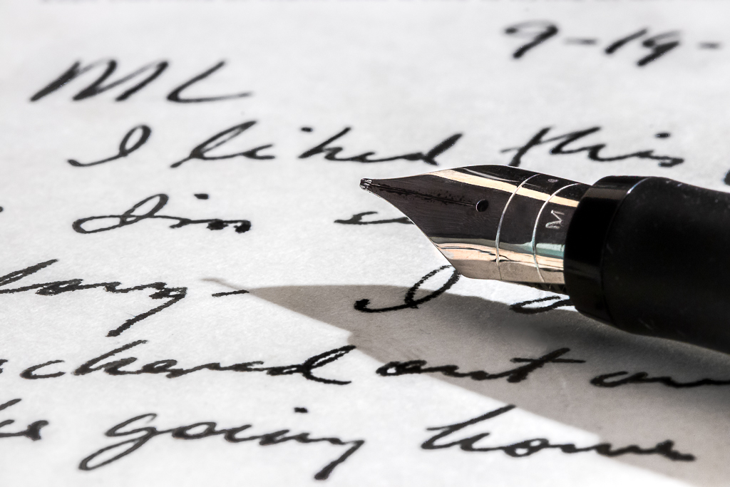
No, I don't think you are at all critical and I'm fascinated by your thoughts. I can't look at this photo and be completely objective as I knew the recipient very well and suspect I knew the writer "X" too but, even so, here is what I attempted to convey.
To my eye the picture is not about the pen and not about the text. It's about the act of writing, about one person communicating something to another. Little of the text is shown, so you have to imagine what the message might be. What was it that the writer liked? Who was going home? Has the correspondent set down the pen because the letter is complete or because she/he is awaiting further inspiration?
More interesting to me, the image also hints at the personality of the writer. The cursive handwriting is bold and clear, perhaps the writer is as well? And maybe a bit self-centered? Used "I" quite a bit. The fountain pen shows something of a flair.
That's my story and if anyone has a suggestion as to how I could tell it more effectively, that would be great. Just need to dig up the old postcard again! |
Sep 18th |
4 comments - 1 reply for Group 65
|
4 comments - 1 reply Total
|