|
| Group |
Round |
C/R |
Comment |
Date |
Image |
| 50 |
Jun 19 |
Comment |
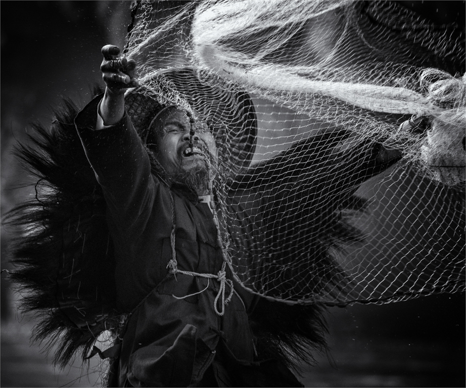
This image is interesting and makes for a great monochrome subject. I think it could do with even more texture/grunge in selective places. I agree with Cindy regarding the contrast making areas lighter which adds depth to the image. |
Jun 11th |
| 50 |
Jun 19 |
Comment |
You have handled the subjects well using natural light which shows in the depth of dark and light throughout the image. Your choice of different book covers and textures add to the story you are trying to convey. Maybe a little lightening in selective areas, such as the top book and the body of the boat may help to make these areas further stand out. |
Jun 11th |
| 50 |
Jun 19 |
Comment |
I like that you have tried something different, however for me this image just doesn't work. I was trying to figure out what is going on and until I read the title didn't pick that it was a pole vaulter. The image is split in half with the lower pole coming up through the middle of the image. The main pole area is leaning to the left when it should be vertical and then there's another pole splitting the vaulter in half. All very conflicting and I'm not sure where to look. |
Jun 11th |
| 50 |
Jun 19 |
Comment |
I like the second edited version better with less foreground. Nice use of shutter speed to slow down the water and as you say, a couple of steps to the side to show where the stream is going would have added context to the story. As it stands it appears to just come to a complete stop and I'm left wondering what is going on. |
Jun 11th |
| 50 |
Jun 19 |
Comment |
Nice use of the track on the angle to use leading lines drawing the viewer through the image. The contrast in the image is spot on, as is the composition. The only distracting part is the smoke - I'm not sure why? I can see the different layers via shades of grey but it all still seems flat - maybe try some selective contrast in this area. |
Jun 11th |
| 50 |
Jun 19 |
Comment |
The straight road in the middle of the image draws the viewer directly through to the subject. Overall I find the image flat and I feel it would benefit from more contrast. As a thought you may even lighten the road to further direct the eye where you need it - this would also help to break up the image. |
Jun 11th |
6 comments - 0 replies for Group 50
|
6 comments - 0 replies Total
|