|
| Group |
Round |
C/R |
Comment |
Date |
Image |
| 50 |
May 19 |
Comment |
Yes - a little more room at the front would be ideal. Also agree about toning down the colour of the image and add more contrast to your original image as it all blends into the rocks behind. You also appear to have blown out highlights on the engine - possibly just in the processing. I like the colour of Jeffrey's version - but am not a fan of the blurring he added to the image. |
May 17th |
| 50 |
May 19 |
Comment |
I find that the crop is too close on this image - the boat need some room to move at the front. It has potential as you can see from everyone else's version.... |
May 17th |
| 50 |
May 19 |
Comment |
The symmetry in this image draws you in. Lots that you could do with this - my thoughts would be maybe a crop on the bottom to eliminate some of the white - just an idea. We all see things differently which is great. |
May 17th |
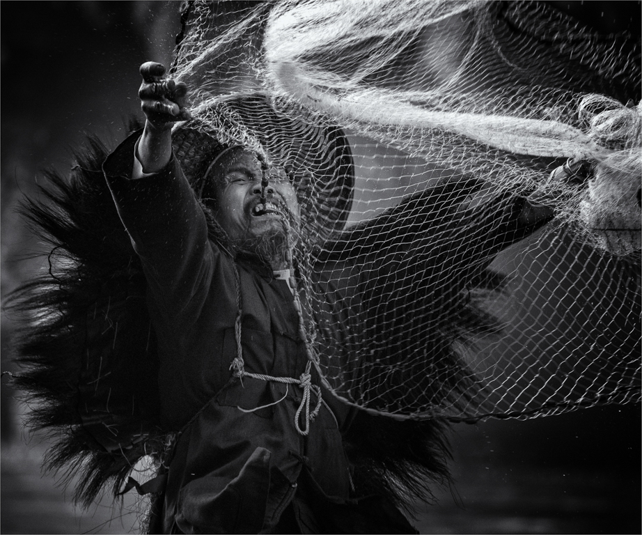
| 50 |
May 19 |
Comment |
I like this portrait with the contrast between the wiry beard and soft jacket. Nice eye contact and tonal range. Well done. |
May 17th |
| 50 |
May 19 |
Comment |
This image doesn't do much for me. I feel that overall it's flat and messy. For me images like this need to be simple. I do like the processing by Jeffrey that makes the roots stand out, but still I find it doesn't hold my interest. |
May 17th |
| 50 |
May 19 |
Comment |
I really like this - the inclusion of the shells breaks up the bouquet. I like the hint of the leaves in the right hand side. Effective processing using Nik software. |
May 16th |
6 comments - 0 replies for Group 50
|
6 comments - 0 replies Total
|