|
| Group |
Round |
C/R |
Comment |
Date |
Image |
| 66 |
Feb 23 |
Comment |
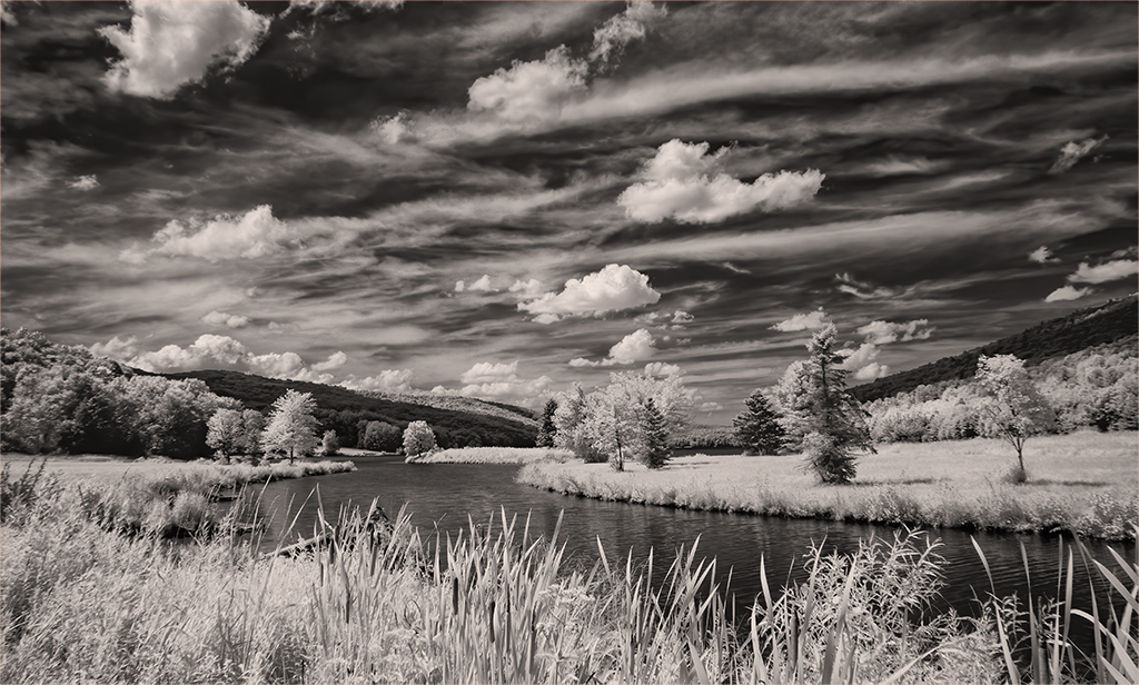
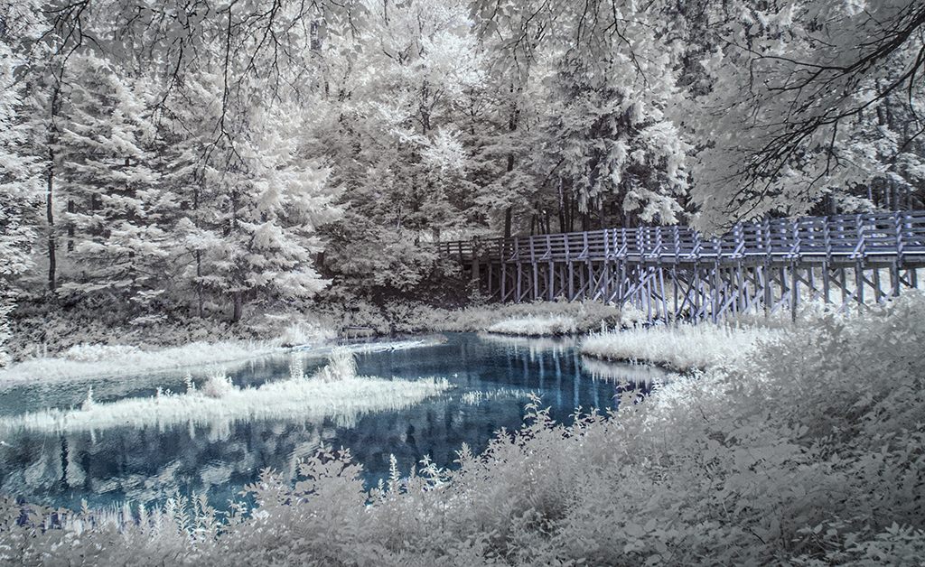
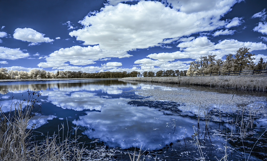
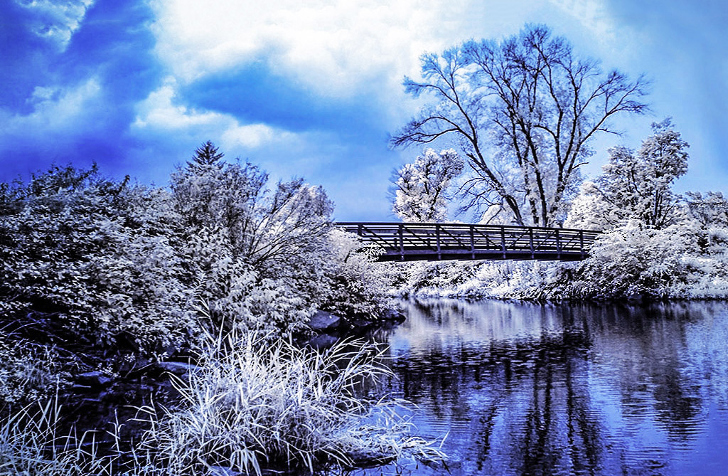
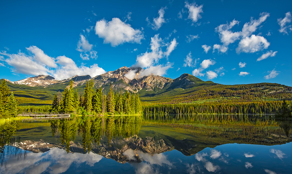
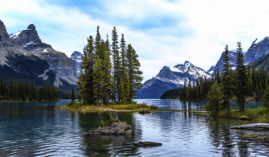
Emil, everyone is playing with your image this month. I like it as is, but being a color guy, I am also attracted to the unconverted orginal. Except for the strong highlights, I like its colors in the reflection, they seem magical. I like both. Thank you for finding such beauty in a marsh. |
Feb 22nd |
| 66 |
Feb 23 |
Comment |
Wow Palli, I love this image. The use of highlights contrasted against the dark stones to walk the viewer to the waders and then beyond to the god lighted hillside is simply great photography. High marks for sure. Thank you for sharing this gorgeous image. |
Feb 22nd |
| 66 |
Feb 23 |
Comment |
Gary, don't worry about getting back to the straight stuff. Your bent stuff is fun, and in this case, it allows those who are avoiding hell to enjoy its excess freedoms. However, I must join the others who want a bit more eye or something closer to that depicted in the original. Please keep enticing us. |
Feb 22nd |
| 66 |
Feb 23 |
Comment |
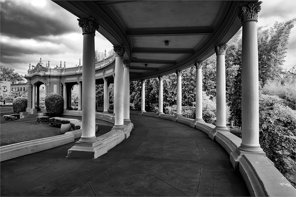
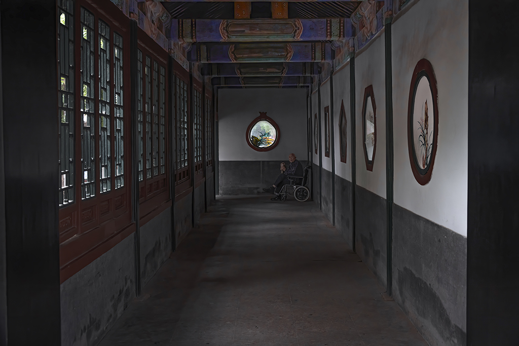
As always Arik, this composition is provocative. It is an image outside of the pavilion, but though its windows and doors. It reminds me of some of the great images of Henri- Cartier-Bresson. Spendid work. Thank you for sharing it.
|
Feb 22nd |
| 66 |
Feb 23 |
Comment |
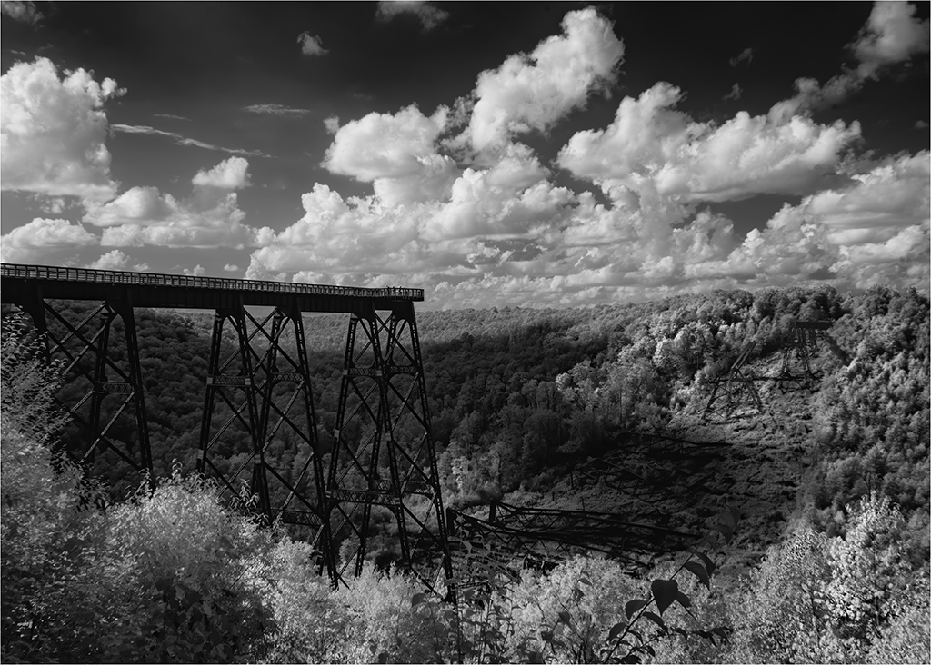
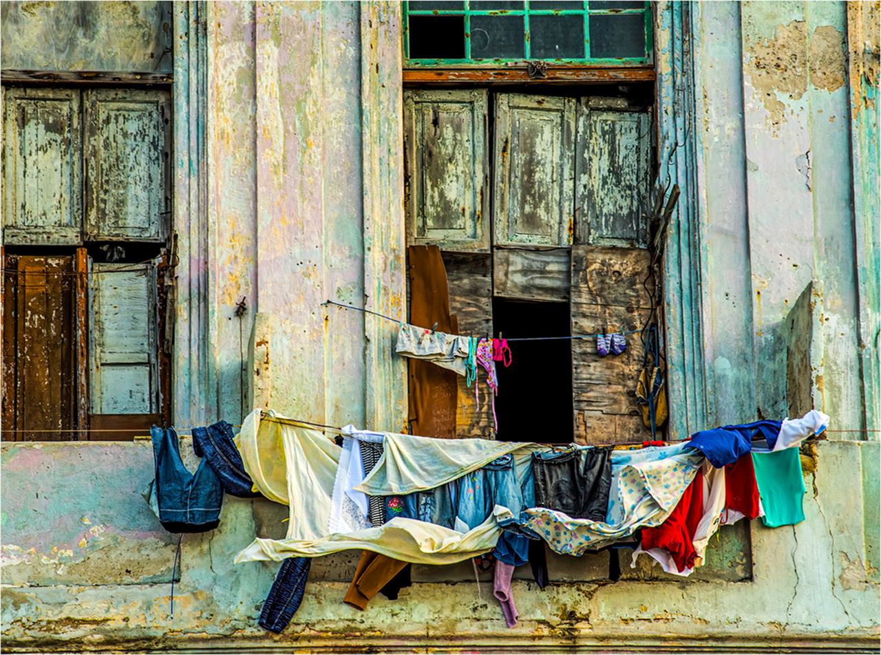
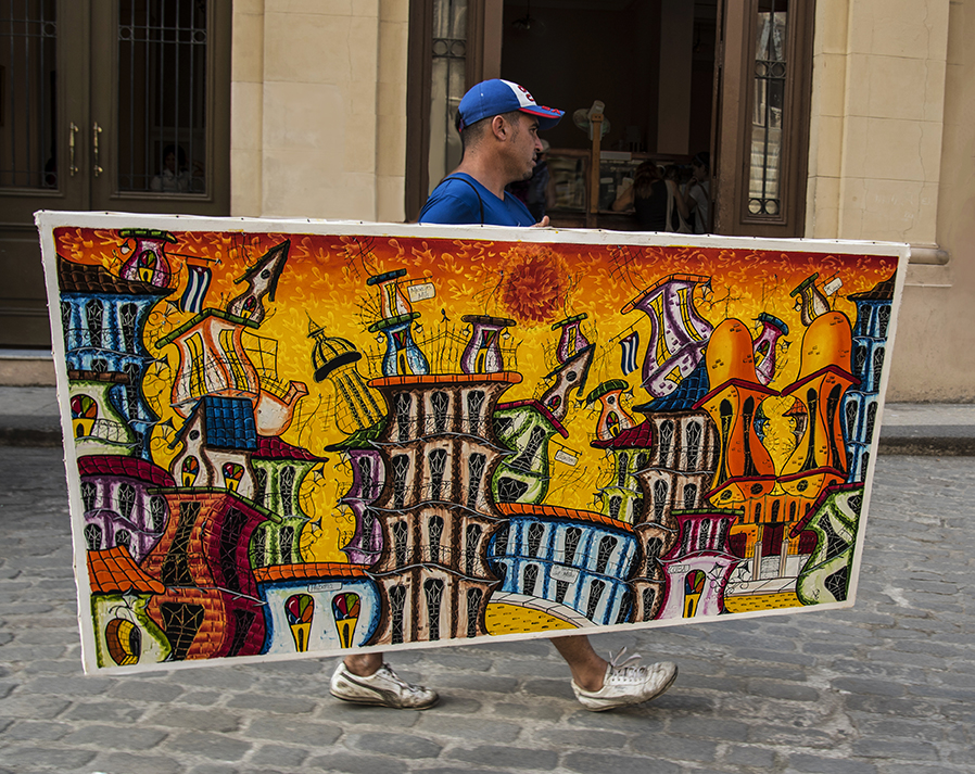
Jack, I had the good fortune to be in Cuba on a cultural exchange program in 2016. We were on a tight leash, so images like the one you shared were not available. I like the energy in the clouds and how your use of the bridge brings the viewer's eye deep into the scene. Splendid work! |
Feb 22nd |
| 66 |
Feb 23 |
Comment |
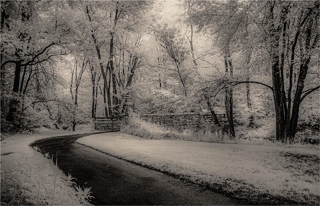
Henry, I should jump quicker on giving feedback and commenting. Can't add much to what others have suggested. For me, not much tweaking was needed. The native image was well composed and rendered. Splendid work. |
Feb 11th |
| 66 |
Feb 23 |
Comment |
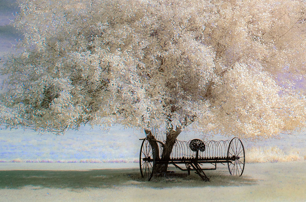
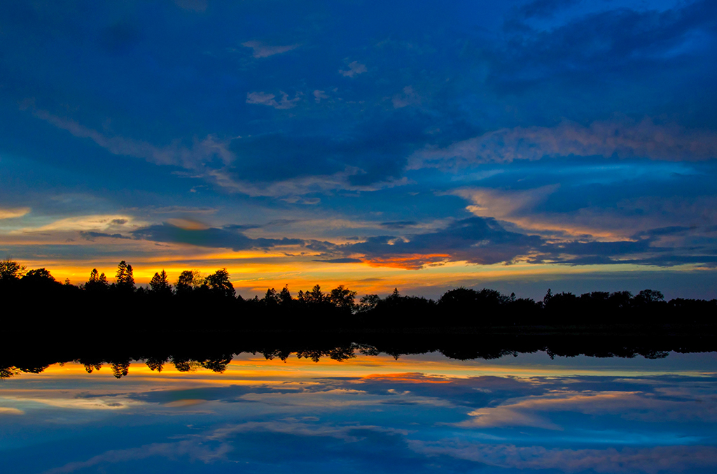
Melanie, looks like the high contrast, high detail folks have converted you, and I like how it adds more energy and drama to an already powerful image |
Feb 11th |
| 66 |
Feb 23 |
Reply |
Thank you for the kind and informative comments. I really do appreciate how you facilitate and manage our discussion group. It has become an essential learning forum for me. You're the best. |
Feb 7th |
| 66 |
Feb 23 |
Reply |
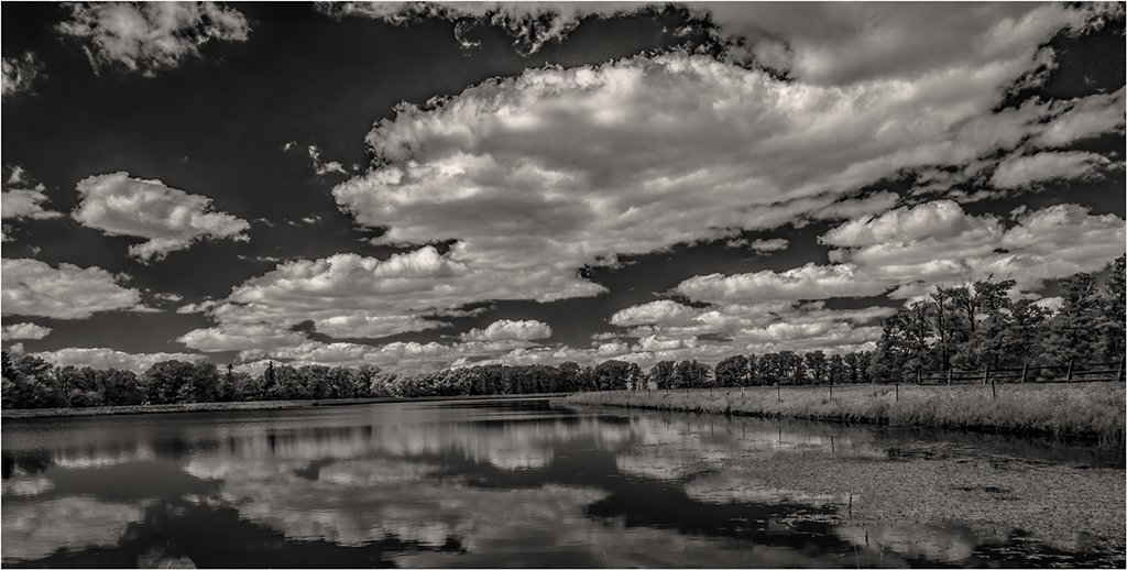
Emil, increasing the contrast in the clouds does add more drama in the story telling and welcomes the viewer to compare the placidness of the water with the energy in the sky. I presume you did this with a layer or was a selection tool sufficient? |
Feb 7th |
| 66 |
Feb 23 |
Reply |
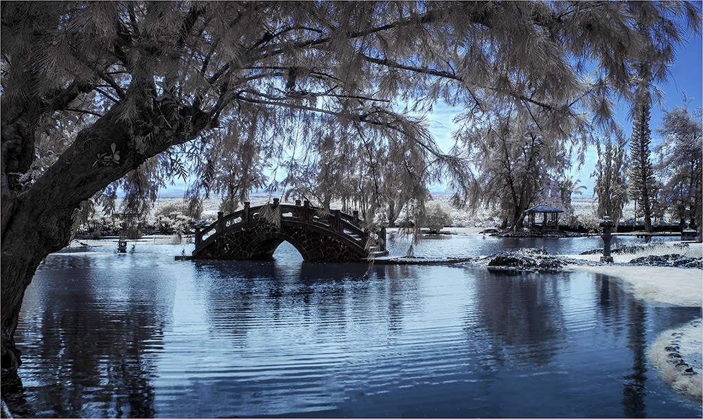
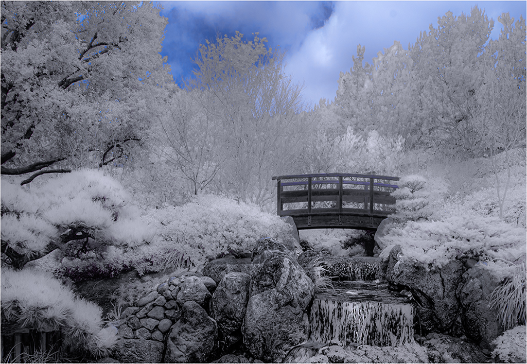
Henry, I was more in Gary's camp of high contrast and detail until I saw your version. The softness adds grace and causes the viewer to appreciate patterns more than details. The vignette does indeed create a Japanese garden effect. Quite lovely. Like it. |
Feb 7th |
| 66 |
Feb 23 |
Reply |
Gary, with landscapes, I'm with you: use the camera's resolution to render something bold and detailed. I like what you did with the clouds. Thank you. |
Feb 7th |
| 66 |
Feb 23 |
Reply |
Arik, it is interesting how there is a split between the high drama, contrast folks and those who like softer images with an emphasis on the Gestalt not the details. I'm still flipping a coin, but leaning toward soft. Thanks for the comments. |
Feb 7th |
7 comments - 5 replies for Group 66
|
| 88 |
Feb 23 |
Comment |
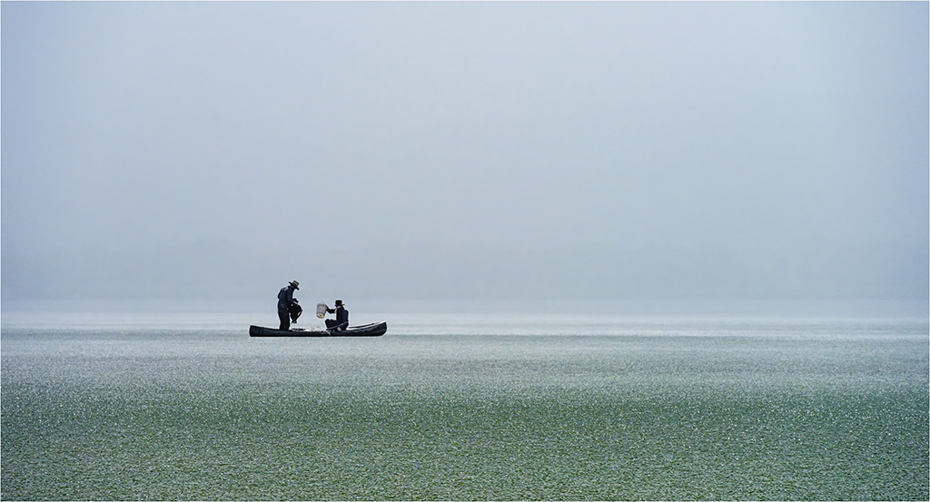
Sanat, what a difference between the original and the finished image. Life seemed washed out in the original, but you rescued it rendering a vivid vital image. I especially like what you did with the sky. The viewer is probably curious about the boat and men managing it, so any cropping that can be done to make them a stronger element of the composition would likely satisfy their curiosity. |
Feb 22nd |
| 88 |
Feb 23 |
Comment |
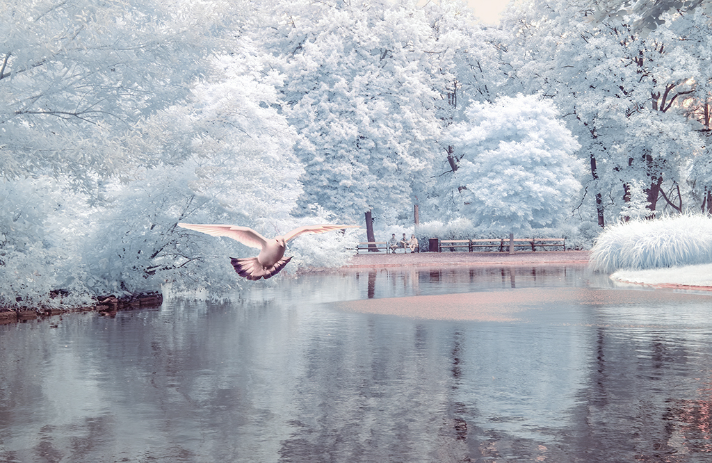
Brian, more than an image, you captured a mood with this photograph. The normalcy of the pigeon contrasted with foreboding presence of the human figure takes us to an unsettling surreal place. Converting it to black and white made all the difference, then your adjustments of tone took it to another level. High marks for sure. |
Feb 22nd |
| 88 |
Feb 23 |
Comment |
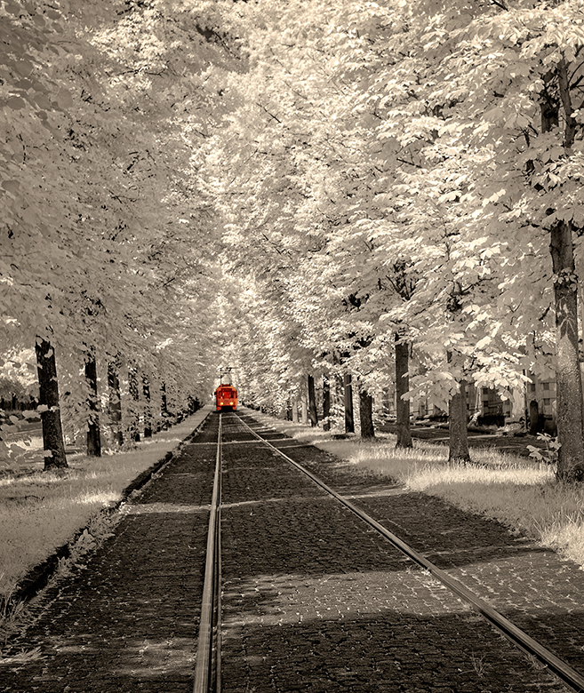
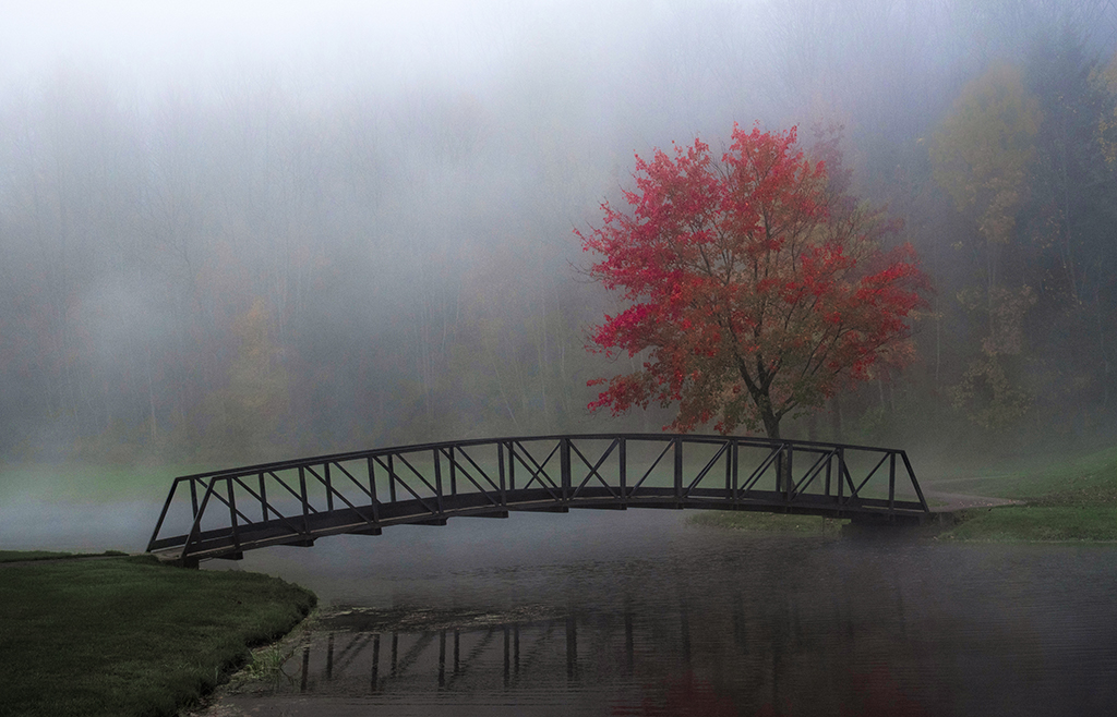
Trey, this "taste of what any driver would see" is art. That you saw it is testimony to your creative talents. Your use of the fog for framing in the composition and defining its subject is wonderful. Thank you for stopping your car to share what you saw and imagined with us. |
Feb 22nd |
| 88 |
Feb 23 |
Comment |
Mark, especially in Germany where the young are into minimal, modern architecture, the contrast between the old and new is stark. You captured this well. I like what you did to remove haze and add a sky (that fits so naturally, by the way). Thanks for sharing your work and reminding me of my Zimmermann relatives living in Germany. |
Feb 20th |
| 88 |
Feb 23 |
Comment |
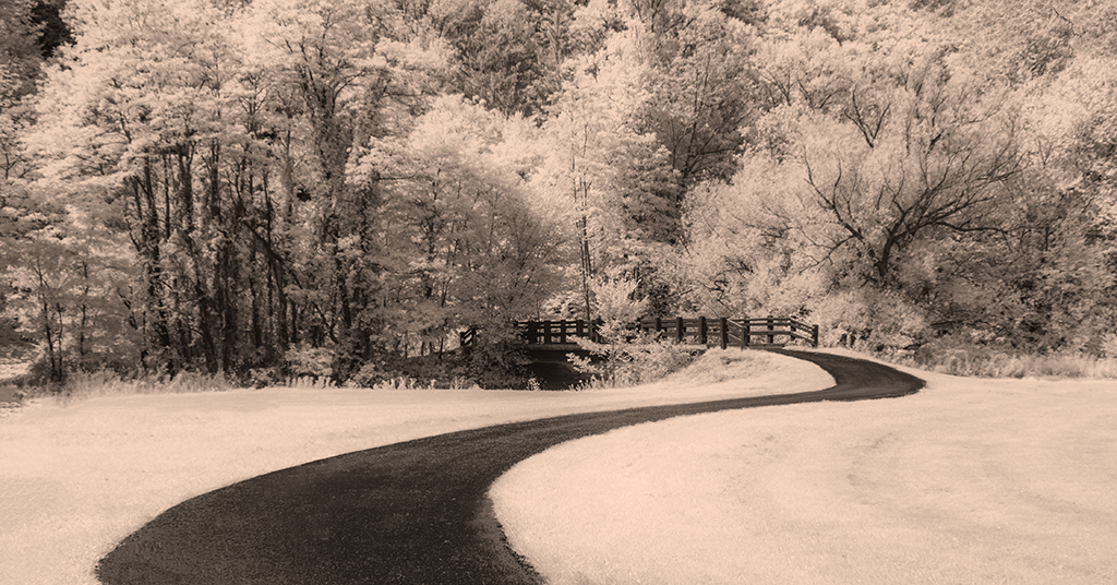
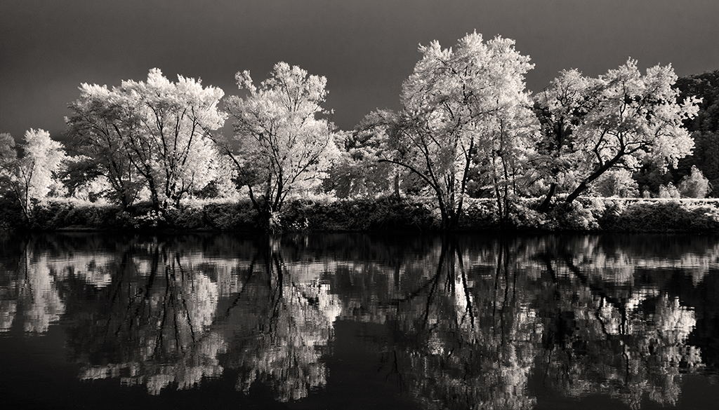
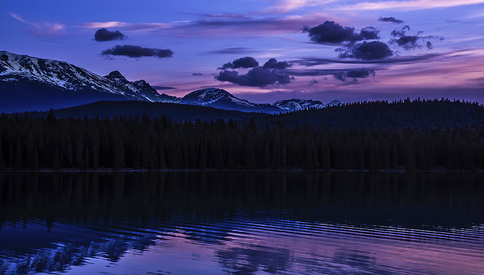
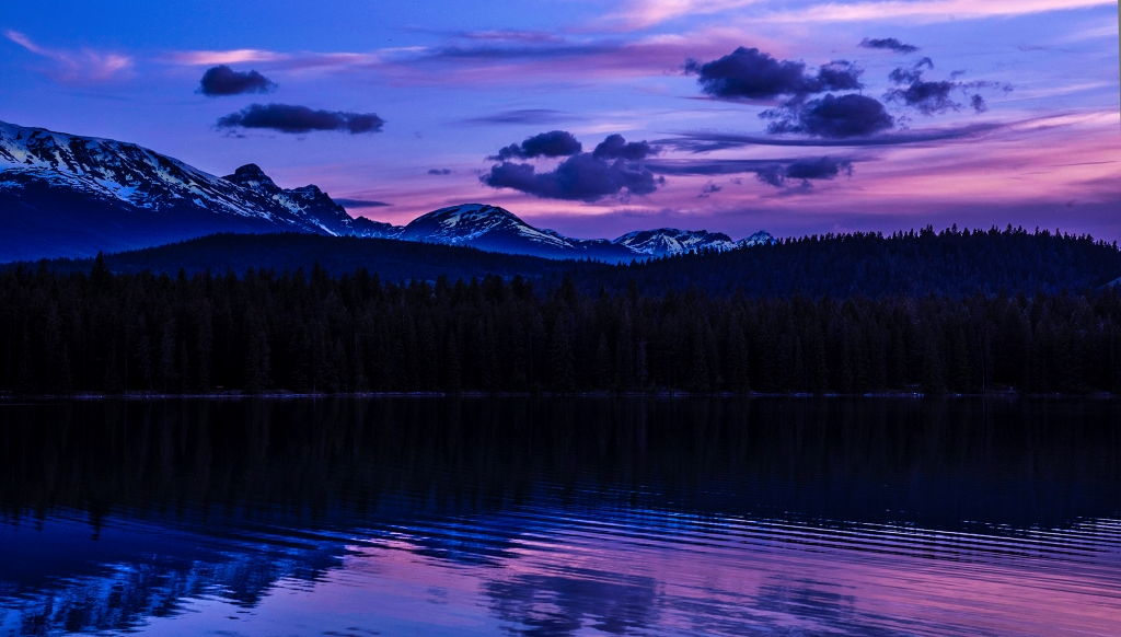
Jacky, I do not know what I like the most, the image or your poem about the image. "Choir of trees" honors the quiet presence of these living things that connect earth to sky. The image is somber and understated. Its darkness belies its meaning. Would lightening up the shadows and bringing out more details in the reflected part of the image change the meaning of the poem? |
Feb 20th |
| 88 |
Feb 23 |
Comment |
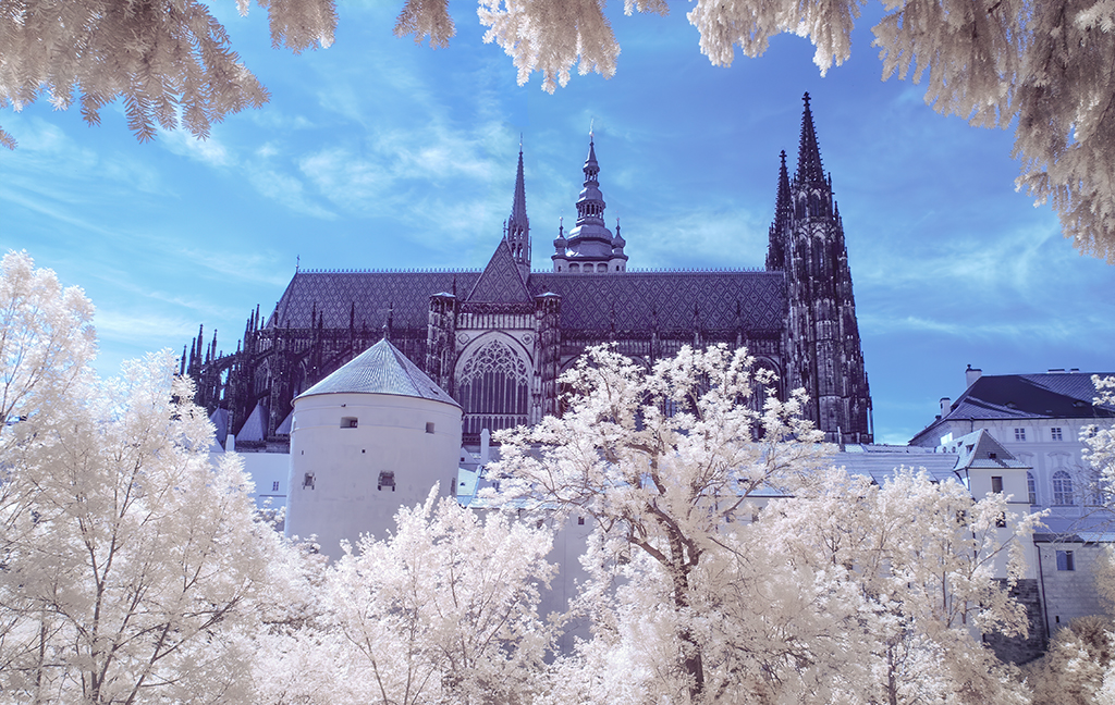
I like Stephen's suggestion but wish some dark blue was in the night sky. I'm surprised Topaz DeNoise still left so much grain in the sky. The reflection, star light and temple make this a very eye fetching image |
Feb 12th |
6 comments - 0 replies for Group 88
|
13 comments - 5 replies Total
|