|
| Group |
Round |
C/R |
Comment |
Date |
Image |
| 66 |
Sep 22 |
Comment |
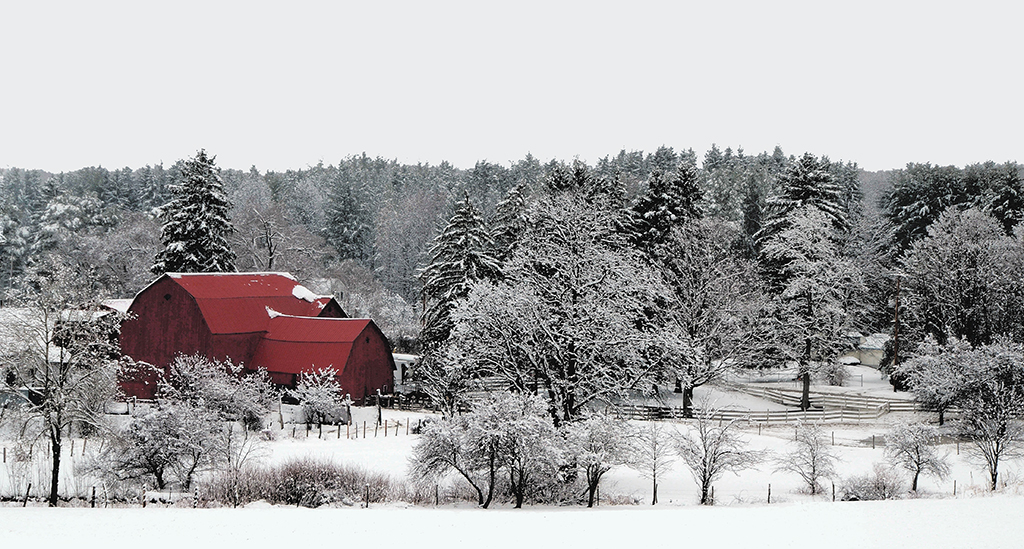
Henry, thanks for sharing the fun moments by the sea with family that is so well captured with this image. How interesting those palm trees are. I like the crop and most of the color conversion; however, as the others have pointed out, the palm trees may appear to some viewers as dead. On the other hand, this sacrifice of color might be a small price to pay for the rich browns in the cottage and lovely blues in the sky. |
Sep 13th |
| 66 |
Sep 22 |
Comment |
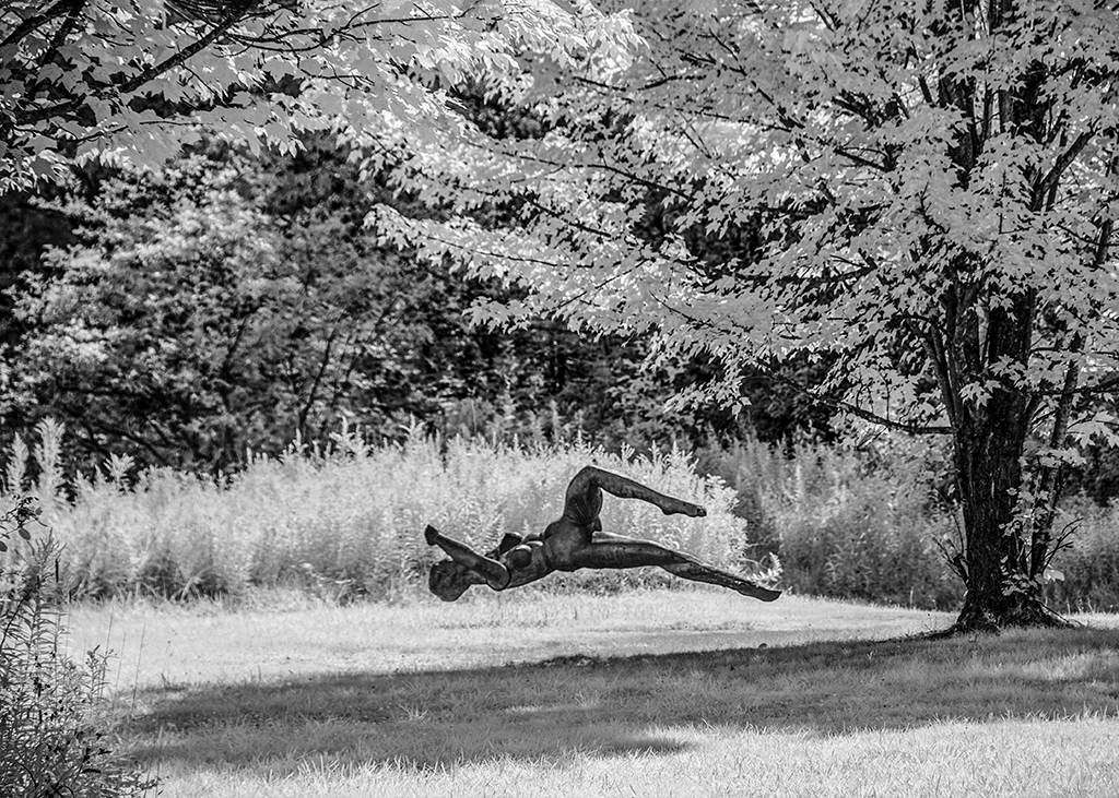
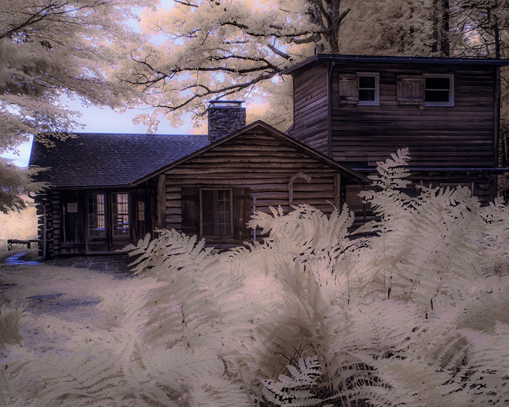
Emil, you masterfully handled the bright areas in the back-left part of the image allowing attention to shift to the ferns. Post-processing nicely brought out the details in the ferns and exposed hidden tonality. The three-trunked tree is a strong element in this composition. Very nicely done. |
Sep 9th |
| 66 |
Sep 22 |
Comment |
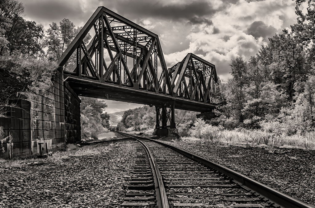
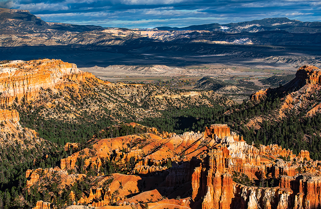
Jack, for me this is a complex composition. The rows of grape vines provide a necessary central focal area to integrate the elements of the forest, left and right, with the distant hills. Palli's suggestion for contrast helps shift attention to the vineyards, Gary's does this more strongly. This is not an easy scene to pull together, but you have done so very artfully. |
Sep 9th |
| 66 |
Sep 22 |
Comment |
Palli, you make an ordinary scene a piece of art. I like what you did to increase the tonality and light-dark dynamics. One minor suggestion: Delete the weed in the middle of the fence in the foreground. |
Sep 2nd |
| 66 |
Sep 22 |
Comment |
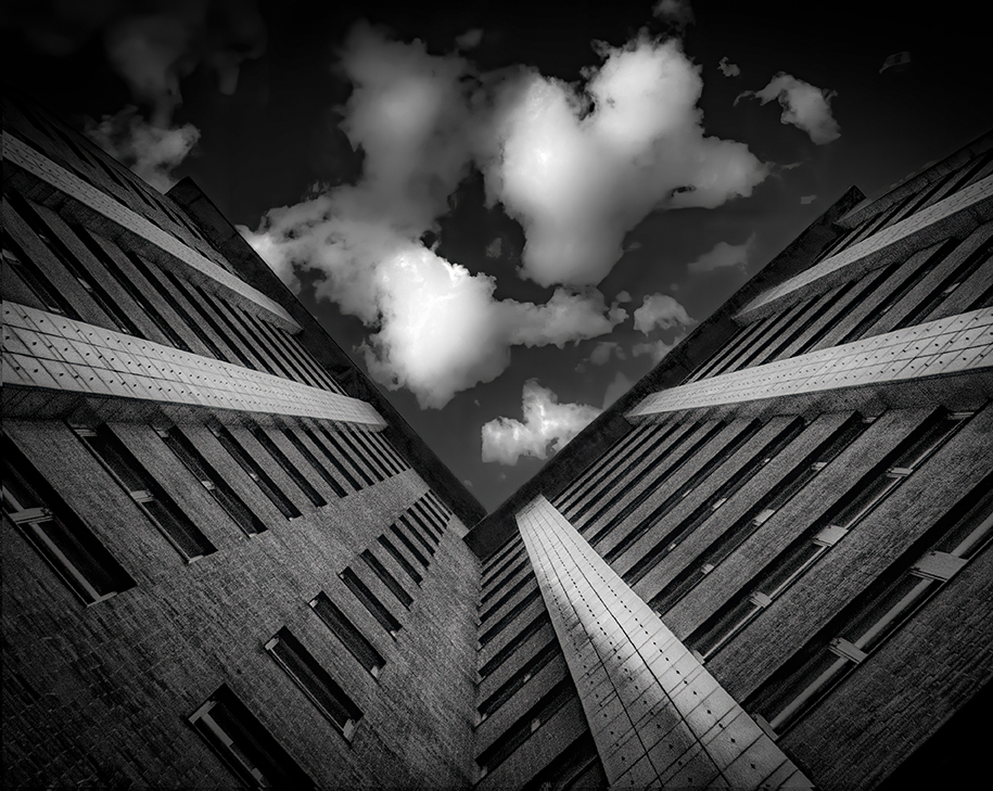
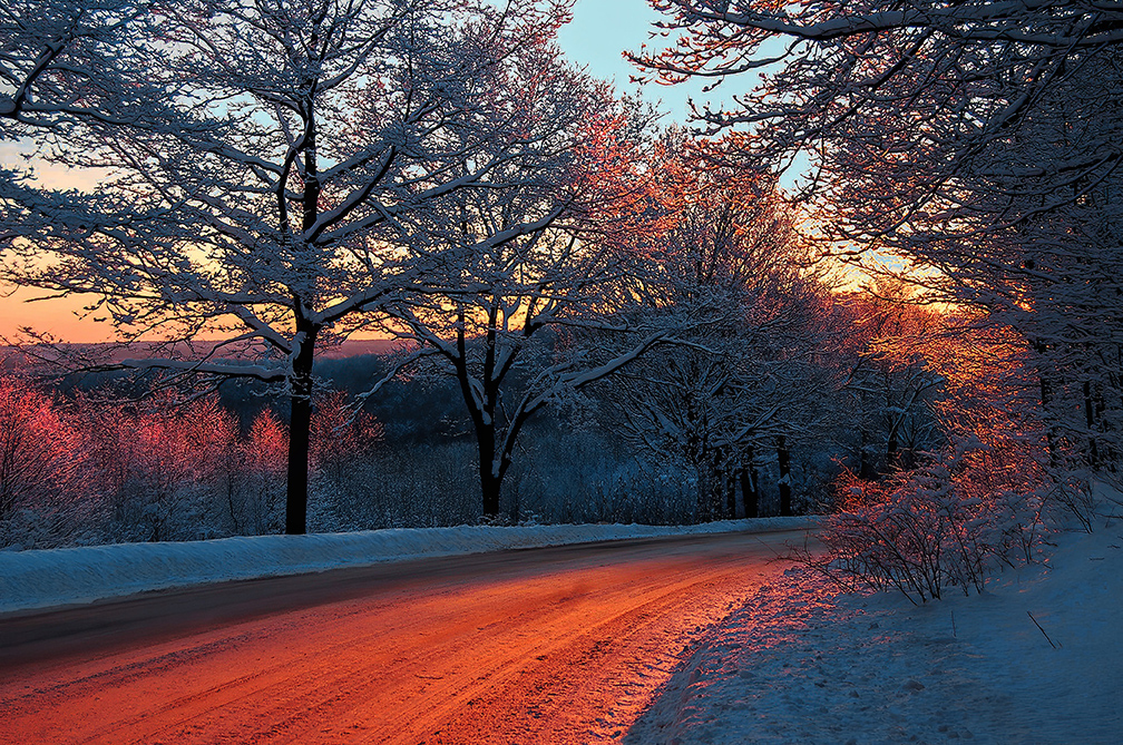
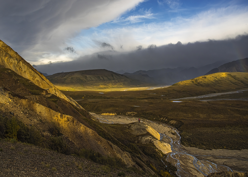
Gary, my eye wants to title this image "Requiem for Summer". It has a dark aura that captures an emotion as well as an image. This emotional shift was nicely crafted in your post-processing work. While it was your deliberate choice, the softening and pattern of blurring is confounding, for me. It also arouses the "out of focus" trigger in the technical side of my obsessive-compulsive brain. But this effect also created the lazy-hazy tone you desired. |
Sep 1st |
| 66 |
Sep 22 |
Comment |
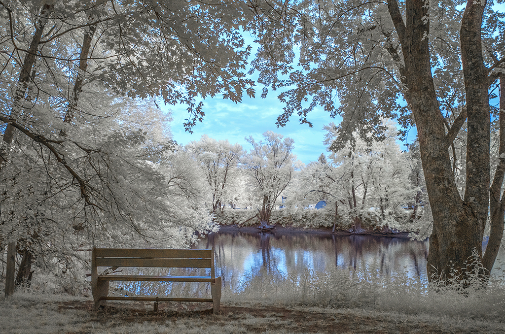
I like the eery, other-worldly tone of this image. Adding the blue rendered a more dynamic image. Could this effect, alternatively, been achieved by whitening the highlights in the background? My eye wants to reduce the patch of light behind the bench. The plaque on the bench is ok, but might be a candidate for deletion? Amazing work with that little point and camera! |
Sep 1st |
| 66 |
Sep 22 |
Comment |
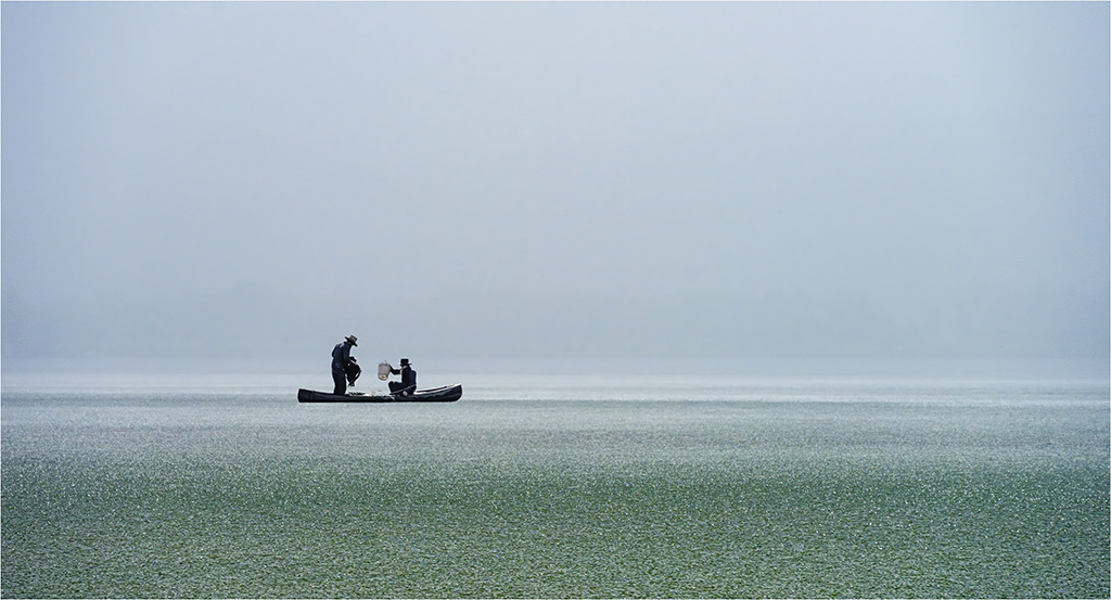
Melanie, I can see why you were attracted to this image while others were shooting frogs. Sometimes an image finds you. Using a high ISO has not added too much noise, but afforded you the option of using a higher F-stop to get depth of field and capture details. I like what you did to show us the curves and patterns that arrested your eye. Lovely! |
Sep 1st |
7 comments - 0 replies for Group 66
|
| 88 |
Sep 22 |
Reply |
I like your analysis. Definitely there is tension on the left side caused by too much cropping. I also like the idea of lightening the shadows under the treeline. For reasons only a psychiatrist can offer, I like dark areas in images, but in this case, a lightening up of the river on the right side would be an improvement. Thanks Trey. |
Sep 18th |
| 88 |
Sep 22 |
Reply |
Yes, the water is gravely dark. I'll lighten it, thanks. |
Sep 18th |
| 88 |
Sep 22 |
Reply |
Perphas this is an "academic" question, but does the rule of thirds apply best when there is uniform visual appeal? What do you do when two or more parts of the image capture the attention of the viewer? |
Sep 18th |
| 88 |
Sep 22 |
Comment |
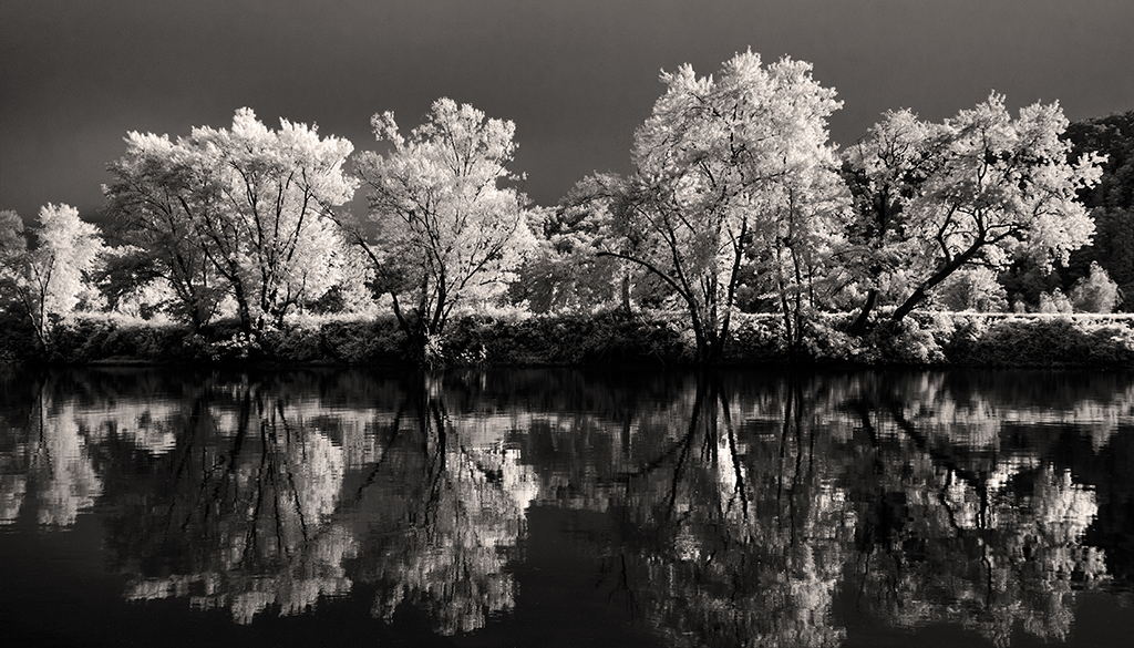
Quang Phan, shooting in the evening at a high ISO can be tricky. Colors shift, tonality can become flatter and, of course, noise is added. However, your post processing tackled these problems while nicely capturing the Gestalt of that unnamed inter-season of late Fall and early Winter. |
Sep 13th |
| 88 |
Sep 22 |
Comment |
Sanat Kumar, this is one of those travel images that evokes a lot of conversation among friends and those who know the significance of the Ramkrishna Temple. Taking out the power line and adding the sky plus making the lens and keystone correction rendered this pleasing image all the more pleasing. |
Sep 13th |
| 88 |
Sep 22 |
Comment |
Rich, you did a lot of things to rescue this interesting image. Some of the original was a light overexposed and Mother Nature challenged you with multiple subject matter competing with the bird. Perhaps deleting competitive white areas and adding a vignette would help? |
Sep 13th |
| 88 |
Sep 22 |
Comment |
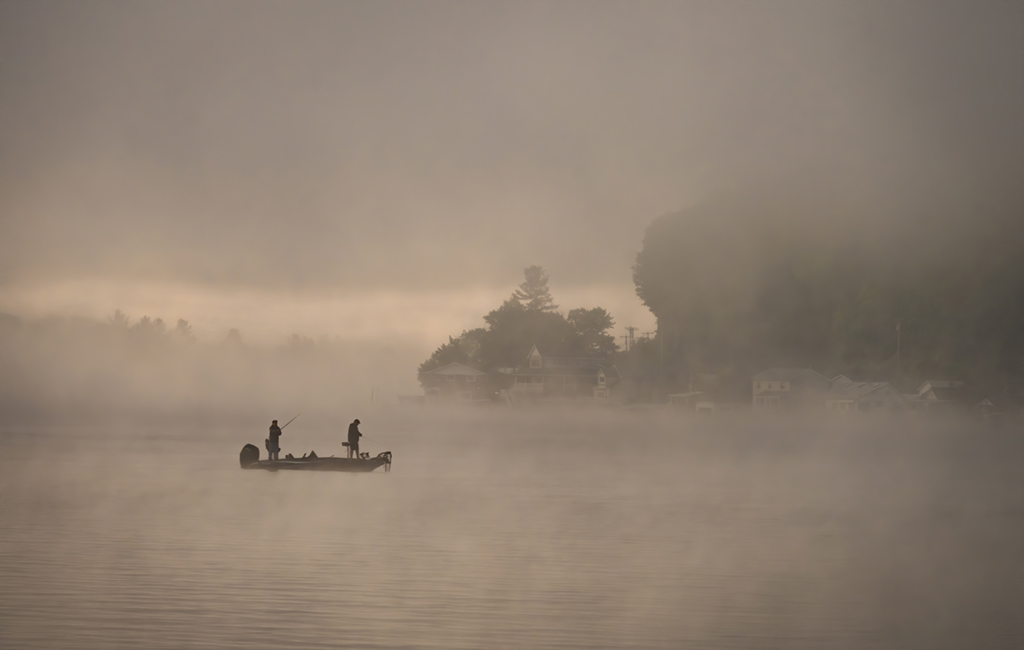
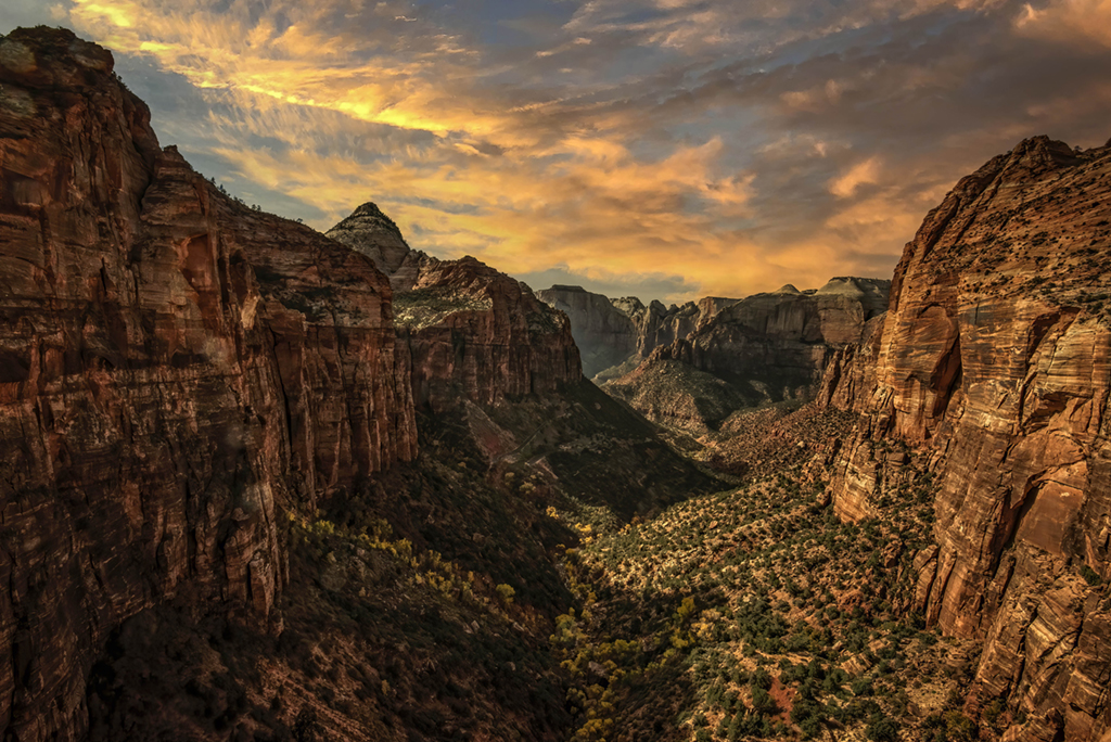
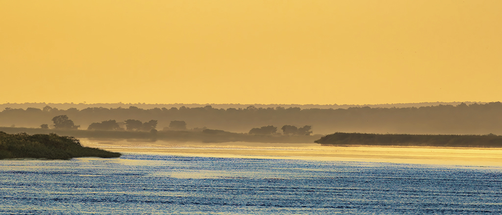
Trey, I am so glad you stopped. What a lovely vista crowned with a dynamic morning sky and shrouded in a mysterious fog. I like your change of the horizon line and what you did to bring out the greens. My only minor suggestion is to crop the foreground a bit more to keep the viewer's eye on that lovely scene in the distance. |
Sep 13th |
| 88 |
Sep 22 |
Comment |
Mark, this is such a beautiful spot in Italy for landscape photographs. I like that you took the shot from the sea and wisely used the V-shape of the houses to compose the image. Colors are lovely. It could be my monitor, but the image seems slightly blurred or has some noise? |
Sep 11th |
5 comments - 3 replies for Group 88
|
12 comments - 3 replies Total
|