|
| Group |
Round |
C/R |
Comment |
Date |
Image |
| 66 |
Sep 20 |
Reply |
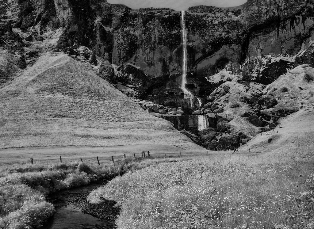
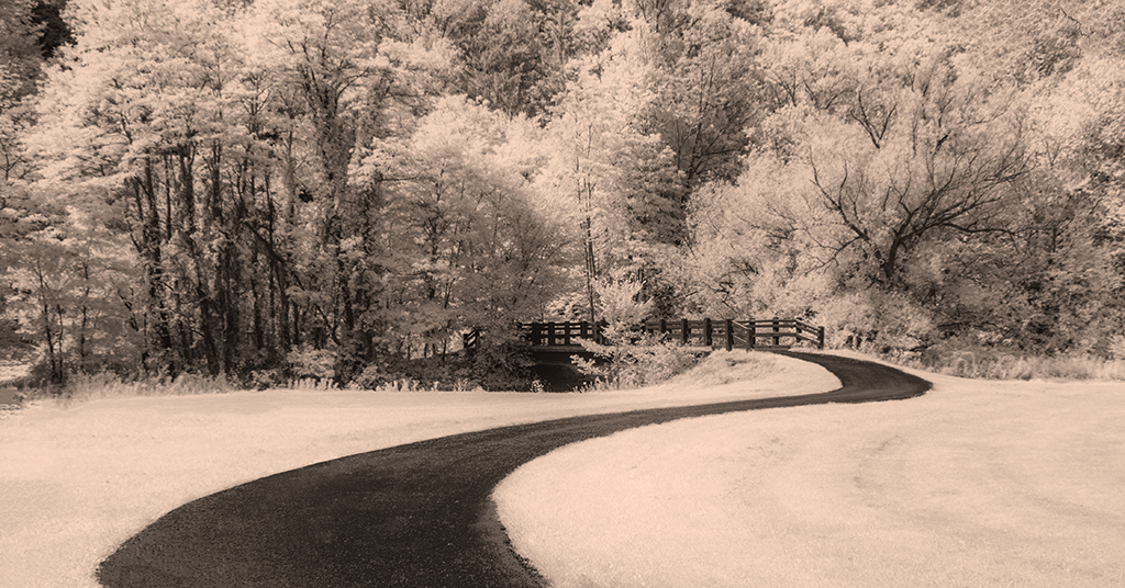
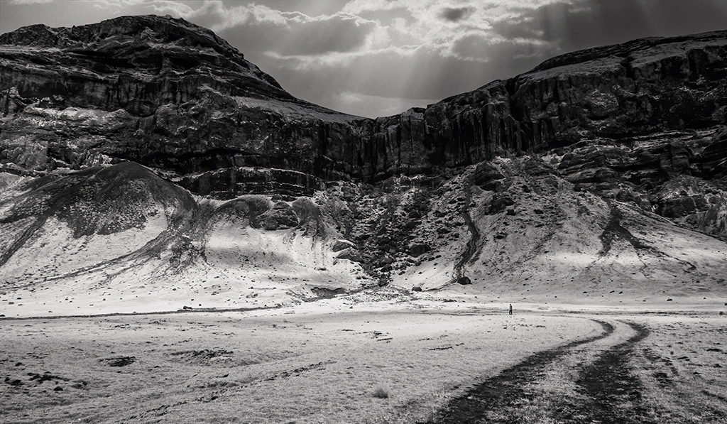
I had some challenges deciding how to crop this landscape. I will try your suggestions . . . or take another shot to create a more balanced composition |
Sep 14th |
| 66 |
Sep 20 |
Reply |
Yes Melanie, in another version, I have it less saturated, but for impulsive reasons I settled with something more fanciful. Less saturated is better and the yellow retains some of the whimsy. |
Sep 14th |
| 66 |
Sep 20 |
Comment |
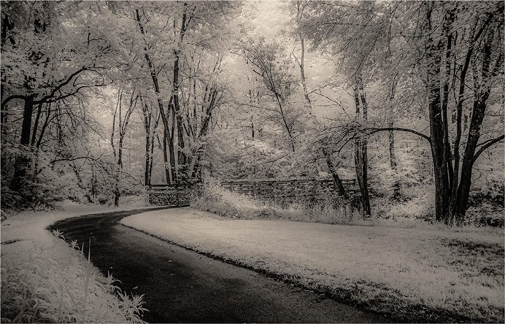
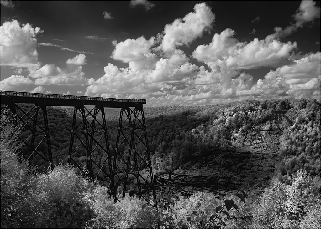
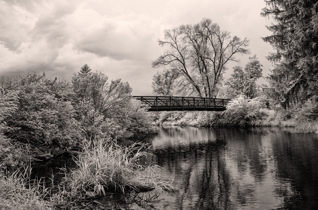
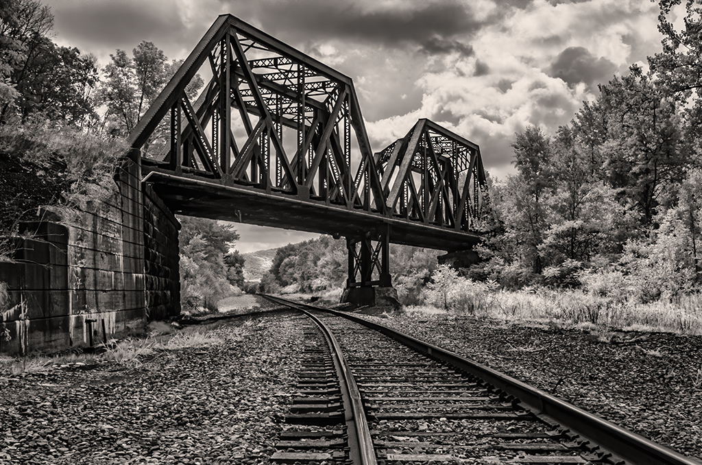
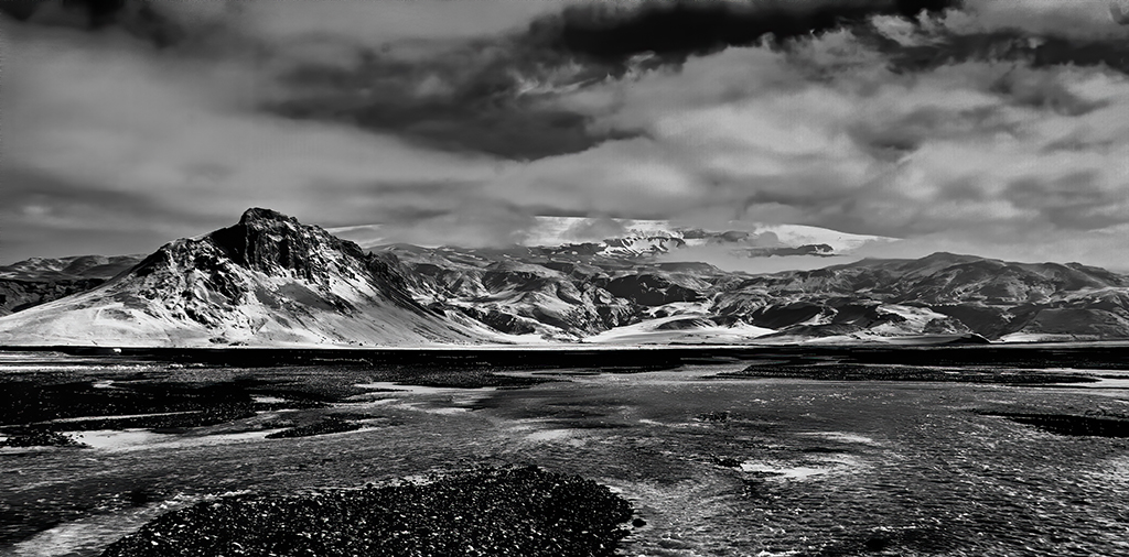
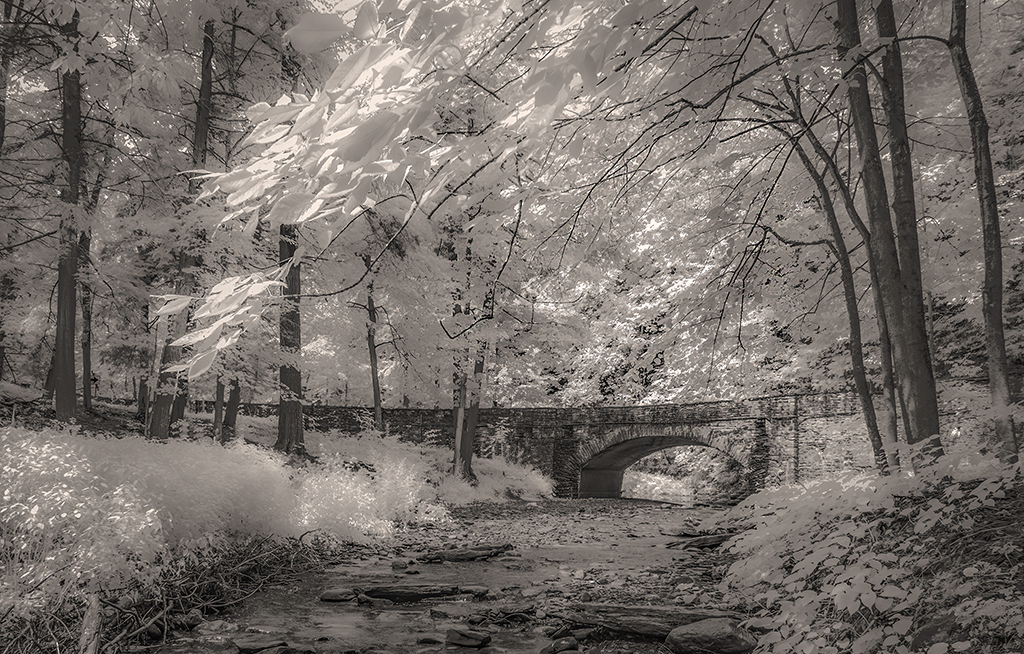
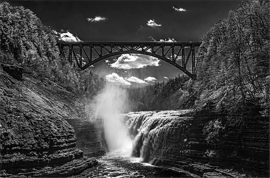
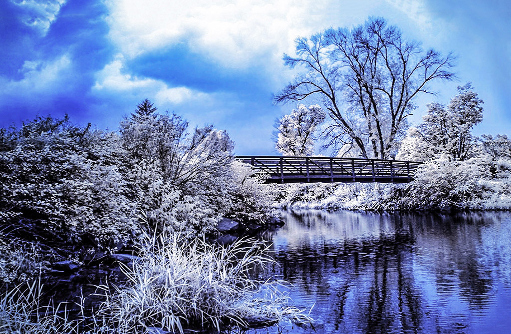
Emil, another powerful image of clouds and a dramatic stormy sky. I like the way the bridge is used to anchor the base of the image. Some of the foliage and trees are sharp and others less so (a consequence of the 15 sec exposure?). I wonder if processing that part of the image in a program like Topaz Sharpen might help? |
Sep 14th |
| 66 |
Sep 20 |
Comment |
Palli, I like the result too. Taking the photo so tight to the subject adds power to it especially when a giant lizard is the subject. The filter made the background more uniform in texture and focus. The highlight behind the monster adds dramatic contrast. The left leg of the monster is resting on a block. Would it be cool to make that leg appear to be extending toward the viewer by deleting the block? |
Sep 14th |
| 66 |
Sep 20 |
Comment |
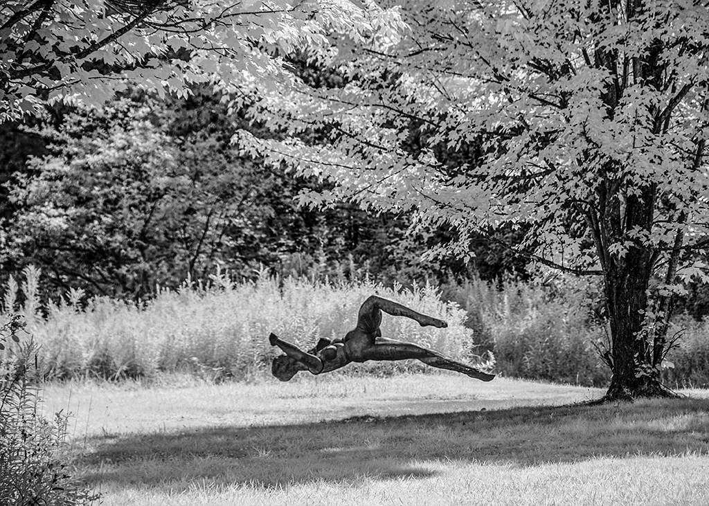
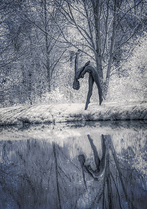
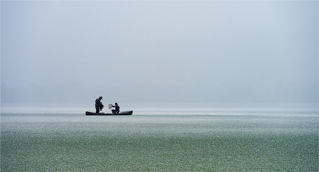
What a fresh way of seeing. I have a couple looking up shots taken while cross country skiing (laying on my back resting). I like yours because of its complexity. However, the leading lines might be stronger, IMHO, with some of the crossing branches deleted and maybe a crop drawing more attention to the willow? |
Sep 14th |
| 66 |
Sep 20 |
Comment |
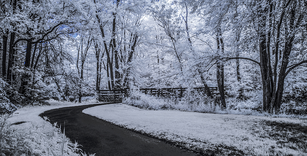
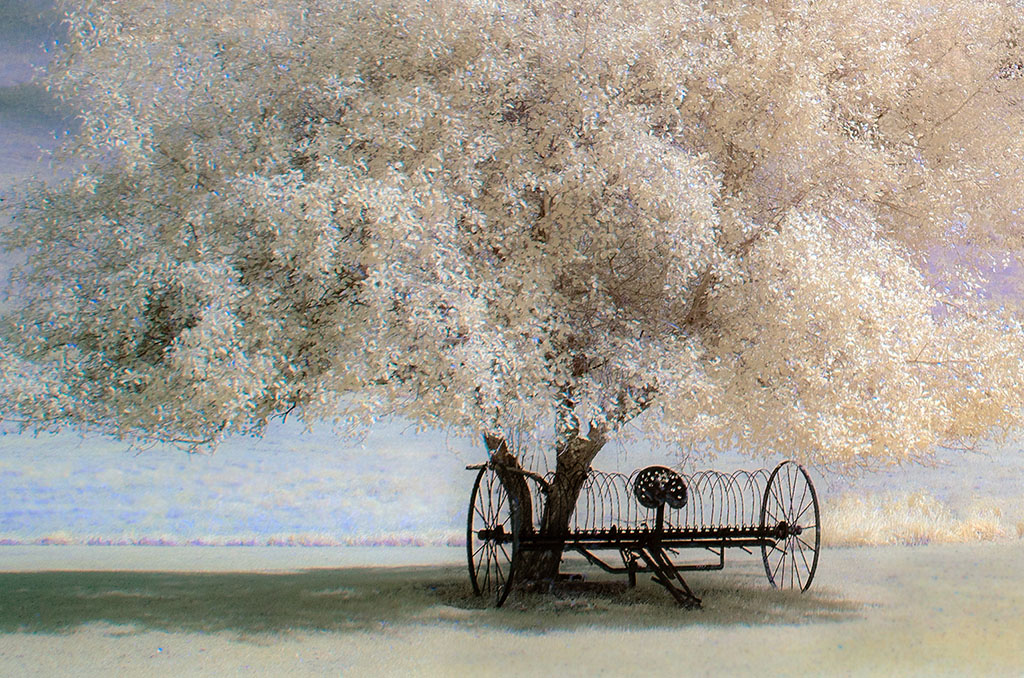
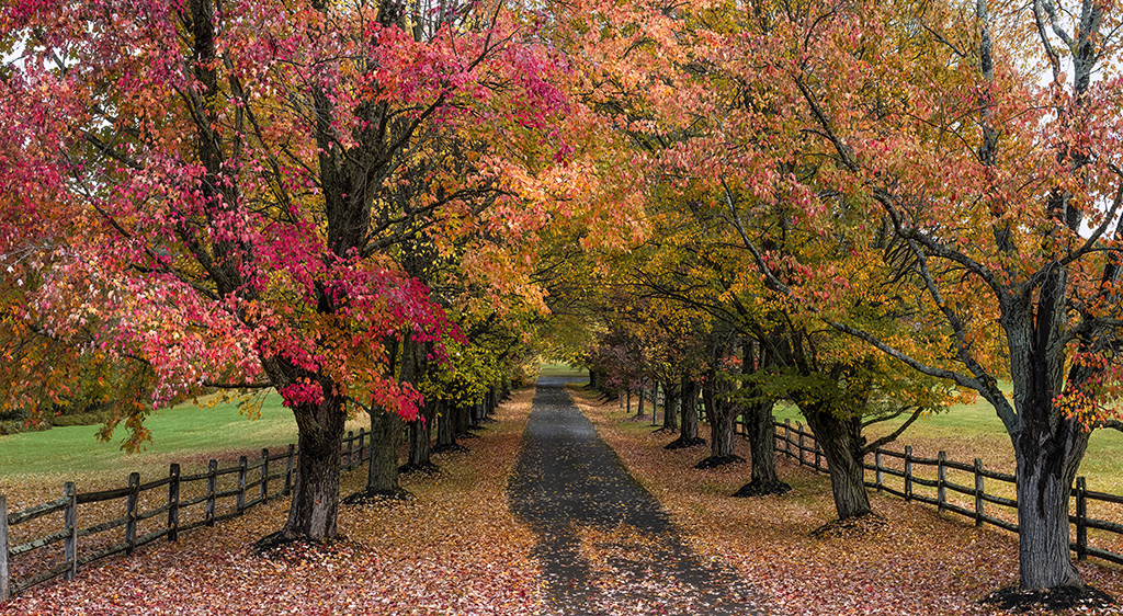
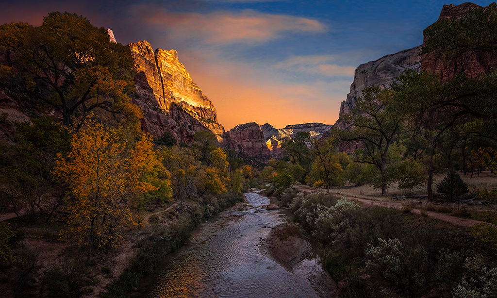
Jack, I am inclined to agree with suggestions about cropping, but would like to recommend, if you elect to try a horizontal landscape format that you remove some of the trees at the horizon line on the left side of the image, which, IMHO, would keep the viewers eye on the lovely god-lighted tree. |
Sep 11th |
| 66 |
Sep 20 |
Comment |
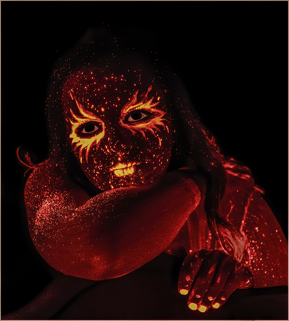
Melanie, I like the idea of retaining color in an image. I think you dialed in the right level of red to make it interesting without making it garish. Very creative. It occurs to me that there are several ways to introduce color using layers, the History Brush, or painting. Again, you have inspired me. |
Sep 11th |
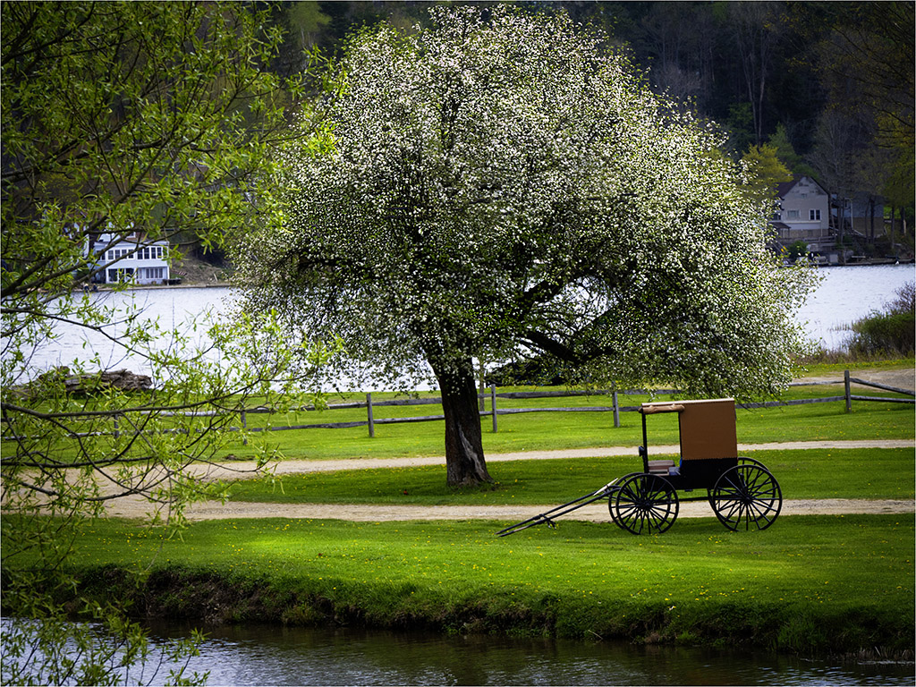
| 66 |
Sep 20 |
Comment |
We have several Amish areas in Western New York. Gary, your image is an inspiration to revisit them. The depth of field is certainly sufficient. All the buggies are sharp. I like what you did to replace the highway, it's seamless work. The flood filter adds interest. Did you have other choices in mind to enhance depth? My eye wants to relocate the horse, and reduce the number of buggies (more of an opinion than advice). |
Sep 2nd |
6 comments - 2 replies for Group 66
|
| 88 |
Sep 20 |
Reply |
Gary, your adjustment of the tree line hits the sweet spot. The image I sent the group looks more like yours. The luminosity setting on my monitor must be too high? |
Sep 14th |
| 88 |
Sep 20 |
Reply |
Thank you Trey for your supportive comments. I knew I has taking a risk "juicing" the colors, but the results are OK. |
Sep 14th |
| 88 |
Sep 20 |
Reply |
Louis, I like what you did to bring out the the tree line in the shadows. I will tinker with this. |
Sep 14th |
| 88 |
Sep 20 |
Comment |
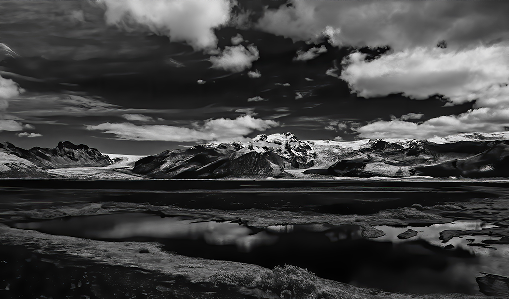
Gary, you have done a lot in post processing to render a lovely image. These high contrast situations are a challenge; however, you brought out the details in the shadow areas and in the reflection. The sky became more defined too. Mother Nature added some bushes at the lower left corner. I wish she didn't do this, but it may not be worth the effort to remove them, if you agree. |
Sep 14th |
| 88 |
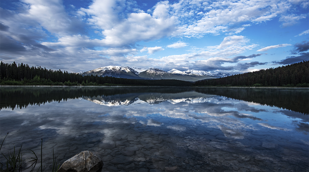
Sep 20 |
Comment |
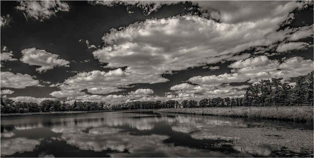
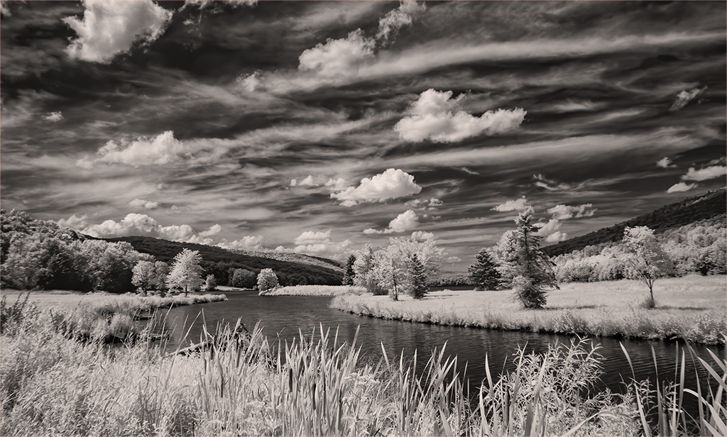
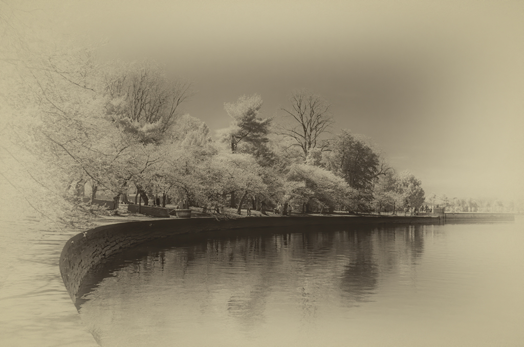
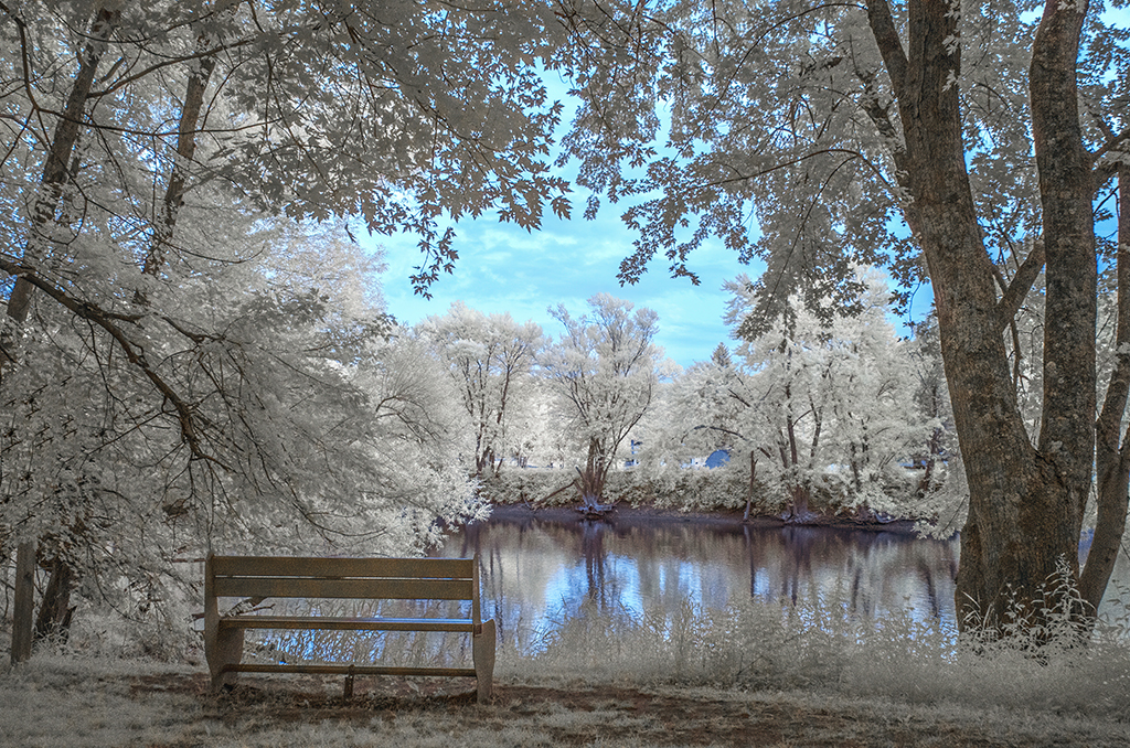
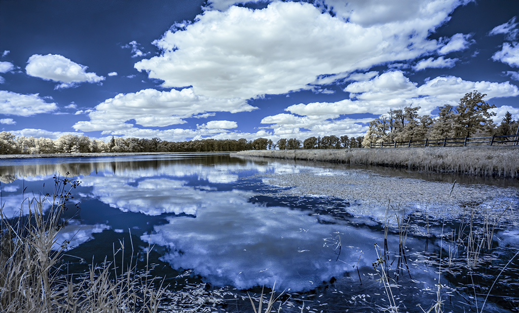
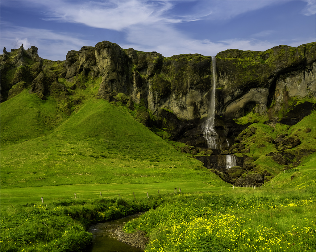
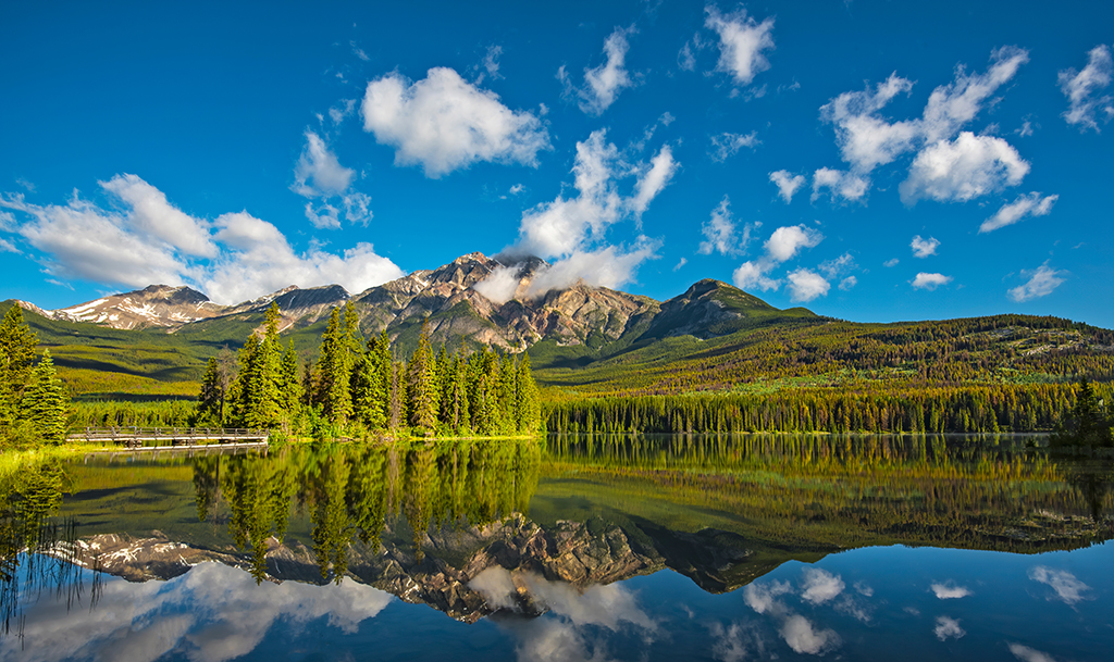
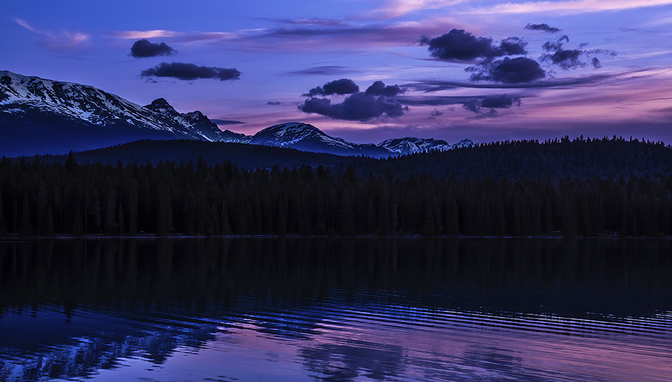
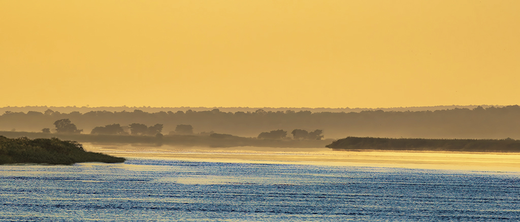
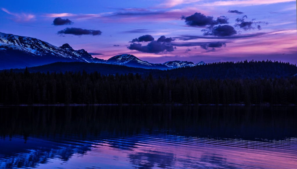
For me the subject of this peaceful scene is the pond and boats in the context of this gorgeous remote meadow. I agree with the other's comments on the sky. Also, the trees on the hillside in the distance seem too enhanced. Perhaps increasing their saturation might help or darkening them by decreasing the shadow slider in camera raw may allow the viewer to focus more on the pond? |
Sep 14th |
| 88 |
Sep 20 |
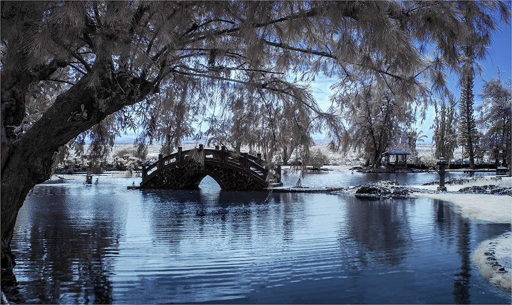
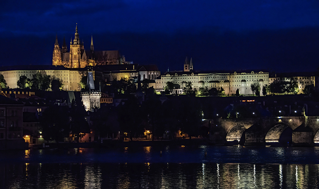
Comment |
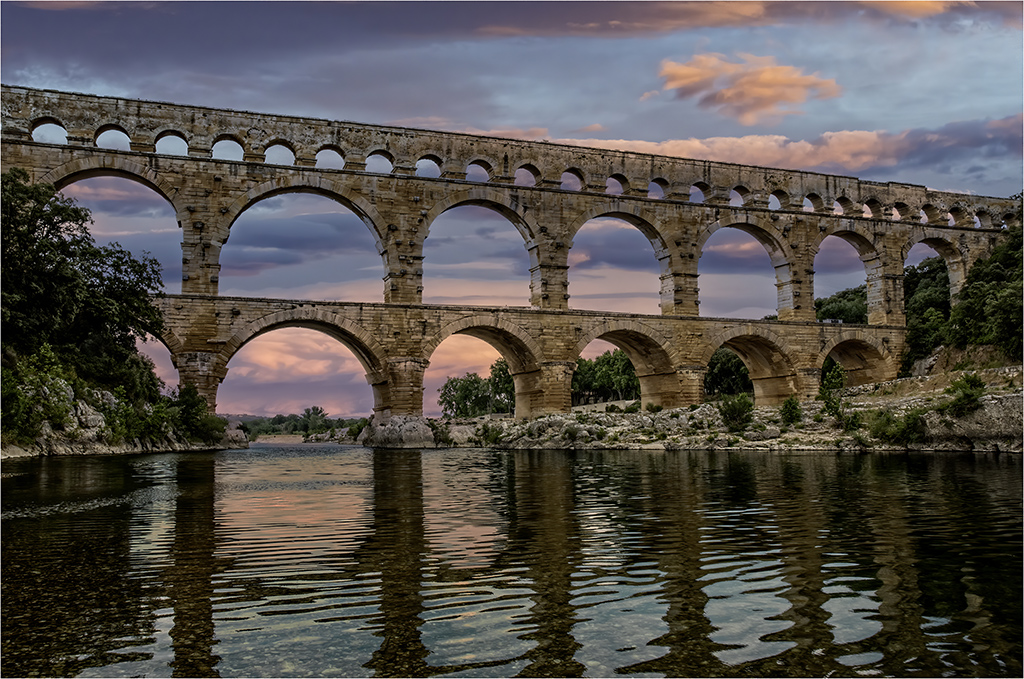
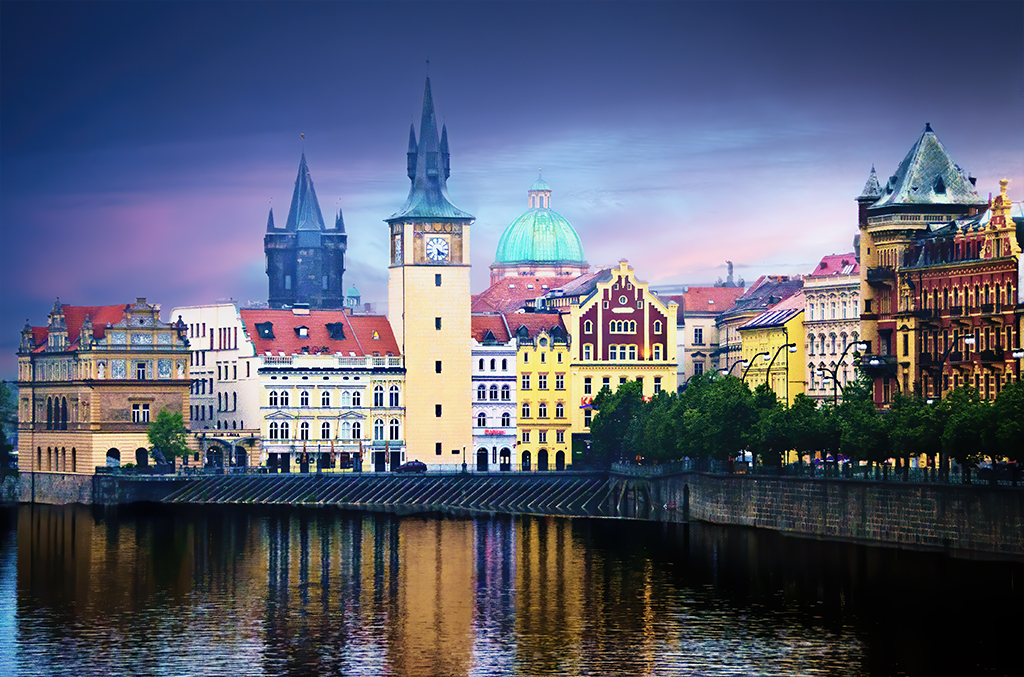
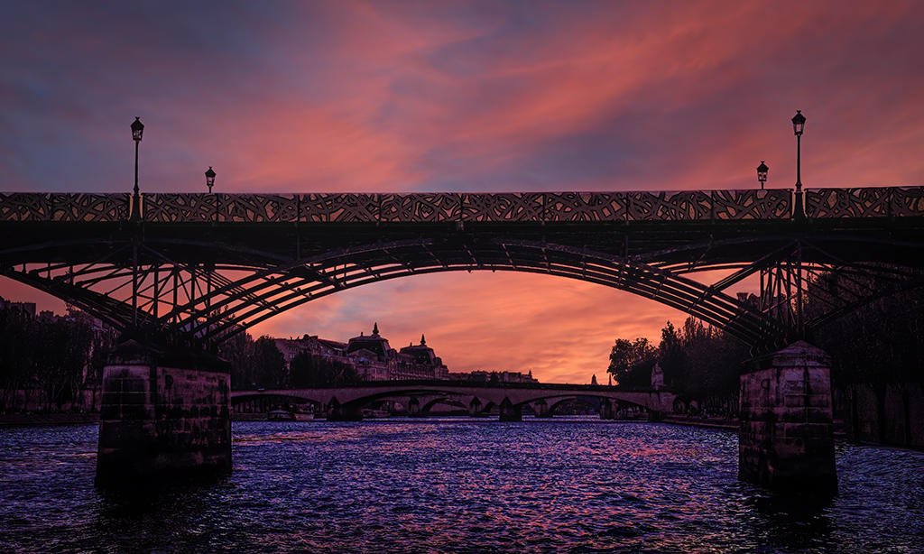
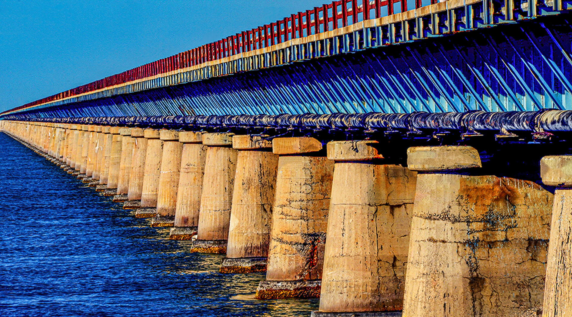
These bridges are so graceful and powerful. You have captured their beauty well. I appreciate all the details and steps you shared processing it. I like the image as is in a horizontal format. You wanted an image with a blue twilight sky counterbalancing the bridge. It's lovely. My 2 cents concerns the tiny harbor lights on the horizon, left side of the bridge. My eye wants them deleted. |
Sep 14th |
| 88 |
Sep 20 |
Comment |
Scott, I agree with the others. The colors in the sky and the dune produce a pleasing contrast. The skull, being white and a symbol of death, is an interesting dominate subject of this image IMHO. What might be done to make it more discernible and integrated? |
Sep 11th |
| 88 |
Sep 20 |
Comment |
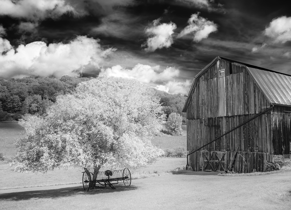
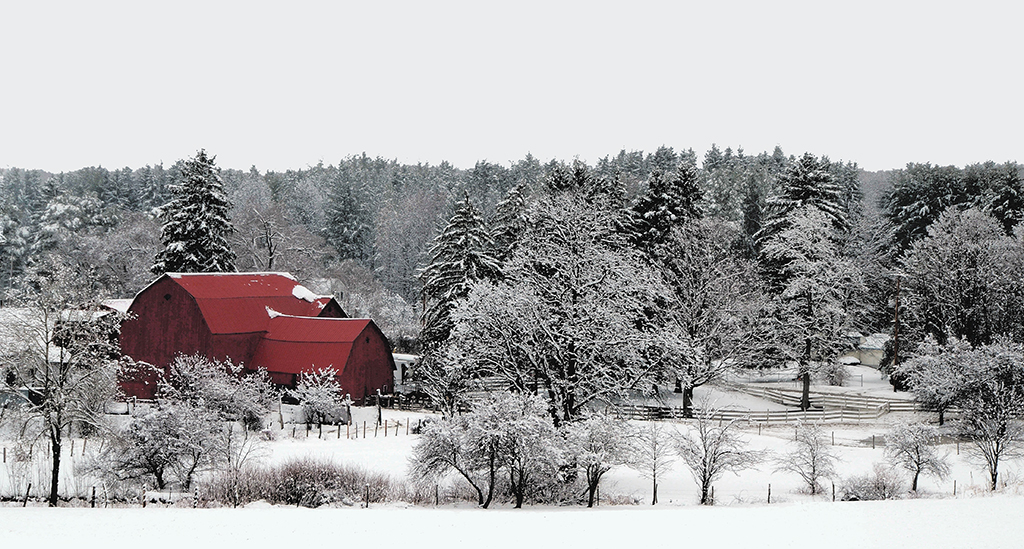
We have a wealth of abandon barns in Western New York. This image is inspiration to put them on one's project list. I really enjoy your work in color; however, I can see why you elected to convert this image to black & white. The tonality has depth and the details are rich. Your post-processing tools (e.g., Silver Efex Pro) helped to make especially the sky more interesting. If you wanted to experiment with the original color image, it would be quite lovely with the band of trees removed so that the blue of the sky would directly contrast with the yellow in the field? |
Sep 2nd |
| 88 |
Sep 20 |
Comment |
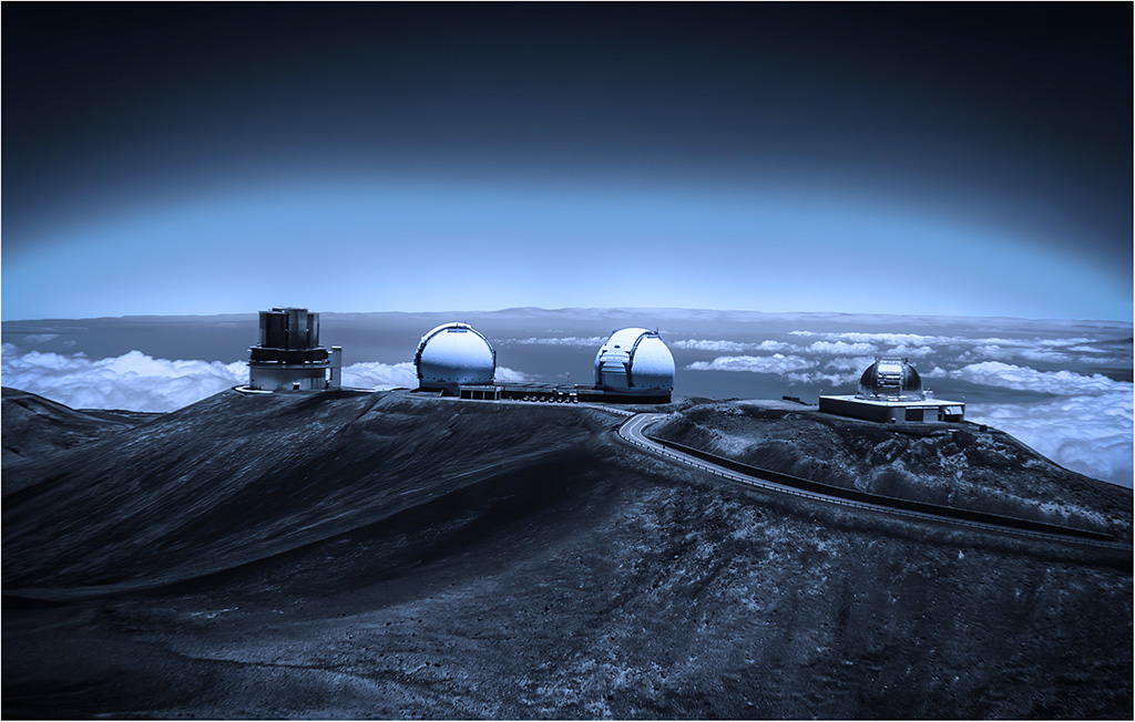
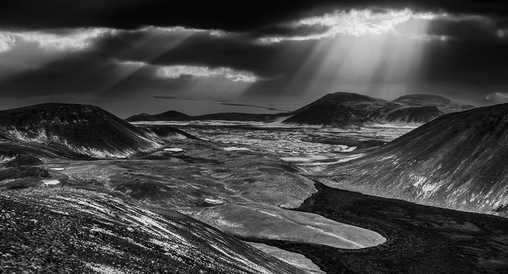
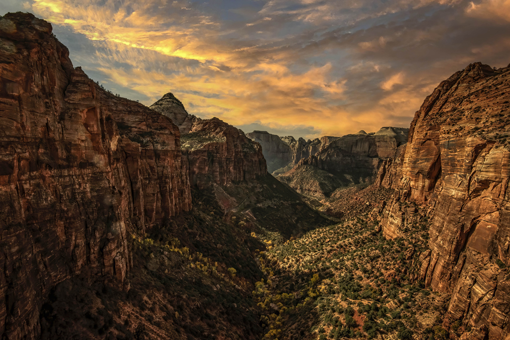
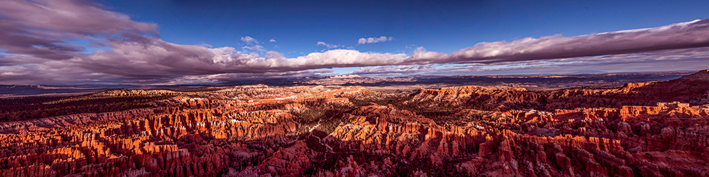
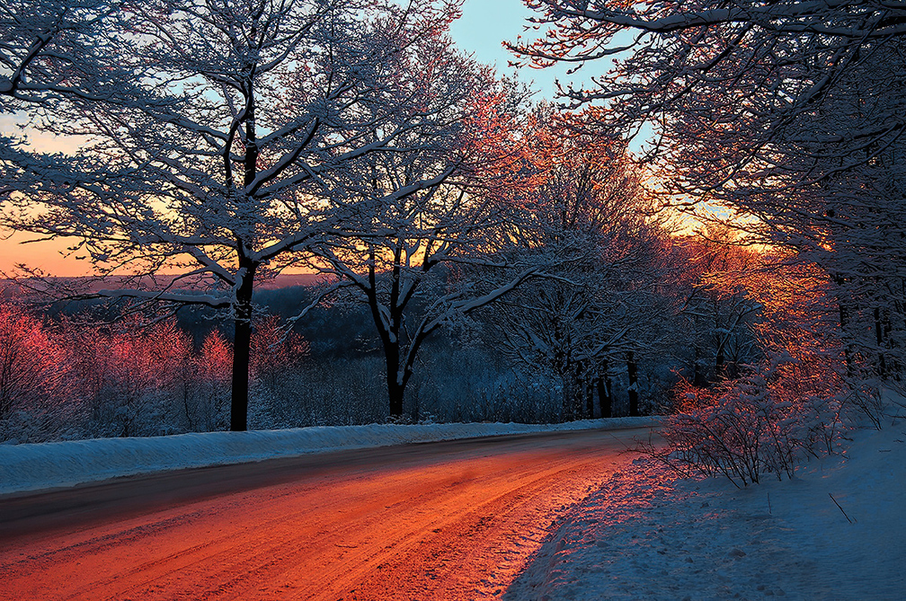
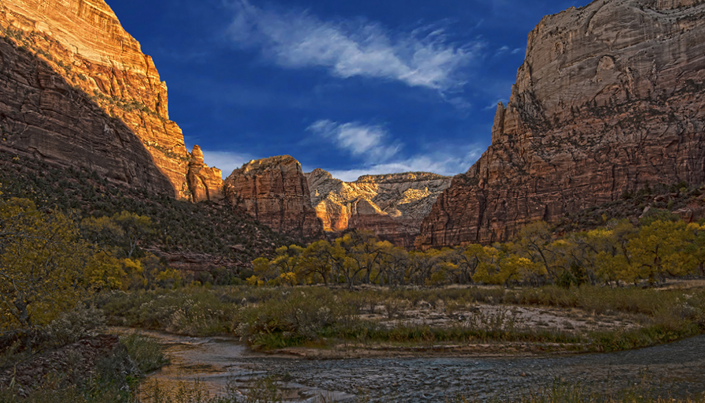
What an impressive photograph taken with an equally impressive camera. This camera seems especially well designed for landscape photography. In this image you took full advantage of the dazzling light. Your cropping and post-processing was spot on. Great work! Louis, welcome to our discussion group. I am looking forward to your October submission. |
Sep 2nd |
6 comments - 3 replies for Group 88
|
12 comments - 5 replies Total
|