|
| Group |
Round |
C/R |
Comment |
Date |
Image |
| 66 |
Jan 20 |
Comment |
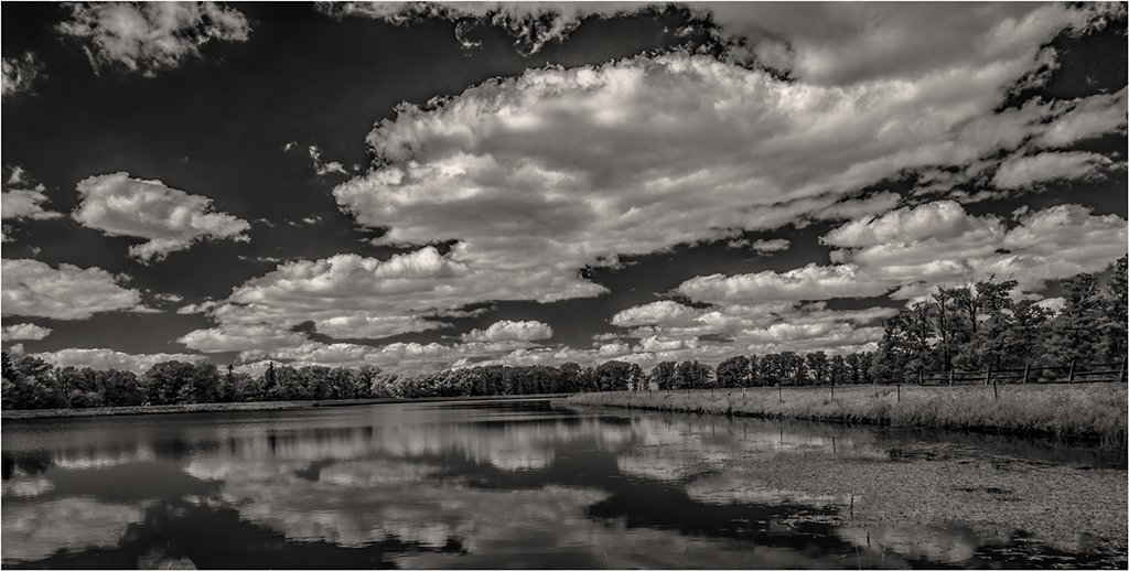
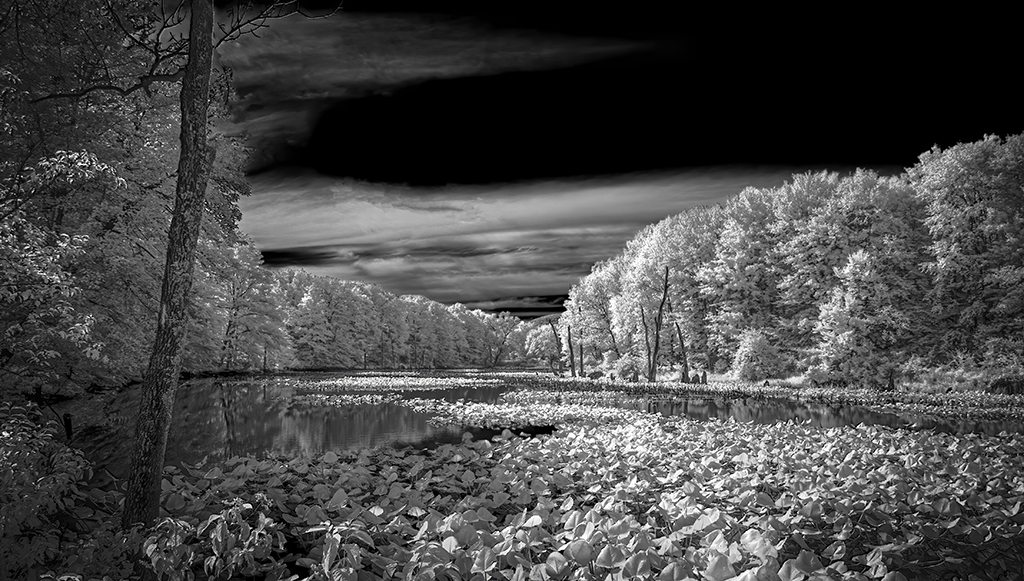
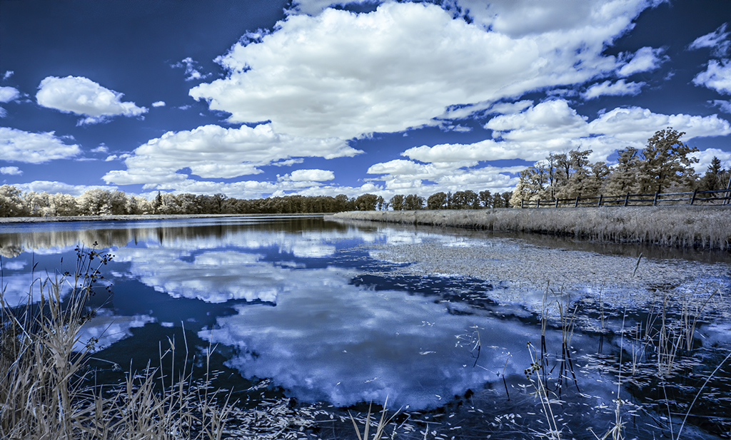
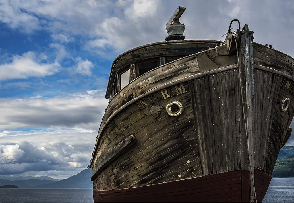
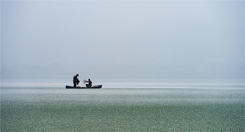
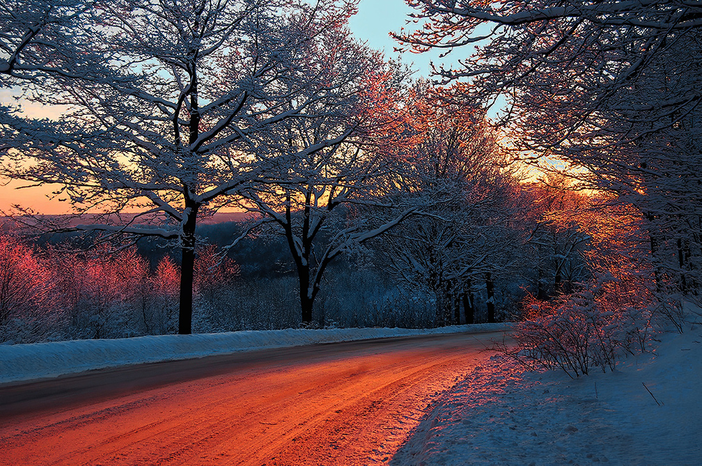
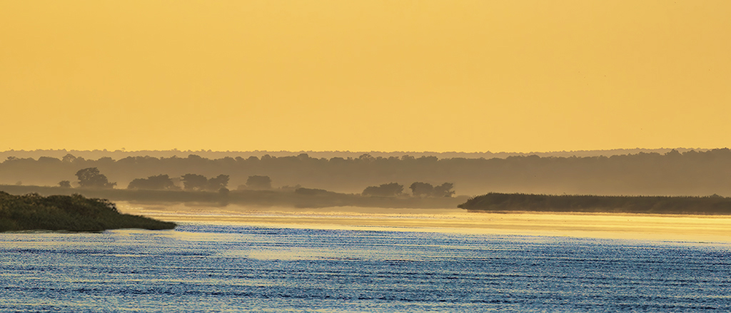
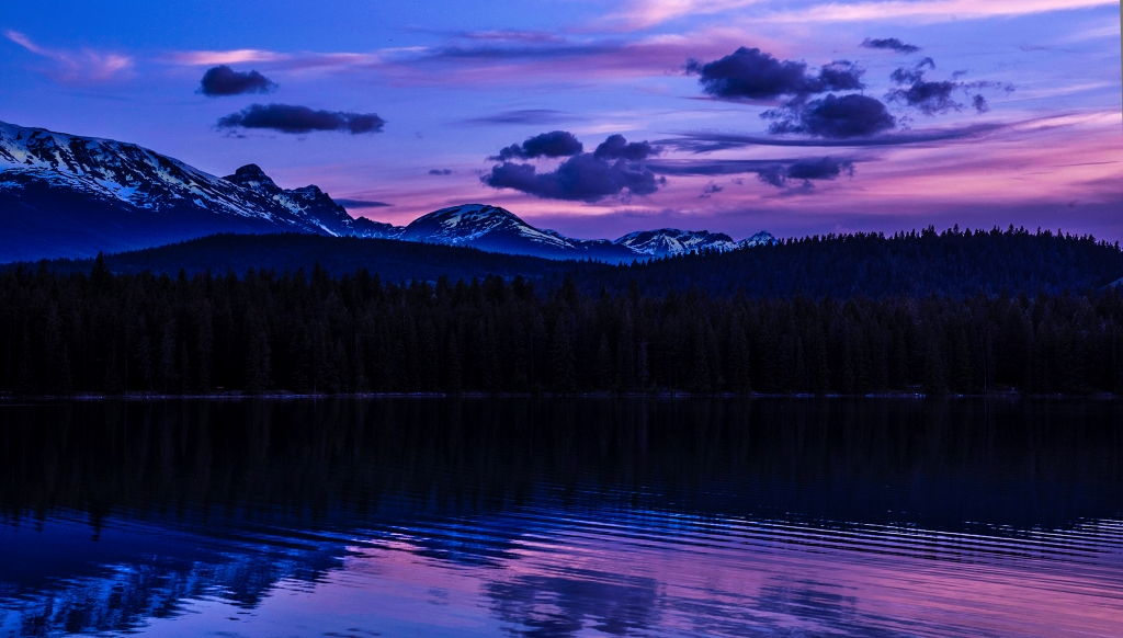
Jack, one thing I liked about the first IR images I saw was their unique, but natural way, to capture sepia tones, which you have done masterfully here. Contrast is an artists option. Sea scenes seem to benefit from clouds that suggest a storm has just left or is coming soon. So, the modifications of Emil and Gary do bring out the clouds more . . . if that is what you want and can also achieve it with sepia tones. |
Jan 19th |
| 66 |
Jan 20 |
Reply |
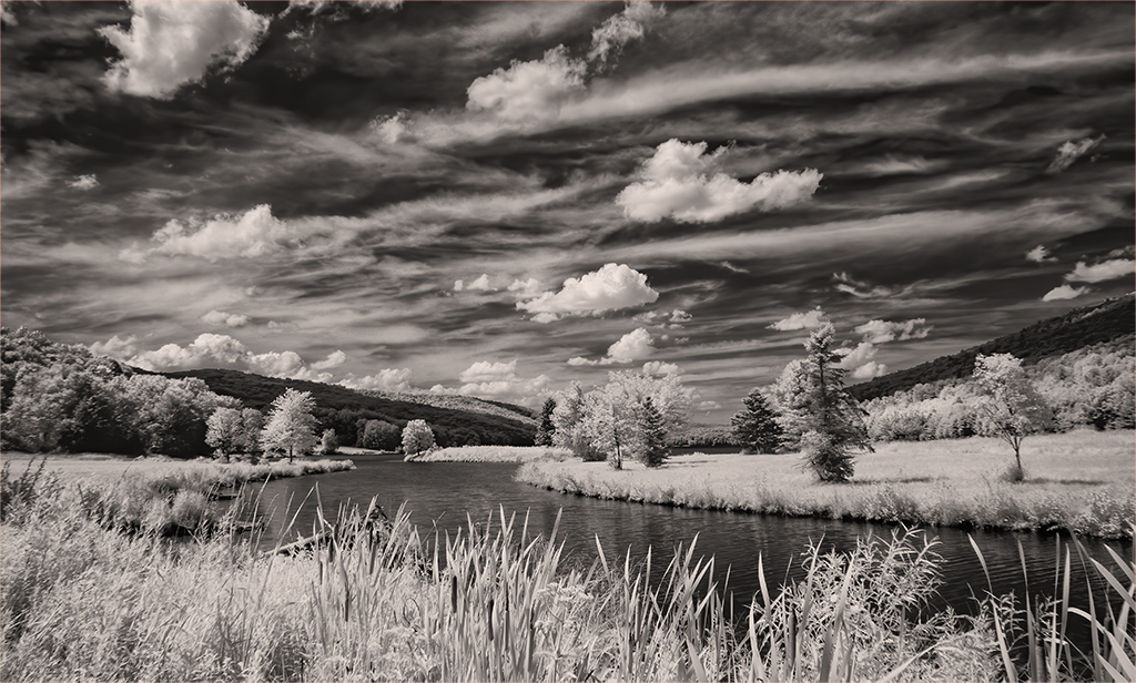
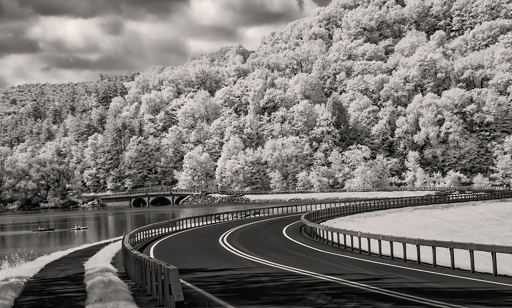
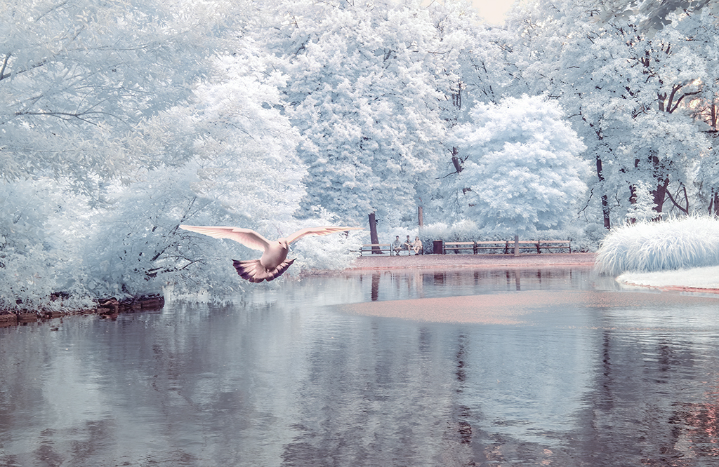
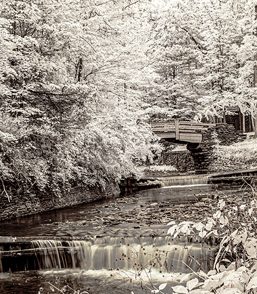
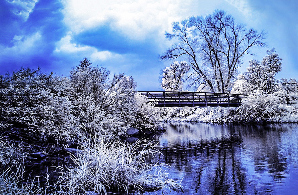
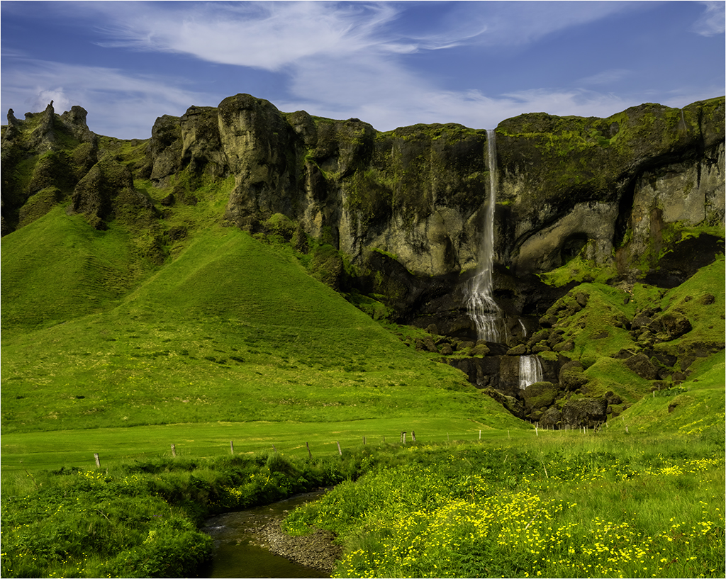
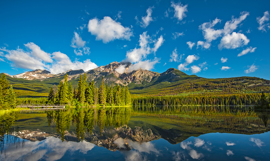
I like the conversion, but also like what Melanie did with contrast. Can the two be combined? However, the color version may be harder to bring out the highlights in the middle of distant trees and reflection in the stream while vignetting or darkening the left and right sides of the image? |
Jan 19th |
| 66 |
Jan 20 |
Comment |
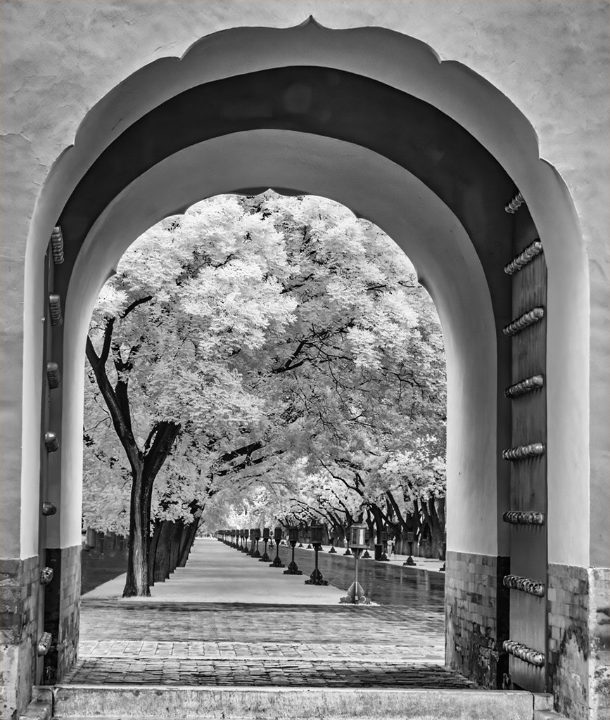
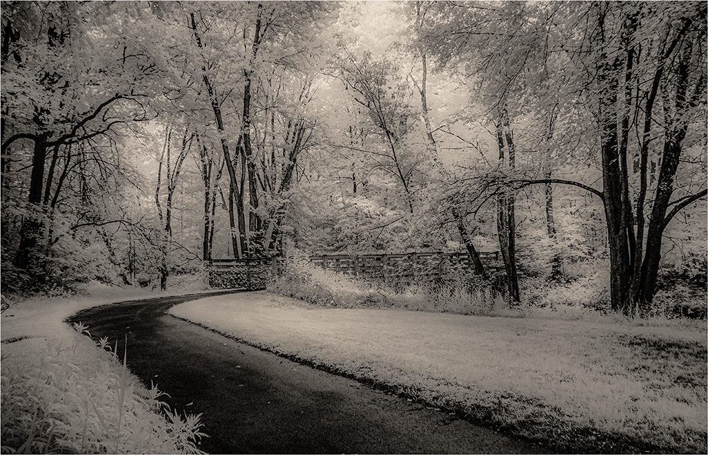
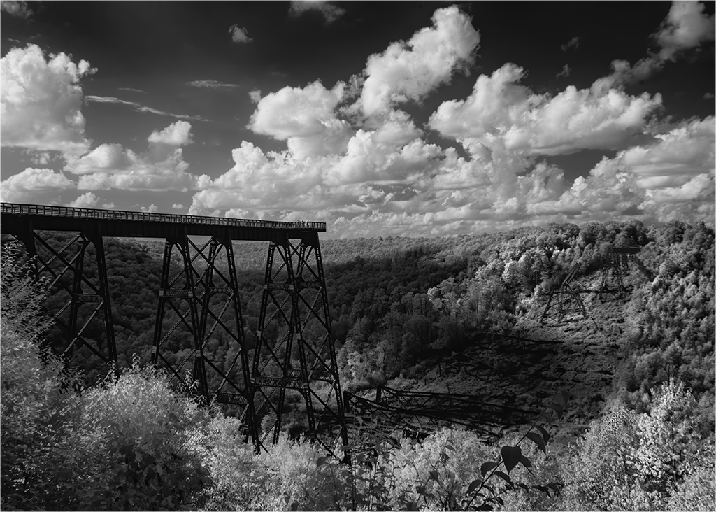
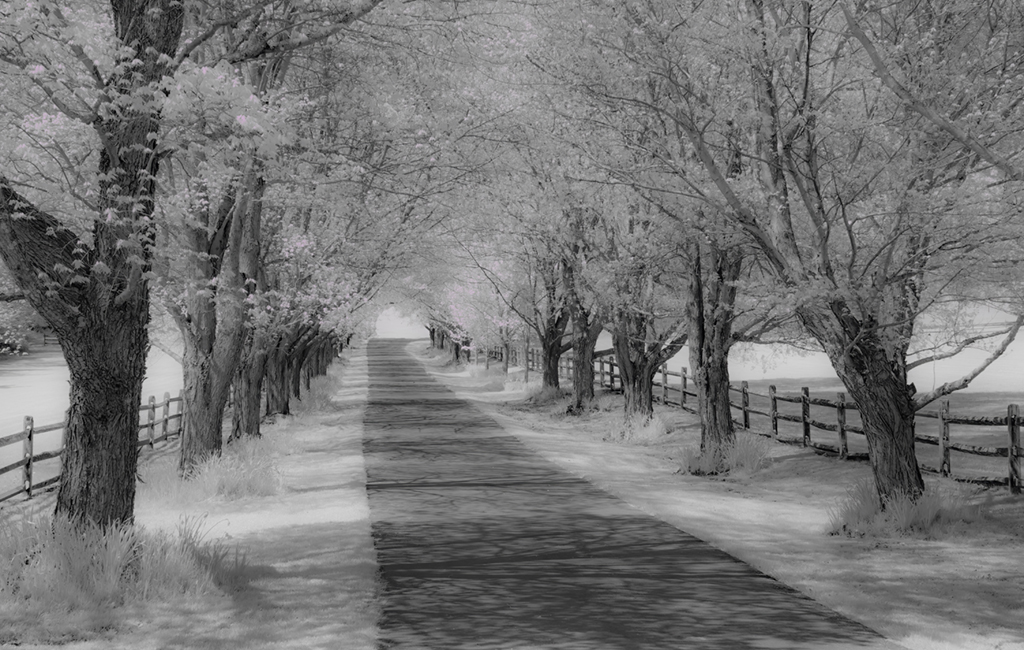
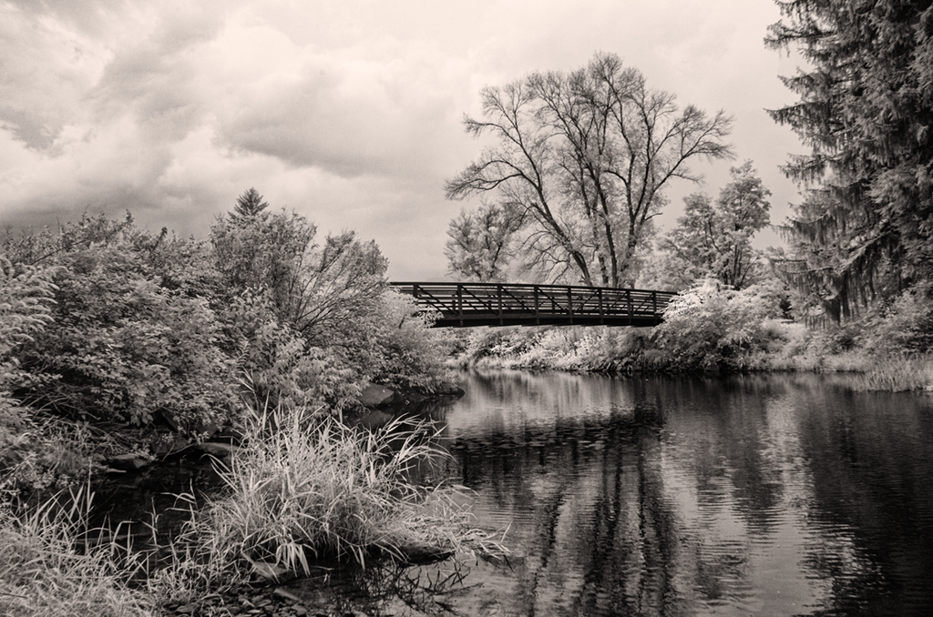
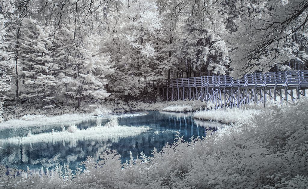
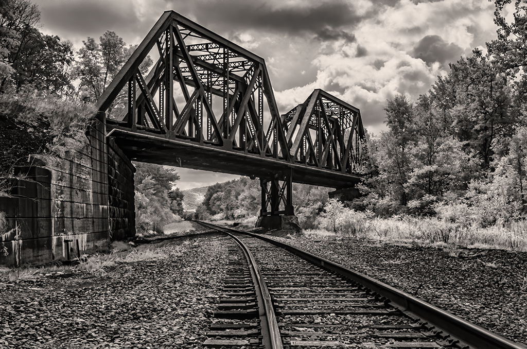
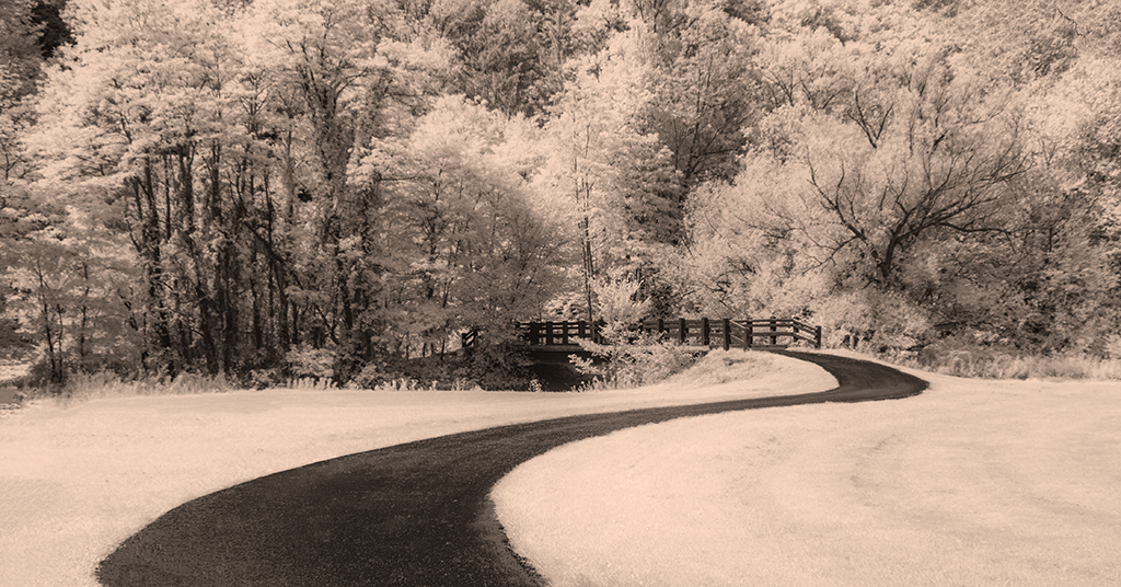
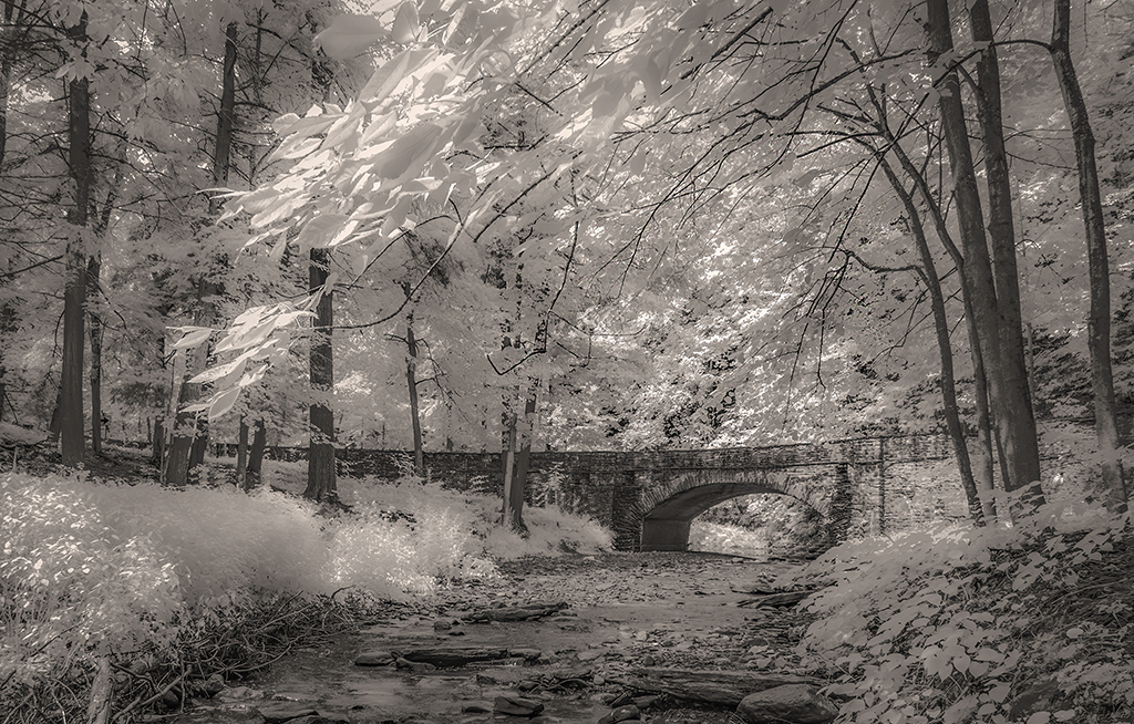
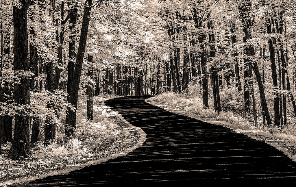
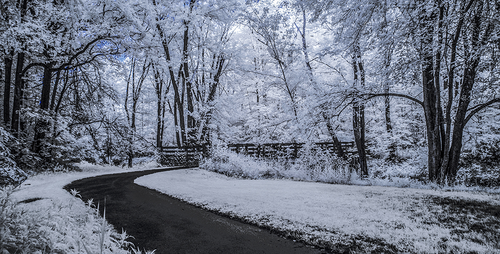
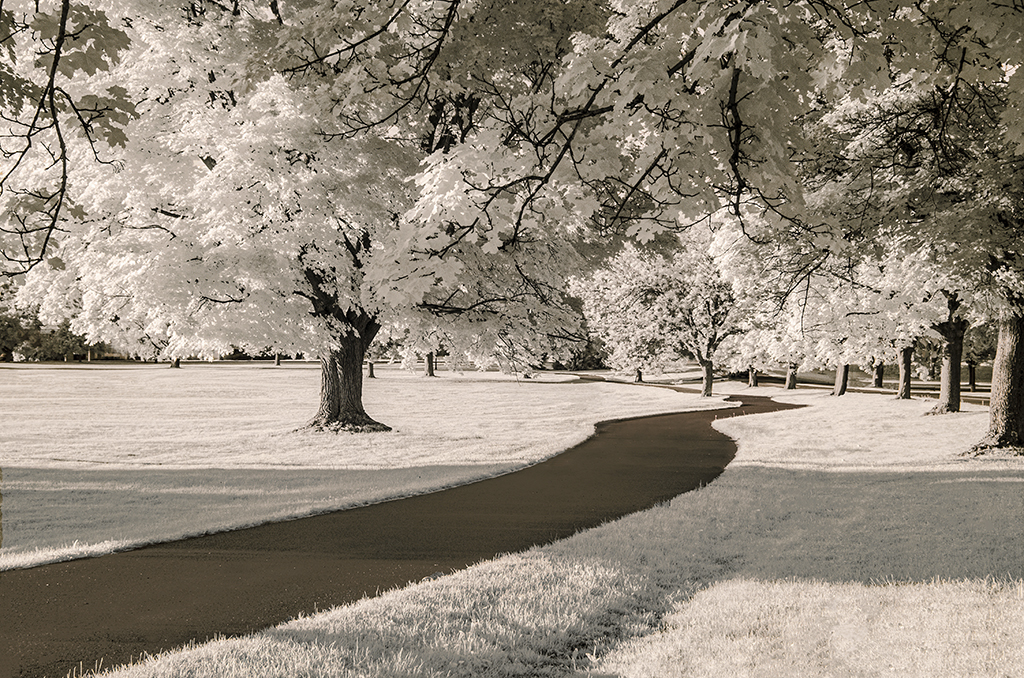
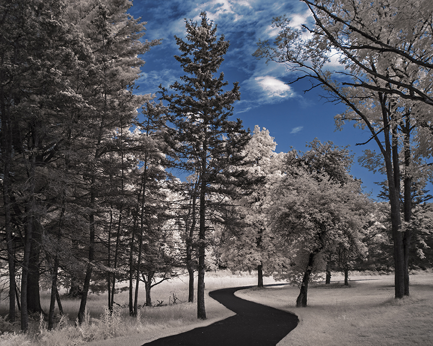
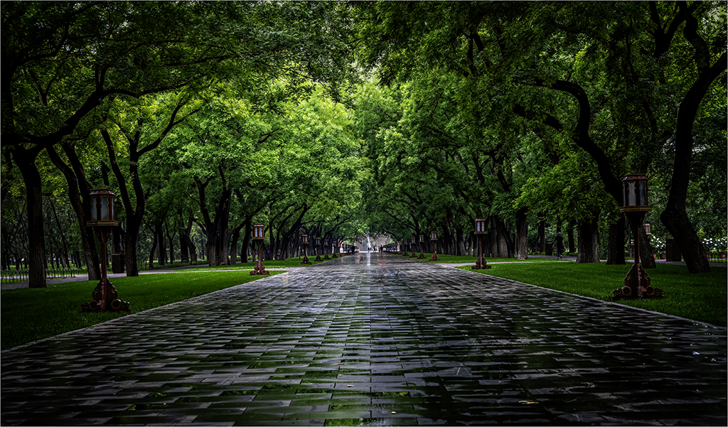
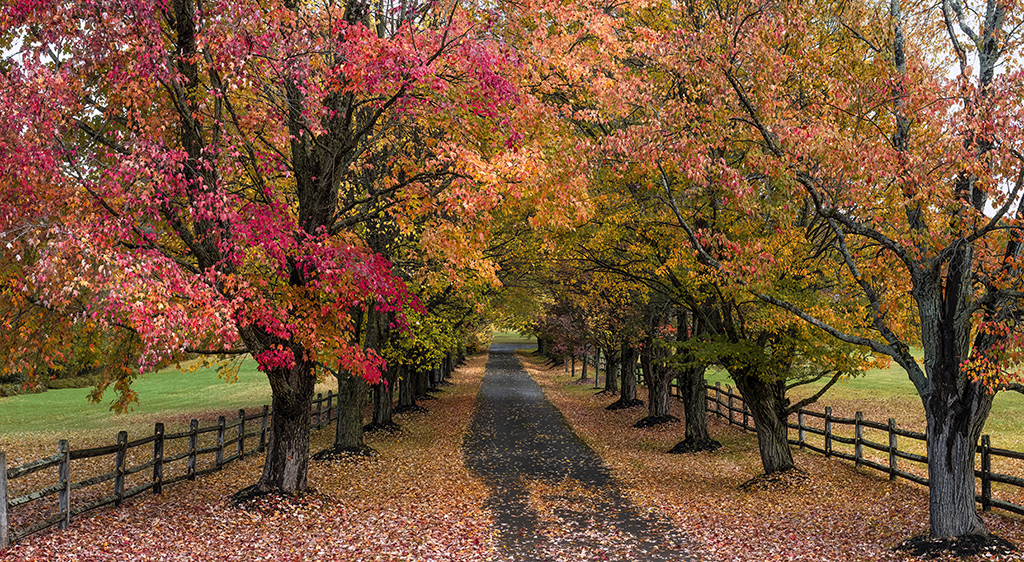
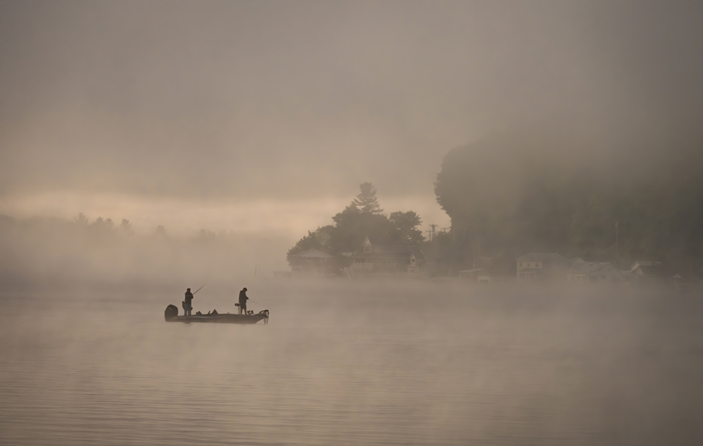
Gary, symmetry indeed. Converting to vertical not only brought out the symmetry but also cropped out the distracting white signs on the extreme left and right. I like what post processing did to the walkway, darkening it and adding texture. My eye wants less vignetting . . . but not sure about this. |
Jan 19th |
| 66 |
Jan 20 |
Comment |
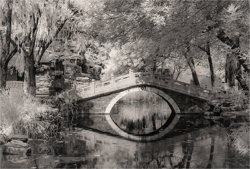
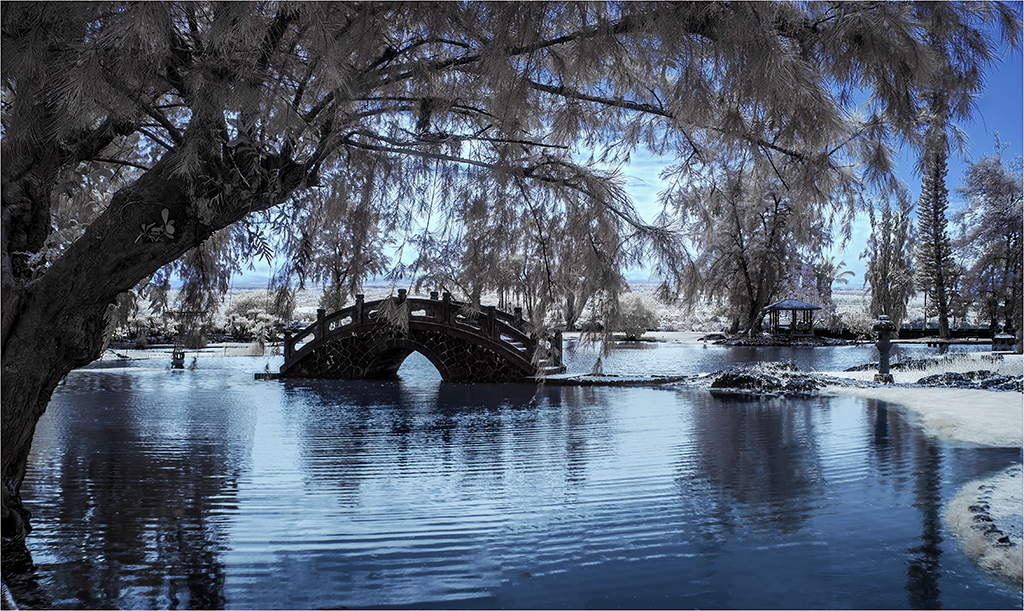
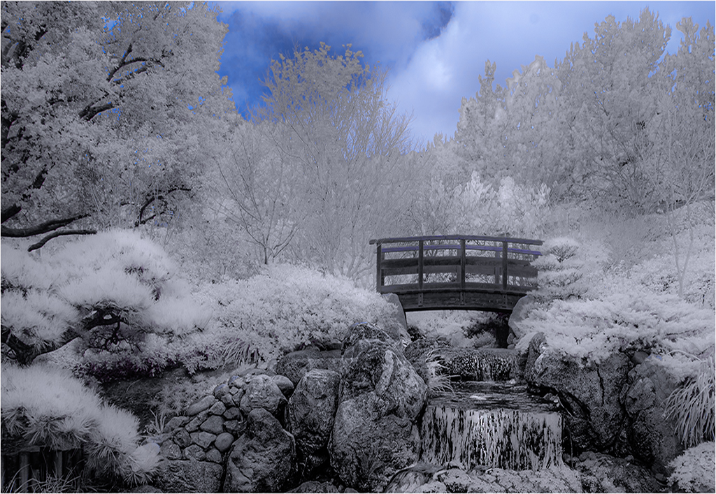
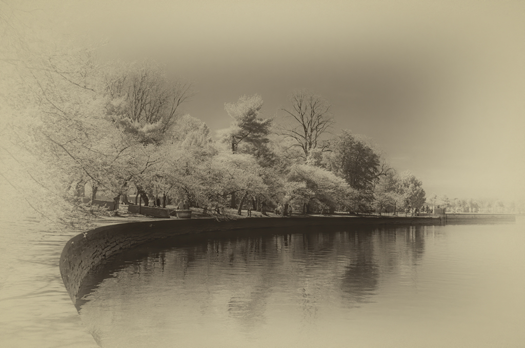
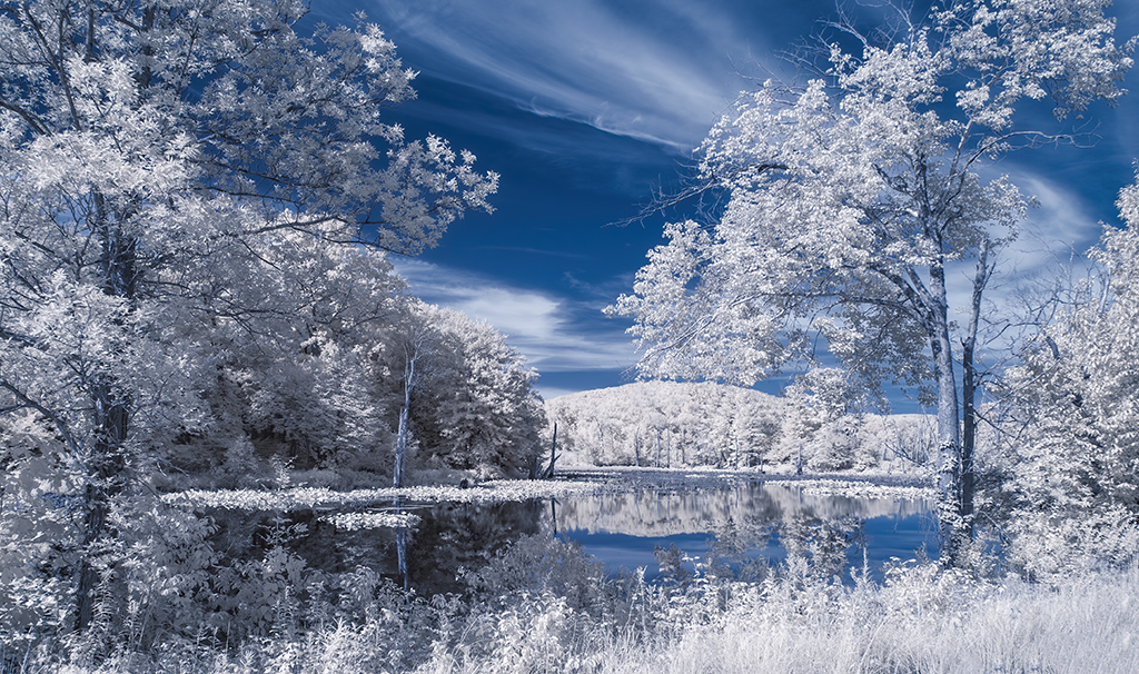
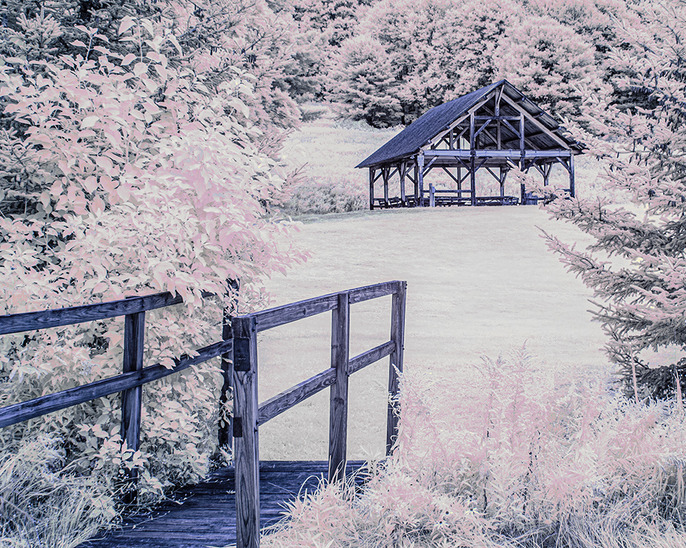
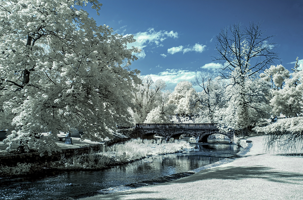
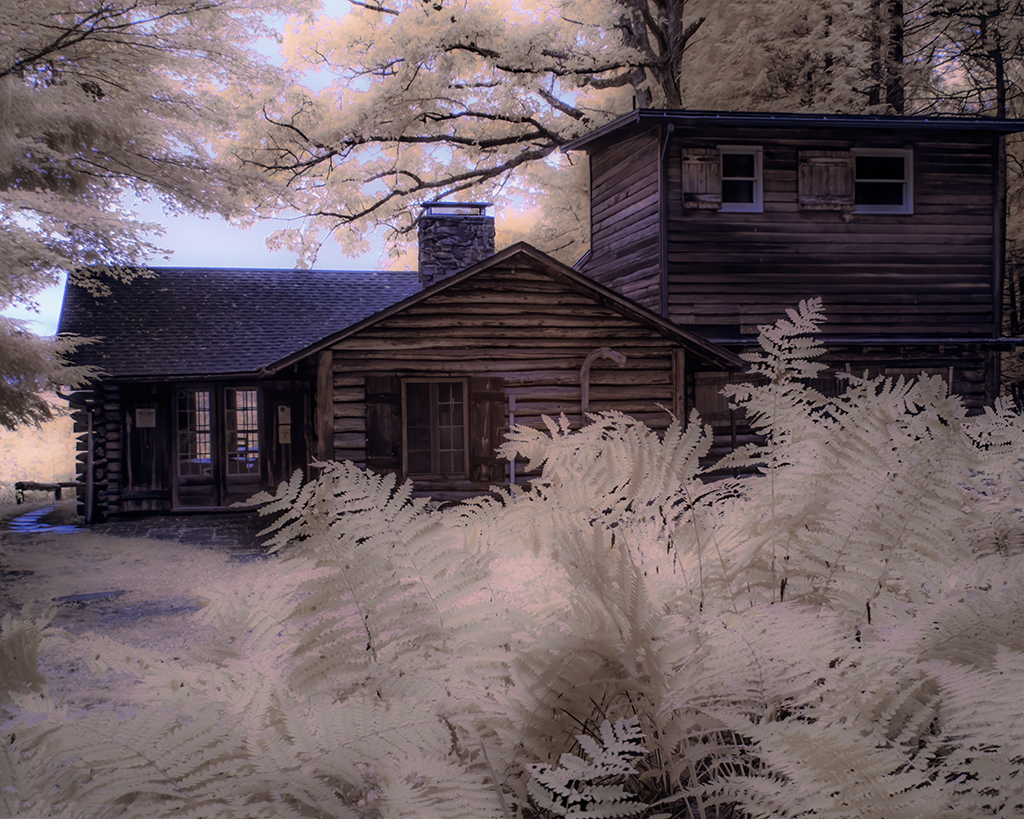
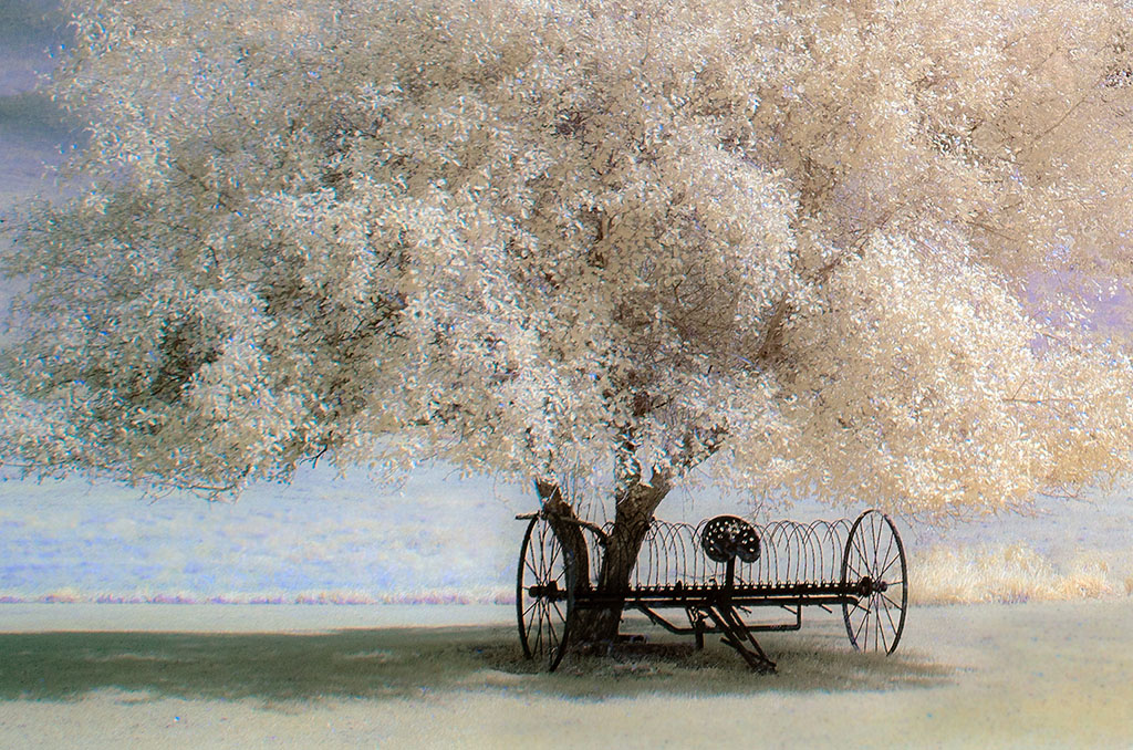
Emil, my eye basks in the beauty and serenity of the black & white version of this lovely image, but to be honest, I also sort of like the original version. It is a matter of opinion and style, but this may be an image Russell Hart would like to keep some color retained in. For example, the colors in the reflection provide some contrast with the brown fringe areas. Is there a compromise possible or would we end up with a . . . compromise? |
Jan 7th |
| 66 |
Jan 20 |
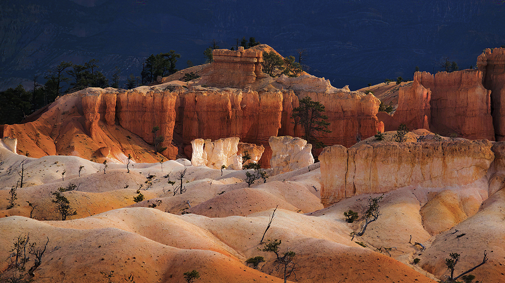
Comment |
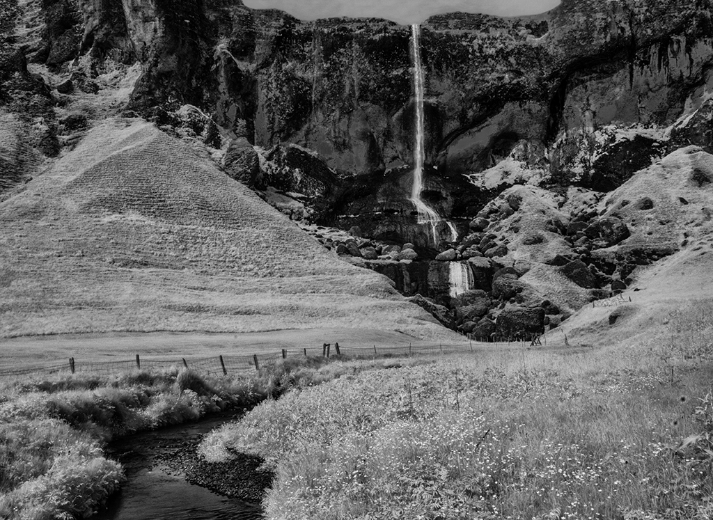
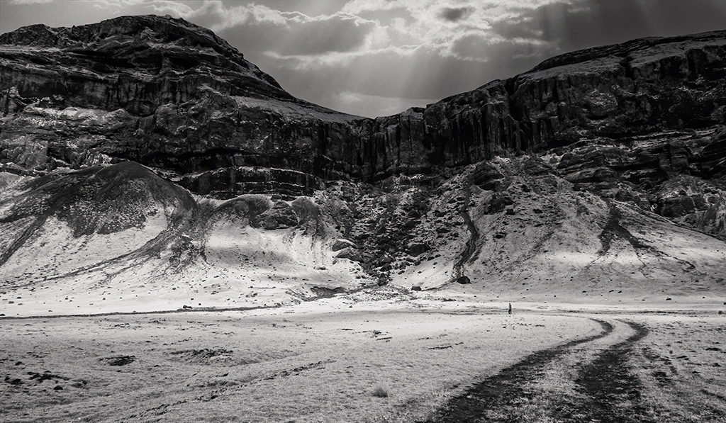
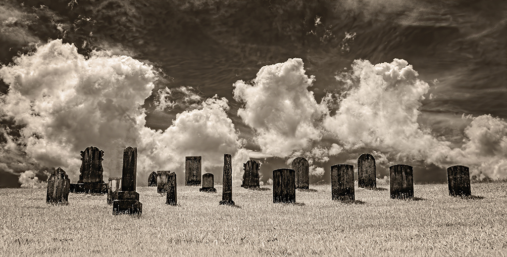
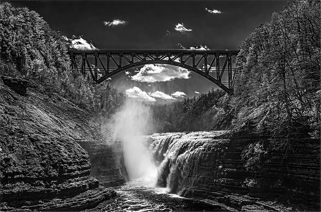
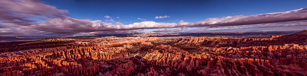
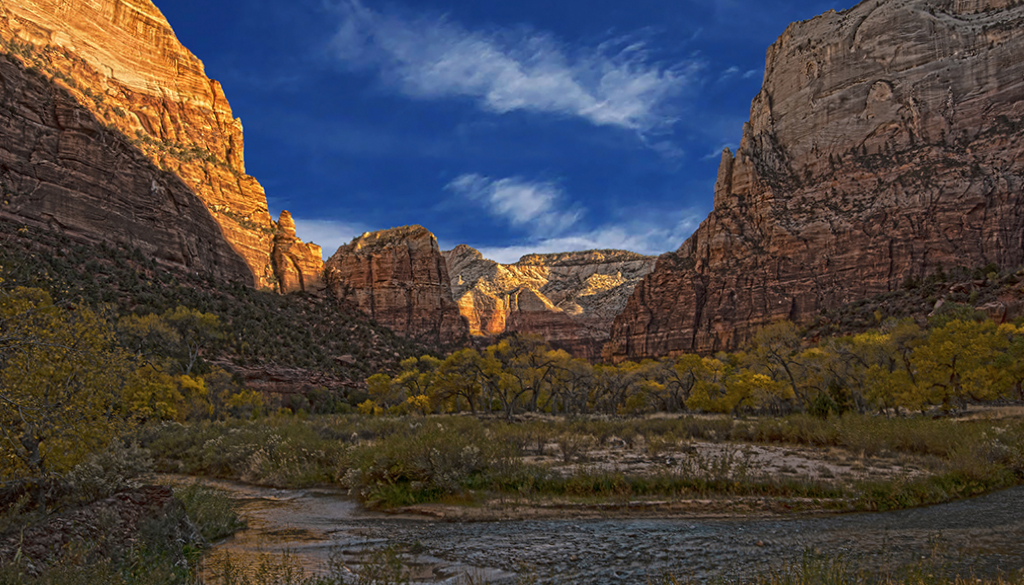
Great detail! The contrast defines the subject so clearly. I like the way you brought out the wispy clouds in the dark sky. You made this hoodoo appear like a sacred icon. Hoodoos are such interesting creations of Mommy Nature. Bryce Canyon is loaded with them, but I did not realize they are prolific elsewhere. |
Jan 7th |
| 66 |
Jan 20 |
Comment |
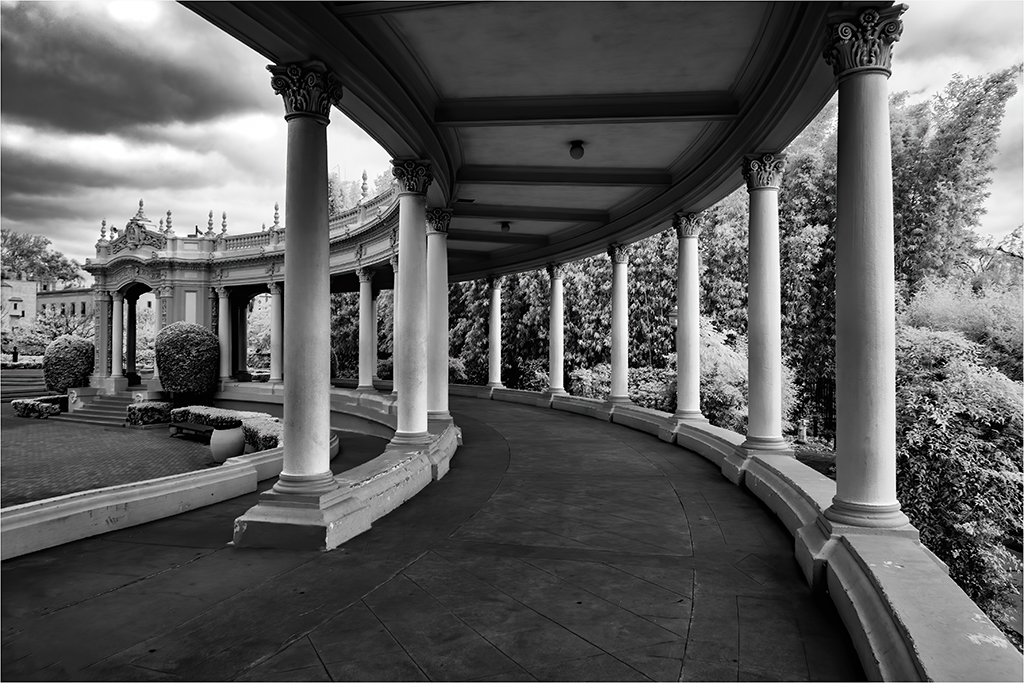
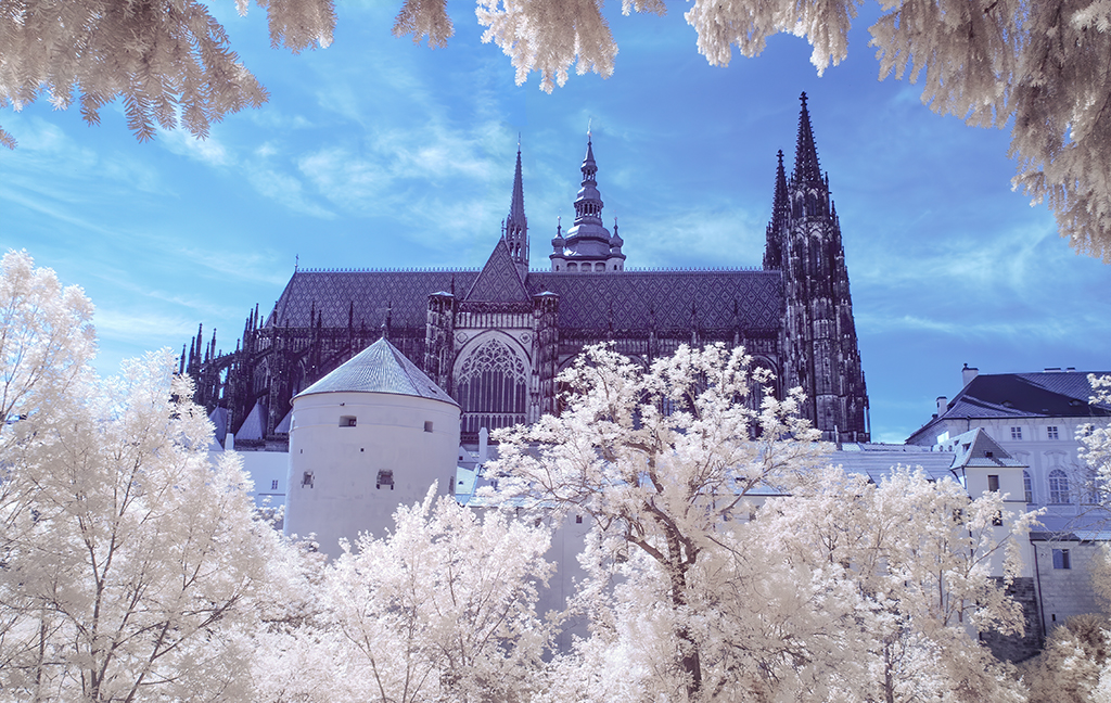
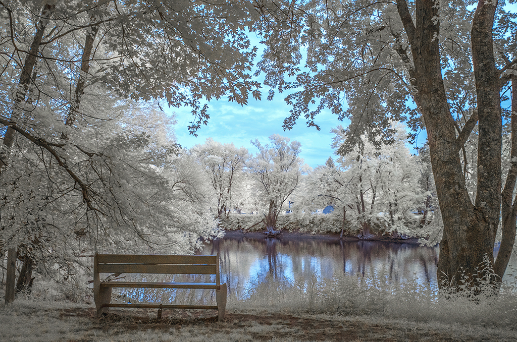
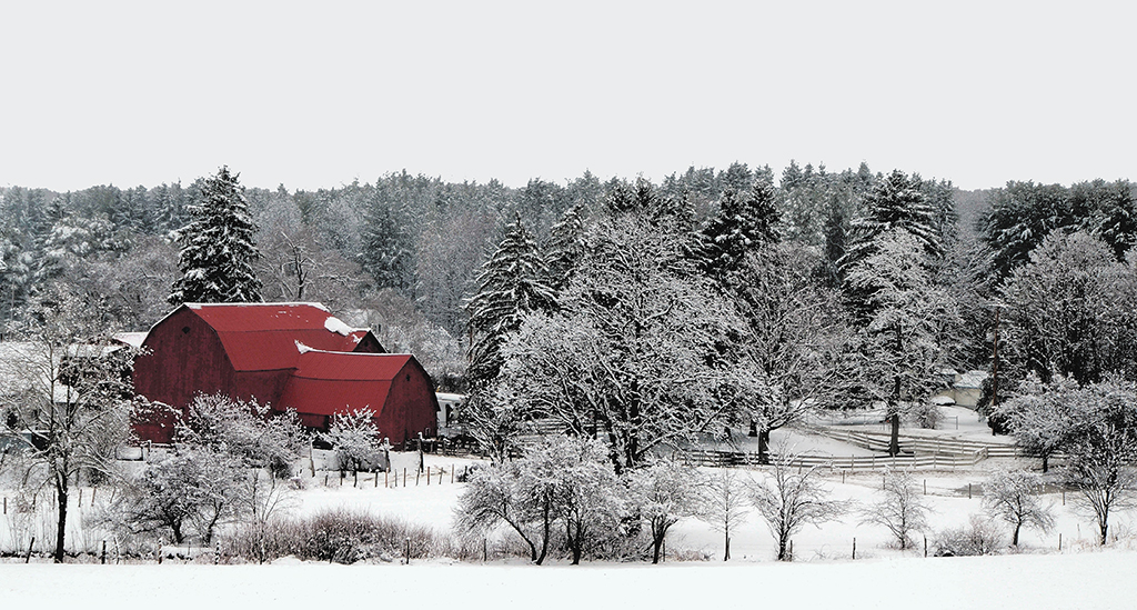
What a dilemma we have. While we can convert an IR image into something like a colored image (beautiful as it might be), we still have to be faithful the style of IR and its emerging colorized cousins. Like you Melanie, my first reaction was that this photograph too close to an image taken in the usual visual part of the electromagnetic spectrum. I've had some luck using color adjustment layers to keep some color but not expand the range of colors. You, again, have taken us into less charted waters. |
Jan 7th |
| 66 |
Jan 20 |
Reply |
Thanks Gary for the reinforcement. I took chances with this image and it is good to know my IR instincts are maturing. |
Jan 7th |
| 66 |
Jan 20 |
Reply |
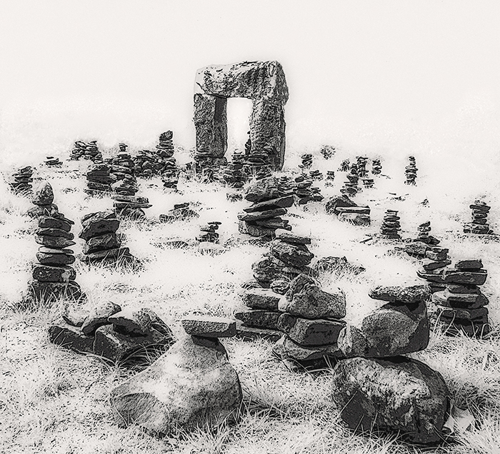
Yes, there is something about the placement of the arch that arouses discord in our sense composition. I struggled with this in post processing. The nearly random arrangement of carins added to the challenge. Perhaps as Emil suggests, darkening the arch may be more soothing to the eye? |
Jan 7th |
| 66 |
Jan 20 |
Reply |
Emil, I love your suggestion. You put your finger what gives me pause with this image. I'll try a version with a darken arch. |
Jan 7th |
5 comments - 4 replies for Group 66
|
| 88 |
Jan 20 |
Comment |
Scott, you juxtaposed 2 symbols of power: the mountain and the king of beasts. And you captured this image near sunset, another engaging metaphorical element. It is astounding. I have to echo Lou's admiration about using a slow shutter speed (camera was on a bean bag?) and also admire the courage you had to sustain to be near this predator for such a long time. |
Jan 19th |
| 88 |
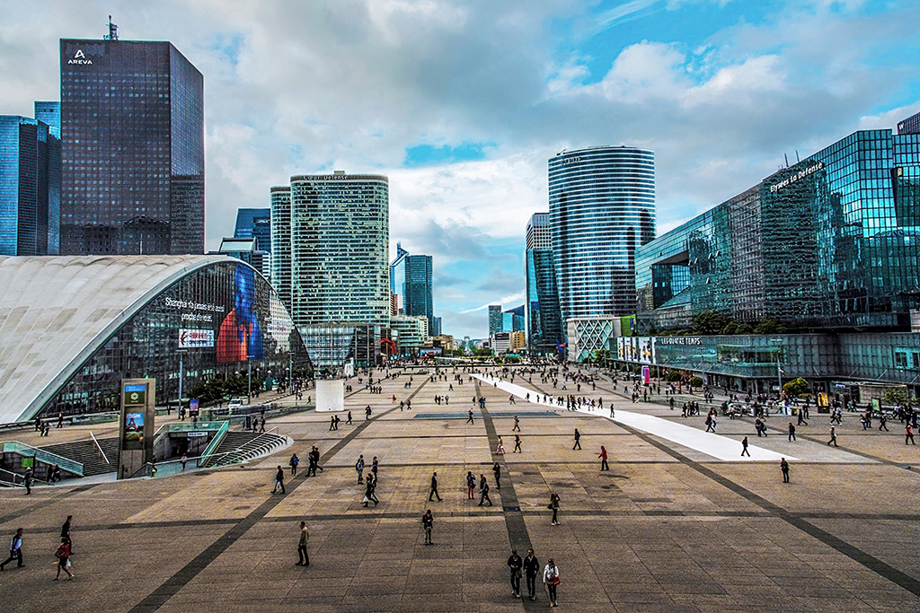
Jan 20 |
Comment |
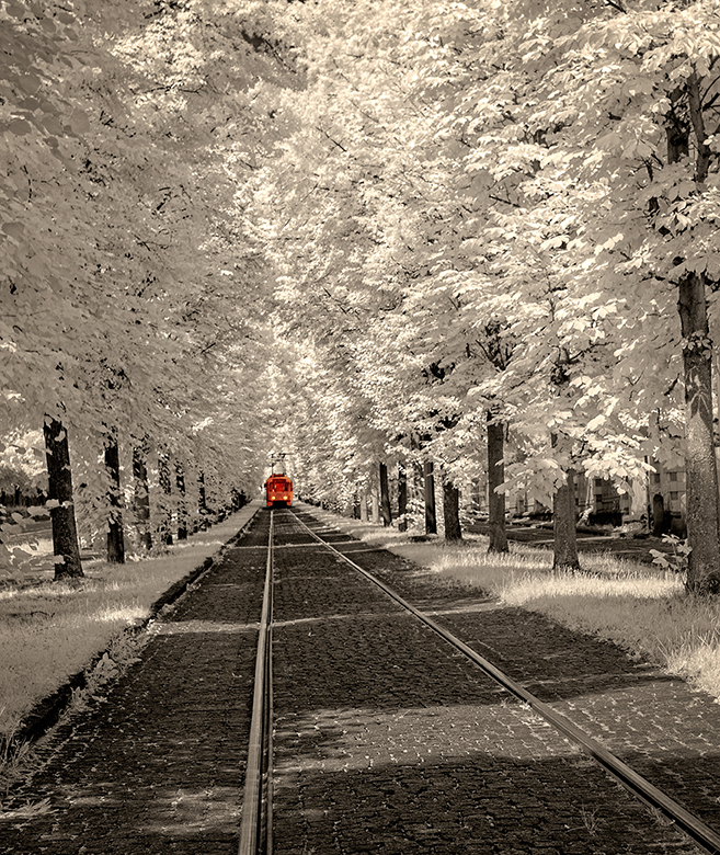
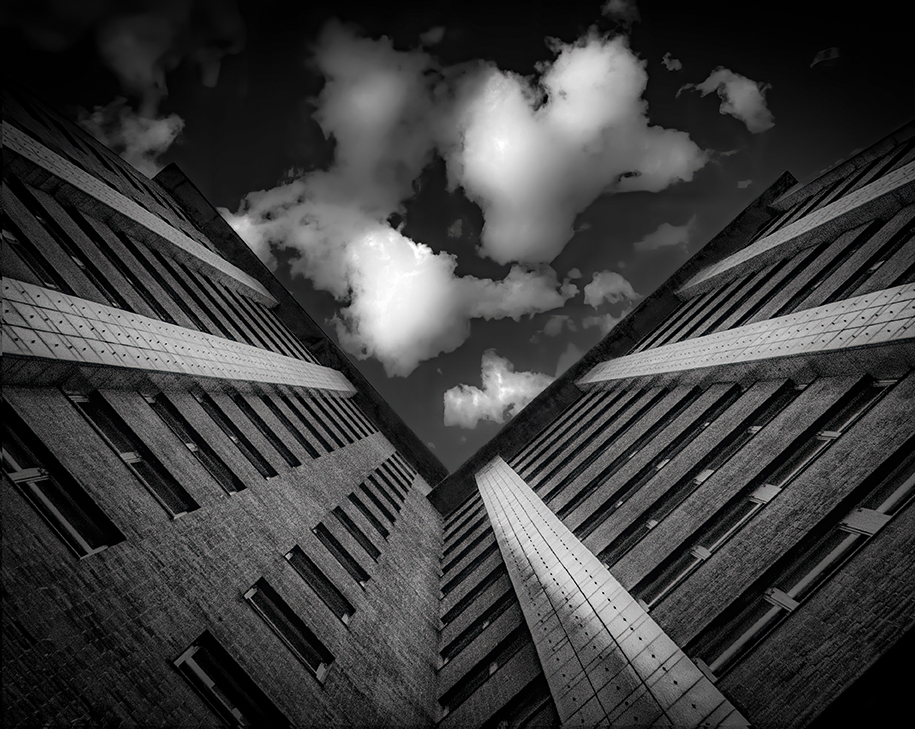
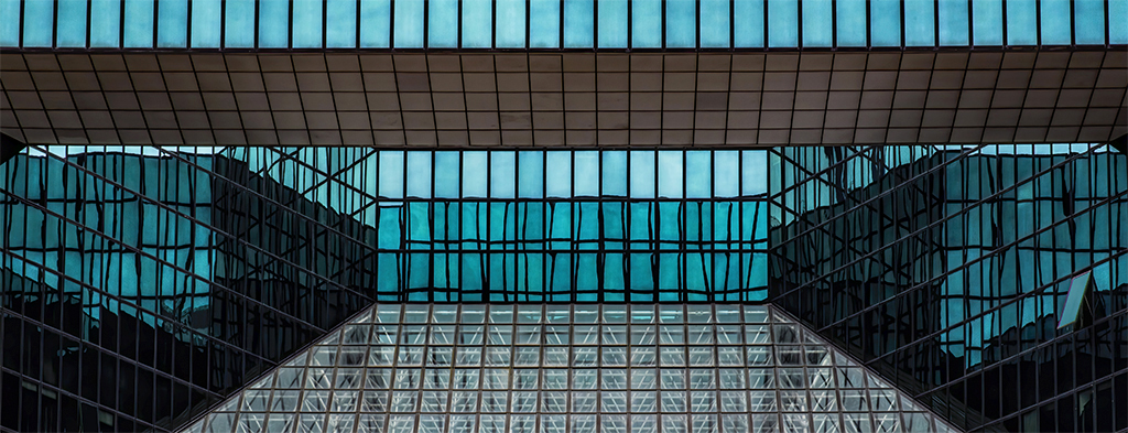
Trey, the lines and complexity of shapes and colors make this such an interesting image. It instructs views to be mindful of the eye candy in cities. The parallax issues are hardly noticeable (especially after Gary's suggested crop). |
Jan 19th |
| 88 |
Jan 20 |
Comment |
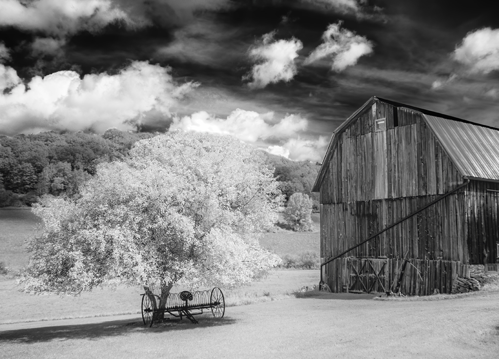
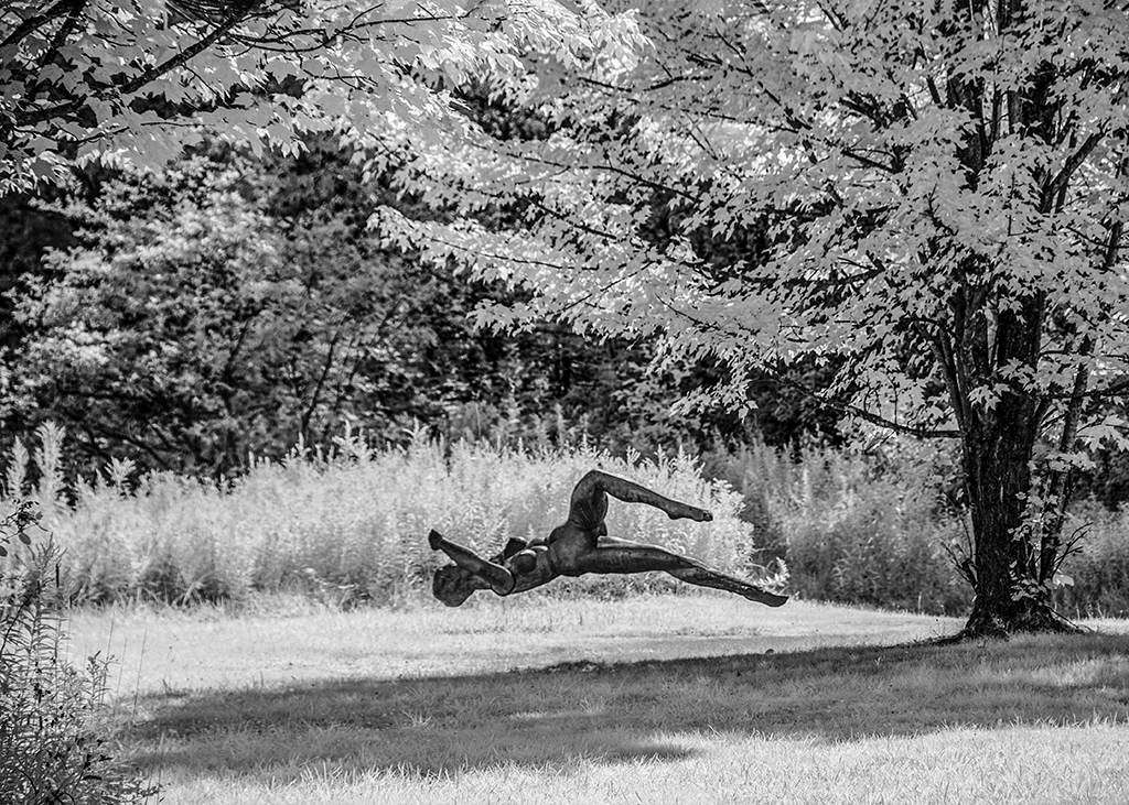
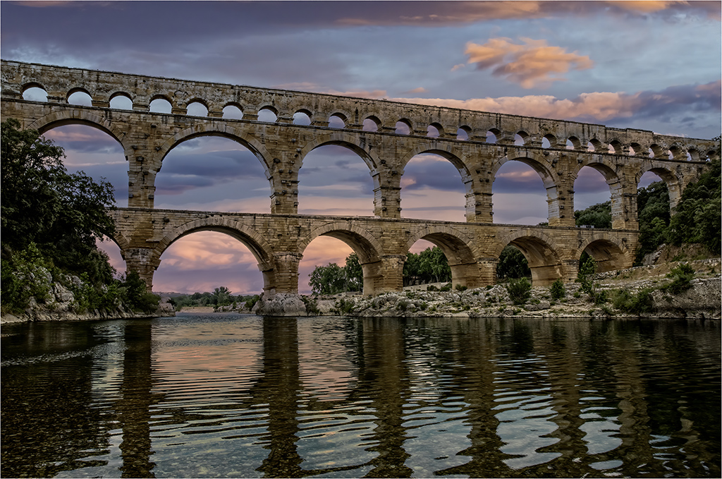
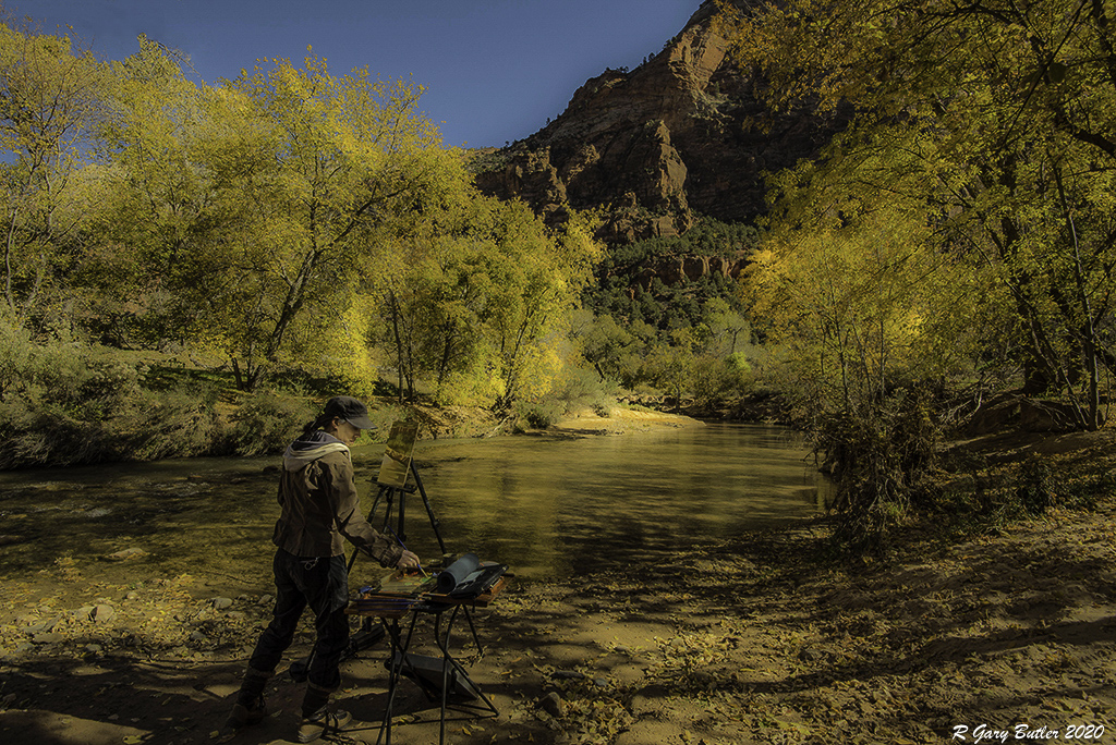
I like the mood this image induces. Bringing out the colors adds to the feel of it being in rural France. I agree with some of the cropping suggestions, but alternatively you might also mull on deleting the pole and the brightly colored runner (and his reflection). |
Jan 19th |
| 88 |
Jan 20 |
Comment |
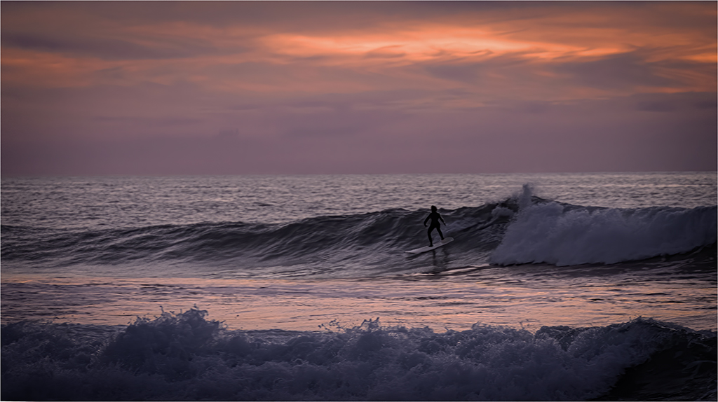
Interesting image. I like the way your shutter speed allowed some movement of the fuzzy seeds but froze other subject matter. I agree with Gary about the sky. The highlights as I see them on my monitor may be a tad too bright? |
Jan 7th |
| 88 |
Jan 20 |
Comment |
The small villages in the south of France are splendid. You captured what makes this area such a delight to visit. The light is softer allowing the more subtle shades of blue and yellow to emerge. I like your depth field and the detail it renders and your use of the road and walkway to take the viewer into the image. |
Jan 7th |
| 88 |
Jan 20 |
Reply |
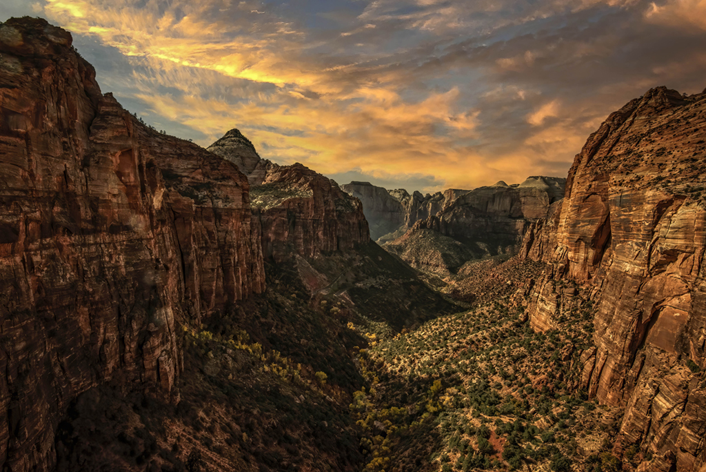
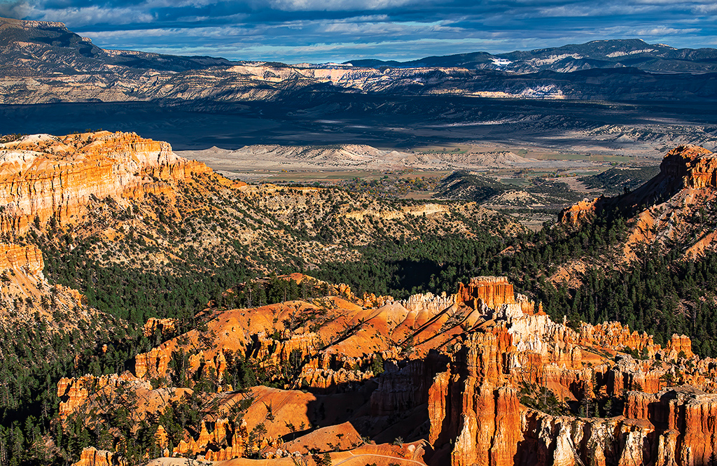
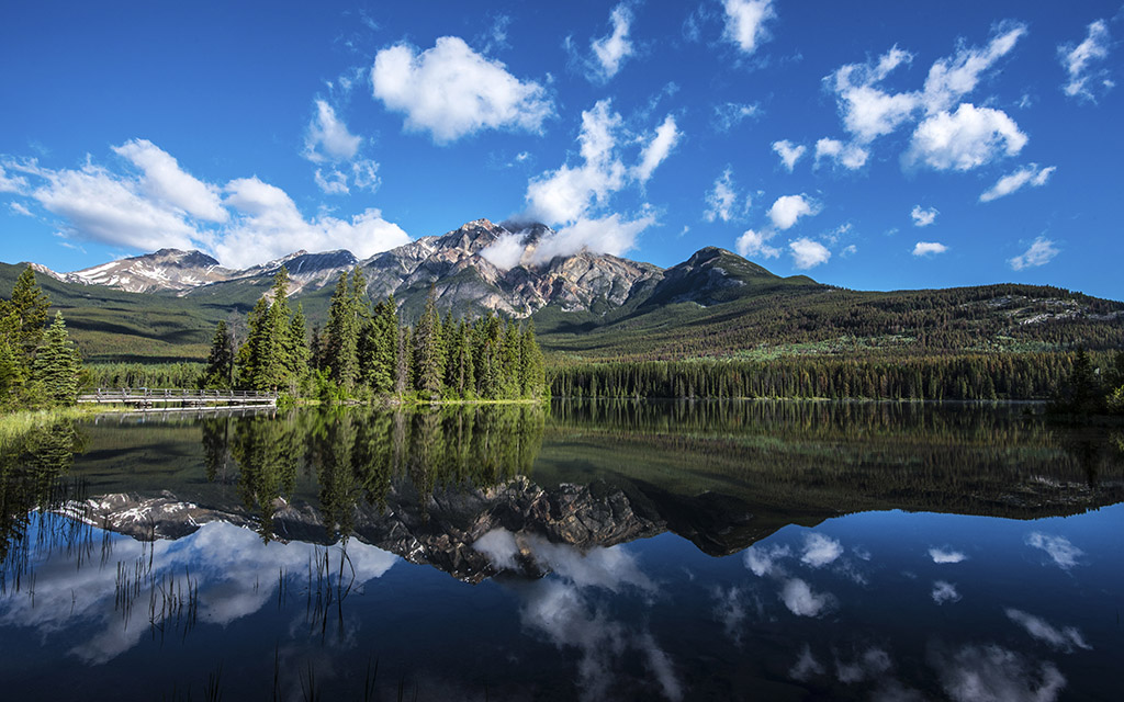
Trey, these big locations in the National Park can be overindulging for photographers. I am a sucker for this vastness. Images can be too complex. Although the sky was interesting, cropping to include the foreground area is smart. Another alternative is to compose it vertically and keep the sky cropping out all that is not in the bowl of the amphitheater? I hope I am learning something. |
Jan 7th |
| 88 |
Jan 20 |
Reply |
Gary, my notes on this image may be in error. I was certainly in the area of the amphitheater, perhaps a bit South of it closer to Bryce Point. Images on the internet of the amphitheater are usually taken from more northern locations. |
Jan 7th |
| 88 |
Jan 20 |
Reply |
Scott, I think I straddled the fence by cropping out sky. However, for the sake of simplicity in composition, I could have followed Trey's advise and focused more on the foreground and clipped out the sky and the mesa. |
Jan 7th |
5 comments - 3 replies for Group 88
|
10 comments - 7 replies Total
|