|
| Group |
Round |
C/R |
Comment |
Date |
Image |
| 66 |
Jul 19 |
Comment |
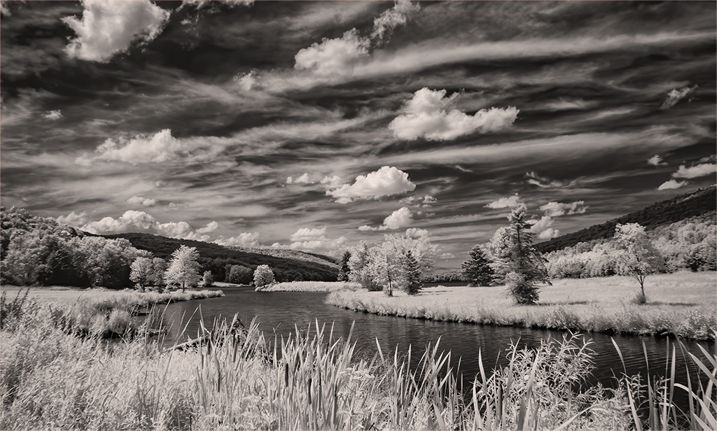
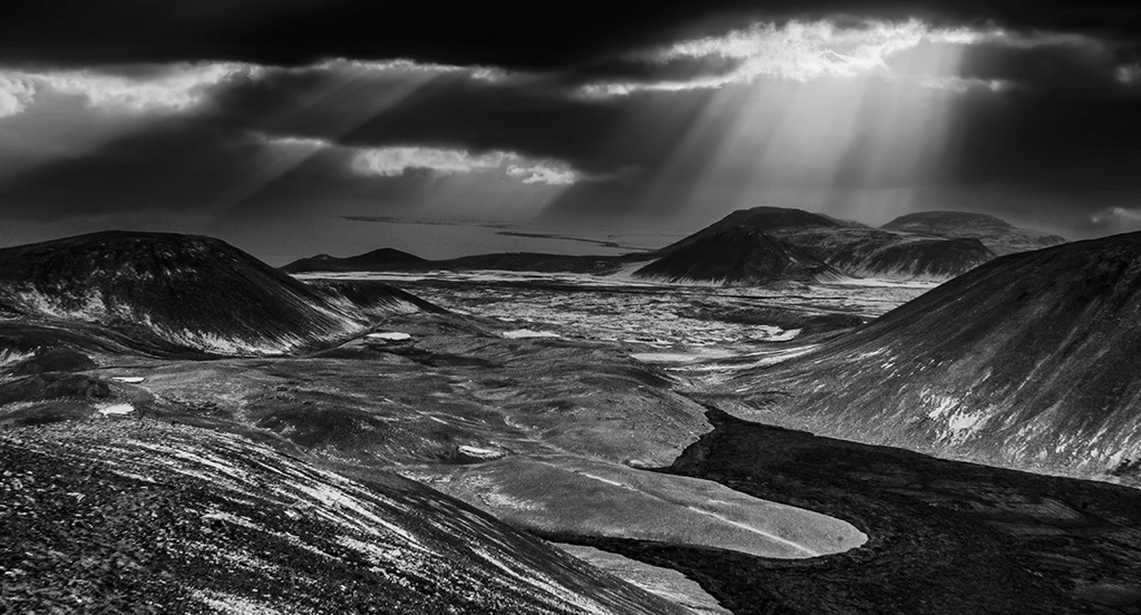
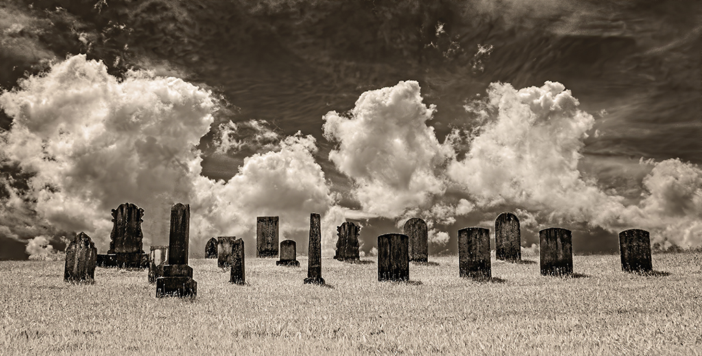
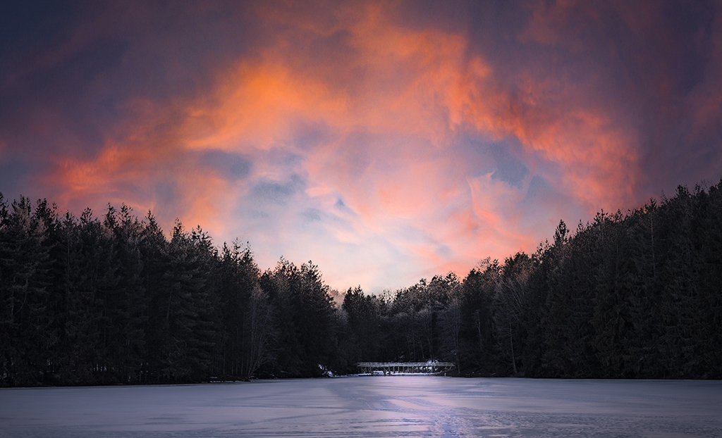
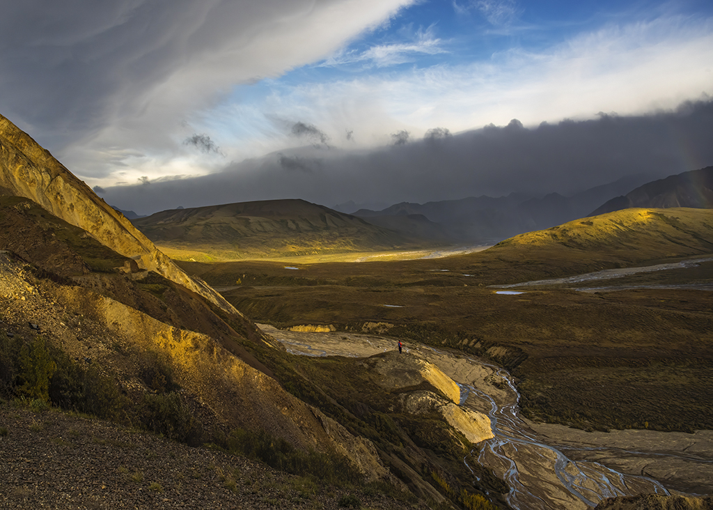
Emil, clouds are wonderful subjects, but it is not easy to capture the emotional power in them. I like the way you have filled the frame with these storm clouds and used post processing to render contrast and definitional effects normally not accomplished without a polarizing filter. Wow. |
Jul 20th |
| 66 |
Jul 19 |
Comment |
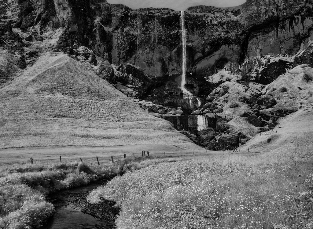
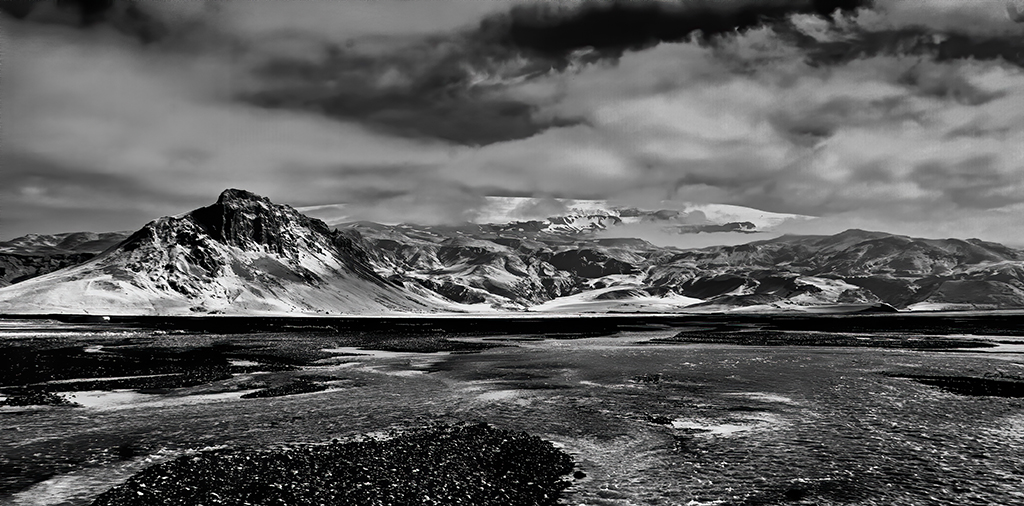
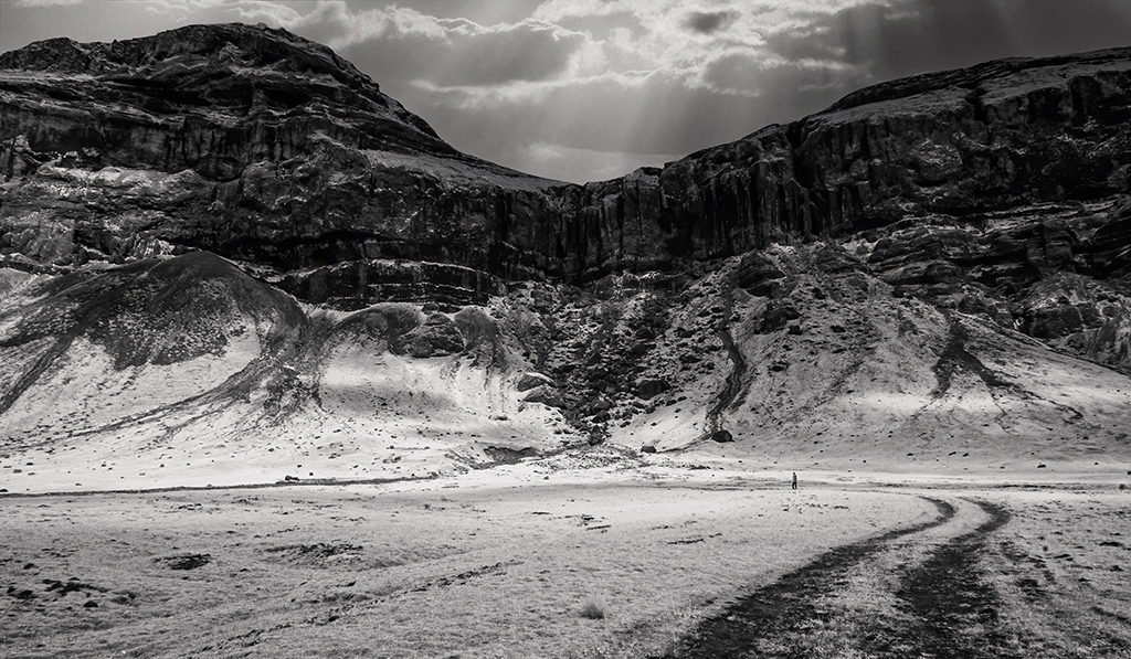
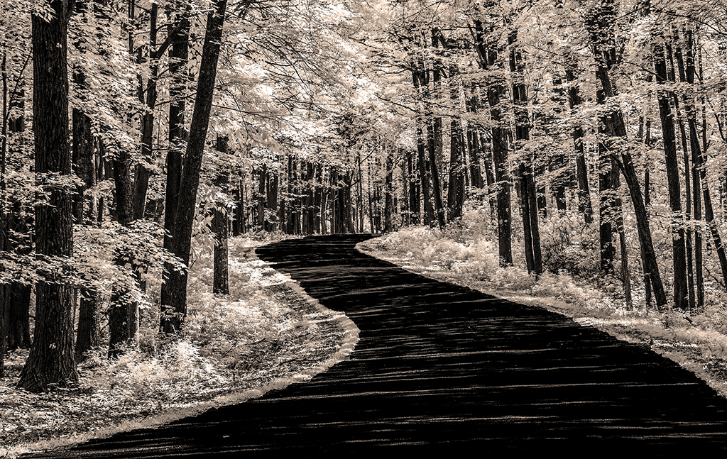
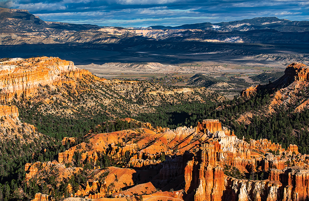
Ernie, I have noticed a preference in you for moody dark highly detailed and textured images. I like this. The details you brought forth through post processing provide depth and elaborate the composition. Are you sure you were not with Neil Armstrong and took this photo of the lunar surface? |
Jul 20th |
| 66 |
Jul 19 |
Comment |
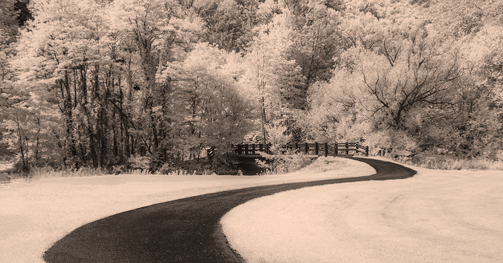
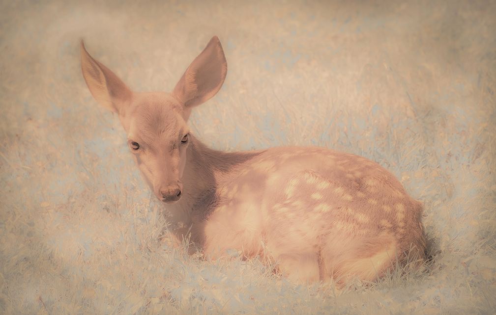
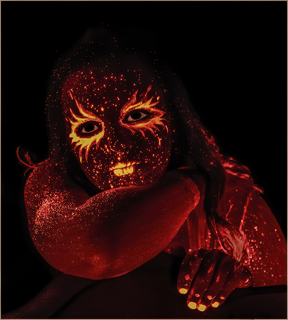
For completely irrational reasons, IR tends to bias me towards buildings, structures and things, not people, animals and other living critters. Your lovely simple, but powerful, image of a butterfly is instructive. I like the way you converted it to a pure black & white composition. You have inspired me to move my IR into the world of the living. |
Jul 20th |
| 66 |
Jul 19 |
Comment |
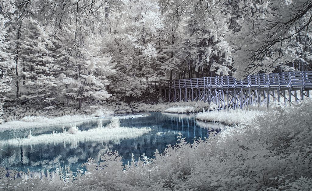
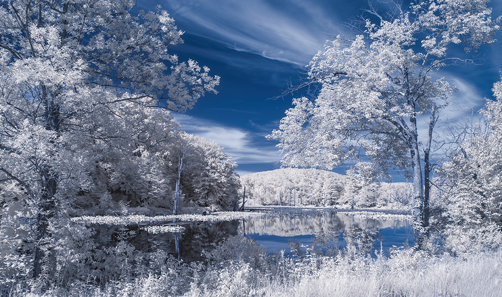
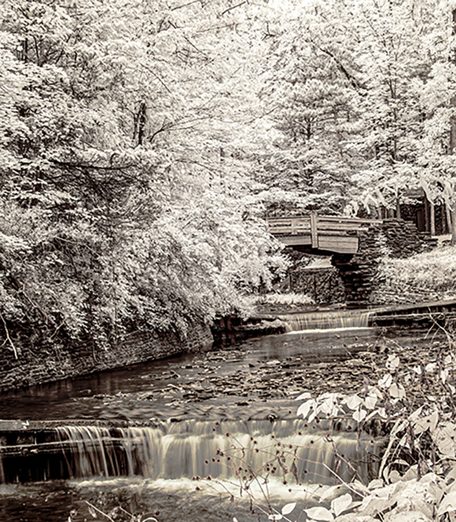
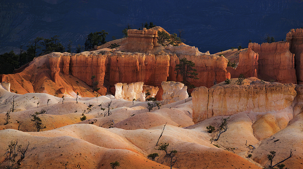
Indeed Palli this is a busy highly detailed image. The rich texture of the bushes and dead branch is counterpointed by the smooth reflection. Some folks do not like information rich images. I find them to be interesting. You are a good student of Gary's. I must line-up to take his next class. I like the way you brought out the details and sharpened the bush in the upper right section of the image. |
Jul 14th |
| 66 |
Jul 19 |
Comment |
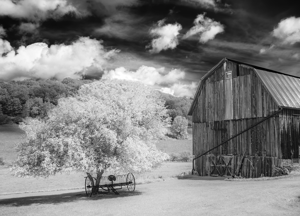
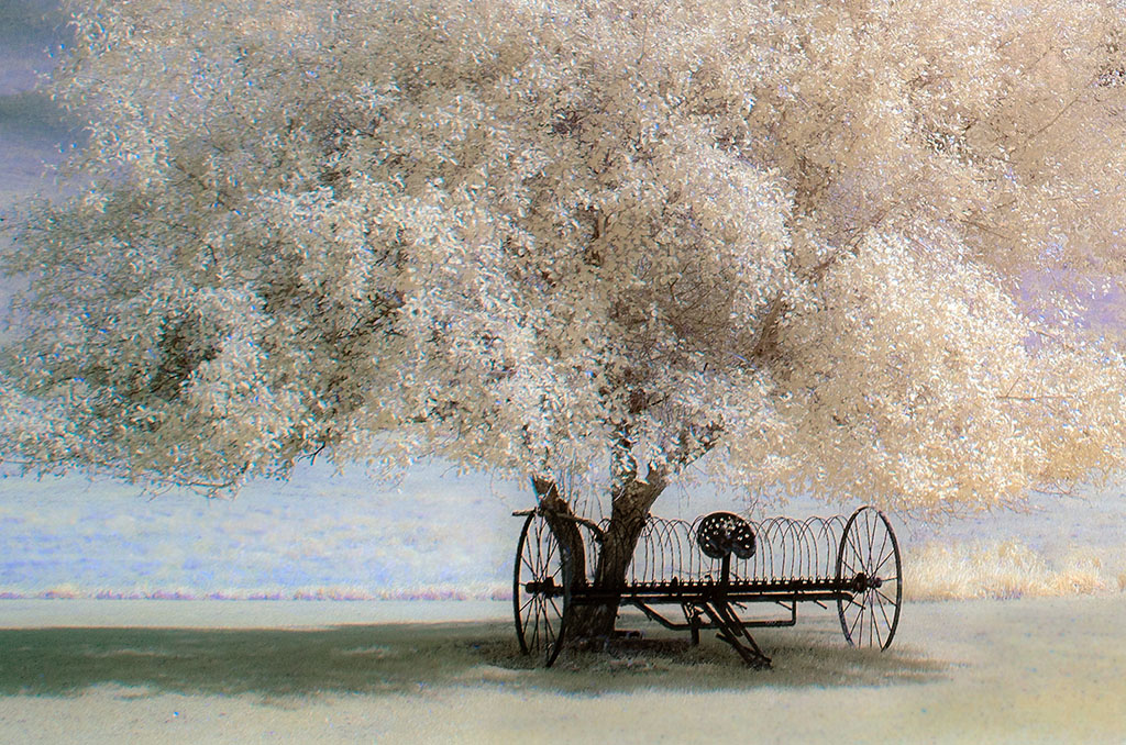
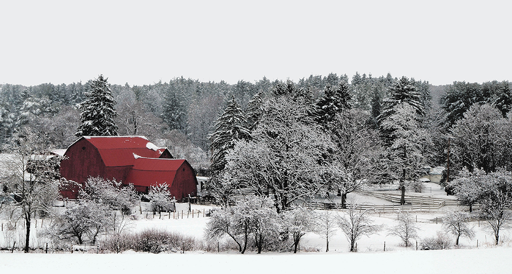
Sad as it may be, decaying barns, homes and other structures are good subjects for IR. It is amazing what you did in post processing. You could give your original to 100 photographers and only handful could produce anything close to your final image. Darkening the edges and using an antique filter were essential artistic decisions. Bravo. |
Jul 13th |
| 66 |
Jul 19 |
Comment |
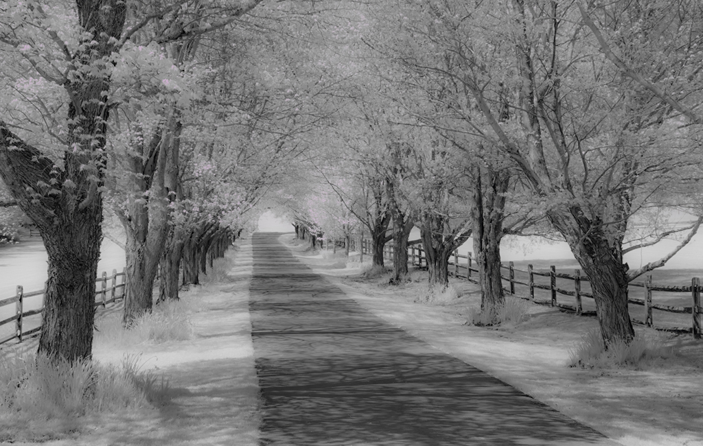
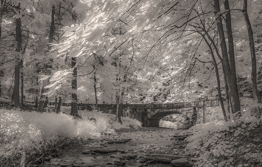
Jack, you've done it for me. I hate power lines; now, I must think differently about them. Indeed they are graceful and complement the flowing lines in the field. The hazy sky reinforces the languid feel of this pleasant IR image. I like Gary's adjustments, particularly his enhancing of the contrast of the power lines. |
Jul 3rd |
| 66 |
Jul 19 |
Reply |
Gary, I strongly agree, the image is too tight on the right side. Even adding one quarter inch will help. Thanks. |
Jul 3rd |
| 66 |
Jul 19 |
Reply |
Thanks for the kind feedback. When I work on this image again, I will give it some breathing room (I am not sure why I cropped it to such a square frame?). |
Jul 3rd |
6 comments - 2 replies for Group 66
|
| 88 |
Jul 19 |
Comment |
Sumit, this is a very comforting, homey, back to basics image. It captures one of those perfect moments. The image is improved by flipping it horizontally. You have multiple subjects in this image: the tractor, the farm buildings, and people. My eye is drawn to the people, but they are less discernible than other subjects. I don't have a suggestion to create a different composition other than using Lightroom to delete some of them . . . and that does not seem right. |
Jul 20th |
| 88 |
Jul 19 |
Comment |
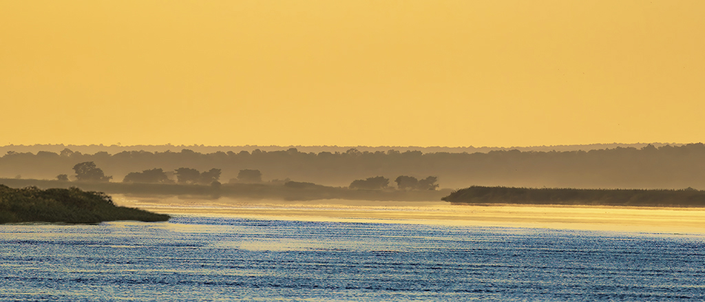
Scott, given that this is an iPhone photo, I am amazed. What is the megapixel equivalent to a digital single lens camera? In post production you removed the kids to draw more attention to the sunset. Lines in the sand and other stuff could be removed for the same purpose. I don't know the color space of the iPhone you used, and this may have set limits on what you could do, but being biased to more rather than less saturation, I urge you to saturate the sky more and then heighten the contrast with the trees in the foreground. |
Jul 14th |
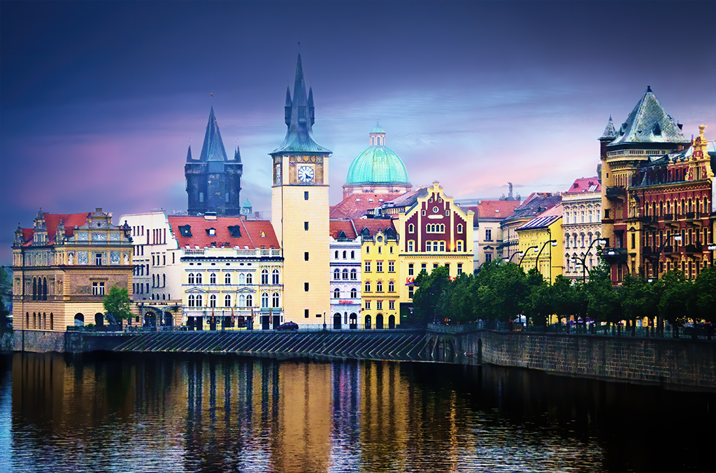
| 88 |
Jul 19 |
Comment |
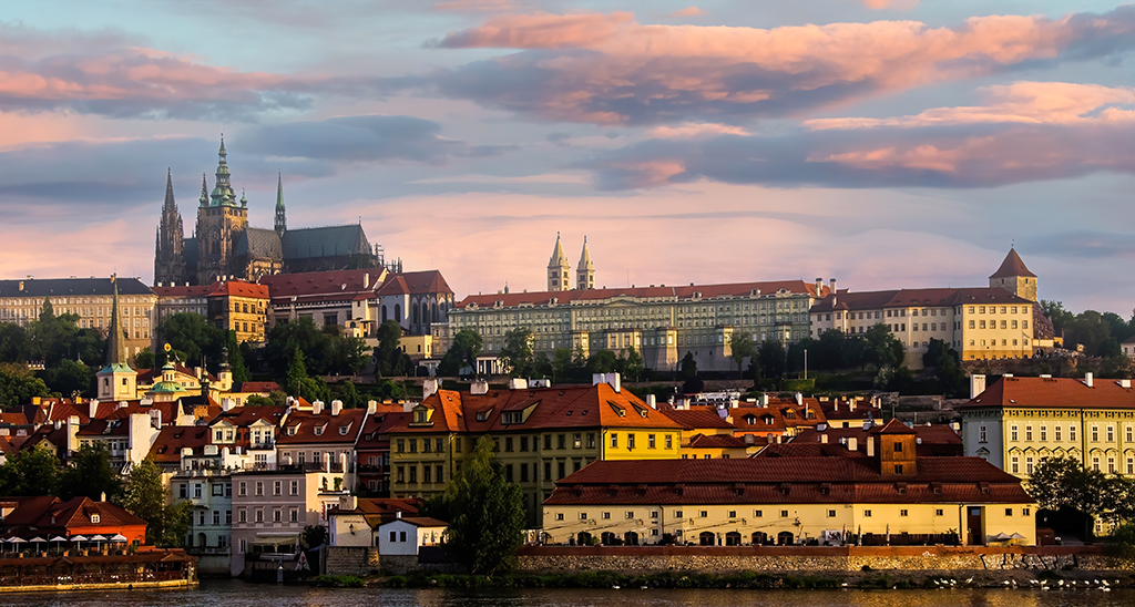
The roofs and domes in cities like Budapest can create a mosaic of color and texture. Your images captures this nicely. I like the way you used the river as a leading line. The hazy sky in the distance does not add much. Perhaps as Trey suggested, darkening it might bring out the beauty of the city even more. |
Jul 13th |
| 88 |
Jul 19 |
Reply |
I agree. Thanks for the suggestion. |
Jul 8th |
| 88 |
Jul 19 |
Reply |
Gary, I like what you did to remove halos. However, inconsistent as the sky is, I like it more than other options, noting Sumit's advice. I am going to claim artistic license here (I only use this obviously defensive tactic twice a year, and shucks, just 5 months remain). |
Jul 8th |
| 88 |
Jul 19 |
Comment |
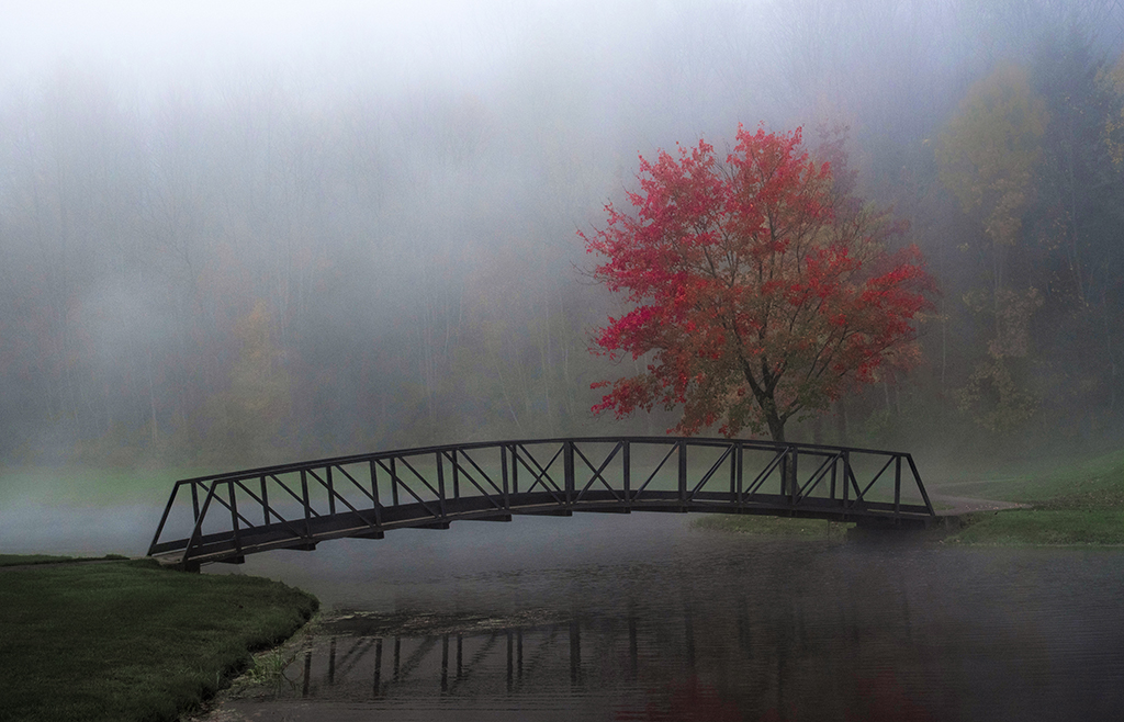
So Rajani, just for the shot alone, you had to stand quietly in freezing water for 20 seconds! I've had heated discussions with club members about whether or not "difficulties taking a shot" should be added to the criteria for judging an image. I do not think it should be ignored. I like your photograph even more knowing the effort you put into it. Nice capture of morning light. Lovely. However, to my eye, I agree with Gary. Less reflection from the trees will more likely keep the attention of the viewer on the church. |
Jul 8th |
| 88 |
Jul 19 |
Comment |
Trey, you are becoming a master of converting photographs into paintings. You must invest a lot time to render your final image. I especially like the subtle effects you add such as making the shadows of the dock railing slightly blue to contrast with orange of the dock boards. Your work reminds me of Edward Hopper. I agree about the sky looking a little too unlike its photographic origin. |
Jul 3rd |
| 88 |
Jul 19 |
Comment |
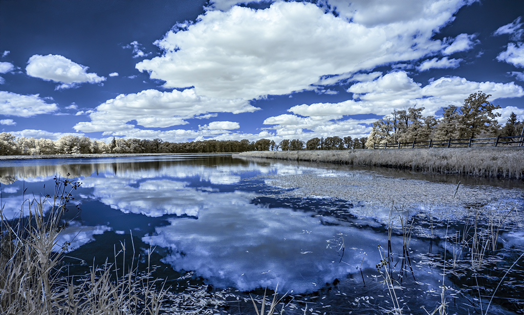
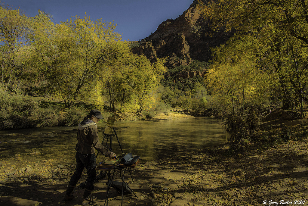
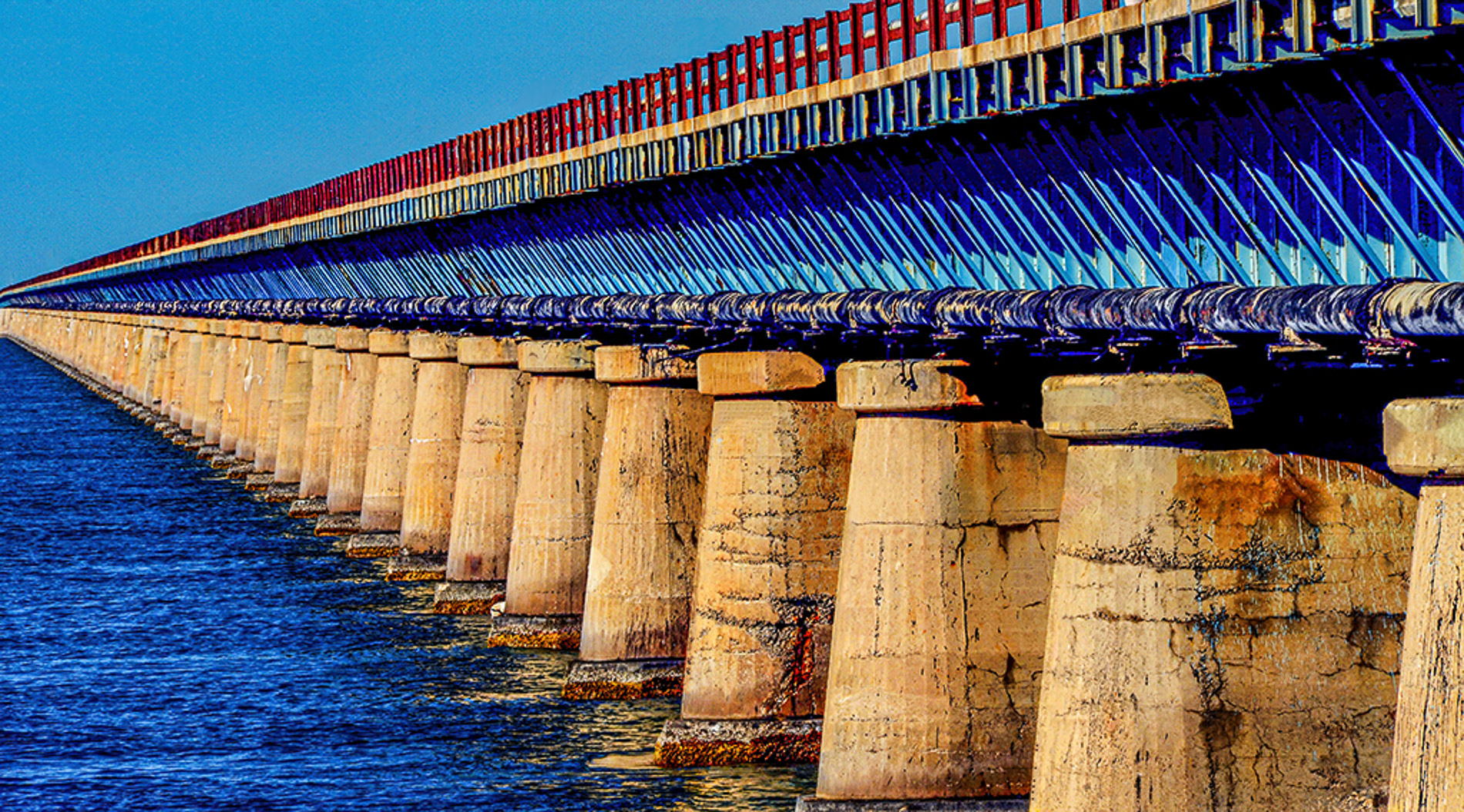
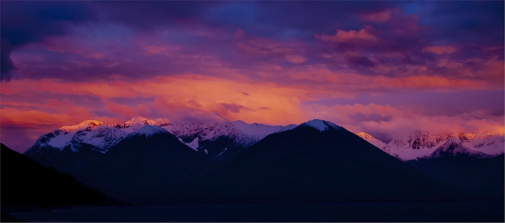
Gary, this image is a tasty buffet of color for the eyes. The contrast of reds with blues and foreground highlights against the distant sky collaborate to make a lively stunning image. Some snobby photographers I know do not think that color can be artful. They should look at this image. Gary, you said you had some images from Chicago to share. Glad you did. |
Jul 3rd |
6 comments - 2 replies for Group 88
|
12 comments - 4 replies Total
|