|
| Group |
Round |
C/R |
Comment |
Date |
Image |
| 66 |
Jun 19 |
Comment |
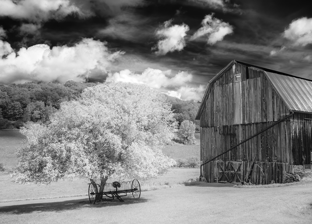
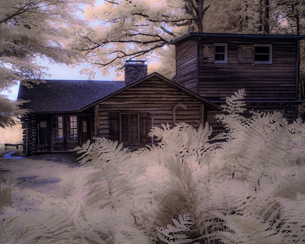
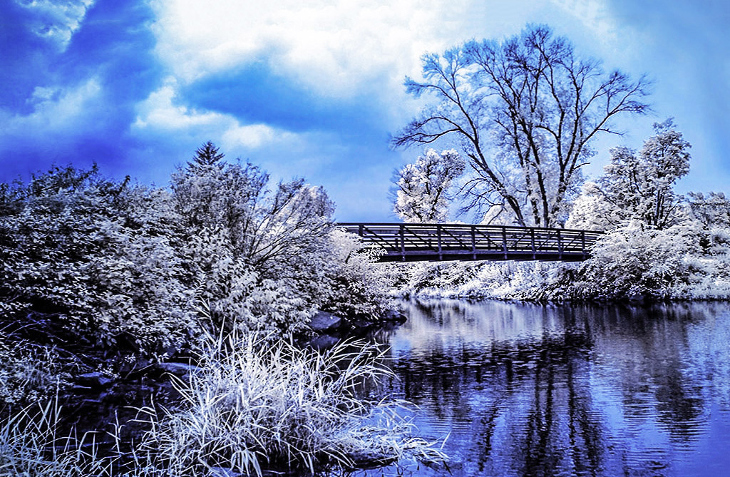
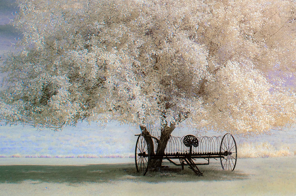
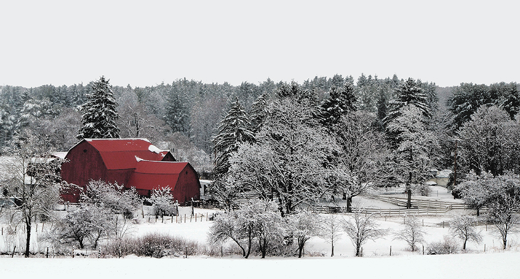
Gary, I can tell you spent many years with film before you converted to digital. The original image is nearly perfect. There is not much post processing to be done. The composition is also spot on. The 24mm lens coupled with the f/13 aperture revealed a lot of details within the barn and surrounding the windmill. Great subject for IR |
Jun 17th |
| 66 |
Jun 19 |
Comment |
Palli, this image loads the eye and brain with a lot of interesting things to enjoy. I like the way you flipped the image, it "reads" better this way. Something to consider: would cropping the bottom a bit more draw more attention to the building? My compulsive eye wants to waste time looking at the panel leaning against the railing in the lower right of the image; a minor thing, however. |
Jun 17th |
| 66 |
Jun 19 |
Comment |
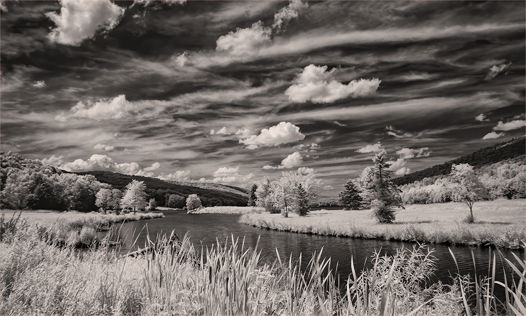
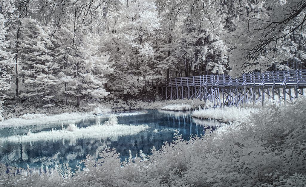
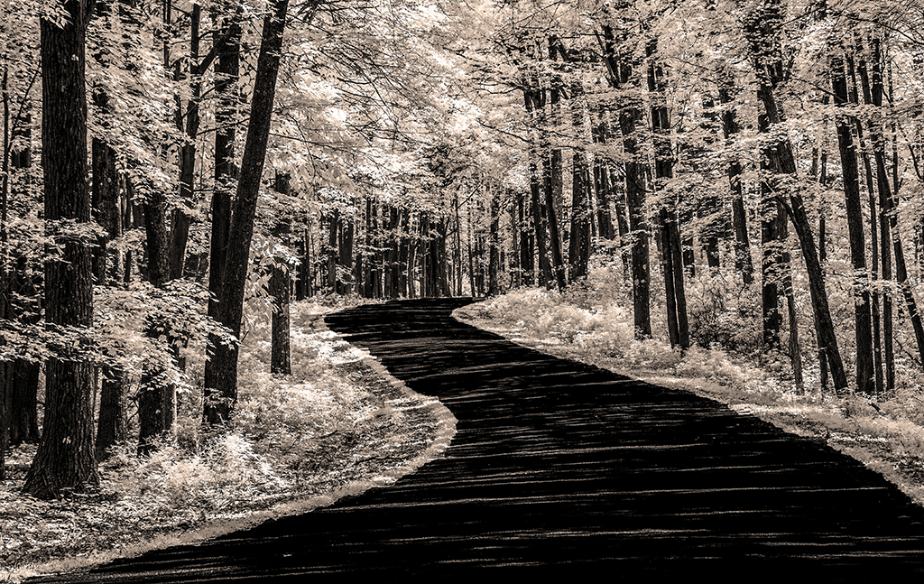
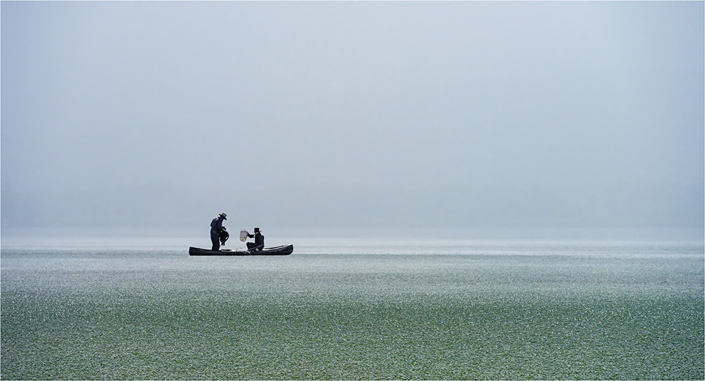
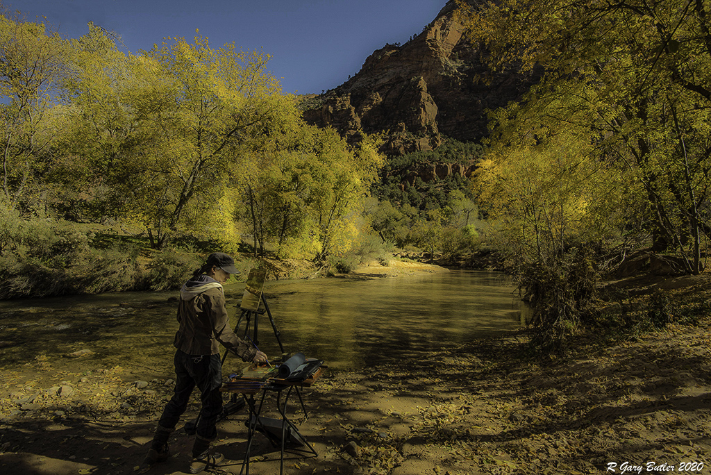
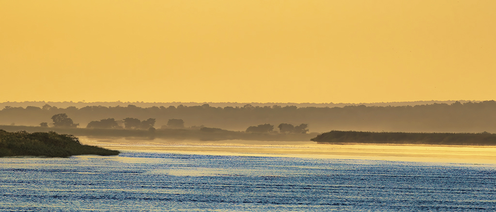
Melanie, speaking from my experience, this image is an accomplishment. I have been to Florida several times harvesting only a couple interesting images. Maybe it is because I've spent 99% of my life in the North? For me this image captures something mysterious and even dangerous. The foreground is placid and peaceful while the background is textured, hidden and cluttered (a challenge of composition we also have in busy Northern forests). So, blurring the background might enhance the foreground, but counter some of its delightful creepiness. |
Jun 17th |
| 66 |
Jun 19 |
Comment |
Jack, I have taken this kind of photo several times in my mind walking by barriers and fences. I like the visual irony: Strong unyielding square links of steel can't stop a soft gentle green vine from trespassing. The horizontal lines behind the fence add to the irony. Lovely image. |
Jun 17th |
| 66 |
Jun 19 |
Comment |
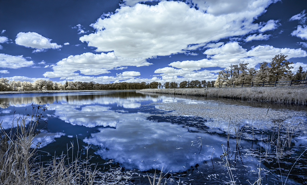
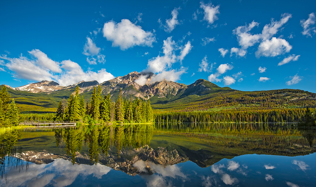
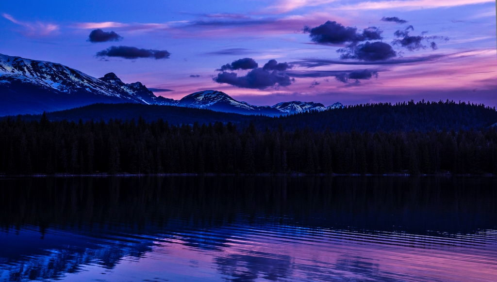
Ernie, there is something so attractive about reflections. They are a form of multiple exposure that allows one to compress and conjoin incongruous things. I like them. However, some viewers have trouble with their complexity and subject multiplicity. Cropping and highlighting can sometimes improve the composition for those who prefer less complexity. |
Jun 16th |
| 66 |
Jun 19 |
Comment |
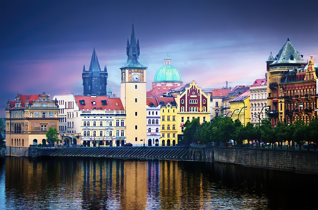
Emil, this is such an elegant image, so nicely composed with masterful use of highlights, contrasts and reflection. You should share it with those that manage tourism in St. Louis. It certainly makes me want to visit. |
Jun 15th |
| 66 |
Jun 19 |
Comment |
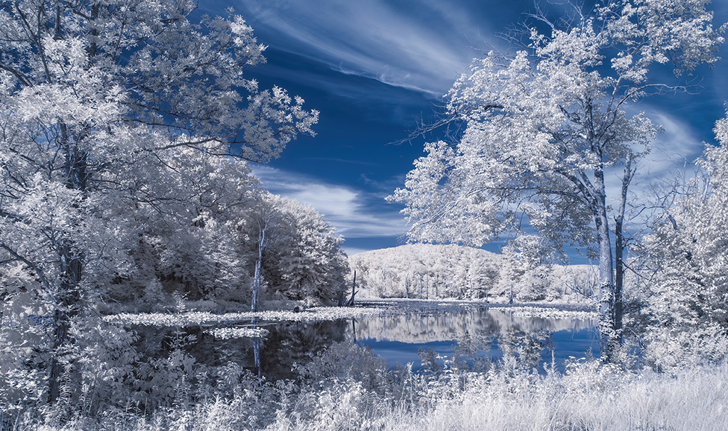
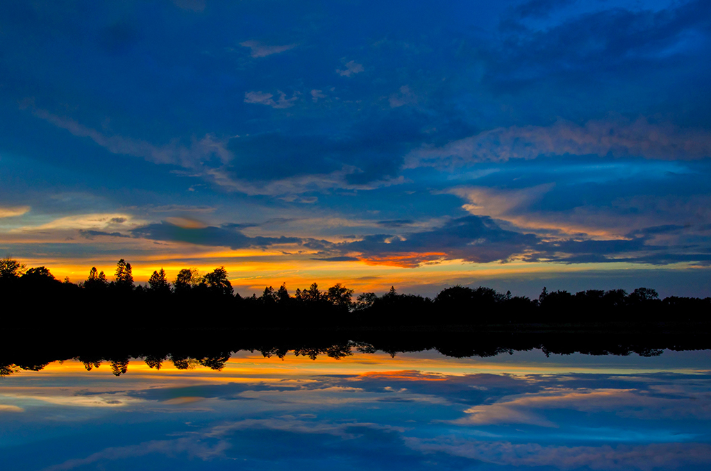
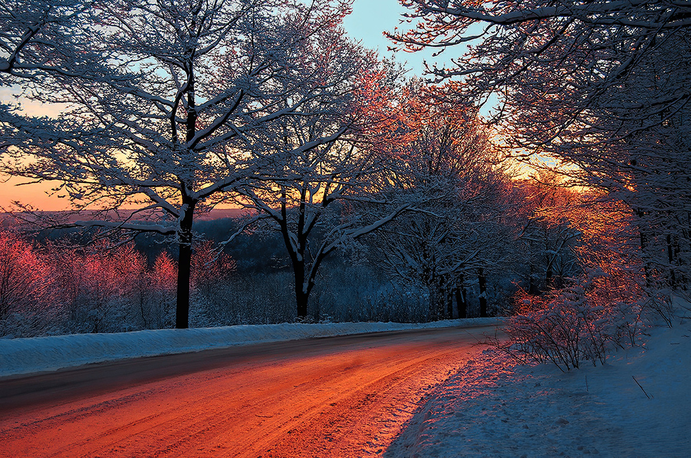
Gary, Palli, Jack, Emil & Melanie, I appreciate your feedback so much. Indeed the foliage is too dark and dirty. I like the contrast between the meadow and the forested area; however, it need not be obtain by underexposure and dim lighting. The meadow could be dodged a bit more too.
The blue sky is a seemingly natural touch; however, an adjustment of saturation could make it more so. |
Jun 11th |
7 comments - 0 replies for Group 66
|
| 88 |
Jun 19 |
Reply |
Glad to hear you say you enjoy what some folks call "taking native images." It is unnecessarily dialectal to discriminate between the the image taken in the field and the finished version. Truth is, when in the field we also imagine what can be done with an image in post production. So, it is not step one then step two, rather it is one continuous creative loop, isn't it? And isn't it all fun? |
Jun 16th |
| 88 |
Jun 19 |
Comment |
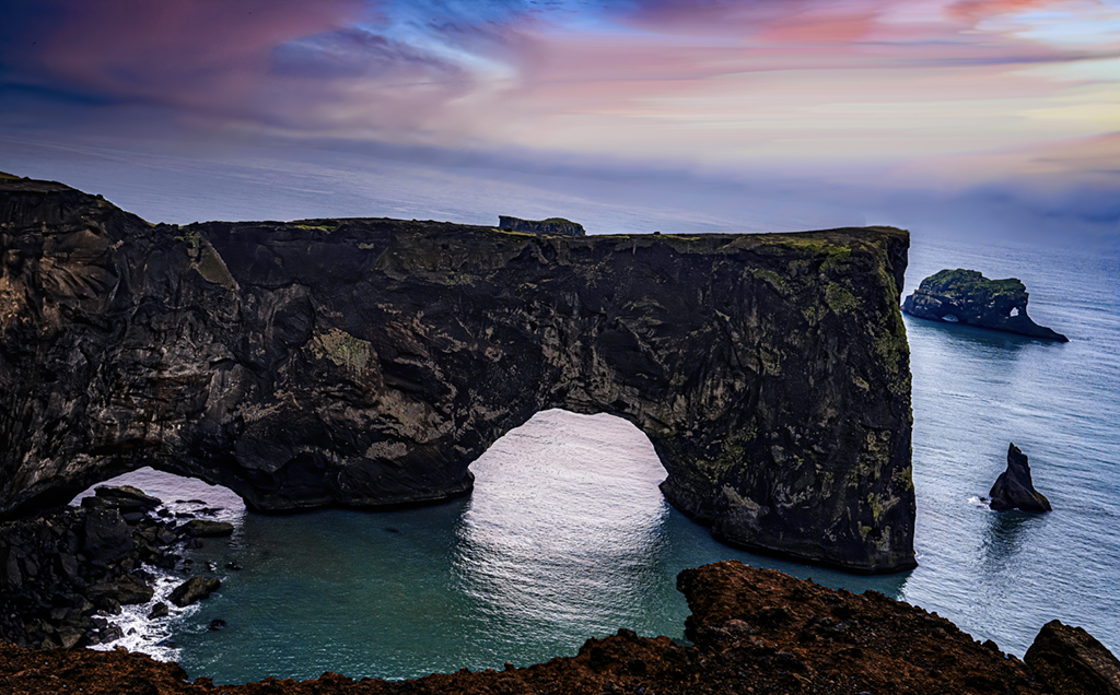
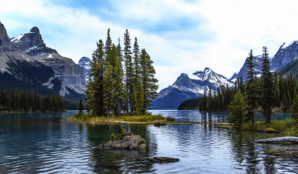
Lou, this is a challenging image to compose. There are 4 horizontal lines that may affect the view's gaze: the sea horizon line, the top of the arch, its shadow and the wall leading diagonally away. An unbalanced image can add a lot of interesting drama to an image. There is a guy in my camera club who would urge you to paste in a tiny sailboat on the right side of the image, or perhaps paste in the back of a model sitting on the wall wearing a white dress? But it is your call. |
Jun 16th |
| 88 |
Jun 19 |
Comment |
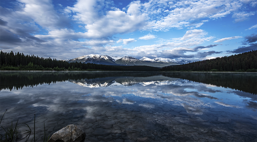
Rajani, you indeed captured Venice at its best. The image sparkles. The small f-stop rendered two light stars that draw the viewer down the canal. The lighting of buildings is warm and inviting. The only thing you might consider tinkering with is the color of the night sky. Would a shift toward a dark blue add even more color contrast with the warm street lights? |
Jun 16th |
| 88 |
Jun 19 |
Comment |
Trey, you are a digital artist as much as you are a native photographer. I admire your post production skills and would like to learn more about how you took an ordinary, even drab image and transformed it into a work of art. The soft, subtle shades of color and even light make this an image to look at for hours without becoming fatigued. Give us more. |
Jun 15th |
| 88 |
Jun 19 |
Comment |
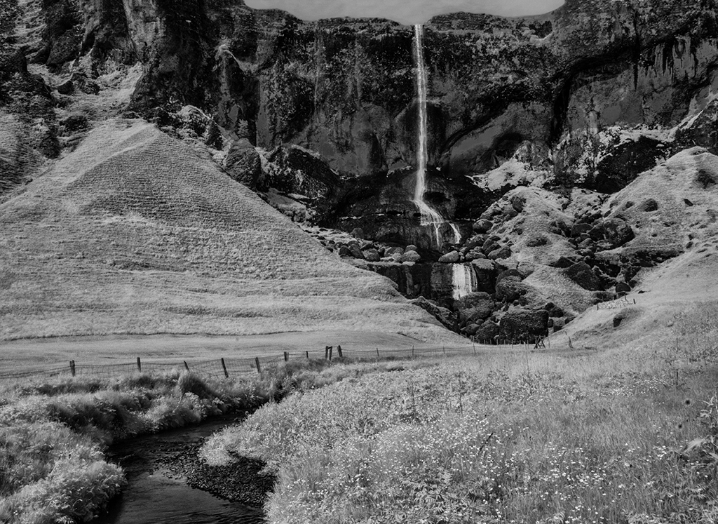
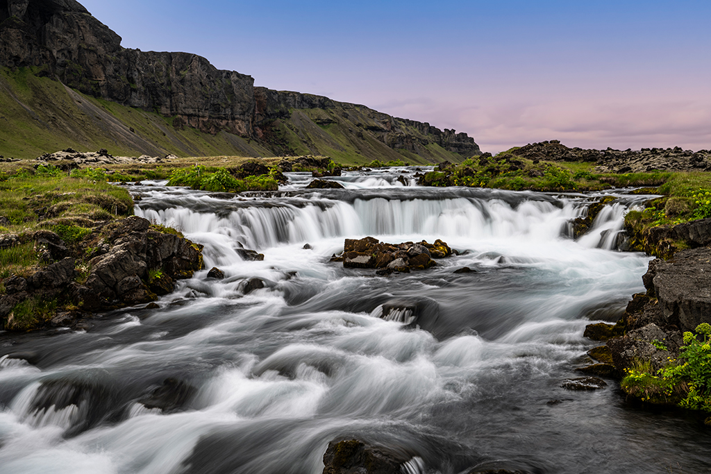
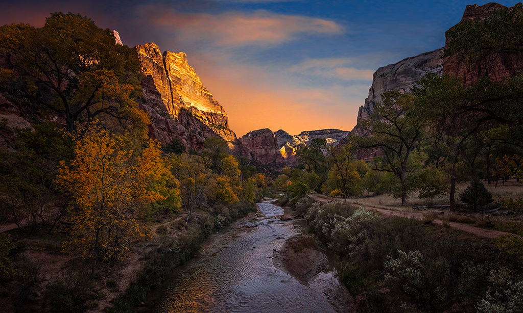
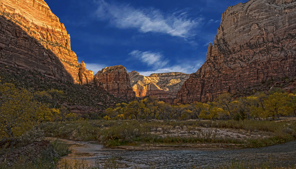
Scott, this is a masterful image. I like the way you used the stream to guide the eye to Cathedral Rock. Merging the images helped you capture all the information at the scene and use it. It could be my monitor, but it seems the blue sky peeking through the clouds is a bit too cyan & saturated. |
Jun 15th |
| 88 |
Jun 19 |
Comment |
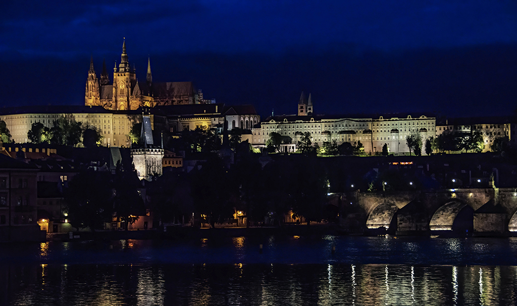
Gary, it is amazing what you did to transform the original photo into the lively finished image. Cropping out the foreground emphasized the skyline. Like Ansel Adams suggested, we write the music in the field but play it in the darkroom. However, I wonder if our post processing acumen will eventually take some of the fun out of writing "music" in the first place. |
Jun 15th |
| 88 |
Jun 19 |
Comment |
Trey, Scott, Rajani, & Trey, thank you for the feedback. I agree about the trees. I have a tendency to favor high contrast which sometimes darkens the shadows too much. I like Gary's adjustment. I do not know what to do about the halo Rajani refers to. A foggy mist formed quickly during sunset. Post processing enhanced it. I like a touch of it, but it can look unnatural. |
Jun 11th |
6 comments - 1 reply for Group 88
|
13 comments - 1 reply Total
|