|
| Group |
Round |
C/R |
Comment |
Date |
Image |
| 36 |
Aug 25 |
Comment |
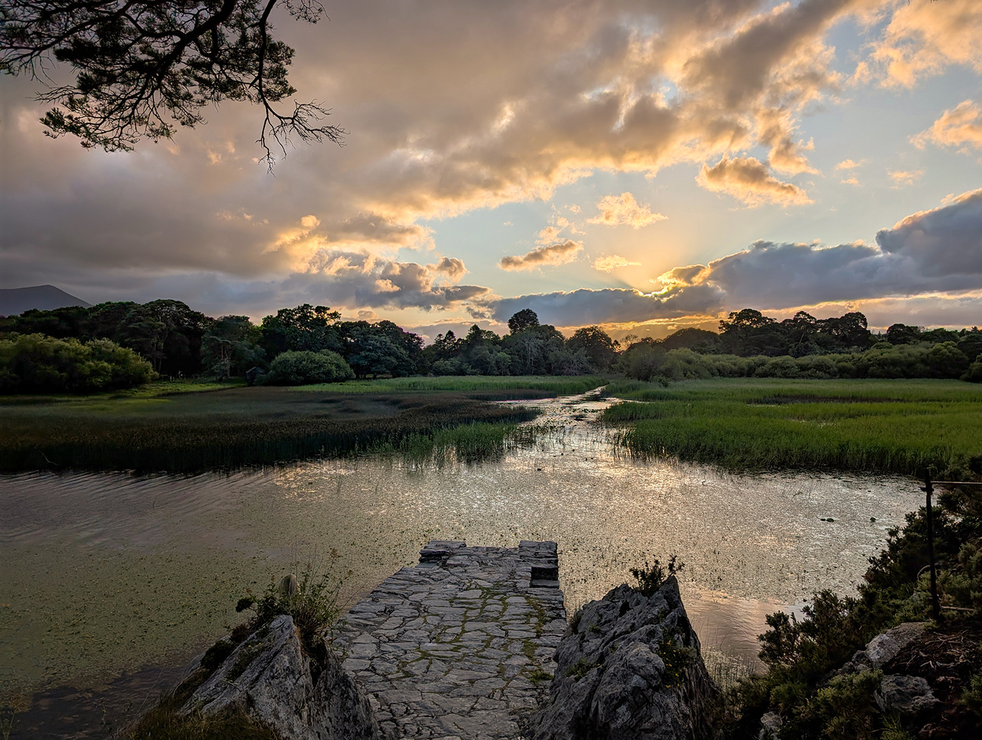
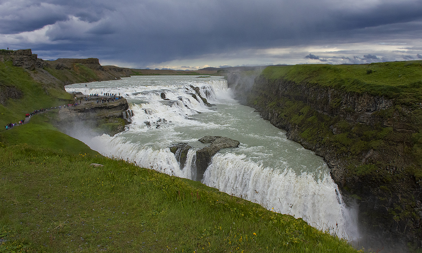
Hi Adi, I think this image has the bones of an iconic image that just need to be teased out. I agree you that as shot it does not really have a strong subject. But look at those falls, that is dramatic. I think that Grace and Barbara are on the right track with their crops that make the falls front and center. I think I like Grace's version the most but I would make a couple of changes. I would darken the reflection in the water a bit since it is distracting from the subject which is the falls. Then I would increase contrast in the sky and the rockface to bring out the texture in both. I might increase saturation of the sky and maybe the foliage a bit. Another thing to consider is a light vignette or circular gradient mask for a brightness/contrast adjustment layer centered on the falls. |
Aug 19th |
| 36 |
Aug 25 |
Reply |
Hi Larry, thanks for your comments. So, I don't use Lightroom, I just use Photoshop exclusively. So are you saying for the foliage in the background to increase saturation or change the hue? Do you have any thoughts what to do with foreground? I actually did lift the shadows on it some with a mask, but it was the same adjustment layer I used for the background highlights. Any input would be appreciated. |
Aug 19th |
| 36 |
Aug 25 |
Reply |
Hi Grace, thanks for commenting on my image. So as far black spots (which I'm pretty sure were stones) that's a fair point and the image does look better without them. I'm curious, did you do your version from my original or my submission, because I don't really see any difference in the shadows and highlights on the ground. As to the sky, I am a sucker for a dramatic sky, and your version is certainly that. The reason I didn't go that far was because the reflection of the sky in the water would match if the sky was to saturated. Now I do know a couple of techniques to match up the sky with water reflections, but in this case with all reeds and objects in the water, I felt trying to do that would be a can of worms I did not want to open. Ditto for trying to up the saturation of the reflections. I do like you idea of creating a foil with cool water and warm sky, but I would also like to maintain some symmetry between the sky and its reflection in the water. |
Aug 19th |
| 36 |
Aug 25 |
Comment |
Hi Gokul. I do agree with the others about the foreground and lighting. One way to bring out more texture in clouds is to do some dodging and burning to over emphasize the shadows and highlights. The right hand side of you image is almost a black void, yet I can see some detail in Grace's version. As far as the foreground clutter, sometimes it is unavoidable if you want to capture the image. I like Grace's idea of cropping the foreground out, but I think I would keep some of it in, maybe use a 16:9 aspect ratio crop which would lose some of the parking lot. Also, it might be interesting to do a B&W treatment. |
Aug 19th |
| 36 |
Aug 25 |
Comment |
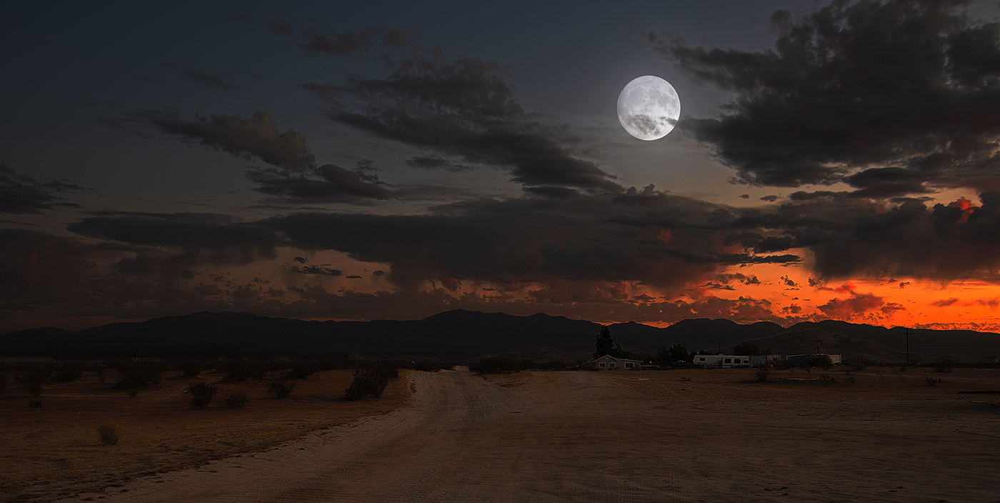
I love the way the fireworks light up the surrounding mountains. The long exposure really worked for capturing the town and the mortar going up and exploding. The focus is tack sharp. As to the moon, I feel it is a distraction, since it is blown out, a little irregular, and pulls my eye away from the town and fireworks. You could add a moon taken at a lower exposure which would give it detail, but I would probably just clone it out. Just my two cents. |
Aug 19th |
| 36 |
Aug 25 |
Comment |
A beautiful photo of the Smokey Mountains at sunrise! The lighting really adds a lot. I do agree with the others that the sky could use more detail. I like Grace's treatment of the sky in her version, but I prefer you version's trees and mountains. I think softer focus is better for the this image. |
Aug 19th |
| 36 |
Aug 25 |
Comment |
Postcard perfect image, Larry! I love the bright lights and the smooth water with the reflections contrasting with the sky. The brightly lit skyline says "Miami" to me! This ones a keeper! |
Aug 19th |
| 36 |
Aug 25 |
Comment |
That's a great image, Barbara! I love the way the water contrasts with the sky. I actually like the placement of the mast in the sun rather than a symmetrical placement. I do agree with the others that I wish the water was smoother, but if you weren't going for the dreamy look I understand why that wouldn't be desirable. Thanks for the tip about Skyfire! I'm definitely going to check it out. |
Aug 19th |
6 comments - 2 replies for Group 36
|
6 comments - 2 replies Total
|