|
| Group |
Round |
C/R |
Comment |
Date |
Image |
| 36 |
May 24 |
Reply |
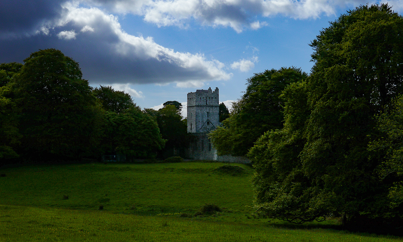
Yeah, I may have over sharpened the church and tree a little. In answer to your question, its an Photoshop adjustment layer with a mask so its easy to fix. I'll probably just decrease opacity of the layer. I might clone out those flags too, as well as the couple and sign as you suggested. |
May 22nd |
| 36 |
May 24 |
Reply |
Yeah, I may have over sharpened the church and tree a little. In answer to your question, its an Photoshop adjustment layer with a mask so its easy to fix. I'll probably just decrease opacity of the layer. I might clone out those flags too. |
May 22nd |
| 36 |
May 24 |
Comment |
That's a great image of the old mill and stream! I do agree with the others that some detail seems to be lost in the shadows on the stream. I don't really have a problem with the crop, I think its fine. The long exposure gives an interesting texture to the water. The roof of the mill appears a little blown out to me, I don't know if that was something you were going after, but I would probably burn it a bit to see if I could recover some detail. |
May 22nd |
| 36 |
May 24 |
Comment |
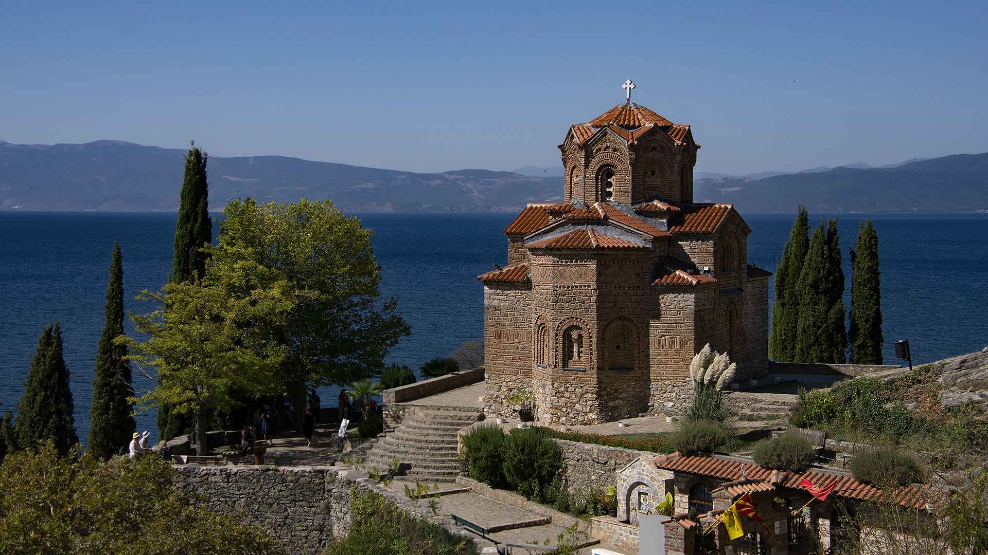
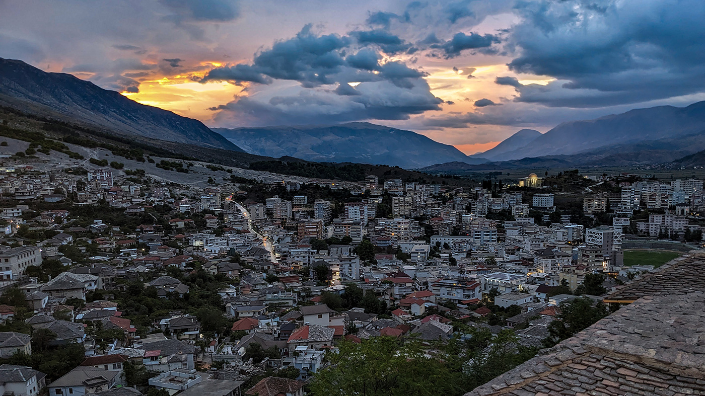
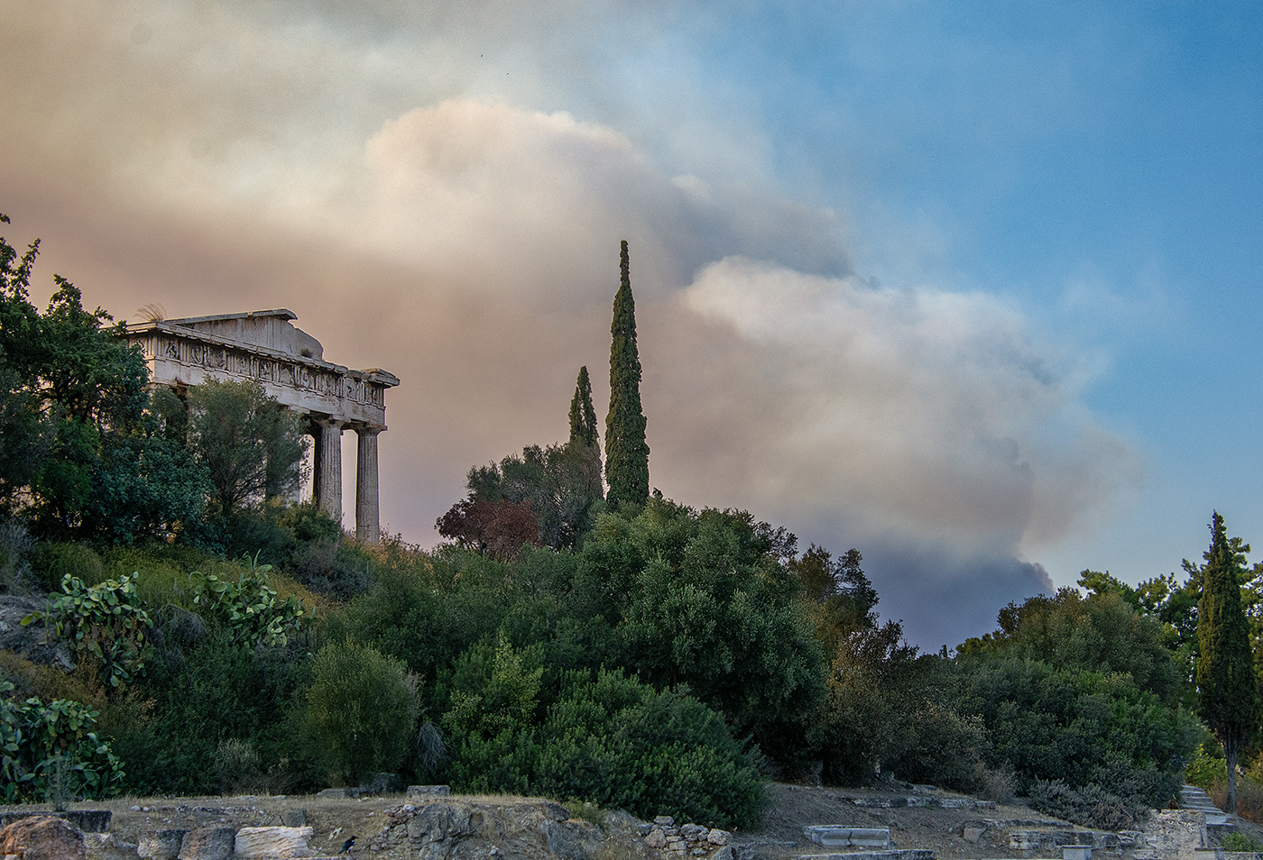
I think you really achieved the effect you were going for, the clouds and golden lighting really give an beautiful, ethereal feeling. One nit, the color on the roof of one of the buildings seems a bit off to me, almost blueish. Its the building in the center of the image. Could it be the lighting? It's easy enough to fix with a hue/saturation adjustment layer and a mask in Photoshop. I'm sure there is something similar in Lightroom. |
May 19th |
| 36 |
May 24 |
Comment |
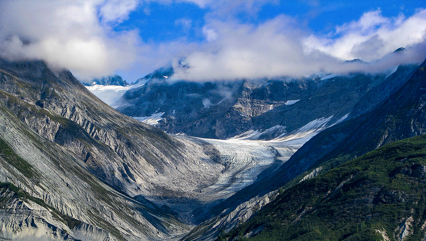
This is a very stark image and I think the B&W treatment enhances this feeling, along with the photographer who is dwarfed by the landscape. |
May 19th |
| 36 |
May 24 |
Comment |
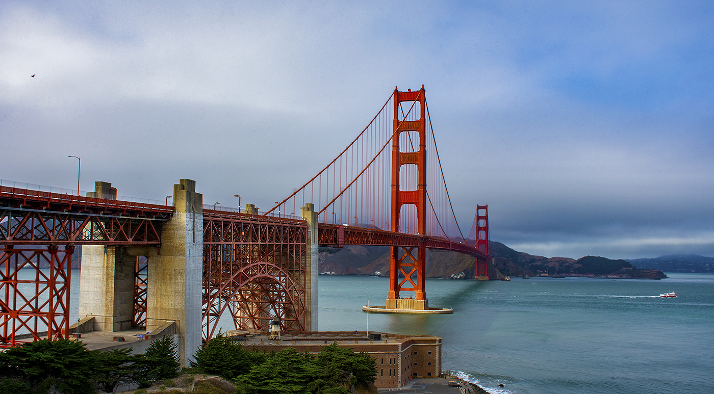
I really like the warm lighting on the bridge. I think I like this version better that the cropped version, the sky gives the image more balance and I think having the treetops present adds to the image. I think a fall color picture of this bridge at the same time of day would look amazing! I would also like to see it at a different angle, perhaps one the looks more down the entrance of the bridge. All in all its a good image, the colors are warm, the focus is sharp and the subject is clear and well lighted. |
May 17th |
| 36 |
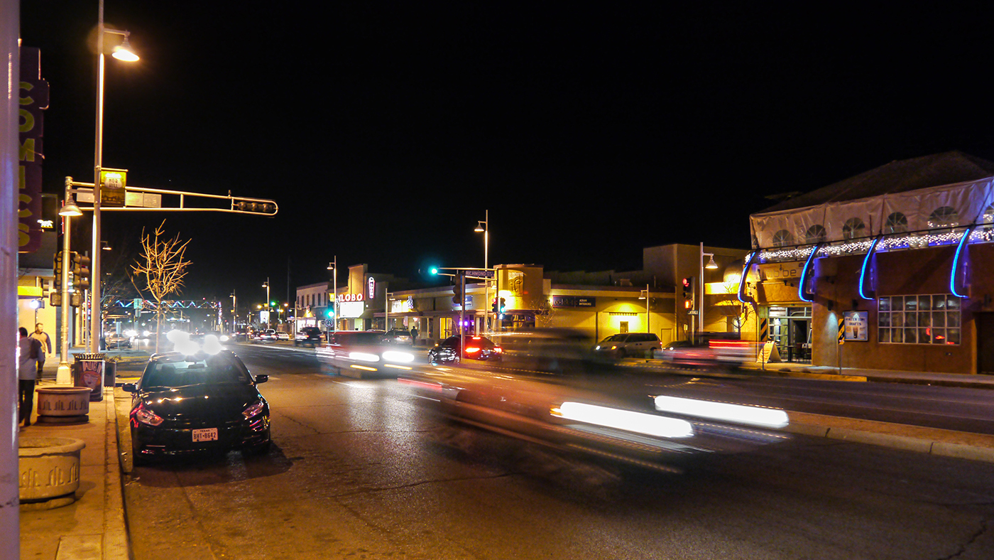
May 24 |
Comment |
This is a wonderful image of an old theater with its sign and marquee lit up. I think the main subject is the sign and the minivan does not block the marquee. It probably would have been better to have the full entrance visible, but the motion blur of the van adds to the image. Also, I have an almost identical minivan, so I think its kind of cool. I think you achieved the cinematic effect you were looking for. |
May 17th |
5 comments - 2 replies for Group 36
|
5 comments - 2 replies Total
|