|
| Group |
Round |
C/R |
Comment |
Date |
Image |
| 36 |
Jan 23 |
Comment |
I love the wall painting, that's the star of the image here. The people at the table and the open door to the store. I actually like the blurry people at the lower right. They add a feeling of movement. |
Jan 15th |
| 36 |
Jan 23 |
Comment |
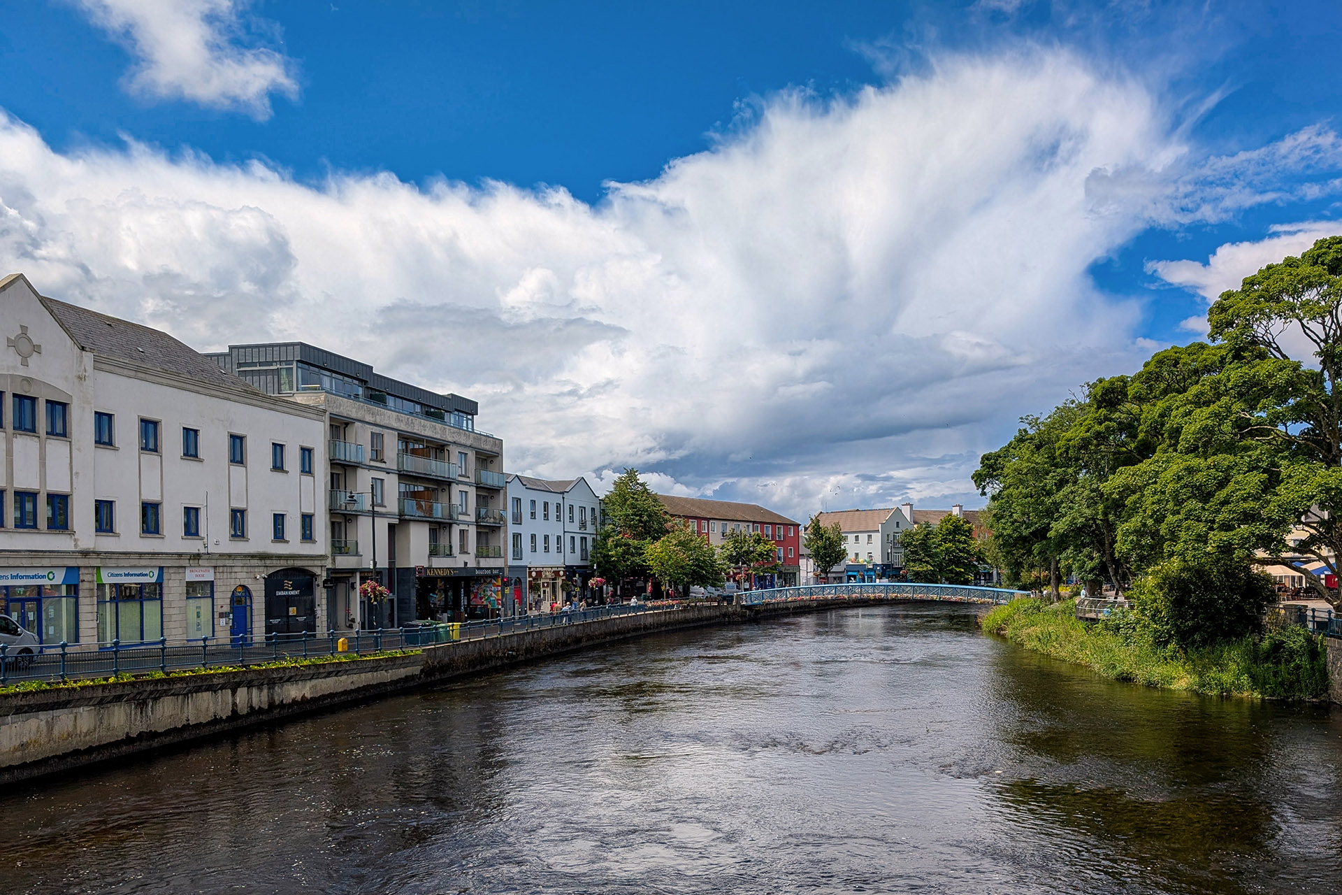
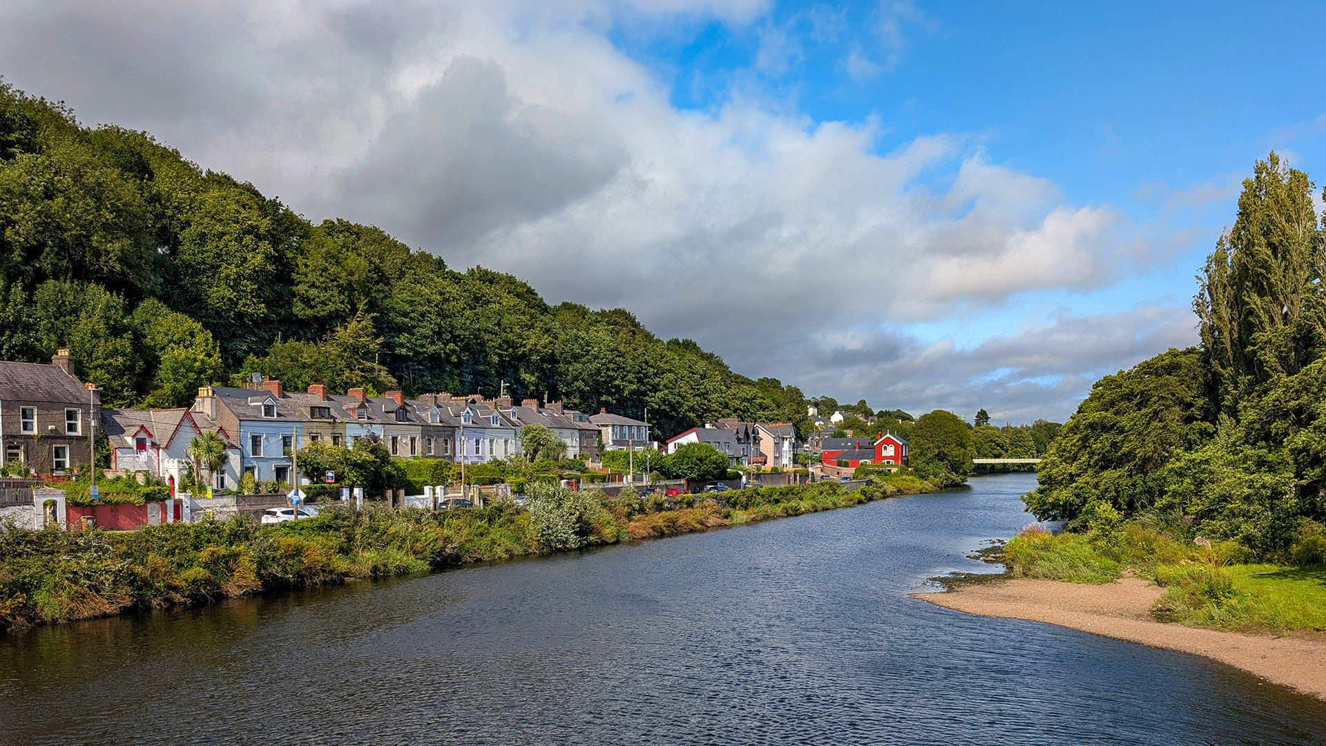
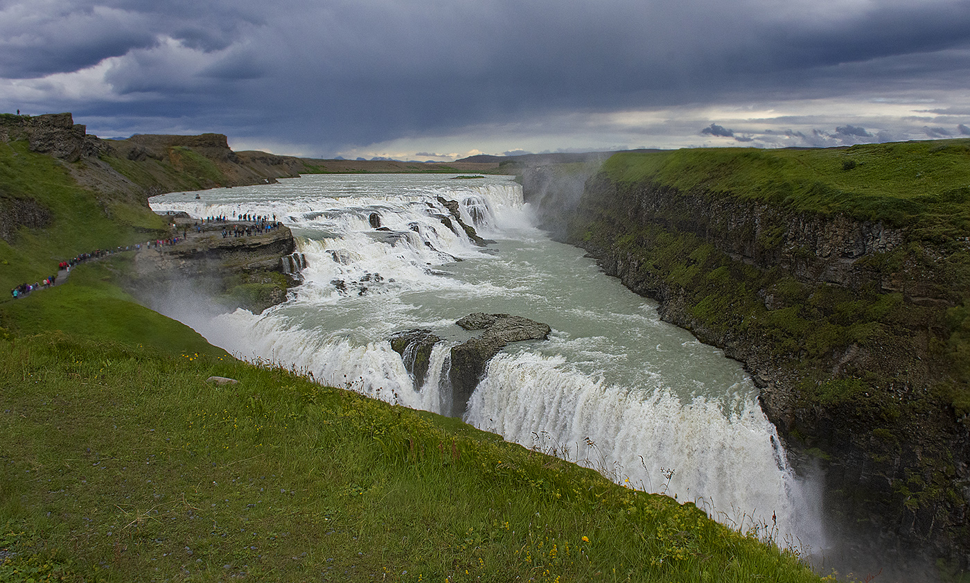
I love the water in your image Diane, great job slowing it down. I agree with the others that the trees are oversaturated and exposed. I don't really know LR but in PS I would mask the trees and rocks in the background, so they are not included in the adjustments made to the water and forground rocks. |
Jan 15th |
| 36 |
Jan 23 |
Comment |
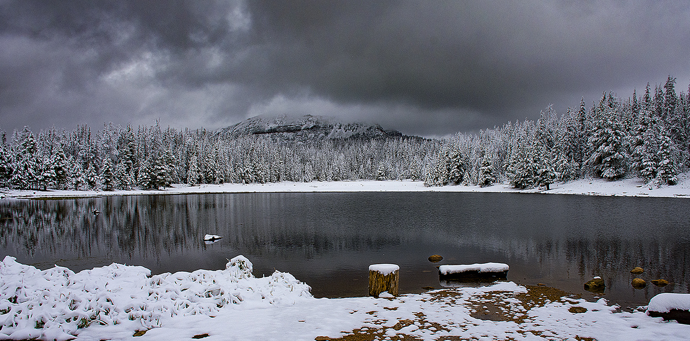
I think the black and white treatment give the image a very dreamlike feel. I like the long exposure, the water looks muted and yet reflective. I don't think I would change a thing. |
Jan 15th |
| 36 |
Jan 23 |
Comment |
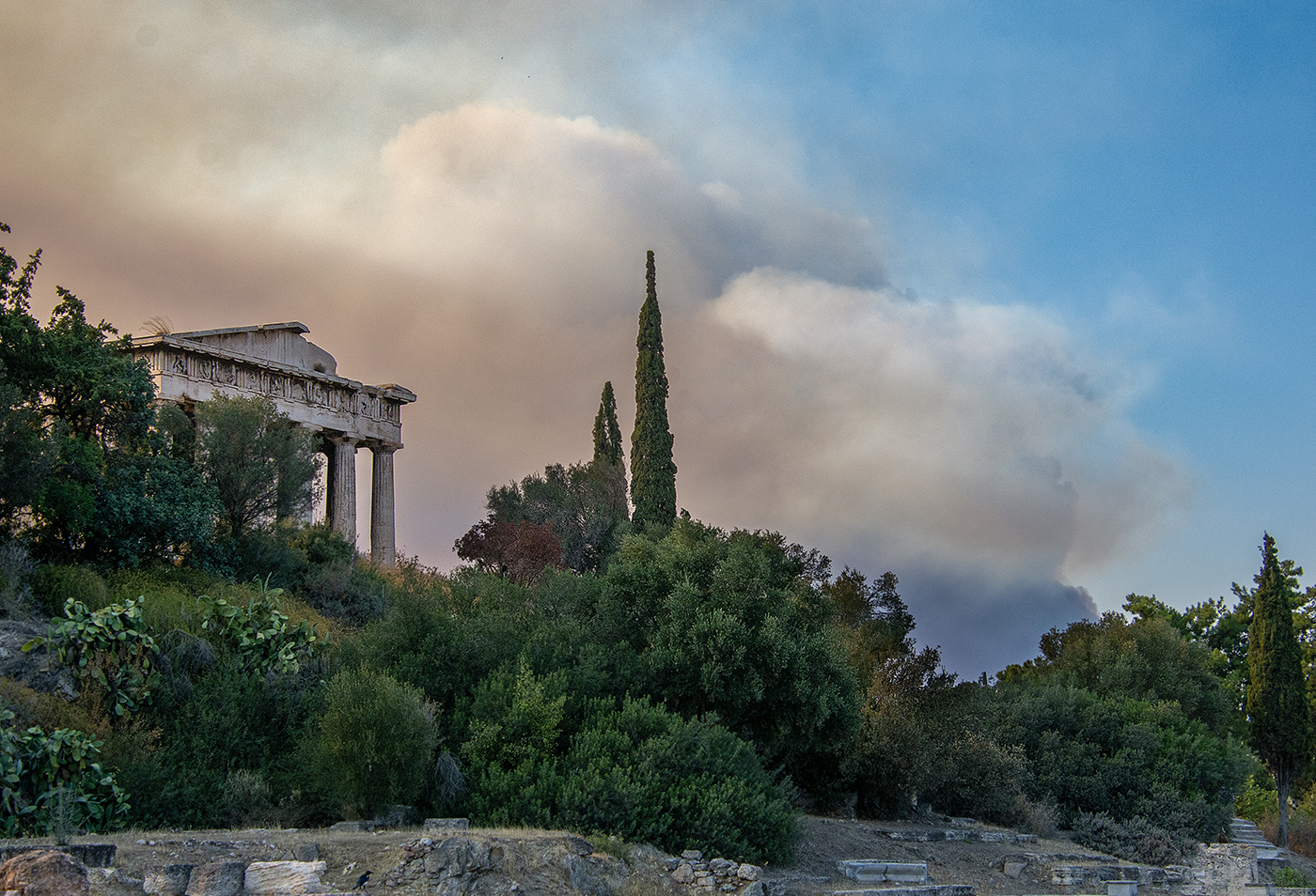
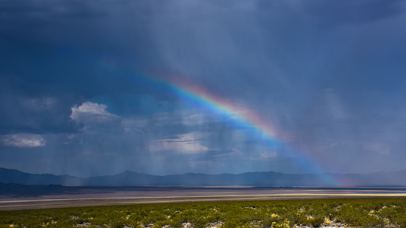
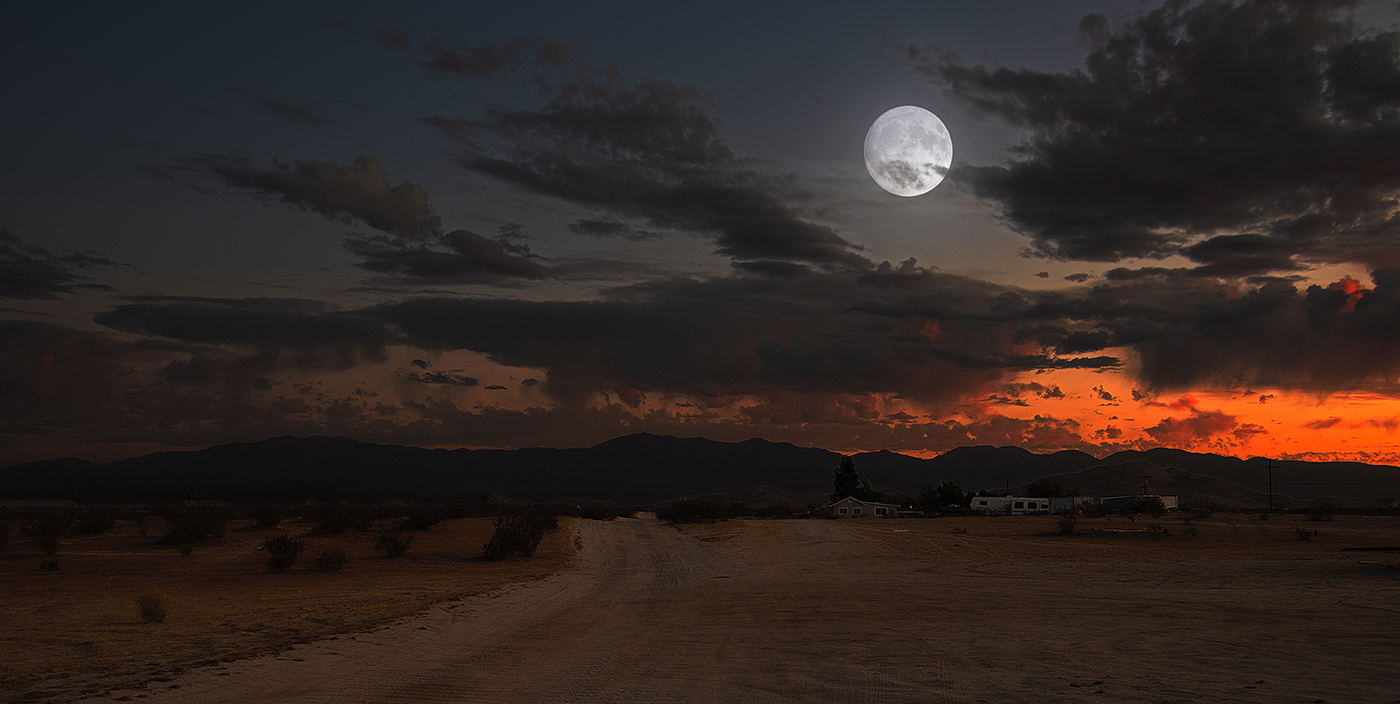
I really like both images, the original and the one with the sky replacement. The original looks more journalistic to me. One thing I did notice about the sky replacement is the chimney of the house on the right appears to be disappearing into the clouds, which does not look real. Perhaps if you blended the original sky using a gradient mask with the replacement sky at the horizon, it might work better. I can see in the original the chimney appears to be partially obscured by wind blown dust or sand. |
Jan 15th |
| 36 |
Jan 23 |
Comment |
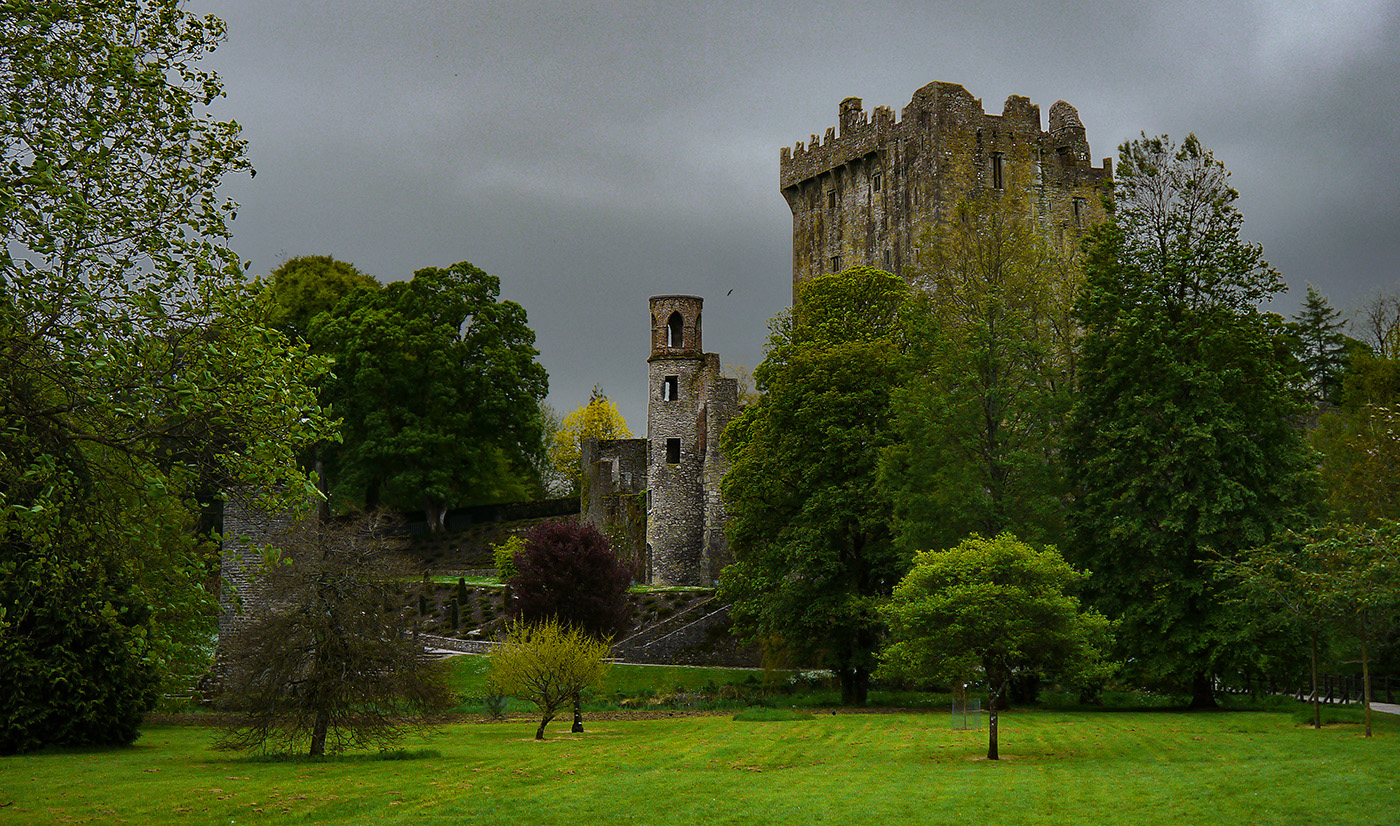
Fascinating image, Larry. I really like the composition and saturated colors. I think it was the right choice, to put the tree at the center. I can see from the image that it is not possible to get both the tree and fountains centered. |
Jan 15th |
| 36 |
Jan 23 |
Comment |
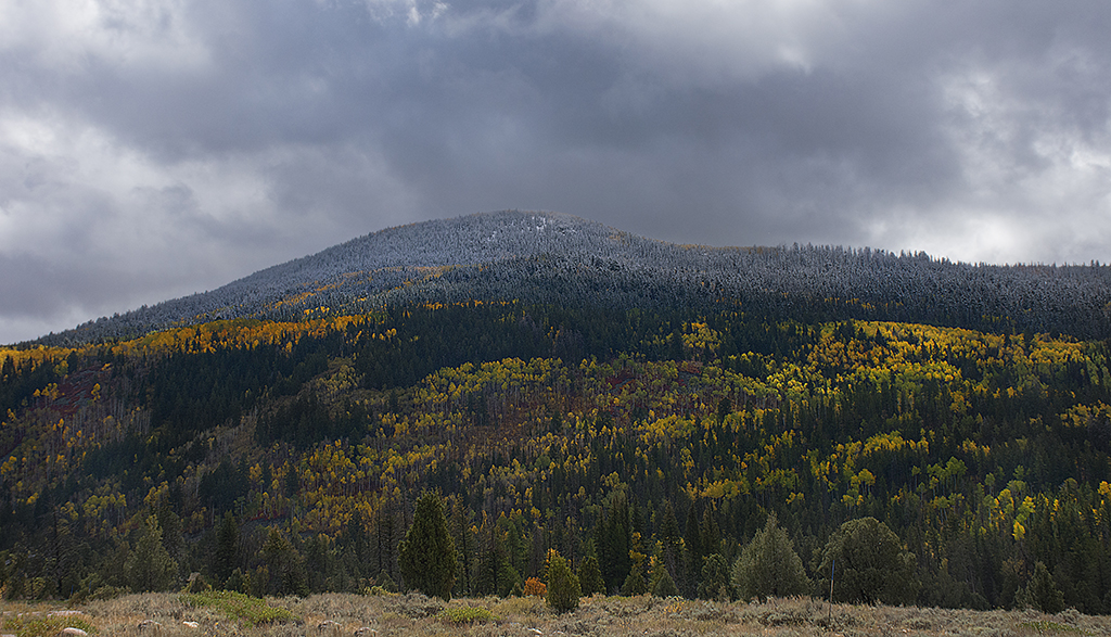
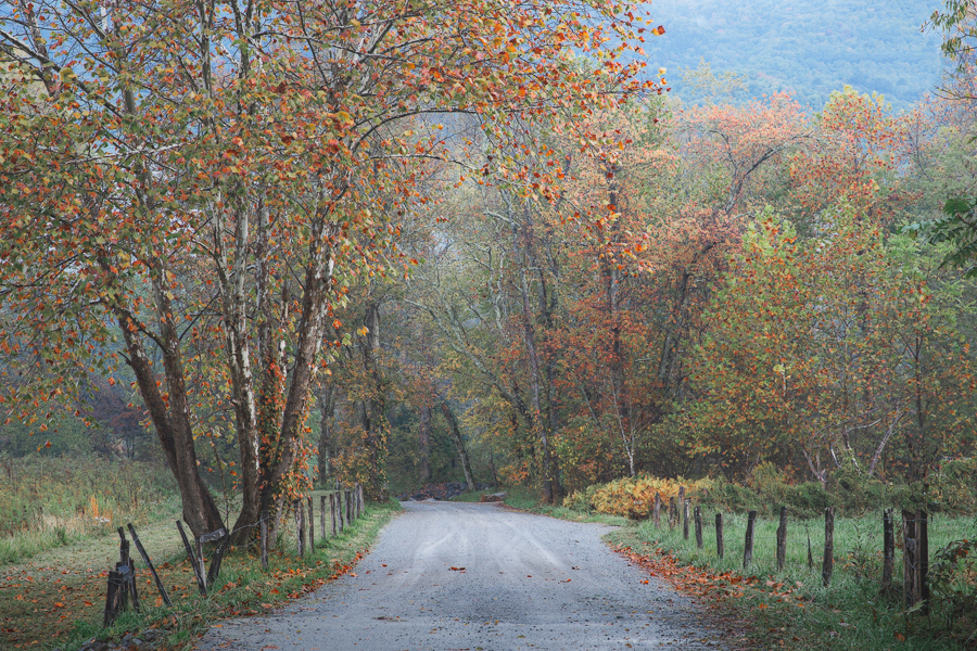
A really moody lovely fall image! I read the comments and I agree the road is too bright in the foreground. I like Diane's suggestion to use a linear gradient and I tried it on your image with Photoshop using a gradient mask on a brightness adjustment layer. Here is the result. |
Jan 15th |
 |
7 comments - 0 replies for Group 36
|
7 comments - 0 replies Total
|