|
| Group |
Round |
C/R |
Comment |
Date |
Image |
| 36 |
Jan 22 |
Reply |
That's a pretty good idea! |
Jan 13th |
| 36 |
Jan 22 |
Reply |
I will give that a try, thanks! |
Jan 13th |
| 36 |
Jan 22 |
Reply |
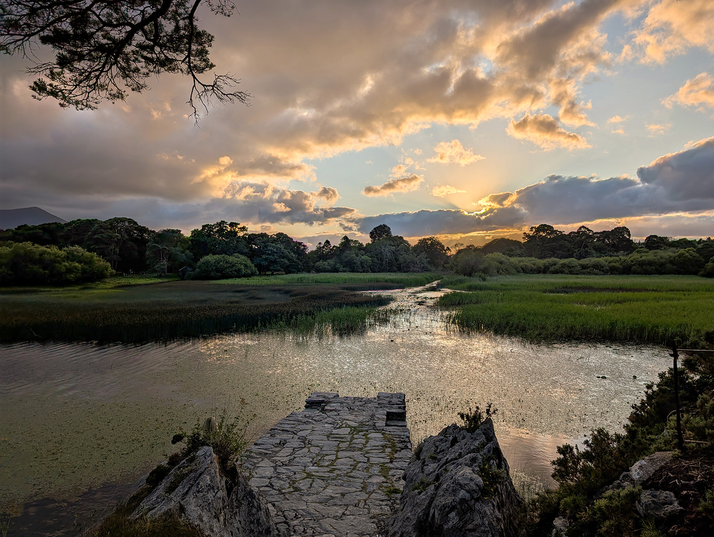
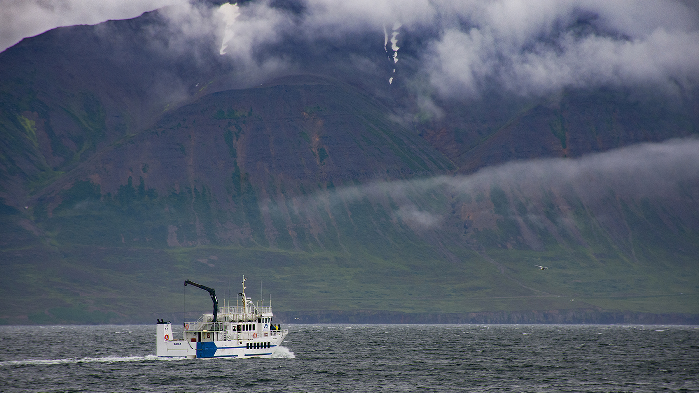
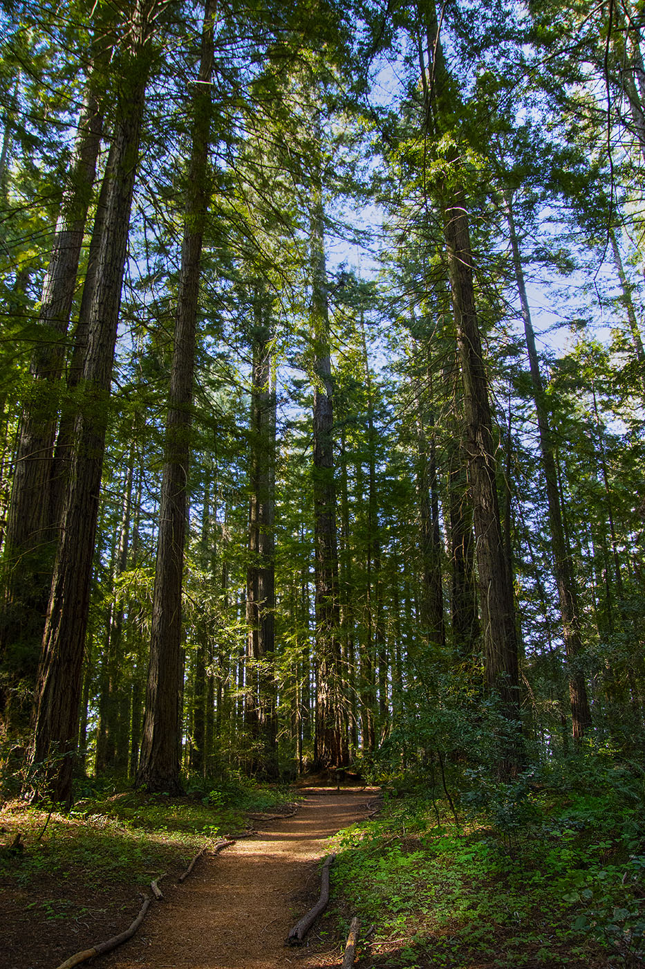
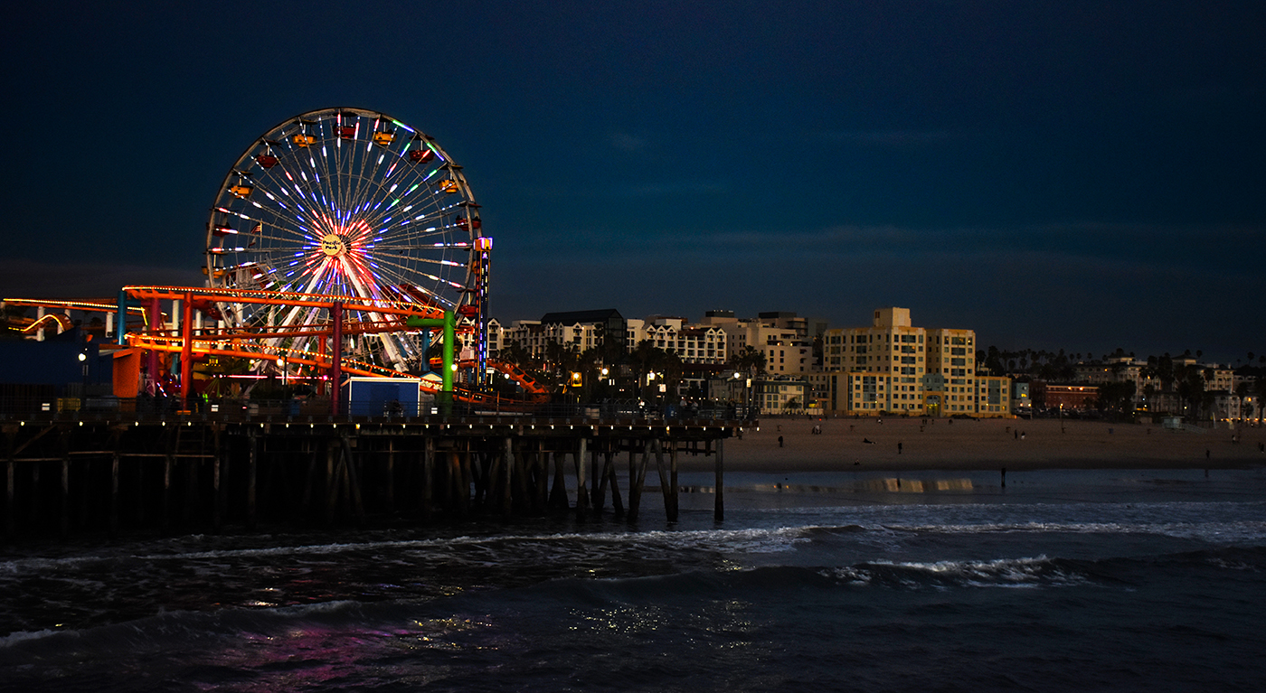
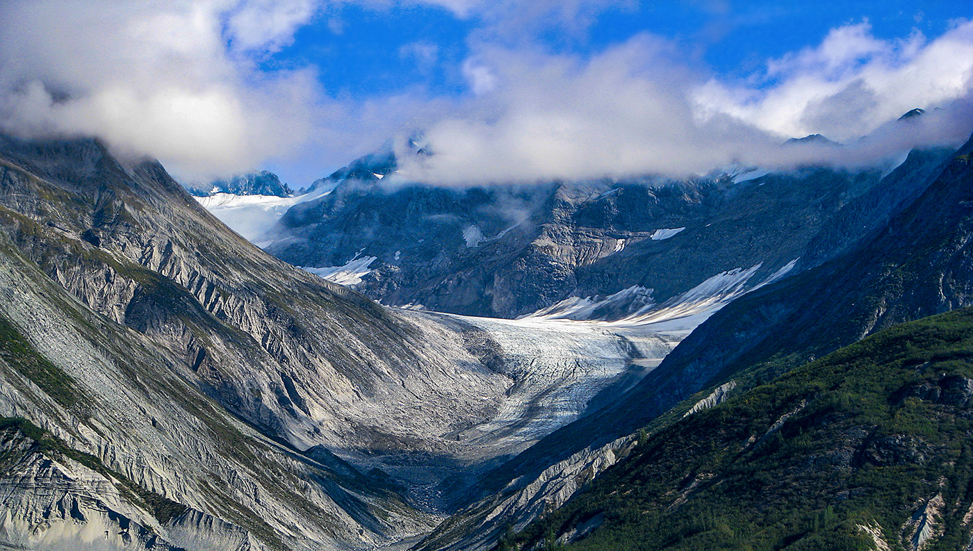
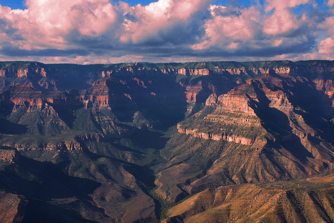
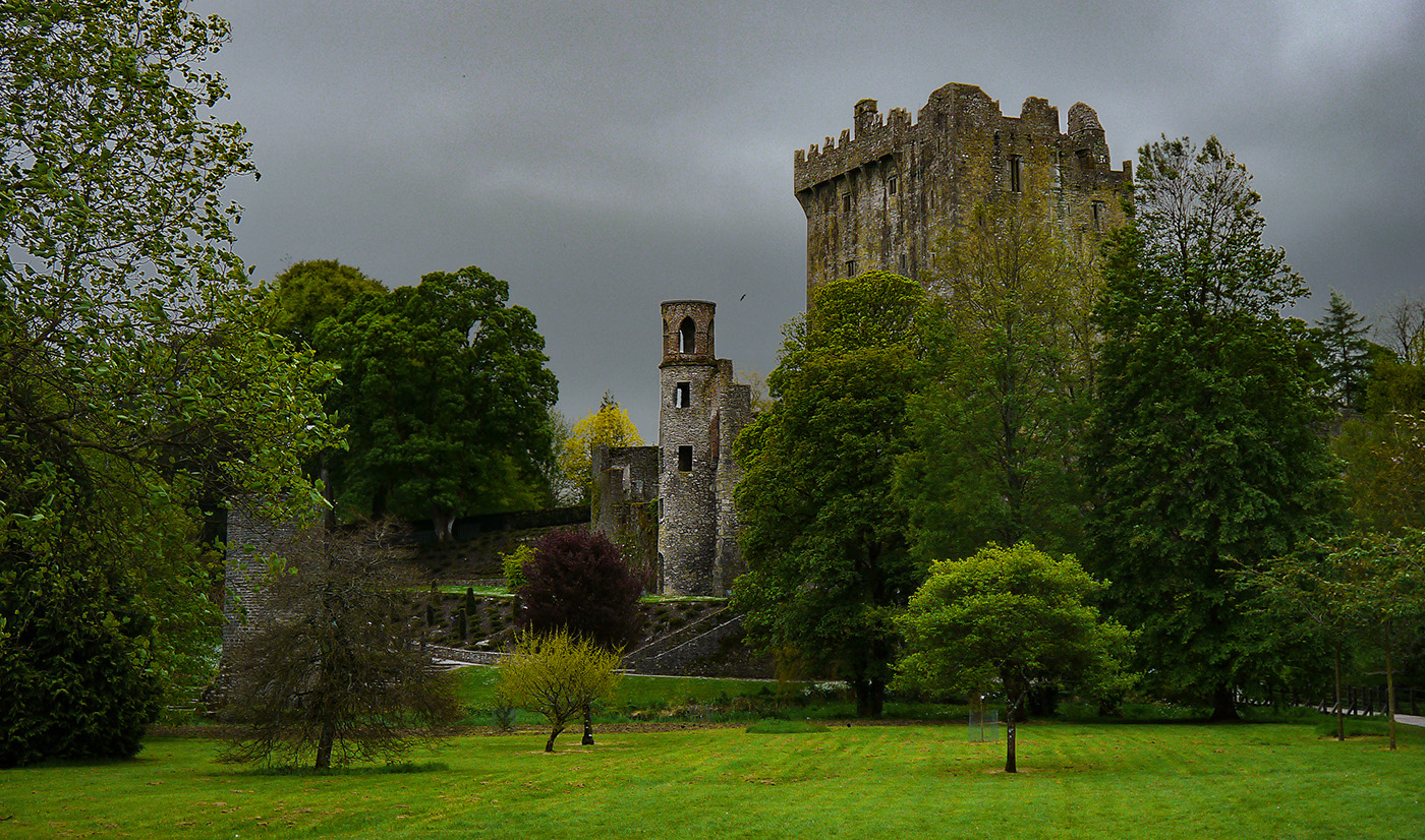
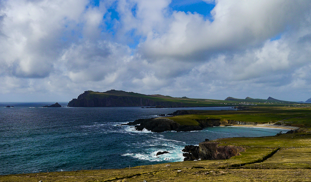
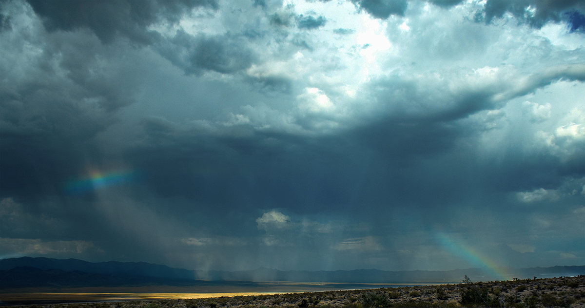
I actually had the wrong camera settings in my description, see below. At this point I would definitely have used different settings and may varied them a bit more. At the time I was going for max depth of field and used ISO to compensate. I could have also slowed down the shutter. I was handheld in a pretty windy environment and I was a little afraid of getting camera shake though. It would have been nice to have a tripod, but we really didn't have room to pack one. I think a monopod would be a good compromise on our next trip. |
Jan 13th |
| 36 |
Jan 22 |
Comment |
I made a little mistake in my info above for the shot. Here is the correct camera settings. Canon D7200 18 mm, F/15, 1/1000 sec, f/14, ISO 1000. |
Jan 13th |
| 36 |
Jan 22 |
Reply |
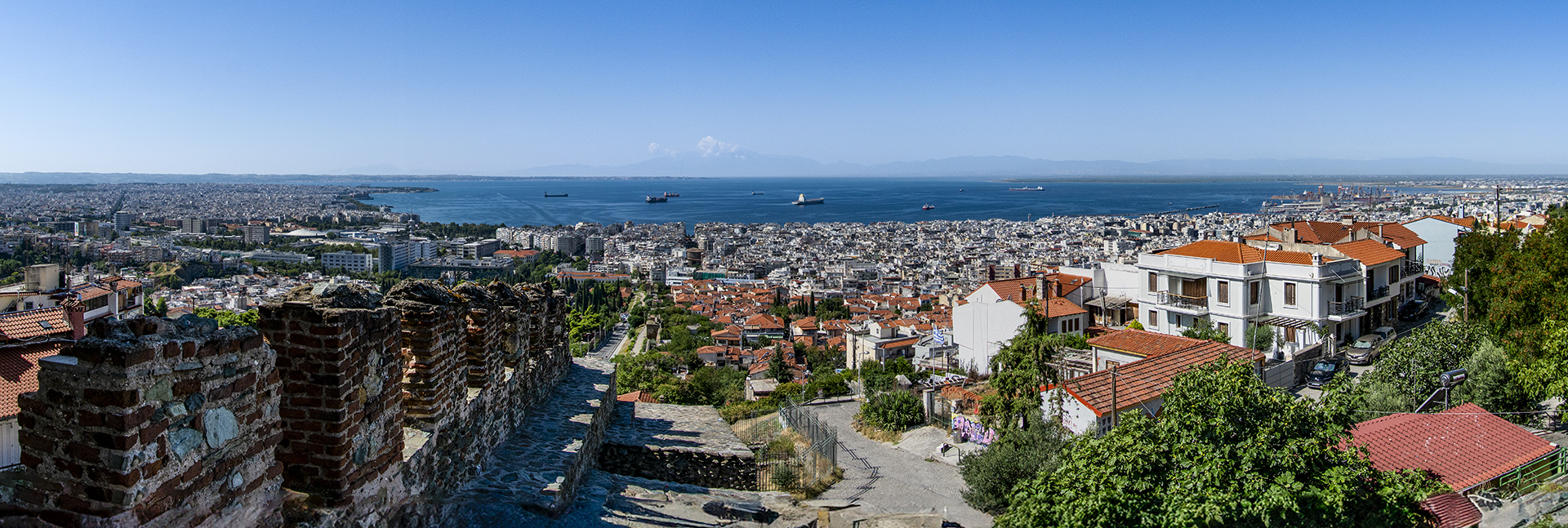
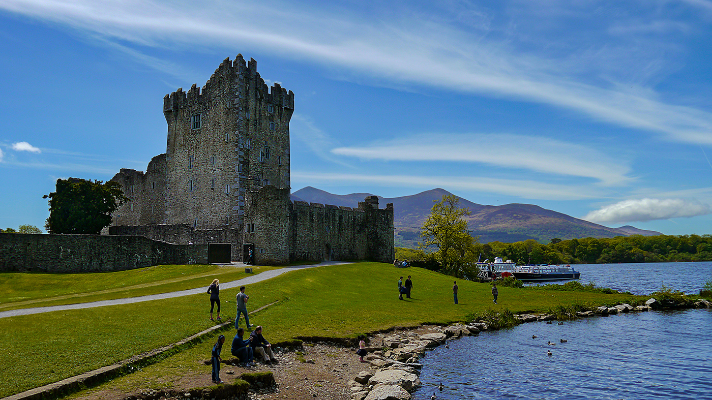
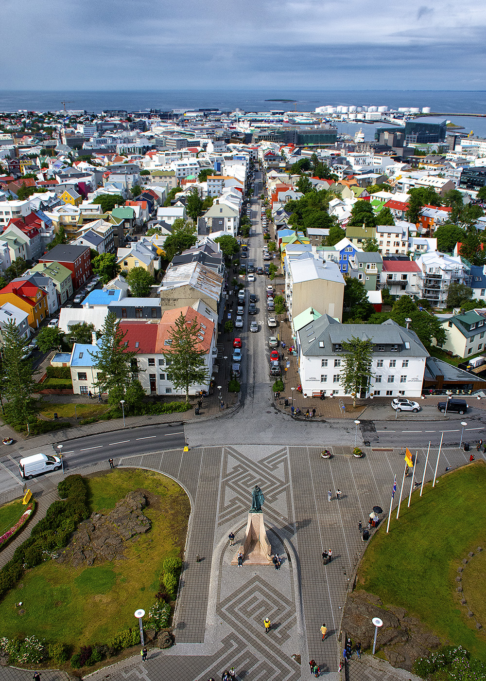
There were a bunch of groups there, but some of our people were definitely in that bunch. We went with a company called Overseas Adventure Travel (OAT). |
Jan 13th |
| 36 |
Jan 22 |
Comment |
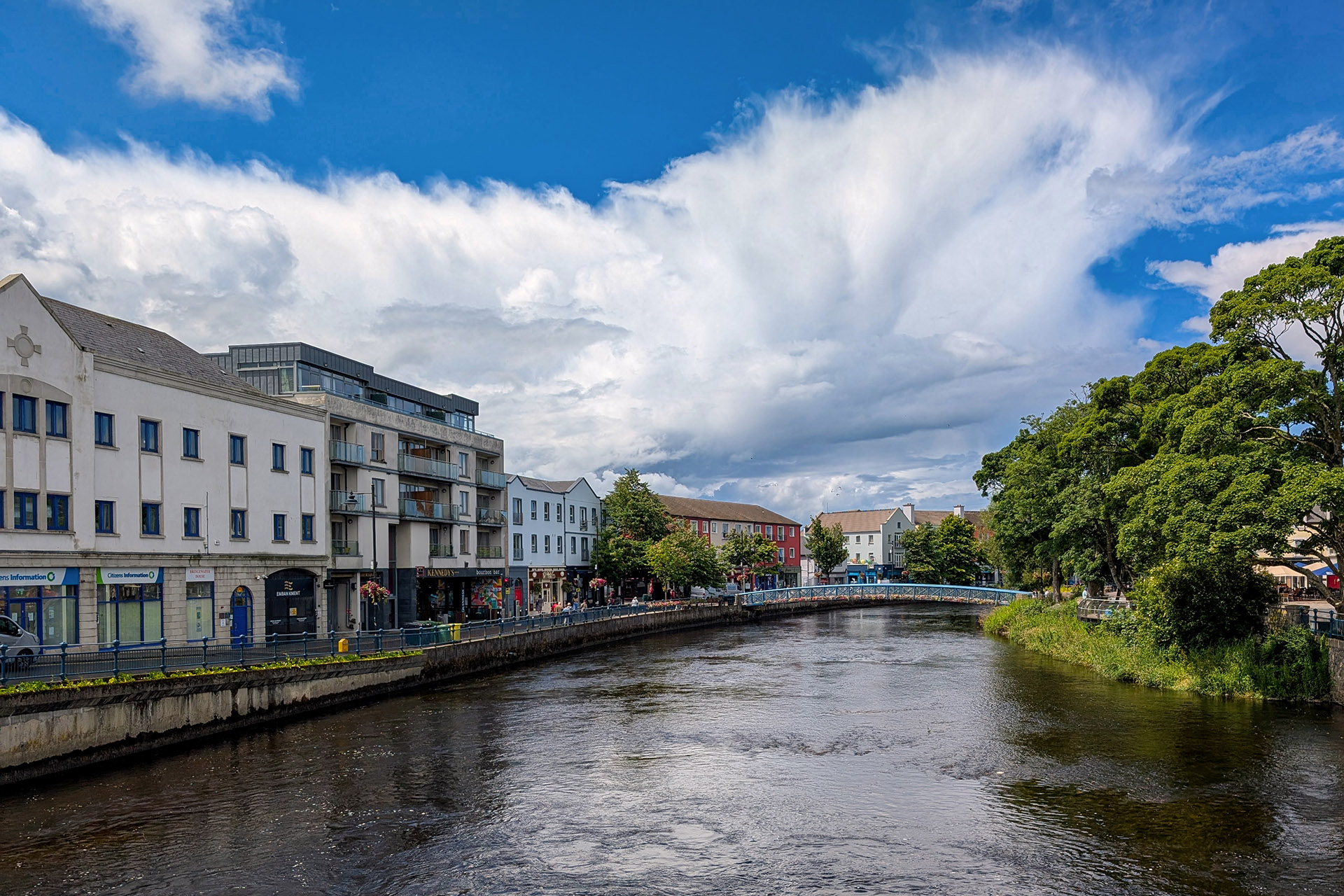
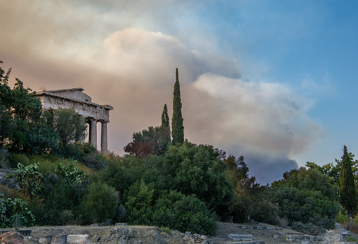
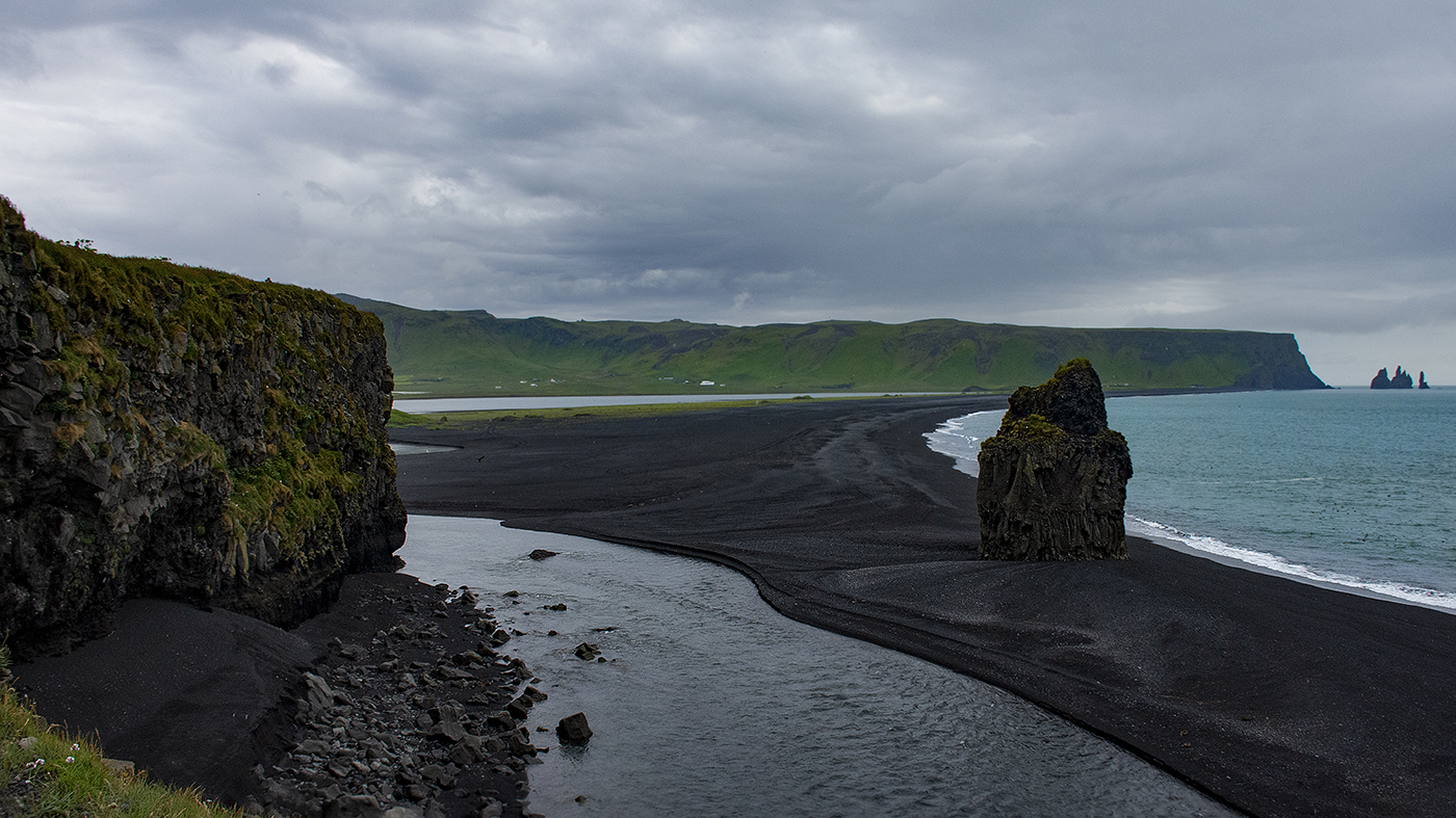
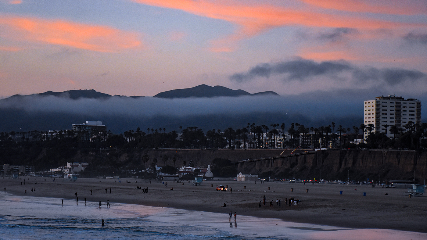
That's a really dramatic image! Good job with the sky. Creating a mask for the sky can be really tricky and halos are hard to avoid. The latest version of Photoshop has a select sky feature, which does a pretty decent job, even with trees, although it is not perfect. I like Larry's suggestion of cropping the bottom, but I would not do quite as much as his example. I would crop just above where the last sand patch is in the rocks, since I do find the rocks have a lot of interest. I also agree with Michael that the lighthouse could be brightened. |
Jan 13th |
| 36 |
Jan 22 |
Comment |
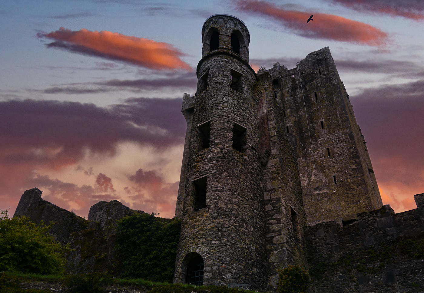
That's a fascinating view of the Forbidden City, and one I have never seen. I like the others comments, particularly Larry's about making it a panorama. I also noticed some of the sky is a little blow out, so you might want to darken it a bit and see if you can restore some of the detail to it. |
Jan 12th |
| 36 |
Jan 22 |
Comment |
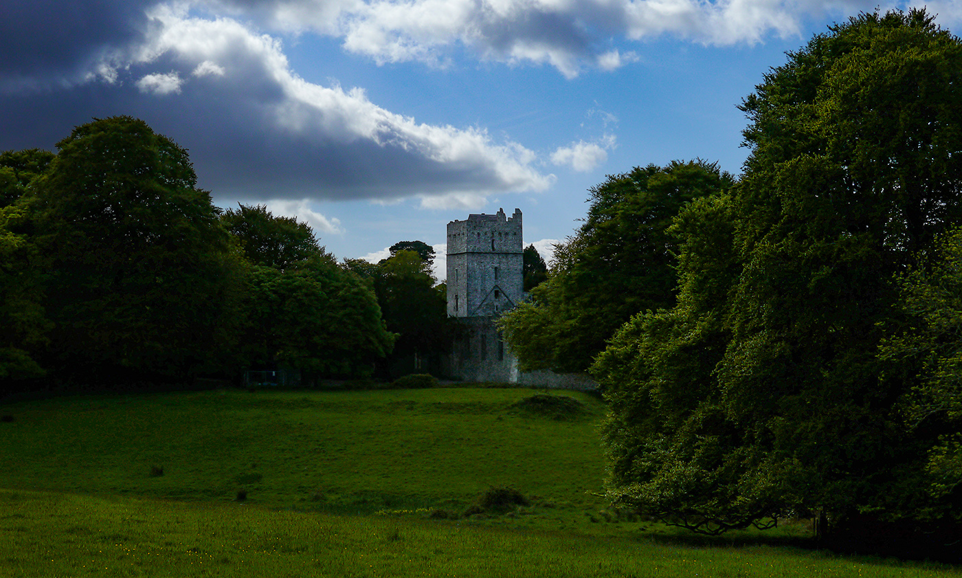
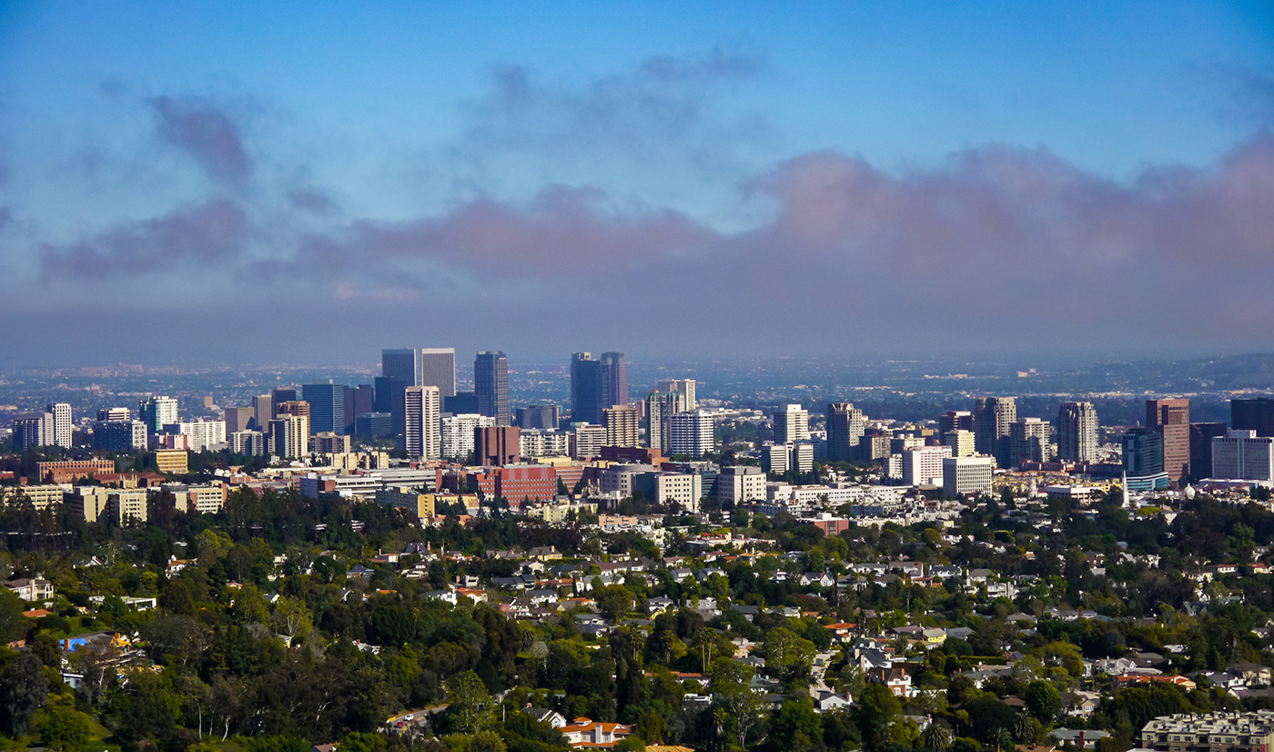
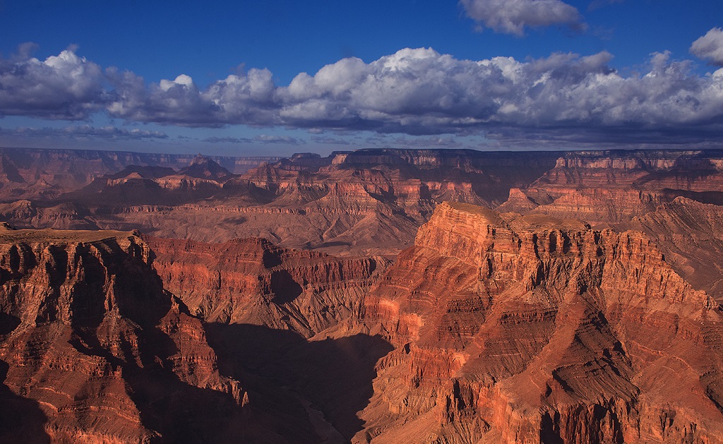
Black and white is a good choice for the image. It has a somewhat moody feel. I'm not sure if it would be improved with contrast. My eye is drawn to the school, so I would not change the lighting on the other buildings. I also like how you dodged and burned the buildings somewhat unevenly. It adds to the mood of the image. |
Jan 12th |
| 36 |
Jan 22 |
Comment |
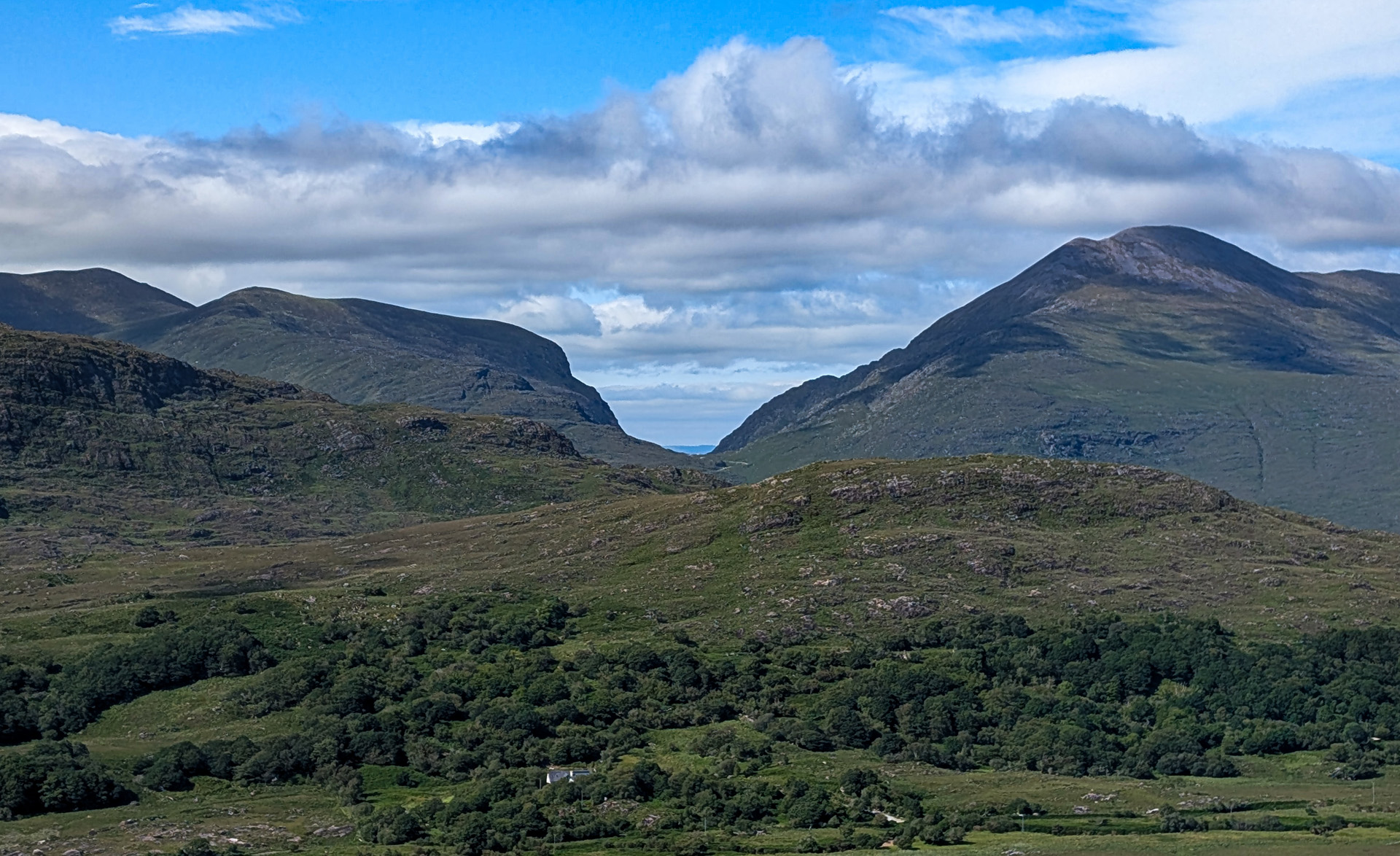
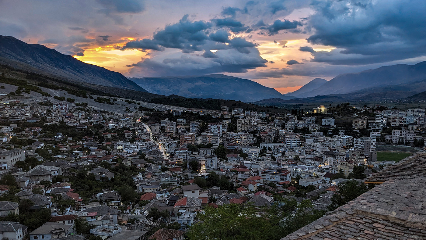
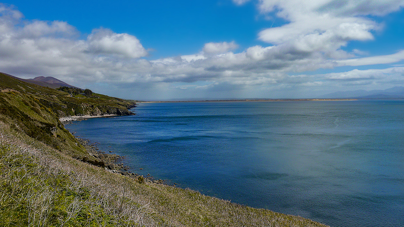
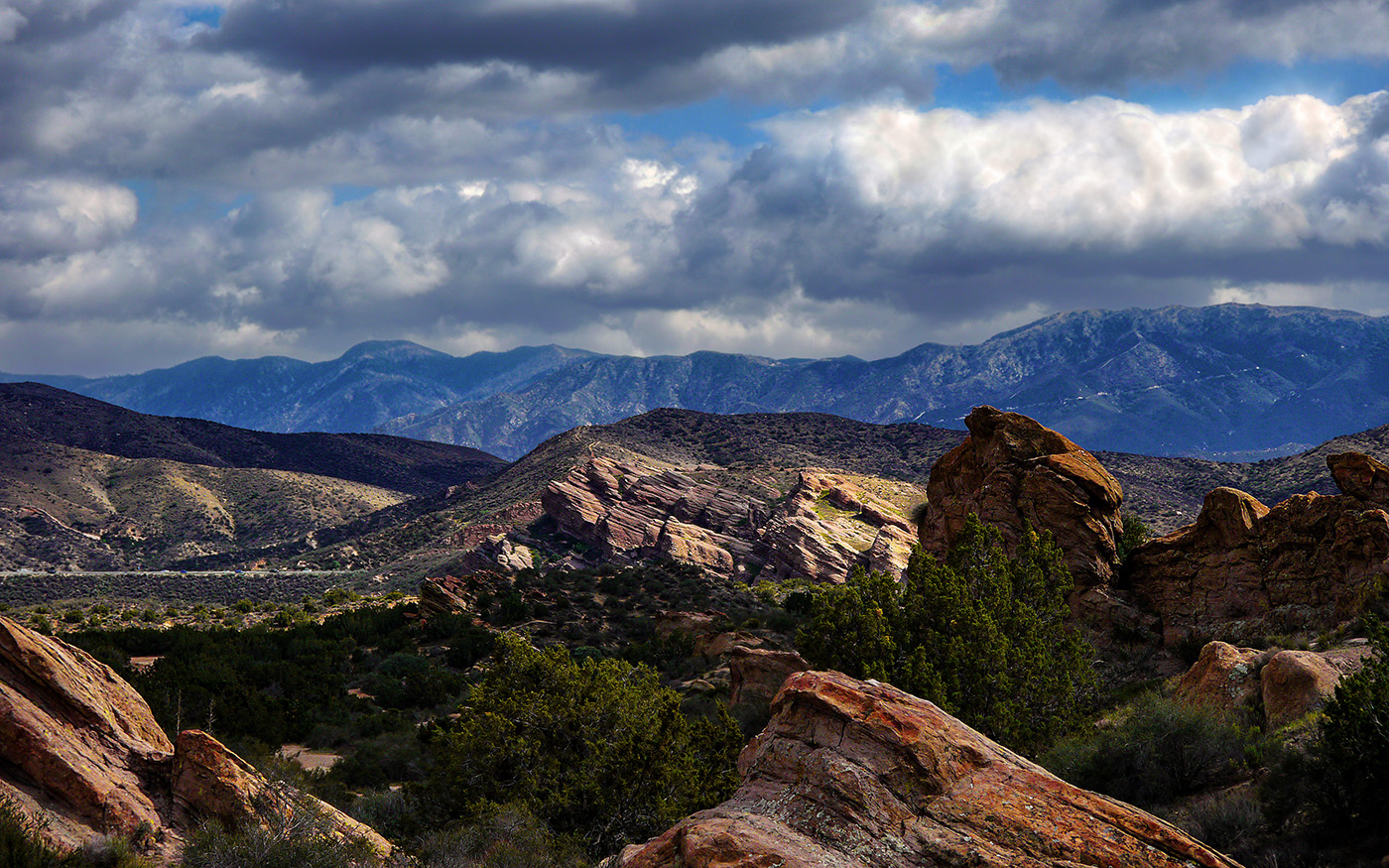
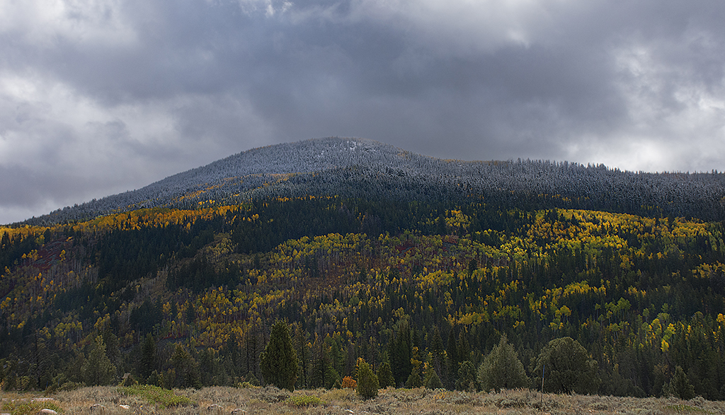
I love the golden glow of the sunrise on the mountains. I would have guessed from just looking at the image, that the mountains are the subject. I wonder if the image would be better without so much of the foreground, since it is very dark. The contrast is nice with the mountains, so I would keep some of it. You would have to play around with where to crop it. |
Jan 12th |
| 36 |
Jan 22 |
Comment |
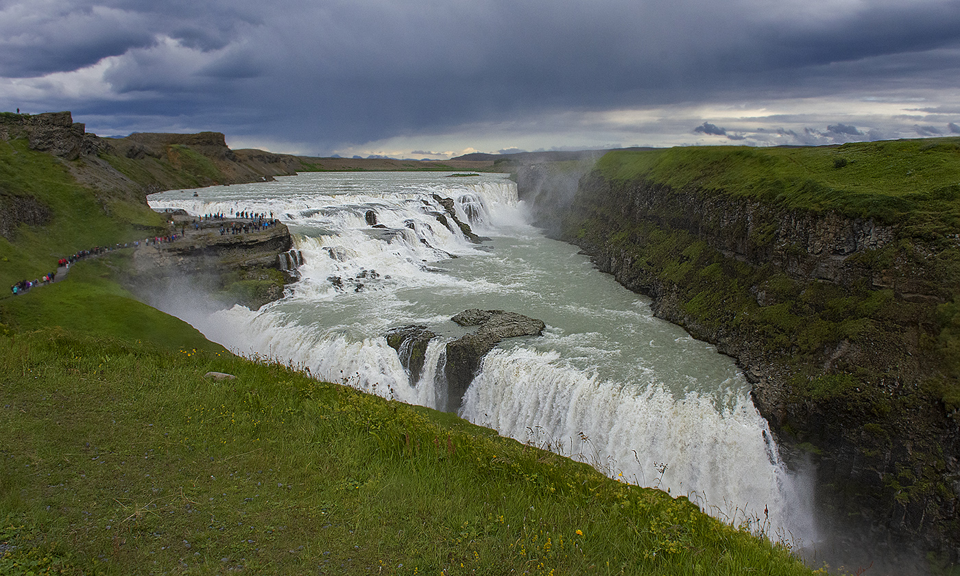
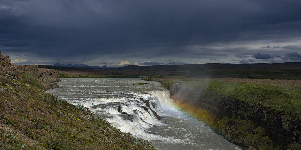
It's always a pleasure to look at your images, Larry. I love the how the water reflects the falls. I like Arne's suggestion of a vignette. It's just a nit, but the rocks at the top of the falls are a little too bright for my eye. |
Jan 12th |
| 36 |
Jan 22 |
Comment |
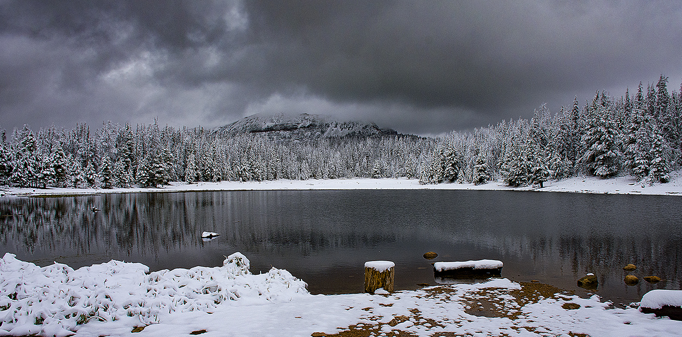
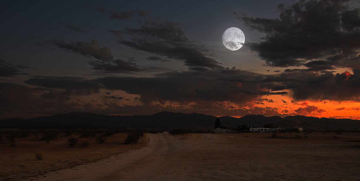
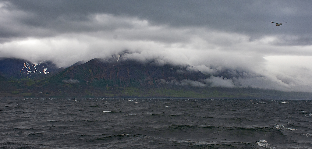
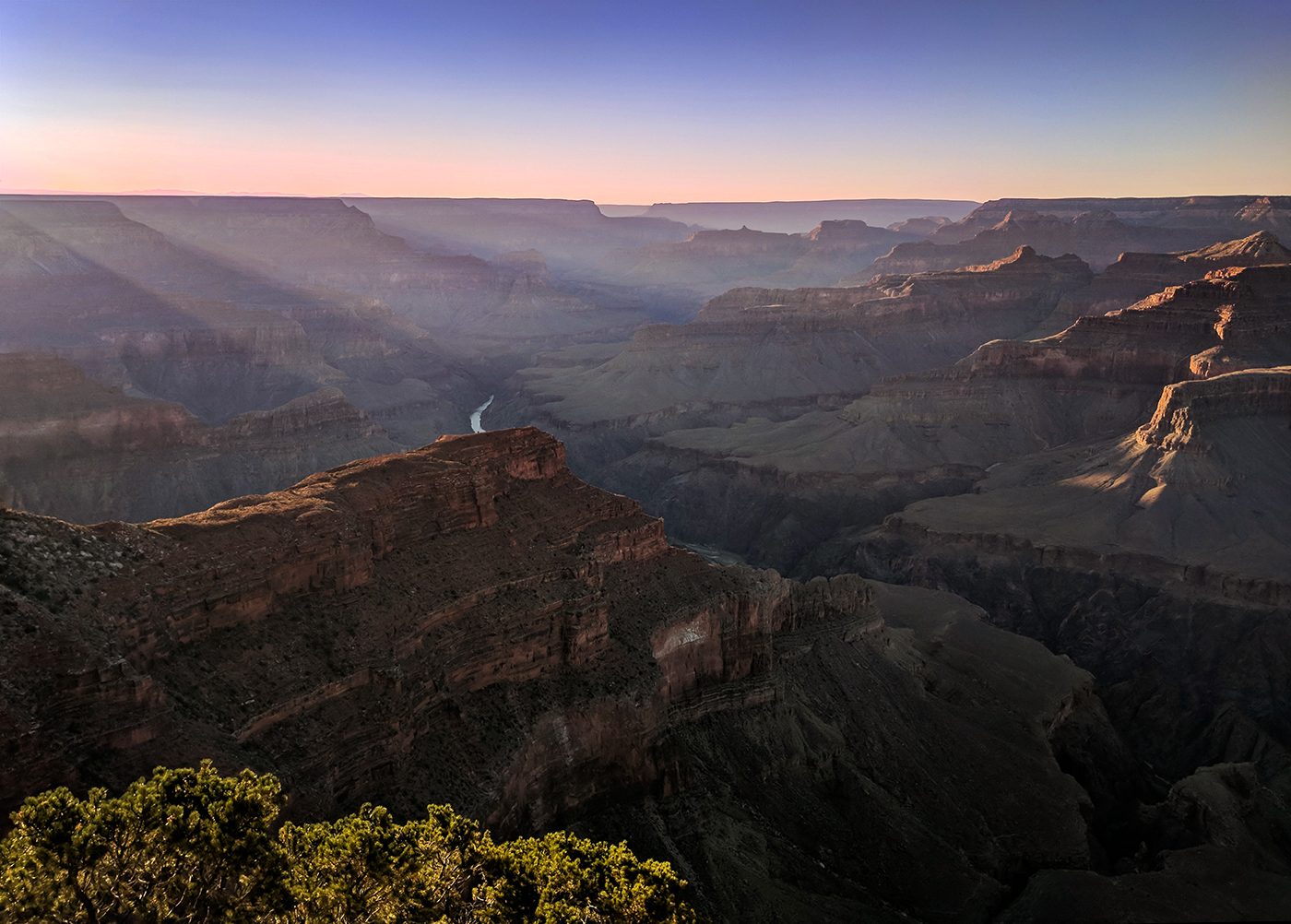
I really love the ethereal quality in this image. I like the suggestions everyone has made. I actually had never heard of an Orton effect, Michael, but I look it up and it does look interesting. Another thing to try to decrease the brightness of the sky and ground would be a light vignette, not do heavy, just enough to decrease the brightness surrounding the subject. |
Jan 12th |
7 comments - 4 replies for Group 36
|
7 comments - 4 replies Total
|