|
| Group |
Round |
C/R |
Comment |
Date |
Image |
| 36 |
Dec 21 |
Comment |
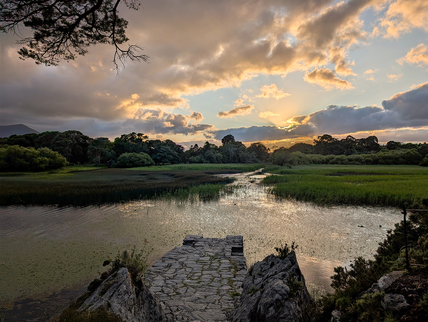
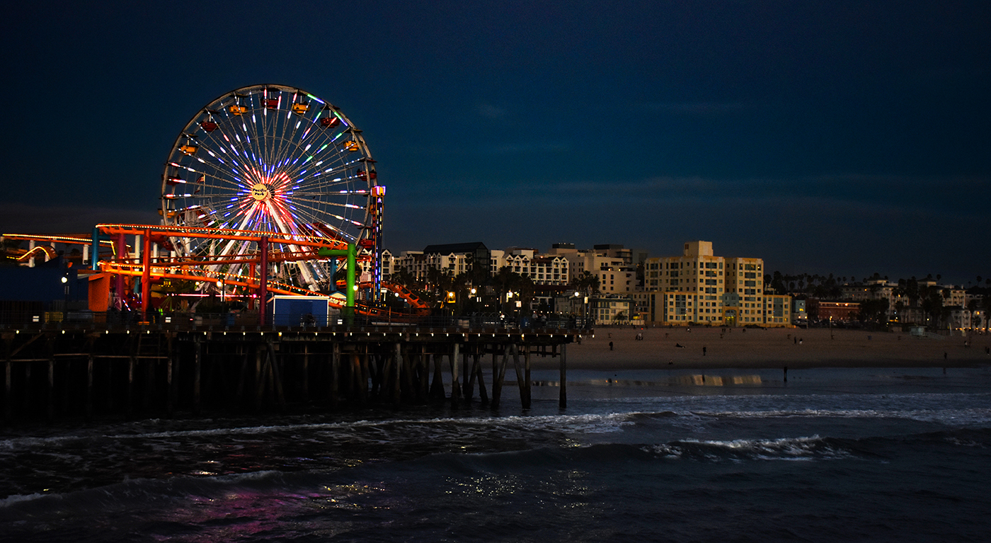
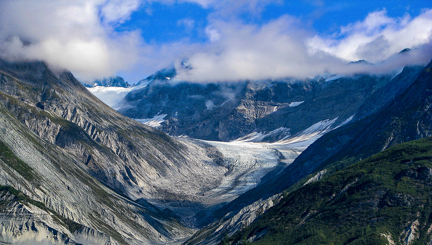
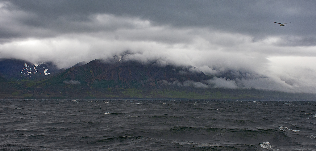
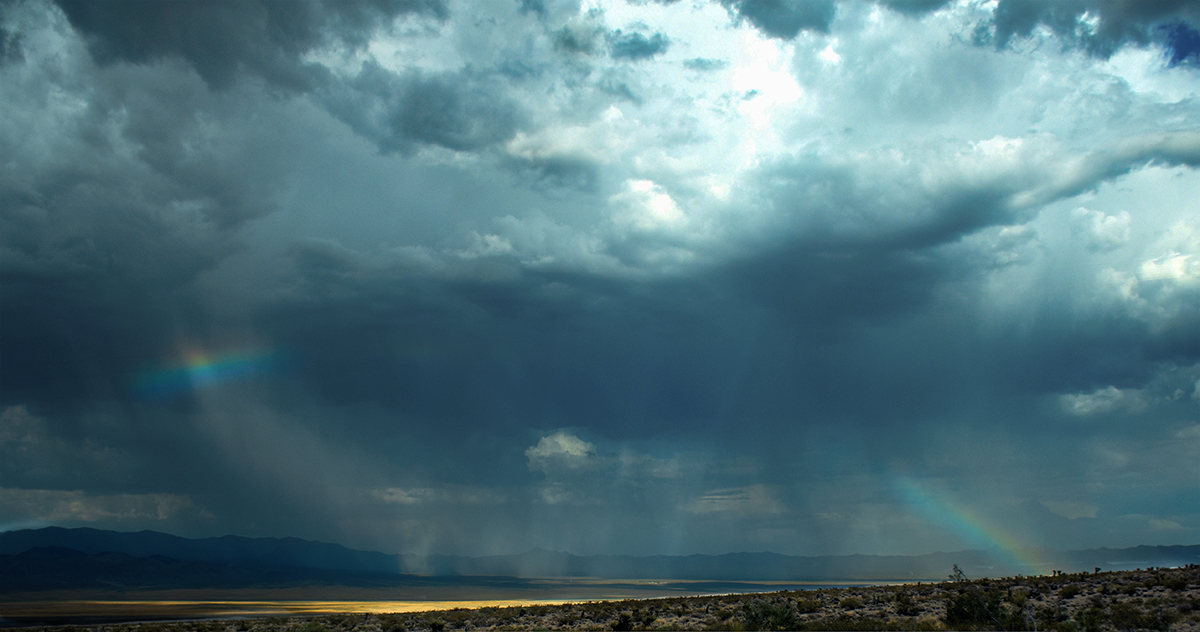
Thanks for all your comments. I took them into account and reworked the image. The sky replacement had added a curves adjustment layer that was primarily magenta so I took that out. I also masked out the water a little so it would retain more of its original color. I also added a warming filter matched to the color of the orange part of the sky to bring more orange out in ground and mist. The foreground mist is still somewhat magenta. This is because the flipped sky is magenta in this area, not orange. You cannot see this part of the sky on the image because it is cropped out and is above the crop. |
Dec 16th |
 |
| 36 |
Dec 21 |
Comment |
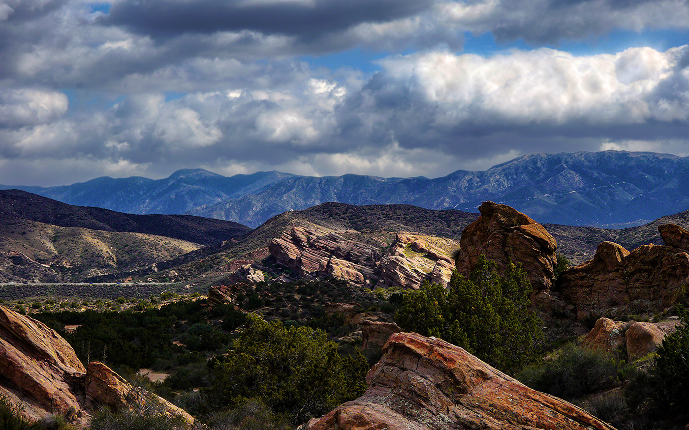
I like the drama in this image. I agree with the comments about darkening the foreground. The sky does appear to be a bit noisy. I have this problem sometimes when I increase contrast on a sky. This solution I have used is to duplicate the layer, and noise reduction and subtly brush it in with a soft white bush on a black mask and playing with the opacity settings. |
Dec 16th |
| 36 |
Dec 21 |
Comment |
This is a good image, but I agree with the others, it needs to be toned down, probably by decreasing the brightness and perhaps the contrast. |
Dec 16th |
| 36 |
Dec 21 |
Comment |
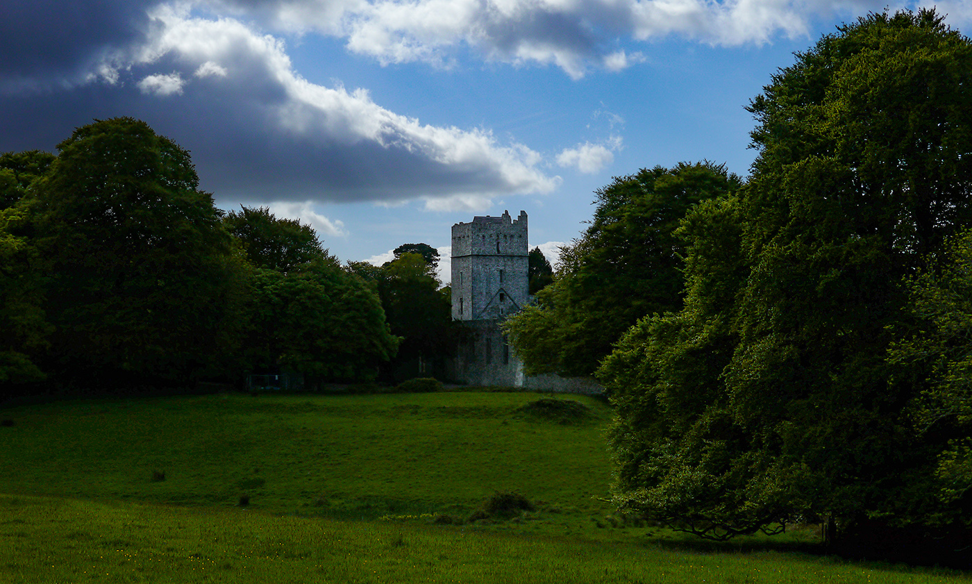
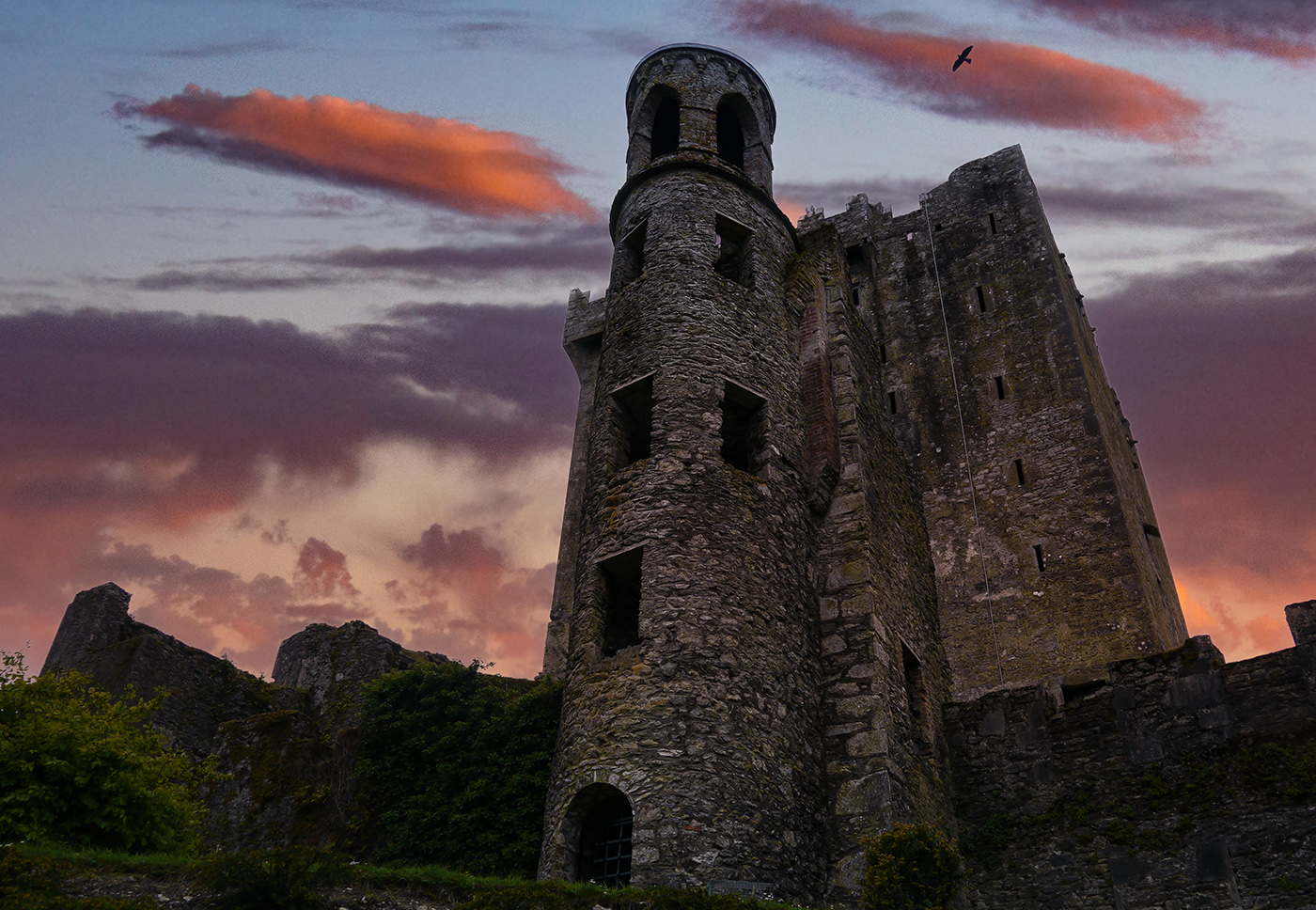
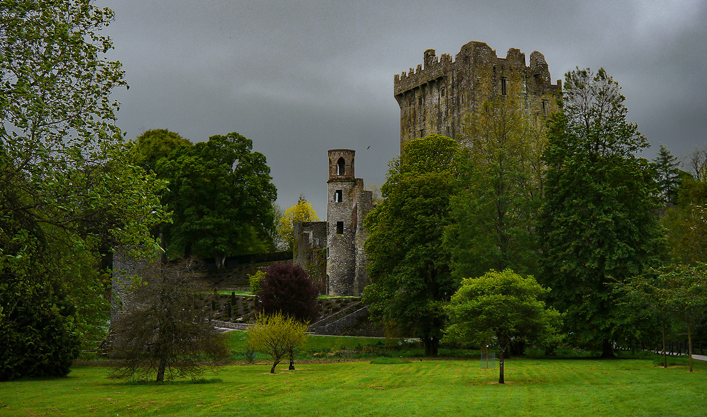
That's a great image, and reminds me of a stave church I saw near Oslo when I was a boy on a trip to Norway in 1968. I like that you did black and white and especially the treatment of the building you did with dodging and burning in Photoshop. I like Michael's suggestion of a radial gradient or vignette. My only real problem with the image is the chain link fencing around the building, which I think mars the mood of the image a little. It is unfortunate, I had the same thing happen to me when I photographed the Rock of Cashel in Ireland. They were doing some sort of restoration, and there were scaffolds and construction fences everywhere! Perhaps Larry's suggestion of a linear gradient would obscure the fence a bit so it is not so noticable. |
Dec 16th |
| 36 |
Dec 21 |
Comment |
I really love that you did this in black and white. I really captures a great mood with the sky contrasting with the textures in the tree. I like Larry's suggestion about the gradient in the lower right, I think that would bring out focus to the tree even more. |
Dec 16th |
| 36 |
Dec 21 |
Comment |
Nice image Larry! I have Photopills on my phone but have only used it for some astrophotography. I really should take a look at it to see what else it can do. I wonder if the image could be made more dramatic by doing something with the lighting. There is an interesting play of light in the trees in the background. |
Dec 16th |
| 36 |
Dec 21 |
Comment |
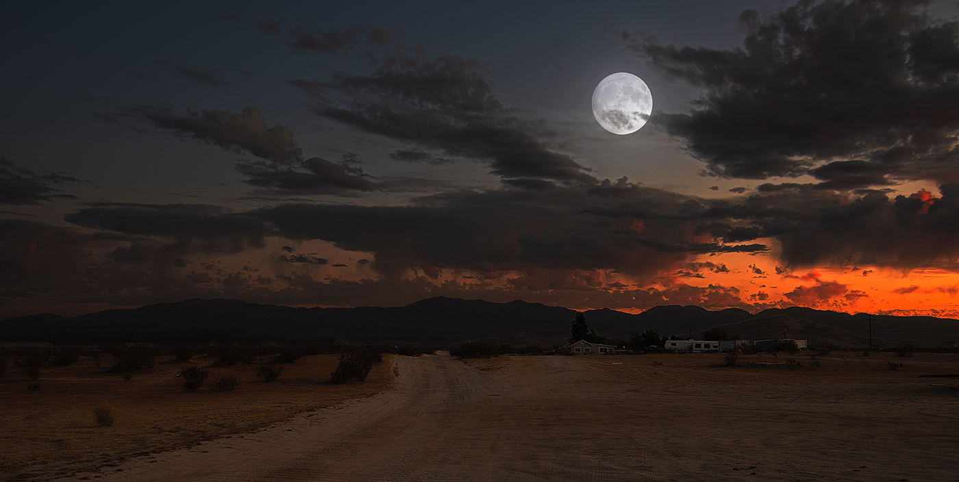
Wow, that's a really great image. I love the color and size of the moon. I agree with Larry, I think the image would be improved by increasing the color on the trees. I would personally increase saturation/vibrance, but I'm not super familiar with Lightroom since I use Photoshop pretty much exclusively. |
Dec 16th |
7 comments - 0 replies for Group 36
|
7 comments - 0 replies Total
|