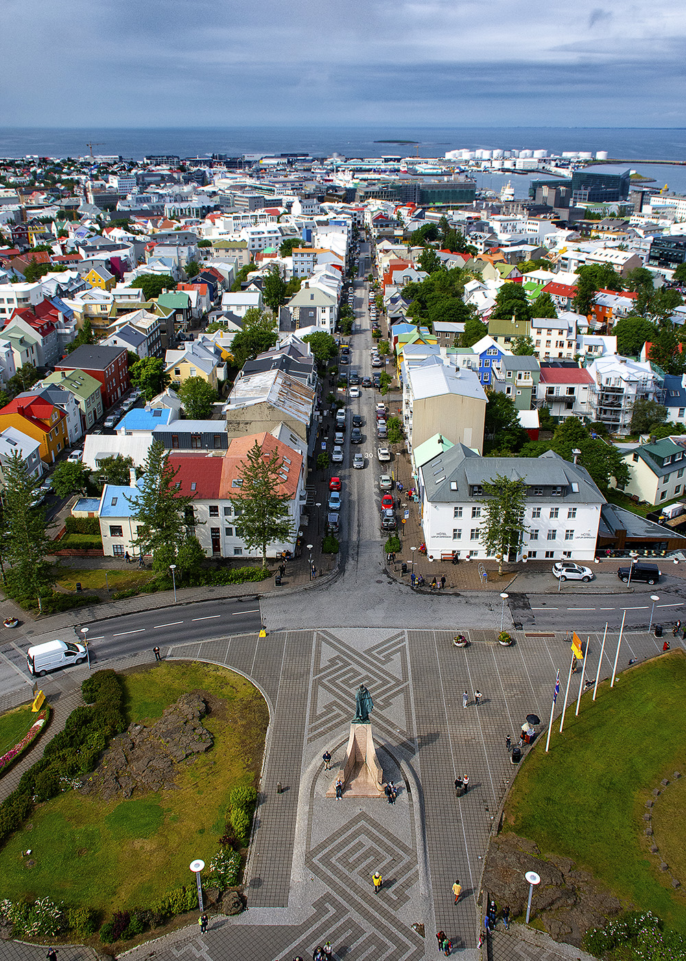
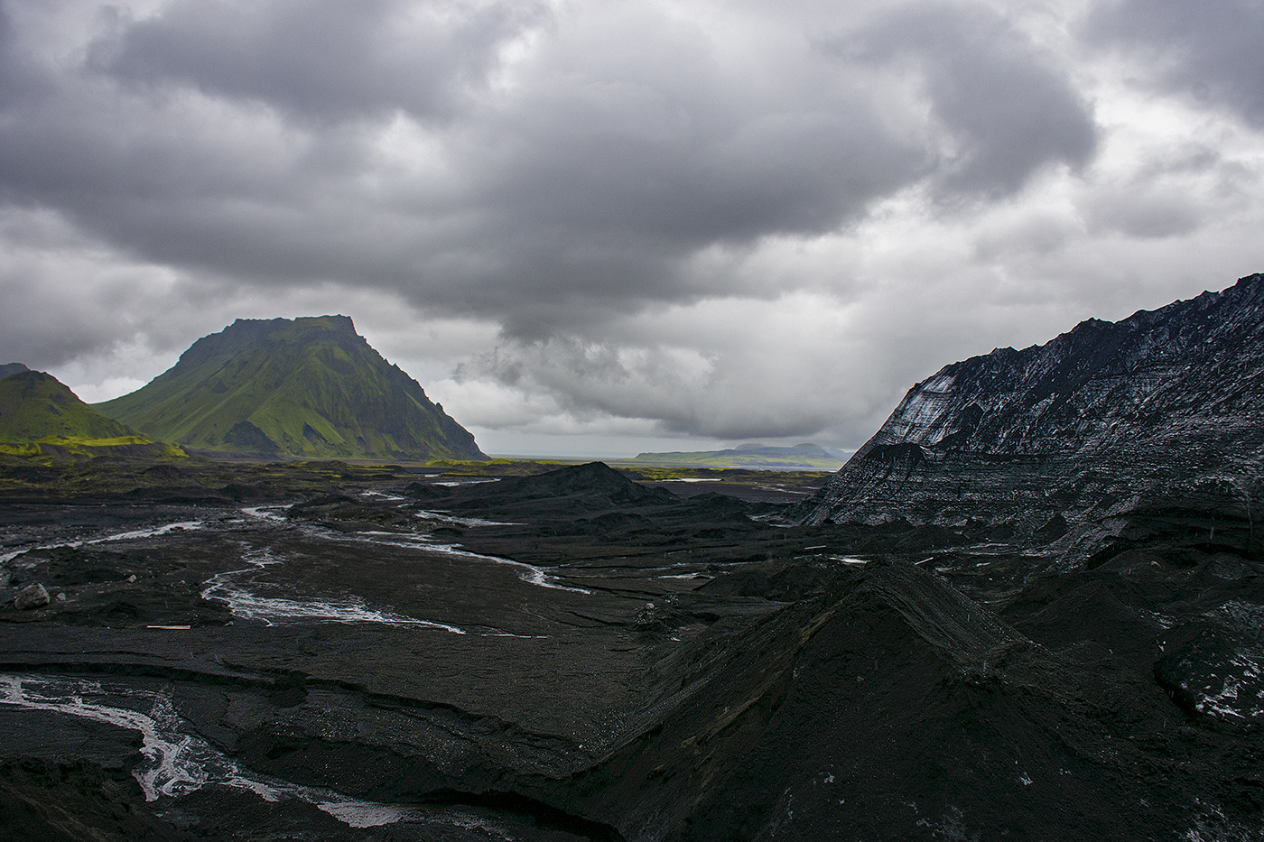
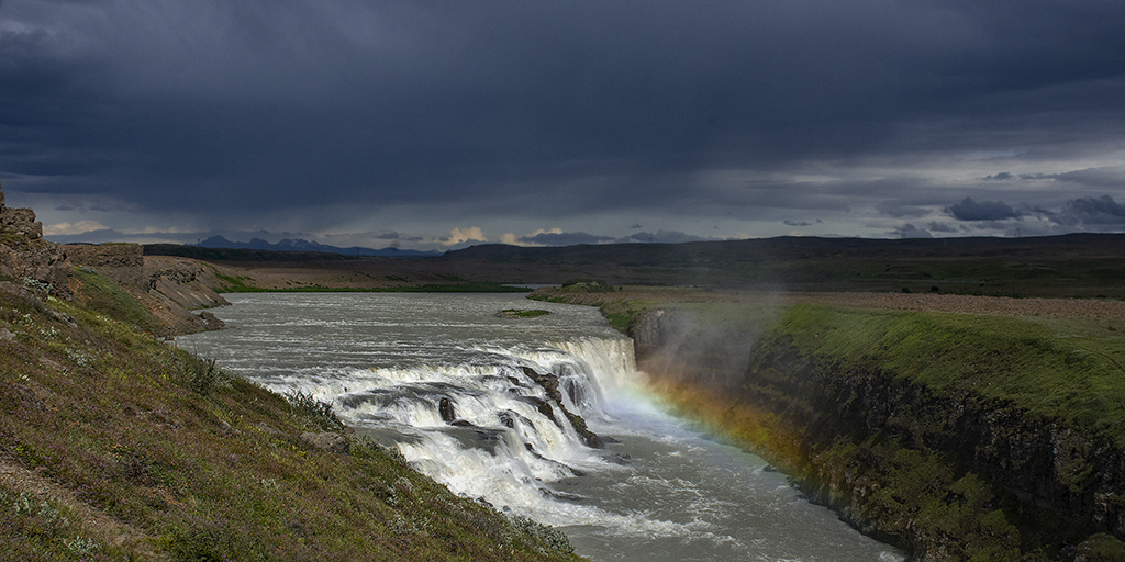
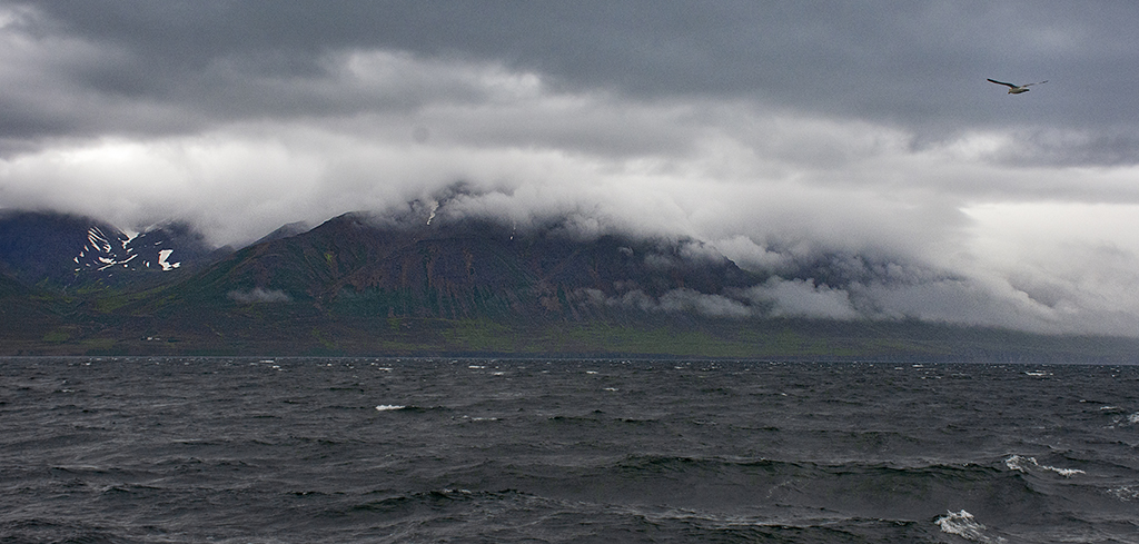
|
| Group |
Round |
C/R |
Comment |
Date |
Image |
| 36 |
Nov 21 |
Comment |
I love this image, particularly the two drops of water on either side of the bud, picking up the sky. I agree that it is a little soft, however this can easily be fixed in Photoshop with a little selective sharpening. I had a similar problem a few years ago shooting flowers in macro. In my case, the problem was I had to shoot at 1/60 because of my lighting and I shooting at around F/20 to get depth of field. I did not know to lock the mirror up and Even though I was on a tripod the vibration of the mirror was enough to make every image blurry. Annoyingly, in camera the images looked good and it wasn't until I got them into a bigger display that the problem became apparent. I was able to fix some of these images with the same technique, and this image is not nearly as soft as those were. |
Nov 4th |
| 36 |
Nov 21 |
Comment |
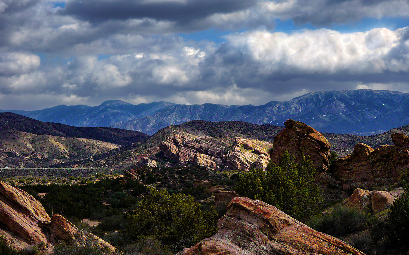
This is a very good image, particularly given there is almost no post processing, particularly the detail of the sky. The only thing I might do is slightly sharpen the foreground stones and foliage to bring out some more detail in them. There are some interesting patterns of moss and lichen on the stones. |
Nov 4th |
| 36 |
Nov 21 |
Comment |
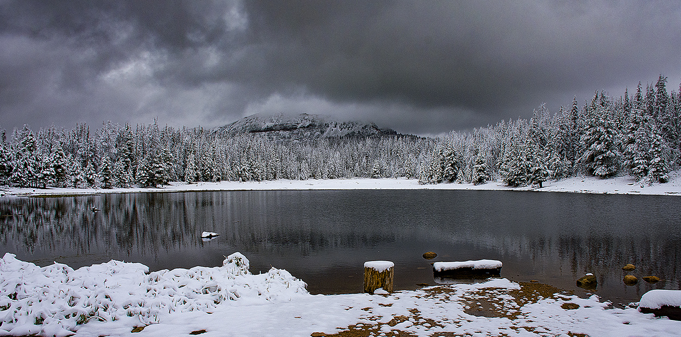
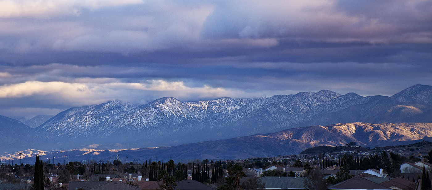
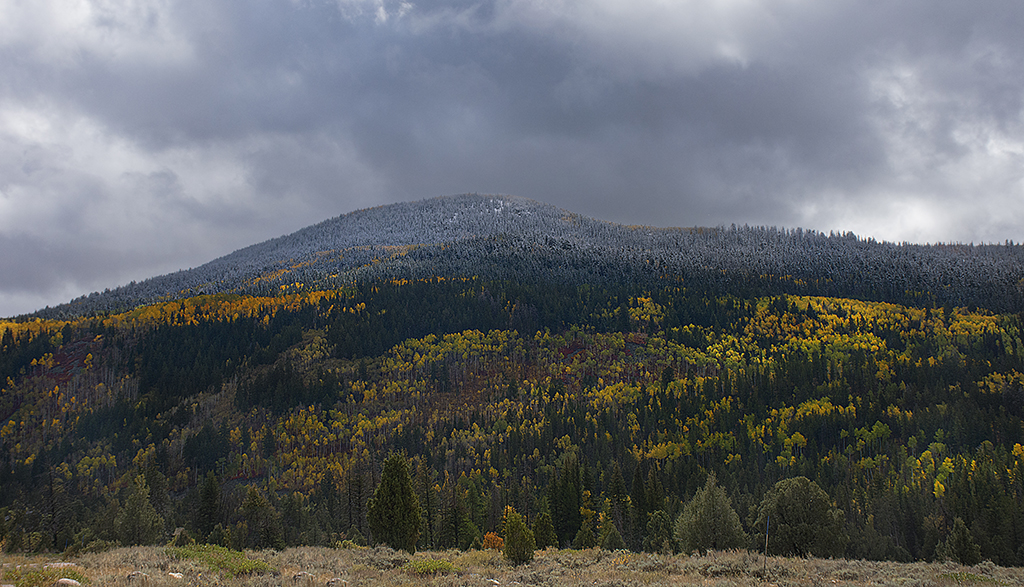
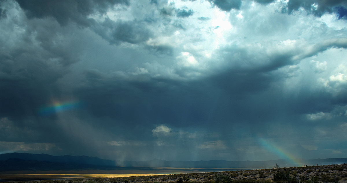
Very nice winter scene. I do notice the my eye goes to the sky first, since it is so bright. It might be improved by changing the tone curve manually as you mentioned above. |
Nov 4th |
| 36 |
Nov 21 |
Comment |
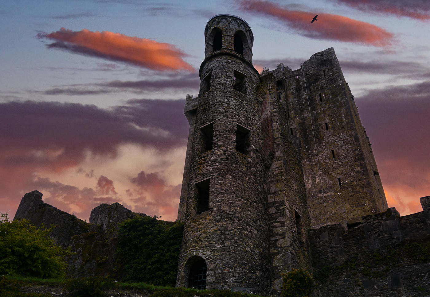
This is a really interesting image. When I first looked at the thumbnail, I saw Gandalf holding his hat, perhaps in Mirkwood. After reading your description I do see where it could also be the Madonna holding her child. I agree with Michael about the Modonna's position, it does not significantly impact the image. One thing you might want to try is reducing the brightness of the trees even more, perhaps as much as 1/2 the current level, to really accentuate the Madonna. Just a though, I'm not sure it would work. Overall this is a really great image. |
Nov 4th |
| 36 |
Nov 21 |
Comment |
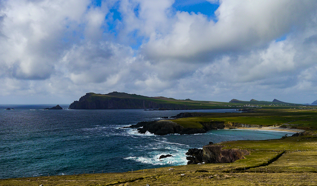
Black and White is not my forte either, so take my comments with a grain of salt. Overall I like the image. The seawall in the middle of the image does not really bother me, it creates a nice leading line into the rock, sea and sky. I think if you added a little more contrast to the sky, it would increase the emotional impact of the image. The sea is a little flat, since you used a low shutter speed to blur the water, so adding contrast in the sky would offset that flatness. The other thing you might want to consider is slightly sharpening the first 3 pilings and the foreground portion of the seawall. Nice work! |
Nov 4th |
5 comments - 0 replies for Group 36
|
5 comments - 0 replies Total
|