|
| Group |
Round |
C/R |
Comment |
Date |
Image |
| 36 |
Sep 21 |
Comment |
Big Sur has so many photogenic areas, as this image shows, and it has been years since I have been there. I like Barbara's suggestion about cropping the image to 16:9. Parts of the sky are very bright, and are drawing my eye away, so I would tone down the highlights in the sky. The same thing is happening with the water, so I would darken that and perhaps increase saturation, particularly the greens and blues to bring out the color near the shore which is very pretty. I would also increase the saturation of the yellow flowers on the hill to bring them out a bit more. Finally I would slightly brighten the sea stack, and the mist and the horizon. |
Sep 14th |
| 36 |
Sep 21 |
Comment |
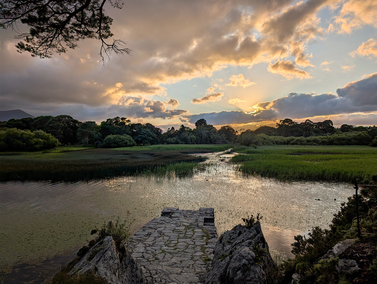
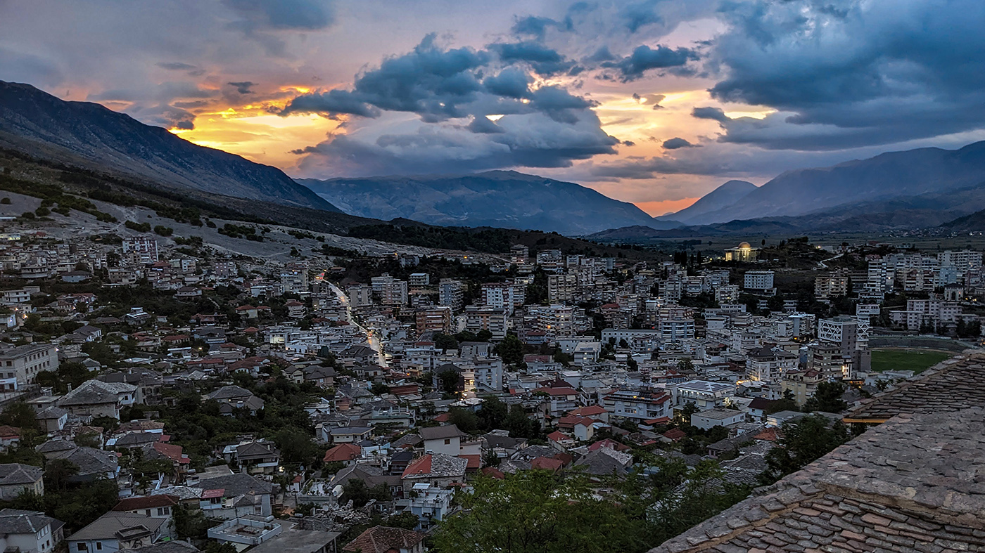
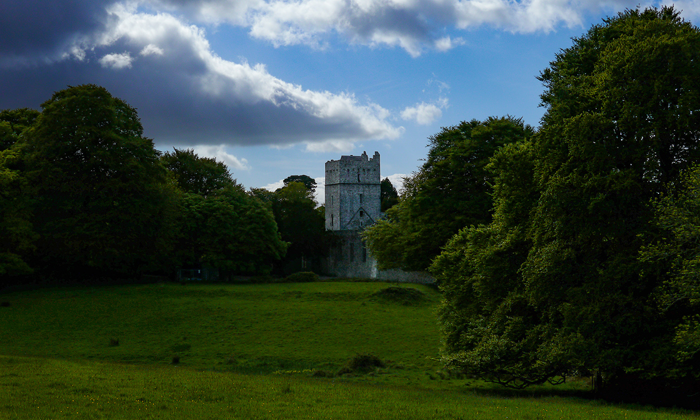
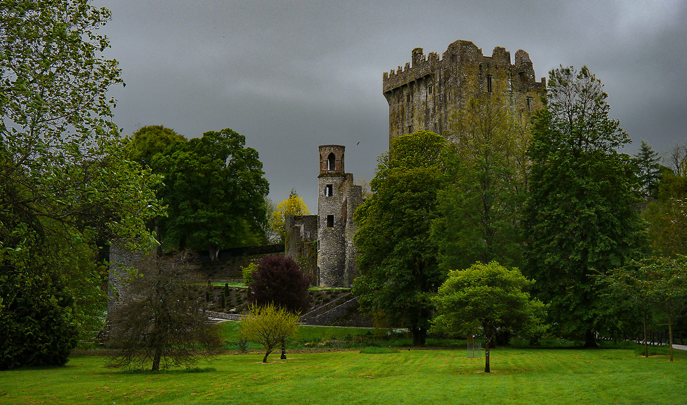
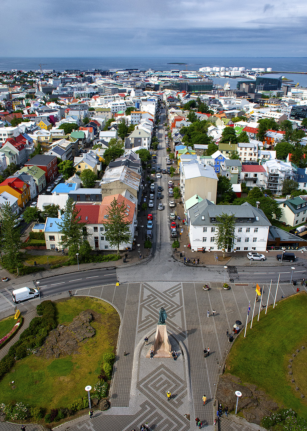
Welcome to the group! I really like the composition, this image has a lot of interest. I agree with the other that the section of the wall on the lower left should be cropped out. The other problem I see is that the sun is so bright, it draws the eye from the rest of the image. If it were my image, I would add some contrast to the clouds and try to darken the sky. You have some really interesting light rays coming off of the sun, so I would enhance those with a brightness contrast adjustment. I like Larry's suggestion of brightening the portions of the wall that are catching the sun's light. I would also saturate the flowers more as Barbara suggested. I'm not sure how you do this in Lightroom, since I use Photoshop, but I am sure there are ways to accomplish this. |
Sep 14th |
| 36 |
Sep 21 |
Comment |
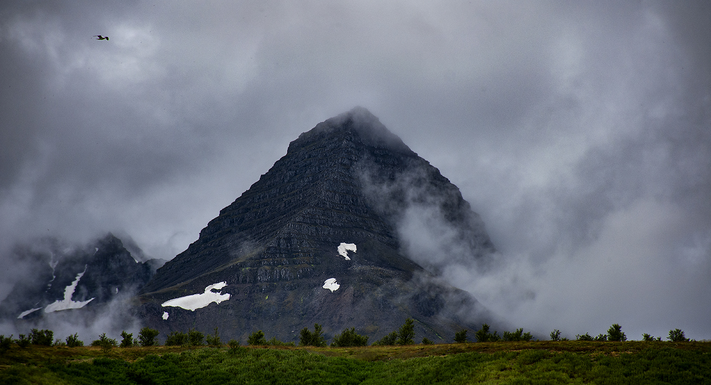
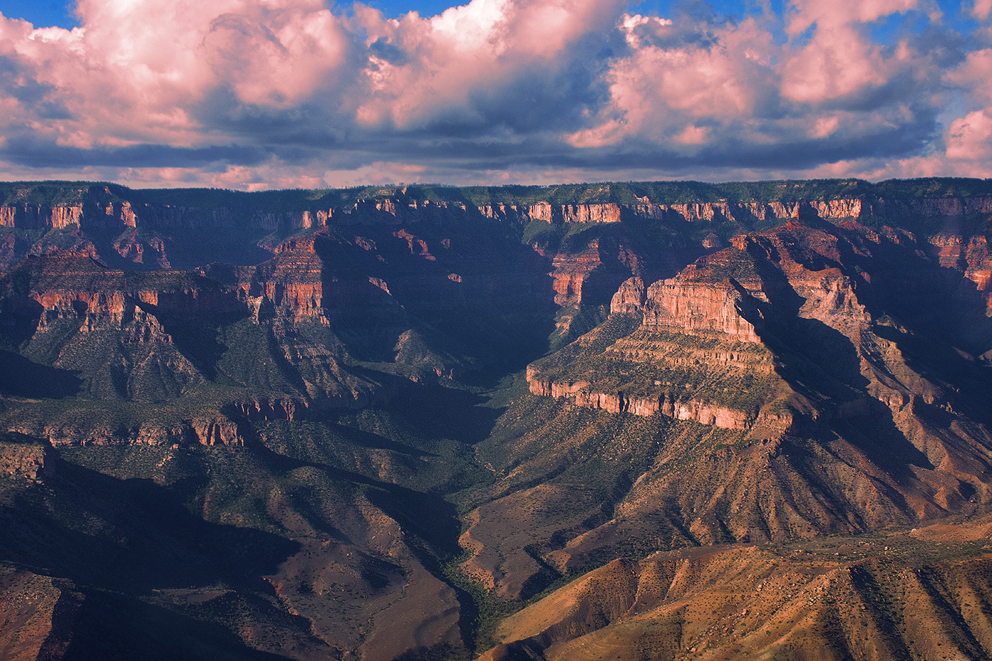
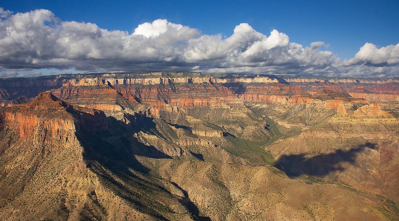
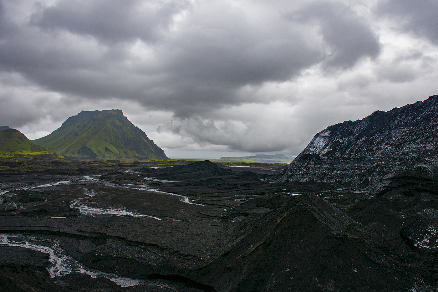
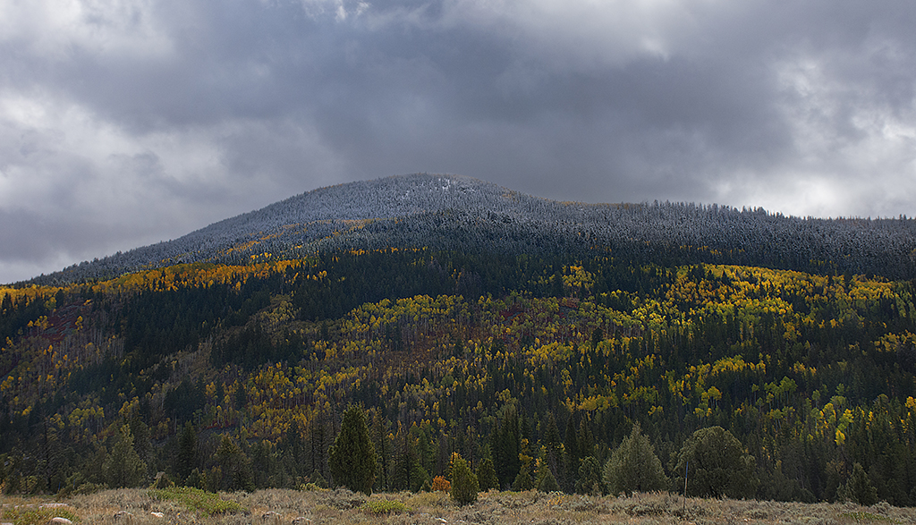
This image has a lot of potential. I love the pyramid! The image does seem rather flat to me though and the clouds, since they are brighter that the rest of the image are drawing my eye. I think you should darken the clouds and try to create more contrast in the ground, particularly around the pyramid shape, since that is clearly the subject. |
Sep 14th |
| 36 |
Sep 21 |
Comment |
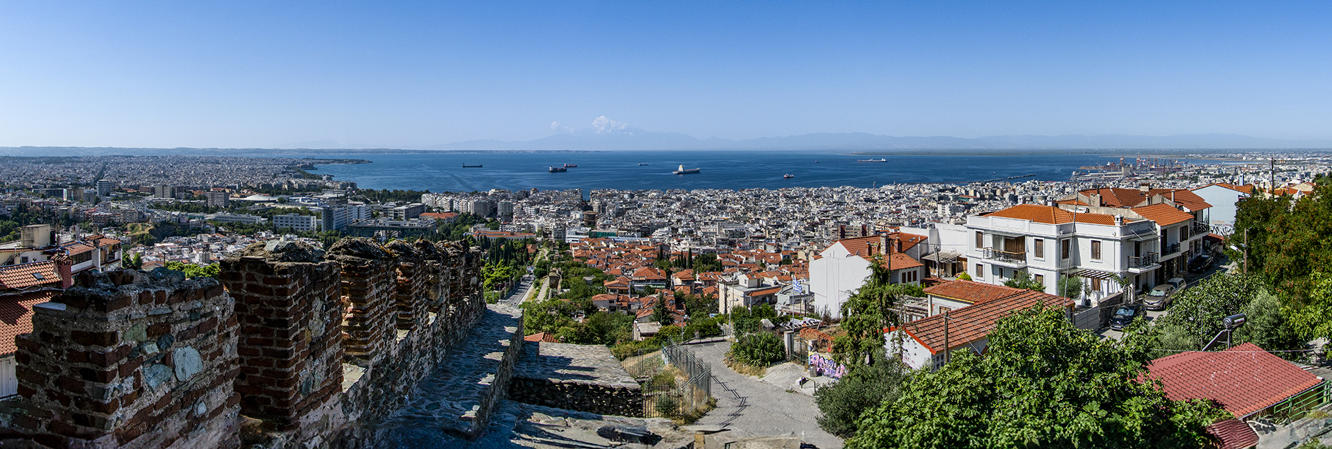
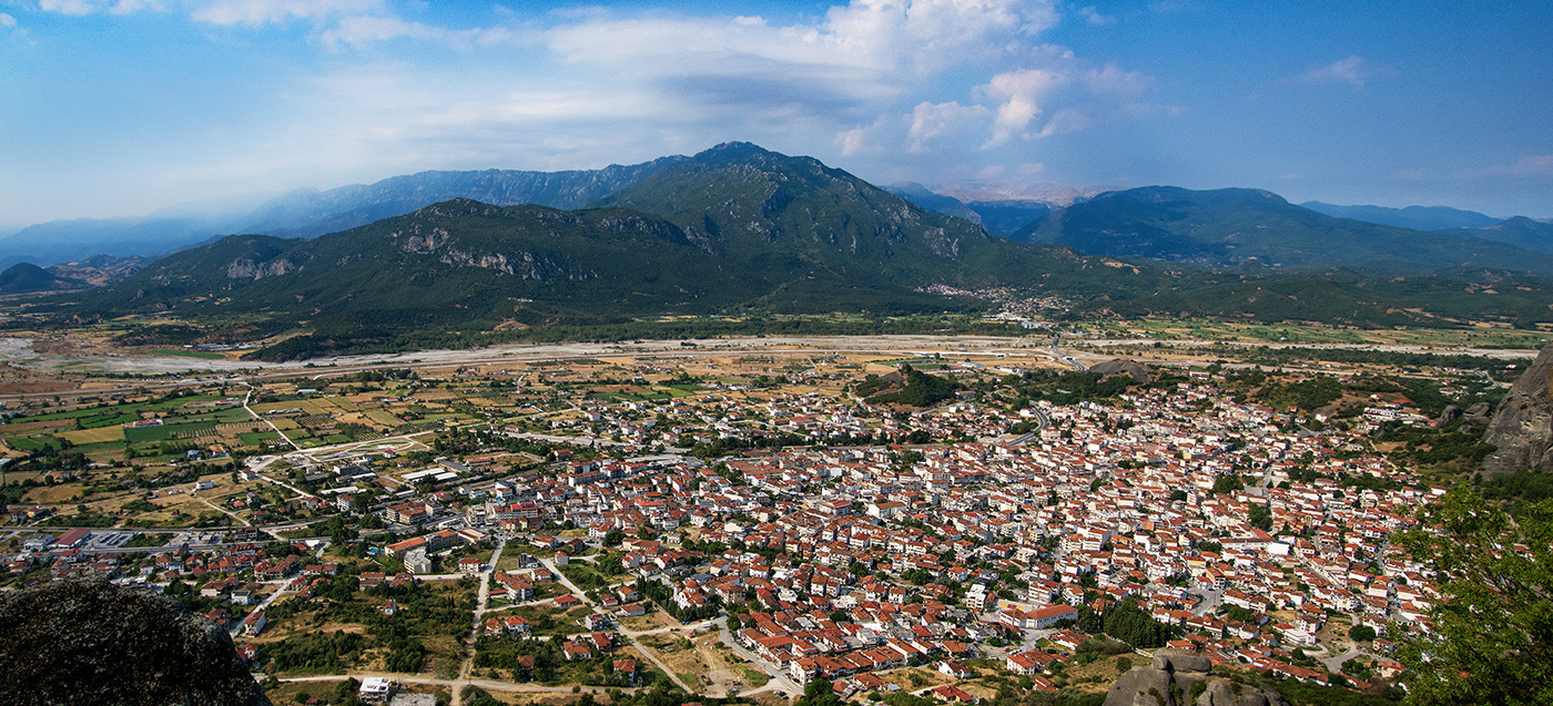
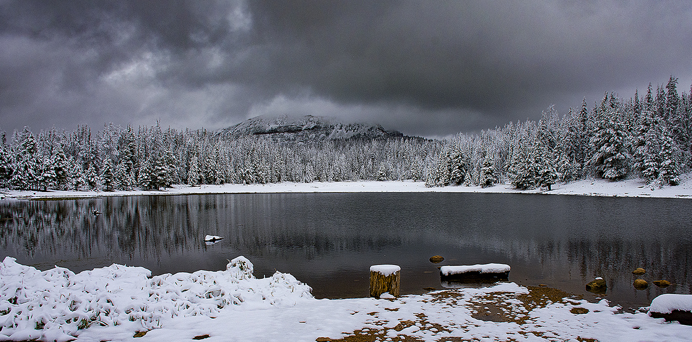
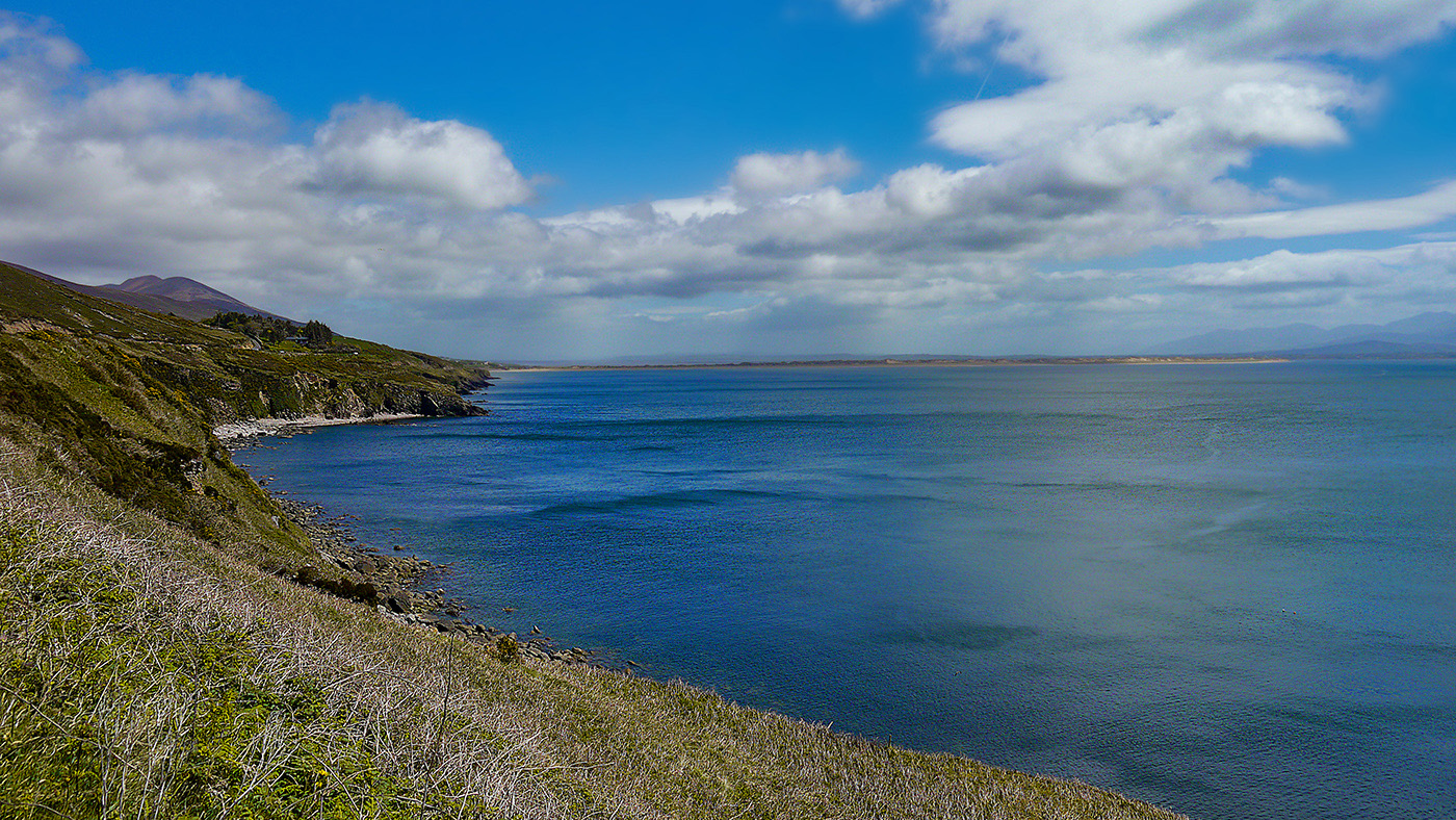
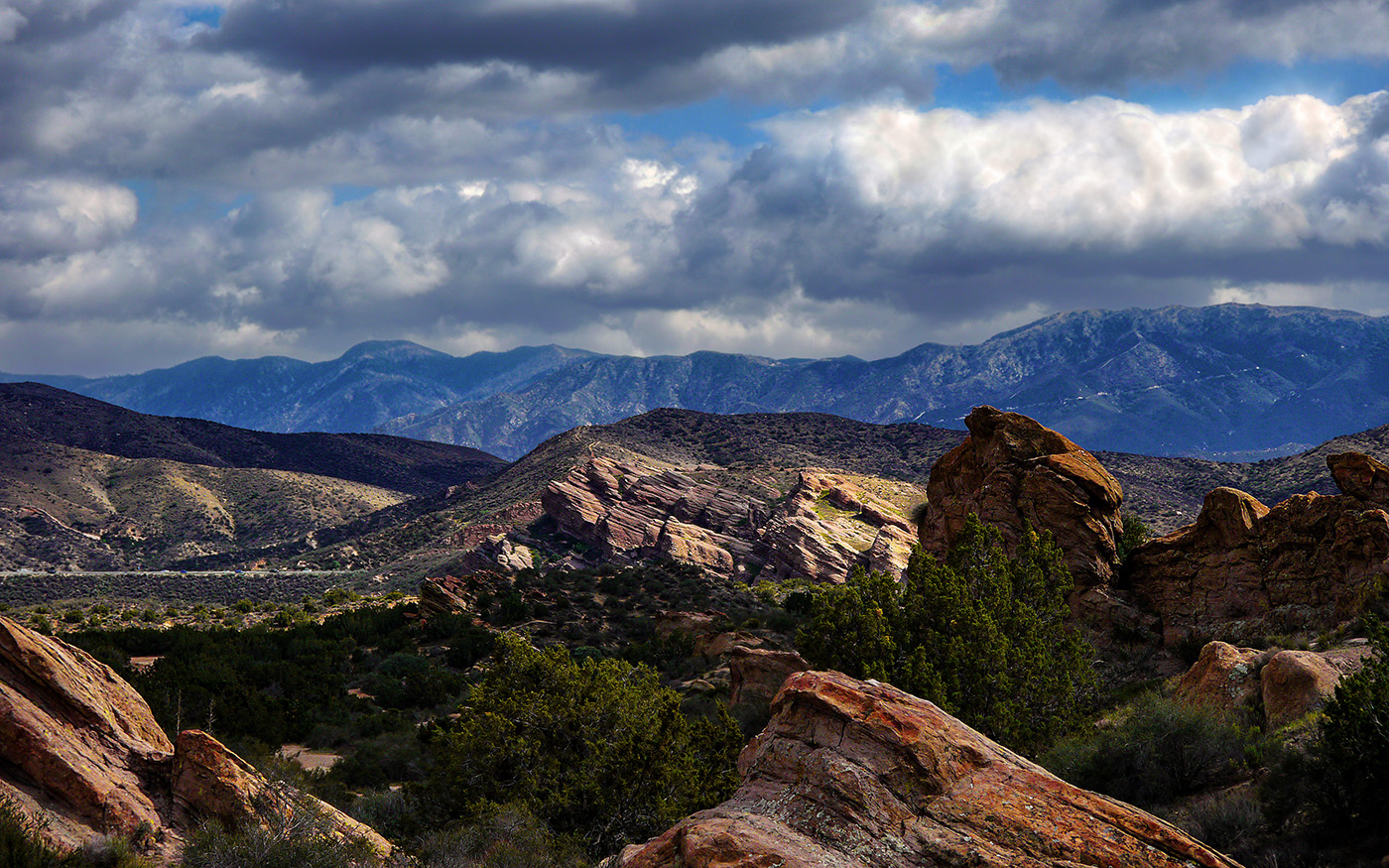
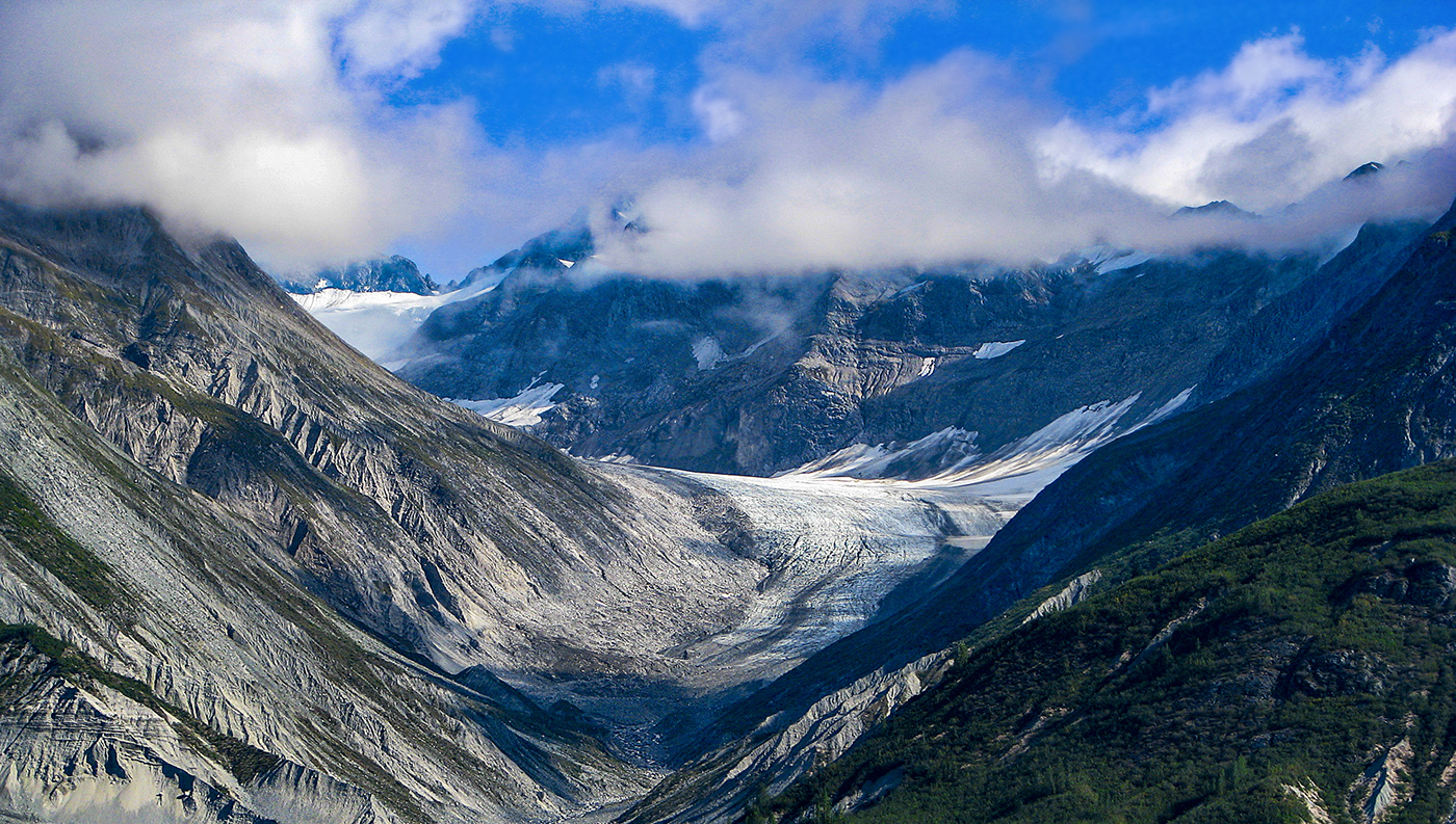
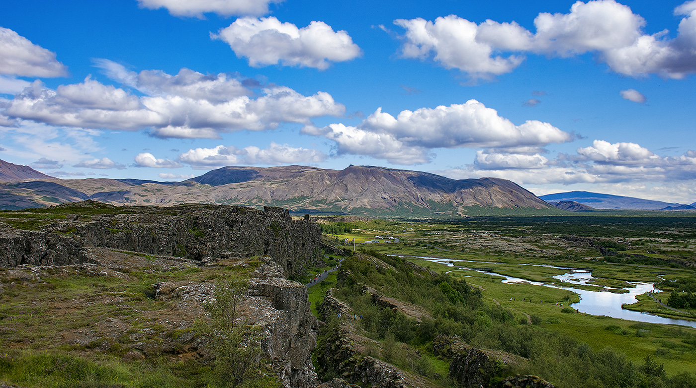
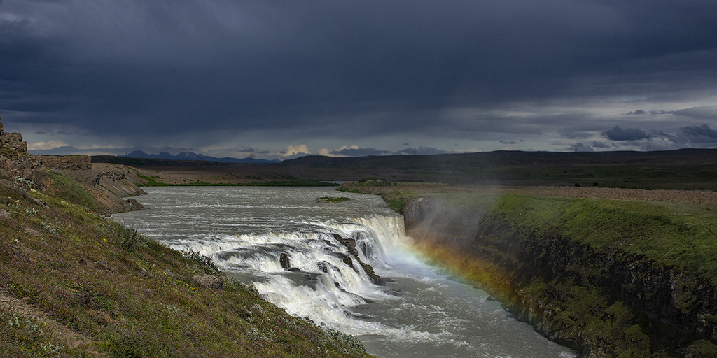
Really nice image! I love the pano format. I agree with Larry that darkening the background mountains slightly would improve the image. |
Sep 14th |
| 36 |
Sep 21 |
Comment |
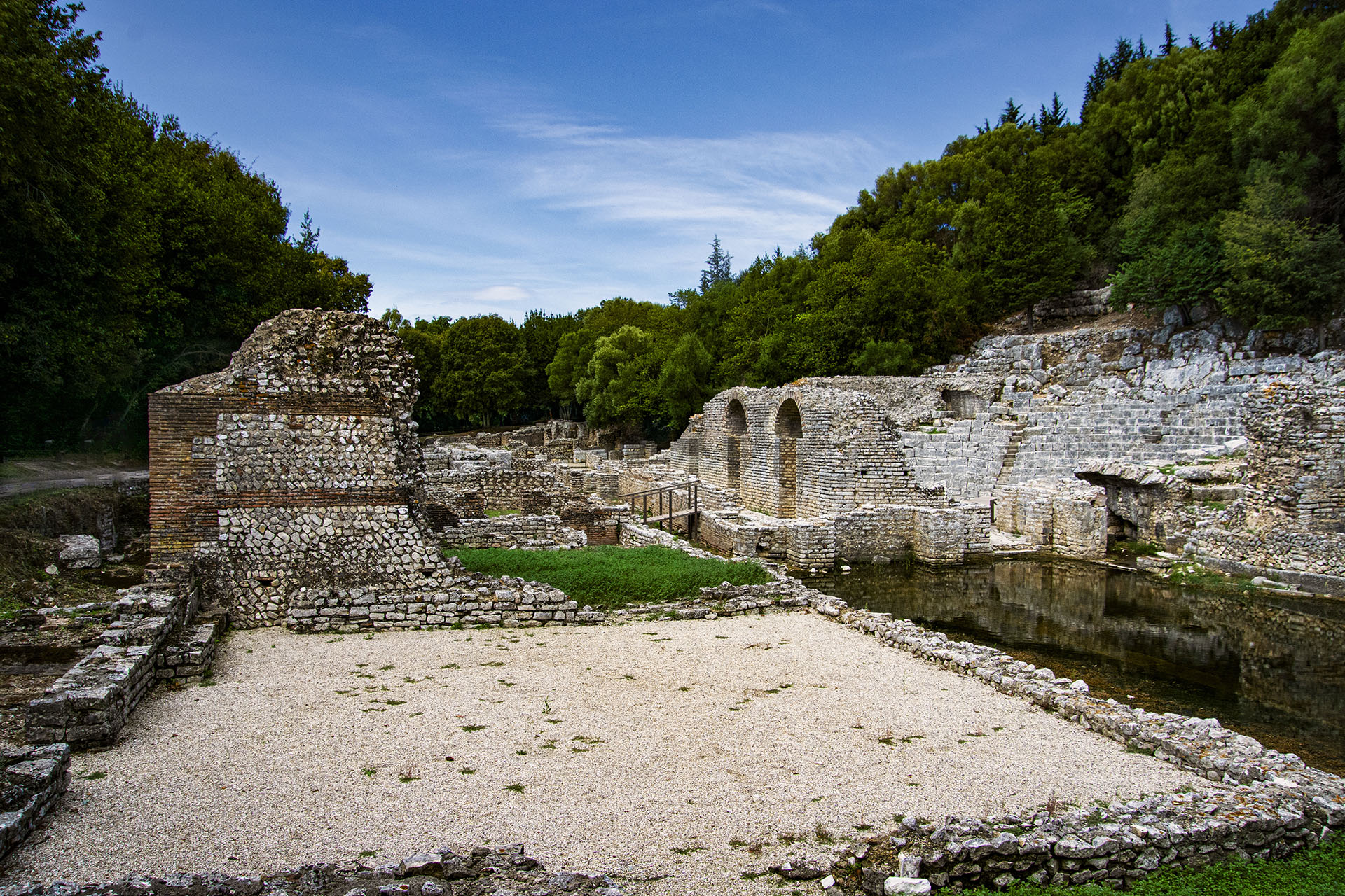
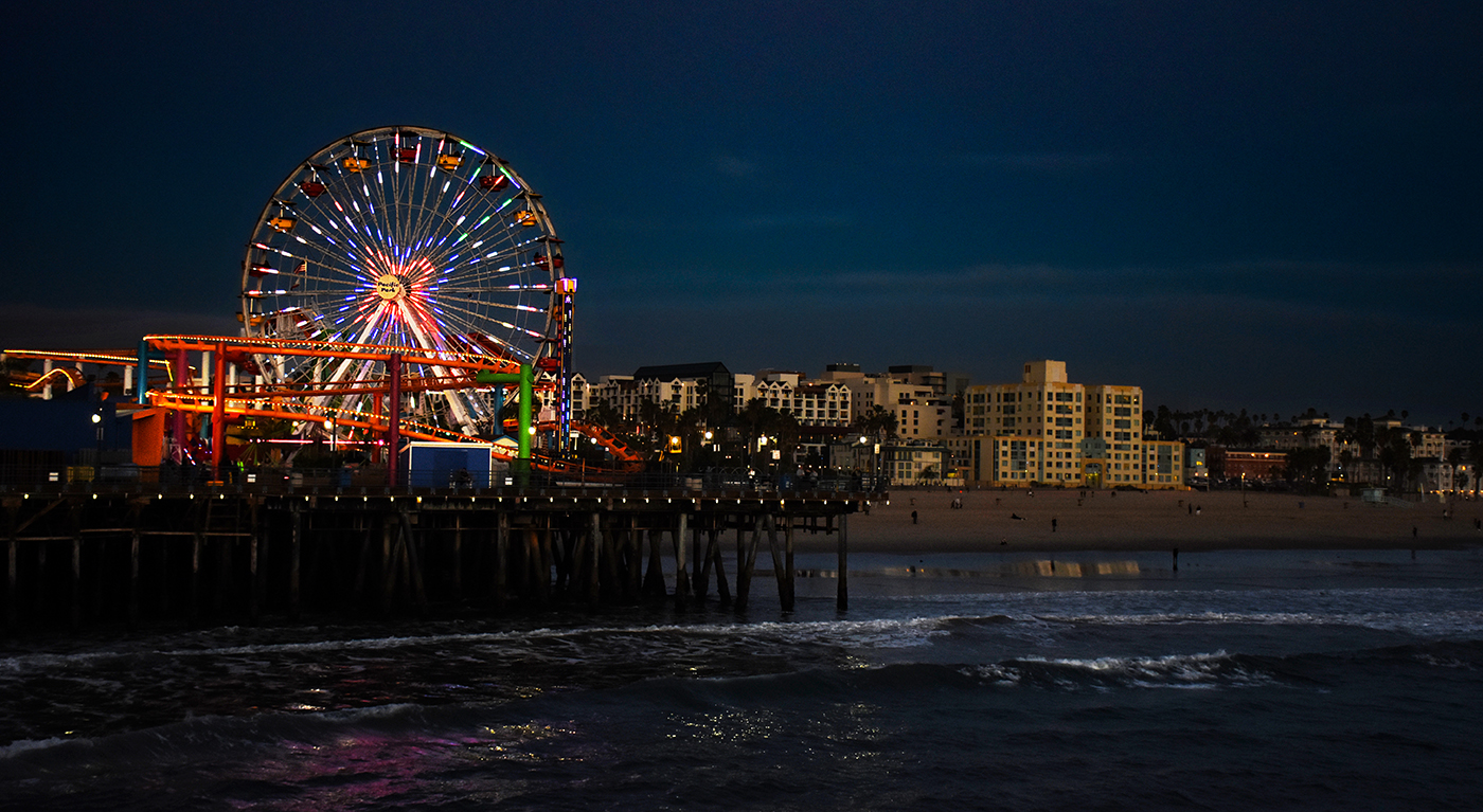
You really go the extra mile to get an image and it really does show! I love the what you did with the exposure of the water and the contrast it creates with the sharpness of the rocks. I don't think I would change a thing. |
Sep 14th |
| 36 |
Sep 21 |
Comment |
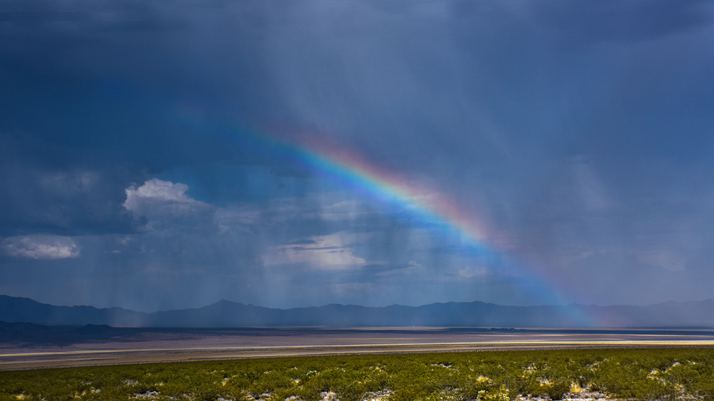
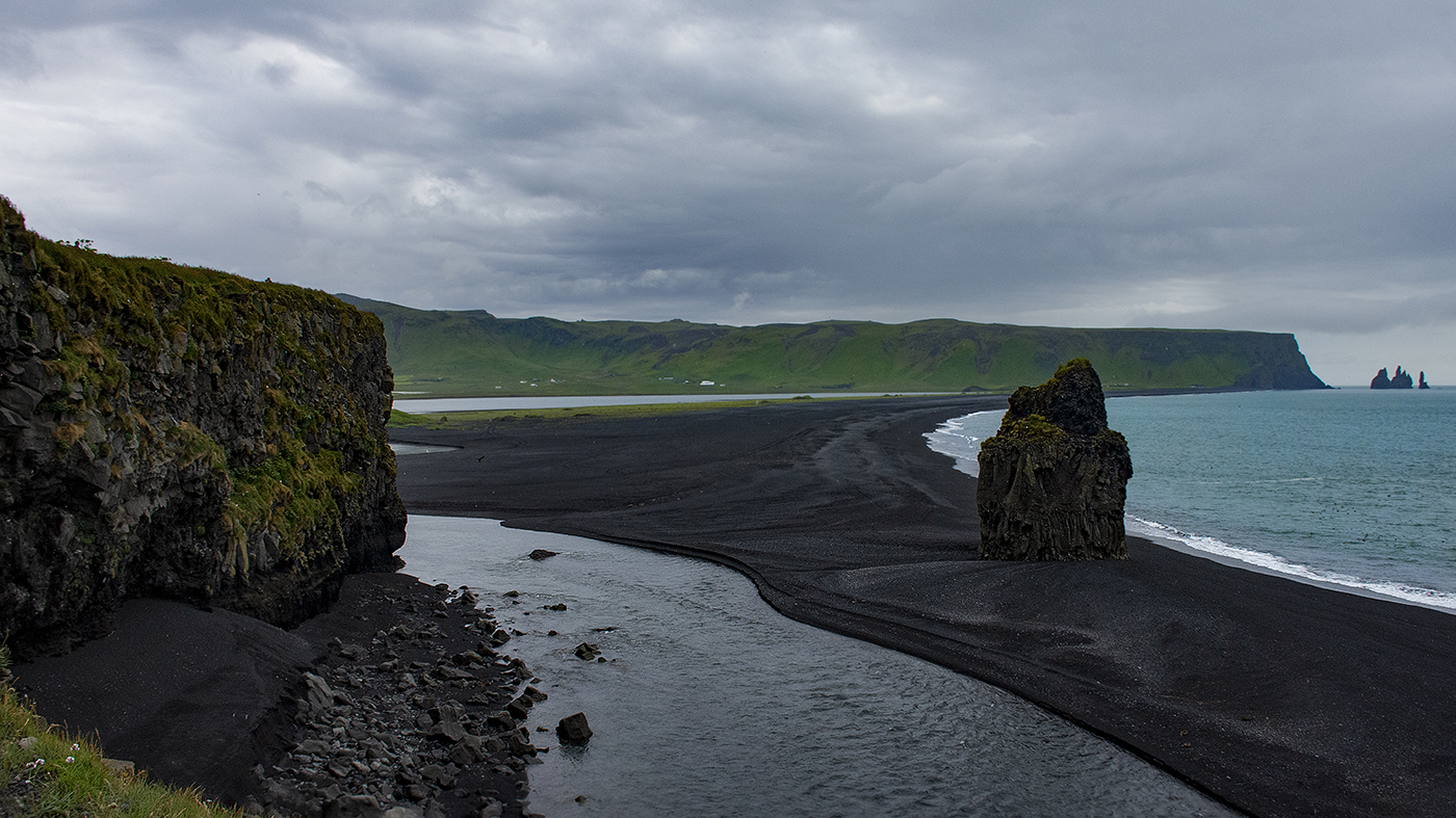
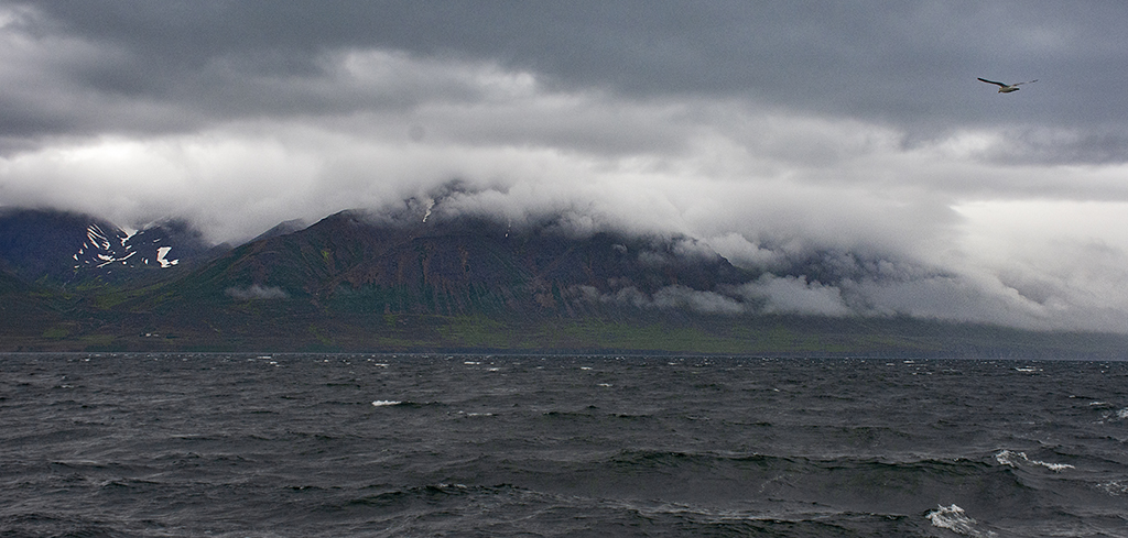
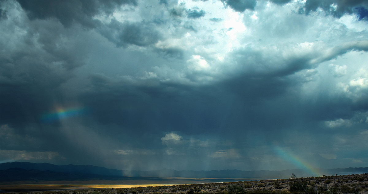
A really great image that captures the feeling of a coming storm. I love the detail in the clouds and the windswept sand and the two clumps of grass, which really add a lot to the image. It is simple and yet powerful. |
Sep 14th |
6 comments - 0 replies for Group 36
|
6 comments - 0 replies Total
|