|
| Group |
Round |
C/R |
Comment |
Date |
Image |
| 36 |
Apr 21 |
Reply |
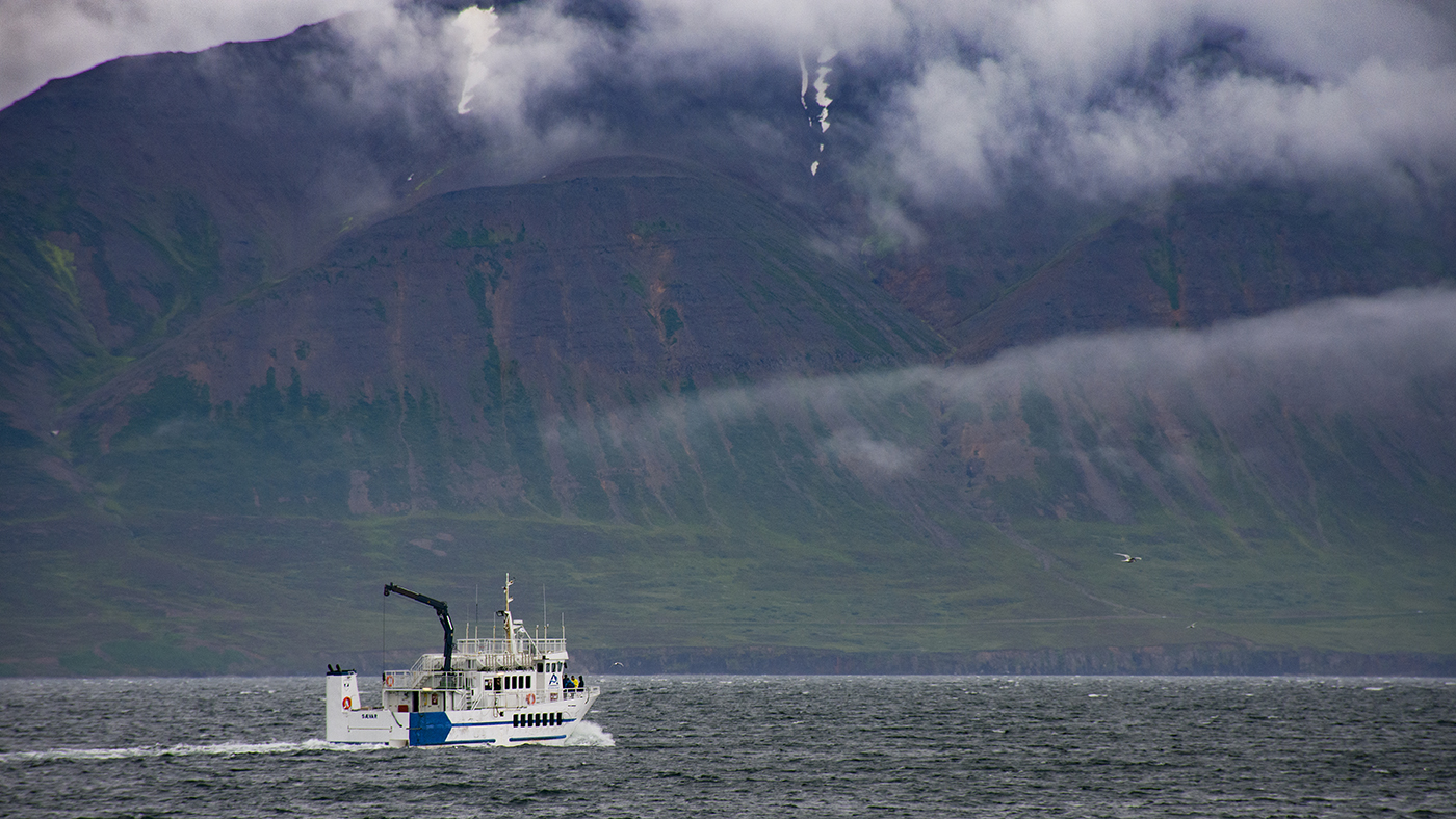
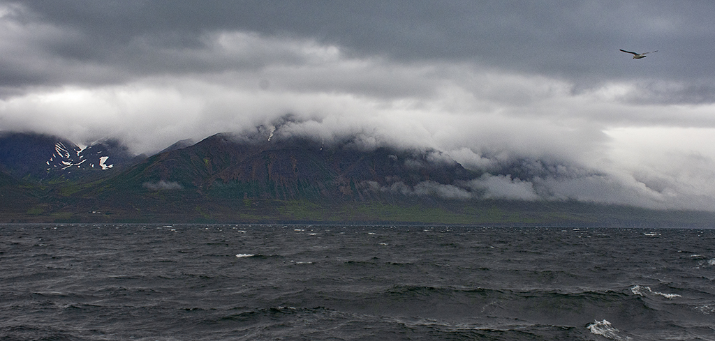
Actually the crop was pretty close to square - it just didn't seem like an interesting image to me, but I like the ocean and I thought the patterns the wind was creating on the water were interesting. A boat would definitely liven it up though. |
Apr 19th |
| 36 |
Apr 21 |
Comment |
Thanks for all your comments. I toned down the sharpness as a number of you had commented on the fact that it seemed oversharp. I'm not sure what to do about the bay, since I tried doing a vertical crop, but I was not really happy with it. In this version, I enhanced the sky reflection in the water to add some interest, and added a warming filter to to whole image to soften the light. There is a boat out of frame to the right that would have definitely added more interest to the water, but it was already out of frame by the time I got this picture. I was debating trying to add it in, I did get a shot of it, but I'm not sure if that much manipulation is allowed for this category. Let me know if you all think this is better. |
Apr 19th |
 |
| 36 |
Apr 21 |
Comment |
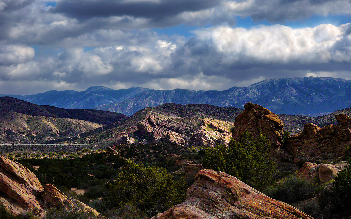
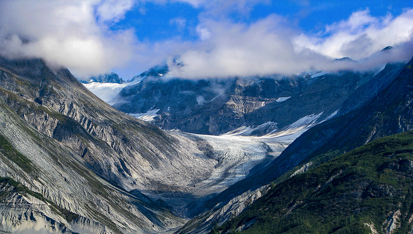
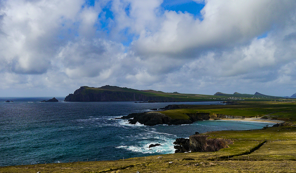
Stunning image! I love the colors and the reflection of the mountain in the water. The only change I would make is to crop about 10 percent off the top, the sky is clear there and does not really add anything to the image, and nothing is really going on on the mountain next to it in the portion you would loose. |
Apr 14th |
| 36 |
Apr 21 |
Comment |
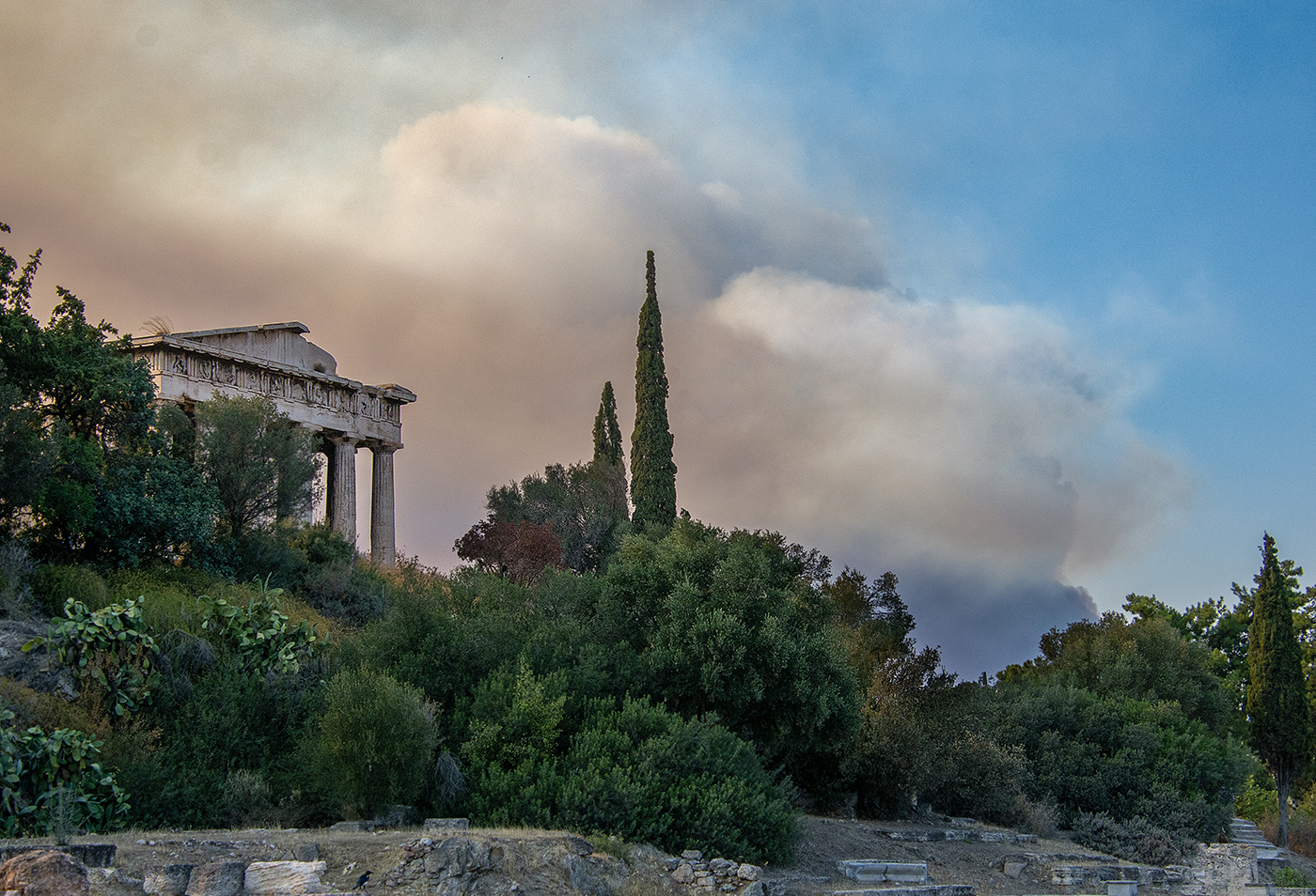
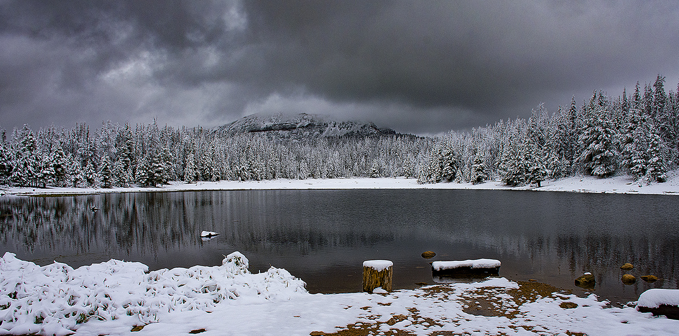
A really lovely image. I love the misty atmosphere and I think you achieved evoking a sense of serenity. I do agree with the others about cloning out the buoys, they are a distraction and detract from the sense of timelessness the image evokes. |
Apr 14th |
| 36 |
Apr 21 |
Comment |
I really like what you did with the lighting. I do like you second image better than the first. It really improves upon the lighting quite a bit and gives more dimension to the image. |
Apr 14th |
| 36 |
Apr 21 |
Comment |
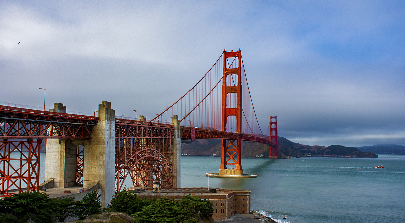
I really love the bridge with the pilings in the foreground and the reflection of the bridge piers in the water. I agree with the others that the sky is very bland and does not do the image any favors. I saw Richard's treatment of the sky, but I think it looks over processed. You could try adjusting the sky's brightness, or contrast to try to tease out some detail. Another thing to consider is a sky replacement, but with the bridge that could be some work. |
Apr 14th |
| 36 |
Apr 21 |
Comment |
Larry, your images continue to amaze me, along with your adventures to get them. This image is stunning! I actually like the more subdued Milky Way in your image. It is definitely there but does not looked forced. You could use dehaze to pull it out more, but I'm not really sure that is necessary. I also love the dead tree by the water and the lighting in the sky. I did notice the weird lights in the water that Richard mentioned, but since this is a reality based competition, you can't clone them out. You might be able to burn them out at least make them less noticeable since dodging and burning is typically allowed in reality based competitions. |
Apr 14th |
| 36 |
Apr 21 |
Comment |
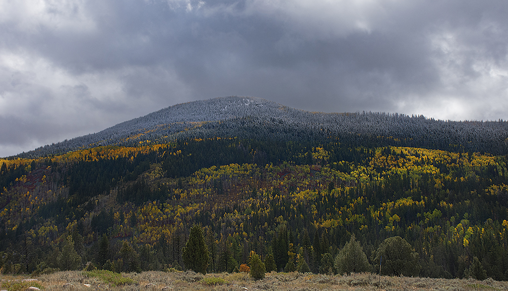
I really love the colors in this image. The light really does make the image appear to have fall colors. I has to look closely to realize the trees are actually bare! I am not bothered by the balance of the image, I actually the the large tree on the right balances the road on the left. I understand the sky was bland which is why you cropped the top, but I personally would have liked to have seen a little more of the tree tops. |
Apr 14th |
7 comments - 1 reply for Group 36
|
7 comments - 1 reply Total
|