|
| Group |
Round |
C/R |
Comment |
Date |
Image |
| 36 |
Dec 20 |
Comment |
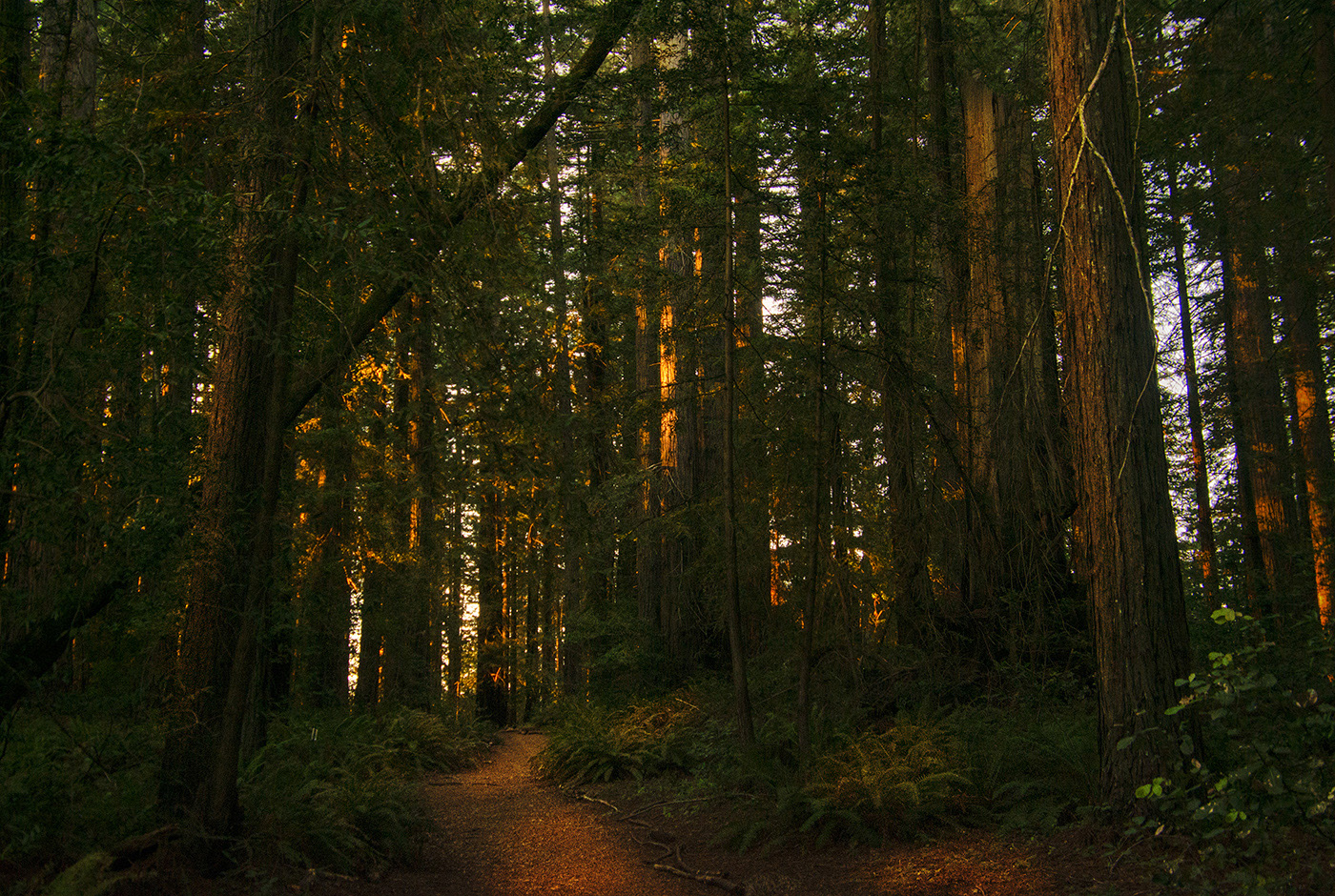
A really beautiful image. The tree really stands out against the sky. I agree with suggestions made by Arnie, Richard and Michael. You could create a mask of just the dark parts of the tree on an exposure or brightness/contrast adjustment layer, if you use Photoshop. That would allow you to play with just how much to brighten it. |
Dec 17th |
| 36 |
Dec 20 |
Comment |
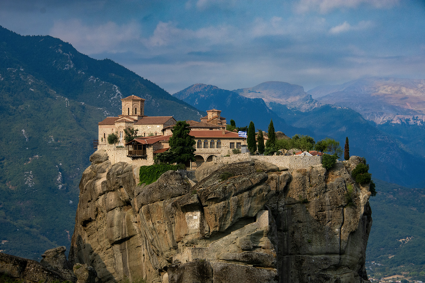
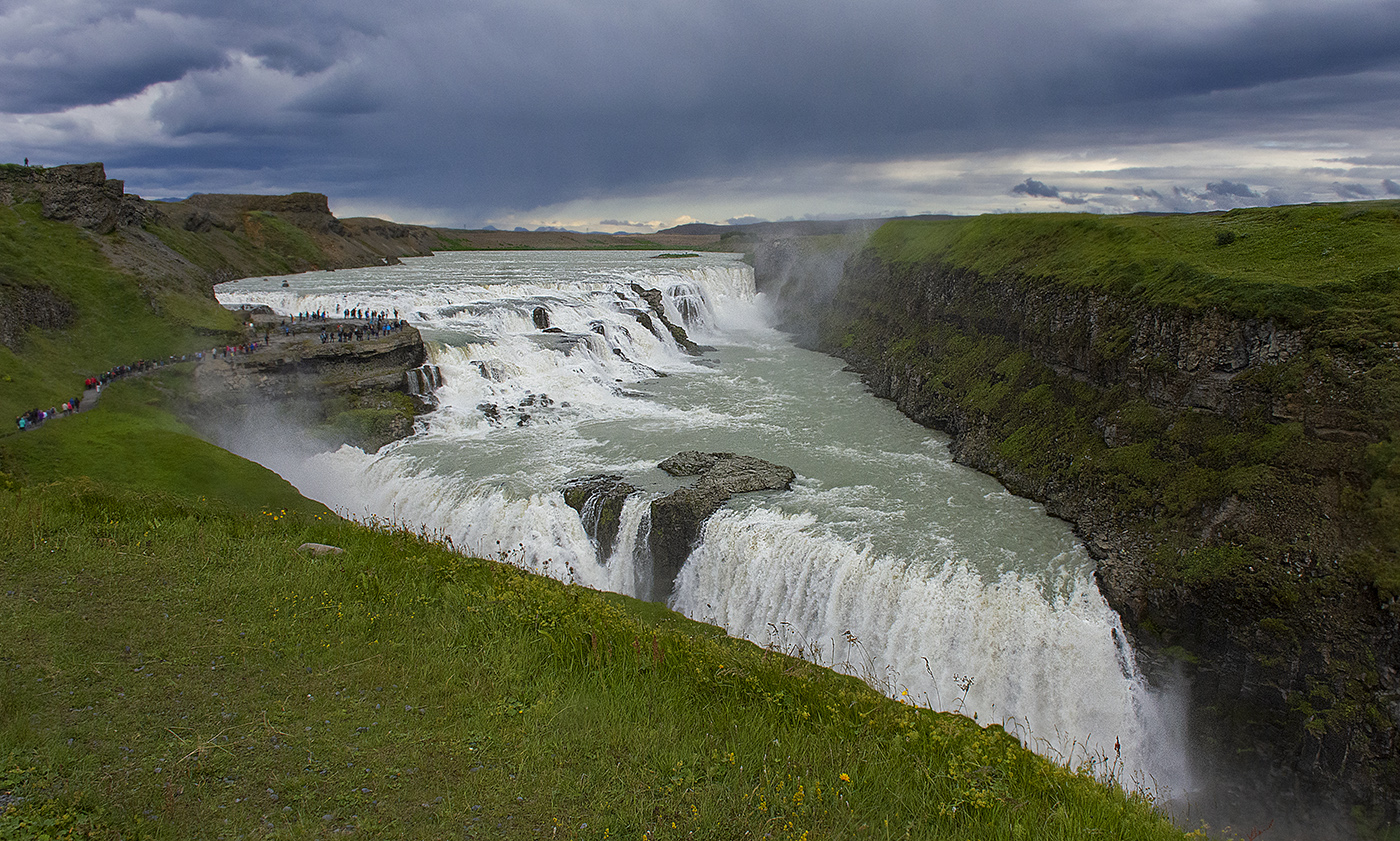
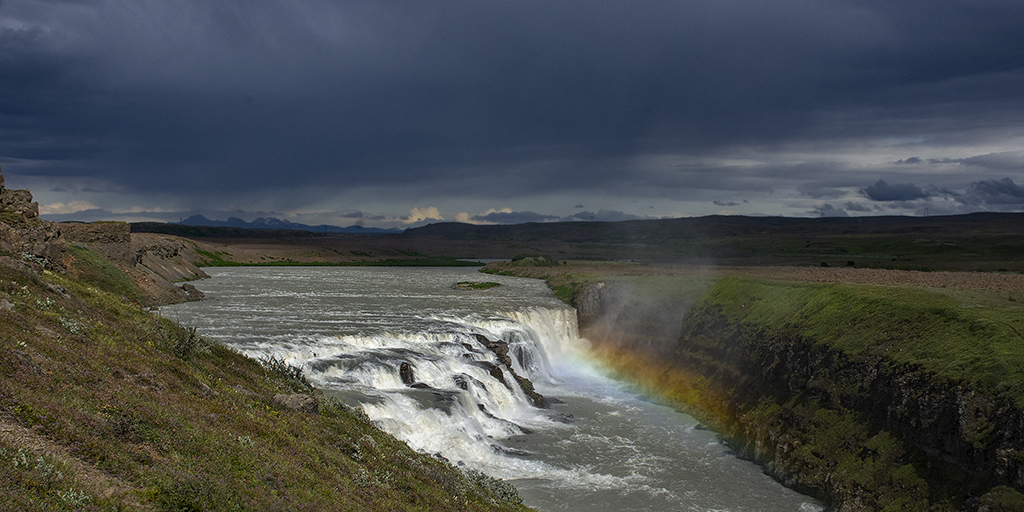
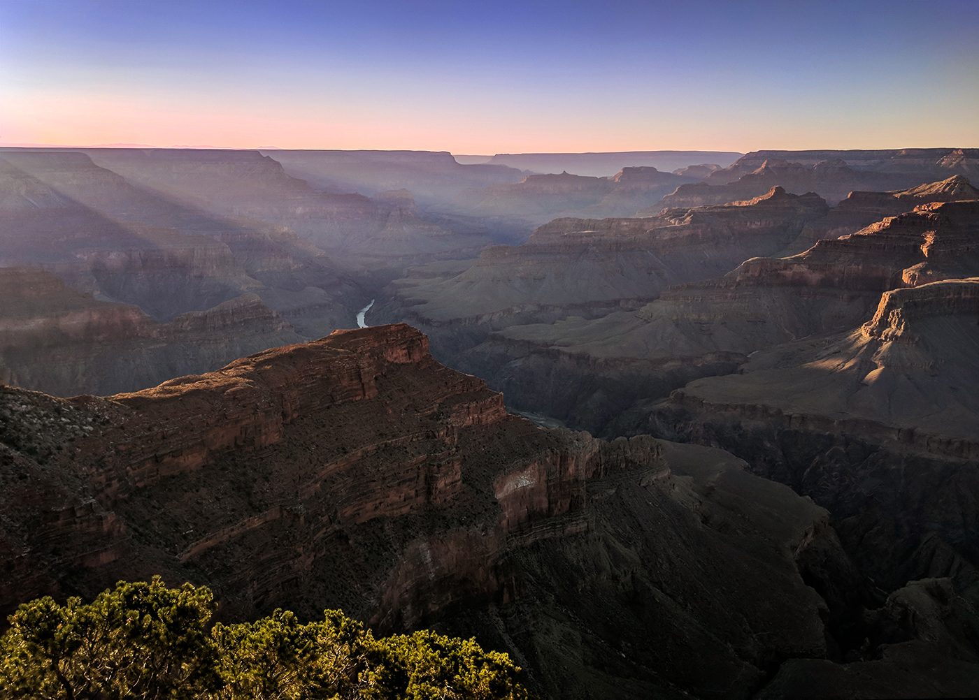
Welcome Krishnandu! I really love this picture. The sky is stunning and the falls are remarkable. Although the subject of the image is the falls, a really like the wide vista of the rest of the picture and I think if definitely gives the falls a context, so I personally would not crop it. My only nit is that the plant in the left foreground is a little chopped off and I would like to see more of it, but I don't think you could crop it out without losing too much of the image. It is a little bright as well, so you might consider selectively toning down the brightness on it. |
Dec 16th |
| 36 |
Dec 20 |
Comment |
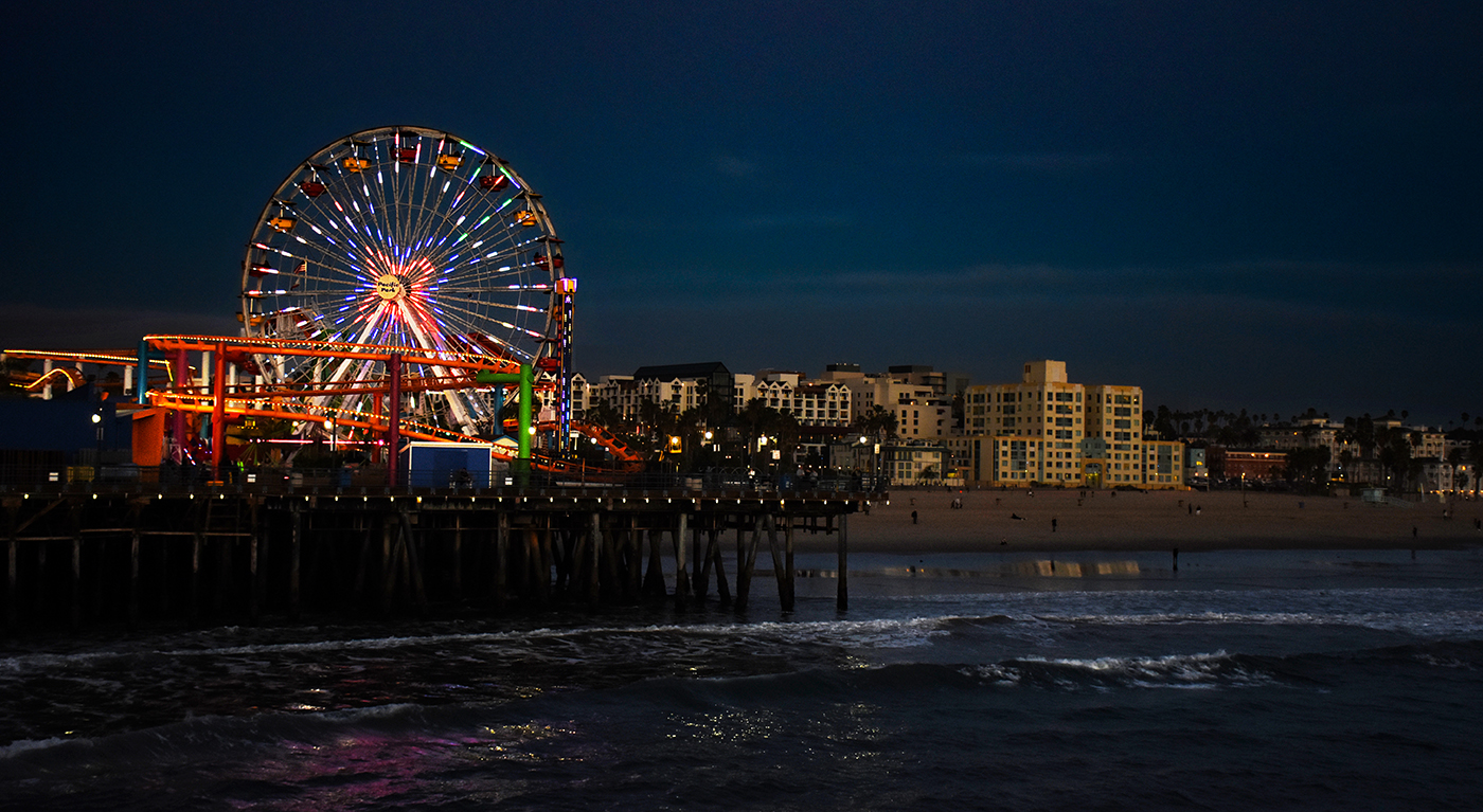
That's a pretty cool picture! I love the blue effect. I agree with Larry the the bright shoreline is distracting, and Michael that the bush on the left should be cloned out. Other than those nits, it really is an outstanding image! |
Dec 16th |
| 36 |
Dec 20 |
Comment |
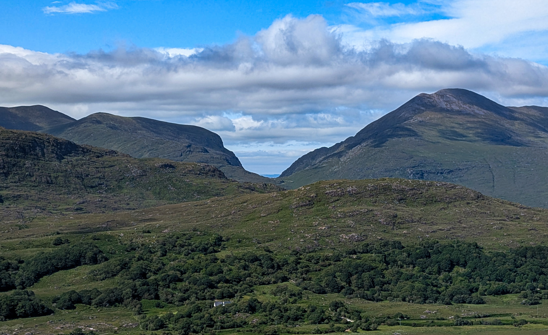
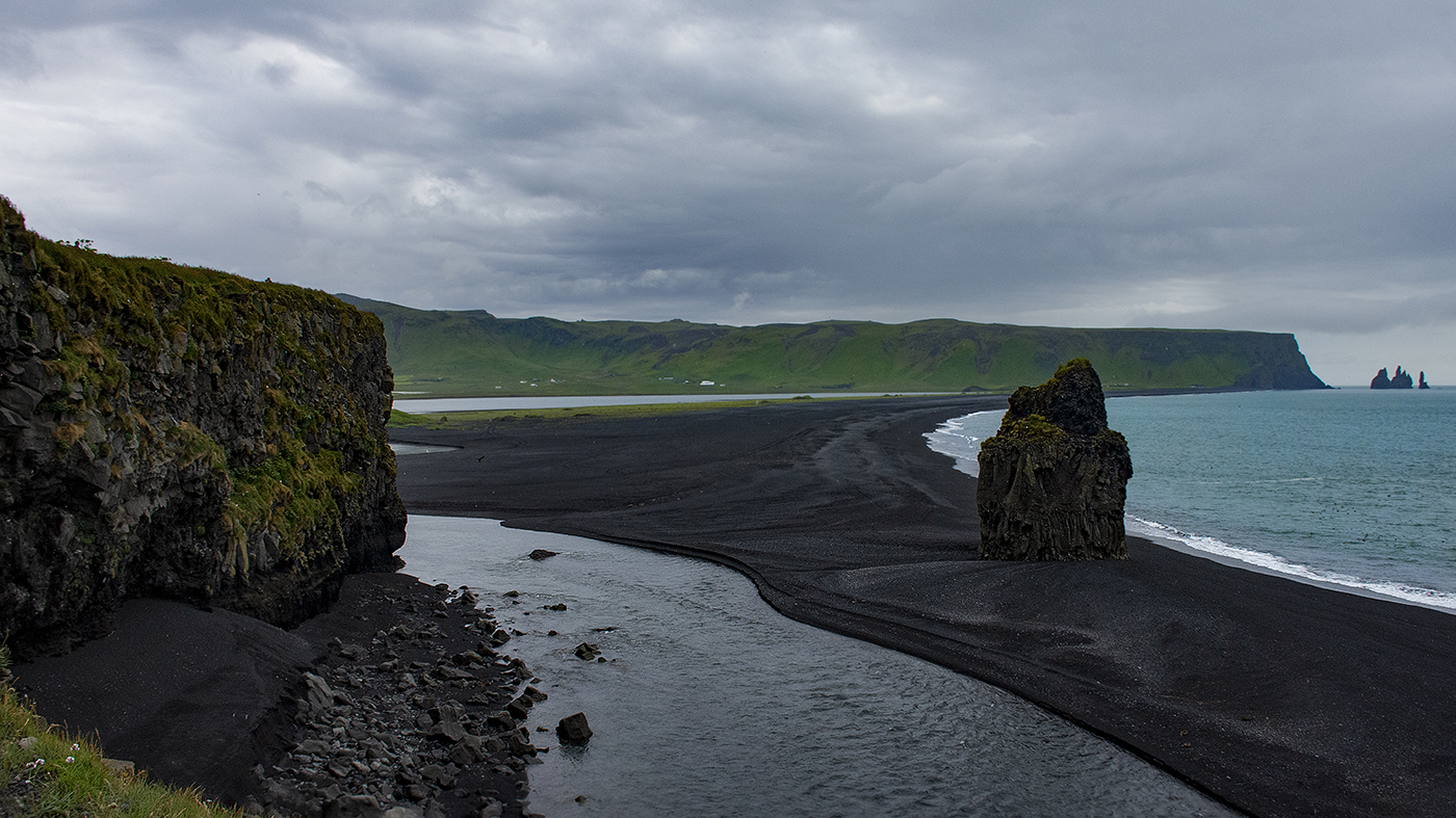
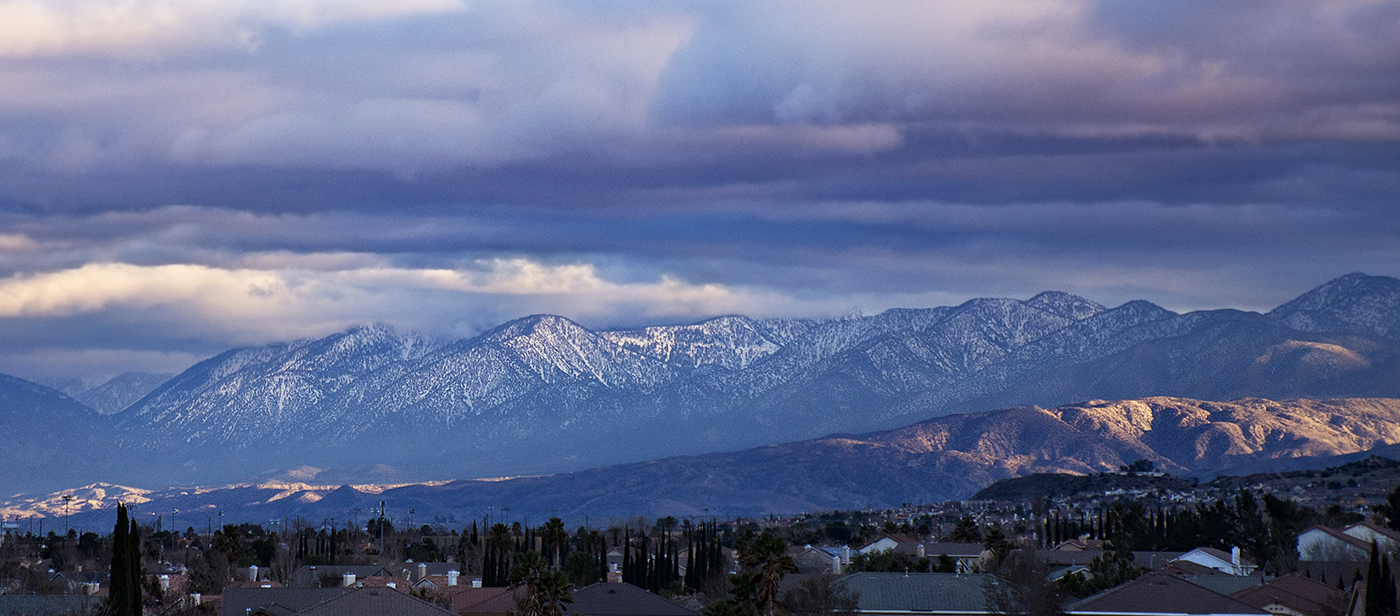
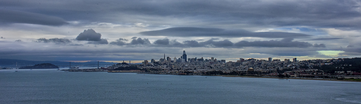
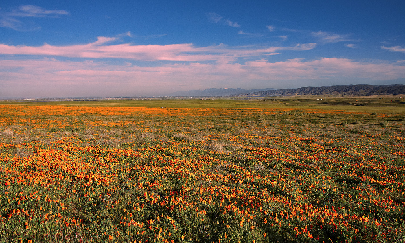
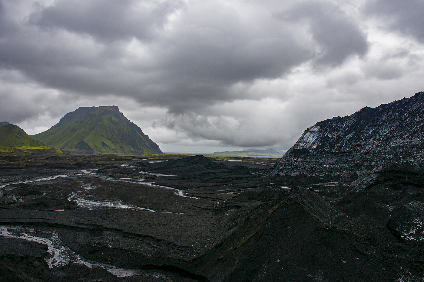
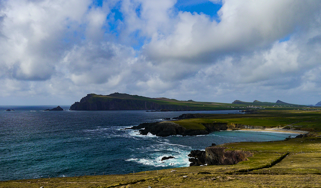
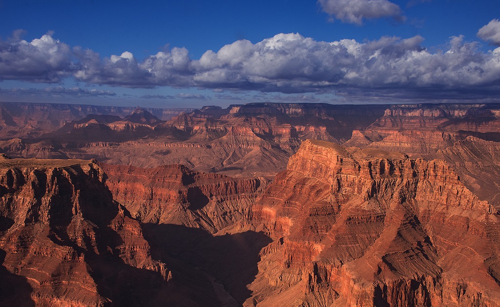
I really like the pano presentation for this image, it really conveys the vastness of the subject. I do agree with Richard, the the image is a bit flat, and I think his adjustments do make the image better. You could also just try increasing the dehaze a little more as well. Larry's treatment looks a little over processed to my eye, particularly the sky, which is a lot more orange than the original. Its hard to tell though, since his starting image is pretty small. I do like that Larry was able to bring out so much detail in the mountains, I just think I would tone the processing a little bit. |
Dec 16th |
| 36 |
Dec 20 |
Comment |
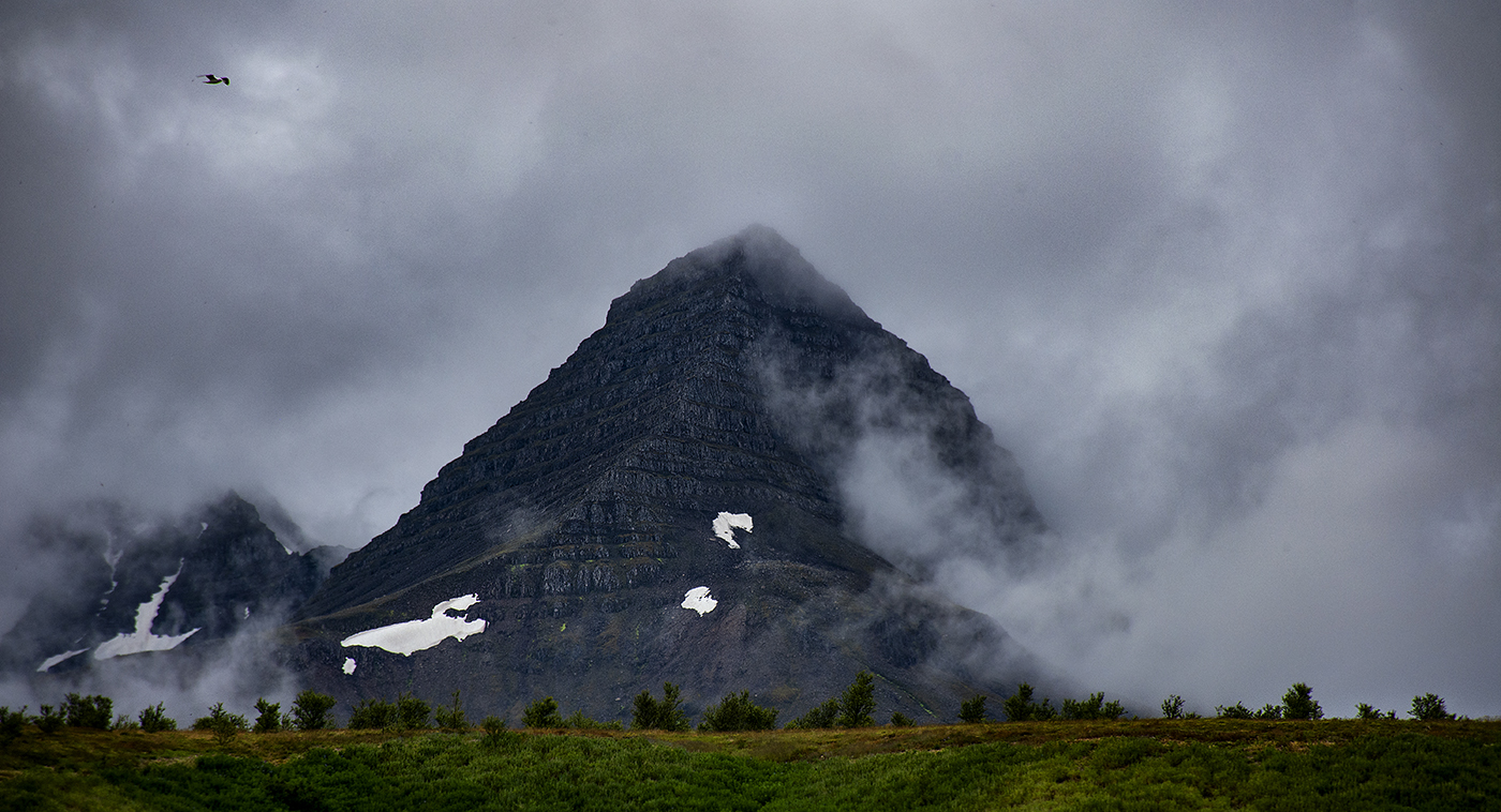
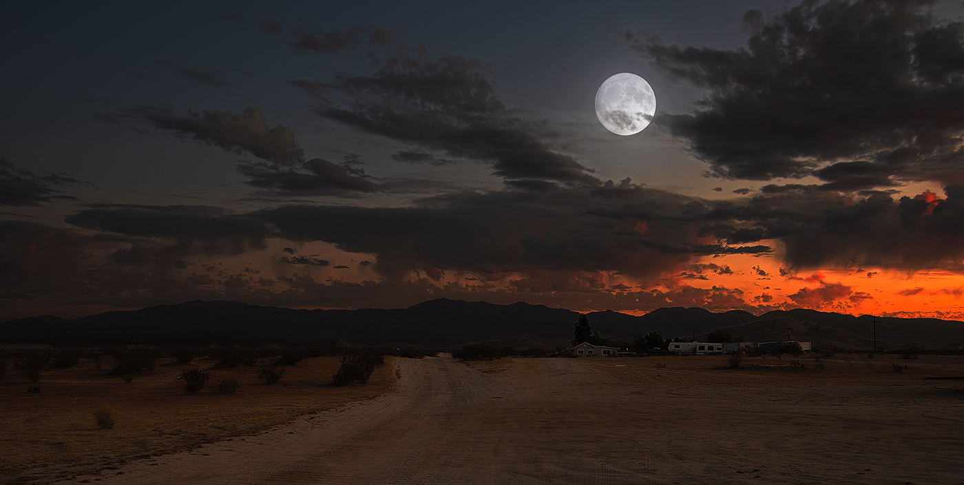
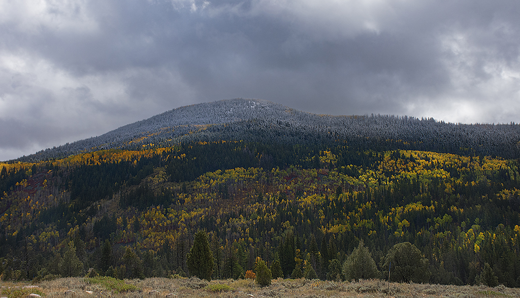
Thanks for all your suggestions. I think you are all right and I will loose the bird. Michael, I like you suggestions about ways to make the sky more dramatic. |
Dec 16th |
| 36 |
Dec 20 |
Comment |
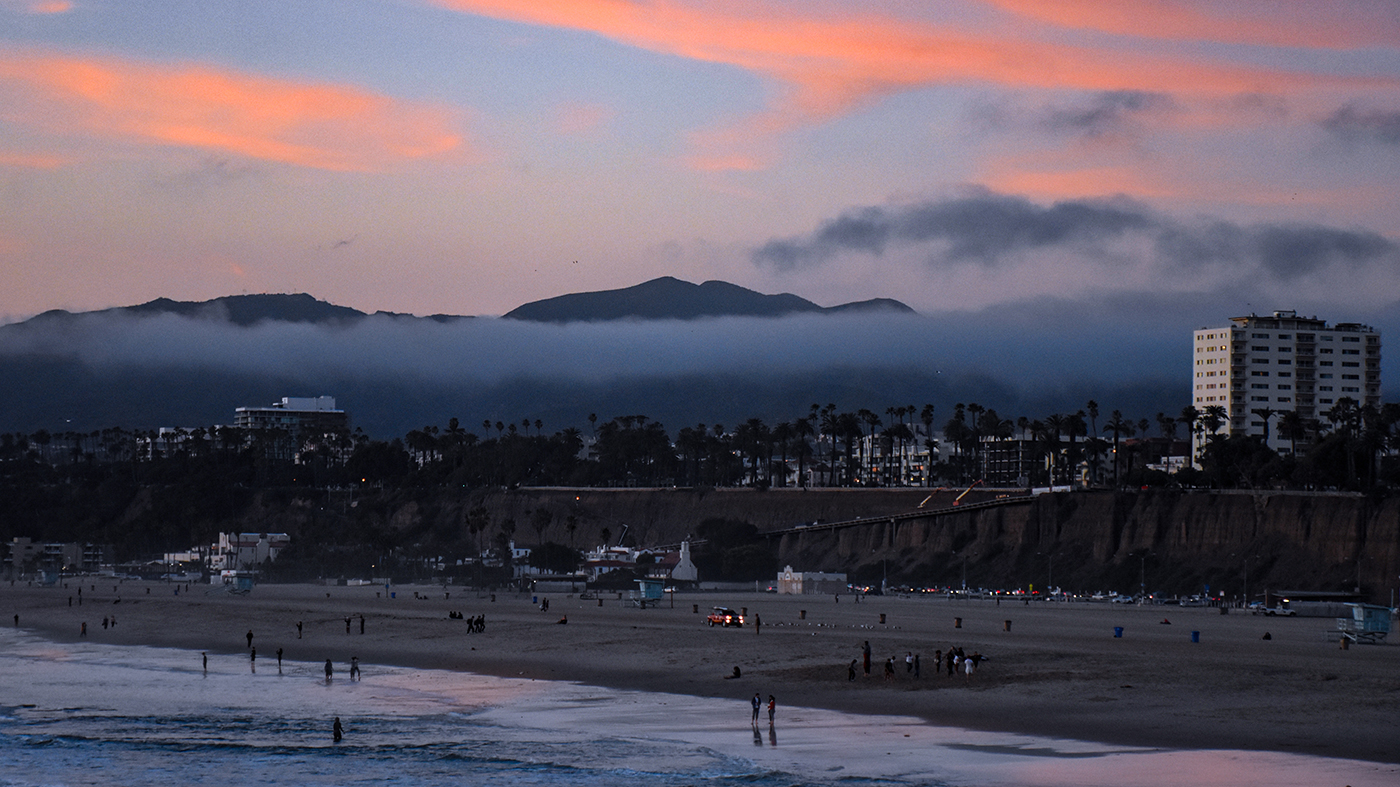
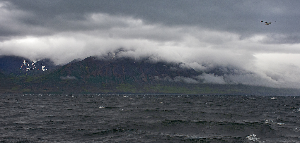
Larry, you always have the most interesting stories associated with your images! I really like the moody lighting of this image. There are two things I am not sure about. The first is really bright band that looks like it is at the crest of breaking wave at the right top quarter. I find it is really drawing my eye from the rest of the image. It is probably reflected moonlight, but I am not sure. The second is there seem to be some interesting wave action at the top of the image, but it is to dark to see clearly. Did you consider brightening that part of the image in post processing? |
Dec 16th |
| 36 |
Dec 20 |
Comment |
Larry, you always have the most interesting stories associated with your images! I really like the moody lighting of this image. There are two things I am not sure about. The first is really bright band that looks like it is at the crest of breaking wave at the right top quarter. I find it is really drawing my eye from the rest of the image. It is probably reflected moonlight, but I am not sure. The second is there seem to be some interesting wave action at the top of the image, but it is to dark to see clearly. Did you consider brightening that part of the image in post processing? |
Dec 16th |
7 comments - 0 replies for Group 36
|
7 comments - 0 replies Total
|