|
| Group |
Round |
C/R |
Comment |
Date |
Image |
| 36 |
Nov 20 |
Comment |
Also - I realized that I inadvertently modified my original image when I resized it for submission, apparently Photoshop remembered the settings I had used in Camera Raw for dehaze and did it to the original when I opened it. Here is the correct original image. I was wondering why it looked better when I resized it. |
Nov 19th |
 |
| 36 |
Nov 20 |
Comment |
Thanks for all your comments. I reworked the photo, decreasing the saturation of the blue and cyan channels for the ground and the blue channel for the sky. Let me know what you think. |
Nov 19th |
 |
| 36 |
Nov 20 |
Comment |
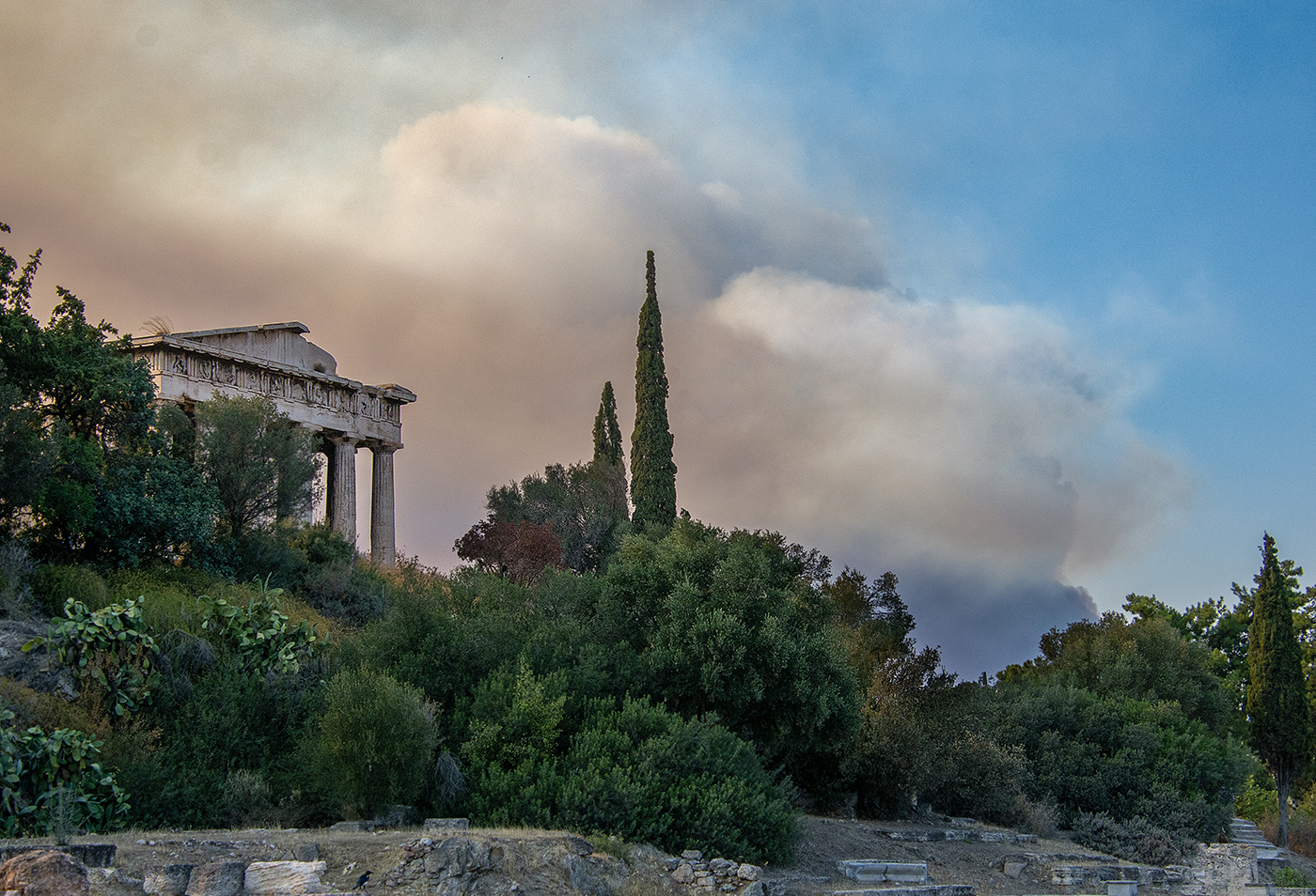
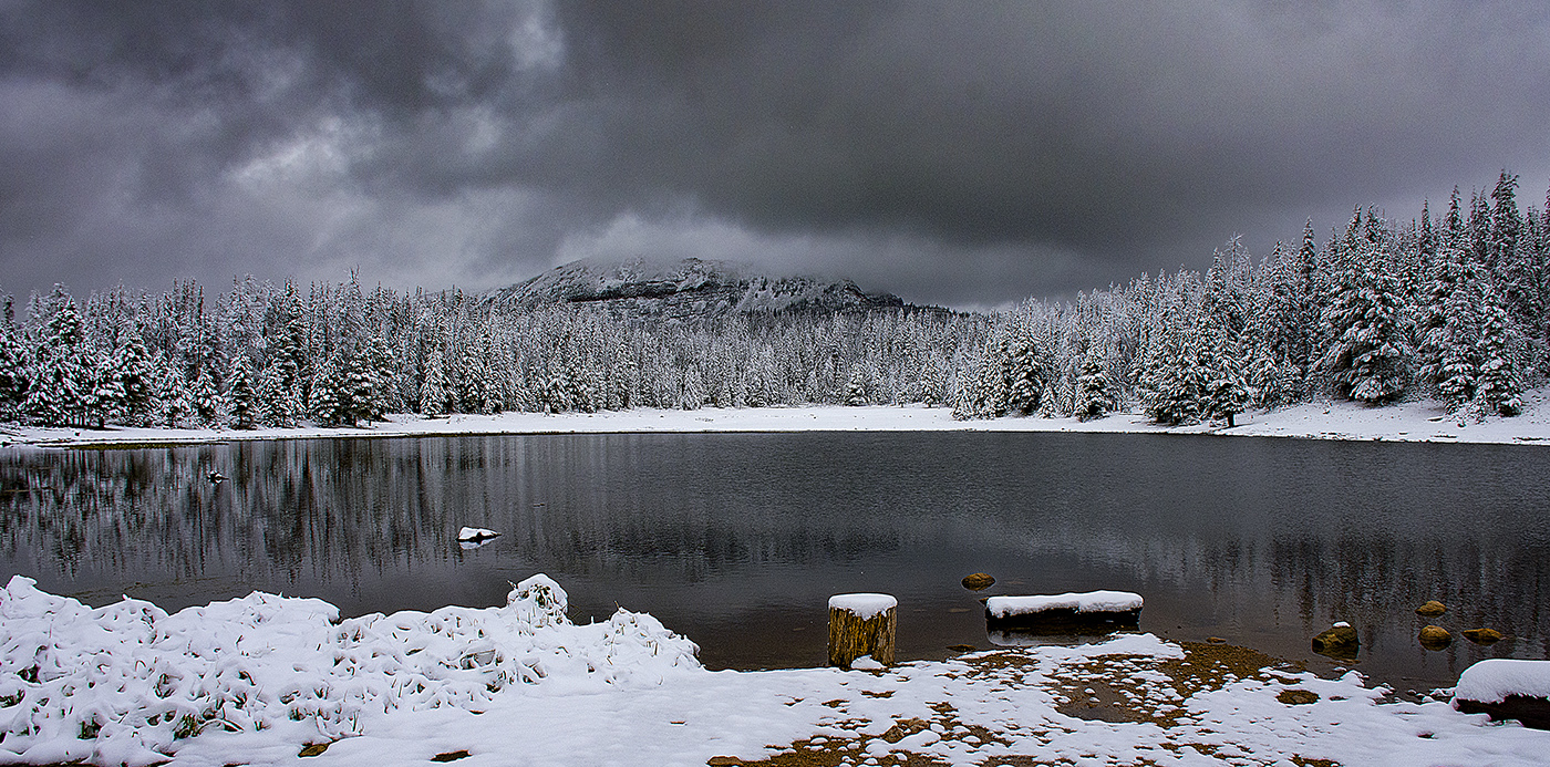
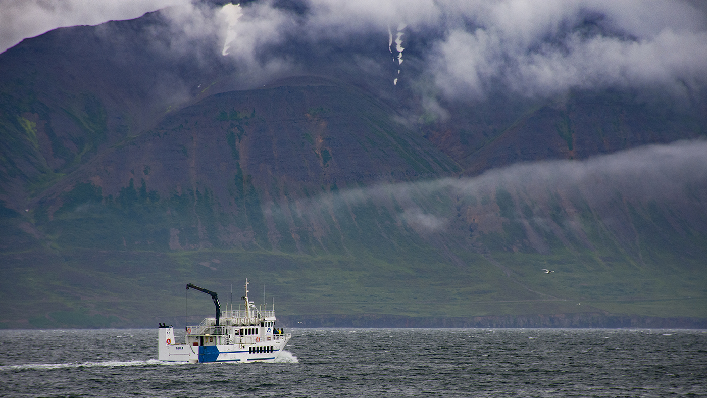
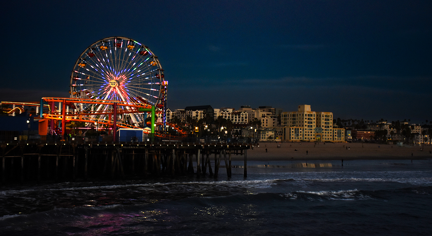
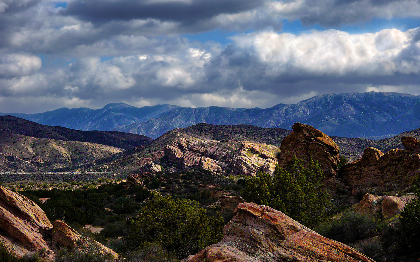
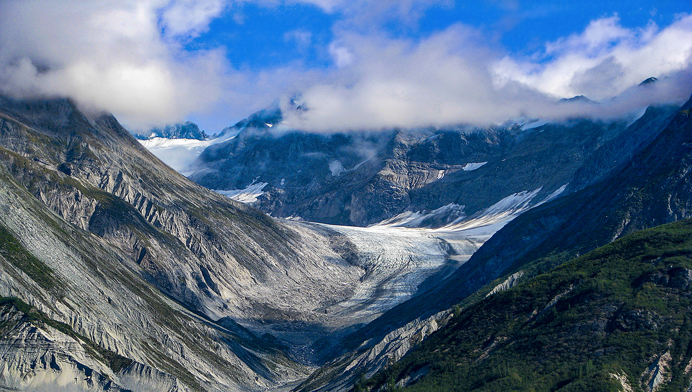
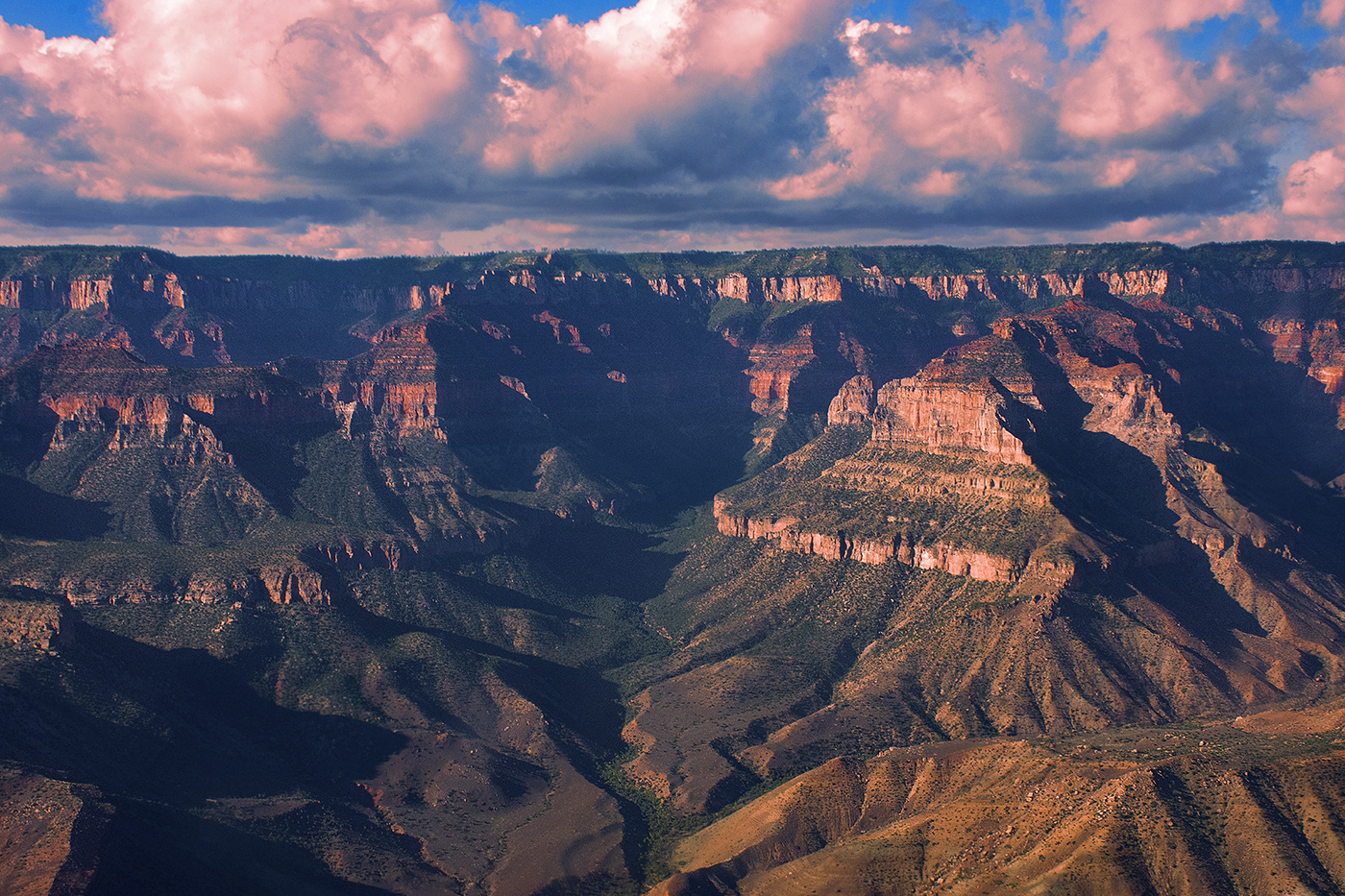
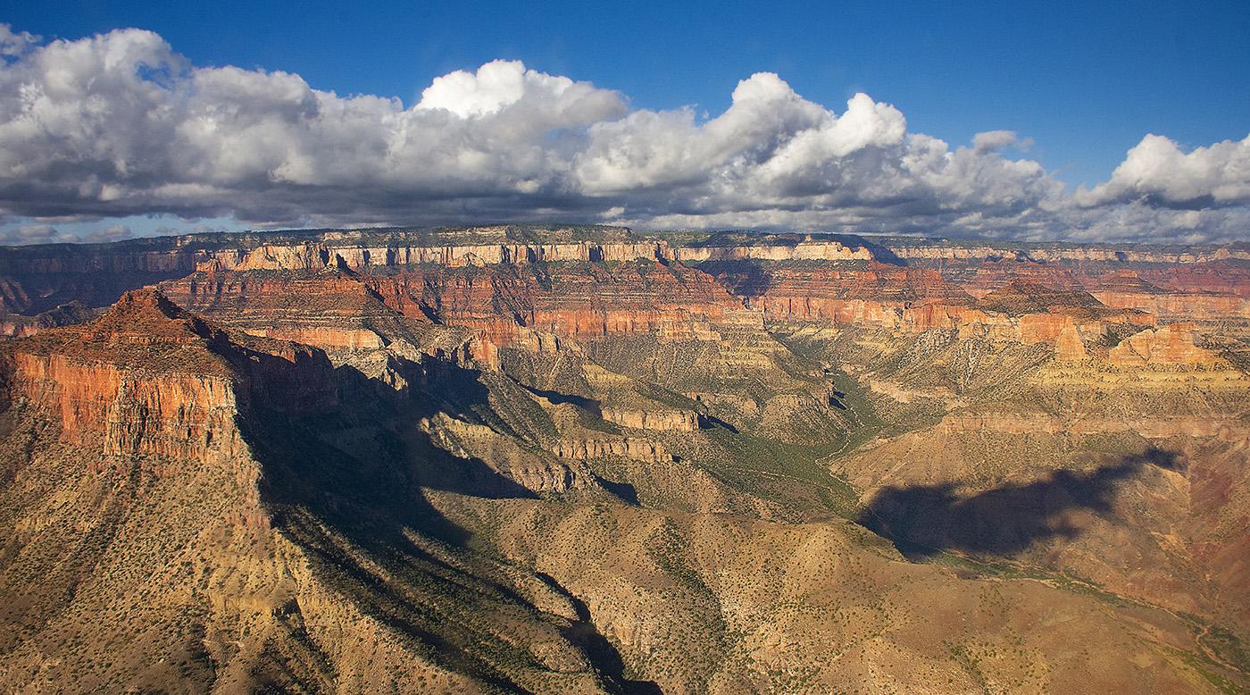
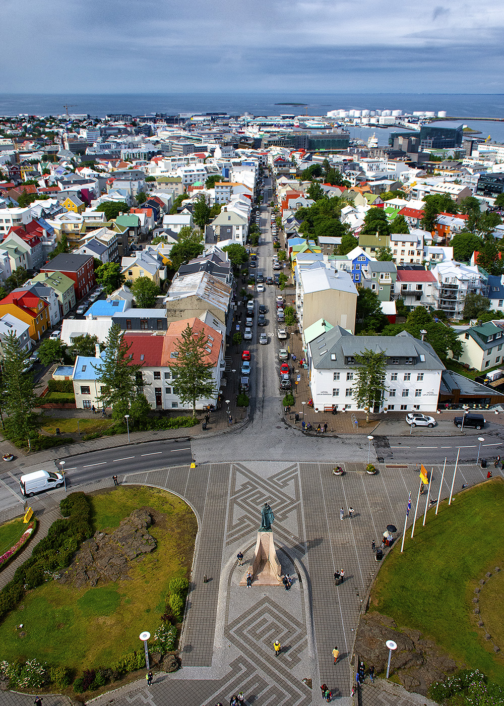
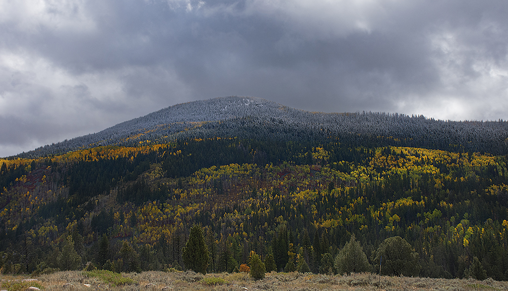
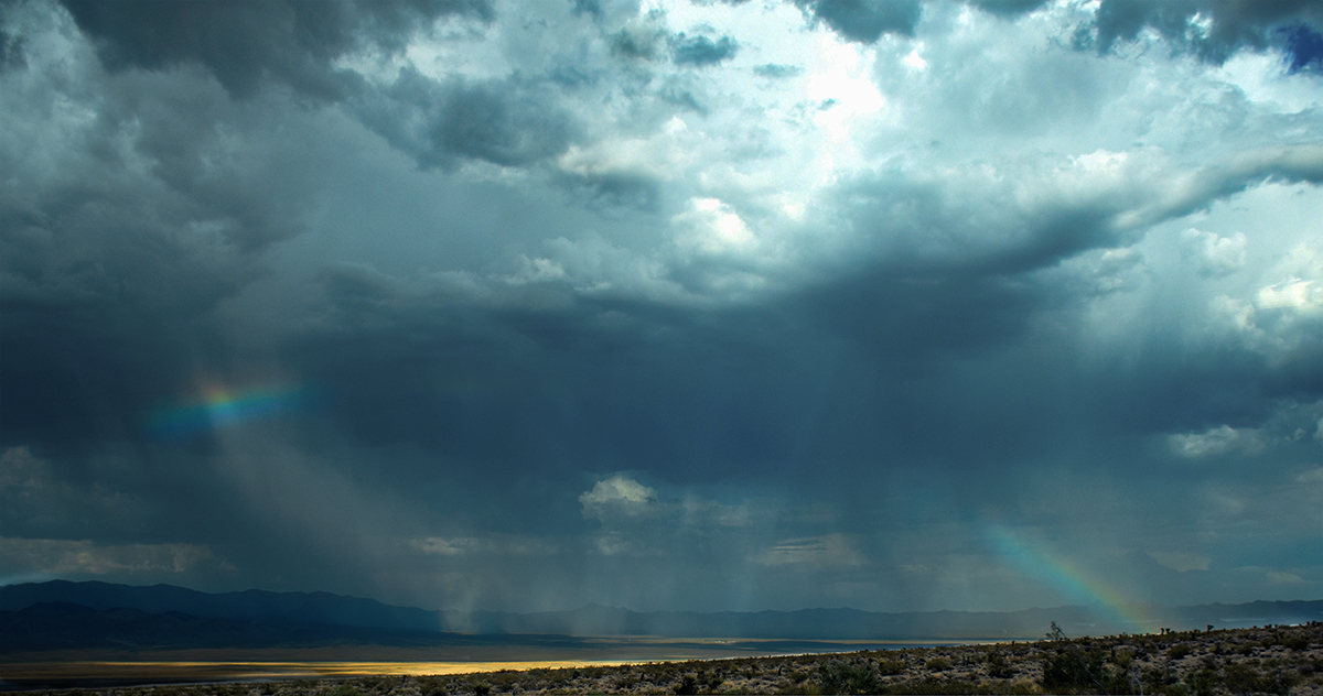
I really nice winter scene. I love the mountains and the clouds. I do agree that the snow does draw your eye from the mountain. The crop Larry has does not really solve that problem. I do like Arne's suggestion about dodging the mountain snow. You could burn the foreground snow a bit as well. You might want to try a luminosity mask for both operations, or you could do them manually. If it were my image, I would also bump up the contrast on the clouds to add a bit more drama to the sky, but that is my personally preference, the sky is already pretty dramatic as it is. |
Nov 13th |
| 36 |
Nov 20 |
Comment |
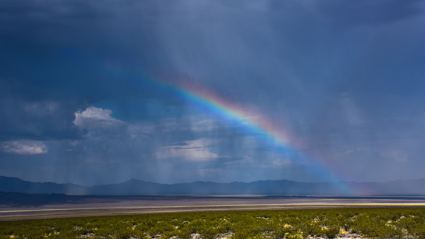
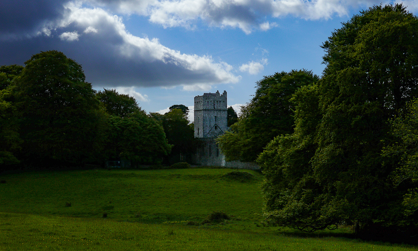
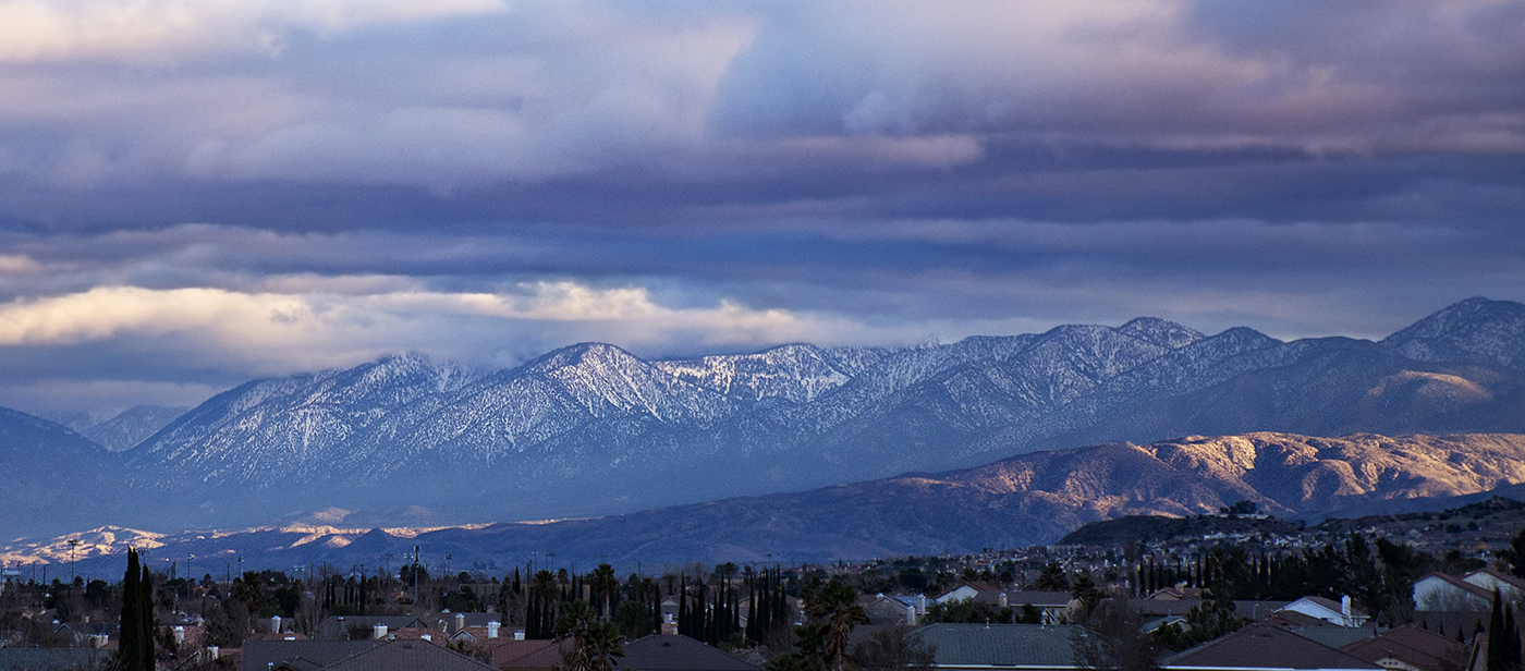
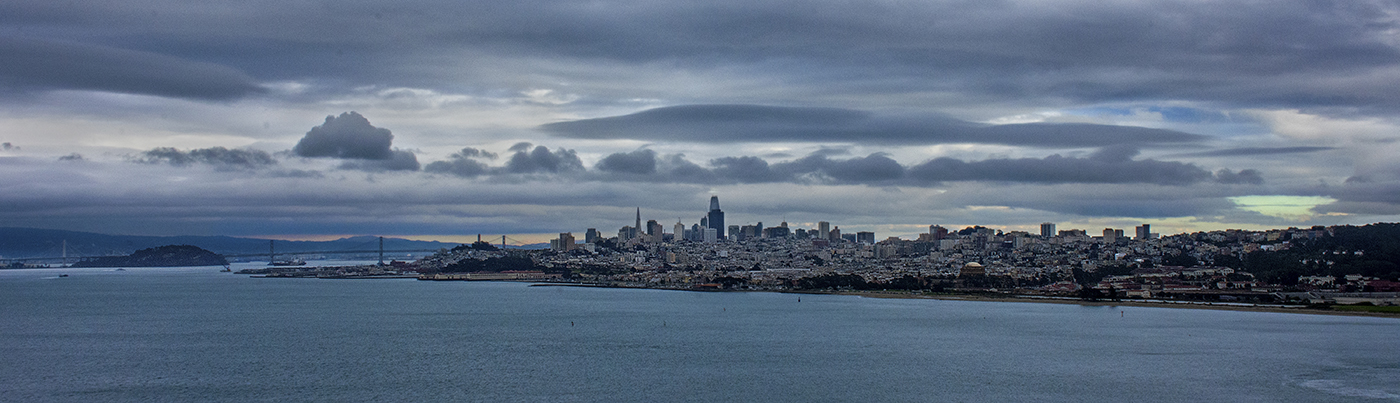
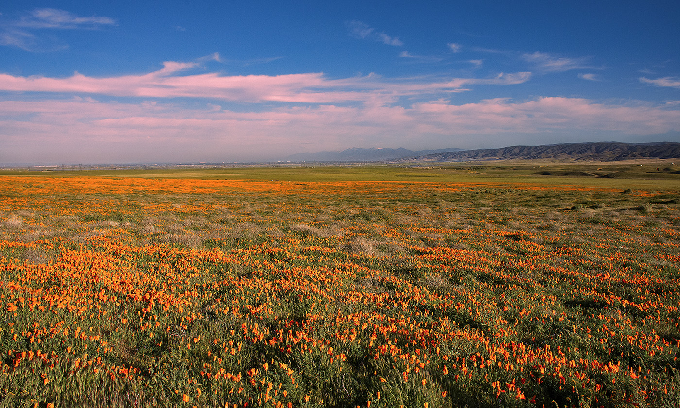
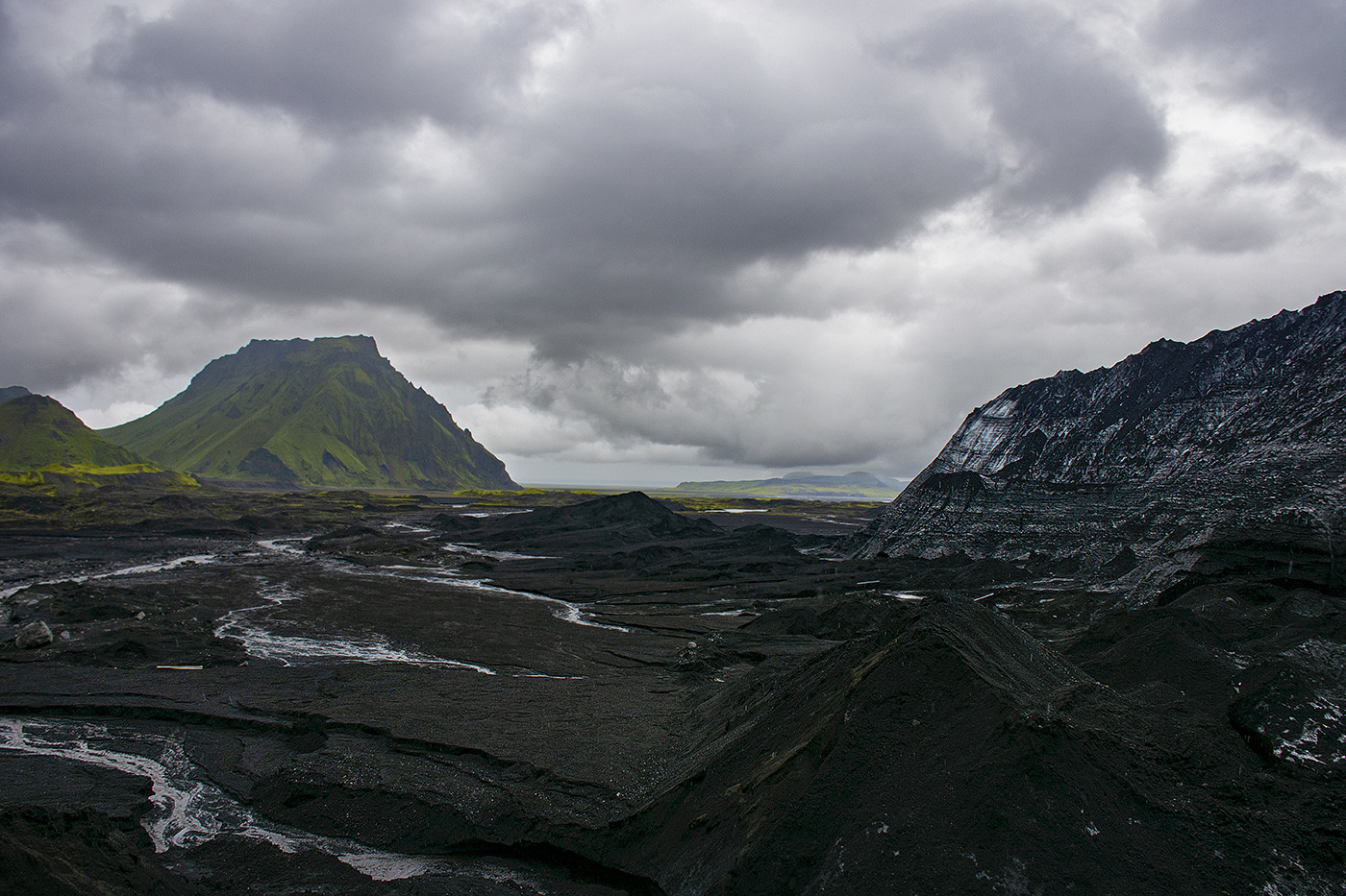
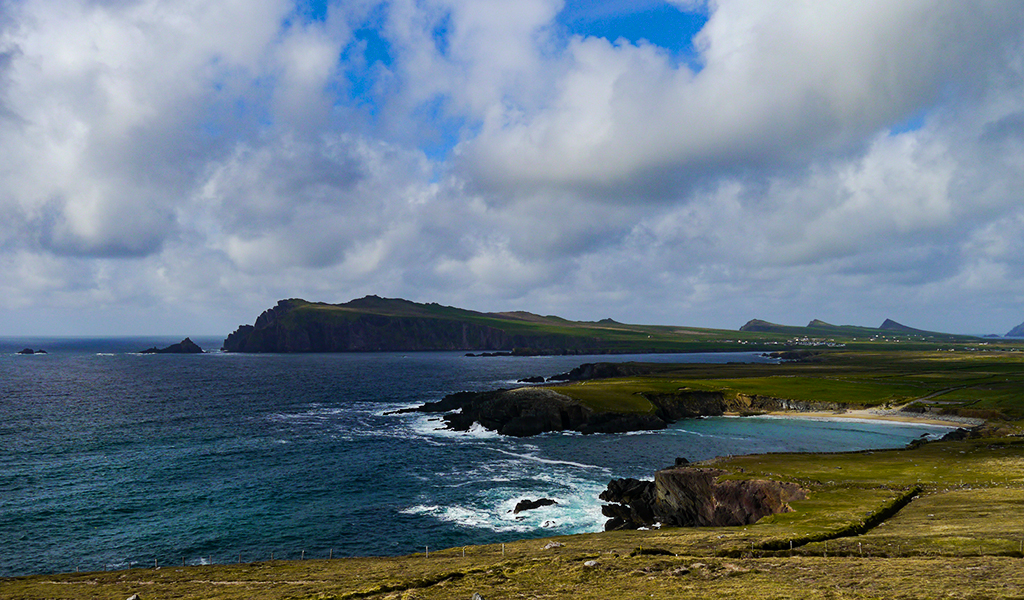
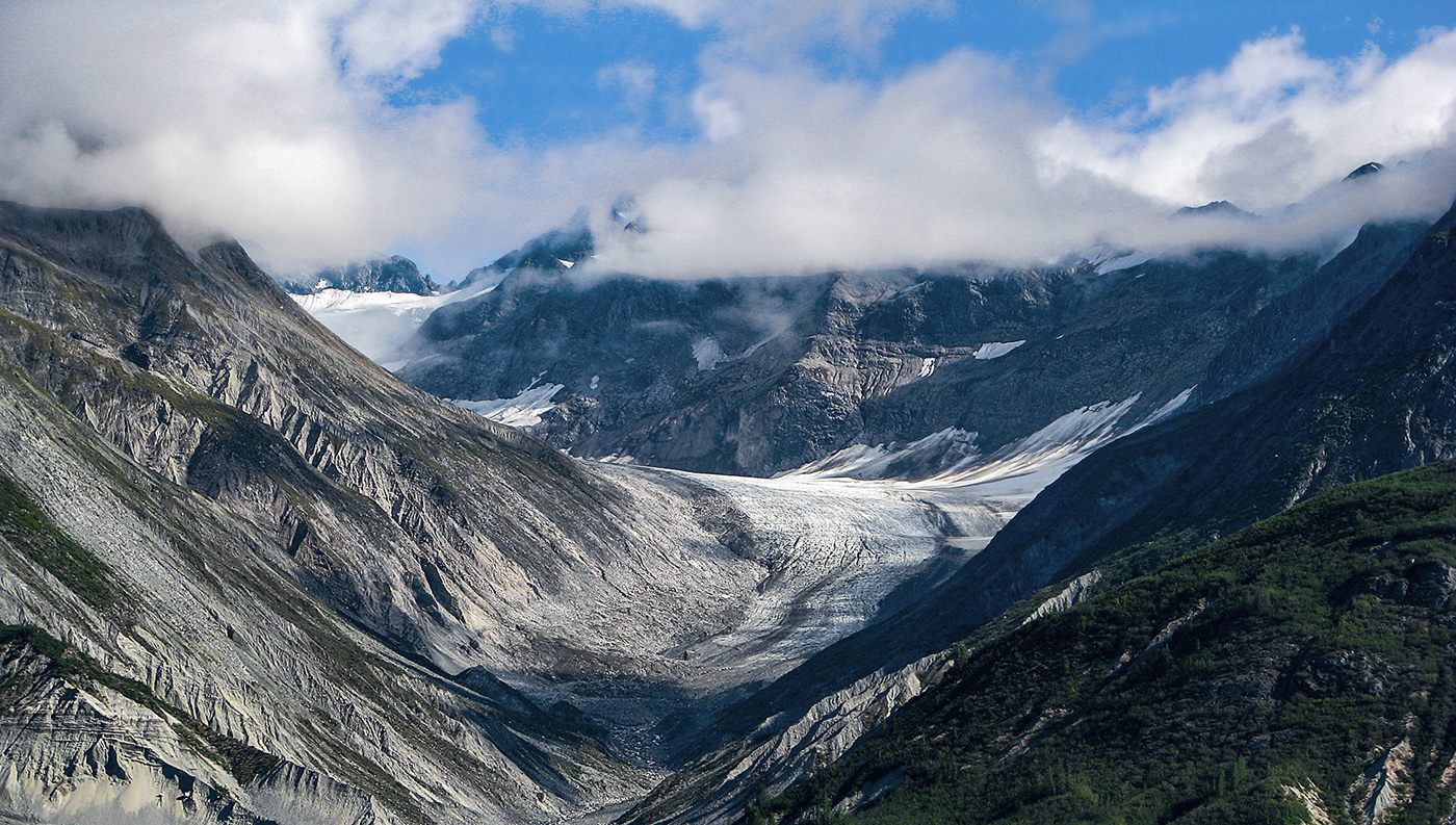
Great image! I love cloud photos. I do agree about cropping the bottom. I did not notice it until I read the other comments. I'm not sure about a top crop. I think the idea does have some merit, but you should experiment with that to see which way you like it better. |
Nov 13th |
| 36 |
Nov 20 |
Comment |
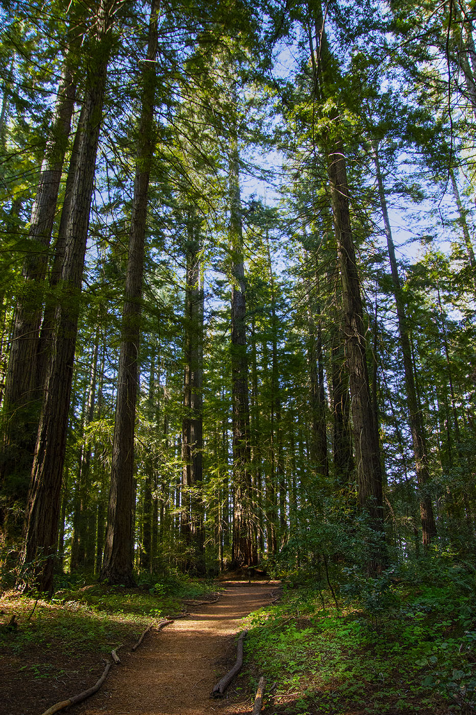
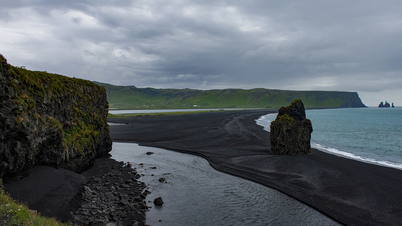
This is a beautiful image. Everything is spot on. I love the moss and the little (fern?). Great job with the water! A very pleasing image. |
Nov 13th |
| 36 |
Nov 20 |
Comment |
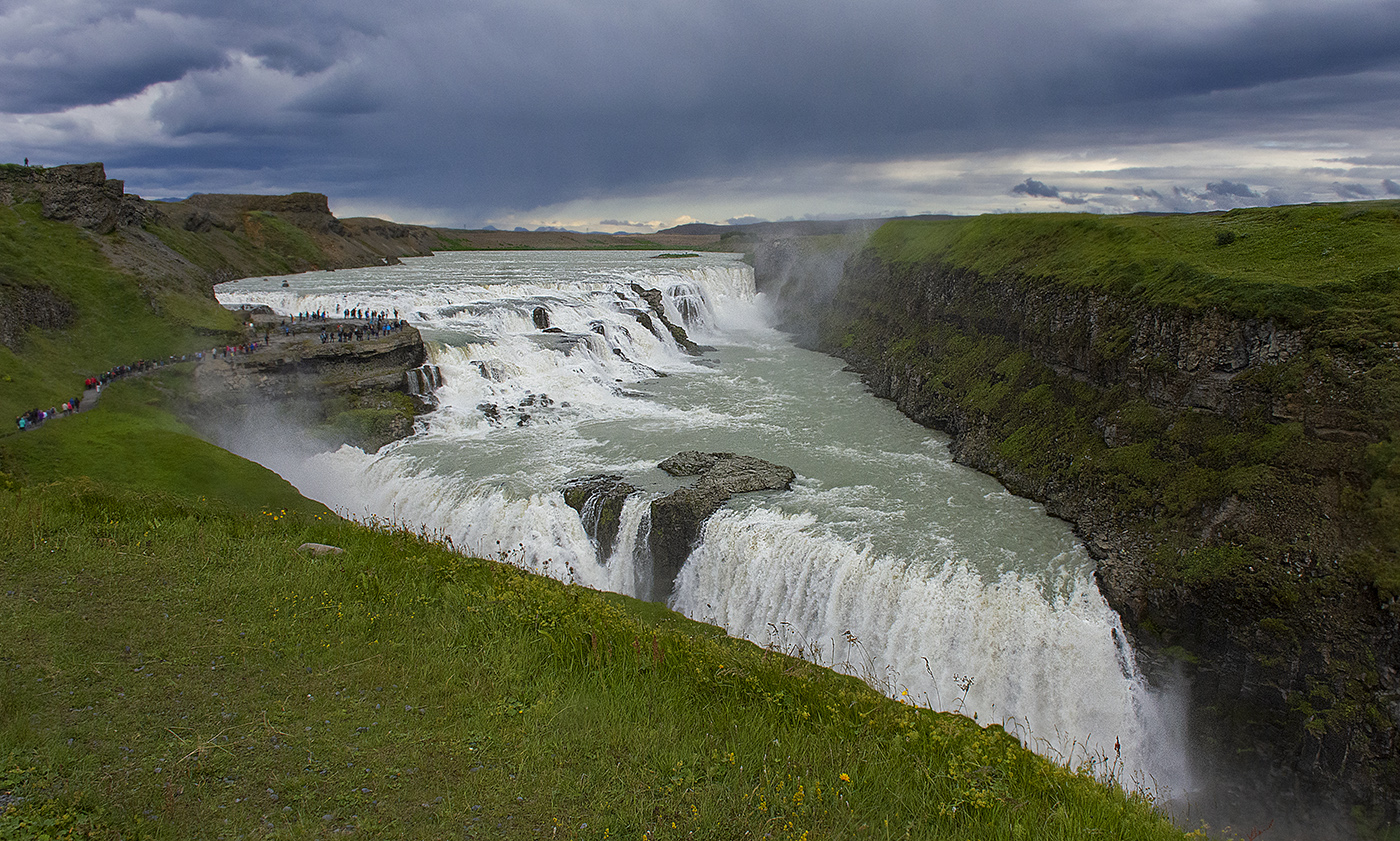
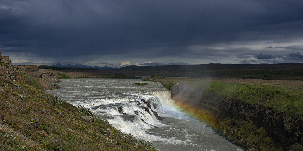
You always go the extra mile to get a great image! I love the colors as well as the composition. The colors are nicely saturated and you have a nice leading line to the falls. I don't really have a problem with the color of the falls, but if you want to get them whiter, in Photoshop you could mask them in a hue/saturation adjustment layer and then slightly desaturate them. I use this trick in portraiture to make the whites of the eyes a purer white. It works there really well. I don't think you would need to mask all of the water coming down, just the main parts. I would set the mask to exclude all and then paint in the portions of the falls to whiten them with a soft brush set to about 8% flow. You can over do it a little and then set the opacity of the adjustment layer to tone it down so it is more realistic. Just a thought. |
Nov 13th |
| 36 |
Nov 20 |
Comment |
I really like this image, the composition is quite pleasing to the eye. For some reason, the black and white appears to be a bit more blown out than your original image, particularly the sky. Perhaps increasing the contrast and toning down the brightness would help, or burning in the sky a bit. It is so bright, my eye keeps getting drawn to it. |
Nov 12th |
7 comments - 0 replies for Group 36
|
7 comments - 0 replies Total
|