|
| Group |
Round |
C/R |
Comment |
Date |
Image |
| 36 |
Sep 20 |
Comment |
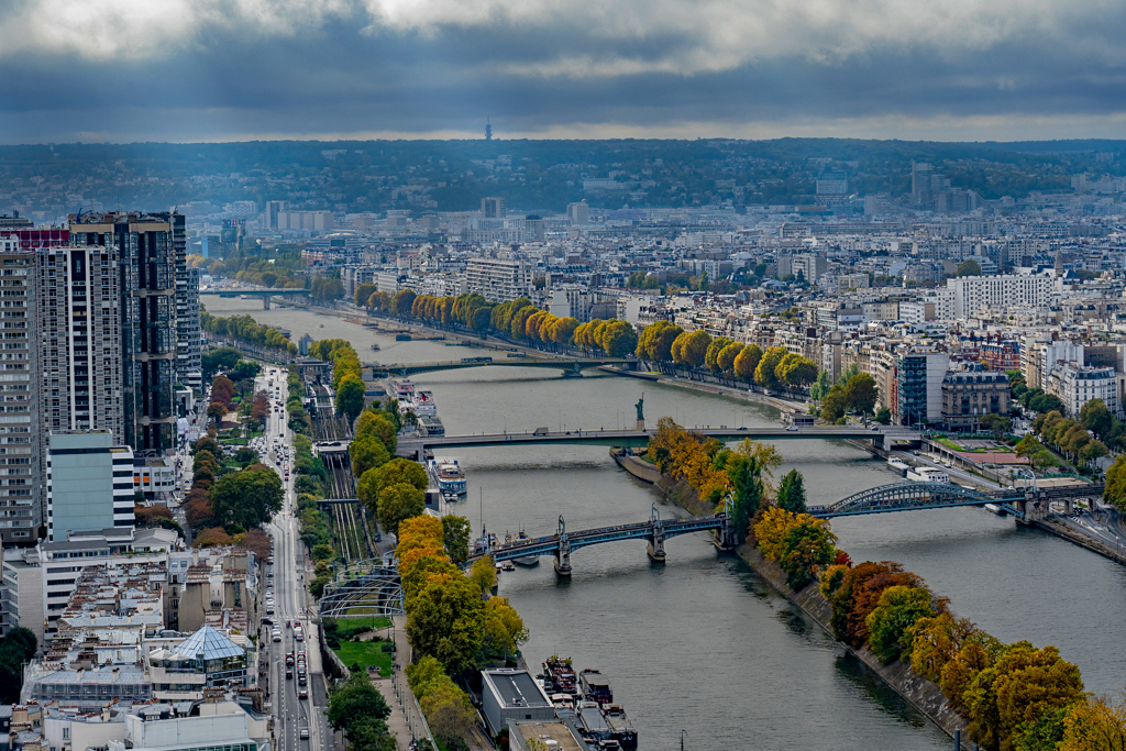
I really like the composition of the image. I do agree with the comments about the haze and the brightness of the water. I thought I'd take a stab at fixing it by masking the water in Photoshop and decreasing its brightness. I also used a dehaze filter to cut some of the haze out. I sharpened the trees and the buildings in the foreground and darkened the background a bit. I also decrease brightness and increased contrast on the clouds and enhanced some of the light rays coming out of them. Finally I bumped up the saturation on the foliage. I used your original image as the source and did not bother cropping it. Let me know what you think. |
Sep 16th |
 |
| 36 |
Sep 20 |
Comment |
Wow, that's an amazing image! The only issue I see is that the valley floor which is in shadow, looks a little over-processed to me, like you cranked up the exposure/brightness a little too much. There is a little bit of a blue/purple cast to the shadows. I have had the same problem on a few of my images. You could try to desaturated it slightly, just enough to make the cast not so noticeable. |
Sep 14th |
| 36 |
Sep 20 |
Comment |
Good result from a midday image. You might consider cropping out more of the sky, since it does not really hold a lot of interest, and the canyon wall is really the subject. |
Sep 14th |
| 36 |
Sep 20 |
Comment |
Nice b&w conversion. I like the longer exposure to blur out the cars and the way the light plays on the wet street. The man to the right does not really bother me. I do agree with Micheal punching up the mist/rain effect might make the effect more obvious. |
Sep 14th |
| 36 |
Sep 20 |
Comment |
Nice image, very simple and pleasing to the eye. I do think the contrast could by enhanced a bit and I like Arne's suggestion of a luminosity mask. |
Sep 14th |
| 36 |
Sep 20 |
Comment |
Great image. Your B&W conversion and work on the "smoke" really paid off! I do agree with Micheal about the sun. It does pull your eye away from the landscape. Cropping it out might be the best answer, or you could burn it so it is not so distracting. BTW I really like the color in the original too. |
Sep 14th |
6 comments - 0 replies for Group 36
|
6 comments - 0 replies Total
|