|
| Group |
Round |
C/R |
Comment |
Date |
Image |
| 36 |
Jun 20 |
Comment |
Nice image! You're right about the B&W treatment. I like the crop too. |
Jun 8th |
| 36 |
Jun 20 |
Comment |
I really like that image composition, however, I do agree with the others, that the image seems a bit flat. I thought I'd take a shot at improving the contrast, at brightness, using two different zones for the ground and the sky and using a camera raw filter on each zone. I did get some weird halo artifacts on one of the buildings which I tried to fix up (I think because the starting image was so small, probably jpeg artifacts). I then applied global adjustment layers for vibrance and exposure. Let me know what you think. |
Jun 8th |
 |
| 36 |
Jun 20 |
Comment |
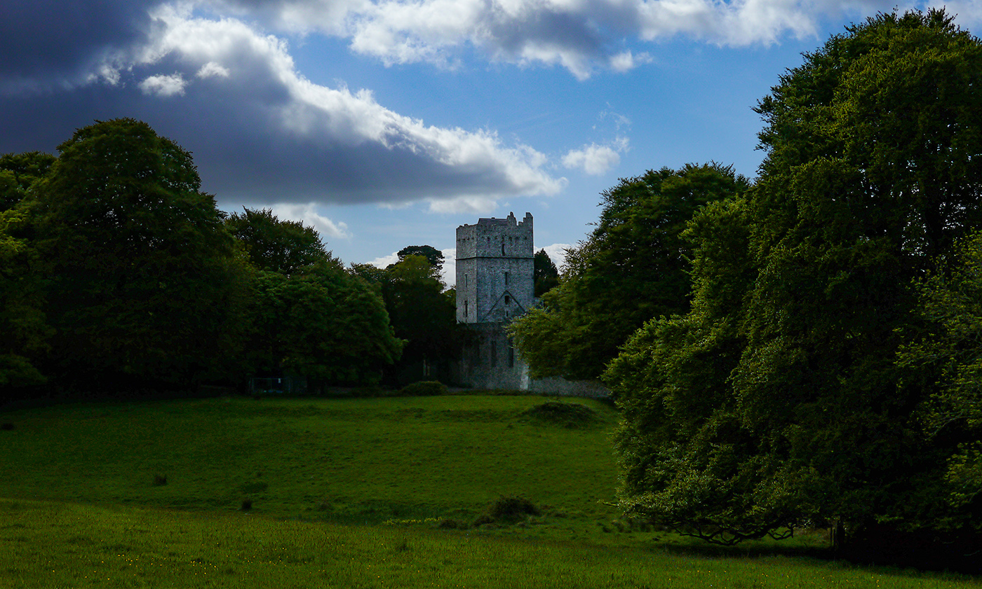
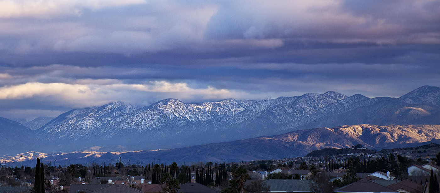
Nice image! Definitely a lot more impact in B&W. I like the vignette effect. Larry is right, it definitely has a foreboding mood. I don't think I would change a thing. |
Jun 8th |
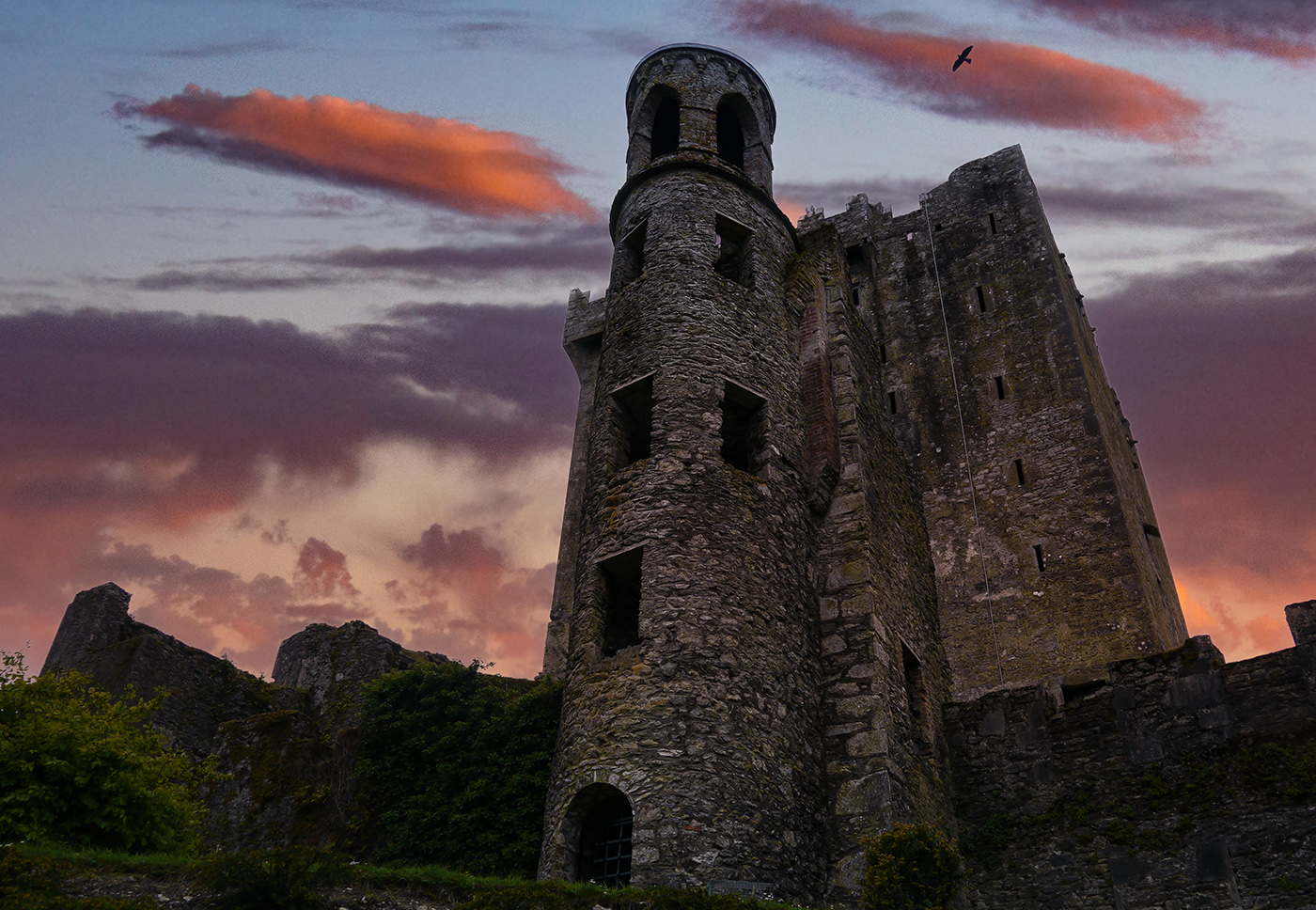
| 36 |
Jun 20 |
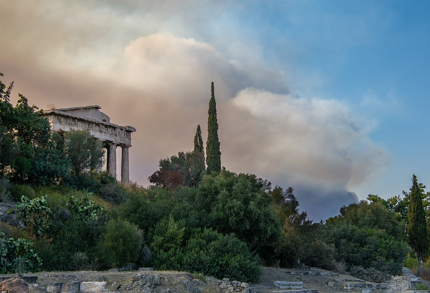
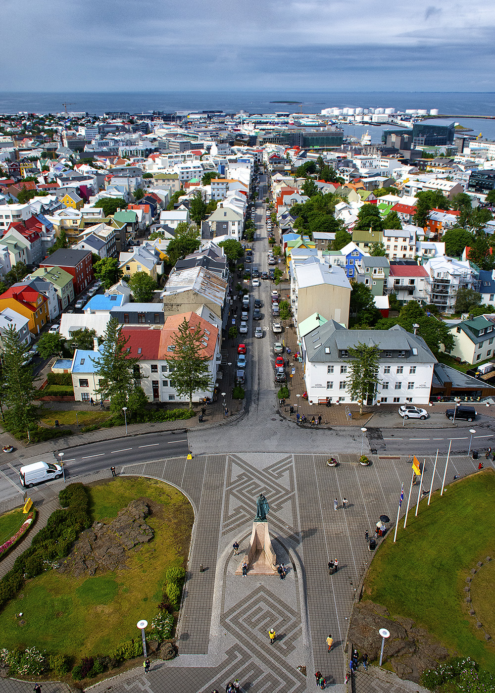
Comment |
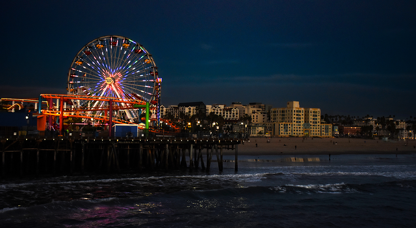
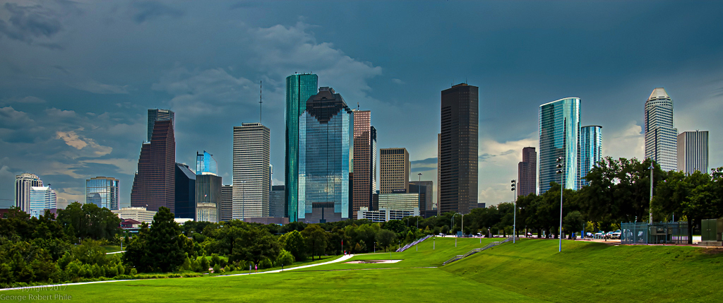
When I first saw this image, I though it was actually selectively made B&W for impact, but it's just the environment. The vibrant color in the display contrasted with the subdued colors of the day really give this image a lot of impact. One nit - there is a person on the left in a red coat who is cut in half, I would adjust the crop to get rid of them. Overall, great image! |
Jun 8th |
| 36 |
Jun 20 |
Comment |
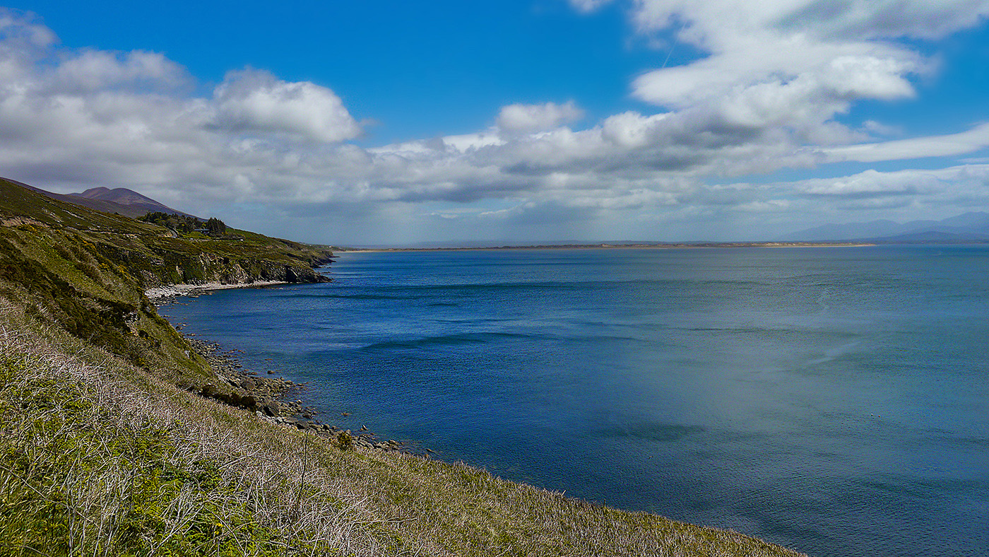
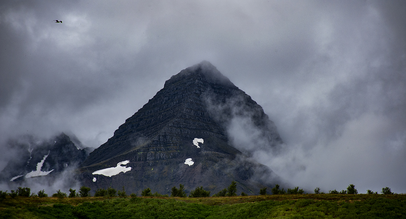
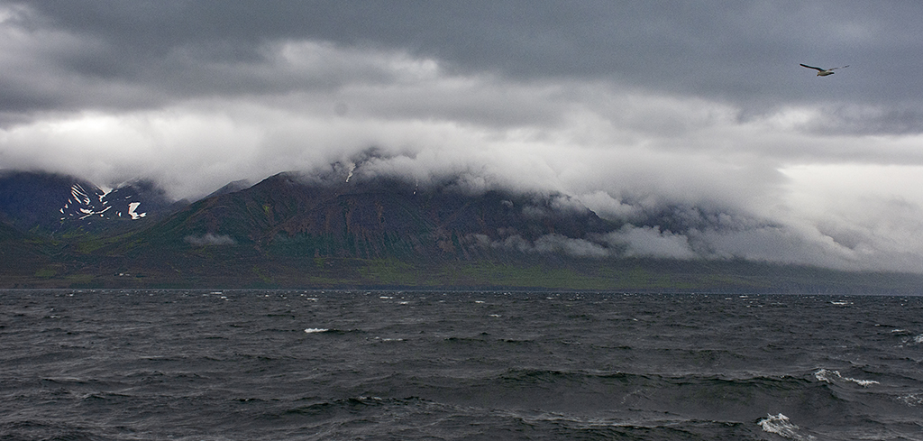
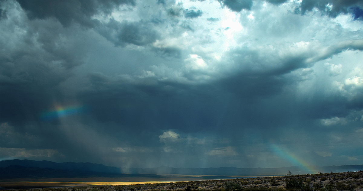
Wow! I really like the mood of this image. I actually thought it was fog, before I read your explanation. A lot of camera work here, and the result really shows it. The colors in the sky are beautiful! I'm not even sure if my camera supports a cable release, I have a wireless remote for it. Like Richard, the ocean is an hour away from me but might as well be a light year. |
Jun 8th |
| 36 |
Jun 20 |
Comment |
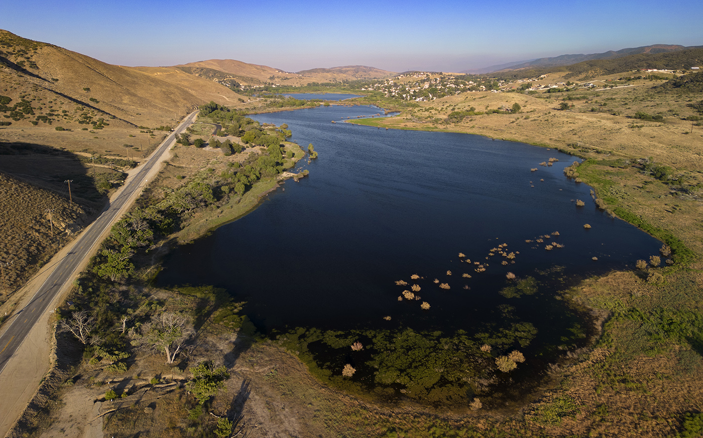
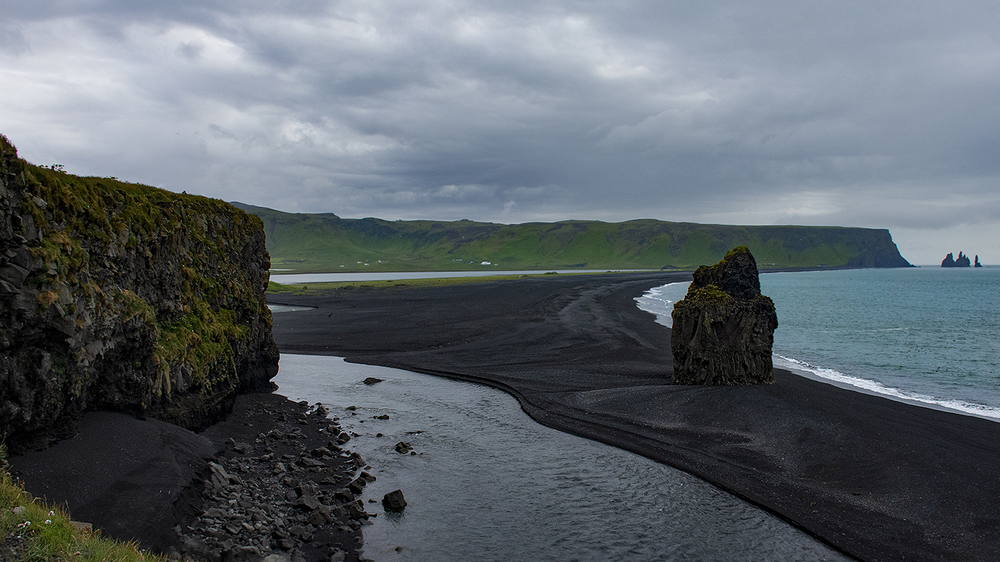
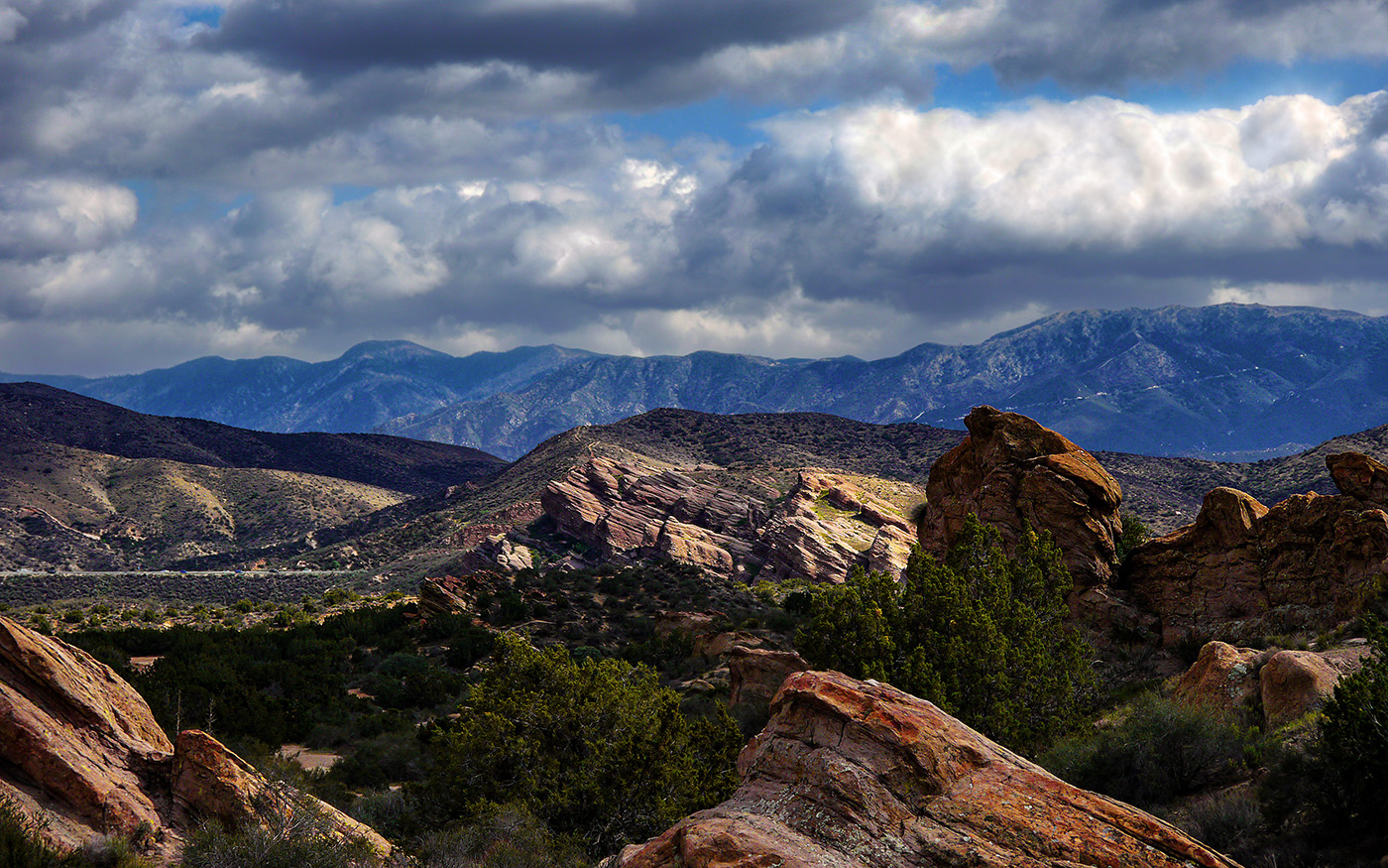
A reflective shot would have been really cool, but it is a really nicely composed image anyway. I do see the couple of dust spots Richard is talking about, but those are easily removed. I agree with Larry that the colors are a bit washed out and the sky is a bit bland. You could bump of the contrast on the sky and maybe darken it a bit, and maybe the same for the rocks or try increasing vibrancy a bit on the rocks as well. You could also try messing around with curves adjustment layer for specific channels to punch up the rocks a bit.
If you did have your heart set on a reflection scene, there are ways to fake that in Photoshop. Basically you invert the picture at the horizon and mask it for where you want the water. You then apply some filters to make it look a little more natural. You could probably do something like this in the foreground where the rocks are. I've seen a few videos on YouTube with the specifics, if you are interested. |
Jun 8th |
6 comments - 0 replies for Group 36
|
6 comments - 0 replies Total
|