|
| Group |
Round |
C/R |
Comment |
Date |
Image |
| 36 |
Mar 20 |
Comment |
I really like the composition and color in this photo. I actually am not sure that sharpening would improve it, the softness adds some atmosphere which is pleasing. I agree that the birch tree is a little distracting and perhaps could be darkened a bit. |
Mar 13th |
| 36 |
Mar 20 |
Comment |
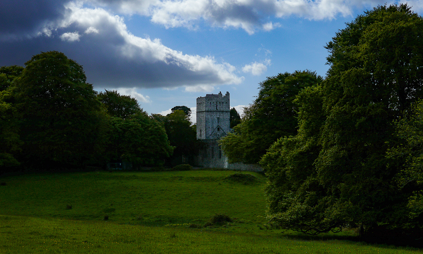
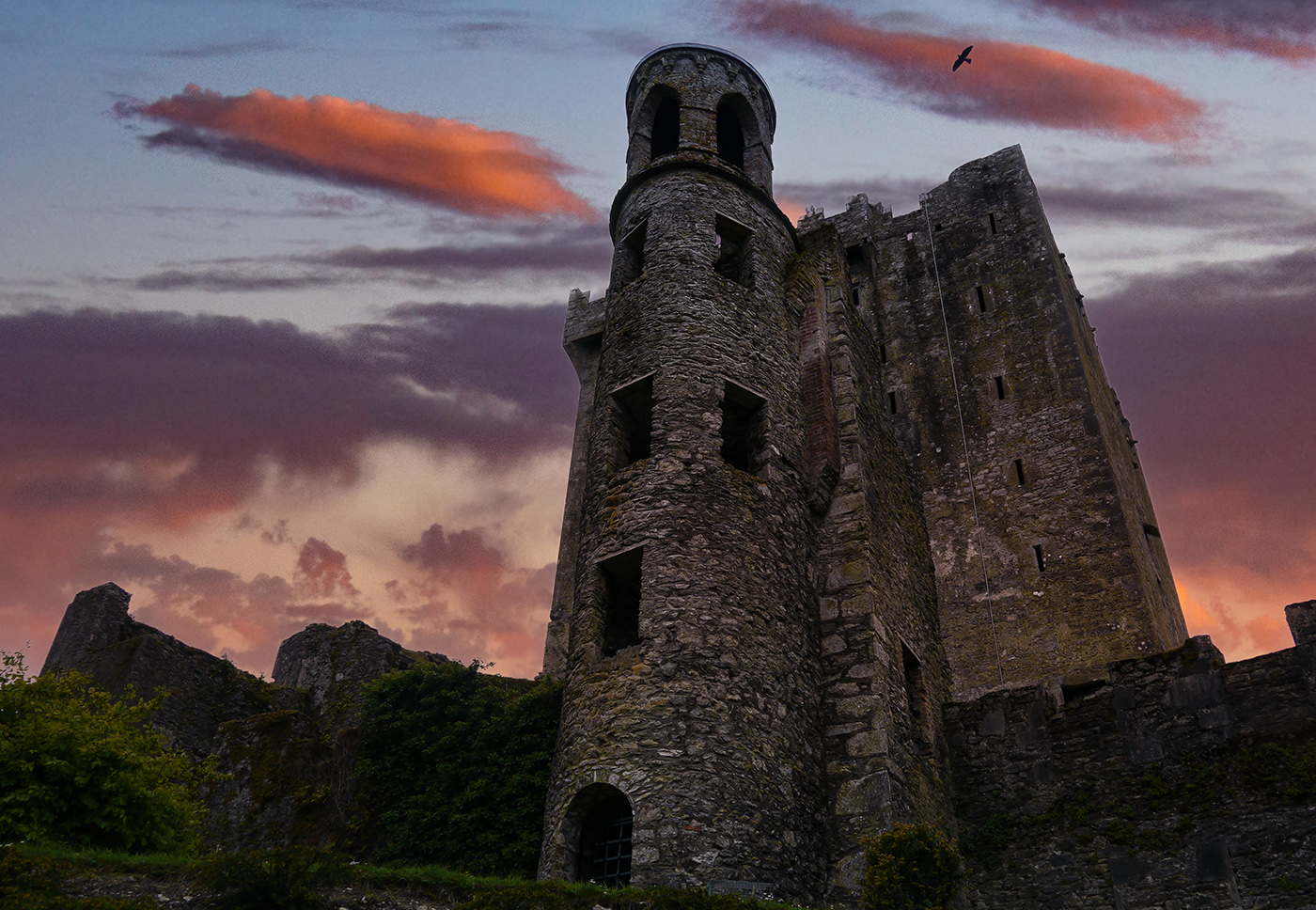
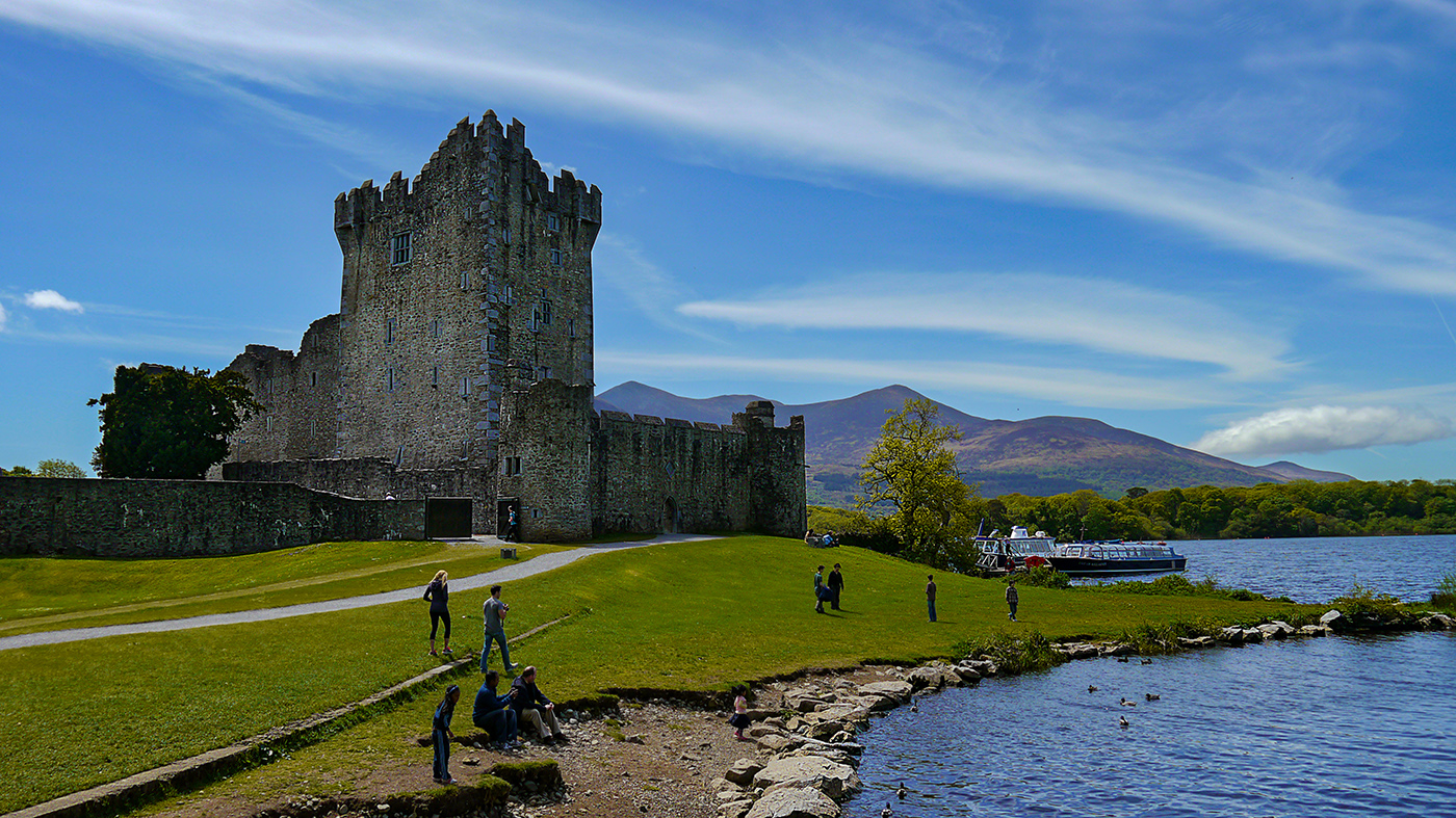
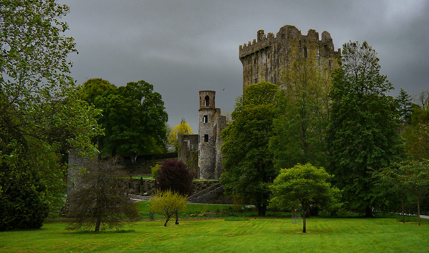
Thanks for all the comments. I need to figure out a way to get the sky darker without introducing a bunch of artifacts which I was at the edge of getting and had to back off. I will fiddle around with that. I like the suggestions about the crop and lightening the castle a bit. I did actually sharpen the leaves a bit, but mainly concentrated on the stonework of the castle because I wanted it to stand out. As far as the bird goes, this photo was entered into a travel category which is reality based, so I can't take it out, only sharpen, dodge, burn, or crop. (You can take out artifacts like sensor dust) |
Mar 13th |
| 36 |
Mar 20 |
Comment |
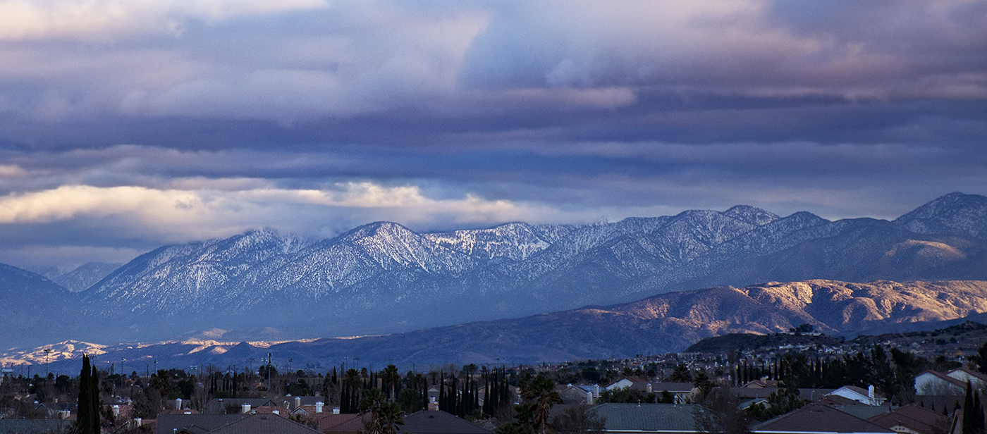
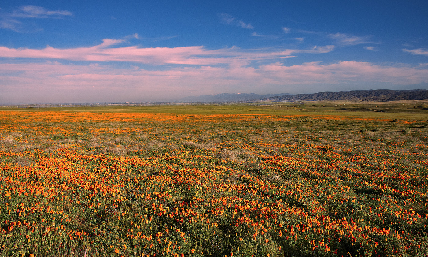
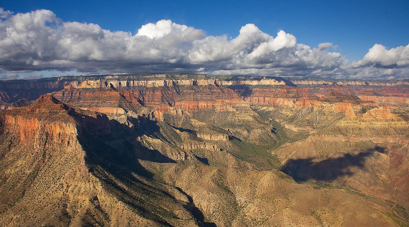
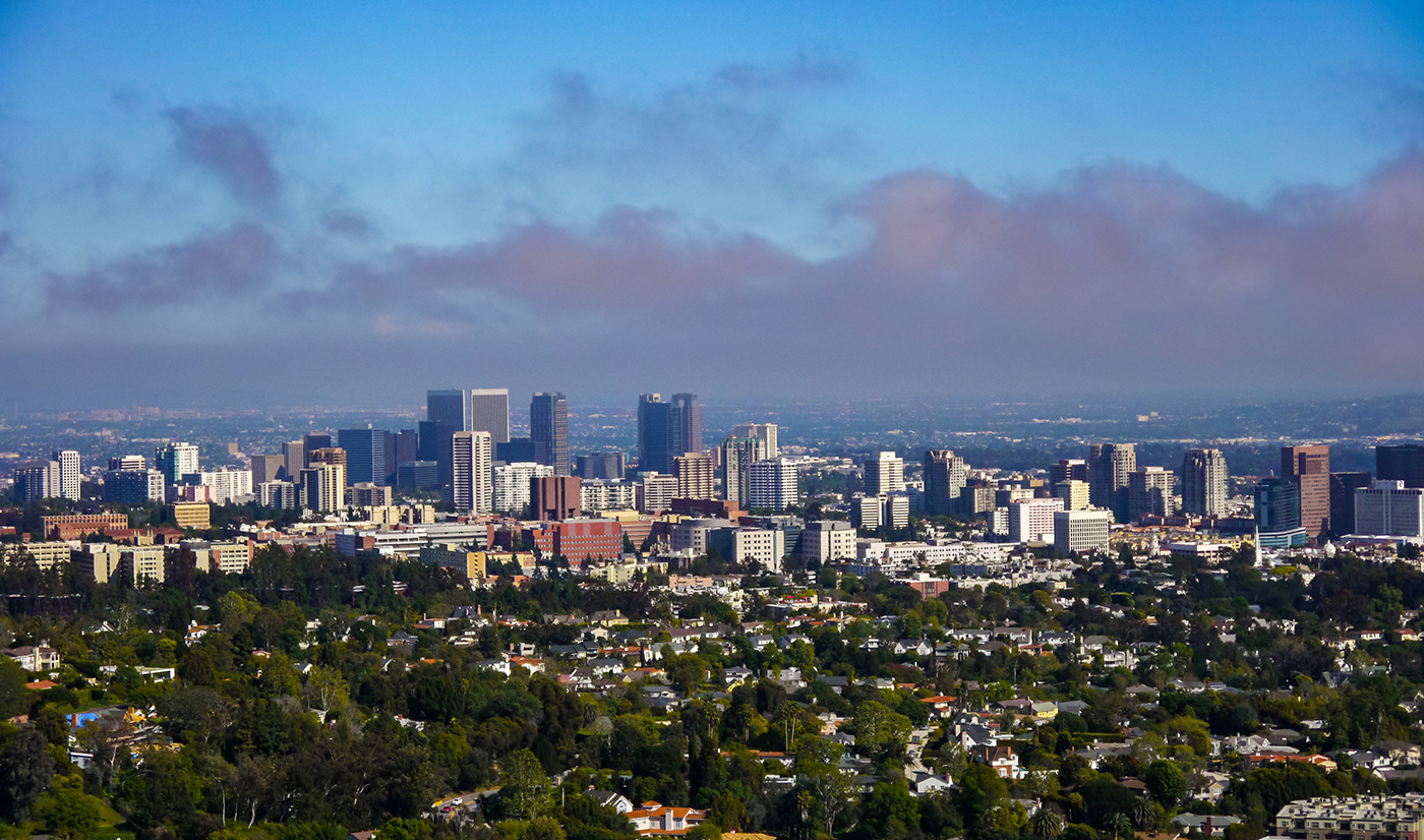
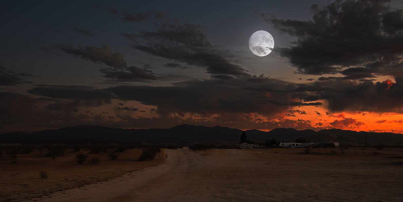
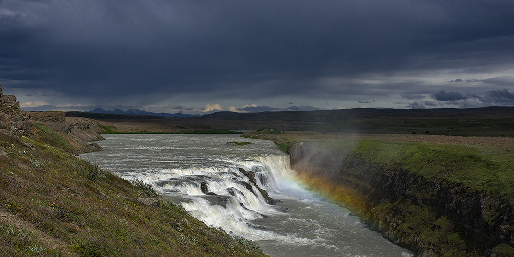
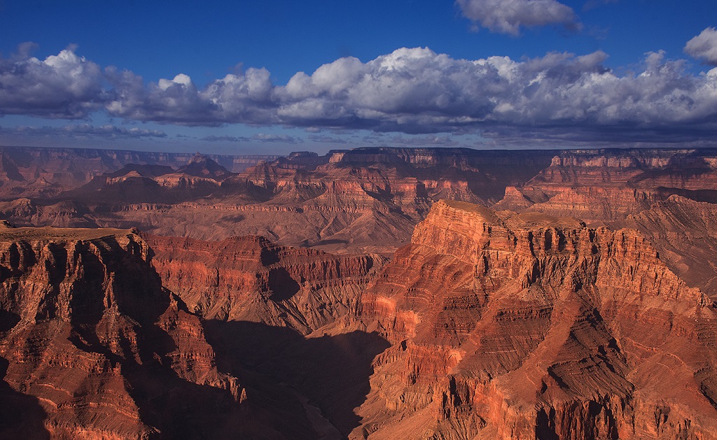
Powerful image! The clouds really make it special. I would not change a thing. |
Mar 13th |
| 36 |
Mar 20 |
Comment |
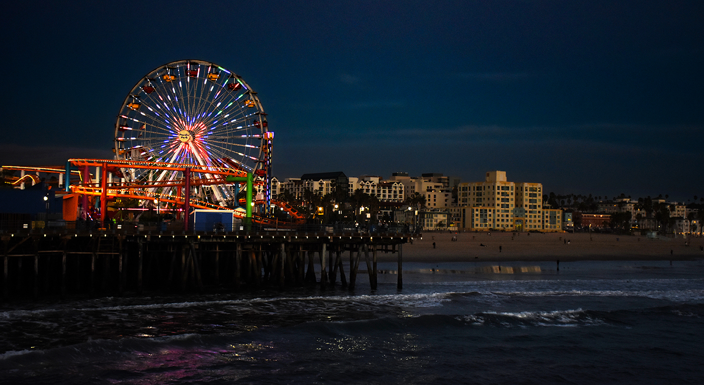
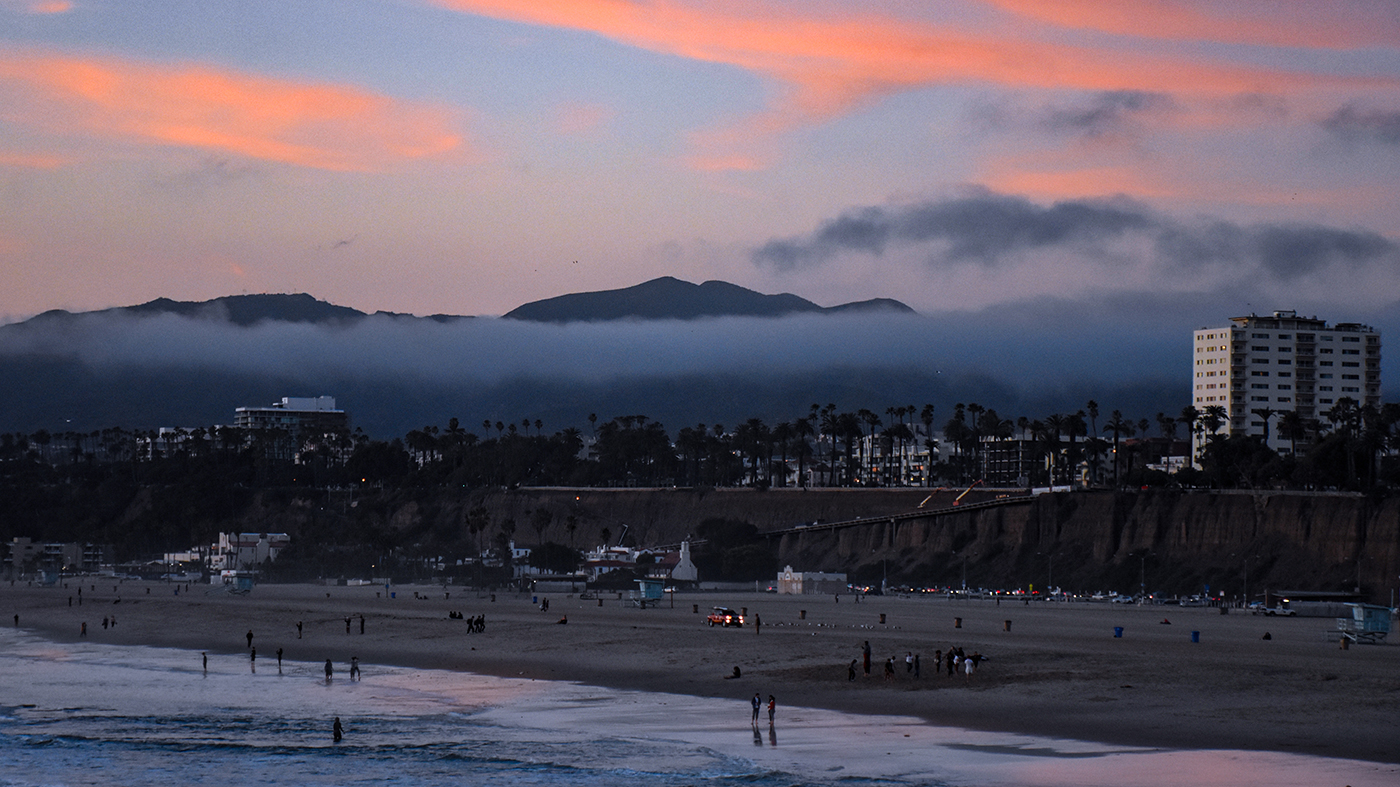
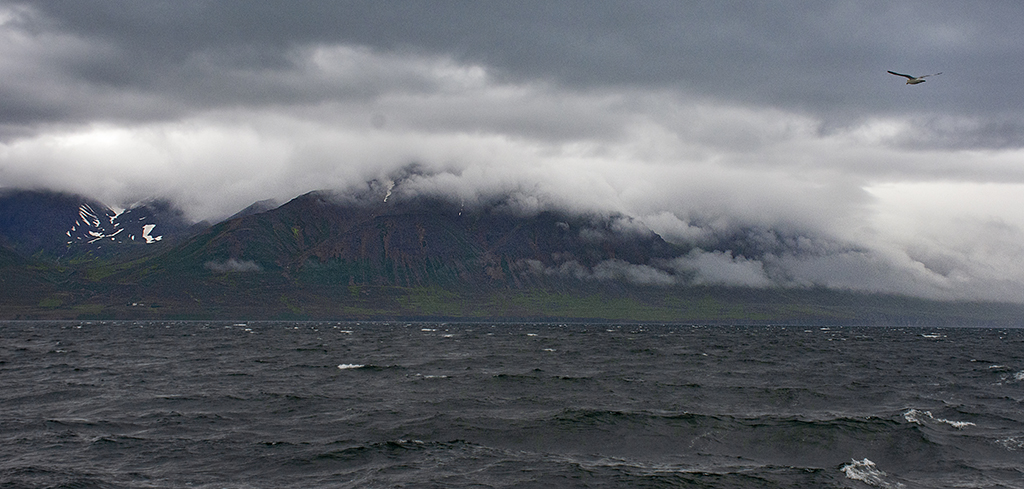
I love how the pier is suspended in fog. It's a great effect, and with b&w is both moody and a little surreal. Really quite creative! |
Mar 13th |
| 36 |
Mar 20 |
Comment |
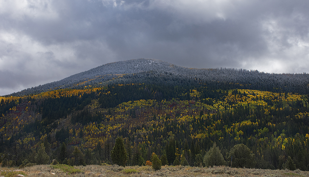
Nice sky! Colors and contrast are perfect. I agree that you could sharpen the trees a bit. |
Mar 13th |
| 36 |
Mar 20 |
Comment |
I like the revised image of the stump a lot better than the original, the stump in the original seemed a little over processed to me. The color one would have made a good image too. I love the sky! I agree since the subject is the stump, b&w makes more sense. |
Mar 13th |
| 36 |
Mar 20 |
Comment |
I think I like the unaltered image better. The perspective is what you would expect from that point of view. In the altered image the top of the building actually looks larger that the bottom. You can also see that the left exterior wall appears to be bowed out somewhat. It also makes the building look flatter and wider than it actually is. One thing I might have done to the original image is rotate it counterclockwise .5 of a degree or so, because it does not appear to be level, but this might be due to the point of view which is not straight on but slightly off to the right. It is a good image, overall color and contrast are great and the sky adds some interest. |
Mar 13th |
7 comments - 0 replies for Group 36
|
7 comments - 0 replies Total
|