|
| Group |
Round |
C/R |
Comment |
Date |
Image |
| 36 |
Feb 20 |
Comment |
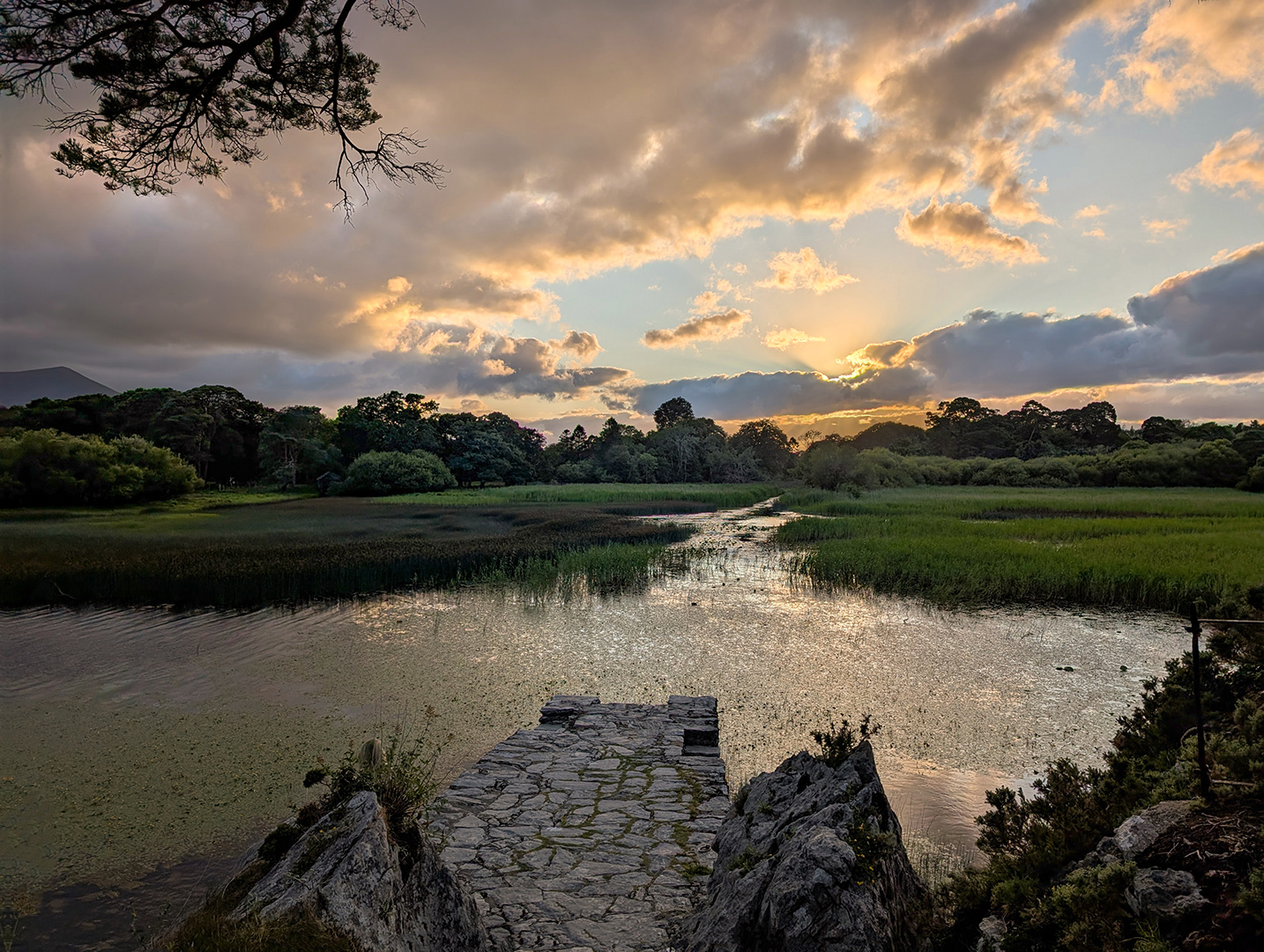
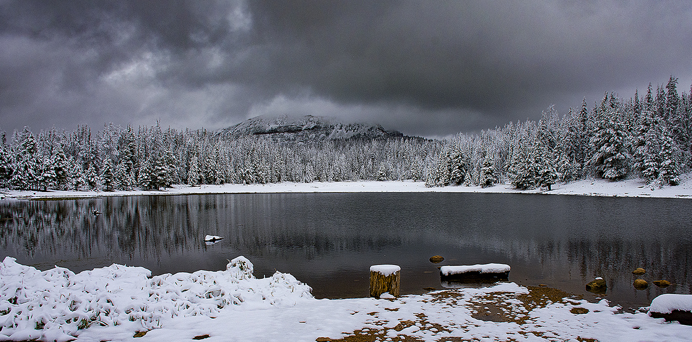
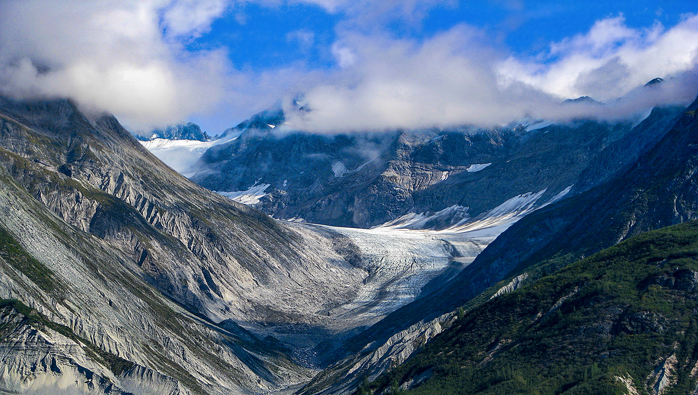
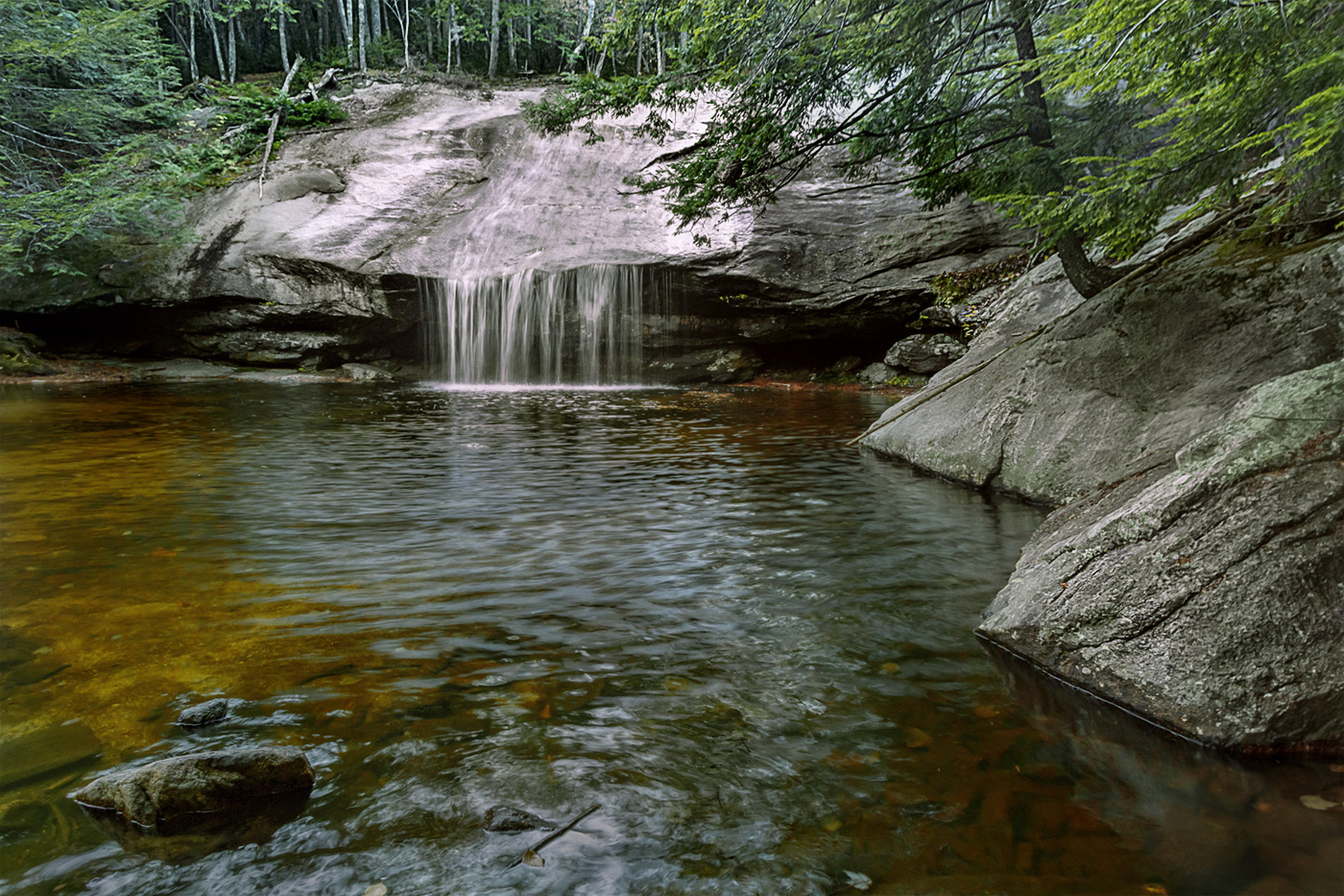
This is a really nice image and typical of the northeast where I grew up. I like the colors in this image and the waterfall in the forest is beautiful. I did note the glare and the water and at the bottom of the shot. It also seemed to me the trees and rocks are a little soft. I took the liberty of doing a little post processing in Photoshop. I did a unsharp mask layer just on the trees and rocks with an opacity set to 50%, a camera raw layer on the water decreasing the whites and highlights to zero, opacity set to 30% and did a light vignette of just the waterfalls. I also burned the bright area in the foreground. See if you think that improves it at all. |
Feb 18th |
 |
| 36 |
Feb 20 |
Comment |
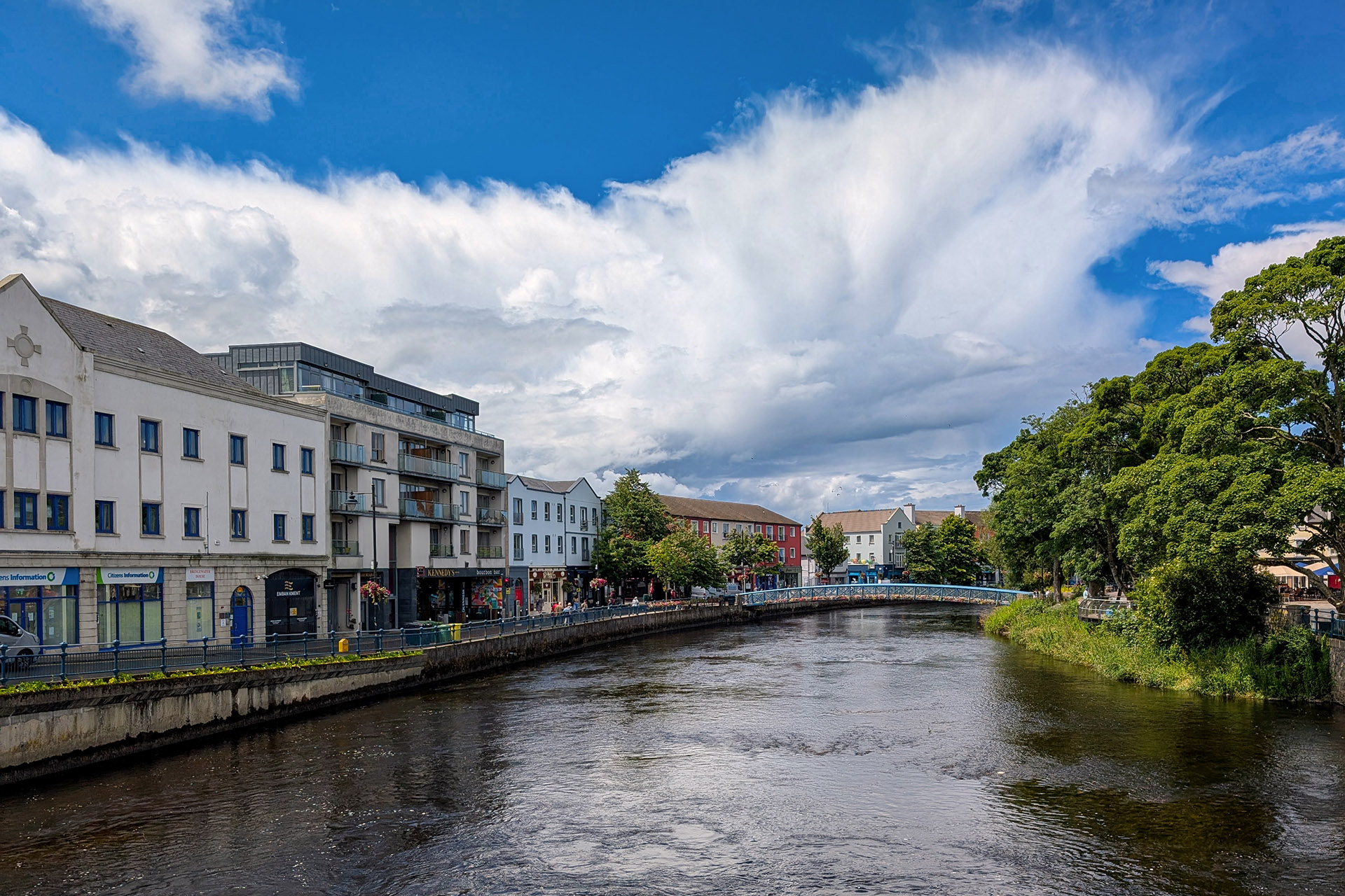
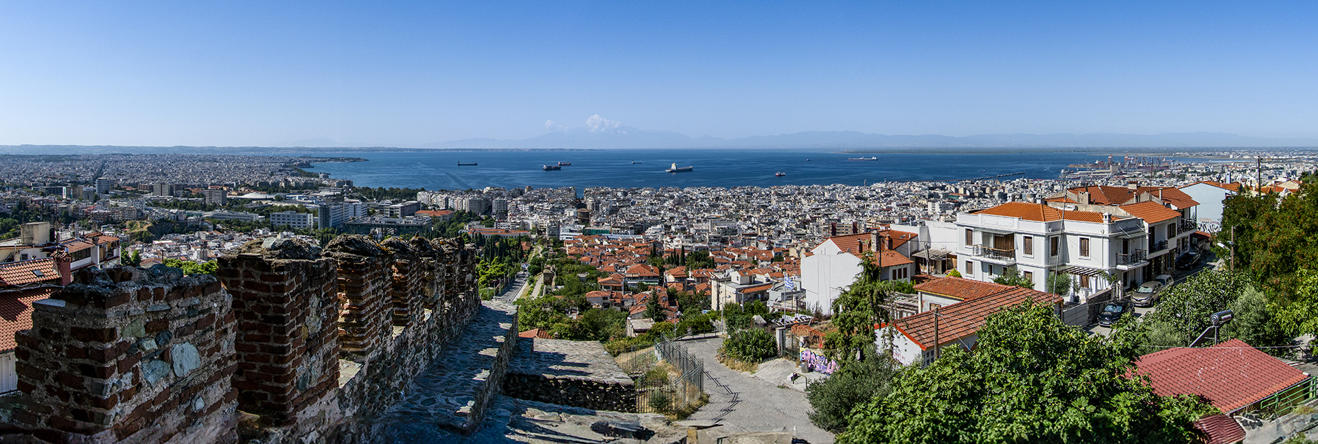
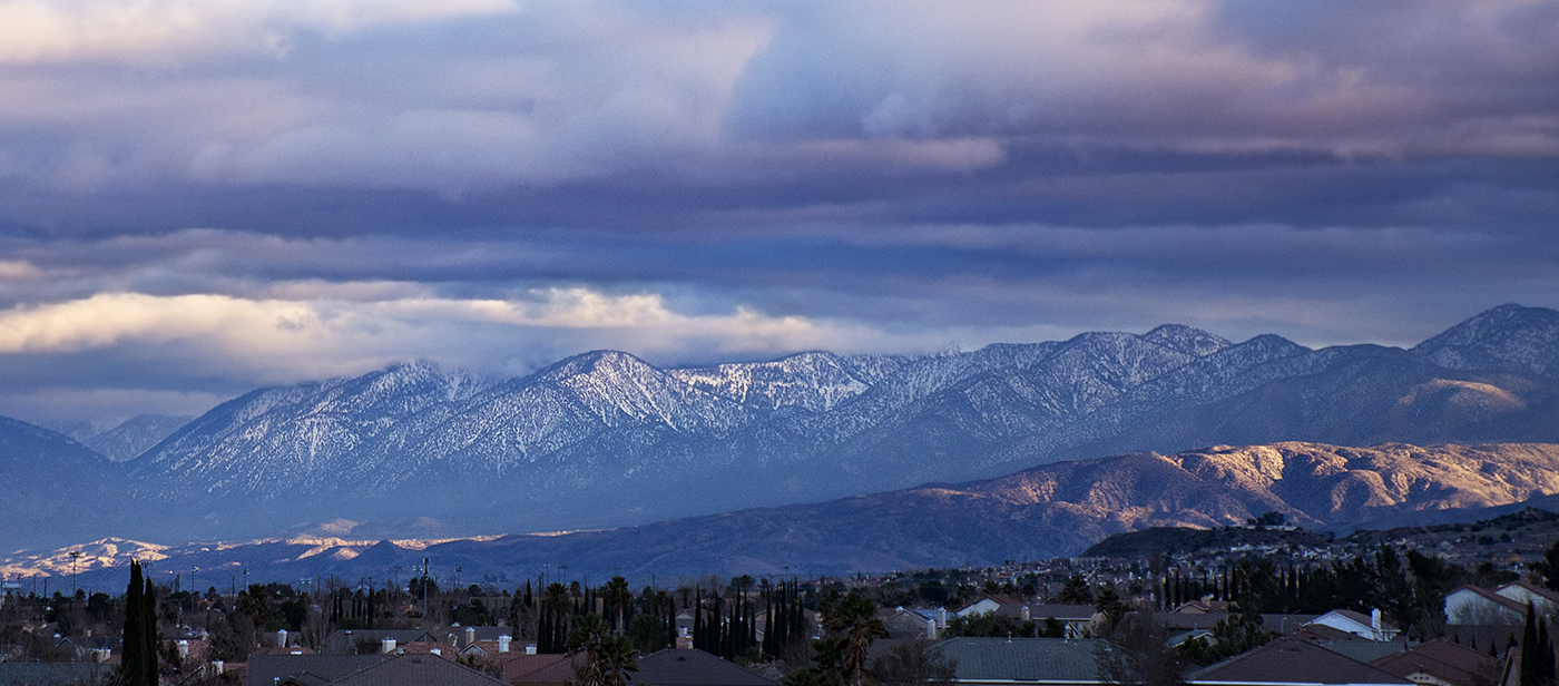
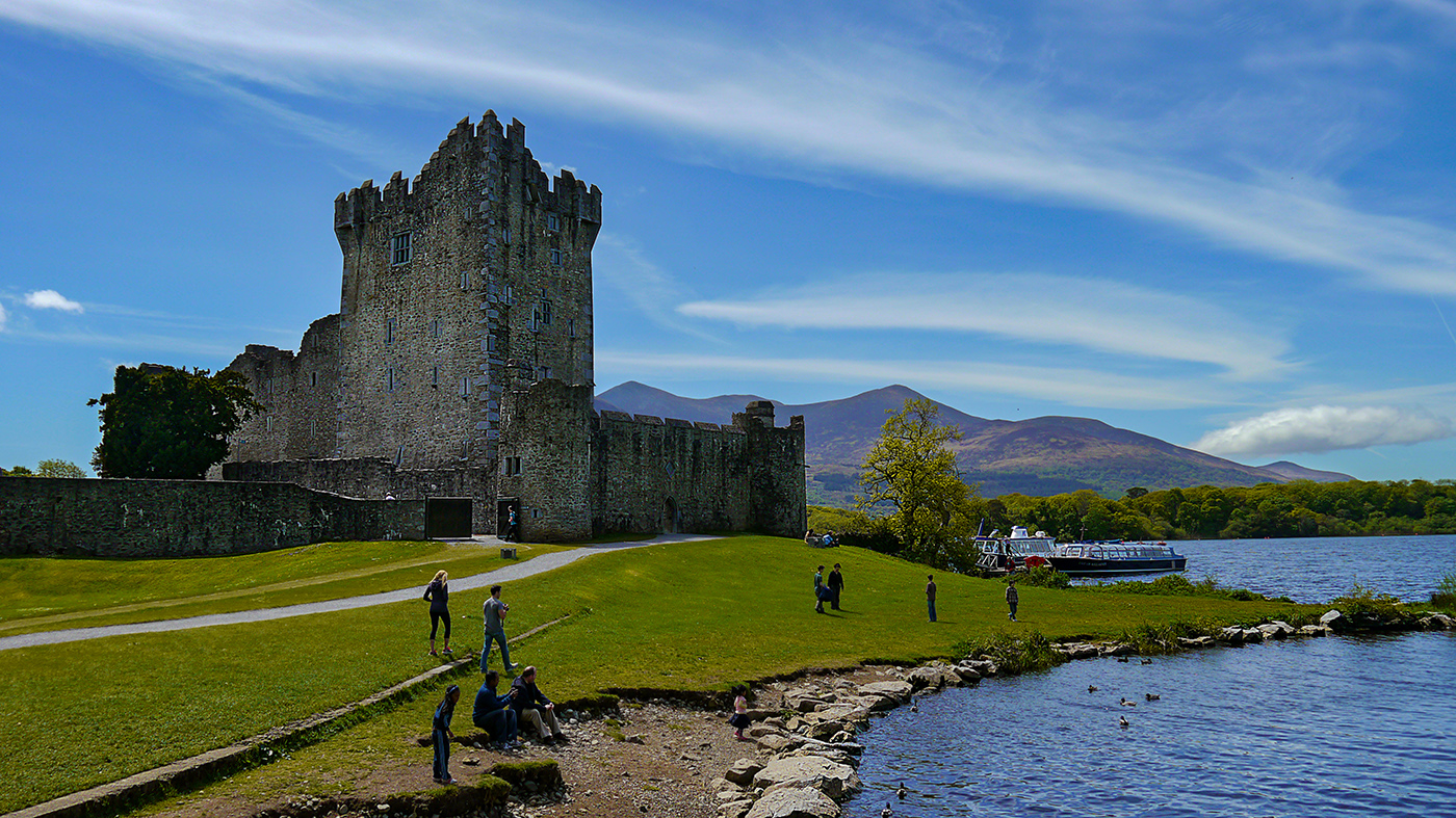
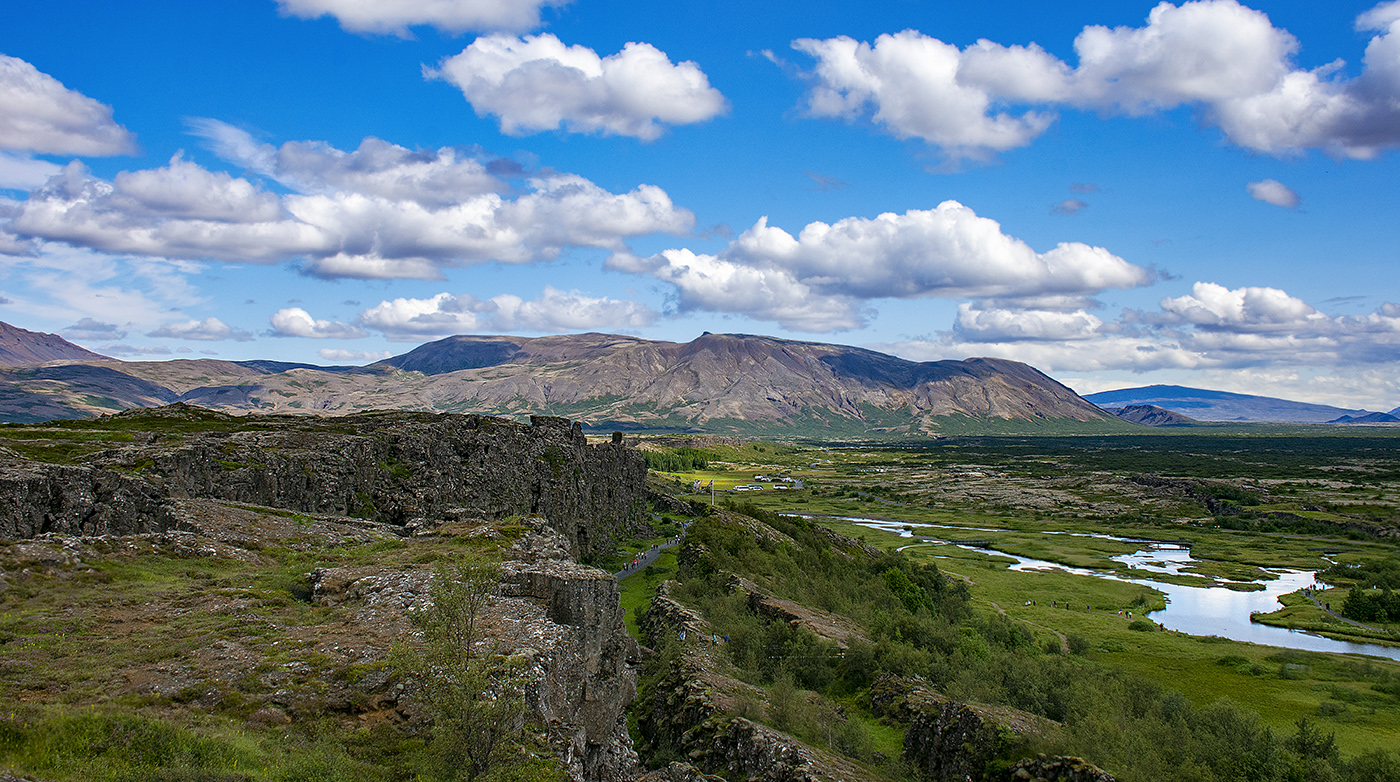
I like the way you cropped this image and the post processing is good. I particularly like the reflection of the houses in the water. I do agree with the others that the picture does seem to lack a 'wow' factor it is nevertheless a good image. I have simulated the golden hour on some images by using a Photoshop Warming Filter adjustment layer, you could try that or a sky replacement with something more interesting. That is one of the disadvantages of living in sunny California, I have taken a lot of pictures that would be much better if there were some clouds in the sky. |
Feb 17th |
| 36 |
Feb 20 |
Comment |
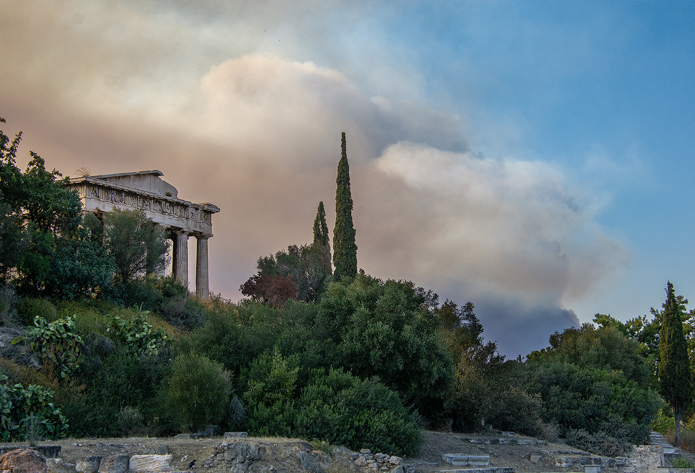
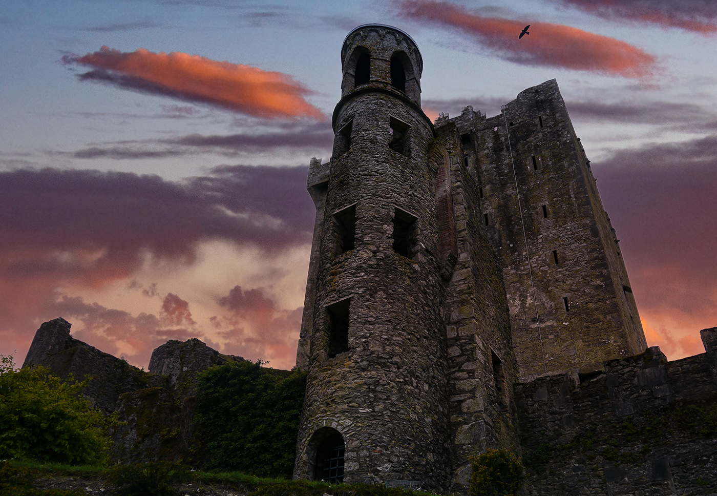
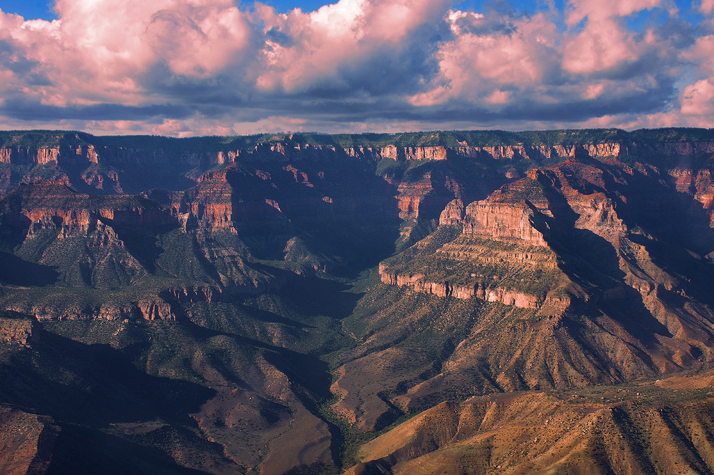
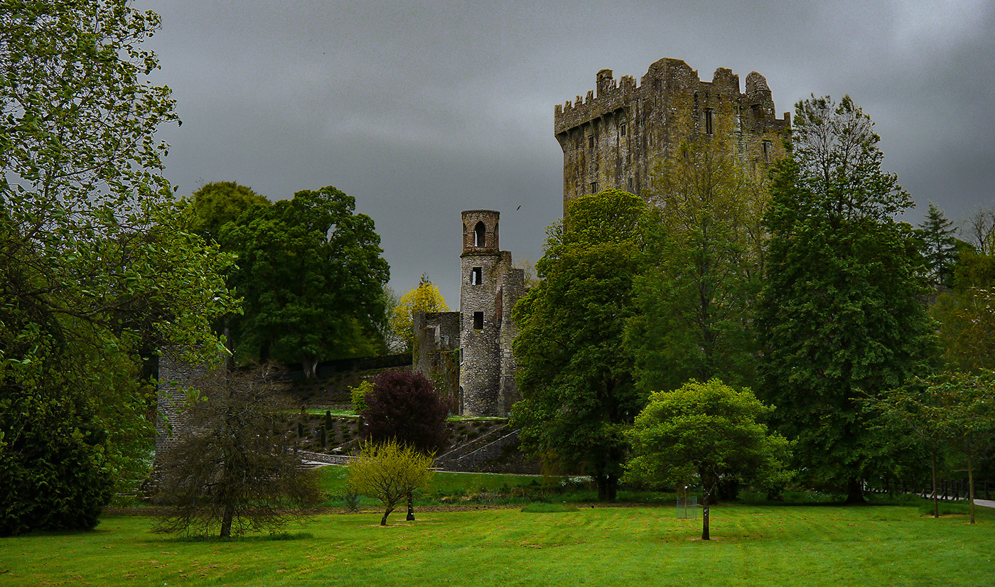
That's a very powerful image. It's a very moody image and there is a stark contrast between the monument and the clouds and ground. I like your modification to make the monument stand out more with additional contrast, it does improve it, although it was still a great image in its original form. The B&W treatment really does improve it! |
Feb 17th |
| 36 |
Feb 20 |
Comment |
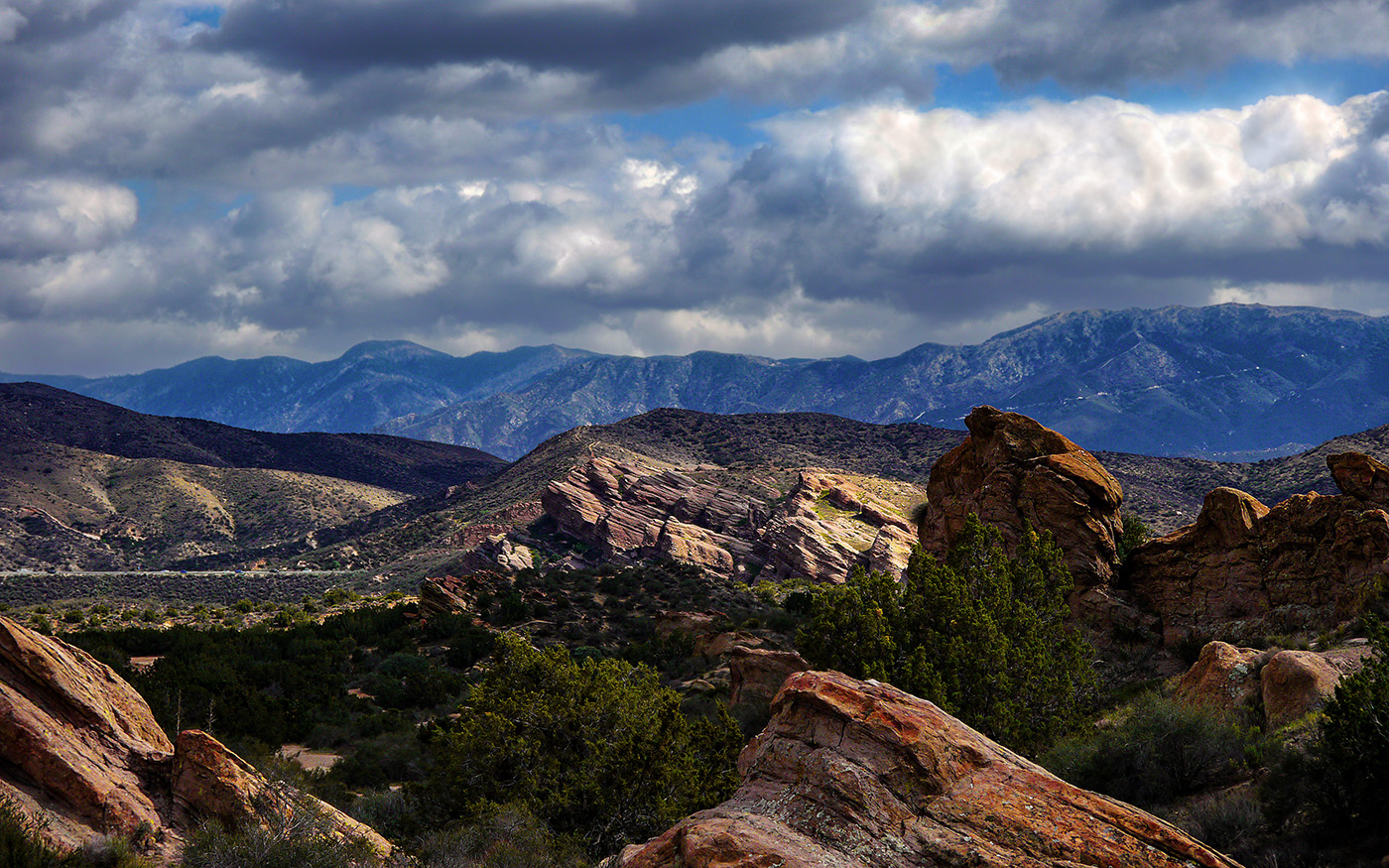
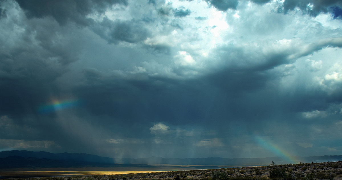
It's funny, I really thought the sky was dramatic, but I read the comments about the bright spot, and now I do find it somewhat distracting from the rest of the scene. It is a bit blown out. I like Larry's crop, but it does eliminate almost half of the image. I do really like the pinks and purples in the clouds. |
Feb 17th |
| 36 |
Feb 20 |
Comment |
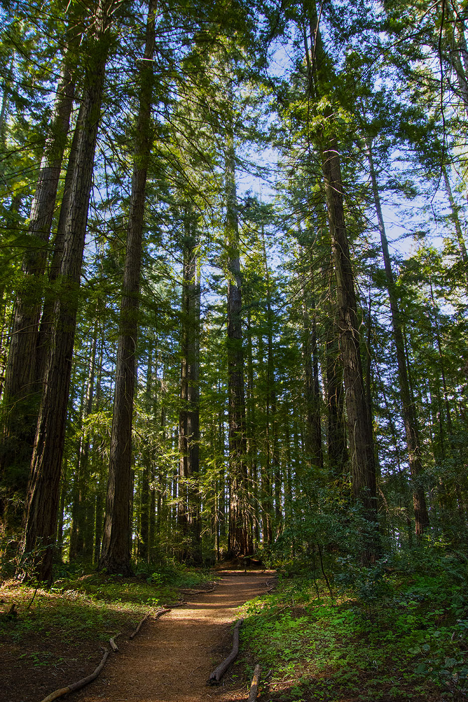
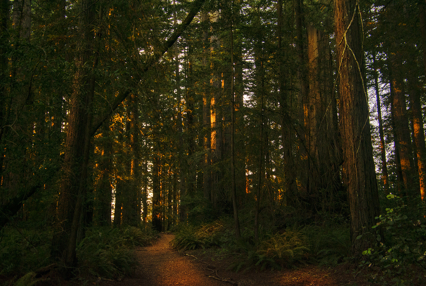
Those are both really nice images, Larry. I really like the first one, the orange color makes it almost monochromatic and very dramatic. The focus is good, trees are sharp and I like the compression you got with the telephoto. |
Feb 17th |
| 36 |
Feb 20 |
Comment |
I don't do a lot with B&W so take what I say with a grain of salt. Maybe several grains. I like the composition of this image but I agree with Larry. To me the towers look very soft. I like Larry's treatment of the image, but the towers still seem a little soft. Perhaps some selective sharpening would help? |
Feb 17th |
| 36 |
Feb 20 |
Comment |
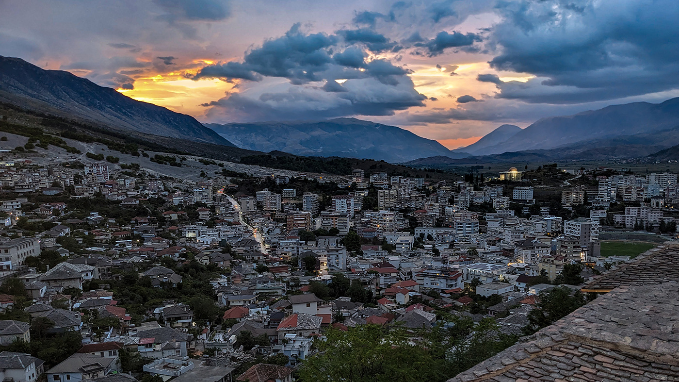
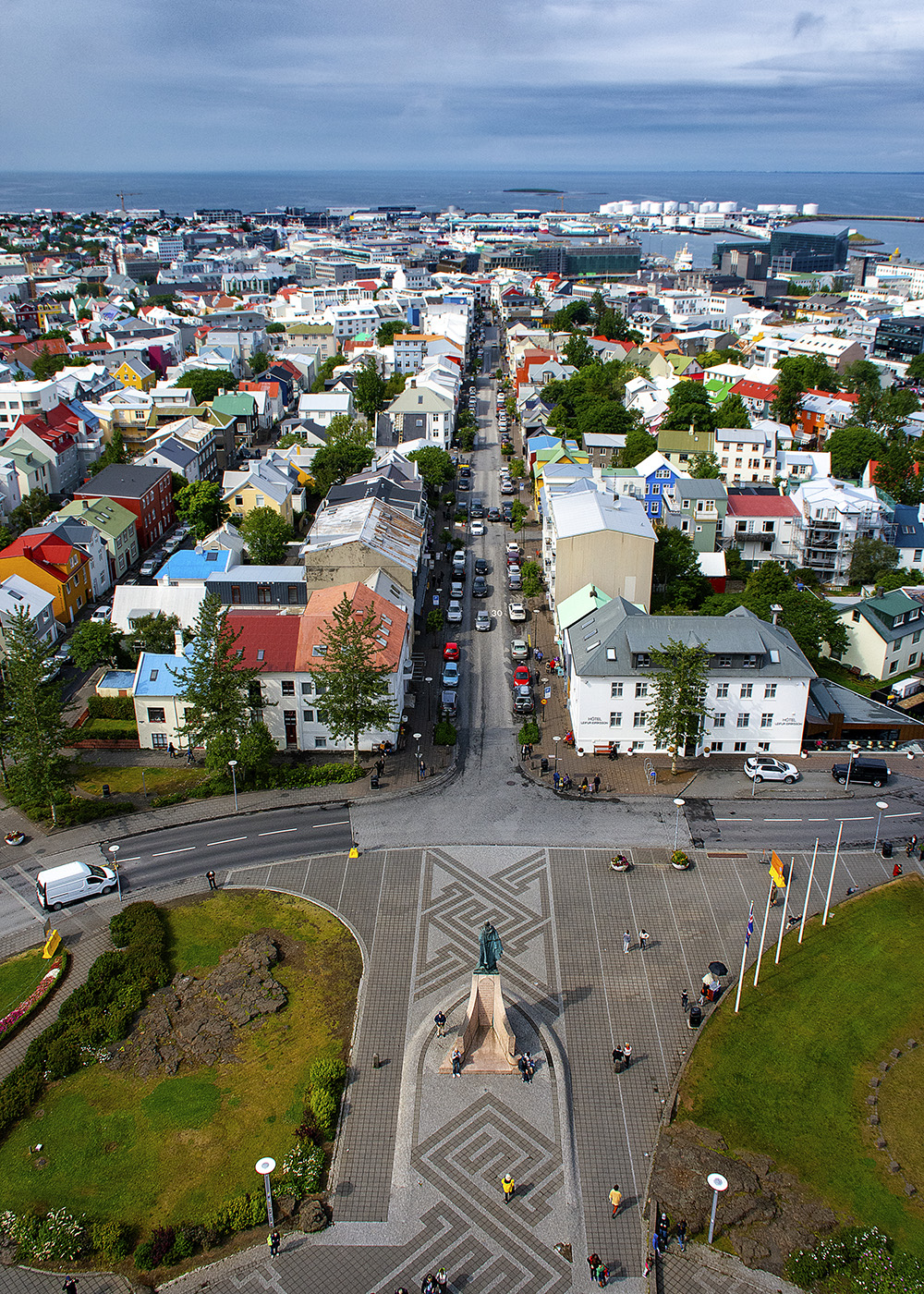
Thanks for all your suggestions. I was entering this in a color contest so I wanted to keep the roofs in the foreground in the image, since they do add color. I have noticed that the more color you have in this particular contest, the better you do. I might remove that one roof that is cut off at the edge of the bottom. Darkening the foreground is definitely an option and I like the idea of brightening the whites in the skyline. I think I'll give that a shot. |
Feb 9th |
7 comments - 0 replies for Group 36
|
7 comments - 0 replies Total
|